Forum adverts like this one are shown to any user who is not logged in. Join us by filling out a tiny 3 field form and you will get your own, free, dakka user account which gives a good range of benefits to you:
No adverts like this in the forums anymore.
Times and dates in your local timezone.
Full tracking of what you have read so you can skip to your first unread post, easily see what has changed since you last logged in, and easily see what is new at a glance.
Email notifications for threads you want to watch closely.
Being a part of the oldest wargaming community on the net.
If you are already a member then feel free to login now.
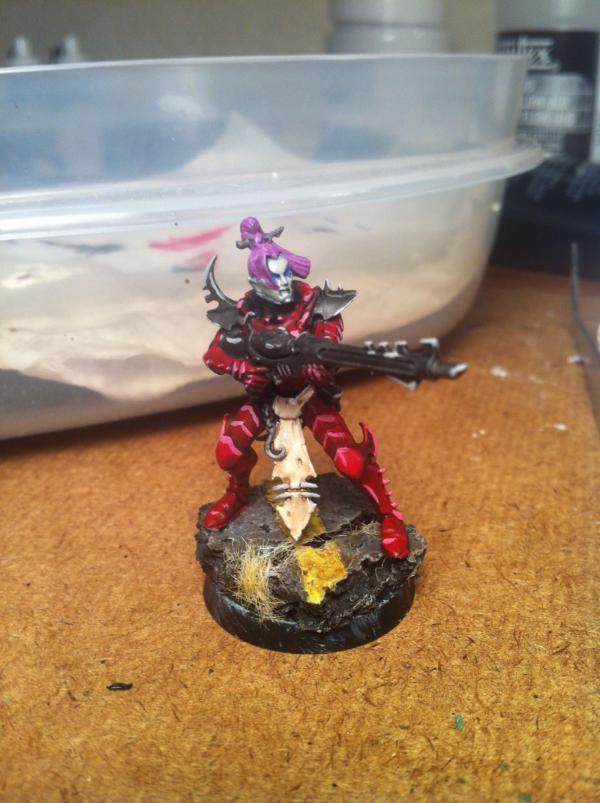
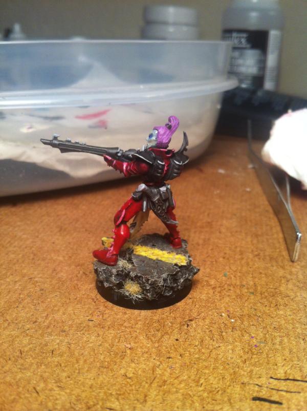
So here's my model for my paint scheme for the dark eldar I am slowly collecting. C&C welcome and appreciated.
I like how the grey vs red areas turned out, but I think I'm going to change some things. Next time the hair will be blue to match the wash on the skin. I might not make the highway base quite so light grey, more asphalt-y instead. I plan on painting some power-weapon green glow for the guns and some blood splatters on the more important models, not the grunt troopers. Personally I think the base looks purty kewl.
Did I overdo the highlights? I think it might be a bit too pink, but I wasn't sure how to get the raised armor edges to pop out otherwise. I think maybe a bit darker grey too. I also touched up the edges of the base on the bottom.
I like the base and the colour scheme alot - about the highlights I do not think you over did them. My DE are base colour incubi darkness, and over prominent area's are mixed 75%ID to 25% Sotek Green, then I use Sotek green as the base highlight, and the n a 25% SG to 75% White as a very thin edge highlight.
Also about the hair, I don't really worry about colours there as my DE have different coloured hair!
One thing im not sure of is the green you mentioned for the weapon, and how that will look against red
I've certainly never seen a pink apple, but they all have an orange cast to them. Look at the shade-base-highlight series of paints offered by several different companies and they all trend to orange as well for the reds. A pure white edge highlight looks right if done sparingly, but only if the white is opaque enough that it doesn't look pink.
The key to highlighting reds is subtlety. You want very slight contrast and less is usually more. Often just a simple base and wash or single slight highlight gets the job done without looking cartoonish.
ETA: The warmth of the red is determined by which way you go with this. Going the magenta/pink route makes for a cold red that looks bright. Orange/yellow makes for a warmer, deeper red.
This message was edited 1 time. Last update was at 2013/04/10 16:49:28
Thanks for the feedback, I will try out some orange highlights. And I know I should do thinner edge highlights, it's just that I don't have great brush control and the armor is tricky so sometimes i end up smearing it a bit...
helotaxi wrote: I've certainly never seen a pink apple, but they all have an orange cast to them. Look at the shade-base-highlight series of paints offered by several different companies and they all trend to orange as well for the reds. A pure white edge highlight looks right if done sparingly, but only if the white is opaque enough that it doesn't look pink.
The key to highlighting reds is subtlety. You want very slight contrast and less is usually more. Often just a simple base and wash or single slight highlight gets the job done without looking cartoonish.
ETA: The warmth of the red is determined by which way you go with this. Going the magenta/pink route makes for a cold red that looks bright. Orange/yellow makes for a warmer, deeper red.
I honestly don't know why I didn't just google it, myself. Usually I'm on that like a Google-fu master.
I guess it kind of depends on the type of apple you're looking at, though, and they all tend to go white a lot sooner than you'd expect.
Big images of apples in the spoiler.
Spoiler:
vs
Corvettes, on the other hand, obviously go pink, with a little bit of blue from the sky.
This message was edited 2 times. Last update was at 2013/04/10 17:09:23
DS:80+SGMB--I+Pw40k12#+D++A+/wWD-R++T(D)DM+
2013 W/L/D Ratio:
Dark Angels (3/12/2)
Malifaux (1/3/0)
JWhex wrote: Some of you guys need to go a through bad girlfriend or two and gain some perspective on things.
If you add white to your highlight color you just mute the color rather than give it a highlights. If you look at a color wheel (just google color wheel) you will see yellow at the top. When selecting what color to mix for your highlight find your color and then move one step up towards yellow. So one step up from red is orange. So you want to mix red and orange for your highlight. The only time you mix white to make a highlight is when you are using yellow because yellow is at the top of the wheel.
It's nice to see some color on a Dark Eldar - you're braver than I, for the DE I'm painting now I stuck with black armor with blue edge highlights.
When I've been doing my edge highlights, what I've been doing is laying them on as smooth as possible and trying to blend them so I have lighter highlights on the upper parts. My lines are thick and terrible though, so what I do is afterwards go back over them with black (my base color) to thin them down and make them sharper.
I'm at work now, but I can post a picture of the Venom I'm working on when I get home to give you an idea.
Yeah, I will be doing blending for the more important figures, but I was trying to do just a single highlight to keep myself sane while working on the grunt troopers.


 vs
vs 
