| Author |
Message |
 |
|
|
|
|
Advert
|
Forum adverts like this one are shown to any user who is not logged in. Join us by filling out a tiny 3 field form and you will get your own, free, dakka user account which gives a good range of benefits to you:
- No adverts like this in the forums anymore.
- Times and dates in your local timezone.
- Full tracking of what you have read so you can skip to your first unread post, easily see what has changed since you last logged in, and easily see what is new at a glance.
- Email notifications for threads you want to watch closely.
- Being a part of the oldest wargaming community on the net.
If you are already a member then feel free to login now. |
|
 |
2013/02/13 05:43:57
Subject: night lords test models; feedback wanted
|
|

Morphing Obliterator
|
evening dakka,
finally got a pair of test models done for my night lords army:
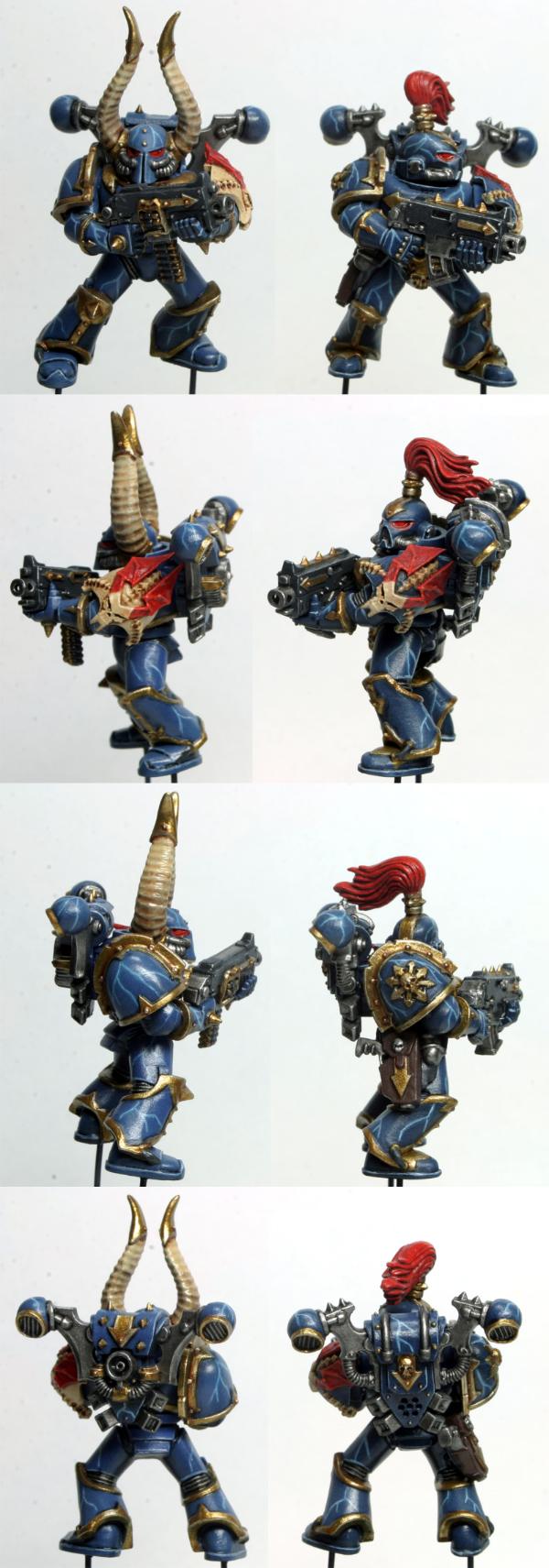
details aside, these guys were painted up exactly the same except for two key differences: the base armor color and the color scheme for the left shoulder pads. the gent with the horns is based in GW mordian blue and the gent with the top knot is based in GW regal blue. bit hard to tell from the photos, but in person the regal blue is notably darker. I think I'll be sticking with that for the base armor color.
would love some feedback on the color scheme. in particular, I'd like to get some opinions on the left shoulder pads; do you like the all-bone version or the bone-accents-on-blue-armor version? also, does the lightning on the armor stand out enough from the edge highlights? I'm wondering if the colors are too similar and it's confusing. lastly, thoughts on the gold trim? feels a bit too dark to me, but I'm not sure that something brighter really fits with their fluff.
the eyes were a failed attempt at adding a bit of glow to the bottom rim. I've come to realize that red simply does not glow when it shines onto a dark blue surface  I'll be abandoning that idea and focusing more on trying to add depth to the eyes.
oh, and apologies for the shine on the models. they should be a bit more matte, but my satin varnish was giving me trouble the other night.
|
|
|
|
 |
|
2013/02/13 08:20:19
Subject: night lords test models; feedback wanted
|
|

Sure Space Wolves Land Raider Pilot
|
I'd say it's a pretty good job on both accounts. They do look more finished than mine.
Personally, I use an Imperial Primer under coat, top it with Kantor Blue, detail the model, then finish off with Druchii Violet.
The units that really explain a Night Lords color scheme are, however Warp Talons, Raptors, Chaos Lords and Terminators.
With as many Lightning claws stuck in as possible...
|
|
This message was edited 1 time. Last update was at 2013/02/13 08:20:30
 Ave Dominus Nox Ave Dominus Nox 
 *A feral howl* ~2900pts *A feral howl* ~2900pts
 |
|
|
|
|
2013/02/13 08:38:52
Subject: night lords test models; feedback wanted
|
|
Bounding Assault Marine
Layton, Utah
|
Very well done. Both models.
I prefer darker minis so i like the regal blue for the power armor more, and an added bonus to the darker power armor is that the lighting stands out more.... and if you are going to take the time to do the lighting show it off!!!!
Gold has the perfect depth of color for a blue base.
Lastly i like both shoulders and it might be nice for a little diversity in the army by doing both at random, OR do one type on all the guys except sergents.
|
 Hopefully one day i'll have an army! Hopefully one day i'll have an army! |
|
|
|
|
2013/02/13 22:21:55
Subject: night lords test models; feedback wanted
|
|
Giggling Nurgling
|
Nice Paint Job very crisp and clean lines I can only hope when I finally get around to doing my Night Lords they look so good. Only other comment I have is I am partial to painting the skull mask on the helmets 
|
|
|
|
|
2013/02/13 23:25:44
Subject: night lords test models; feedback wanted
|
|
Morphing Obliterator
|
huh, I hadn't even thought about doing that. the photos I've been using for reference don't show that, but going through the 40k wiki I see a few examples now. I might have to try that out on a couple models, just for variety. thanks for the idea
|
|
|
|
|
|
2013/02/14 09:10:40
Subject: night lords test models; feedback wanted
|
|

Mighty Chosen Warrior of Chaos
|
I might sound like a jerk :/ but tbh I think if they were maybe 1 shade darker of blue it would make the lighting pop alittle more. And the gold for the shoulderpads look good but I think something like liquid gold would be alot nicer! BUT
thats not to say these dont look amazing!
|
|
|
|
|
|
2013/02/14 09:38:47
Subject: night lords test models; feedback wanted
|
|

Longtime Dakkanaut
|
Sexy stuff. I always imagine them darker, so it's nice to see them the way they are. I like the icon pauldron from the one on the right a lot more the ne on the let just kinda fades and doesn't have as nice of a color depth
|
15 successful trades as a buyer;
16 successful trades as a seller;
To glimpse the future, you must look to the past and understand it. Names may change, but human behavior repeats itself. Prophetic insight is nothing more than profound hindsight.
It doesn't matter how bloody far the apple falls from the tree. If the apple fell off of a Granny Smith, that apple is going to grow into a Granny bloody Smith. The only difference is whether that apple grows in the shade of the tree it fell from. |
|
|
|
|
2013/02/14 15:53:21
Subject: night lords test models; feedback wanted
|
|
Morphing Obliterator
|
kronicpsycho wrote:I might sound like a jerk :/ but tbh I think if they were maybe 1 shade darker of blue it would make the lighting pop alittle more. And the gold for the shoulderpads look good but I think something like liquid gold would be alot nicer! BUT
thats not to say these dont look amazing!
there's nothing jerk-like about sharing your opinion when that's exactly what I asked for the next shade down in my collection of blues is necron abyss, which is really dark. it almost looks black at table-top distance. I could definitely make my own mix, but I was looking for a base color that's going to be easily repeatable over time. the old regal blue is supposed to match up well with the new kantor blue, so I've got a replacement color if I run out.
I get what you're saying about the lightning not popping as much as it could. I might be able to get it brighter by going over the white a second time. it's pretty thin right now; more like a very light gray then true white. that might also solve my concern about the lightning and edge highlighting being too similar in color.
as to the gold, the liquid gold range is definitely something I want to get into but probably won't happen soon.
thanks for the feedback! Automatically Appended Next Post:  poda_t wrote: poda_t wrote:Sexy stuff. I always imagine them darker, so it's nice to see them the way they are. I like the icon pauldron from the one on the right a lot more the ne on the let just kinda fades and doesn't have as nice of a color depth
yeah, the more I look at it the more I'm leaning towards the shoulder pad with the blue base color. the all-bone look is a lot easier to paint, but it's just too much bone color in one spot I think.
|
|
This message was edited 1 time. Last update was at 2013/02/14 15:55:32
|
|
|
|
|
2013/02/14 17:23:15
Subject: night lords test models; feedback wanted
|
|
Colonel
This Is Where the Fish Lives
|
It looks great, but I would definitely go darker on the blues. I personally would start with a black primer and use VMA Insignia Blue as a base color and work up from there. It will make them look much more sinister, which fits well with their fluff.
Also, you should really invest in some Vallejo Liquid Gold paint... You really won't be sorry, they are absolutely fantastic. For your Night Lords, I would something like Red Gold, since their official colors are dark blue and brass. The Red Gold has a kind of gunmetal color to it and would sharp with a dark, deep blue.
|
 d-usa wrote: d-usa wrote:"When the Internet sends its people, they're not sending their best. They're not sending you. They're not sending you. They're sending posters that have lots of problems, and they're bringing those problems with us. They're bringing strawmen. They're bringing spam. They're trolls. And some, I assume, are good people."
|
|
|
|
|
2013/02/14 17:30:11
Subject: night lords test models; feedback wanted
|
|
Shas'la with Pulse Carbine
|
I also imagined them darker, but I'd be proud to field these guys. Great work!
|
GW Apologist-in-Chief |
|
|
|
|
2013/02/14 17:30:16
Subject: night lords test models; feedback wanted
|
|
Longtime Dakkanaut
|
Really spot on IMO, if I would change anything it would be to bring the lightning bolts up 1 more shade closer to white, they're just a bit muted for lightning.
I don't think that the blue is too light, I just think the lightning needs more contrast.
|
|
|
|
|
|
2013/02/14 18:02:51
Subject: Re:night lords test models; feedback wanted
|
|
Morphing Obliterator
|
the way I'm doing these guys now is to prime black, spray from the bottom up with necron abyss for all the shadows/recesses, base coat with regal blue from the top and sides and then a small bit of zenithal and spot highlighting from the top with space wolf gray (I think... at work, so don't have the paints in front of me). maybe if I did more coverage with the necron abyss and only used the regal blue from the top down to about 45 degrees? I'm trying to resist buying more paints at the moment because I have the entire old GW line already.
hmm, brass... maybe that's why the gold doesn't look right to me I kept thinking gold trim was too bright for them. perhaps it's time to take the VLM plunge after all. scooty, where do you get yours from? I usually order vallejo stuff from thewarstore.com, but they seem to be out of the red gold at the moment.
|
|
|
|
|
|
2013/02/14 18:36:16
Subject: Re:night lords test models; feedback wanted
|
|
Colonel
This Is Where the Fish Lives
|
 varl wrote: varl wrote:hmm, brass... maybe that's why the gold doesn't look right to me I kept thinking gold trim was too bright for them. perhaps it's time to take the VLM plunge after all. scooty, where do you get yours from? I usually order vallejo stuff from thewarstore.com, but they seem to be out of the red gold at the moment.
That is where I get mine from as well. Unfortunately (and also fortunately), TheWarStore.com is about the only reputable online seller that I could find here in the United States. On the bright side, they seem to get restocked rather quickly most of the time so hopefully they'll get more soon.
It's a shame you live on the otherwise of the country, as I would be glad to loan you mine.
|
d-usa wrote:"When the Internet sends its people, they're not sending their best. They're not sending you. They're not sending you. They're sending posters that have lots of problems, and they're bringing those problems with us. They're bringing strawmen. They're bringing spam. They're trolls. And some, I assume, are good people."
|
|
|
|
|
2013/02/14 18:54:23
Subject: night lords test models; feedback wanted
|
|
Stealthy Dark Angels Scout with Shotgun
|
I think the shoulder with the bone on blue looks better. I also like the one that is based in regal blue.
Overall, I think they look fantastic! Keep it up!
|
 -My typical roll. -My typical roll. |
|
|
|
|
2013/02/14 19:14:17
Subject: night lords test models; feedback wanted
|
|

Liche Priest Hierophant
|
How do you make the lightning?
|
|
|
|
|
|
2013/02/14 19:17:42
Subject: Re:night lords test models; feedback wanted
|
|
Morphing Obliterator
|
 ScootyPuffJunior wrote: ScootyPuffJunior wrote: varl wrote:hmm, brass... maybe that's why the gold doesn't look right to me I kept thinking gold trim was too bright for them. perhaps it's time to take the VLM plunge after all. scooty, where do you get yours from? I usually order vallejo stuff from thewarstore.com, but they seem to be out of the red gold at the moment.
That is where I get mine from as well. Unfortunately (and also fortunately), TheWarStore.com is about the only reputable online seller that I could find here in the United States. On the bright side, they seem to get restocked rather quickly most of the time so hopefully they'll get more soon.
It's a shame you live on the otherwise of the country, as I would be glad to loan you mine.
ok, cool. I had a hard time finding vallejo anywhere in the US, so wanted to make sure I hadn't missed a vendor while I'm thinking about it, a few VLM questions for you:
1. what alcohol do you use for thinning? I've got 70% and 91% isopropyl handy. will either of those work or do I need something that's closer to 100%?
2. is the consistency runny like an oil wash or more like thinned acrylic paint? wondering how much I have to worry about flooding the surface.
3. I know I'll have to dedicate a brush exclusively for VLM, but does it matter what type of brush (synthetic vs. real sable)?
Automatically Appended Next Post:
from my P&M blog:
"I did the lightning in two stages. the first stage used a mix of ice blue, water and glaze medium; about 1 part paint, 6-10 parts water and 1 part medium. the exact ratio doesn't matter too much as you can just apply more layers to darken up the line if the mix is too thin. I painted in the outline for the lightning using this mix and a size 0 brush, going over each line a few times until I got enough color.
the second stage was done with skull white mixed with a bit of retarder; about 2 parts paint to 1 part retarder. I used a fine detail brush for that and just put a line of white down the center of each ice blue outline. it ended up being a bit easier then I thought it would be. the hardest part was deciding how much lightning to do and where to put it."
as an addendum to that, the next time I do this I'm going to go back over the white a second time to try and brighten it up. the first coat of white looks more like a light gray since it's such a fine, thin line.
|
|
This message was edited 1 time. Last update was at 2013/02/14 19:37:41
|
|
|
|
|
2013/02/14 19:49:47
Subject: night lords test models; feedback wanted
|
|
Colonel
This Is Where the Fish Lives
|
The 91% from Walgreens or any other drug store is all you need to thin the Liquid Gold paints, and you may find that a lot isn't necessary. My Silver is pretty thin and usually I use it straight from the bottle, but most of my golds need to be thinned down a little. Just remember, since these are alcohol based, they dry very fast.
Depending on how thin they are, they do have a tendency to run if you get a little heavy-handed with them. As long as you have a coat or two of varnish on the model already, they can be tiddied up with some straight isopropyl and a paint brush.
Having dedicated brushes is a must, and I would recommend synthetic hair because the alcohol is pretty rough on natural hair brushes. Just pick up some cheap brushes from a craft store to use with them and make sure you don't get them wet... Water will ruin the paint.
|
d-usa wrote:"When the Internet sends its people, they're not sending their best. They're not sending you. They're not sending you. They're sending posters that have lots of problems, and they're bringing those problems with us. They're bringing strawmen. They're bringing spam. They're trolls. And some, I assume, are good people."
|
|
|
|
|
2013/02/14 19:56:21
Subject: night lords test models; feedback wanted
|
|
Morphing Obliterator
|
excellent, I've got all that to hand then. one other thing I just thought of: normally when I'm going to paint gold, I base coat the area with a medium brown like GW's bestial brown. is that still necessary with the VLM colors?
Edit: how do you like the VLM silver, anyway? I've read a few times that people weren't very happy with it compared with how amazing the golds are
|
|
This message was edited 1 time. Last update was at 2013/02/14 19:57:56
|
|
|
|
|
2013/02/14 20:46:21
Subject: Re:night lords test models; feedback wanted
|
|
Lone Wolf Sentinel Pilot
|
The blue seems a little light to me, but other than that they look great. The bone and red areas look good and so does the lighting. I just prefer a little darker imho. But they still look great. 
|
DC:80+S+++GM+B++IPw40k08++D++A+++/hWD346R++T(M)DM+ Successful trades with Tweems, Polonius, Porkuslime, Mark94656, TheCupcakeCowboy, MarshalMathis, and Hahnjoelo
 |
|
|
|
|
2013/02/14 22:24:07
Subject: night lords test models; feedback wanted
|
|
Hurr! Ogryn Bone 'Ead!
|
Those are gorgeous!
|
|
|
|
|
2013/02/14 22:54:21
Subject: night lords test models; feedback wanted
|
|
Colonel
This Is Where the Fish Lives
|
varl wrote:excellent, I've got all that to hand then. one other thing I just thought of: normally when I'm going to paint gold, I base coat the area with a medium brown like GW's bestial brown. is that still necessary with the VLM colors?
Edit: how do you like the VLM silver, anyway? I've read a few times that people weren't very happy with it compared with how amazing the golds are
It wouldn't hurt to use a brown undercoat, but they Liquid Metal paints have pretty decent coverage. I personally don't use an undercoat because I feel like it is a waste of time.
As far as the Silver; I love it... I have absolutely no complaints about it. As a matter of fact, I feel like it is the brightest silver metallic paint available, save more maybe the Alclad II metallic paint. When it is on a model you can see it reflecting the light that hits it... It is seriously bright.
|
d-usa wrote:"When the Internet sends its people, they're not sending their best. They're not sending you. They're not sending you. They're sending posters that have lots of problems, and they're bringing those problems with us. They're bringing strawmen. They're bringing spam. They're trolls. And some, I assume, are good people."
|
|
|
|
|
|
|


