| Author |
Message |
 |
|
|
|
|
Advert
|
Forum adverts like this one are shown to any user who is not logged in. Join us by filling out a tiny 3 field form and you will get your own, free, dakka user account which gives a good range of benefits to you:
- No adverts like this in the forums anymore.
- Times and dates in your local timezone.
- Full tracking of what you have read so you can skip to your first unread post, easily see what has changed since you last logged in, and easily see what is new at a glance.
- Email notifications for threads you want to watch closely.
- Being a part of the oldest wargaming community on the net.
If you are already a member then feel free to login now. |
|
 |
2016/07/27 19:39:37
Subject: WORST 40k artwork thread
|
|

Committed Chaos Cult Marine
|
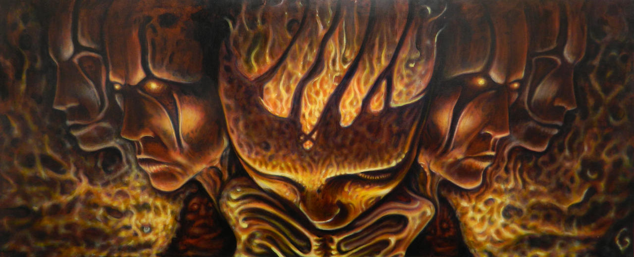
 Selym wrote: Selym wrote: Melissia wrote: Melissia wrote:You don't need to have gakky art in order to have a surreal nightmare world. You don't need to make excuses for bad art.
For example;
Not quite got the thematics of 40k, but they both show some dark and creepy themes while retaining proportions and a sense of style.
Neither conveys any sort of horror to me. At all. They're too clean and bright. Blanche's stuff looks like it came straight out of a nightmare.
It's not really worth arguing though. I get what you're saying; different things appeal to different people.
|
|
|
 |
|
2016/07/27 21:14:56
Subject: WORST 40k artwork thread
|
|

Powerful Phoenix Lord
|
I'd love to see some Jakub Rozalski art for 40K...(sigh) 
|
|
|
|
|
2016/07/28 00:05:31
Subject: WORST 40k artwork thread
|
|

The Last Chancer Who Survived
|
 ChazSexington wrote: ChazSexington wrote:
Neither conveys any sort of horror to me. At all. They're too clean and bright. Blanche's stuff looks like it came straight out of a nightmare.
It's not really worth arguing though. I get what you're saying; different things appeal to different people.
Any argument dismissed as not worth arguing is one that has me interested. These any closer to your preferences?
|
|
|
|
|
2016/07/28 03:51:22
Subject: WORST 40k artwork thread
|
|
Ultramarine Master with Gauntlets of Macragge
|
PourSpelur wrote:To me, Blanche's art is the spirit and soul of 40k.
You see bad proportions, I see a surreal nightmare world. Almost correct but horribly off.
You see a focus on detail, ignoring the bigger picture. I see a skewed view that showcases the "wrongness" that is the heartbeat of the setting.
This is a very, very good post, that really elaborates on why Blanche's stuff is so excellent. His work is concept art more than anything else; he largely just does sketches that get the idea and the feel of the setting that some hyper-polished CG art just doesn't quite get.
Also seeing the AoS and Wulfen art really bums me out. So much of it looks like loading screen art for World of Warcraft and it's really flat and unexciting. No real soul and just straight depictions (or in some cases, tracings) of existing models.
|
Check out my Youtube channel!
 |
|
|
|
|
2016/07/28 04:32:51
Subject: Re:WORST 40k artwork thread
|
|
Trigger-Happy Baal Predator Pilot
|
 Kid_Kyoto wrote: Kid_Kyoto wrote:This is turning out to be a pretty interesting thread rather than the usual snark and b#$%^-fest. On pin-heads, I think it's the artist attempting to address the 'problem' that on most marines models the bare head is the same size as a helmet. GW does this on purpose (they know that helmets take up space) so the model looks right, even if the biology/science is wrong. Artists try to show that in 'real life' marine heads are small and only look right with a helmet on. I see the logic, but I think they're better off following the aestetic route rather than the correct one. On Blanche, I love his stuff, sad to see people hating it bascially for not being photo-correct. And yeah, the worst art is the ones where every figure looks like a GW model built with stock parts. It turns artists into tracers and does nothing to enrich the world. I guess at the end of the day I don't have much to contribute (other than the Ork Codex) because IMHO GW art has always been head and shoulders above everyone else's. Compare Rogue Trader or Warhammer RPG to their contemporaries from TSR, White Wolf, FASA, West End or Steve Jackson and it's hard to look down on them now. The quality of the art and art direction is what drew me towards GW in the first place.
But that's just it, on a lot of those pin head pictures, even if you assumed the helmets increase the size of the head as much as motorcycle helmets do, they're still wayyyyy too small. But there's also no real reason to make that assumption, even. 20th century military helmets increase the size of your head profile because they're deliberately spaced off of your skull so they don't fracture your skull when they deform from impacts (whether they're steel helmets, or kevlar). "Ceramite", whatever physical properties it might have, wouldn't have that issue. Also space marine noggins are tough. All the gadgetry is pretty shrunk down in power armor, too. The helmet could easily not increase the size of your head profile much more than a paintball mask does (ie, not much). Shoot, going by inquisitor rules from back in the day, power armor gives you 10 armor points to every part of your body but the head. That gets six. Automatically Appended Next Post: Also I second whoever said this is turning into an interesting thread! That AoS artwork looks like dino-riders from when I was a kid but worse. And also I'm glad there are some people defending Blanche! Love the guy! Automatically Appended Next Post: Hey guys check out these new AoS units from the new white dwarf!

|
|
This message was edited 3 times. Last update was at 2016/07/28 04:40:35
|
|
|
|
|
2016/07/28 05:05:12
Subject: WORST 40k artwork thread
|
|
Regular Dakkanaut
|
Do not mock the Dinoriders.
|
|
|
|
|
2016/07/28 06:19:10
Subject: WORST 40k artwork thread
|
|
Krazy Grot Kutta Driva
|
Selym wrote: ChazSexington wrote:
Neither conveys any sort of horror to me. At all. They're too clean and bright. Blanche's stuff looks like it came straight out of a nightmare.
It's not really worth arguing though. I get what you're saying; different things appeal to different people.
Any argument dismissed as not worth arguing is one that has me interested. These any closer to your preferences?
I'll jump back in on this. Those are all great images, 1 and 4 in particular. What I really enjoy about them is they look like snapshots of a world we don't understand. One we can't understand. Knowing that there's some mystery makes me want to fill in those gaps. That's the same thing I love so much about the old Blanche art.
Take a good, scary monster movie. In the vast majority of them the monster isn't fully visible. Mostly flashes and images. My imagination will fill in the fuzzy spots and end up with something more terrifying than anything possible with latex or CGI.
|
|
|
|
|
2016/07/28 07:03:27
Subject: WORST 40k artwork thread
|
|
Longtime Dakkanaut
|
Indeed! I still have the T-Rex and Triceratops action figures, although sadly I think their armour and weapons have been lost.
|
|
|
|
|
|
2016/07/28 08:00:28
Subject: WORST 40k artwork thread
|
|

[MOD]
Otiose in a Niche
|
For me Blanche's art reminds me Lovecraft's description of a Cthulhu idol. It was crude, but because the artist was afraid to make it more detailed, because that would make him think about Cthulhu and drive him insane.
I'm not saying Blanche's art is the only way to convey the 41st millennium, but its deliberate sketchiness and abstraction make it feel like the 41st M is so insane that showing in more clarity would drive us all mad.
|
|
|
|
|
|
2016/07/28 13:06:51
Subject: WORST 40k artwork thread
|
|
Trigger-Happy Baal Predator Pilot
|
 JamesY wrote: JamesY wrote:
Indeed! I still have the T-Rex and Triceratops action figures, although sadly I think their armour and weapons have been lost.
Aha! Find those and your Orks just got themselves a new 'squiggoth', or, uh, your AoS whatever those guys are called just got themselves a new whatever those mounts are called (don't care!).
|
|
|
|
|
|
2016/07/28 13:09:49
Subject: WORST 40k artwork thread
|
|
The Last Chancer Who Survived
|
Haters gonna hate, Bl'd Ang'ls gonna Ang'late.
|
|
This message was edited 1 time. Last update was at 2016/07/28 13:09:58
|
|
|
|
|
2016/07/28 14:20:33
Subject: WORST 40k artwork thread
|
|
Consigned to the Grim Darkness
|
Kid_Kyoto wrote:For me Blanche's art reminds me Lovecraft's description of a Cthulhu idol. It was crude, but because the artist was afraid to make it more detailed, because that would make him think about Cthulhu and drive him insane.
... you're giving it way too much credit. It's incompetence, not intentional.
|
The people in the past who convinced themselves to do unspeakable things were no less human than you or I. They made their decisions; the only thing that prevents history from repeating itself is making different ones.
-- Adam Serwer
My blog |
|
|
|
|
2016/07/28 14:42:17
Subject: WORST 40k artwork thread
|
|

Fixture of Dakka
|
For a thread that is suppose to be 40K worse art ever, I am finding I am liking a lot of the art being shown.
|
Agies Grimm:The "Learn to play, bro" mentality is mostly just a way for someone to try to shame you by implying that their metaphorical nerd-wiener is bigger than yours. Which, ironically, I think nerds do even more vehemently than jocks.
Everything is made up and the points don't matter. 40K or Who's Line is it Anyway?
Auticus wrote: Or in summation: its ok to exploit shoddy points because those are rules and gamers exist to find rules loopholes (they are still "legal"), but if the same force can be composed without structure, it emotionally feels "wrong". |
|
|
|
|
2016/07/28 15:56:57
Subject: WORST 40k artwork thread
|
|
Committed Chaos Cult Marine
|
Selym wrote: ChazSexington wrote:
Neither conveys any sort of horror to me. At all. They're too clean and bright. Blanche's stuff looks like it came straight out of a nightmare.
It's not really worth arguing though. I get what you're saying; different things appeal to different people.
Any argument dismissed as not worth arguing is one that has me interested. These any closer to your preferences?
First one is decent. The rest do nothing for me.
As for the argument, it's just opera vs. thrash metal. Some people like opera, some like thrash, some like both. Blanche's art conveys much more emotion to me than the others' more realistic art.
Melissia wrote: Kid_Kyoto wrote:For me Blanche's art reminds me Lovecraft's description of a Cthulhu idol. It was crude, but because the artist was afraid to make it more detailed, because that would make him think about Cthulhu and drive him insane.
... you're giving it way too much credit. It's incompetence, not intentional.
His style is very much intentional. His cover for the 3rd edition rulebook has much more "normal" proportions for the Space Marines, but a lot of his other artwork has a wrongness to the proportions. It's meant to be nightmarish and convey the grim darkness of the far future.
|
|
|
|
|
2016/07/28 16:30:17
Subject: WORST 40k artwork thread
|
|
Consigned to the Grim Darkness
|
I disagree. Also, the C: SM third edition cover wasn't exactly great artwork in and of itself, either, a jumble of marines with very slightly better proportions to his usual crap but still on the lower end of quality when it comes to GW art. You're giving way too much credit to what is basically a bad artist with some weird fetishes. My comparison to Rob Liefeld is still pretty apt.
|
|
This message was edited 1 time. Last update was at 2016/07/28 16:30:44
The people in the past who convinced themselves to do unspeakable things were no less human than you or I. They made their decisions; the only thing that prevents history from repeating itself is making different ones.
-- Adam Serwer
My blog |
|
|
|
|
2016/07/28 16:33:47
Subject: WORST 40k artwork thread
|
|
Trigger-Happy Baal Predator Pilot
|
|
|
|
|
|
|
2016/07/28 16:58:26
Subject: WORST 40k artwork thread
|
|
Esteemed Veteran Space Marine
UK
|
Elbows wrote:I think one huge difference you'll find in the older artwork (beyond the quality of the artists) is that the game was smaller and the world was just as big. As such you had a lot of miniatures derived from art and not the other way around.
The artists were creating the world of Warhammer 40K just as much as the sculptors. If we look at John Blanche's art for the Imperium - it's almost entirely stuff he just made up. It's not based on a miniatures line, etc.
The artists were not beholden nearly as much to what miniatures were available or what units existed - they frequently were creating fluff simply by doing art in the way they wanted to. You'll see all manner of war machines, fliers etc. in the background of pictures which didn't (and still don't!) "exist" in the 40K tabletop game.
I get an overwhelming feeling of "look at the miniatures...create some rather soulless computer artwork to sell them" approach from a lot of the newer stuff. The older art comes across more often as "fanboy" art. Ie. artists who were really enthused with the world they were portraying.
My personal favourite artist of the time was Mark Gibbons. He developed immensely from his early work. While he gave into some of the pin-head sizing and the somewhat comic-driven proportions his art work was really fantastic.
The below is an excellent example. Doesn't exist as a model. It's just a piece of fluff art 100%. I don't even like Chaos stuff but Mark just had a visual style I really, really like. It doesn't hurt that this was pre-computer art.
A lot of his work become iconic...this simply was "The" Avatar picture...for a decade or more.
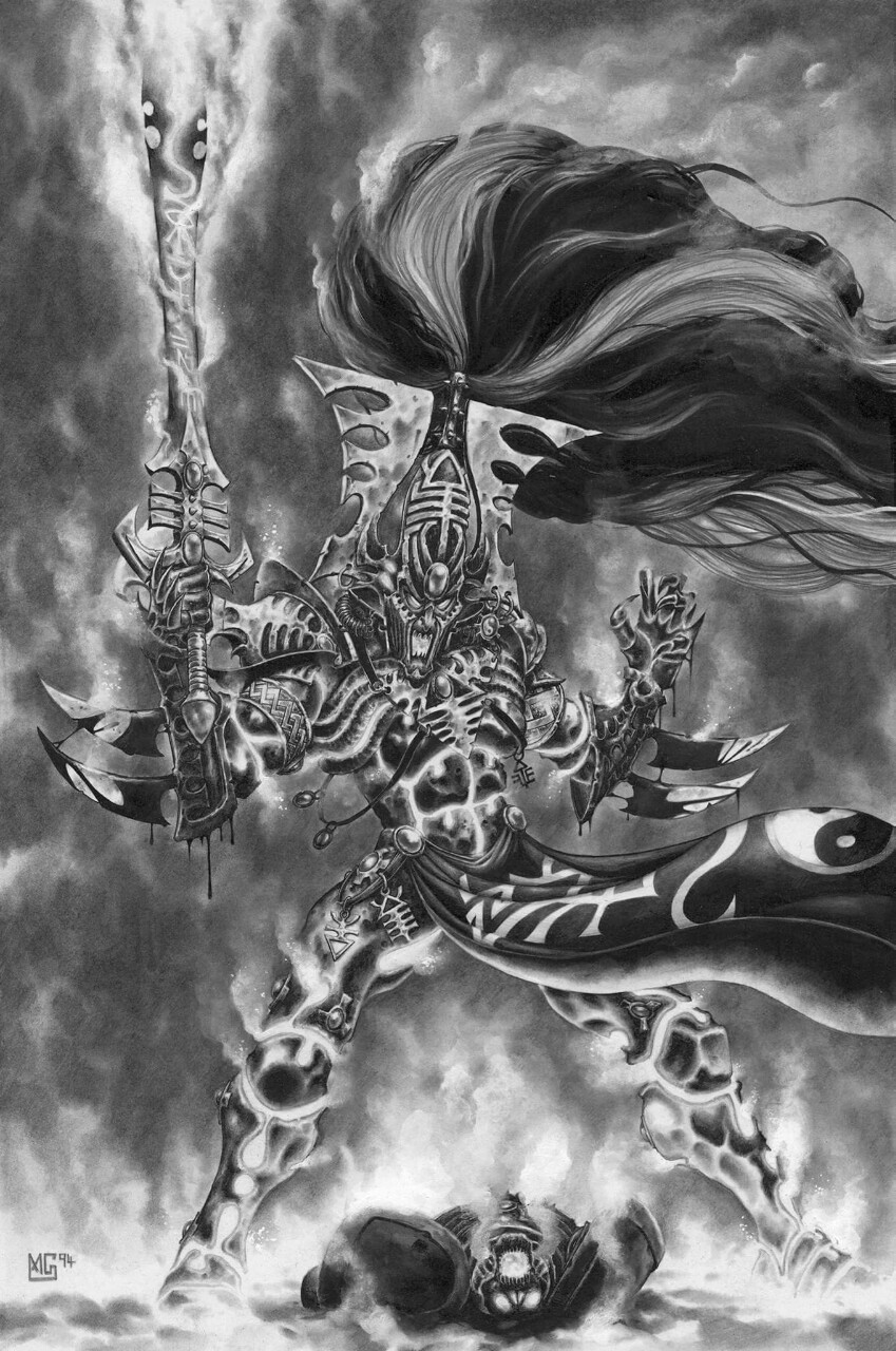
While I understand that art has changed and public consumption has changed, some of the older stuff really is stand-out artwork.
PS: There was an artist who did some black/white art in some of the early 2000 Fantasy books I believe, had some incredibly gritty awesome looking dwarves. Anyone know who that artist was?
Those are iconic images for me. Truly reminiscent of when I first got into the hobby. That Chaos one would make a great anniversary model for chaos if they ever did anything like that for them!
PourSpelur wrote:To me, Blanche's art is the spirit and soul of 40k.
You see bad proportions, I see a surreal nightmare world. Almost correct but horribly off.
You see a focus on detail, ignoring the bigger picture. I see a skewed view that showcases the "wrongness" that is the heartbeat of the setting.
I completely agree, and while some of the proportions and perspective might be completely askew that's kind of the point. Hasnt the whole universe got their perspective completely messed up in the 41st Millenium? I can understand why Blanches art wouldn't be to everyone's tastes, but for me it captures the essence of the setting perfectly. The atmosphere is so spot on. The pictures are supposed to look wrong and messed up, that's the whole point. It's artistic expression and interpretation. Little Windows into the madness of the incredibly rich and vibrant setting that both the artists and sculptors have created for us.
Melissia wrote:You don't need to have gakky art in order to have a surreal nightmare world. You don't need to make excuses for bad art.
You're missing the point spectacularly, it's not about making excuses for bad art, it's about interpreting that art in a different way. It's not like Blanche has drawn a picture of a space marine that's set out to be photo realistic. His work was always about an artistic representation of the characters and the setting. If you want photo realism look no further than the recent AoS sigmarine blandfest art that's been showcased in this very thread.
|
|
|
|
|
|
2016/07/28 20:03:16
Subject: Re:WORST 40k artwork thread
|
|
Krazy Grot Kutta Driva
|
Look at this hack work. It's just a bunch of dots and splashes of color. The proportions are all wrong. What's that thing on the left? A tree? Saruman's tower? The trash heap this painting belongs on?
Whatever it is I'm glad this scribble will be instantly recognized as hot garbage.
OK, I'm not implying that Blanche belongs on the wall next to Van Gogh. What I'm implying is that good art provokes a response. I get that response from Blanche. If you don't that's fine. What I disagree with is the assertion that because you don't like it, it's bad.
|
|
|
|
|
2016/07/28 21:51:28
Subject: WORST 40k artwork thread
|
|
Fresh-Faced New User
|
having spoken to Blanche about specific pieces from the INQ stuff I like and have drawn from for inspiration for models the stylistic choices are deliberate. The idea is a world of madness and horror from what I understood of the conversation (not being technically great as an artist myself)
for me the Liber Chaotica was stunning BECAUSE of that style, the author of the text (the book being an artefact of the game world rather than just an explanation of the gods) shone because it depicted the art sketched by an author as he lost his grip on reality. The way that figures became less and less human in their proportions (head to body size the shift from the 6 heads we are used to in GW's 28mm models or the 8 heads to body of more realistic art) means that we get a sense of intrinsic wrongness from the figures we see.
showing art from blanche of the more radical inquisitors, the warped stuff the imperium did as punishments such as deathmasking and arco-flagelation as well as chaotic figures, or sorcerers and the demonic to my (now ex) girlfriend. She didn't play the game, didn't have an understanding of the background but to her artists eye she saw these things were wrong... were evil or monsterous.
His art to me shows that the artist has been damaged and changed by what he/she has seen and gives a sense of wrongness that the world these figures inhabit is truly broken.
his stuff outside of GW shows that its a deliberate style.
His influence in shaping the world, things like servo skulls and the way that people are twisted and reborn with their bionic parts has done allot to shape the casual grimness of the Imperium. the way that the AdMech are depicted in his work makes the reaction of humans to these figures in the books understandable. the innate revulsion and discomfort that Cain views a Techpriest with becomes instantly understandable when we view the art drawn. the way that the Marines are human but yet... not as well. the Blanchitsu series in WD showing concept models drawing from his art I found really interesting and the style of painting that has come from his art. (heavy uses of inks and washes to provide the colour of the pieces) really does add something to the world that the hyper clean and bold colours of the eavy metal team of the late 90's-2005ish didn't really capture for me.
it doesn't stand up well in comparison to the modern art which uses allot of really detailed digital backgrounds and focuses on lots of bold colour though but when viewed in the context of the 3.5 era rulebook (the BT on the cover) where the majority of the art was black and white and to me very much sculptural, standing as dramaticised depictions of battles or events shown in a gallery that don't have any of the horror or violence of a battle. the use of colour and the fact non of it was cleaned up or polished worked really well.
There is some truly shocking art out there and I agree the modern stuff in some cases is a bit cartoonish or heavy cgi'd kids show but allot of the third edition art was like that so it isn't suprising their going back to that style.
as inspiration for miniatures for INQ Blanche is really helpful for that unsettling wrongness sort of thing.
|
|
|
|
|
2016/07/29 00:00:44
Subject: WORST 40k artwork thread
|
|
Consigned to the Grim Darkness
|
 General Kroll wrote: General Kroll wrote:You're missing the point spectacularly, it's not about making excuses for bad art
IE, making excuses for bad art.
I haven't asked for photo-realism. I have asked for art that looks like it was drawn by someone who knows what they are doing.
|
The people in the past who convinced themselves to do unspeakable things were no less human than you or I. They made their decisions; the only thing that prevents history from repeating itself is making different ones.
-- Adam Serwer
My blog |
|
|
|
|
2016/07/29 04:18:52
Subject: WORST 40k artwork thread
|
|
Warning From Magnus? Not Listening!
|
This argument has gone on long enough, and its obvious that neither side is going to change their opinion. Can you both please drop it before the mods come in and close this interesting thread?
|
 Necrons - 3000 pts Necrons - 3000 pts
 HH Imperial Militia/Cults - 1000 points Check out my P&M blog! (https://www.dakkadakka.com/dakkaforum/posts/list/805464.page) HH Imperial Militia/Cults - 1000 points Check out my P&M blog! (https://www.dakkadakka.com/dakkaforum/posts/list/805464.page)
 Bretonnia - 4500 pts Bretonnia - 4500 pts
Dakka trades (50): Gav99 (3), FenrisianStuart21 (2), gardeth, norrec65, syypher, Sargow, o Oni o, Rommel44, Lloyld, riverrat88, GloboRojo (2), Cocking_08, mickmoon (2), Acardia, Twoshoesvans, Prandtl, Thedragisal, CptJake, toasteroven, allworkandnoclay, CleverAntics (2), system seven, Siphen, Craftbrews, jmsincla, ellis91, HurricaneGirl, Bionic Reaper, quickfuze, VanHallan, quiestdeus, -iPaint-, Shadowblade07, Dez, Gremore, Ph34r, SwordBird, slyndread (2), JoeBobbyWii, VeternNoob, Madoch1, Dax415, CaptainRexKrammer, francieum, Telmenari, Melevolence |
|
|
|
|
2016/07/29 04:47:05
Subject: WORST 40k artwork thread
|
|
[MOD]
Otiose in a Niche
|
Melissia wrote: Kid_Kyoto wrote:For me Blanche's art reminds me Lovecraft's description of a Cthulhu idol. It was crude, but because the artist was afraid to make it more detailed, because that would make him think about Cthulhu and drive him insane.
... you're giving it way too much credit. It's incompetence, not intentional.
Hey Blanche ain't my idol, he ain't my dad, he ain't even my friend.
But insisting repeatedly that something you don't like is incompetent ain't going to persuade anyone and will only come off as an implied insult (his work is incompetent, therefore anyone who likes it...).
After a very, very brief time arguing taste is a waste of pixels.
(Also likes Rob Liefeld  )
|
|
|
|
|
|
2016/07/29 04:48:18
Subject: WORST 40k artwork thread
|
|
Consigned to the Grim Darkness
|
Dude, I don't even know you any more!

|
The people in the past who convinced themselves to do unspeakable things were no less human than you or I. They made their decisions; the only thing that prevents history from repeating itself is making different ones.
-- Adam Serwer
My blog |
|
|
|
|
2016/07/29 05:40:52
Subject: WORST 40k artwork thread
|
|
[MOD]
Otiose in a Niche
|
Sisters of Silence concept art.
Sorry... back on topic, seems there was a lot of early HH art with chubby rolly polly marines, anyone know what I was talking about?
|
|
|
|
|
|
2016/07/29 08:49:19
Subject: Re:WORST 40k artwork thread
|
|
Longtime Dakkanaut
|
Melissia wrote: Kid_Kyoto wrote:On Blanche, I love his stuff, sad to see people hating it bascially for not being photo-correct.
I hate it because it has crappy composition, bland coloring, inhuman and absurd proportions on human characters, lazy facial features, and is just downright awful in pretty much every regard.
There's literally no reason for me to like his garbage. He is, at best, a step above Rob Liefeld in quality, and that's being generous.
Well, he did the 2nd ed box set and I think we can safely say that wasn't bland colouring?

|
|
|
|
|
2016/07/29 09:59:48
Subject: WORST 40k artwork thread
|
|
The Last Chancer Who Survived
|
> In the Grim Darkness of the Far Future
> Grim Darkness
> Colourful box art
|
|
|
|
|
2016/07/29 11:33:16
Subject: WORST 40k artwork thread
|
|
Powerful Phoenix Lord
|
IN THE BLAZING COLOURFUL FUTURE THERE IS ONLY FABULOUS COMBAT
|
|
|
|
|
2016/07/29 11:38:09
Subject: Re:WORST 40k artwork thread
|
|
The Last Chancer Who Survived
|
 WE
WE WILL GAIN COVER SAVES BY BLINDING THEM!
|
|
|
|
|
2016/07/29 13:27:15
Subject: Re:WORST 40k artwork thread
|
|
Librarian with Freaky Familiar
|
I feel like this is obligatory

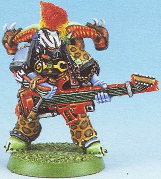
The second edition was a weird time.
|
|
This message was edited 1 time. Last update was at 2016/07/29 13:28:17
To many unpainted models to count. |
|
|
|
|
2016/07/29 13:29:55
Subject: WORST 40k artwork thread
|
|
Powerful Phoenix Lord
|
2nd edition was also about colour...loads of colour. Oh, and back banners. I actually didn't mind the colours.

Far more interesting than most tabletop armies now.
Even Marines had a bit...brighter of an aesthetic normally. These are recently painted but embody the style/colours quite well from the mid-90's.
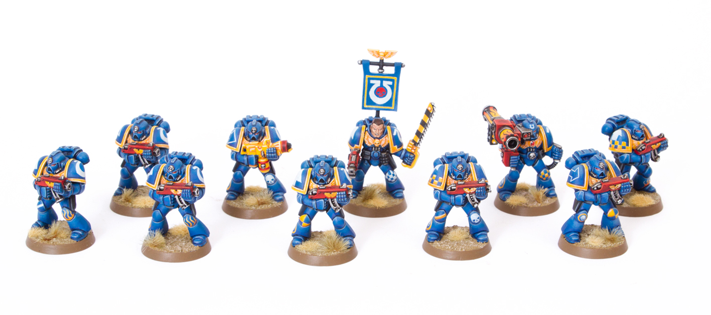
|
|
This message was edited 1 time. Last update was at 2016/07/29 13:31:00
|
|
|
|
|
|
|