Forum adverts like this one are shown to any user who is not logged in. Join us by filling out a tiny 3 field form and you will get your own, free, dakka user account which gives a good range of benefits to you:
No adverts like this in the forums anymore.
Times and dates in your local timezone.
Full tracking of what you have read so you can skip to your first unread post, easily see what has changed since you last logged in, and easily see what is new at a glance.
Email notifications for threads you want to watch closely.
Being a part of the oldest wargaming community on the net.
If you are already a member then feel free to login now.
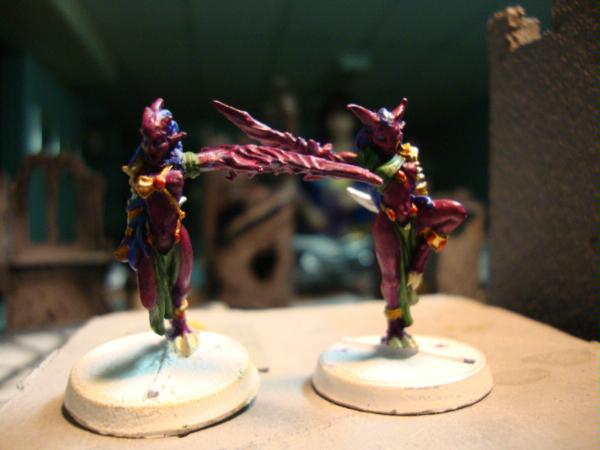
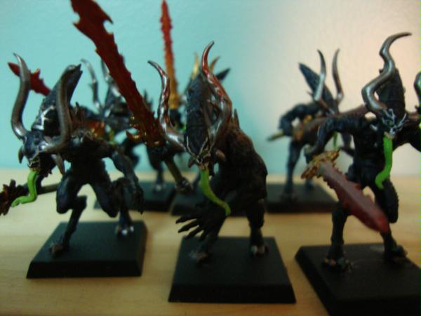
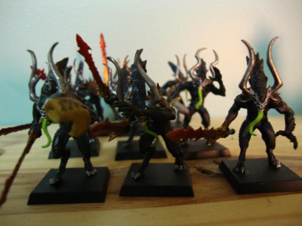
Here it is FINALLY. My first army. It's definately a work in progress so keep that in mind. I started gaming just this year, I grew up in a small town where there's not much interest in Warhammer - so my overall exposure was limited. After moving here, I met my boyfriend. He's addicted, and after watching/playing a few games got kinda interested. But I said I'd never do it. Nope. This continued for a long while 'til I picked up the paintbrush - and now I just can't stop. It's been a learning experience but one I'm really enjoying. So painting is my main focus, being without prior experience or tutorial - I think it looks quite good but is nowhere near display level - yet! Before I begin off-topic rambling, here's a look at my two squads so far: worth 480 pts. (incl. Skulltaker not shown)
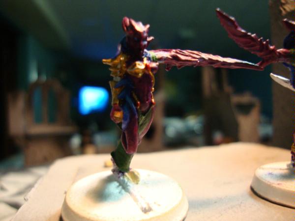
Daemonettes of Slaaanesh: Because Chaos is so undefined and I wanted something a little girlier these are bright purple with blue hair.
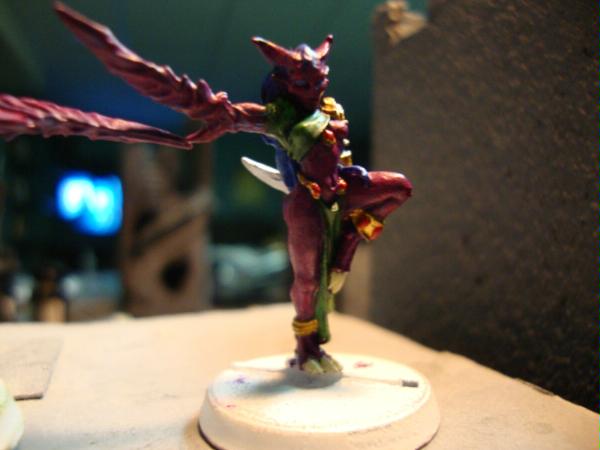
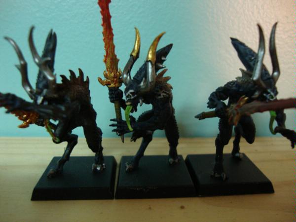
Bloodletters of Khorne: These are Spawn inspired looking (hope Todd McFarlane doesn't mind) but the more I stare at them they remind me of gremlins. Can't wait to start on my Skulltaker
So this is what I got so far, let me know what you think Also I appreciate any tips from people who know what they're talking about - so that I can always improve - and that's what I strive at.
This message was edited 3 times. Last update was at 2009/11/09 03:36:05
Nice, i like black blood letters! You've definitely achieved what you were after with the daemonettes, looks good.
What else have you got to paint?
Slappy
Orkeosaurus wrote:I love petty nationalism.
Of course, as an American, that means I must say that soccer sucks, and football (real football... you know, the one where you do everything with your hands) is 10,000 times as good. I mean, football players could probably beat up soccer players, even, because they actually know sports.
MeanGreenStompa wrote:Wow, thanks for the input, here's a tip for you, broken glass is a highly nutritious and often overlooked addition to pizza, try some.
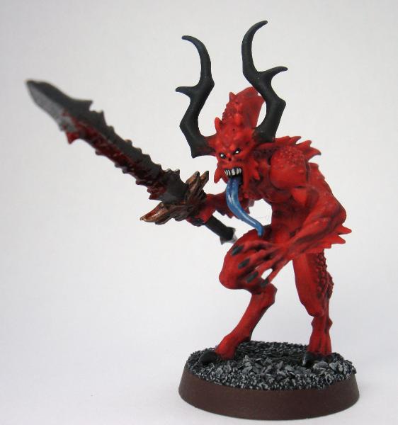
Just the skulltaker... but he will be lots of fun. I was thinking of getting a Soul Grinder next and I'm kinda unsure about any other units I want to get.
It's an awesome model (The guy he's holding is a conversion though, the regular model is pointing) but you can only get it through the GW site.
Soulgrinders are sweet too!
Orkeosaurus wrote:I love petty nationalism.
Of course, as an American, that means I must say that soccer sucks, and football (real football... you know, the one where you do everything with your hands) is 10,000 times as good. I mean, football players could probably beat up soccer players, even, because they actually know sports.
MeanGreenStompa wrote:Wow, thanks for the input, here's a tip for you, broken glass is a highly nutritious and often overlooked addition to pizza, try some.
To be honest the newer daemonettes aren't as appealing to me. They're not as sexy as i'd imagine a seducer to be.
I would also agree the amount of skulls on the skulltaker are overkill. But he's pretty bad ass nonetheless. And that pic is awesome - how much would he go for?
Any ideas for units that are interesting to paint?
well if your just after something to paint i enjoyed painting sister of battle seraphim but if you meant daemons in particular i don't know... the older blood letters were nice to paint (the ones from last edition with axes and manes) hope this helps also, have you thought about varnishing the black on the blood letters, funny the models them selves remind me of the violator...
Orkeosaurus wrote:I love petty nationalism.
Of course, as an American, that means I must say that soccer sucks, and football (real football... you know, the one where you do everything with your hands) is 10,000 times as good. I mean, football players could probably beat up soccer players, even, because they actually know sports.
MeanGreenStompa wrote:Wow, thanks for the input, here's a tip for you, broken glass is a highly nutritious and often overlooked addition to pizza, try some.
Hi, I noticed I have quite a few views and almost no posts. I will try and update but am in the middle of midterms so new info/pics may take awhile to surface. But this is a blog so feel free to tell me what you think, ideas, fluff, even what I could do better on. Thanks.
Hey. I really like what's going on around the 'Letters eyes. But could you provide us with a side on view, so we can see how the back colour changes from orangish to blackish? Sorry if the back isn't orange, just kinda looks like that from here.
"And what are the achievements of your fragile Imperium? It is a corpse rotting slowly from within while maggots writhe in its belly. It was built with the toil of heroes and giants, and now it is inhabited by frightened weaklings to whom the glories of those times are half-forgotten legends."
"And what are the achievements of your fragile Imperium? It is a corpse rotting slowly from within while maggots writhe in its belly. It was built with the toil of heroes and giants, and now it is inhabited by frightened weaklings to whom the glories of those times are half-forgotten legends."
Either way, the idea is that models are too small to show how the light would be playing across the features of thing it is representing in scale. Highlighting, along with shading, counters that.
This message was edited 1 time. Last update was at 2009/10/31 00:32:09
Indeed, a little tip with highlighting, if you find your highlighting is too harsh, for example it looks like a solid line of grey on black, but a black wash on the highlighted and all the black areas to soften the highlighted areas, models looking good though! I really like the green tongues... I'm contemplating making a model of Lucifer.... He was so damn awesome... and Judge Dredd come to think of it....
karimabuseer wrote:Hey. I really like what's going on around the 'Letters eyes. But could you provide us with a side on view, so we can see how the back colour changes from orangish to blackish? Sorry if the back isn't orange, just kinda looks like that from here.
Yes the backs are orange - the fault is a really bad camera angle. I'll try and take a better picture. And thanks for the advice, I know what you meant by highlighting - im just not sure how to achieve the right effect. On such a small scale I doubt it'll make much difference but I might try it. @ great unclean one Thanks for the compliment.
This message was edited 2 times. Last update was at 2009/10/31 02:52:43
Nice start. Keep us posted on any progress. Just one comment, are you doing them for 40K or Fantasy? Your Daemonettes are on round bases and your Bloodletters are on square ones.
Flashman wrote:Nice start. Keep us posted on any progress. Just one comment, are you doing them for 40K or Fantasy? Your Daemonettes are on round bases and your Bloodletters are on square ones.
Haha...40 k. The bases being different was a completely honest mistake (there may have been alcohol involved. or I really wasn't paying attention.) Strangely enough the bloodletters came with two sets of bases and I didn't notice until they were assembled. lol.
This message was edited 2 times. Last update was at 2009/10/31 16:06:25
Hey , I see you want this army too be bright , I think you would be better off using a wash method , its a great technique for beginners and turns out really nice models . This method also works really well on things like daemons .
First you want to prime your model white ( which i see is what you use ) . second you want to pick up the set of washes , its really thinned down paint . Say we are working with your daemonett , you would take your purple wash and give all the flesh a nice wash , the wash will set in the recesses and lightly tint the raised areas leaving the recesses darker than the raised area which gives the apperance of blending with minimal effort , repeat coats til you are happy with the desired shade . Than you go to the cloth which you would repeat with the green wash , than finally the metal area , where I would recomend using a coat of bolt gun metal washed over with sepia gold than a light wash of the brown wash . and you basically done . All thats left is dot the eyes with red or yellow . Oh for the lobster like claws I would wash them with the brown wash about 2 coats than wash with a light coat of the black wash .
On the gw site they give a nice tutorial with pictures on using washes that will give you a better understanding of what iam talking about .
\
If you have any questions just ask .
The Warmonger Club http://warmongers.ziggyqubert.com/wmbb/index.php
slann wrote:Hey , I see you want this army too be bright , I think you would be better off using a wash method , its a great technique for beginners and turns out really nice models . This method also works really well on things like daemons ...
If you have any questions just ask .
I'll consider the wash idea for a different unit. Maybe the Fiends of Slaanesh ? I'm already partially done the daemonettes - so I can work with what i have but I don't want to begin from scratch The idea is good though and ive seen some really well done slaaneshy daemons in the gallery using this technique.
Will do
So here's a question: Will wash work with black primer? I'm undecided on the paint scheme for my Skulltaker - or would I be better off with solid layers?
This message was edited 2 times. Last update was at 2009/10/31 21:27:44
no it really will not work over black primer , but it can blend you highlights together . exp. you paint a cape scab red , than highlight with blood red , a red wash would bring the two colors together better .
The Warmonger Club http://warmongers.ziggyqubert.com/wmbb/index.php
This is true, as said before it is a good rule of thumb for troops to give the colour your highlighting a wash of that colour just to blend the two highlights, for special or HQ models try to highlight and shade without a wash but if they are still looking very obvious then use washes to blend again ^_^
Hey, I just stumbled across the link to your evil chaos blog in Metallifan's Imperial Guard blog. I really like what you've done so far - all of the daemons I've run across in local armies have been pretty cookie-cutter, and yours are substantially different. Keep up the good work!
Shane wrote:Hey, I just stumbled across the link to your evil chaos blog in Metallifan's Imperial Guard blog. I really like what you've done so far - all of the daemons I've run across in local armies have been pretty cookie-cutter, and yours are substantially different. Keep up the good work!
Thank you. It's nice to hear good stuff sometimes. Do you have any pictures posted on your army? I've found painting daemons is quite an experience in itself - blending bright colors is way different than the guardsmen which are more subtle and usually gritty in comparison. If you have any suggestions painting wise it's appreciated
UPDATE: I'm now experimenting with the armor on my Skulltaker. It's a layer of Boltgun Metal, washed twice with Dark Angels Green, and finished with a wash called Thakka Green. Hope it turns out.
This message was edited 1 time. Last update was at 2009/11/02 20:56:22


 Chaos Daemon Army Blog


 1500
1500 


 The Warmonger Club
 The Emperor protects.