| Author |
Message |
 |
|
|
|
|
Advert
|
Forum adverts like this one are shown to any user who is not logged in. Join us by filling out a tiny 3 field form and you will get your own, free, dakka user account which gives a good range of benefits to you:
- No adverts like this in the forums anymore.
- Times and dates in your local timezone.
- Full tracking of what you have read so you can skip to your first unread post, easily see what has changed since you last logged in, and easily see what is new at a glance.
- Email notifications for threads you want to watch closely.
- Being a part of the oldest wargaming community on the net.
If you are already a member then feel free to login now. |
|
 |
2010/05/05 09:12:04
Subject: Help with NMM - Sanguinor WIP
|
|

Fresh-Faced New User
|
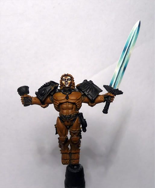
I just wanted to get a critique of my NMM. I am new to it and cannot figure out what I am doing wrong. I am also having trouble with smoothness. Any thoughts would be greatly appreciated.
|
|
This message was edited 1 time. Last update was at 2010/05/05 18:52:10
|
|
|
 |
|
2010/05/05 09:47:18
Subject: Help with NMM - Sanguinor WIP
|
|

Ferocious Blood Claw
|
Mate, looks pretty damn good to me so far!
|
|
|
|
|
2010/05/05 09:54:58
Subject: Help with NMM - Sanguinor WIP
|
|
Most Glorious Grey Seer
|
The face looks okay, although the brown spot on the forhead is a little odd. Generally isn't it light colors on surfaces facing up and dark colors on surfaces facing down?
|
|
|
|
|
|
2010/05/05 10:18:02
Subject: Help with NMM - Sanguinor WIP
|
|

Avatar of the Bloody-Handed God
|
aliengod3 wrote:I just wanted to get a critique of my NMM. I am new to it and cannot figure out what I am doing wrong. I am also having trouble with smoothness. Any thoughts would be greatly appreciated.
There is nothing wrong with the smoothness.
Its just reflective metal doesnt behave the same way normal object shades.
|
Paused
◙▬▬▬▬▬▬▬▬▬▬▬▬▬
◂◂ ► ▐ ▌ ◼ ▸▸
ʳʷ ᵖˡᵃʸ ᵖᵃᵘˢᵉ ˢᵗᵒᵖ ᶠᶠ |
|
|
|
|
2010/05/05 10:26:53
Subject: Help with NMM - Sanguinor WIP
|
|

Fresh-Faced New User
|
The main thing missing that I can see on his face, is any yellow shades.
I presume hes meant to be gold?
Jumping from brown to white without transition colours makes him look a bit like the lion from the wizard of oz  This
This shows off an nmm with more yellow used in the transitions.
I personally think thats what you need to correct.
The actual shading, and such, is spot on. Though I agree with the others that the forhead is a little odd as a "dark spot".
|
|
This message was edited 1 time. Last update was at 2010/05/05 10:28:25
|
|
|
|
|
2010/05/05 10:41:14
Subject: Re:Help with NMM - Sanguinor WIP
|
|
Avatar of the Bloody-Handed God
|
|
Paused
◙▬▬▬▬▬▬▬▬▬▬▬▬▬
◂◂ ► ▐ ▌ ◼ ▸▸
ʳʷ ᵖˡᵃʸ ᵖᵃᵘˢᵉ ˢᵗᵒᵖ ᶠᶠ |
|
|
|
|
2010/05/05 10:48:27
Subject: Help with NMM - Sanguinor WIP
|
|
Fresh-Faced New User
|
Ya the face was real problematic for me. I kept placing highlights over the previous layers so the blend did not turn out very well. I will try a wash of yellow to tone done the white. I have a problem with going overboard when I try new techniques and I definitely went overboard with the white. I may just repaint the face.
|
|
|
|
|
2010/05/05 14:04:02
Subject: Help with NMM - Sanguinor WIP
|
|

Bonkers Buggy Driver with Rockets
|
I think it looks awesome. I'd be really proud to get that result.
|
 For The Emperor For The Emperor
 ~2000 ~2000
 Blood for blood's sake! Blood for blood's sake!
 ~2400 ~2400 |
|
|
|
|
2010/05/05 16:49:26
Subject: Re:Help with NMM - Sanguinor WIP
|
|
Storm Trooper with Maglight
|
Yea you do need some more yellow, but you are past basic NMM already. Which way did you do it? This will be the deciding factor of smoothness. Wet blend= smooth, but a very hard transition. Layering= Slightly noticable brush strokes, but a very subtle transition. Shadowing= ALMOST IMPOSSIBLE for NMM. Any way good start. The sword is great, it just has too many reflective spots. Metal doesnt have that many.
http://www.istockphoto.com/file_thumbview_approve/4771315/2/istockphoto_4771315-sword-cross-swords.jpg
If you look the transition to white reflecting is at the tips and in the very areas that light hits, otherwise it is a blend into a light gray. Great job though, Just add a bit more yellow to the brown.
|
___________________________________
Andy |
|
|
|
|
2010/05/05 17:05:12
Subject: Help with NMM - Sanguinor WIP
|
|
Rampaging Furioso Blood Angel Dreadnought
|
I think your blade looks fantastic.
|
|
|
|
|
|
2010/05/05 18:43:27
Subject: Help with NMM - Sanguinor WIP
|
|
Fresh-Faced New User
|
I appreciate the feedback, thanks! I have been using layering only. Easier on the blade because it is long so easier to get nice blends but I am having trouble getting my paint to flow correctly on the face which is partly why it looks a bit harsh (that and too much white).
@Brush_slip: I agree about the reflective spots. Maybe that is why I think it is not looking believable. I am actually using the sanguinor painted by GW as a guide to figure this NMM thing out.
http://www.games-workshop.com/gws/catalog/productDetail.jsp?catId=cat400010a&prodId=prod550014a
|
|
|
|
|
2010/05/08 18:29:31
Subject: Re:Help with NMM - Sanguinor WIP
|
|
Fresh-Faced New User
|
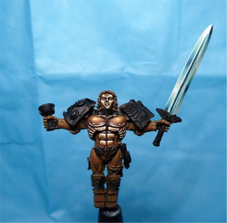
Here is a pic of the most recent picture I have. NMM is pretty difficult to pull off...
|
|
|
|
|
2010/05/08 18:40:06
Subject: Help with NMM - Sanguinor WIP
|
|
Rampaging Furioso Blood Angel Dreadnought
|
I'm certainly no NMM expert... but just as a fan and observer I'd say you are lacking the middle tone.
It's either brown or off white. You've already surpassed my skill level so I can't offer much in the way of technique.  ...but I'd say overall it looks like he is wearing very shiny brown armour, instead of gold. I really do love that sword though.
|
|
|
|
|
|
2010/05/08 19:38:52
Subject: Help with NMM - Sanguinor WIP
|
|
Fresh-Faced New User
|
Ya you are right. I guess I focused all of my mid tones in the same area again so they all get lost under lighter highlights :( Maybe I will get the legs and arms right...
|
|
|
|
|
2010/05/08 22:50:10
Subject: Help with NMM - Sanguinor WIP
|
|
Long-Range Ultramarine Land Speeder Pilot
|
The sword looks awesome.
|
|
|
|
|
|
2010/05/08 22:53:17
Subject: Re:Help with NMM - Sanguinor WIP
|
|
Alluring Sorcerer of Slaanesh
Union, Kentucky United States
|
Your heading down the right path and doing great, just a couple of things. One always use white primer for things like this. Two I would dile back the face a little bit as it is VERY bright. Three look at metal in the light and you can see how the brightest/shiniest part is generally the top end as light is reflecting down and then away. You don't want to line as much around with the extreme highlight as it defeats the purpose of what your trying to do. All in all though great stuff and I easecially LOVE and I mean LOVE the sword!!!
|
Listen, my children, as I pass onto you the truth behind Willy Wonka and his factory. For every wonka bar ever created in existance, Mr. Wonka sacraficed a single Oompa Loompa to the god of chocolate, Hearshys. Then, he drank the blood of the fallen orange men because he fed them a constant supply of sugary chocolate so they all became diabetic and had creamy, sweet-tasting blood that willy could put into each and every Wonka bar. That is the REAL story behind willy wonka's Slaughter House! |
|
|
|
|
2010/05/08 23:28:06
Subject: Help with NMM - Sanguinor WIP
|
|
Rough Rider with Boomstick
|
I think it looks kind of bronze-like, and is really damn good.
Good job mate.
|
I have 2000 points of  , called the Crimson Leaves. , called the Crimson Leaves.
I will soon be starting WoC, devoted to 
I have 500 points of  , in blueberry and ice cream (light grey and light blue) flavour. From the fictional world Darkheim. , in blueberry and ice cream (light grey and light blue) flavour. From the fictional world Darkheim.
DarkHound wrote:Stop it you. Core has changed. It's no longer about nations, ideologies or ethnicity. It's an endless series of proxy battles, fought by mercenaries and machines. Core, and its consumption of life, has become a well-oiled machine. Core has changed. ID tagged soldiers carry ID tagged weapons, use ID tagged gear. Nanomachines inside their bodies enhance and regulate their abilities. Genetic control. Information control. Emotion control. Battlefield control. Everything is monitored, and kept under control. Core has changed. The age of deterrence has become the age of control. All in the name of averting catastrophe from weapons of mass destruction. And he who controls the battlefield, controls history. Core has changed. When the battlefield is under total control, war... becomes routine.
|
|
|
|
|
2010/05/09 00:09:59
Subject: Help with NMM - Sanguinor WIP
|
|

Enigmatic Sorcerer of Chaos
|
I'm having a similar problem with NMM gold at the moment. The white is a total kick in the teeth. The face looks amazing as does the sword. His pecks look like they might have missed a mid-late highlight in there. I found that mixing paints to get NMM it was best to do the whole figure to ensure I got the same tone through out.
Looking good!
|
|
|
|
|
2010/05/09 00:59:07
Subject: Help with NMM - Sanguinor WIP
|
|
Stern Iron Priest with Thrall Bodyguard
|
good to see you've made the move over from CMON, Damien...
these forums are much more active...
are you following the pics in the WD article, 'cause it seems like you're not using the pics for reference of where exactly to lay down the layers...
it shouldn't be so difficult, with the 9 or 10 stages in the article's pics...
i'm sure i will eat my words as soon as i start on mine  ...
@Empchild: i'm of the opposite opinion...
the colors start from Scorched Brown, so there is no benefit from using White Primer...
cheers
jah
|
Paint like ya got a pair!
Available for commissions.
|
|
|
|
|
2010/05/09 03:50:06
Subject: Help with NMM - Sanguinor WIP
|
|
Fresh-Faced New User
|
Glad everyone likes the sword. I wish the entire model were as easy to paint as it was.
Hey Jah! I started following the article for the face and sword but for some reason I got lost in my painting session and forgot to reference the article for the chest which is why it looks a bit odd.
After reading some of the initial comments I found some pictures online to help me figure out the midtones. I have a couple of good colors on hand that I can use for the midtones so I will try adding them to the mini while I work on the arms, legs and backpack.
Also I am still having trouble getting real fine lines. I think once I can master very fine lines I will be on a good path. Still have to figure out paint flow for this...
|
|
|
|
|
2010/05/17 05:46:31
Subject: Help with NMM - Sanguinor WIP
|
|
Fresh-Faced New User
|
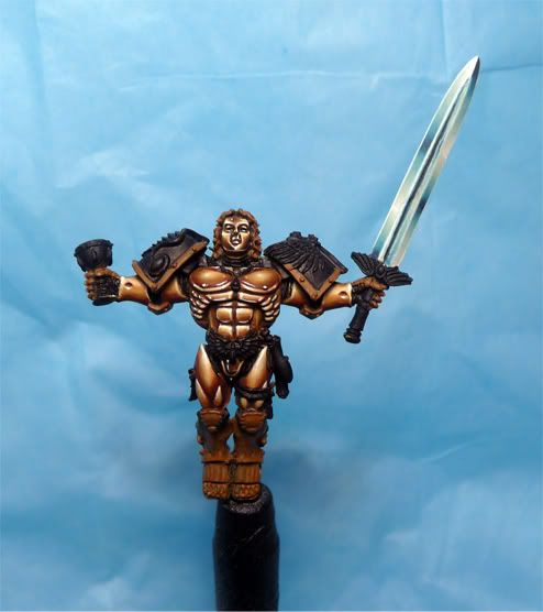
I had a bit of time today to work on this mini. Painted the arms and thighs. Painted different from the article because the reflections did not look right so I painted them the way they are now. Pretty happy with how everything is looking. Critiques are always welcome
|
|
|
|
|
2010/05/17 05:59:37
Subject: Re:Help with NMM - Sanguinor WIP
|
|
Shas'o Commanding the Hunter Kadre
Missouri
|
I think it looks amazing so far.
|
 Desubot wrote: Desubot wrote:Why isnt Slut Wars: The Sexpocalypse a real game dammit.
"It's easier to change the rules than to get good at the game." |
|
|
|
|
2010/05/17 05:59:54
Subject: Re:Help with NMM - Sanguinor WIP
|
|
Sinewy Scourge
|
Very nice, you've nailed the metallic look. Although I still think it looks more like polished copper or bronze than it does gold.
|
|
|
|
|
|
2010/05/17 06:01:41
Subject: Re:Help with NMM - Sanguinor WIP
|
|
Storm Trooper with Maglight
|
I think it looks great. I really like the darkness of the gold, almost a bronzed look. Great job. All of the highlights are hit right and the sword looks better in the updated pics, im not sure if you changed it, it may be the angle of this one.
|
___________________________________
Andy |
|
|
|
|
2010/05/17 06:06:45
Subject: Help with NMM - Sanguinor WIP
|
|
Hellacious Havoc
|
Frankly, I'm jealous. It looks fantastic. I'll agree with the above posters that yes, it does look more bronze than gold, however, it's still awesome.
Great work, keep it up!
|
I play:
1000 pt Sons of Calthus
1000 pt  Splinter Fleet Goliath Splinter Fleet Goliath |
|
|
|
|
2010/05/25 05:45:34
Subject: Help with NMM - Sanguinor WIP
|
|
Blood Angel Chapter Master with Wings
|
Update pls!
|
|
|
|
|
|
2010/05/25 13:52:17
Subject: Help with NMM - Sanguinor WIP
|
|
Tunneling Trygon
|
Honestly, you thought you needed help? Man, I would have to be the luckiest man on Earth to get an effect even half as good.
|
|
|
|
|
2010/05/25 16:29:31
Subject: Help with NMM - Sanguinor WIP
|
|
Revered Kroothawk
|
I like the brass colouration, it makes a refreshing change from spangly gold. It looks really good, I'm jealous of your nmm skills.
|
|
|
|
|
|
|