he looks good, but your right, he does need some highlights.
a good general rule, unless you are going for extreme contrast highlights, is to pick a color about 1.5 shades brighter than the base color and trim the edges in a VERY thin line.
the gives the illusion of the light hitting the model and making it bright in some areas.
if you arent sure where to begin highlighting, then i would start with the cloak. Its normally one of the biggest and most easily noticable pieces of the model, and in this case, it definetely is.
since is based grey, i would start by moving a darker shade of grey, or mabey even black in the dark recesses or the cloak, where it folds back or is crinkled up. This will help develop the illusion of shadow.
after you have done that, leave the middle or raising areas the basic grey you have on it right now. that color becomes the "base" color of the cloak.
next, we need to build up the more raised areas of the cloak, but applying a slight brighter shade of grey to the cloak. this will give the impression that light is directly hitting the cloak, giving it the look of being brighter.
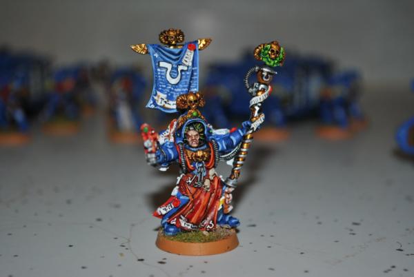
an example of highlighting a cloak is found on this gallery image of my psyker. its not a great picture, or my best model by far, but the point does get across.
for the rest of the highlights, if the light is comming from the left, you can try highlighting the left side of the raised areas.
for example: the sword. to highlight the sword, if light is comming from the left, then i would definetely get a brighter shade of metallic silver (like mythril or chainmail) and then apply a very small amount, in a very small line, across the left edge of the blade. that gives it the appearance that its glistening in the sun.
take that process and repeat it over the model, mixing the colors for each base color you have behind it. so far the model looks good, just get those highlights in and show it off!


 , but i'm sorry the best advice i can give is: think the sun is above it and give the place's you thinks the sun shine's on a brighter collour.
 planning a 1000 points army "cancelled"
 (Red) grey knights Hell Yea


 1000pts
 500pts