Switch Theme:

Helping with my IG paint scheme  [RSS] Share on facebook Share on Twitter Submit to Reddit
»
Author Message
Advert


Forum adverts like this one are shown to any user who is not logged in. Join us by filling out a tiny 3 field form and you will get your own, free, dakka user account which gives a good range of benefits to you:
  • No adverts like this in the forums anymore.
  • Times and dates in your local timezone.
  • Full tracking of what you have read so you can skip to your first unread post, easily see what has changed since you last logged in, and easily see what is new at a glance.
  • Email notifications for threads you want to watch closely.
  • Being a part of the oldest wargaming community on the net.
If you are already a member then feel free to login now.


Made in gb
Rebel_Princess


London

When I originally started painting my test model for my new IG army I was hoping for an urban camo paint scheme however from comments I recieved it looked a bit boring so i've tried to evolve it into a blue, more interesting scheme. However, it just doesn't seem like i've done enough to it and I was hoping for some tips on how to improve it as I have the imagination of roadkill. Here's the man himself, i'm ok with skin and the areas i'm most interested in are the armour and the lasgun.


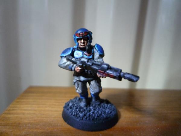
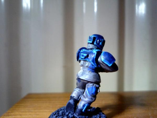
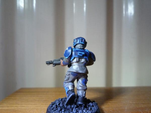
My paintscheme for the armour is an undercoat of regal blue, with highlights in ultramarines blue followed by an edge highlight of ice blue.

The fatigues are done Codex Grey with Regal Blue, Space Wolves Grey and ultramarines blue splodges of camo. I then washed it all in Devlan Mud and highlighted the fatigues in Codex Grey followed by an edge highlight of 50/50 Codex White and Skull White.

The lasgun is simply Chaos Black with a highlight of Adeptus Battle Grey as I was unsure of how to do paint it.

Thanks for any help guys, much appreciated.


Roll up roll up and join Da Kroozin Klanker's squadron of Killa Kans, PM me or look at the Waagh Dakka article for info! 
   
Made in gb
Leader of the Sept


For the fatigues I think you need to check out some real world camouflage. The blobs are a bit unplanned. Camouflague is designed to break up outlines so the blobs should be overlapping and ideally placed in locations where they will break you the sihouette of the person. It doesn't always work at 28mm scale, however, so play around a bit and check out some real examples.

I think the armour plates look ok. However you have highlighted around all of the edges. This makes it look like the armour is glowing. Hard edge highlihgting should only be on edges that might be reflecting an external light source (the sun for example). I would recommend losing the extreme highlihgts at least from the bottom edges of the armour leaving them only on upper edges and vertical edges.

The gun is a little indistinct, but it might be worthwhile tidying up the hard edge highlighting a bit by thinning down the highlight line with black again.

This message was edited 1 time. Last update was at 2012/01/10 18:40:02


Please excuse any spelling errors. I use a tablet frequently and software keyboards are a pain!

Terranwing - w3;d1;l1
51st Dunedinw2;d0;l0
Cadre Coronal Afterglow w1;d0;l0 
   
Made in gb
Rebel_Princess


London

Oh okay I never really thought of camouflage in that way before, thanks! Also good tips on the sunlight, any ways that I could make the armour look more interesting, because it just feels a little bland all blue.

Thanks again


Roll up roll up and join Da Kroozin Klanker's squadron of Killa Kans, PM me or look at the Waagh Dakka article for info! 
   
Made in us
Screamin' Stormboy


Texas

The armor looks pretty cool to me, maybe add a little black to the fatigues for some more contrast?
[Thumb - imagesCAPKM154.jpg]
going for a color scheme sort of like that?


Awww Yeah! 
   
Made in us
Willing Inquisitorial Excruciator


Utah

Biggest problem I see is on the armor, you are going through too many color changes in too few layers. This your paints. If you really want the edging to be that light, think your paints, it should take at least 2-3 coats per color. It wouldn't be so bad if you were just moving up a couple of shades, but when you are going that bright that quick every brush stroke is very obvious. I think the highlighting is a bit over the top anyways, it doesn't look like highlighting, it looks like everything has light blue rims.

As Flinty said, look up some real world camo.

Camo patterns are not going to continue over the belt, pouches, pockets, or boots. Notably the pockets are going to have the same camo pattern, but not be a continuation of the existing pattern, as they are a seperate piece of material. Do the belts and boots in black, possibly with a gloss coat to make them shine.

This message was edited 1 time. Last update was at 2012/01/10 19:11:52


My Armies: 1347 1500 1500
My Necron Nihilakh Dynasty blog: http://www.dakkadakka.com/dakkaforum/posts/list/416131.page 
   
Made in gb
Rebel_Princess


London

Dr.Painboy that is exactly the sort of thing I was aiming for I just fell down along the way, great inspiration for the fatigues!

Riplikash, you're definitely right about the armour colours it is a bit OTT now I look at it, and now i've found a new camo scheme I will need the armour to look more stealthy looking. Also thanks for the extra detail on the fatigues, it helps to add that extra touch to your models.


Roll up roll up and join Da Kroozin Klanker's squadron of Killa Kans, PM me or look at the Waagh Dakka article for info! 
   
 
Forum Index » Painting & Modeling
Go to: