| Author |
Message |
 |
|
|
|
|
Advert
|
Forum adverts like this one are shown to any user who is not logged in. Join us by filling out a tiny 3 field form and you will get your own, free, dakka user account which gives a good range of benefits to you:
- No adverts like this in the forums anymore.
- Times and dates in your local timezone.
- Full tracking of what you have read so you can skip to your first unread post, easily see what has changed since you last logged in, and easily see what is new at a glance.
- Email notifications for threads you want to watch closely.
- Being a part of the oldest wargaming community on the net.
If you are already a member then feel free to login now. |
|
 |
2012/12/20 23:29:02
Subject: IG command squad
|
|

Bloodthirsty Chaos Knight
|
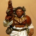
Working on some command squad members with special weapons. Could use some feedback, particularly on some specific things but anything constructive is welcome! The shoulder pads have since been painted where appropriate.
For the melta gun, what would be a good way to paint the tubing hanging below it?
Is this too much grime/gunk? I'm kind of digging the dirty look myself but I think I have to clean them up a little.
How can I make the boots interesting? I know that's a super weird question, but whenever I try to paint IG boots, they come out ridiculously flat and bland. I end up throwing some pigment over them to make them dusty/muddy. I haven't even started on these yet.
|
|
|
|
 |
|
2012/12/20 23:30:55
Subject: IG command squad
|
|
Using Object Source Lighting
|
I would say that a sharp highlight on the metals would do nicely to keep it grimy but provide more contrast. The skin could also maybe use a little cleaner
Other than that, it looks nice.
|
|
|
|
|
|
2012/12/20 23:33:51
Subject: IG command squad
|
|
Bloodthirsty Chaos Knight
|
 spiralingcadaver wrote: spiralingcadaver wrote:I would say that a sharp highlight on the metals would do nicely to keep it grimy but provide more contrast. The skin could also maybe use a little cleaner
Other than that, it looks nice.
Right now there's zero highlights on the metals, and I need to fix that for sure. Also hard to see the metal too well in these shots anyway, but they do need something. Once I get my shipment of new paints in tomorrow I'll be doing that better. 
|
|
|
|
|
|
2012/12/20 23:49:35
Subject: IG command squad
|
|
Decrepit Dakkanaut
|
I think my biggest complaint is that you used brown wash over green paint. The effect looks kind of wonky. I'd suggest either switching over to a black wash, or going over the models you have and re-highlight them with a browner color, like a desert yellow, perhaps, or some sort of tan.
|
|
|
|
|
|
2012/12/20 23:54:21
Subject: IG command squad
|
|
Bloodthirsty Chaos Knight
|
 Ailaros wrote: Ailaros wrote:I think my biggest complaint is that you used brown wash over green paint. The effect looks kind of wonky. I'd suggest either switching over to a black wash, or going over the models you have and re-highlight them with a browner color, like a desert yellow, perhaps, or some sort of tan.
I have a nice dark green wash that I used initially, then I got a little wash-happy when I went over the whole model. I'm not sure if I'm disliking the wonky myself, but I'll probably experiment tonight as I just found out my package of new paints arrived. Yay!
While I'm experimenting I might try the yellowish highlight idea, but I'm not sure if it'll just make things look too... weird. I think I'd rather stick with the green and try a black wash instead, or be more selective and stick with the green shade.
Thanks!
|
|
|
|
|
|
|
|