| Author |
Message |
 |
|
|
|
|
Advert
|
Forum adverts like this one are shown to any user who is not logged in. Join us by filling out a tiny 3 field form and you will get your own, free, dakka user account which gives a good range of benefits to you:
- No adverts like this in the forums anymore.
- Times and dates in your local timezone.
- Full tracking of what you have read so you can skip to your first unread post, easily see what has changed since you last logged in, and easily see what is new at a glance.
- Email notifications for threads you want to watch closely.
- Being a part of the oldest wargaming community on the net.
If you are already a member then feel free to login now. |
|
 |
2013/03/23 02:20:07
Subject: Why do models look so much worse on the Tabletop
|
|

Secretive Dark Angels Veteran
|
Than what they do when you finish painting them at home?
I'm usually quite happy with the quality of painting at home, but when I put them on the tabletop I realise how terrible they are. They don't pop like other people's miniatures do (possibly due to basecoating black). Maybe a gloss coat perhaps?
|
|
|
|
 |
|
2013/03/23 02:42:01
Subject: Why do models look so much worse on the Tabletop
|
|

Grizzled Space Wolves Great Wolf
|
I have never noticed this. I actually think my models look best on the table top because I paint them in such a way that they look unified and look best when viewed from 2-3 feet away.
Perhaps you could post some pictures of your miniatures and we could comment?
|
|
|
|
|
2013/03/23 02:47:41
Subject: Why do models look so much worse on the Tabletop
|
|
Death-Dealing Ultramarine Devastator
|
base coat doenst matter, need ot work on highlights and dry brush from an above angle like if light was hitting the m only from the top
|
dark angels 2,000 pts
Tyranids: 2,000 Pts
6th edition
26-2-3
+5 successful trades strengthofthedragon2, Grav33, godswildcard, lynxstrife, SonicPara |
|
|
|
|
2013/03/23 02:56:13
Subject: Why do models look so much worse on the Tabletop
|
|
Navigator
|
Are you playing against Golden Demon contestants? That could make you think your minis are rubbish no matter how great you paint them. If so, shoot them in the head, steal all their minis.
(Due to legal reasons, the above comment of 'shoot them in the head' must be acknowledged as a joke, and such action is in no way condoned by this poster, this website, or its affiliates.)
|
|
|
|
|
2013/03/23 03:00:35
Subject: Re:Why do models look so much worse on the Tabletop
|
|
Hellish Haemonculus
|
Personally, I've noticed the opposite to be true. I'm pretty hyper-critical of my own work until I see it compared to other armies on the tabletop. (Admitted, there is one guy who drives in from out of state who makes me want to kill myself whenever I see my models next to his.) I notice you don't have any pics of your work on Dakka. If you put some up, maybe the community could help give you some constructive advice.
|
|
|
|
|
|
2013/03/23 03:11:38
Subject: Re:Why do models look so much worse on the Tabletop
|
|
Secretive Dark Angels Veteran
|
I only have a rather poor Iphone camera on hand and no light box at the moment, I'll post some up later.
I don't think my miniatures are poorly painted, I like them quite a lot in comparison with most other paintjobs I've seen.
I have quite a strict colour palette as well.
The problem is in brightly lit environments, or under fluoroscent lighting, the flaws in the painting become extremely apparent. Colours seem duller, highlights seem chalkier, and all the blemishes become apparent- short of painting them in store it's hard to fix the errors as the light as home still remains the same 
|
|
|
|
|
|
2013/03/23 05:17:18
Subject: Why do models look so much worse on the Tabletop
|
|
Dakka Veteran
|
Matte varnish would be better than gloss, unless you want your minis to shine like morning glory.
|
|
|
|
|
2013/03/23 08:18:30
Subject: Why do models look so much worse on the Tabletop
|
|

Jealous that Horus is Warmaster
|
Perhaps it isn't your painting nor models, but the lighting at your LGS? I find that as long as I am satisfied with my own painting, and know that I've done what I've intended to do, it's all good with me!
|
|
|
|
|
|
2013/03/23 08:20:44
Subject: Re:Why do models look so much worse on the Tabletop
|
|
Last Remaining Whole C'Tan
|
I totally have the opposite. My models look absolutely terrible in pictures, but on the table they look mediocre-to-poor.
|
 lord_blackfang wrote: lord_blackfang wrote:Respect to the guy who subscribed just to post a massive ASCII dong in the chat and immediately get banned.
 Flinty wrote: Flinty wrote:The benefit of slate is that its.actually a.rock with rock like properties. The downside is that it's a rock
|
|
|
|
|
2013/03/23 08:24:38
Subject: Why do models look so much worse on the Tabletop
|
|
Hoary Long Fang with Lascannon
|
Yeah, it sounds like just a lighting issue. Bright florescent lighting can be quite different than warmer incandescent or the simulated daylight as I use. Remember, florescent lighting is actually green so that will make a difference in how colors and shading are perceived. That being said, I haven't noticed a huge difference with mine.
|
|
|
|
|
|
2013/03/23 11:42:42
Subject: Re:Why do models look so much worse on the Tabletop
|
|

Tzeentch Veteran Marine with Psychic Potential
|
In general, what makes model pop on the tabletop is the contrast.
If you do a very subtle metal scheme on Necrons, they will look like a bunch of scrap metal on the TT.
On the other hand, if you make flashy colour details, they will catch the eye and pop out.
Exemples from the showcase (and bear in mind I am absolutely not judging the paint quality, but only the contrast in colours):

This guy will pop. Black, white, a solid blue. Those are eye catching colours.
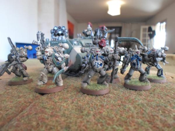
My own plague marines. Dull colours, green to dirty bone. These do not pop (even though I did a fair TT paint job IMHO).
If you want your models to pop, use solid colours, not subtle shades. 
|
|
|
|
|
|
2013/03/23 19:01:23
Subject: Why do models look so much worse on the Tabletop
|
|
Longtime Dakkanaut
|
Yep, as Seb says...contrast is the key.
If you poke around a bit, you will find two different big groups of painters. Ones who do a lot of careful blending and highlighting so that it looks good when you have the miniature in hand and are looking at it closely...and the other group who uses fairly blocky colors and what not.
The figures which are painted to look good in hand tend to be more washed out when you are further away than arms length. The ones which are blocky tend to look pretty good on the table top, but are rough to look at when you have them up close and personal.
Steve Dean and Kevin Dallimore are both the top of the field for the blocky painting, and although some of the figures might look a bit rough if you compare them to something painted by a Jen Haley or Jessica Rich...the figures look excellent on the table and the methods used are highly sought out by historical games who generally use massive formations of figures.
Pretty sure Kevin's books on painting are still available as well, so if you are interested in his style...they might be worth searching out. They are excellent for what they are, though it isn't everyone's cup of tea.
|
|
|
|
|
2013/03/23 19:31:42
Subject: Re:Why do models look so much worse on the Tabletop
|
|
Gargantuan Gargant
|
 Seb wrote: Seb wrote:In general, what makes model pop on the tabletop is the contrast.
Very true. My models tend to look best in very bright, white light (what I paint under), from about a foot away - just far enough to gloss over the minor inconsistencies, but close enough to see that there is actually some nuance to the painting. On the tabletop, though, they would likely look rather dull, as I generally don't push the contrast very far. Looser painting styles with higher contrast tend to "pop," as so many like to put it, at range, where even the most realistic painting in the world can lose its effect as the eye moves farther away. Some of the more impressive armies on the tabletop look almost sloppy, when viewed closely, while meticulously painted models can look dull and muddied once they hit the table. Some folks paint for a specific view range, others just happen to have a style the suits one view better than another. It sounds to me that you fall into the latter category and I'm right there with you. I don't game much, though, so it bothers me less.
|
The Dreadnote wrote:But the Emperor already has a shrine, in the form of your local Games Workshop. You honour him by sacrificing your money to the plastic effigies of his warriors. In time, your devotion will be rewarded with the gift of having even more effigies to worship.
|
|
|
|
|
2013/03/23 20:28:23
Subject: Why do models look so much worse on the Tabletop
|
|
[ARTICLE MOD]
Huge Hierodule
|
can you post some pics of your figures from the tabletop view?
|
|
|
|
|
|
2013/03/23 21:46:15
Subject: Why do models look so much worse on the Tabletop
|
|
Tail-spinning Tomb Blade Pilot
|
Ya models need to stand out. Bright whites yellows and stuff really pop
|
|
|
|
|
|
2013/03/24 04:58:10
Subject: Re:Why do models look so much worse on the Tabletop
|
|
Nasty Nob
|
First, I would say to make sure that you are using a good 'daylight'/white light to paint with. I use and LOVE an Ott light, but I also got it for a huge discount, and probably wouldn't just spring for one. A good, neutral white light will help you make sure that your miniature looks best in the widest possible lighting conditions (though a very yellow/blue/green light will still make it look funky).
After that, like people have said, paint with high contrast. You don't have to go for a cartoonish, blocky style (though it can look good on the TT), but you can also make sure to pick some vibrant, contrasting colors to stand out (like bright yellow on Bad Moon Orks) or apply bright, but realistic highlights (like white teeth tips on orks, or shiny gold on marines). Don't feel that you need to use ALL three of those techniques (which might melt your eyeballs), but using one or two will help.
I've also noticed that a lot of armies that look really good on the TT also use vibrant colors or bright highlights on defining parts of the miniature. An Ultramarine with bright golden shoulder pad rims has a highlight that helps define his shape. A Blood Axe with camo with bright white spots has a highlight, but it obscures the model's outline, and doesn't help it to stand out.
Contrasting bases can really help. The dull grey of most Space Wolves really pops when they are based on snow bases, while the bright colors of the Imperial Fists stand out when they are on a more muted brown/green base.
|
|
|
|
|
|
2013/03/24 15:01:48
Subject: Why do models look so much worse on the Tabletop
|
|
Longtime Dakkanaut
|
 Know No Pear wrote: Know No Pear wrote:Perhaps it isn't your painting nor models, but the lighting at your LGS? I find that as long as I am satisfied with my own painting, and know that I've done what I've intended to do, it's all good with me!
This is what I was gonna post. The different lightning lets you see things your lighting at home might not. I usually notice a lot of stuff I missed after playing a game with freshly paired models, so I feel your pain haha.
|
|
|
|
|
2013/03/25 00:26:44
Subject: Re:Why do models look so much worse on the Tabletop
|
|
Posts with Authority
South Carolina (upstate) USA
|
 Ouze wrote: Ouze wrote:I totally have the opposite. My models look absolutely terrible in pictures, but on the table they look mediocre-to-poor.
I find the same is true for me as well. Someday I need to build a light booth for taking photos. My painting is a solid tabletop quality most of the time,but the lighting in my place just doesnt work well for photos.
|
Whats my game?
Warmachine (Cygnar)
10/15mm mecha
Song of Blades & Heroes
Blackwater Gulch
X wing
Open to other games too
|
|
|
|
|
2013/03/26 02:10:24
Subject: Re:Why do models look so much worse on the Tabletop
|
|
Secretive Dark Angels Veteran
|
Problem is I play Ravenwing, there isn't much I can do with a Black/White colour scheme.
Here is a finished DV Biker Sarge. I hate having un-helmeted marines so he's wearing a Bronze Death-mask.
Also, WIP of my Ravenwing Jetbikes. I have to do weathering and a bit of touch up.
|
|
|
|
|
|
2013/03/26 09:14:15
Subject: Why do models look so much worse on the Tabletop
|
|
Tzeentch Veteran Marine with Psychic Potential
|
Unless I am mistaken, you dry brushed it with white ?
In general, the heavier the dry brush, the more dulled the colour will be.
If you take your seargent, just go over the red of the bolter, they will pop. I'd use red for the chainsword housing, again without drybrush.
For RW, your best bet is to have very solid whites and reds.
|
|
|
|
|
|
2013/03/26 13:28:20
Subject: Re:Why do models look so much worse on the Tabletop
|
|

Sneaky Sniper Drone
|
Man those models like there are well on the way to becoming AWESOME! But that's just it, they look well on their way not finished. Very carefully wash those feathers on the bike with a blue (trust me this looks great for a "white" shadow) and then make those bolters stand out.
Might I recommend looking here for a 'traditional' approach to highlighting black or here for a very different approach to it.
|
|
|
|
|
2013/03/26 13:33:25
Subject: Why do models look so much worse on the Tabletop
|
|
Space Marine Scout with Sniper Rifle
|
It's your lighting. If you paint them in one type of light and play with them in another they will look different. Try to recreate the same atmosphere you play in and see if that helps.
|
|
|
|
|
2013/03/26 14:59:23
Subject: Why do models look so much worse on the Tabletop
|
|
Basecoated Black
|
Yup, and I would add that if you are painting in lighting that is either too bright or too dim you will have this problem. I'd guess that you are painting under a spotlight, which make very subtle detail pop. Under normal lighting, all of your detail will disappear! Conversely, if you are painting with insufficient lighting, you will overdo the highlights and in normal lighting the models will look overdone and washed out.
 djdakkadakka wrote: djdakkadakka wrote:It's your lighting. If you paint them in one type of light and play with them in another they will look different. Try to recreate the same atmosphere you play in and see if that helps.
|
|
|
|
|
2013/03/26 15:21:51
Subject: Why do models look so much worse on the Tabletop
|
|
[ARTICLE MOD]
Huge Hierodule
|
Second the suggestion to wash the feathers with blue. Might also want to add some grass or debris of another color to you bike bases. Right now, they look very monochrome.
|
|
|
|
|
|
2013/03/26 16:49:52
Subject: Why do models look so much worse on the Tabletop
|
|
Space Marine Scout with Sniper Rifle
|
With whites I almost always add just a small amount of a dirt color. Nothing white is free of stains and to me that gives it a more real feel. That's just me.
|
|
|
|
|
2013/03/27 00:46:12
Subject: Re:Why do models look so much worse on the Tabletop
|
|
Secretive Dark Angels Veteran
|
Actually, I did weather the feathers brown with a Tamiya weathering kit but it's either come off during play (haven't varnished yet) or doesn't show up in the photograph.
Just waiting to finish painting the jetbikes before weathering them.
The bases actually are quite colourful IRL, it doesn't really show up in the photo for some reason. I'll give it a drybrush later.
Hmm, maybe I should do more painting in the LGS, I have been painting under spotlight mostly at home in the dark.
Good tips all, thank you for the input!
|
|
This message was edited 1 time. Last update was at 2013/03/27 00:47:00
|
|
|
|
|
2013/03/27 12:56:04
Subject: Why do models look so much worse on the Tabletop
|
|

Big Mek in Kustom Dragster with Soopa-Gun
|
Highlights stand out more at a distance than they do up close. Random infantry tend to not have this level of detail, but most people try to do it for expensive models, HQs, or the one-of-a-kind type thing that probably wasnt "expensive" but you only field 1-2 anyway.
Also as stated before, sharp changes in color/lighting also help. This is why i like to slap random blue on my orks that wear red armor, the blue pops out and grabs your attention then you see the whole model.
|
 An ork with an idea tends to end with a bang. An ork with an idea tends to end with a bang.
 14000pts Big 'n Bad Orkz 14000pts Big 'n Bad Orkz
 6000pts Admech/Knights 6000pts Admech/Knights
 7500pts Necron Goldboys 7500pts Necron Goldboys |
|
|
|
|
2013/03/27 14:25:26
Subject: Why do models look so much worse on the Tabletop
|
|
Basecoated Black
|
I think what you mean is that, at a distance, the only thing that stands out is high contrast? The further away you get, the less detail you can pick out. Subtle shading is a complete loss once you are more than arm's length away.
That is why painting in a dark room with a spotlight is such a bad idea, it over-emphasizes everything. Even lighting is best, with as much natural light as you can get.
 Vineheart01 wrote: Vineheart01 wrote:Highlights stand out more at a distance than they do up close. Random infantry tend to not have this level of detail, but most people try to do it for expensive models, HQs, or the one-of-a-kind type thing that probably wasnt "expensive" but you only field 1-2 anyway.
Also as stated before, sharp changes in color/lighting also help. This is why i like to slap random blue on my orks that wear red armor, the blue pops out and grabs your attention then you see the whole model.
|
|
|
|
|
2013/03/29 22:49:12
Subject: Re:Why do models look so much worse on the Tabletop
|
|
Secretive Dark Angels Veteran
|
Hmm, strangely enough I'm quite pleased with how they look in store now. Maybe I just had to get used to them psychologically. Weird....
|
|
|
|
|
|
2013/03/30 02:49:45
Subject: Why do models look so much worse on the Tabletop
|
|
Boosting Ultramarine Biker
|
I would paint the edge of the base an earth tone. It's the same color as the model (black) so it might help the model stand out.
|
|
|
|
|
|
|
 Mechanicus
 Ravenwing
 Deathwing
 Sven Bloodhowl's Great Company 2750
 Loki's Thousand Sons: 700 WIP