Switch Theme:

Aradae Mawr, by Mierce Miniatures (alternate Dragon Ogre) - Lots of pics  [RSS] Share on facebook Share on Twitter Submit to Reddit
»
Author Message
Advert


Forum adverts like this one are shown to any user who is not logged in. Join us by filling out a tiny 3 field form and you will get your own, free, dakka user account which gives a good range of benefits to you:
  • No adverts like this in the forums anymore.
  • Times and dates in your local timezone.
  • Full tracking of what you have read so you can skip to your first unread post, easily see what has changed since you last logged in, and easily see what is new at a glance.
  • Email notifications for threads you want to watch closely.
  • Being a part of the oldest wargaming community on the net.
If you are already a member then feel free to login now.


Made in us
Average Orc Boy


Texas

Copied/pasted from my blog posts: Part 1, Part 2. Only difference between here and there is beer references, more vague references to Warhammer, and occasional mouseover text, but feel free to check it out.

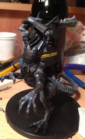
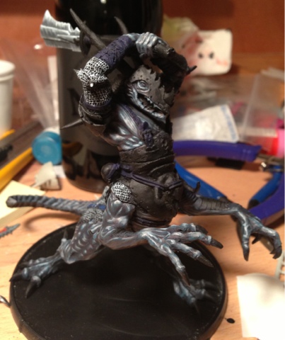
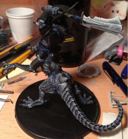
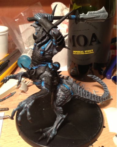
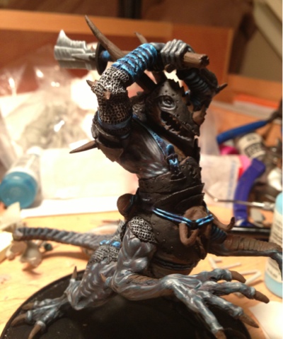
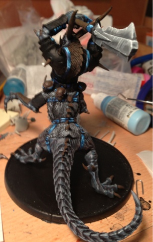
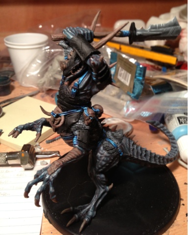
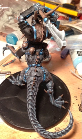
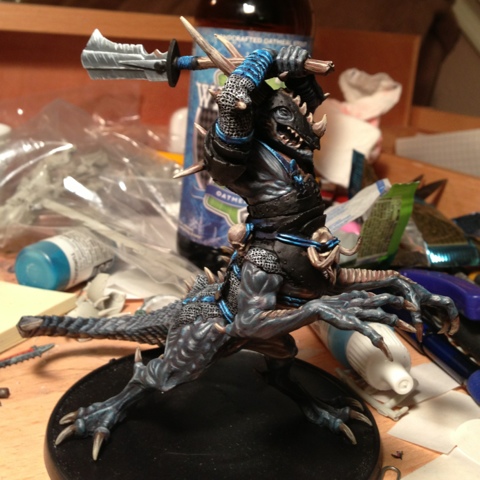
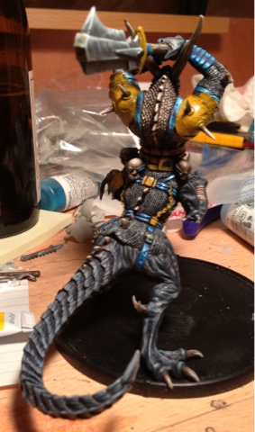
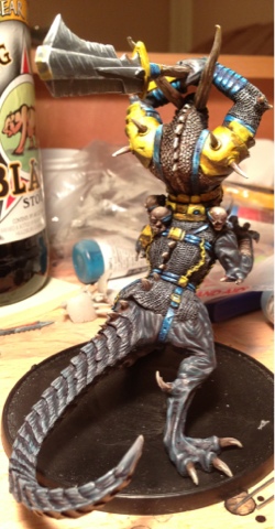
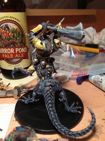
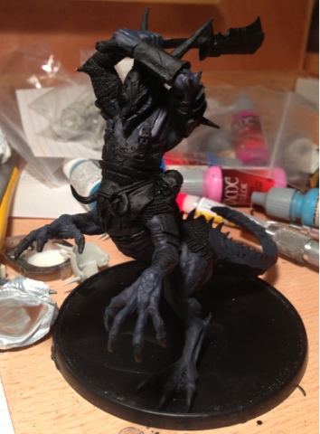
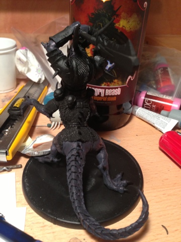
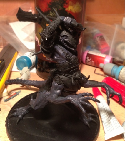
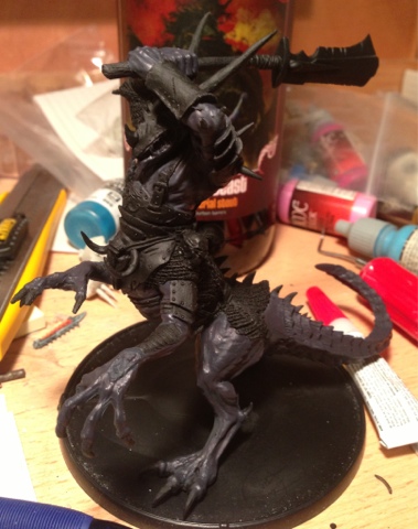
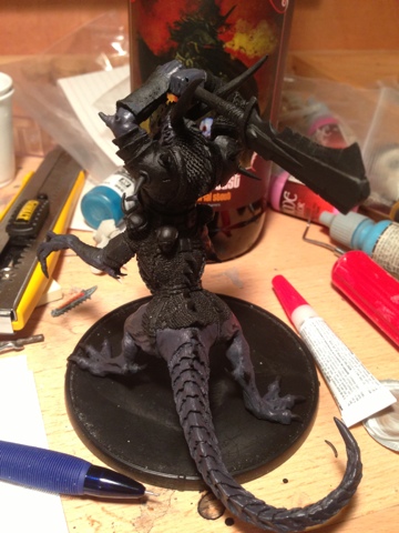
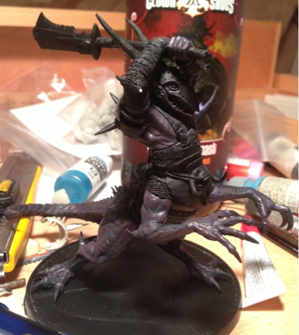
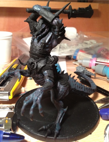
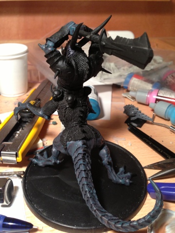
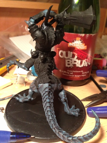
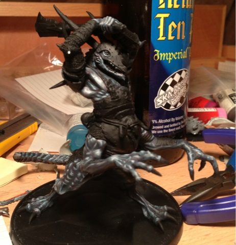
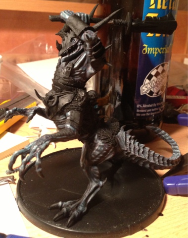
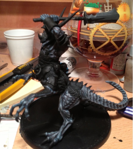
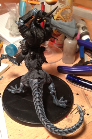
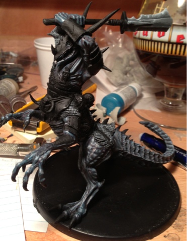
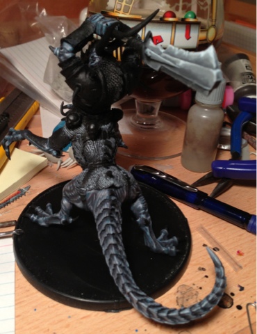
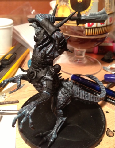
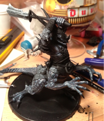
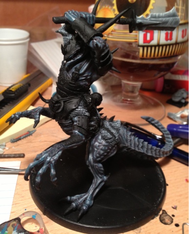
This is Aradae Mawr, another model from the Mierce Miniatures kickstarter. I originally bought him to be a Dragon Ogre, but think that as large as he is, a chariot might be a better option. I also haven't decided if I'm going to give him a Chaos God to follow, so my color palette is extremely limited. Without green, red, or blue available I was pretty much limited to yellow, orange, or purple being the primary skin color. I ended up going with purple because its a color I use very very rarely, and want to practice with.
[Author's Note: the steps on this one are focusing purely on colors. I always, always, thin my paint with water as well. As a rough guide, I use a drop of water for every 3 drops of paint in a mix. So if you see that a layer was 3:1:2 of certain colors, there are also two drops of water in there. I'm just too lazy to include them when writing a WIP.]

Skintone, Layer 1:

Using purple, I had a few decisions to make. Did I want to use the Vallejo purple paint colors (which highlight up towards pink), or did I want to mix my own? I decided on mixing my own, to give me better control of the tints, and so that I could try to balance the red and blue against each other.
The first layer was 3 drops of Vallejo Red, to two drops of Medium Blue, and two drops of SS Camo Black Brown (to darken it up). I used the brown instead of the black to produce a warmer shadow, rather than a cold one. I'll most likely use Camo Black for the entire model, where I can, to keep the shadows consistent in tint. The first layer was painted with a Games & Gears 2 brush.

Skintone Layer 2:

For the second layer, I used 3 parts Vallejo Red to two parts of Camine Red, to two parts of Medium Blue, and a single drop of SS Camo Black Brown. I stuck with the Games & Gears brush, but moved to a 1.

Skintone Layer 3:

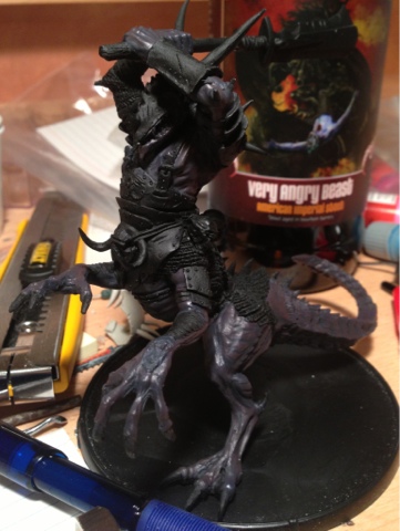
For the third layer, I grabbed a Clown Shoes Very Angry Beast (since Aradae is probably himself very angry), and mixed three drops of Carmine Red with one drop of Medium Blue and one drop of SS Camo Black Brown. I actually re-mixed this shade; the first time I used two drops of Medium Blue, and it completely overwhelmed the reds and looked perfectly blue. I'd keep 3:1 or 4:1 red:blue ratios throughout the rest of the model.

Skintone Layer 4:

For the fourth layer, I mixed two drops of Carmine Red with two drops of Bloody Red, and then added a drop of Medium Blue. Looking back at the photos now, I think this layer and the one below are almost identical to layers 2 and 3. I have a feeling I will drop those two layers, as I have too many transition layers in this model, and the first four are all dark and subtle. This layer really should have been the second.

Skintone Layer 5:

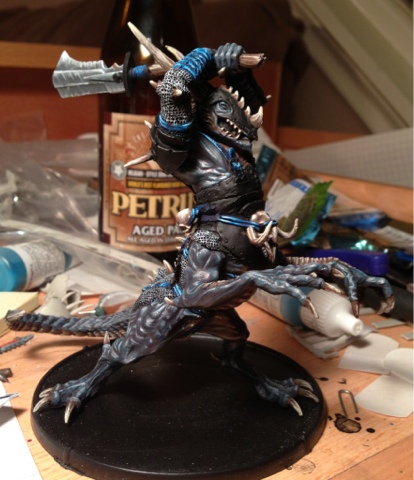
The fifth layer used three drops of Bloody Red to one drop of Medium Blue. Again, this should have been the third layer, as the second and third do exactly the same thing that the fourth layer and this layer do. My next Tawyrdraig will correct this. Frustrated at myself for making this mistake (two unnecessary layers) and out of beer, I called it a night. This layer and the previous one were done with a Games & Gear 0 brush.

The next day, I jumped back in with a single layer:

Skintone Layer 6:

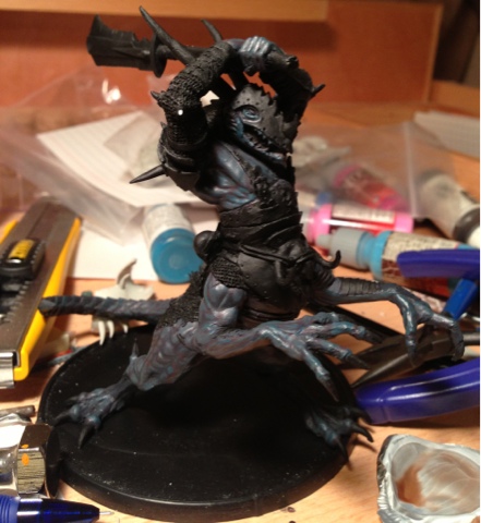
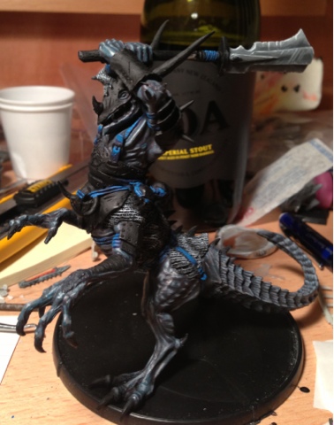
The sixth layer was painted after a Mordheim game, so I only had time for a single layer before I had to go to bed. This layer was two drops of Bloody Red to two drops of German Orange, followed by two drops of Medium Blue. I initially only did a single drop of the blue, but the orange completely overwhelmed the blue, and the layer went pink almost immediately. I was hoping for an iridescent indigo effect for the model, so I had to go overboard on the blue to correct it. I'd rather have the shade looking too blue than too pink, as the whole point of mixing my own shades of purple was to avoid that Squid Pink highlight. I was back to my Winsor & Newton Series 7's for this layer; this one was done with a 1.
After a single layer, I gave up for the night and resolved to come back.

For day three, I jumped right back into it!

Skintone Layer 7:

Now we're getting somewhere! The seventh layer dialed back the orange, using two drops of Bloody Red to only a single drop of German Orange. I also increased the blue shade, by going with 1/2 a drop of Medium Blue, and half a drop of Sky Blue. The sky blue is much closer to white than the medium, and combined with the more restrained orange levels, is starting to approach that iridescent color I'm hoping for. The brush shifted down in size, to a Winsor and Newton Series 7 size 0.

Skintone Layer 8: Switched over to a porter for smoother brush control.

For the eighth layer, I used the same 2 Bloody Red : 1 German Orange, but this time added a single drop of Sky Blue. This layer was very lightly applied, but as is usually the case with my models, the last two layers are the least amount of paint on the model, but provide the most "pop". Brushwork was done with a Winsor & Newton Series 7 size 00.

Skintone Layer Nine:

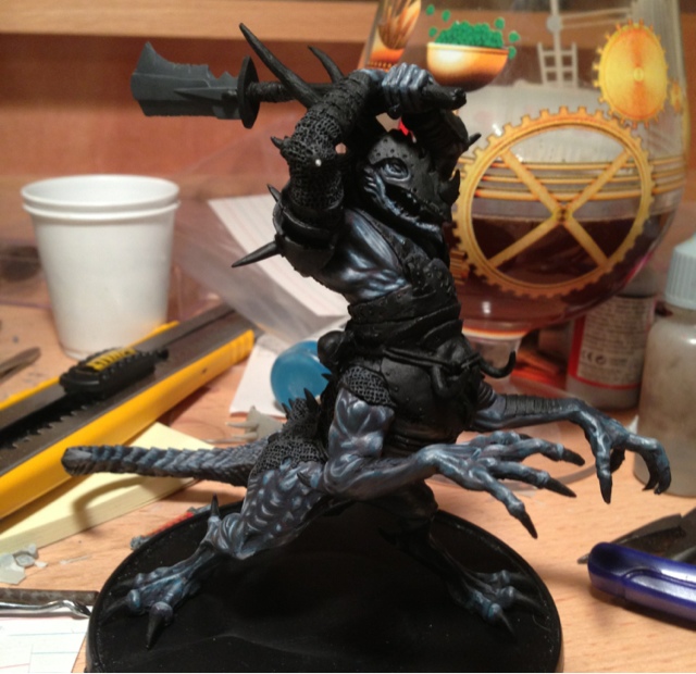
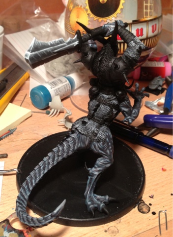
For the final layer, I added a drop of white to what was left over from the above layer, and downsized brushes again to a Winsor & Newton Series 7, size 000. This was very, very sparingly added to the points of the model that face my light source. Content with the skintone, I called it a night.

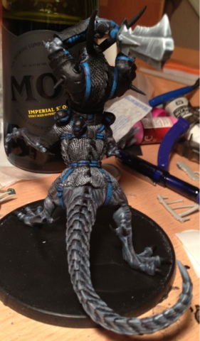
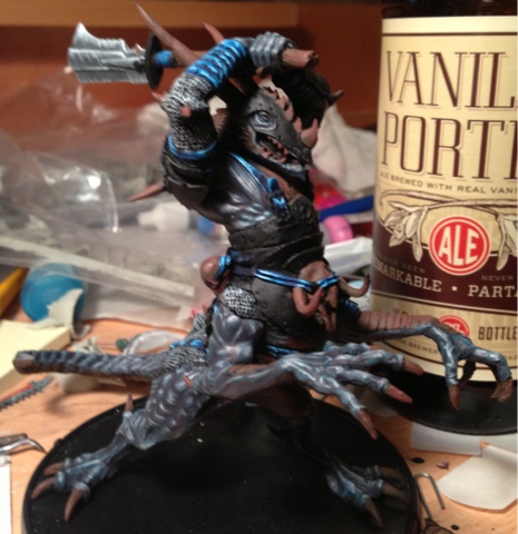
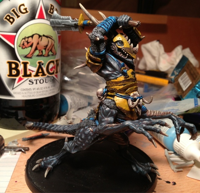
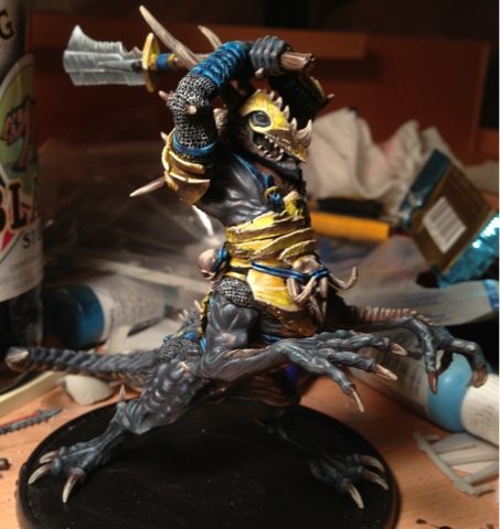
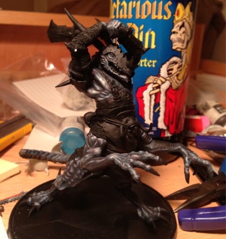
Day Four: Now for the metallics!
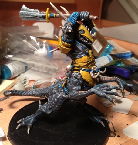
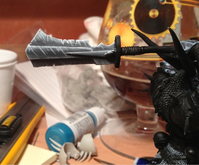
Silver Layer 1:

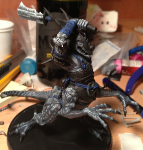
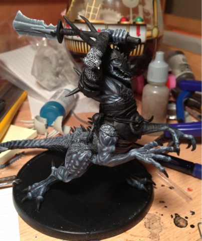
When I'm painting models that I want to be awesome looking, I always end up going non-metallic over metallic. The reflection off a metallic paint scheme is a bit unrealistic to my eyes, and I hate the washes and tinting that I have to do to emphasize contrasts with metallic paint. Since my paint style relies on high-contrast painting to the level of almost being white, using metallics (which provide pure reflected light) always breaks the highlight illusions I run. If I'm painting hordes of infantry I don't mind as much, but for centerpiece models like this one, I prefer to just run with greys.
So, now that I've justified using NMM, I'm going to actually have to do it! When doing gold I tend to start with the medium level and paint up or down from there, but I'm never as comfortable with silver, so I layer it the same way I would any other shade. This layer started with 1 1/2 drops of black, 2 drops of SS Camo Black Brown, and 3 drops of Basalt Grey. I also decided to give the Games & Gears brushes a shot at this, since I knew I'd be wet blending at some point, and that's what they're designed for. I used a size 1 for everything in this color range, except for the final highlight.

Silver Layer 2:

The second layer of silver was done with pure, unmixed, unchanged Basalt Grey.
"Ryan," you ask. "I see a lot of parts of this model that are supposed to be metallic, but you've not got any grey on them? What are you thinking?"
I decided with the first layer that I didn't trust my skills with silver to do justice to this model, but my 
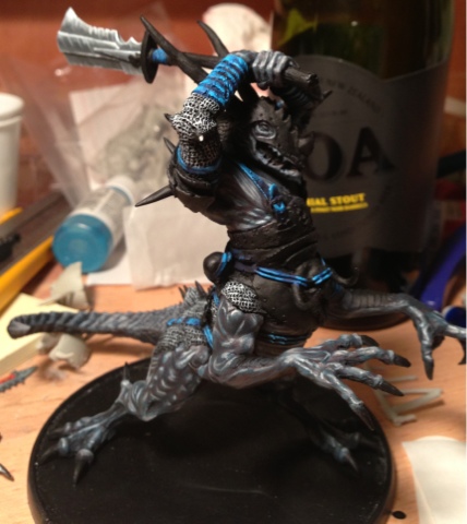
NMM golds always appear much more pleasing to my eyes. As a result, I'll come back and do the remainder of the metallic portions in a bronze/golden yellow. The silver will be restricted to the chainmail, the buckles, and the halberd blade.
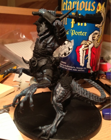
Silver Layer 3:

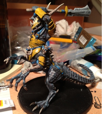
For the third layer, I wrote down that I used Medium Grey, but I blame that Flemish Red in the background for that one; this tint is not nearly brown enough for Medium Grey. I believe this is Stonewall Grey instead. Since I'm wet-blending as I go, I'm not doing transition layers between shades, I'm just mixing the new one into the old.
I'm disappointed at this point with the way the halberd is shaping up, so I make the decision that I'm going to come back in and wet blend it on its own once all the layers are done. I'm covering my paint as I go at this point, so I'll have access to the previous shades when it comes time to wet blend. This is one of the detriments to the way I do NMM: you can't stop overnight and come back to it; it's all got to be done in one sitting. Fortunately for me, the family is all in bed, so I'm able to work until (what turns out to be) 2 AM to get it all finished.

Silver Layer 4:

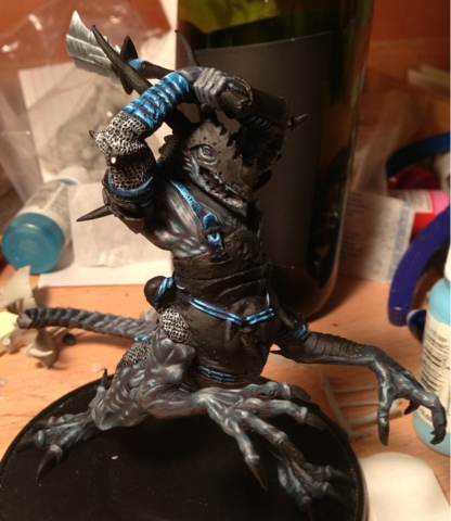
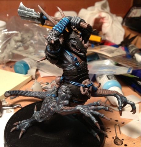
The fourth layer is pure Wolf Grey. I'm wet blending it into the chainmail, and painted myself a few highlight notes on the halberd, but otherwise ignored it. Once done, I went back and completely wet blended the halberd. The first layer went in lines across each layer, followed by progressively faster additions of the previous layers. When done, I ended up with this:

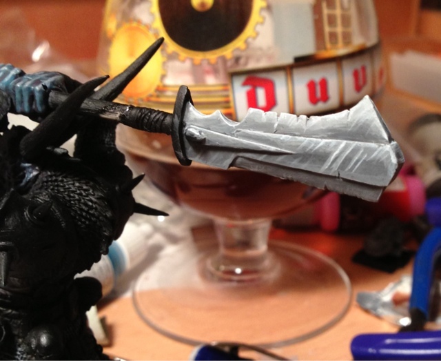
When wet blending, I over-saturate my water so that I can work with it. Rather than going 3 parts paint to one part water, it's much closer to 3:2 (and with the wolf grey, 1:1).

Silver Layer 5:

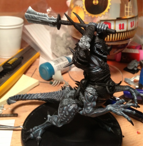
When I'm giving paint advice, I always tell the people I'm teaching to highlight models to the point where their next level would be all white, and then stop. For the vast majority of painting, I never want to use pure white. There's no way to highlight past it, it grabs the eye and forces attention, and you have to be exceedingly careful with it for fear of blowing away the rest of the model's highlights.
One of the two exceptions to that is non metallic metals. With NMM, you want to create the illusion that the metal is directly reflecting the light. White is the only way, short of metallic paints, that you can do that. This layer is pure white, applied very sparingly with a Winsor & Newton Series 7, size 000, to the tips of the metallic parts (where the light would reflect off it). As you can see, the addition of the white has caused my purple to now look under-highlighted, so I call it a night here while I try to decide if it's acceptable (as the other layers might be able to bring that popping contrast back; right now they're just black pits that emphasize the darkness of the model instead of its brightness) and grab a few hours of sleep before work in the morning.

This message was edited 1 time. Last update was at 2013/08/26 15:45:25


Creator of The Beer Waaagh: http://www.thebeerwaaagh.blogspot.com
The Mierce Painting Thread

Tournament Credentials:
Best Army or Painted: Alamo 2009, 2010 (2nd), 2012; Bayou Battles 2010-2011, [2012 2nd overridden by 2nd Overall], 2013 (2nd); Capital City Carnage 2010-2011; Lone Wolf [2011 overridden by 1st Overall], 2012; Quake City Rumble 2012-2013; War Games Con 2010
Player's Choice: Alamo 2012, 2010, 2009 (3rd); Bayou Battles 2009-2013; Capital City Carnage 2010, 2011 (2nd); Lone Wolf 2011-2012; Quake City Rumble 2012 (2nd), 2013
Sportsman: Bayou Battles 2009 (3rd); Capital City Carnage 2009; Lone Wolf 2011 [overridden by 1st Overall]
Overall: Lone Wolf 2011; Bayou Battles 2012 (2nd); Quake City Rumble 2012 (2nd)
General: Over my dead body.
 
   
Made in us
Average Orc Boy


Texas

[Part two, in which I get massively depressed about the model, sulk for a few days, then get over myself and fight on]:
Excited about where I was on Aradae Mawr with his skin and silver parts done, I moved on to the minor colors on the model. I decided blue was a decent complement to the purple skintone, so I chose that for the bindings on him.

Blues, Layer 1:

For the first layer, I decided to keep a similar palette and mixed 3 parts of Stormy Blue with one part SS Camo Black Brown.

Blues, Layer 2:

For the second blue, I added two drops of Stormy Blue to two drops of Medium Blue.

Blue, Layer 3:

For the third layer, I added three drops of Medium Blue to a single drop of Sky Blue.

Blues, layer 4:

For the fourth layer, I started with two drops of Sky Blue on their own, but the contrast was far too harsh. I added a single drop of Medium Blue to pull it back to realistic.

Blues, Layer 5:

For the final layer of the blues, I went with plain Sky Blue. At this point, I began to have problems with the model. I felt the blue overwhelmed the purple skintone, and drove it further into the grey shades of the NMM silver. I gritted my teeth and pressed on, though, hoping the next few colors would fix the problem.

Browns, Layer 1:
For consistency's sake, I resolved to use the same brown mixture that I had used with Glaun, except I would use hints of purple rather than the green of Glaun's skintone. This would be a mistake, but I wouldn't realize that until I sank into the depths of despair...

For the first layer, I used four parts of Leather Brown to four parts of SS Camo Black Brown, and then cut it with a drop of Royal Purple.

Browns, layer 2:

For the second layer, I used four parts of Leather Brown to two parts SS Camo Black Brown, with a drop of Royal purple.

Browns, Layer 3:
I began to get frustrated with the darkness of the browns. I added a dark beer, to see if it would help things along.

For the third layer, I used four Leather Brown to one Royal Purple. I began to get very frustrated with my entire palette at this point; the brown just wasn't getting light enough, and I began to see darkness all over the model. This frustration would only increase as this shade went further along.

Browns, Layer4:

For the fourth layer, I used two parts of Leather Brown to two parts Medium Grey, with a half a drop of the royal purple. The shade still came out far too dark. I didn't realize at the time, but the purple I was using tends to overwhelm other colors that it's mixed with, much like black does. I should have been using half to a third of the amount I was using, but I didn't realize it at the time. Instead, I started to get really frustrated. I had switched to a Winsor & Newton brush for this layer, but it was still too dark and harsh. Rather than forcing my way through it, I got discouraged and slowed my rate of painting. The browns, which should have taken two days at the most, instead dragged out over an entire week.

Browns, Layer 5:

After just doing a single layer the night before, I came back to the model. For the fifth layer, I used all medium grey, and abandoned the purple entirely. While this started brightening up the model as I'd hoped, it also created some harsh highlights that just made me even more upset. It was two days before I'd come back to work on the model.

Browns, Layer 6:

For the sixth layer, I used a 50/50 mix of Medium Grey and Pale Flesh. Despite using the colors I was accustomed to, the layer still felt wrong. The transitions were far too harsh (because the earlier layers were far too dark). I despaired. I hit the Painter's Wall. Like a chump, I stopped again instead of just working through it. I took another two nights off. (On the positive side, though, I managed to get sleep both of those nights - normally when I'm painting I only get 4-5 hours.)

Browns, Layer 7:

The model has now been "in progress" for five days longer than it should have been, four of those due to me just being unwilling to work on it. The delay means I won't be able to get a unit of these painted up in time for a local store contest, which disappoints me. However, I decide to suck it up and see what I can salvage.
I move on the the last layer on the browns. As usual, it manages to tie every layer before it into a cohesive mass, like it always does. I'm satisfied with the way it ends up, like I always am (though unlike normal, I'm not pleased with myself). The model is starting to pull together. All that remains is the remainder of the armor. Flush with confidence for getting past the browns, I decide to go insane...

Time for the gold! I used to have a fantastic blend of colors I'd use for NMM gold that I could do in my sleep. However, it's been three years since I've used significant amounts of it in a model. Rather than test out my paints to ensure I know what I'm doing, I just plow forward!
Gold: Basecoat

I decide to contrast the purple skin and otherwise excessive darkness of the model, that I'm going to go with bright, gaudy, shiny, eff-you-I've-got-bling gold. To start, I paint all the to-be-gold parts of the model with Plague Brown. However, I've not used my Plague Brown in three years. As a result, it takes three coats to adequately coat the model. I finish off my belgian sour and get something much, much stronger to make the inevitable wet blending more tolerable...

Gold: Dark portions

To darken NMM gold, I use a remarkably simple process. Figure out where the dark/light contrast point on the section I'm painting is. Draw a line across that point with SS Camo Black Brown. Wet blend that Camo Black Brown downwards into the Plague Brown layers below it. This will create the illusion of the ground reflecting light back up onto the metal portion of the model, and also create the illusion of a horizon on the model. Whereas I generally just do "what feels right" highlighting with silver, I go very reflective with the gold (which is why you see a harsh line for the top of the browns). The next layer will increase that contrast, and shockingly, make it look reflective.

Gold: Highlights

For the highlights, I do the opposite of what I did for the brown. I pick a yellow (in this case, Sunny Yellow) and draw a line right above the Camo Black Brown line. I then wet blend it upwards, into the Plague Brown on top. For those of you worried because the tops of the metallic sections are darker than the middle, fear not: there are still a few steps to come.

Gold: Reflective Highlights

So, we've got darkness, and we've got highlights to simulate the sky and the ground. For our penultimate step, we want to add our light source reflecting off the metal. To do this, I take Pale Flesh, and using a very small brush, brush it over all the points where the metal changes direction. Specifically, the edges of every armor plate, and the tops of rivets and chain links. In addition, I use it anywhere a part of the gold portions is pointing straight up, to simulate it reflecting the light source above. Inspired by some of the other works I've seen, I also added a few "sunburst" effects, to create the illusion of the light scattering when it hits the armor.

Gold: White reflections

Finally, I added a touch of white to simulate the light source reflecting off the gold.

The model is still not finished - I still need to add some red for the eyes, tongue, and gem in the sword, as well as basing it - but it's done being shared online until the WAMP contest. I'll add another WiP with those steps once its done!

Creator of The Beer Waaagh: http://www.thebeerwaaagh.blogspot.com
The Mierce Painting Thread

Tournament Credentials:
Best Army or Painted: Alamo 2009, 2010 (2nd), 2012; Bayou Battles 2010-2011, [2012 2nd overridden by 2nd Overall], 2013 (2nd); Capital City Carnage 2010-2011; Lone Wolf [2011 overridden by 1st Overall], 2012; Quake City Rumble 2012-2013; War Games Con 2010
Player's Choice: Alamo 2012, 2010, 2009 (3rd); Bayou Battles 2009-2013; Capital City Carnage 2010, 2011 (2nd); Lone Wolf 2011-2012; Quake City Rumble 2012 (2nd), 2013
Sportsman: Bayou Battles 2009 (3rd); Capital City Carnage 2009; Lone Wolf 2011 [overridden by 1st Overall]
Overall: Lone Wolf 2011; Bayou Battles 2012 (2nd); Quake City Rumble 2012 (2nd)
General: Over my dead body.
 
   
Made in gb
Rampaging Reaver Titan Princeps


Earlobe deep in doo doo

Awesome painting and a wonderful collection of Beers your making my current Adnam's obsession look boring, found it at a Crate for £12 £1 a bottle for lovely beer. one thing bunging these threads together rather than separately would make it more of a blog and allow people to find all your work in one easy place rather than half a dozen threads you'll also get a more general appraisal that way.

"But me no buts! Our comrades get hurt. Our friends die. Falkenburg is a knight who swore an oath to serve the church and to defend the weak. He'd be the first to tell you to stop puling and start planning. Because what we are doing-at risk to ourselves-is what we have sworn to do. The West relies on us. It is a risk we take with pride. It is an oath we honour. Even when some soft southern burgher mutters about us, we know the reason he sleeps soft and comfortable, why his wife is able to complain about the price of cabbages as her most serious problem and why his children dare to throw dung and yell "Knot" when we pass. It's because we are what we are. For all our faults we stand for law and light.
Von Gherens This Rough Magic Lackey, Flint & Freer
Mekagorkalicious -Monkeytroll
2017 Model Count-71
 
   
Made in us
Monstrous Master Moulder


Utah

Nice work!


Forum Index » Dakka P&M Blogs
Go to: