| Author |
Message |
 |
|
|
|
|
Advert
|
Forum adverts like this one are shown to any user who is not logged in. Join us by filling out a tiny 3 field form and you will get your own, free, dakka user account which gives a good range of benefits to you:
- No adverts like this in the forums anymore.
- Times and dates in your local timezone.
- Full tracking of what you have read so you can skip to your first unread post, easily see what has changed since you last logged in, and easily see what is new at a glance.
- Email notifications for threads you want to watch closely.
- Being a part of the oldest wargaming community on the net.
If you are already a member then feel free to login now. |
|
 |
2014/09/23 22:37:49
Subject: Looking for Painting Critique and Advice
|
|

Fresh-Faced New User
|
Hey Dakka, I'm a relatively new painter who's looking for ways to improve further. This is one of my latest models (Salamander Assault Marine W/ Flamer), any feedback on what I can do to improve, change, or keep doing would be great. Sorry in advance for the relatively poor picture quality.
|
|
This message was edited 2 times. Last update was at 2014/09/23 22:49:27
|
|
|
 |
|
2014/09/23 23:52:27
Subject: Re:Looking for Painting Critique and Advice
|
|

Mutated Chosen Chaos Marine
|
I'd say look at techniques for applying washes between layers and/or before the final highlights. A second pinpoint detail in the helmets with a brighter color (yellow or white works great) will really make the eyes pop.
Might wanna work with lighting and auto-focus too. 
|
|
|
|
|
|
2014/09/23 23:55:10
Subject: Looking for Painting Critique and Advice
|
|
Legendary Master of the Chapter
|
It's a bit blurry but hhighlights appear to be in the right spots except the top of the head is a bit dark
|
|
This message was edited 1 time. Last update was at 2014/09/23 23:56:10
 Unit1126PLL wrote: Unit1126PLL wrote: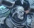 Scott-S6 wrote: Scott-S6 wrote:And yet another thread is hijacked for Unit to ask for the same advice, receive the same answers and make the same excuses.
Oh my god I'm becoming martel.
Send help!
|
|
|
|
|
2014/09/24 00:08:23
Subject: Looking for Painting Critique and Advice
|
|
Colonel
This Is Where the Fish Lives
|
Either go brighter for the base color or less extreme for the highlights; unless your going for a Tron-style look.
As someone else pointed out, the helmet is a bit reversed. It should be lighter on top and darker on the bottom.
You're off to a good start though!
|
 d-usa wrote: d-usa wrote:"When the Internet sends its people, they're not sending their best. They're not sending you. They're not sending you. They're sending posters that have lots of problems, and they're bringing those problems with us. They're bringing strawmen. They're bringing spam. They're trolls. And some, I assume, are good people."
|
|
|
|
|
2014/09/24 17:24:55
Subject: Looking for Painting Critique and Advice
|
|
Boosting Ultramarine Biker
|
+1 to all of the above, and work on making your edge highlites thinner. Use the side of the brush where possible for a nice, thin line. Where it's not possible, practice painting the thinnest line you can. Overall, very nice start.
|
|
|
|
|
2014/09/24 20:21:17
Subject: Looking for Painting Critique and Advice
|
|
Xenohunter with First Contact
Indianapolis, IN
|
First off, from someone who also takes crappy photos and tried to get critiques, take better photos lol. It's hard to give advice when we can't see it that well.
Your highlights look too stark. When you paint, use this simple formula for a table top standard:
Base coat, wash, highlight layer 1, highlight layer 2.
Make sure the colors you use naturally highlight your base coat color. When you follow this guide, you can't loose! Your technique looks great - especially on the highlights. I think you just may have used the wrong highlight colors (either too light or too dark).
Are you using GW paints? I find it helpful to have a chart or something to look at when picking colors and wanting to avoid making your own mixes. If you have a GW store nearby, they do have a pamphlet/checklist thing with all their colors on it. It's nice because it makes it easy to see all the colors and compare light to dark colors to pick the right highlights.
|
What is best in life? To crush your enemies, to see them driven before you, and to hear the lamentations of their women. Grrr. |
|
|
|
|
2014/09/24 21:06:39
Subject: Looking for Painting Critique and Advice
|
|
Legendary Master of the Chapter
|
Another way to do highlights i find is to do more between color mixes.
Mix your final highlight color with the current base color, and highlight a little thick. then use your final highlight and make sure its in between the first highlight.
|
Unit1126PLL wrote: Scott-S6 wrote:And yet another thread is hijacked for Unit to ask for the same advice, receive the same answers and make the same excuses.
Oh my god I'm becoming martel.
Send help!
|
|
|
|
|
2014/09/24 22:16:51
Subject: Re:Looking for Painting Critique and Advice
|
|
Mutated Chosen Chaos Marine
|
Might want to look into the Reaper Master Series line of paints. They've got some great 3 packs that are perfect for layering. Add a couple of washes in between, finish with highlights or a glaze.
Their coverage, shelf life, applicators (droppers instead of stupid pots), and COST are far superior to GW. That being said, GW mettallics, brights, & technical paints are really awesome.
|
|
|
|
|
|
2014/09/25 13:51:10
Subject: Re:Looking for Painting Critique and Advice
|
|
Fresh-Faced New User
|
Thanks for the advice guys, It looks like a major component I'm missing is washes, so I'm going to look up some techniques for those. Thinner highlights is another thing I'm going to try to work for in the future. Colour mixing sounds like it could fix my problems with my overly stark, or "tron-like" highlights, so I'll definitely try that out next model I paint.
Unfortunately I'm not the wealthiest painter in the world, and besides for the occasional metallic paint which I buy from GW, I usually go for affordable acrylics. This does make things slightly more difficult, so if Reaper Master is substantially cheaper than GW it's definitely worth a look . Same goes for the camera unfortunately, I know it's kinda rubbish, but it's the best I could get my hands on.
|
|
|
|
|
|
2014/09/25 18:38:37
Subject: Re:Looking for Painting Critique and Advice
|
|
Fixture of Dakka
|
I disagree that your highlight color is too bright. The GW Dark Angel palette is Caliban Green + Nuln Oil on the recesses against Warpstone Glow on the raised edges, which is very contrasty and looks fantastic.
However, your highlight areas would look better if the lines were finer. Also, you've colored the beak a Warpstone Glow, which would mean that you'd have to do line highlights in the next step up (Moot Green), on areas like the around the eyes.
You can also use Moot Green on the corners of the highlights to bring them out. Here is an example of a Dark Angel Terminator that I painted in a similar color scheme; sorry, but none of my DA termies are based... I never decided what terrain I wanted them in. If you click on the image, the blowup will show what I mean about the corner highlights. You can also see how a little bit of other color (like on the assault cannon, and the purity seal) can really liven up the monochromatic marine schemes.
|
|
This message was edited 2 times. Last update was at 2014/09/25 19:43:59
|
|
|
|
|
2014/09/28 17:07:20
Subject: Re:Looking for Painting Critique and Advice
|
|
Fresh-Faced New User
|
So I took you guys advice, and tried it out on another model, and I think it's starting to look a lot better. I thinned up the highlights, and add a brighter color highlight to some areas on the face to make the eyes pop a bit more. Tried out a striped highlight on the legs as well, and I think that turned out well. I mixed my colors to add some extra layers, and I added some washes in between, and I think it somewhat reduced the stark highlights.
Also, a little bit of orange added to the centers of the eyes made them look miles better. Thanks dakka, good tips. Any more advice, and I'd be happy to take it.
|
|
|
|
|
|
2014/09/28 23:37:02
Subject: Re:Looking for Painting Critique and Advice
|
|
Mutated Chosen Chaos Marine
|
Looks great!
|
|
|
|
|
|
|
|

 Burn the heretic
 The Undying Spawn of Shub-Niggurath