| Author |
Message |
 |
|
|
|
|
Advert
|
Forum adverts like this one are shown to any user who is not logged in. Join us by filling out a tiny 3 field form and you will get your own, free, dakka user account which gives a good range of benefits to you:
- No adverts like this in the forums anymore.
- Times and dates in your local timezone.
- Full tracking of what you have read so you can skip to your first unread post, easily see what has changed since you last logged in, and easily see what is new at a glance.
- Email notifications for threads you want to watch closely.
- Being a part of the oldest wargaming community on the net.
If you are already a member then feel free to login now. |
|
 |
2014/11/17 05:26:53
Subject: Learning to Paint Flames
|
|

Primered White
|
After digging around the net and seeing a some really well done flames on some of the Imperial Knights out there I've finally decided to give it a go. I have a Imperial Knight sitting on the shelf and I figure it's about time to get some paint on the model. One of my goals is to paint some proper flames on the Knight but I wouldn't mind getting a couple Legion of the Damned Marines in there. I figure I might as well put all my notes in one spot and by posting here maybe get some addition ideas or techniques. The more ideas the better!
One of the other limitations is that everything has to be done by brush. At some point I'd love to pick up an airbrush but I don't see that happening anytime soon (but if it does I'll make sure to post examples here). So to start out with everything will be done by hand.
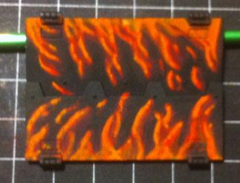
And on to take 1(ish):
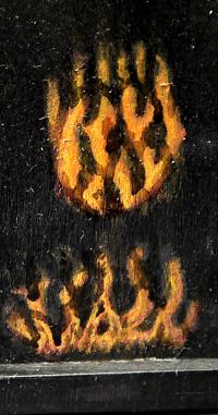
Well not technically my first try the result was pretty much identical. I had tried some flames earlier on a piece of plasticard, result was the same and I'm pretty sure that pasticard ended up in the garbage. It's now a couple months later and figured I'd try again. This time I'd try on the wood bitz box that I use. Even though there was some primer on it the wood medium really didn't help out with the thinned down paints. No flow to the colors and large blocks where I didn't want large blocks. Result wasn't great but all part of the learning process. On the bright side, while painting the bitz box I noticed I had plenty of spare Rhino doors/hatches which would make for a better test platform.
Take 2:
Better progress on this test than on the box. I started out dry-brushing the darker red and then slowly built up to a scarlet red. As a background layer this worked great and game me a slightly cloudy background but with no abrupt edges. Next step I tried was to apply some gloss varnish as a test to see if that would help smooth out the color transitions. Mixed results on that. I haven't really used much brushed on varnish before and this layer went on thick. Adding in more colors to transition up to a yellow and really didn't use enough layers. It was an improvement over early tries but the transition was too abrupt. The picture makes it look like the paint's really thick but that's partly the varnish layer and the camera doesn't seem to like how the color transitions work.
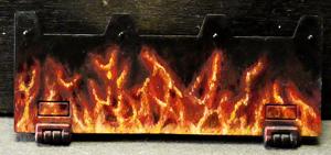
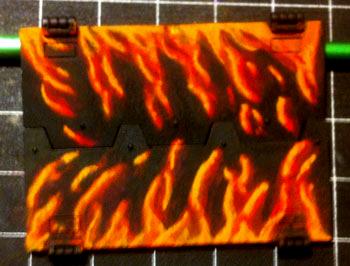
Take 3:
Similar method to take 2 but I tried using more smaller brush strokes. Lesson learned here - there's a lot of variety in flames and best to pick a method and try to keep some consistency between all flames painted on various parts of the model. Again, I don't think the paints were necessarily thinned enough and the flames ended up more yellow than I think they should be. Not horrible, but not really the style I was looking for.
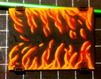
Take 4:
Starting to get a bit closer to the result I was looking for. Used slightly larger flames this time and skipped the varnish layer. I did swing down to the FLGS and picked up some transparent paints from Vallejo (red,orange and yellow). Started again dry-brushing the initial dark red layer and then added in the first transitions to a brighter red. Using the transparent red paint did help smooth out the transitions. It would probably work to just use a red glaze but I had the transparent paint. When I have more time to play around with it I'll experiment with the different paints and see how the results differ. When I did get to the transparent orange paint I think I made a mistake and painted over too much of the darker reds. Lost a sense of depth to the flames and I think they ended up more orange than I wanted.
Take 5:
This is the first one I'm satisfied with. I skipped the orange transparent paint and just went with multiple layers resulting in more depth to the flames. I kept the brush strokes thinner as I progressed up to yellow and eventually ended up using a flesh color as the final highlight. I went back and added a thinned black wash in places to see if that added more depth to the flames. I think it helped but there was some gloss in the wash and I ended up having to use it on all the black areas. Not sure if I'd do this step again. For now I'm good with the end result but the next step is for me to duplicate the result. I'll add in more detailed instructions (paints used, number of layers, etc) when I go back and try the next test.
If anyone has any tips/suggestions, all comments are welcome!
|
|
|
 |
|
2014/11/17 06:02:10
Subject: Learning to Paint Flames
|
|
Fixture of Dakka
|
Excellent! I like it a lot, although my personal favorite is Take 3.
Good job 
|
|
|
|
|
2014/11/17 08:54:26
Subject: Re:Learning to Paint Flames
|
|

Longtime Dakkanaut
|
I think these are starting to look good. I like the bright colours and textures in the later versions, but I prefer the shapes in the earlier versions - the last few look a bit veiny. I think the key to nice fire shapes is to be mindful of the direction of the flames. Flames are actually just the visible roots of very tall pillars of hot gas. Even though they can seem a bit random, they also tend to move and sway together with the wind. It's good to have some lines of force for the flames to follow. The loose flecks of flame are also important. I think they look best with a kind of an S shape to them. I did some quick doodles to try and illustrate what I mean. As you can see that direction of the flames can be as simple as a line, or complex like a twisting fire-storm. 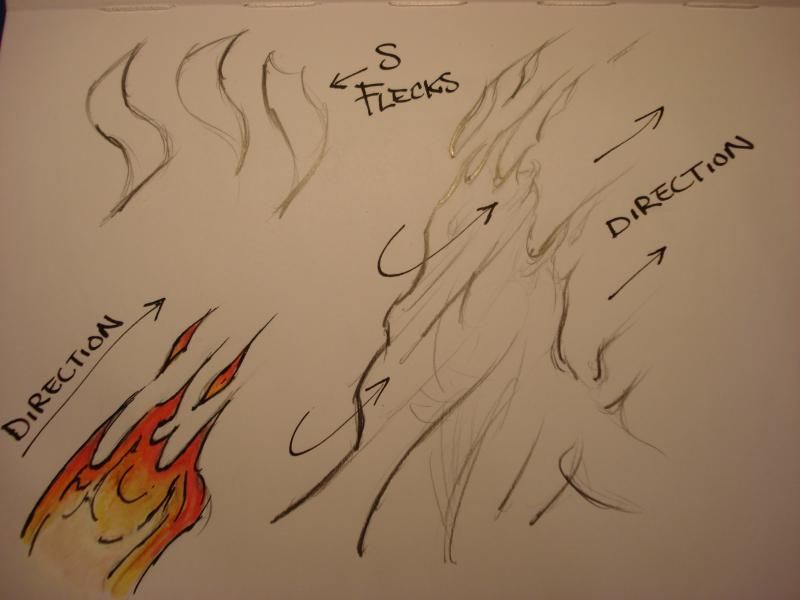 Don't be afraid to use plenty of white for the heart of the fire (take a look at how much white is in the dakka logo explosion). I would actually suggest starting with white and mapping out your flames in white first, then colouring them in afterwards with reds and yellows. The white base should really help the other colours to pop. I'm not super keen on the murky reds and greys in the background. I guess it is more realistic that way -- but for stylized LoD / hotrod type flames, I would just paint them with a clean black edge.
|
|
This message was edited 2 times. Last update was at 2014/11/17 08:59:07
|
|
|
|
|
2014/11/17 17:49:03
Subject: Learning to Paint Flames
|
|

Gargantuan Gargant
|
Non-patronizing slow clap for Smacks. That's probably the clearest, most concise, and most generally useful primer on painting flames I've ever seen.
|
The Dreadnote wrote:But the Emperor already has a shrine, in the form of your local Games Workshop. You honour him by sacrificing your money to the plastic effigies of his warriors. In time, your devotion will be rewarded with the gift of having even more effigies to worship.
|
|
|
|
|
2014/11/18 01:19:20
Subject: Re:Learning to Paint Flames
|
|
Primered White
|
Thanks for the diagram Smacks! By the time I got to the later examples I was definitely more interested in getting the range of colors down and completely missed paying attention to the general flow/direction of the flames. Really good tips to keep in mind on my next try.
|
|
|
|
|
2014/11/18 13:33:53
Subject: Learning to Paint Flames
|
|
Rotting Sorcerer of Nurgle
|
I prefer take 4 myself, but it's all down to personal taste. Stick with the one YOU like.
|
Check out my gallery here
Also I've started taking photos to use as reference for weathering which can be found here. Please send me your photos so they can be found all in one place!! |
|
|
|
|
2014/11/21 19:46:55
Subject: Re:Learning to Paint Flames
|
|
Primered White
|
Updating with my latest take and some quick steps on how I got to the end result. I did try starting out with the lighter colors first on one attempt but that really didn't turn out how I expected and I moved on. I went back to the technique I'm more familiar with and started out with the darker colors, building up to the lights. I took some pictures with my iphone so that I could have a reference of the process I used. Pictures aren't great but it was an easy way to take them.
First step for me was to mark out the columns of flame in Scab Red (no idea what the current GW color is called). Fairly thin layer applied with some dry-brushing and stippling to add some depth to the flame columns.
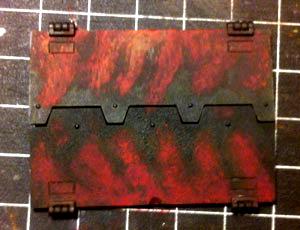
Next, I added in some outlines for some of the actual flames in another layer of Scab Red.
Following layer was a blend of Scab Red and Troll Slayer Orange. Highlighting the front edges of the flames
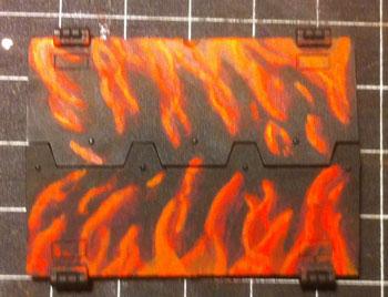
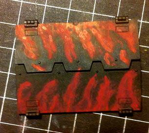
Working in pure Troll Slayer Orange.
Next, a mix of Tau Light Ochre and Troll Slayer Orange, building up to pure Tau Light Ochre and still applied to the leading edge of the flame.
Tau Light Ochre mixed in with Yriel Yellow using the same process as above.
To get to the final step I added in some Vallejo Flat Flesh to the yellow and ended up with my final result
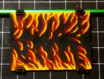
Looking at the pictures of the flames there are some things that I like and some that I don't. This sample feels more like flames than some of the other tests but I think I need to use more S shapes.I'm happy with the shapes at the base of the flames but less satisfied with the sections at the top.
|
|
|
|
|
2014/11/21 21:00:53
Subject: Learning to Paint Flames
|
|
Homicidal Veteran Blood Angel Assault Marine
|
I think they may be a bit thin near the top, but that's my only input. I think you have great effects on them!
|
|
|
|
|
|
2015/02/07 00:01:29
Subject: Re:Learning to Paint Flames
|
|
Primered White
|
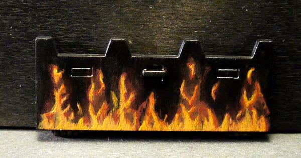
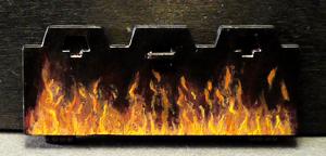
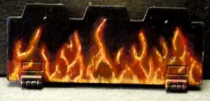
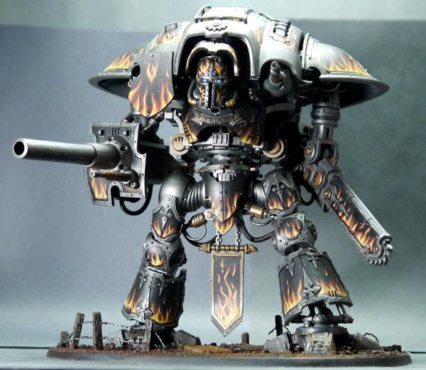
Well it took a little while but I finally went to work on my Knight Titan. Thanks to everyone for all the tips as they really helped with the flames. Overall I ended up with a result that I was happy with and got the result I was looking for.
|
|
|
|
|
2015/02/07 09:33:06
Subject: Learning to Paint Flames
|
|
Mekboy Hammerin' Somethin'
|
Looks great! If there's one thing that's lacking, I'd say thicker flames spread out across the bottom of the besagew (the shield-looking piece on the shoulder's front). It's a big area across the bottom, and looks a little like it's only kinda on fire as is.
A look similar to the way it's spread across the shoulders would bring it all together.
|
|
|
|
|
|
2015/02/07 09:35:07
Subject: Learning to Paint Flames
|
|

Ancient Space Wolves Venerable Dreadnought
I... actually don't know. Help?
|
Awesome! Just one thing, if you're doing a black/grey IK, don't do silver trims.
|
|
|
|
|
|
2015/02/07 09:52:51
Subject: Learning to Paint Flames
|
|
Jealous that Horus is Warmaster
|
Doing a "warmer" metal trim might help like Matthew suggested gold or brass/bronze
|
|
|
|
|
2015/02/07 10:20:57
Subject: Learning to Paint Flames
|
|
Strangely Beautiful Daemonette of Slaanesh
Canada eh?
|
You sould put those on the inside of the rhino winsome lights in the floor!... oh wait never mindXD Its my idea! Lul jk free game.
|
|
This message was edited 1 time. Last update was at 2015/02/07 10:21:09
Yeah... Not the best person to talk to no more, great fandom(sarcasm)
 Ordeo Xeneophiliac Mechaneo Safietus Obligatorum Division Ordeo Xeneophiliac Mechaneo Safietus Obligatorum Division
 Tau Obsidian cast Tau Obsidian cast
 Saim-Hann Skirmishers Saim-Hann Skirmishers
 Random deamonette devision Random deamonette devision
 Band of brothers Band of brothers
 Gallant Pulsers(DiamondRamz) Gallant Pulsers(DiamondRamz)
 Ravaging Raptors Ravaging Raptors
 Tyranid Khimera Genom Tyranid Khimera Genom
http://www.dakkadakka.com/dakkaforum/posts/list/0/579207.page#6527715
http://www.dakkadakka.com/dakkaforum/posts/list/579184.page |
|
|
|
|
2015/02/07 10:38:14
Subject: Re:Learning to Paint Flames
|
|
Excited Doom Diver
|
WinterHound wrote:Well it took a little while but I finally went to work on my Knight Titan. Thanks to everyone for all the tips as they really helped with the flames. Overall I ended up with a result that I was happy with and got the result I was looking for.
This right here is an excellent example of how practising and experimenting with a new technique can yield amazing results. Your knight is beautiful, and frankly would have looked amateurish if you'd gone with your first fire method.
Though I agree that the metal should be a warmer bronze tone...
|
|
|
|
|
2015/02/07 22:19:01
Subject: Learning to Paint Flames
|
|
Primered White
|
Both styles of trim had their merits. I found the silver trim kept the flames as the focal point of the armor plates while the gold acted more as a frame for the flames which drew my eye more to the armor plate as a whole. Originally I was looking to do more weathering on the knight and felt it would look better as a tarnished silver than gold. Again, just a matter of taste and how I wanted the knight to look overall. If I ever get my painting backlog cleared up I'd definitely paint up another knight with the gold trim. It'd be a great way to indicate rank between my knights.
|
|
|
|
|
|
|
 4500
4500 


 ~2800 points