| Author |
Message |
 |
|
|
|
|
Advert
|
Forum adverts like this one are shown to any user who is not logged in. Join us by filling out a tiny 3 field form and you will get your own, free, dakka user account which gives a good range of benefits to you:
- No adverts like this in the forums anymore.
- Times and dates in your local timezone.
- Full tracking of what you have read so you can skip to your first unread post, easily see what has changed since you last logged in, and easily see what is new at a glance.
- Email notifications for threads you want to watch closely.
- Being a part of the oldest wargaming community on the net.
If you are already a member then feel free to login now. |
|
 |
2015/04/27 18:39:15
Subject: First attempt at painting
|
|

A Skull at the Throne of Khorne
|
Picked up the Dark Vengeance set a few weeks ago and had my first attempt at painting the models and a quick dabble with basing too.
Fairly pleased with the results (other than the tabard - just couldn't get a smooth layer) - any hints or advice welcome.
Cheers, Mark.
|
|
|
 |
|
2015/04/27 19:02:18
Subject: First attempt at painting
|
|
Horrific Howling Banshee
|
pretty good if this really is your first ever time painting... Mine was... well it was like my first time, rather messy!
|
|
|
|
|
2015/04/27 19:13:37
Subject: Re:First attempt at painting
|
|
Decrepit Dakkanaut
|
Looking nice indeed! Especially for a first go.
I will say that it is very evident where you spent the most time, to the detriment of other areas. For example, in comparison, the face looks unfinished. Consider throwing a little heavier shade on there, it could be the photo but it looks very bare next to the cloth.
It's very easy to concentrate on one part more than others and forget the over-all (Hell, I even found a mini this week that I believed for seven years was totally finished, but it turned out I hadn't painted an entire area). Take a fresh eye to it, look it over as a whole, and consider little tweaks you can add to give each area the same level of finish. 
|
|
|
|
|
|
2015/04/27 19:15:01
Subject: First attempt at painting
|
|

Regular Dakkanaut
|
They look really good, the basing is great too. Congrats on your first paint job, I foresee a great future a head of you!
One suggestion if I may, on the basing. I like to paint the sides of the bases to blend in with the rest of the bases. That's more a personal choice though, I've noticed most people don't go that route.
|
|
|
|
|
2015/04/27 19:39:33
Subject: First attempt at painting
|
|
A Skull at the Throne of Khorne
|
Thanks all. Realised I hadn't painted the base edges yet, so I'll pick a good colour for that and finish those off.
Kept the flesh / face fairly simple, but yes I think more shade and definition would help.
I just followed the GW videos on their website which made the job a lot easier for me (Duncan Rhodes, take a bow!) but they've definitely given me a lot more confidence.
Working on the Deathwing Terminator squad at the moment - I'll post a pic when they're done.
|
|
|
|
|
2015/04/27 20:17:11
Subject: First attempt at painting
|
|
Pestilent Plague Marine with Blight Grenade
|
Wow pretty good for your first time! I would try using some shade for you next go. It will make the detail pop more.
- Base coat
- shade
- layer or 2
- high light (or glaze if you want)
Is like a general rule of thumb I guess
|
|
|
|
|
|
2015/04/28 08:08:37
Subject: First attempt at painting
|
|

Fixture of Dakka
|
Congratulations!!! They look fantastic.
Cloth took me a while to master, too. It's not the easiest thing to paint, because you need to go from quite dark (in the folds) to quite light. On the other hand, it looks fantastic when painted right 
I would suggest as you progress to try some edge highlighting. It really makes your colors pop.
|
|
|
|
|
2015/04/28 09:24:00
Subject: First attempt at painting
|
|
A Skull at the Throne of Khorne
|
Thanks again. Edge highlighting is on the list of things to try for sure. Is that the same as dry brushing or is dry brushing just one way of getting an edge highlight? Not clear from the stuff I've read so far.
Snoop - I've use shade and a bit of layering but maybe haven't been 'brave enough' with it yet.
Thanks all for the encouraging words and tips!!
|
|
|
|
|
2015/04/28 11:16:17
Subject: First attempt at painting
|
|
Tough-as-Nails Ork Boy
|
No, an edge highlight is where you paint a very fine line on an edge or corner. You use a much lighter shade of the same color, almost white; then you paint it on using slightly watered paint (too watery and it runs) and the side of a fine brush onto the corner.
|
|
|
|
|
2015/04/28 14:58:44
Subject: Re:First attempt at painting
|
|

Steadfast Grey Hunter
|
Very nice first attempt! The way you have shaded/highlighted the robe and face remind me very much of the artwork Arenanet use for Guild Wars 2, very stylised. I'm not sure if that is the route you were going for but its still a damn fine table top model, especially for your first time out!
 Talys wrote: Talys wrote:I'm calling it a day with this one 
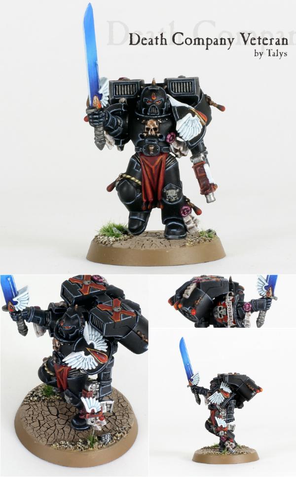
Ok, confession: I was painting Death Company anyhow, and figured since they have all been gripped by the Black Rage, they must be veterans, right? And for those who had better things to do than take dead languages in high school, Vetust is Latin for Veteran
Paradigm: Thank you for doing something fun & positive!
This is a good example of edge highlighting that Talys has used in the monthly painting competition. You can see with the black armour how the grey edge highlights make it pop, turning it from what would be a fairly flat black model into something much more. For your Dark Angels I would recommend edge highlighting with a yellowy green (moot green is the GW colour I think), watered down. You get a little bit of this watered down paint on your brush, use a paper towel to make sure that you do not have too much on the bristles then very carefully paint the edges. Don't worry if it doesn't "pop" too much the first time out, you can add another highlight again using the same paint once the first one is dry. The really important part is to make sure it is well watered (skimmed milk consistency), and not using too much. If you have too much paint on then you will find that it will puddle and clump up in a big lump of opaque colour, rather than being a fine semi-transparent line. You move from semi-transparency to a more opaque colour by building up the edge highlights over smaller and smaller layers.
Part of the painting process is matching the right colors for your highlights. For example, a nice bright red goes more orange in the light, rather than pink. When light hits Green the yellow part of the green shows through more rather than the blue part. You can really make a model pop with just 3 painting steps (Basecoat, wash, Edge Highlight).
Keep up the good work, and you will find you naturally start trying new techniques to paint your models as you get more confident with a brush.
|
Zap Brannigan -
"In the game of chess you can never let your adversary see your pieces."
"If we hit that bullseye, the rest of the dominoes should fall like a house of cards. Checkmate."
"Rock breaks scissors. But paper covers rock, and scissors cut paper! Kiff: we have a conundrum...... Search them for paper... and bring me a rock." |
|
|
|
|
|
|