| Author |
Message |
 |
|
|
|
|
Advert
|
Forum adverts like this one are shown to any user who is not logged in. Join us by filling out a tiny 3 field form and you will get your own, free, dakka user account which gives a good range of benefits to you:
- No adverts like this in the forums anymore.
- Times and dates in your local timezone.
- Full tracking of what you have read so you can skip to your first unread post, easily see what has changed since you last logged in, and easily see what is new at a glance.
- Email notifications for threads you want to watch closely.
- Being a part of the oldest wargaming community on the net.
If you are already a member then feel free to login now. |
|
 |
2017/10/31 01:33:49
Subject: Need help with "drawing the eye" to a face
|
|

Last Remaining Whole C'Tan
|
Hi guys,
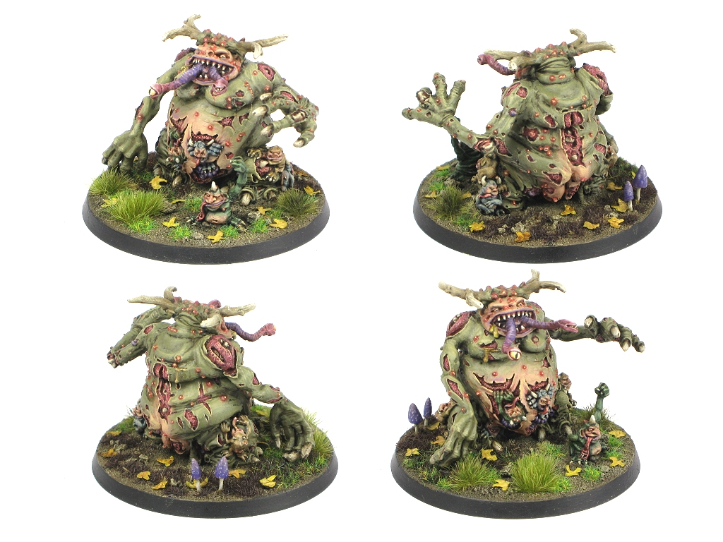
I don't really understand how color theory and advanced painting works. I have a Great Unclean One in progress, and I want to know how you guys would suggest painting the face so it draws the eye, instead of getting lost in the rest of the details of the model.
Here is what I have so far:
|
 lord_blackfang wrote: lord_blackfang wrote:Respect to the guy who subscribed just to post a massive ASCII dong in the chat and immediately get banned.
 Flinty wrote: Flinty wrote:The benefit of slate is that its.actually a.rock with rock like properties. The downside is that it's a rock
|
|
|
 |
|
2017/10/31 01:43:32
Subject: Need help with "drawing the eye" to a face
|
|

Pulsating Possessed Space Marine of Slaanesh
|
Well, i would say the best thing to do is to focus on highlighting the face so it emphasize the forms of the face.
Humans are naturally drawn to faces so if you paint them to show its full depth and form it shouldnt be a problem.
However humans also naturally look at red blood and wounds so getting abit of red up in the face wouldnt be bad,
I would paint the interior of the mouth and gum similar to the wounds, could counter balance the figure abit. Automatically Appended Next Post: Check out this one, http://fantasygames.com.pl/wp-content/uploads/2015/12/unclean-1.jpg
Notice how the dark shadows around the eye displays the form of the face
|
|
This message was edited 1 time. Last update was at 2017/10/31 01:52:39
|
|
|
|
|
2017/10/31 05:43:38
Subject: Re:Need help with "drawing the eye" to a face
|
|
Last Remaining Whole C'Tan
|
ok, thanks for the advice about the darkening around the eyes.
To be clear I haven't started the face at all in any way. I posted this on a facebook group and someone suggested painting the mouth, teeth, and tongue. :/
|
lord_blackfang wrote:Respect to the guy who subscribed just to post a massive ASCII dong in the chat and immediately get banned.
Flinty wrote:The benefit of slate is that its.actually a.rock with rock like properties. The downside is that it's a rock
|
|
|
|
|
2017/10/31 07:42:53
Subject: Need help with "drawing the eye" to a face
|
|
Hurr! Ogryn Bone 'Ead!
|
Some dark shade, absolutely, right now while looking at it personally my eye is drawn to the exposed guts, then the wounds next to his head due to the contrast with the skin tone.
|
Shadowrun is the best game ever. It's the only thing I have ever played in which I have jumped out of a shot out van with a chainsaw to cut a flying drone in half before leveling a building with ANFO assisted by a troll, a dwarf, an elf, and a wizard. |
|
|
|
|
2017/10/31 08:17:16
Subject: Re:Need help with "drawing the eye" to a face
|
|
Last Remaining Whole C'Tan
|
Yes, I haven't started on the face at all. I was looking for color ideas.
|
lord_blackfang wrote:Respect to the guy who subscribed just to post a massive ASCII dong in the chat and immediately get banned.
Flinty wrote:The benefit of slate is that its.actually a.rock with rock like properties. The downside is that it's a rock
|
|
|
|
|
2017/10/31 11:06:06
Subject: Need help with "drawing the eye" to a face
|
|
Longtime Dakkanaut
|
Just like real life, the eyes are critical to this. Then the facial features get taken in, but when you look at someone almost immediately you go to the eyes and then everything else surrounding them.
|
|
|
|
|
|
2017/10/31 11:09:43
Subject: Need help with "drawing the eye" to a face
|
|

Is 'Eavy Metal Calling?
|
If you can vary your highlight colour a bit, that will create contrast without losing conherence. For example, if you're planning to shade/highlight along a dark green to light green spectrum, and you're using simply a brighter/whiter green for the highlights on the body, perhaps mix in a yellowy green of similar brightness for the face. This will keep the model's colour consistent, but the change in tone will draw the eye to the face. This works with shading too, if you're shading with a darker/blacker green, add in a dash of purple when you're shading the face's recesses. Same level of brightness/darkness, but with a different colour tone for contrast.
|
|
|
|
|
|
2017/10/31 17:34:12
Subject: Need help with "drawing the eye" to a face
|
|
Norn Queen
|
Contrasts. If there is a lighter spot on a dark background you will look at the lighter spot. If there is bright red in the middle of muted green you will look at the bright spot.
You know how some people hands/feet are a lighter color skin? Some animals have a white under belly up to their jaw?
If you do some coloration on the skin to establish these patterns and include the face in part of that there will literally be a line moving up the center of it's body going to it's face where a couple of contrasting bright eyes and a red bleeding tongue will become the focus of the model.
|
These are my opinions. This is how I feel. Others may feel differently. This needs to be stated for some reason.
|
|
|
|
|
2017/11/01 22:43:05
Subject: Re:Need help with "drawing the eye" to a face
|
|
Last Remaining Whole C'Tan
|
Thanks for the advice, everyone.
Automatically Appended Next Post:
 Paradigm wrote: Paradigm wrote: if you're shading with a darker/blacker green, add in a dash of purple when you're shading the face's recesses. Same level of brightness/darkness, but with a different colour tone for contrast.
This is the kind of trick I was talking about. I've seen better painters do it. For example, I've seen GW do this, such as with river trolls:

If I am doing bright green eyes, what would be a good color to use for the folds of skin under the eye? Light purple? Darker green?
|
|
This message was edited 3 times. Last update was at 2017/11/01 22:46:15
lord_blackfang wrote:Respect to the guy who subscribed just to post a massive ASCII dong in the chat and immediately get banned.
Flinty wrote:The benefit of slate is that its.actually a.rock with rock like properties. The downside is that it's a rock
|
|
|
|
|
2017/11/01 22:49:02
Subject: Need help with "drawing the eye" to a face
|
|
Powerful Phoenix Lord
|
Simple!

|
|
|
|
|
2017/11/01 23:01:23
Subject: Need help with "drawing the eye" to a face
|
|
Is 'Eavy Metal Calling?
|
That troll is a good example of the theory. Not just the yellowy underside, but also around the face; if you look closely, you can see the lower eyelids, while similar in brightness to the other highlights, have a blue tint to them, creating contrast while maintaining consistency. Likewise, there's a blue hint in the shades around the face that's less notable elsewhere on the model.
With bright green eyes, I'd try a purple hint to the shade as purple and green together works nicely. And for the facial highlights, maybe just a dash of a light purple/lilac tone to match the shading and add a suitably fleshy tone to the green skin.
If you have any expendable Nurgle models do try this on them before the GUO, it can take a bit of trial and error to get the method right unless you really know your colour theory.
|
|
This message was edited 1 time. Last update was at 2017/11/01 23:02:44
|
|
|
|
|
2017/11/02 00:37:00
Subject: Re:Need help with "drawing the eye" to a face
|
|
Last Remaining Whole C'Tan
|
Thanks again. I'll see what I've got from my grab bags.
|
lord_blackfang wrote:Respect to the guy who subscribed just to post a massive ASCII dong in the chat and immediately get banned.
Flinty wrote:The benefit of slate is that its.actually a.rock with rock like properties. The downside is that it's a rock
|
|
|
|
|
2017/11/02 09:48:23
Subject: Need help with "drawing the eye" to a face
|
|
Longtime Dakkanaut
|
Large monsters do very well with a two-tone skin pattern to draw attention around. The trick is to have a fairly high contrast of some sort where you want things to really pop.
This doesn't necessarily mean clashing or very diferent colours or brightness - there are three types:
Light/dark (pretty obvious), warm/cold (tend toward yellow tones for warm, bluer for cold), colour contrast (see a colour wheel).
It's very much up to you how you want to proceed with it, but for me, I tend to start with the face when I'm thinking about things to set the mood/feel of the model, and then figure out what to do with the rest to frame it.
Here's my (first of three) GUO, cos I like putting up picks of him, and because it shows the two-tone thing I was on about. All my oldschool Nurgle daemons have this Brian Froud sort of happy cartoony face thing going on, so faces, bellies and bottoms are generally a 'healthy human' colour. Everything else is a deliberately pretty mad mix of colours - blues, greys, greens, browns, anything even remotely nurgly. 'Sensible' modern thought (and certainly efficiency in painting an army) would more lean toward picking a very limited palette, but that leads to uniformity which I don't personally think suits daemons or chaotic forces in general.
Look at lots of artwork. See what styles of colour or mood get your er, juices flowing. Emulate, extrapolate, improve. :-)
|
|
This message was edited 1 time. Last update was at 2017/11/02 09:57:53
|
|
|
|
|
2017/11/04 00:59:13
Subject: Need help with "drawing the eye" to a face
|
|
Nurgle Chosen Marine on a Palanquin
|
Take a real good look at how the shadows fall in your photo and how dark they are even on a yellowish model. This should give you a really good idea of where paint heavy shadows and how dark to make them.
Maybe take another photo under the same lighting with the light a little more centered (but not dead center) and a little further back and use it to set your shadows.
T
|
|
|
|
|
|
|