Forum adverts like this one are shown to any user who is not logged in. Join us by filling out a tiny 3 field form and you will get your own, free, dakka user account which gives a good range of benefits to you:
No adverts like this in the forums anymore.
Times and dates in your local timezone.
Full tracking of what you have read so you can skip to your first unread post, easily see what has changed since you last logged in, and easily see what is new at a glance.
Email notifications for threads you want to watch closely.
Being a part of the oldest wargaming community on the net.
If you are already a member then feel free to login now.
I am starting AoS with Ogors. The force will have a good mix of the riders and the gluttons.
For that I want to use a Muted Palette (tutorial at the end of the video.) But I need a good colour suggestion for having a good contrast. Help will be welcome.
I would need a colour palette that incorperates the skinn of the monsters, some form of colour in place of the metal, the ogor skin colour and some colour for the pants. Also a spot colour on tatoes and skinn markings.
A long time ago (Warhammer fantasy) I did some colour tests on Ogors and they ended up a bit dark. 'Arthas' colour scheme with purple and dark blue seemed to be good. (From WC3 or Wow) White skinn with red scars was good. Dessert/sandy brown/green was good. Red skin (japanese Oni) or bronze skin was not that good. Preferrably some advice from someone who has a good understanding of colour theory!
Bellow is a quick tutorial to muted colours. I was thinking doing perhaps spot colours on the tatoes of the ogres.
This message was edited 4 times. Last update was at 2020/01/01 23:31:21
I'm not sure what you mean by spot colours.. Do you mean the bright contrast he mentions in the video? If so I wouldn't make the tattoos bright colours. That would look odd in a muted scheme. I'd try to find some way of getting a little colour onto the clothing, then a contrasting colour into the metal. So for example you could have muted blue clothes, then use an orangey rust effect on the metal. Alternatively, you could use muted reddy brrown clothing, and use a copper coloured armour with greeny blue verdigris effect. These make use of complimentary colours to give contrast.
If you saw my commissar from last months contest, that's what I did there, although the colours weren't muted as much as the rest of the overall composition of the piece. I the complimentary colours red and green to get colour and contrast into the piece.
Spots colours: The golours that draw your eye to it. On the model you have painted in the picture it would be the red. The red has a better qualaty to it (it is not as muted) and the other colours balance it nicly by not being to bright. Although you have a nice green black contrast going, I would have liked the model to have less yellow to to bring the red green contrats more forth. Or haviing the horse's shade more in a grey blue combined the green being blue and this make the red stand out even more. I have tryed to mark out all the colours you have used in a diagram bellow. While the model is good, I think it could be better if you cut the green and orange and had it red blue. (Muted green / red would be good, but nobody has seen a green horse.)
I need to come up with a colour scheme that works well. For the Ogors there are 4 'main' arias that need colour in the ogor model line.
- Flesh
- Fur (beasts)
- Metal/weapons
- Clothes.
Since I want to do grey as a background colour I can not use yellow. (Grey and yellow turns into green unless you go via brown. You can clearly see this in the video in the first post. Not a good lock unless your a looking for it IMHO.)
Colour scheme one: I am thinking blue fur/clothes, orange skin, and black weapons with a perhaps a drybrush of orange 'rust' could work.
Colour scheme two: Or do the ogres red, weapons perhaps a dark brown and the clothes / fur as blue.
Colour scheme three: Perhaps I can also do them in shades of dark red and bright orange. Not a lot of contrast in the model then though.
Best place for the spot colours (to draw the eye) would either be weapons or the ogre flesh itself.
(First picture is colours in the sergant model.) The next three are possibles for my ogors.
This message was edited 4 times. Last update was at 2020/01/02 16:03:40
I think that the two things that you want here are at odds with each other.
You want an army that pops on the tabletop yet you want to use generally muted colours.
There was a reason for GW's red phase!
The example model whilst nicely painted and great looking in a well lit studio/lightbox would look pretty drab en masse at arms length on the tabletop.
The only way that I can see you achieving what you want is to include as many elements of osl in your modelling stage. Put in as many flaming torches, glowing orbs, swords, runes, eyes, gems etc as you can. That'll boost the amount of spot colour you get on each model.
I've seen this done really effectively on a midnight undead army. The majority of the models were painted in fairly high contrast blue/grey/white moonlight tones. Kinda samey and drab.
The majick came from bright colours spreading over each unit from any number of light sources. This worked super well for a square based whfb army but would take a load of extra care to do well for AOS and would look trash during a game. YMMV.
If the OSL was only on individual models it could look pretty good.
This message was edited 2 times. Last update was at 2020/01/15 12:05:47
Oli: Can I be an orc?
Everyone: No.
Oli: But it fits through the doors, Look!
The orange on the second one is fine because its armor. But next to the duller colors of the skin it looks lavishly painted. Which would be fine but then it also looks like the animal has been painted teal instead of just having bright fur.
The muddy colors of the ogre make dont sit right with the brighter more cartoony colors of the rest of it.
In the first one all the colors look like they come from the same world. Same tone. Same themes.
Even if you brightened up the red a bit, again, thats armor and it just says those guys painted it lavishly. But the natural stuff needs to stay dark.
These are my opinions. This is how I feel. Others may feel differently. This needs to be stated for some reason.
AngryAngel80 wrote: I don't know, when I see awesome rules, I'm like " Baby, your rules looking so fine. Maybe I gotta add you to my first strike battalion eh ? "
No the base did not have to be blue. I was thinking it was notbso good when I started drybrushing the nect batch.
I thought it should be in a non warm colour though. Perhaps grey can work.
I was considering having the body grey instead of pruple. Orange and grey work great togethee, but I liked the coloura in the model as of now. You relly see the orange.
Based on the example Gor that your showed: I think what you are looking for is a color scheme that allows for the full range of highlight / shadow while maintaining a "reduced range of colors" with an accent color.
My comment would be that the inclusion of orange is at odds with this strategy. Orange would be a great "spot color", but you have used it in too many spots on the figure. The blue and purple portions are adjacent on the color wheel which plays into your "muted" strategy". Dark greys and browns would continue this theme. You'd have to shade them with dark purples and blues to tie them into your scheme. Orange, being across from blue on the color wheel would be your accent color, but it needs to be used sparingly so that it doesn't overwhelm your muted hues across the rest of the model.
I think that in terms of shading and highlights, the second attempt is better. However, the highlights need to be much stronger. Rule of thumb is that your highlights need to be the same degree of brightness change from your midtones that your shadow is. A mistake I used to do all the time was take a color like "warboss green" to shade to black (easy!) and then highlight to what seemed like a bright color, like "moot green". Because the degree of difference between the midtone and black is much greater than the degree of midtone to highlight - it ends up looking weird. Now-a-days, I'd highlight with a warboss green + dorn yellow up to pretty much pure dorn yellow. Using a color across from the color wheel to shade will reduce luminosity without destroying saturation like black and white, where as highlighting with a color adjacent will do the same for highlights.
Anyhow... hope this helps. Happy painting!
I think I moved a bit away from the original starting point a bit. At one point I wanted the orange / blue contrast. With orange being the spot colour and draw the eye to the 'important parts' with mostly are weapons. And the eyes of the character.
At one point I added the purple to work as a bridge between the blue and orange. Instead of doing a pure contrast I used one half of the colourwheel. (Orange to blue by way of purple) for a more cold/warm contrast. Cold warm also works with the mute colurpalete as the grey makes it very cold.
Also, there are very few arias on the model where I could add blue IMHO. Pants, perhaås boots, but I stoped at pants.
How ever you might have a very good point that to much of the caharcter is currently Orange. I think I will limmit the orange to 1 weapons, 2 gut plate, and 3 eyes. The gutplate is such a nice focal point, but it can not be seen from all angels.
I feel like I driftet a long way from whereI wanted to go when I started. But doing the 'colouring' method with contrast paints was very bad on black surfaces. I enjoyed it more when it was more bright.
@Niiai: I think that your paint work of the Ogur Bulls is definitely a step in the right direction. Before you punch up the saturation of the orange gut plates, I think you need more contrast on the skin as the accent color will always have a tendency to overpower the duller colored skin. I think the plate as painted now is perfect...
If I were to do the skin: Here's how I'd approach:
Based on your existing model: I'd take the midtone and maybe add 66% midtone + 33% lightest fleshtone (i.e. a very light pink, VMC Light Flesh or similar) you have and try adding a line of highlight to the raised parts of the flesh and see if that improves things.
- Keep in mind, the shadows and highlights should be the same difference in +/- brightness away from the midtone.
I have limited experience with Contrast Paints. Their transparent shading qualities are very fast, however, as I want a high level of control that I want on the opacity and shade color, they are a poor tool for my style of painting.
keezus wrote: @Niiai: I think that your paint work of the Ogur Bulls is definitely a step in the right direction. Before you punch up the saturation of the orange gut plates, I think you need more contrast on the skin as the accent color will always have a tendency to overpower the duller colored skin. I think the plate as painted now is perfect...
If I were to do the skin: Here's how I'd approach:
Based on your existing model: I'd take the midtone and maybe add 66% midtone + 33% lightest fleshtone (i.e. a very light pink, VMC Light Flesh or similar) you have and try adding a line of highlight to the raised parts of the flesh and see if that improves things.
- Keep in mind, the shadows and highlights should be the same difference in +/- brightness away from the midtone.
I have limited experience with Contrast Paints. Their transparent shading qualities are very fast, however, as I want a high level of control that I want on the opacity and shade color, they are a poor tool for my style of painting.
Cheers you like the plaette. I am a bit confused as to what you are sugesting.
The way I have painted the model now is that I have drybrushed the model from black/mechanicus standar grey/dawnstone/some other grey and in the end grey seer. The grey seer is only aplied to light arias.
I then do all the metal parts with boltgunn metal (or what the new paint is done) black wash and drybrushed up until only sliver.
After that I 'colour' all the parts of the model with contrast paint.
I am unsure you mean by punch up the orange on the gut plate. And add more contrast to the skinn. You mean not water out the skinn colour? I am currently deluding the colours a bit. Also, I should have the shades / highlights in the same range as from the midtone perhaps I should do the final highlight as white instead of black?
This message was edited 1 time. Last update was at 2020/01/24 21:50:16
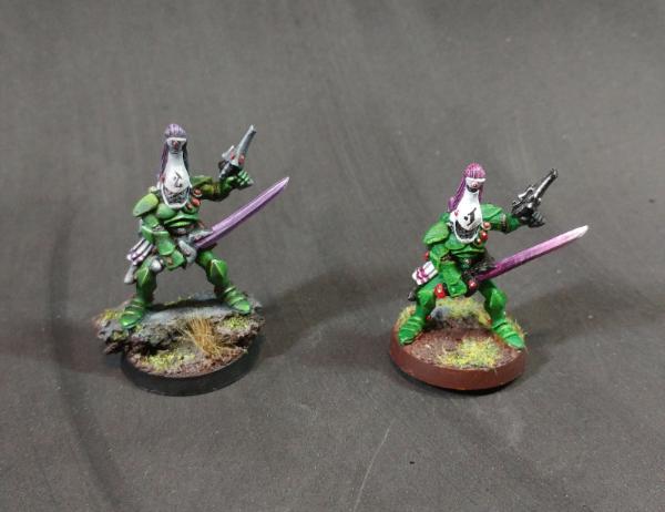
@Niiai: Sorry in advance as these examples are not the best... they are all I had lying around:
In the picture of the two Guardians... I painted the one on the right was painted when I first started the hobby, and the one on the left using the exact same scheme for fun in 2018 to see how much I got better by.
In this case, the white is the accent colour. The green is highlighted one shade upward. You can see that the white helmet draws the attention immediately and the details are lost in the green. In the case of the gut plate, because it is on the body of the model, if it is a lot brighter than the rest of the paint work: It risks drawing the eye only to that part of the model.
On the left Guardian, the green armor has much stronger highlights and shadows. This lets the body stand at more even footing with the accent colour without being overpowered.
I am only cautioning that with the Ogors, if you increase the intensity of the gut plate without attention to the skin of the Ogor, you risk obscuring the details of the model because the orange commands the eye too much.
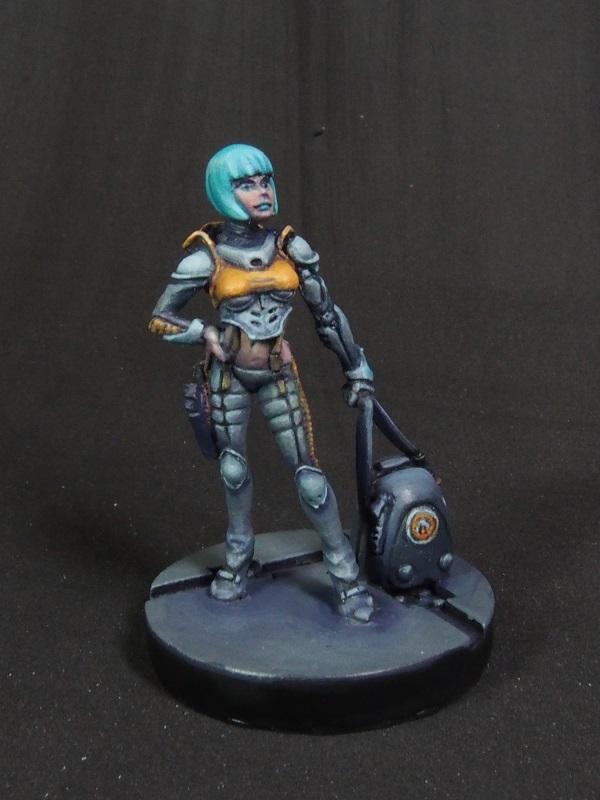
My second admittedly bad example is this girl with a muted grey scheme for the body. I tried to make sure that the face is adequately highlighted and the body's volumes are defined by light and shadow so that the yellow doesn't overpower the composition.
I hope this is a better explanation. It is hard for me to explain without being able to demonstrate it. :(
This message was edited 2 times. Last update was at 2020/01/25 05:10:42


 Heresy World Eaters/Emperors Children

 Eldar- 4436 pts