I've just recently started playing with other colours for shade, having fallen in to a "blackwash everything" mentality over the last decade or so. This
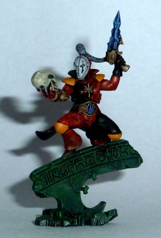
video by Midwinter Minis was the main catalyst for change when they used a dark purple for the shading on a blue model, and worked some pale blue-green in to the highlights for a deeper colour range. I've since tried out the concept on to my test Harlequin (below, not that you can see the purple shade for the red sections in the picture, unfortunately, but you might be able to see it on the blue parts).
The trick with this technique seems to revolve around [ur;=https://usabilitygeek.com/colour-theory-introduction/]colour theory[/url]. Once you know which colour you want as your main colour, choose a colour one or two spaces round the colour wheel as your shade colour, and a colour one or two spaces the opposite way round the wheel to work in to your highlight mix. On my Harlequin, I used a dark purple as the shade layer, followed by red as the main colour, and working orange in to the highlight mix (OK, red to orange is one of the best known of these colour transitions).
For you, perhaps you could use a dark red (or I've heard good things about Rhinox Hide due to being a dark but reddish brown) as your shade colour, paint up purple as your main colour, and add just a hint more blue in to the later highlights. Washes are a bit more difficult to use in the same way, because their transparency will often let the colour underneath show, but perhaps you could play with mixing up a black-red wash and see how that goes, even if you need more than one coat.


 Heresy World Eaters/Emperors Children

