| Author |
Message |
 |
|
|
|
|
Advert
|
Forum adverts like this one are shown to any user who is not logged in. Join us by filling out a tiny 3 field form and you will get your own, free, dakka user account which gives a good range of benefits to you:
- No adverts like this in the forums anymore.
- Times and dates in your local timezone.
- Full tracking of what you have read so you can skip to your first unread post, easily see what has changed since you last logged in, and easily see what is new at a glance.
- Email notifications for threads you want to watch closely.
- Being a part of the oldest wargaming community on the net.
If you are already a member then feel free to login now. |
|
 |
2014/09/14 07:56:59
Subject: Your top 5 most displeasing aesthetic aspectsof the 40k setting?
|
|

Basecoated Black
|
I think most of us can agree that the 40k setting is fairly interesting, full of rich flavor, character, and possibilities for personal storytelling. However, in creating such a vast universe, GW occasionally (or often, depending on who you talk to) make some choices that you simply don't agree with / don't like. What is YOUR top 5 most displeasing aesthetic aspects of the 40k setting? Examples can go from Space Marines being an all Male force to the Tau having Japanese origin names. Anything you don't like about the artistic choice GW went with goes.
Feel to express why you don't like a particular thing as well.
I'll start, items listed in no particular order:
5.) Centurion / Dreadknight Armor: I can't help but think that just look silly. One looks like Randy Parker from a Christmas Story bundled up with too many sweaters "I can't put my arms down!" and the other looks like the terribly conceptualized walkers from the 3rd Matrix movies.In the fluff they're supposed to already be wearing power armor, so it just seems redundant to put even MORE armor on them.
4.) Tyranid Bio Weapons: Why do these things look like guns and swords? Wouldn't the hivemind had though bioweapon would be better to be part of the creature (ala Biovores or thorax weapons)? The way they're designed, it's like the termagaunt could just pick up any ol weapon it wants at will (Now that would make for an unusual First person shooter video game)
3.) Catachan: I could never quite get around why the Imperium would hold such a planet. On Arrakis, the Fremen prevailed there because of the universal need for melange. With Catachan, I just don't see why the Imperium habits it at all. It would seem that it would take more resources to sustain a large enough population to make dozens of regiments per year as opposed to simply getting soldiers elsewhere. Oh, and look at those muscles! Looks like GW was watching too much Rambo and not enough actually looking at natives that have thrived in dangerous jungle for generations.
2.) The New Space Wolf Flyers: They look like Goofy's head. Which is goofy. The weapon placement doesn't make much sense either, this thing has to dip forward to get any line of sight on ground targets.
1.) Wraithknights: I'm not really digging the fluff behind the pilots of WraithKnights. I don't know if Pacific Rim came first, or the Eldar dex, but I didn't like the concept in either setting. Two minds trying to control a 4 limbed walker just doesn't work for me.
|
Actions define a person. |
|
|
 |
|
2014/09/14 08:10:01
Subject: Re:Your top 5 most displeasing aesthetic aspectsof the 40k setting?
|
|
Douglas Bader
|
1) Tyranids.
2) Tyranids.
3) Tyranids.
4) Demons as a whole army instead of a rare summoned monster in a conventional chaos army.
5) Pretty much every new unit released since 5th edition.
|
There is no such thing as a hobby without politics. "Leave politics at the door" is itself a political statement, an endorsement of the status quo and an attempt to silence dissenting voices. |
|
|
|
|
2014/09/14 08:37:06
Subject: Your top 5 most displeasing aesthetic aspectsof the 40k setting?
|
|

Is 'Eavy Metal Calling?
|
Honestly, nothing. 40k has one of the best and most diverse aesthetic backgrounds in sci-fi, and I love every aspect of it. Sine bits are over the top or nonsensical when considered logically, but that's all part of the appeal.
|
|
This message was edited 1 time. Last update was at 2014/09/14 08:37:30
|
|
|
|
|
2014/09/14 08:44:52
Subject: Your top 5 most displeasing aesthetic aspectsof the 40k setting?
|
|

Wight Lord with the Sword of Kings
|
1) Tau
2) Tau
3) Tau
4) Tyranids
5) Tyranids
|
|
|
|
|
|
2014/09/14 08:54:21
Subject: Your top 5 most displeasing aesthetic aspectsof the 40k setting?
|
|
Lit By the Flames of Prospero
|
1) Skulls on everything. Ooh it's grimdark, know what grimdark needs? SPOOKY SKULLS!
2) All the Greater Demons. They just look ridiculous (except the FW ones).
3) Taurox. The 4 tracks make no sense, tracks are designed to spread weight, so making them smaller defeats the purpose of having a tracked vehicle.
4) Dreadknight. It breaks you in half if you turn too quickly, how could anyone design this and not see it?
5) Every SoB model ever. They just look horrendously ugly.
|
Muh Black Templars
Blacksails wrote:Maybe you should read your own posts before calling someone else's juvenile.
|
|
|
|
|
2014/09/14 09:03:49
Subject: Your top 5 most displeasing aesthetic aspectsof the 40k setting?
|
|
Hallowed Canoness
|
1) Lack of Helmeted Sisters.
2) Lack of female Guard heads.
3) Lack of female Sisters heads (and generally the oversized 'hero scale' heads that make it look like their armour is less than a half cm thick).
4) Dreadknights having Terminator pilots - should be a PAGK, since the DK provides Terminator-level protection anyway and even the GK don't have an infinite supply of Terminator suits.
5) PAGK. The wrist storm bolters look... silly on PA gauntlets. Sorry. They just do.
Also, Dshrike - in Rogue Trader, Hunter-Killers had lasguns  That's why Termagants carry their weapons.
|
|
This message was edited 1 time. Last update was at 2014/09/15 19:26:08
   
"That time I only loaded the cannon with powder. Next time, I will fill it with jewels and diamonds and they will cut you to shrebbons!" - Nogbad the Bad. |
|
|
|
|
2014/09/14 10:11:23
Subject: Your top 5 most displeasing aesthetic aspectsof the 40k setting?
|
|
Depraved Slaanesh Chaos Lord
Inside Yvraine
|
1. Sisters of Battle armor isn't revealing enough.
|
|
This message was edited 2 times. Last update was at 2014/09/14 10:12:54
|
|
|
|
|
2014/09/14 11:51:30
Subject: Your top 5 most displeasing aesthetic aspectsof the 40k setting?
|
|
Longtime Dakkanaut
|
1. The terrain and scenery is too Gothic these days
2. Necrons look like toys (I know they are toys, but they do not need to look like it)
3. Tyranid bioweapons, like you said
4. Dark eldar grotesques
5. I'm sure I will think of something
|
|
|
|
|
|
2014/09/14 13:31:27
Subject: Your top 5 most displeasing aesthetic aspectsof the 40k setting?
|
|

Lone Wolf Sentinel Pilot
|
1. Leman Russ tank. Ugly
2. power fists. Somethig like anime characters weapon or other weird stuff
3. Some of the tyranid things. Especially shooting weapons and living space ships
4. Centurion. If it fall, it will never stand up
5. Space Marine figures. They looks little compared to IG/Eldar
|
 Mordant 92nd 'Acid Dogs' Mordant 92nd 'Acid Dogs'
 The Lost and Damned The Lost and Damned
 Inquisition Inquisition
|
|
|
|
|
2014/09/14 13:32:59
Subject: Your top 5 most displeasing aesthetic aspectsof the 40k setting?
|
|
Killer Klaivex
The dark behind the eyes.
|
In no particular order:
- The Taurox. It looks like a badly-converted Tonka toy.
- A lot of the 'big' models like the Wrathkinght and Riptide. I don't know exactly what it is - possibly a combination of the scale and the spindly limbs (relative to their size). It just always looks like my opponent is proxying a Power Rangers action figure or something.
- Why do most Tyranids have hooves?
- What do Necrons have against making capes out of fabric (or some equivalent)? It works fine for Lords, but Necron Overlords appear to be wearing bead-curtains on their backs.
- IG infantry. The bodies are nice enough models, but all the heads look like angry potatoes. Also, Creed appears to be having a stroke.
|
|
This message was edited 1 time. Last update was at 2014/09/14 13:33:23
 blood reaper wrote: blood reaper wrote:I will respect human rights and trans people but I will never under any circumstances use the phrase 'folks' or 'ya'll'. I would rather be killed by firing squad.
 the_scotsman wrote: the_scotsman wrote:Yeah, when i read the small novel that is the Death Guard unit options and think about resolving the attacks from a melee-oriented min size death guard squad, the thing that springs to mind is "Accessible!"
 Argive wrote: Argive wrote:GW seems to have a crystal ball and just pulls hairbrained ideas out of their backside for the most part.
 Andilus Greatsword wrote: Andilus Greatsword wrote:
"Prepare to open fire at that towering Wraithknight!"
"ARE YOU DAFT MAN!?! YOU MIGHT HIT THE MEN WHO COME UP TO ITS ANKLES!!!"
Akiasura wrote:I hate to sound like a serial killer, but I'll be reaching for my friend occam's razor yet again.
 insaniak wrote: insaniak wrote:
You're not. If you're worried about your opponent using 'fake' rules, you're having fun the wrong way. This hobby isn't about rules. It's about buying Citadel miniatures.
Please report to your nearest GW store for attitude readjustment. Take your wallet.
|
|
|
|
|
2014/09/14 13:35:47
Subject: Your top 5 most displeasing aesthetic aspectsof the 40k setting?
|
|

Trazyn's Museum Curator
|
  Anyway, the new Demonettes. Are are those supposed to be lithe and seductive... Speaking of demons, I don't like the 5th ed Bloodletters. I get that they are going back to the old version of bloodletters, before they were turned into bull-demon things, but the current versions just don't look intimitating to me. The 3rd ed (?) versions looked imposing. The new ones look too wirey. They remind me of lil' Wayne for some reason. The new flayed ones are also pretty bad.
|
|
This message was edited 2 times. Last update was at 2014/09/14 13:39:26
What I have
~4100
 ~1660 ~1660
Westwood lives in death!
Peace through power!
A longbeard when it comes to Necrons and WHFB. Grumble Grumble
|
|
|
|
|
2014/09/14 14:52:16
Subject: Your top 5 most displeasing aesthetic aspectsof the 40k setting?
|
|
Ultramarine Librarian with Freaky Familiar
|
1. The way 40k building kits are designed and put together. You rarely see anything that actually looked like a building at one time.
2. Nids with guns. Again, mouth-guns, thorax-mounts or even entire gun limbs would look better.
3. Marine bikers and Land Speeders (except the Scout Bikers and LS Storm). I just think the Space Marine bikers are pointless and serve no purpose when compared to jump-packs, drop pods, Rhinos/Razorbacks and the aerial transports. Battlefield skimmers don't feel right in an Imperial army.
4. Taurox. Replace it with regular wheels and make it smaller or something and it would look and feel better to me.
5. The lack of female guard heads. I don't need boob plates or stuff like that, just an unhelmed female head or perhaps a ponytail coming out from under the helmet.
|
They/them
|
|
|
|
|
2014/09/14 15:17:13
Subject: Your top 5 most displeasing aesthetic aspectsof the 40k setting?
|
|

Servoarm Flailing Magos
|
This guy:
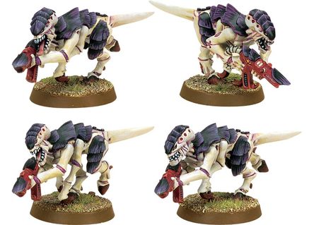
It's a species that evolves rapidly to face any threat... and yet they have to evolve their weapons separately? Why are they not built in? Why is a tyranid evolved to fight space marines completely harmless unless you separately evolve a weapon and stick it in his meaty little fist?
Just a sidenote: I am continously surprised how poorly people here think of the centurions. I love the gimpy little f*ckers. They look bad ass.
|
|
This message was edited 1 time. Last update was at 2014/09/14 15:18:48
|
|
|
|
|
2014/09/14 15:37:00
Subject: Your top 5 most displeasing aesthetic aspectsof the 40k setting?
|
|
Sneaky Lictor
|
 Purifier wrote: Purifier wrote:This guy:
It's a species that evolves rapidly to face any threat... and yet they have to evolve their weapons separately? Why are they not built in? Why is a tyranid evolved to fight space marines completely harmless unless you separately evolve a weapon and stick it in his meaty little fist?
Just a sidenote: I am continously surprised how poorly people here think of the centurions. I love the gimpy little f*ckers. They look bad ass.
Well...I agree that the gun biomorphs look goofy, there is a fluff reason they are spawned separately. The idea is that the gun has a separate mind so that it can effectively be a smart gun. It lets the gun worry about shooting and the body worry about moving, it is about efficiency even if it does look ridiculous.
For me, I hate all the Newcrons. I love Tomb Kings, I play Tomb Kings, I have no idea why we needed Tomb Kings in SPAAAAACE!
|
|
|
|
|
2014/09/14 15:39:14
Subject: Your top 5 most displeasing aesthetic aspectsof the 40k setting?
|
|
Killer Klaivex
The dark behind the eyes.
|
 Sgt_Smudge wrote: Sgt_Smudge wrote:
2. Nids with guns. Again, mouth-guns, thorax-mounts or even entire gun limbs would look better.
I think some look ok - like spinefists and the MC devourers/deathspitters.
It's the ones that look like they're holing a regular gun in both hands that bugs me.
|
blood reaper wrote:I will respect human rights and trans people but I will never under any circumstances use the phrase 'folks' or 'ya'll'. I would rather be killed by firing squad.
the_scotsman wrote:Yeah, when i read the small novel that is the Death Guard unit options and think about resolving the attacks from a melee-oriented min size death guard squad, the thing that springs to mind is "Accessible!"
Argive wrote:GW seems to have a crystal ball and just pulls hairbrained ideas out of their backside for the most part.
Andilus Greatsword wrote:
"Prepare to open fire at that towering Wraithknight!"
"ARE YOU DAFT MAN!?! YOU MIGHT HIT THE MEN WHO COME UP TO ITS ANKLES!!!"
Akiasura wrote:I hate to sound like a serial killer, but I'll be reaching for my friend occam's razor yet again.
insaniak wrote:
You're not. If you're worried about your opponent using 'fake' rules, you're having fun the wrong way. This hobby isn't about rules. It's about buying Citadel miniatures.
Please report to your nearest GW store for attitude readjustment. Take your wallet.
|
|
|
|
|
2014/09/14 15:40:00
Subject: Your top 5 most displeasing aesthetic aspectsof the 40k setting?
|
|
Ancient Venerable Dreadnought
|
Freakazoitt wrote:5. Space Marine figures. They looks little compared to IG/Eldar
Maybe yours do.*
1. Everything Space Wolf. All of it. It's all awful. I used to be okay with some of it, but Wolf Sled, and Wolf Cavalry, and Flying Clown Shoe killed it finally. With freeze rays (because when you live on a frozen planet the logical technological progression is to invent something that makes it colder. But hey, heat rays were already invented and we're Space Wolves. We do what we want!). But it was always sillibad. Long hair and beards on guys designed for fighting in vacuum and hostile environments.Good luck sealing that. The models should all have these awkward haircuts and beards from where their hair was sheared off by the armor seals.
2. Dark Eldar. Eh. Space bondage fetishists. On Green Goblin/Hobgoblin Hoverboards. And Jabba's skiffs.
3. Space Marines in your Space Marines while you Space Marine. Wraithknights and Centurions are just ugly. stupid looking models. Even worse, the Centurions have no reason to exist in the fluff. They filled zero operational shortfalls in the Space Marine inventory. They're large, slow targets in a rapidly moving surgical strike force. Dreadnoughts were kinda cool because of the idea of the Marines preserving fallen heroes to fight again. Centurions? Stupid. And if the Grey Knights can make a giant battle suit to fight big scary daemons, why leave the little vulnerable guy on the front of it where he's easier to damage?
4. Catachans. Good lord, they're bigger than Space Marines, lol. Coulda done that aesthetic with slightly more proportionate bodies.
5. Most of the newer stuff. The wheels have come off the design train. Taurox. Spanish Conquistador Stormtroopers (the helmeted heads are cool though). Flying Clown Shoe. Stormguppies. Dark Angel Cathedral sleds. Wolf Chariots. Hellturkey. Khornemower. Centurions.
*But yeah, seriously. I wouldn't wish true/tall scaling on anyone. It's a horrendously time consuming project, and probably why, two years later, I have a full company's worth of models but only 60 or so assembled.
|
|
|
|
|
|
2014/09/14 15:40:50
Subject: Your top 5 most displeasing aesthetic aspectsof the 40k setting?
|
|

Humorless Arbite
|
1. Space Marines. Most artwork though actually looks really good and inspirational, but the tabletop models just seem out of proportion and really don't appeal.
2. Taurox. Friendly Fire demonstrator supreme.
3. Tau Empire suits --- they're too Gundam for me.
|
|
|
|
|
|
2014/09/14 15:47:04
Subject: Your top 5 most displeasing aesthetic aspectsof the 40k setting?
|
|
Killer Klaivex
The dark behind the eyes.
|
 Veteran Sergeant wrote: Veteran Sergeant wrote:
1. Everything Space Wolf. All of it. It's all awful. I used to be okay with some of it, but Wolf Sled, and Wolf Cavalry, and Flying Clown Shoe killed it finally. With freeze rays (because when you live on a frozen planet the logical technological progression is to invent something that makes it colder. But hey, heat rays were already invented and we're Space Wolves. We do what we want!). But it was always sillibad. Long hair and beards on guys designed for fighting in vacuum and hostile environments.Good luck sealing that. The models should all have these awkward haircuts and beards from where their hair was sheared off by the armor seals.
Agreed. Also, this made me smile.
Veteran Sergeant wrote:
4. Catachans. Good lord, they're bigger than Space Marines, lol. Coulda done that aesthetic with slightly more proportionate bodies.
I think what saddens me is that GW seemed to choose the least interesting IG regiments to focus on. I'd much rather see more stuff for Steel Legion or Vostroyan.
|
blood reaper wrote:I will respect human rights and trans people but I will never under any circumstances use the phrase 'folks' or 'ya'll'. I would rather be killed by firing squad.
the_scotsman wrote:Yeah, when i read the small novel that is the Death Guard unit options and think about resolving the attacks from a melee-oriented min size death guard squad, the thing that springs to mind is "Accessible!"
Argive wrote:GW seems to have a crystal ball and just pulls hairbrained ideas out of their backside for the most part.
Andilus Greatsword wrote:
"Prepare to open fire at that towering Wraithknight!"
"ARE YOU DAFT MAN!?! YOU MIGHT HIT THE MEN WHO COME UP TO ITS ANKLES!!!"
Akiasura wrote:I hate to sound like a serial killer, but I'll be reaching for my friend occam's razor yet again.
insaniak wrote:
You're not. If you're worried about your opponent using 'fake' rules, you're having fun the wrong way. This hobby isn't about rules. It's about buying Citadel miniatures.
Please report to your nearest GW store for attitude readjustment. Take your wallet.
|
|
|
|
|
2014/09/14 15:59:17
Subject: Your top 5 most displeasing aesthetic aspectsof the 40k setting?
|
|
Shrieking Traitor Sentinel Pilot
New Bedford, MA
|
1. Tau
2. Ratlings; Bad-ass space bikers were too silly, but you kept horny hobbits?
3. Tau
4. Lack of female ANYTHING if you don't play DE
5. Daemons looks like bugs, Deviled ham mascots, and chewed bubblegum.
6. The CSM Daemon engines aren't awful, but they look markedly toyish
7. Grey Knights, baby carriers and cluttered x-mas tree armor. They make Tau look dignified.
8. I can't math today, need more coffee
9. Tau
|
|
This message was edited 1 time. Last update was at 2014/09/14 16:00:07
I notice my posts seem to bring threads to a screeching halt. Considering the content of most threads on dakka, you're welcome. |
|
|
|
|
2014/09/14 16:39:48
Subject: Your top 5 most displeasing aesthetic aspectsof the 40k setting?
|
|
Trazyn's Museum Curator
|
 Boggy Man wrote: Boggy Man wrote:
4. Lack of female ANYTHING if you don't play DE, Eldar or Sisters of Battle
Fixed that for you.
I do admit though that the lack of Guardswomen is a bit strange. It's already been established in lore several times that there are women in the Imperial Guard.
Surely it cannot be that hard to add a lady torso to the sprue. They did it for Eldar, after all.
|
What I have
~4100
~1660
Westwood lives in death!
Peace through power!
A longbeard when it comes to Necrons and WHFB. Grumble Grumble
|
|
|
|
|
2014/09/14 16:49:04
Subject: Your top 5 most displeasing aesthetic aspectsof the 40k setting?
|
|
Screaming Shining Spear
|
1. Warp Spiders. FFS, those crap models have been around for 20 years.
2. Dreadknights. Baby carrier.
3. Pink Horrors. They look like mutated pink Gumbys
4. Most Nids, because Zerg did it better.
5. Any Tau without a helmet. WTF are those faces?
|
 4000 points: Craftworld Mymeara 4000 points: Craftworld Mymeara |
|
|
|
|
2014/09/14 16:57:49
Subject: Your top 5 most displeasing aesthetic aspectsof the 40k setting?
|
|
Trazyn's Museum Curator
|
Well...they are aliens. Aliens don't have to look good 
|
What I have
~4100
~1660
Westwood lives in death!
Peace through power!
A longbeard when it comes to Necrons and WHFB. Grumble Grumble
|
|
|
|
|
2014/09/14 20:53:11
Subject: Your top 5 most displeasing aesthetic aspectsof the 40k setting?
|
|
Hangin' with Gork & Mork
The Ruins of the Boston Commonwealth
|
1. Certain codexes being able to beat most other 'dexes without much difficulty
2. Dark Eldar
3. The focus on the Imperium. Why can't we have a larger focus on Orks or something? Orks have been the primary antagonist in nearly all the video games. Why can't we have them a little more in the actual game?
4.Dark Eldar
5. Lack of focus on Xenos armies in general. It's mostly Imperium or Chaos. And that's boring to pretty much everyone
|
|
|
|
|
|
2014/09/14 21:01:43
Subject: Your top 5 most displeasing aesthetic aspectsof the 40k setting?
|
|
Hallowed Canoness
|
I love how many of peoples "aesthetic" dislikes are actually about game rules...
|
"That time I only loaded the cannon with powder. Next time, I will fill it with jewels and diamonds and they will cut you to shrebbons!" - Nogbad the Bad. |
|
|
|
|
2014/09/14 21:12:12
Subject: Your top 5 most displeasing aesthetic aspectsof the 40k setting?
|
|

Grizzled Space Wolves Great Wolf
|
In no particular order...
1. Hero scale in general. Realistic scale looks so much better. I think it's half the reason I prefer DKOK. Cadians would look so much cooler if they were realistic scale instead of bobble head scale.
2. Demons. Pretty much all of them. There are SO many cool ways demons can be modelled... GW have completely missed the mark. The only demon model I kind of like is the FW Bloodthirster.
3. The tendancy to over-bling models. With each new release, models for some reason have to be more and more blinged up. GW have seemingly lost the concept that something simple can look cool.
4. Eldar cone heads. Eldar are one of those armies I skirt around possibly collecting but never do, one of the big reasons I don't is the cone head helmets.
5. Ork vehicles have started to look too much like junk. I like the idea that they might be made from junk and repaired with junk, but IMO they've gone too far. This probably goes back to the "over blinged" thing. You look at Ork vehicles now and you can't tell what's what on them because there's too much junk. If there's no space to even paint some emblems on the vehicle because there's too much detail, IMO it's gone a bit too far.
|
|
This message was edited 1 time. Last update was at 2014/09/14 21:12:55
|
|
|
|
|
2014/09/14 21:14:37
Subject: Re:Your top 5 most displeasing aesthetic aspectsof the 40k setting?
|
|
Contagious Dreadnought of Nurgle
|
1: Skulls
2: Skulls
3: Skulls
4: Skulls
5: SoB looking like men.
|
|
|
|
|
|
2014/09/14 21:21:44
Subject: Your top 5 most displeasing aesthetic aspectsof the 40k setting?
|
|
Stalwart Veteran Guard Sergeant
|
Lack of variety on Space Marine heads without the helmets. It's always generic bald guy. But this one isn't so bad because there's been a few attempts at correcting these with some of the new models having beards and different hairstyles. I just wish there was a little more.
I actually brought up female Guards a long time ago and for some reason people thought I was crazy... There doesn't seem to be a problem here...
Not enough creepy and evil aesthetic on the Dark Eldar. They should have some pretty grotesque bits and models that are maybe FW exclusive. And I mean more grotesque than they are now.
|
Only in Death does Duty end
  3rd Company 3rd Company
 Bravo Two Seven "Ironhides" Bravo Two Seven "Ironhides" |
|
|
|
|
2014/09/14 21:22:40
Subject: Your top 5 most displeasing aesthetic aspectsof the 40k setting?
|
|
Killer Klaivex
The dark behind the eyes.
|
AllSeeingSkink wrote:
3. The tendancy to over-bling models. With each new release, models for some reason have to be more and more blinged up. GW have seemingly lost the concept that something simple can look cool.
Agreed.
I much prefer models with just a few embellishments to the ones with so much crap on them that they resemble coral-reefs on legs.
 BattleCapIronblood wrote: BattleCapIronblood wrote:Not enough creepy and evil aesthetic on the Dark Eldar. They should have some pretty grotesque bits and models that are maybe FW exclusive. And I mean more grotesque than they are now.
I feel that way about tyranids. Considering their fluff, I think they should be a lot more 'icky'. As it stands, they look far too 'clean' and pristine.
|
|
This message was edited 1 time. Last update was at 2014/09/14 21:24:21
blood reaper wrote:I will respect human rights and trans people but I will never under any circumstances use the phrase 'folks' or 'ya'll'. I would rather be killed by firing squad.
the_scotsman wrote:Yeah, when i read the small novel that is the Death Guard unit options and think about resolving the attacks from a melee-oriented min size death guard squad, the thing that springs to mind is "Accessible!"
Argive wrote:GW seems to have a crystal ball and just pulls hairbrained ideas out of their backside for the most part.
Andilus Greatsword wrote:
"Prepare to open fire at that towering Wraithknight!"
"ARE YOU DAFT MAN!?! YOU MIGHT HIT THE MEN WHO COME UP TO ITS ANKLES!!!"
Akiasura wrote:I hate to sound like a serial killer, but I'll be reaching for my friend occam's razor yet again.
insaniak wrote:
You're not. If you're worried about your opponent using 'fake' rules, you're having fun the wrong way. This hobby isn't about rules. It's about buying Citadel miniatures.
Please report to your nearest GW store for attitude readjustment. Take your wallet.
|
|
|
|
|
2014/09/14 21:50:05
Subject: Re:Your top 5 most displeasing aesthetic aspectsof the 40k setting?
|
|

Norn Queen
|
G/morkanaut, just dont get them at all.
Skulls, we get it GW.
DE flyer, looks like the batwing to me
Red Terror model, should be amazing. Isnt.
Old one eye. As above.
Fire raptor from FW, hate it.
Flashgitz, too overbthe top.
But as mentioned above most of GWs stuff is aesthetically very good imo, had to think a bit about those listed and looking over my 5 armies and scenery kits, nothing screams dump me.
|
Dman137 wrote:
goobs is all you guys will ever be
By 1-irt: Still as long as Hissy keeps showing up this is one of the most entertaining threads ever.
"Feelin' goods, good enough". |
|
|
|
|
2014/09/14 22:18:01
Subject: Your top 5 most displeasing aesthetic aspectsof the 40k setting?
|
|
Stalwart Space Marine
|
My top 5:
5.) Certain ork aesthetics bother me, mostly along the comic relief lines. I prefer them darker and more sinister, as was portrayed in Space Marine from THQ, Grimskull was funny to some extent but still a great deal more realistic than Kap'n Bluddflagg and other sillier things.
4.) Dear Lord the Dread knight makes NO sense. I don't know why daemons wouldn't just pull the GK out of his harness and cripple the machine. Additionally, I feel their fluff ideas just too over the top, much in the way comic books are. I get that they're special and unique and powerful and rare and....blah blah blah, give them a flaw.
3.) Tyrannids should be more like the xenomorph species from the original Alien movies (before things went downhill in Alien 3); icky, sticky and truly terrifying... not purple.
2.) More clarity and expansion on some of the "mysteries of the galaxy". Example, the Ghoul Stars, there are so many vague references to this that would make great stories. I get the fact that we can tell the stories, but wouldn't it be great if we knew more officially to tighten up the canonical fluff (maybe this applies across the board as well)
1.) Space wolves make me facepalm on so many levels that have been mentioned above. 1000 thank yous to those who critiqued the idiocy that is now the Sons of Fenris. Murder... ah forget it...
FM Argos
Edit: Honorable Mention: attack bikes... side cars are only cool with certain cocktails...
|
|
This message was edited 1 time. Last update was at 2014/09/15 03:27:19
Thunder Hammers and Melta weaponry solve everything... |
|
|
|
|
|
|