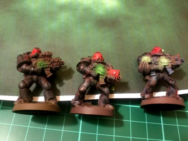
A praising mood? I wouldn't say that. (I have a tendency to be polite and kind when I'm tired - but that's ok, tomorrow I'll re-write my post in a less praising way )
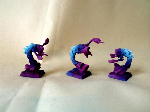
Of course it's just a start, but I like the concept of this base, and the dynamic movement of the tentacle is something I wouldn't have worked if I had not seen this.
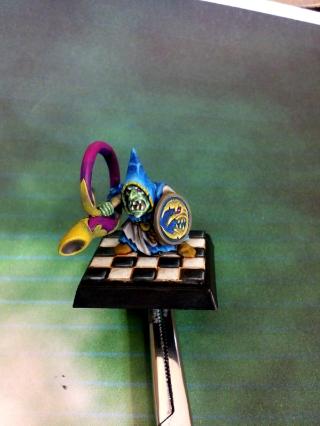
@ monkeytroll : Thank you, but... who is the Shadow?
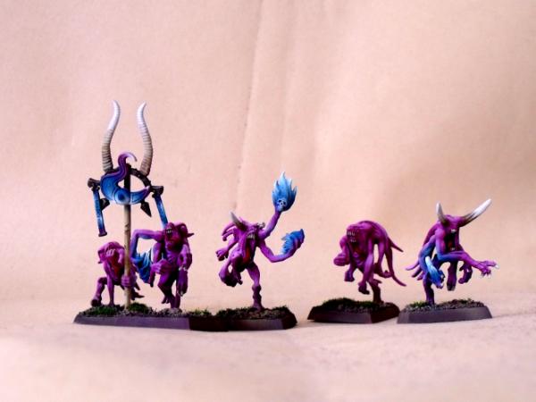
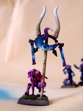
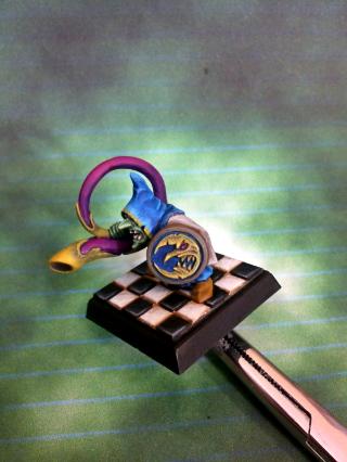
@ tipios : Nope, as Hyenajoe mentioned, there's a Skaven tail & a Pink Horror... Crest? Tentacle? Ponytail?
No worries about the tyre thing... I was just keeing the "joke" up!
Yggdrasil wrote:
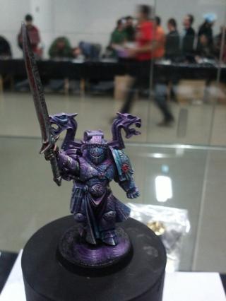
Kudos to you, good Sire... Actually that's what I had in mind : I want the "audience" to wonder about whether he's summoning a Daemon to his side ( Heretic!!! ) or uttering words of power to ward it off!!!
So... Am I on the right track?
Most definitely. You will need to put writing on the inside of the scroll though so it looks like the Inquisitor is reading from it, rather than showing it to someone
the other option is that you face the inquisitor away from the tentacles and have him/her/it being ambushed
endtransmission wrote:Most definitely. You will need to put writing on the inside of the scroll though so it looks like the Inquisitor is reading from it, rather than showing it to someone
the other option is that you face the inquisitor away from the tentacles and have him/her/it being ambushed
Ambush option isn't what I'd have in mind... But I really like the idea of writing something towards him!
There could be an Imperial litany on the front, while he's muttering some dark incantation he'd be reading from the other side!
Pretty ambiguous, thanks!!!
[edit : I had almost forgotten I had come here for the update !
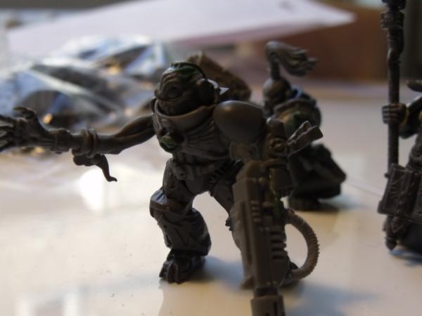
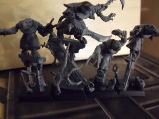
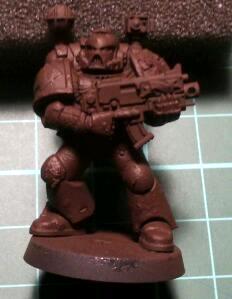
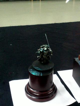
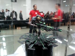
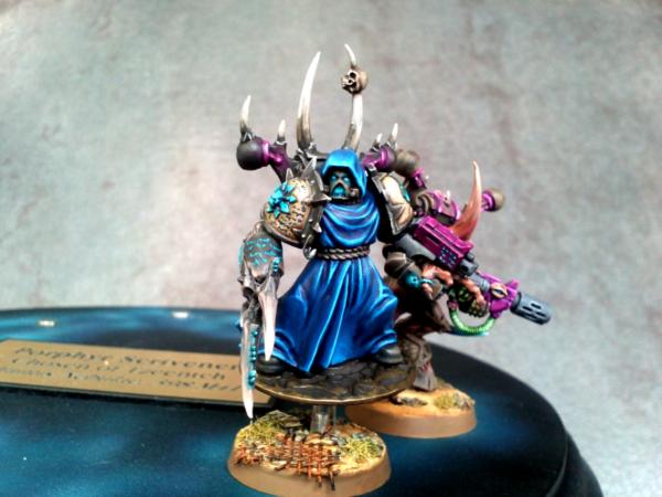
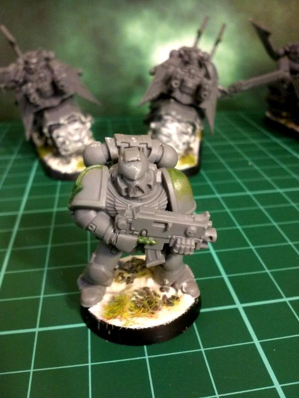
For those who wanted to see the Inquisitor on his base, here's a shot (no, he's not levitating, just not glued yet) :
At a terrified janitor in the corner of the room, just to stop him from whimpering too loudly
"Who knows what evil lurks in the hearts of men? The Shadow knows" Hahahahahahahaha
The Shadow was a pulp radio hero from the 30's who moved into books, comics and film (including one with one of the Baldwins in). A mysterious character with a scarf concealing his face. Plus a cool cape, a trenchcoat, a slouch hat and a pair of .45 automatics .
inmygravenimage wrote:I love the base - very cthulhu!
That was not the aim, but yeah!
Gitsplitta wrote:What's he pointing the gun at?
At the ground... The gun is pointing downside, while he's listing the charges against his quarry, but still visible so that his prey knows any wrong movement will result in instant, explosive death!
monkeytroll wrote:At a terrified janitor in the corner of the room, just to stop him from whimpering too loudly
"Who knows what evil lurks in the hearts of men? The Shadow knows" Hahahahahahahaha
The Shadow was a pulp radio hero from the 30's who moved into books, comics and film (including one with one of the Baldwins in). A mysterious character with a scarf concealing his face. Plus a cool cape, a trenchcoat, a slouch hat and a pair of .45 automatics .
edited to put the image tags in
A scarf & a pair of .45 are all it takes to turn anyone into a bada** hero, uh?
MajorTom11 wrote:Sweet Yggs! Really digging the head-mods, really took care of the 'oh, it's a servo skull' feeling!
Now, as much as I love your conversions, put the putty down and slap some paint on something, I miss the Yggsie paintjobs!
Thanks... I'll try painting a bit next week... But I have to admit the lack of spray undercoat is somewhat deterring me from getting to it... As I know the first thing I'll have to do is that boring white undercoat!
Empchild wrote:I'm definately a fan of the conversion work. Cheers Yggs.
Honestly, I think having to work within a defined perimeter forces you to be creative & resourceful! That's why I joined the Pimp My Wizard contest, because I knew that people would go to great lengths to turn those only 4 base models into scores of different yet great minis! And I'm glad I did lol, for I pretty like it too
Perhaps, he's trying to banish the squid tentacles...
Perhaps, he's trying to banish the large daemon who's in front of him, the only part of it that we can see being some underground tentacles trying to reach the Inquisitor from below, but being warded off by his psychic powers...
Perhaps, it's just the Chaos influence in this foul place that has horrid tentacles sprouting from the tainted soil...
Perhaps, it's his using of forbidden words of power that induce psychic & daemonic phenomena...
Or, perhaps... he's caught in the process of summoning a Daemon, and the "squid" is only the tip of the iceberg of what is being conjured to face his foe...
Do you think I should leave the front tiles (where the tentacles are) square, or file them to match the "roundness" of the base?
Knowing that I'll leave them square on the "back" of the base...
i'm a fan of breaking up shapes like that. I wouldn't go so far as to file them to roughly round, but possibly going with a basing mentality that Migsula tends to use in that using irregular shapes to help create a dynamic look.
Gitsplitta wrote:Perhaps... he's afraid of rats and one just scuttled across the floor so he's going to blast it with his bolter?
No, he's got his first retainer for that (see update below - I am Machiavel's hidden grand-grand-son Mwahahahahahaha). Well, hum.
grey_death wrote:i'm a fan of breaking up shapes like that. I wouldn't go so far as to file them to roughly round, but possibly going with a basing mentality that Migsula tends to use in that using irregular shapes to help create a dynamic look.
You're not helping me much here g_d... Do I round the tiles or not? A quick drawing from above, maybe?
Lord Kaesar II wrote:Psychic squid (from Outer Space!) summoned? Who questions the Inquisition?
Some nice conversion work as always. Kaesar II
Thanks!!!
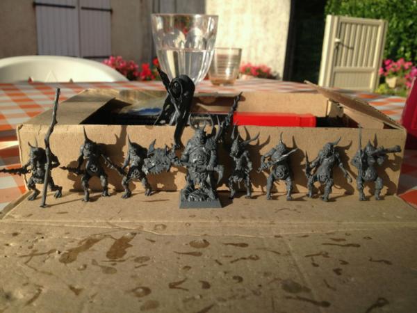
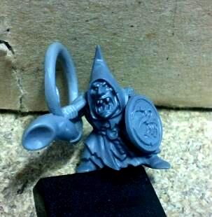
So, in advance I must say sorry for those who expected some paint... Tom, I swear I had planned to at least begin the undercoat, and then when looking for something in my (small) disposable & issued "wardrobe", I just noticed the Bretonnian Men-at-Arms, that Jin had sent me as part of a trade... and, one of them did match a cut-out Scout shotgun, whose arm I had used for my other scouts...
So I spend this weekend's free time in a feverish state, clipping, kitbashing, burrowing through my small bitz box, gluing, cutting (even my finger remembers that last part), and GSing....
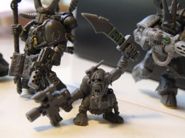
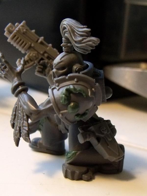
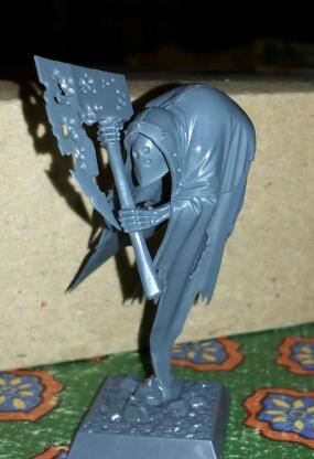
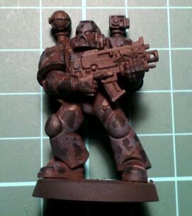
Here's yesterday's result, the first retainer of my yet-to-be-painted Inquisitor!
Ok, at first I had planned to leave his face as is, then I thought it would be funnier if he had night-vision goggles... Then, even funnier if he was heavily augmented with a respirator unit... These two details really turn it into a different mini, but I like it!
What do you think?
Ok, I'll try & post some better songs next time!
Oh, and I'm still after some advice for the Inquisitor base (see previous update), thanks!
[edit : I trust tipios' advice on the song (connection is too slow in here to see videos, so I just link at them hoping they're good) so here's another one (beware, old school French punk) : Bérurier Noir, Vietnam Laos Cambodge ]
Wow how have I missed this thread? Love what you've been doing Yggdrasil! You've got my head whirling about ideas on how to pose some Scouts for my KoB AND even thinking about making a random Inquisitor just for fun! I have to say, that Inquisitor is just all kinds of awesomeness. It just screams secretive agent to me. Cannot wait to see more. And stay safe!
My only issue is that he looks more like an acoyle or henchman than a full blown inqiisitor. I feel like a flowing cape or some such thing would make him more regal and match the powerful look of the other inquisitor. Right now he just looks like one bada** awesome henchmen.
tipios wrote:I like the retainer alot. Did you steal the wire from someones guitar out there
song - not clear enough to like or dislike
base - I think it would look better rounded off front and back, but if you need it square at the back, I would still round off the front.
Nope - I brought it down here, from my guitar strings bits kit lol!!!
Song - removed & replaced
Base - Yeah, I need it round at the back so that my Inquisitor has room for his feet... Thanks for the suggestion.
Mr.Malevolent wrote:Wow how have I missed this thread? Love what you've been doing Yggdrasil! You've got my head whirling about ideas on how to pose some Scouts for my KoB AND even thinking about making a random Inquisitor just for fun! I have to say, that Inquisitor is just all kinds of awesomeness. It just screams secretive agent to me. Cannot wait to see more. And stay safe!
Thanks! It happens sometimes... I usually only find new threads when they're on the front page (it already takes enough time, trying to follow all the ones I have subscribed to!), so I must be missing some gems around here too, that's for sure!! But, they... That's how it goes!
Thanks for the comments, and welcome in here!
Sageheart wrote:I love that man of arms, the face is great!
My only issue is that he looks more like an acoyle or henchman than a full blown inqiisitor. I feel like a flowing cape or some such thing would make him more regal and match the powerful look of the other inquisitor. Right now he just looks like one bada** awesome henchmen.
Make any sense?
Lol... Actually that's why I called him a Retainer ; he IS a henchman of the Inquisitor's retinue So I guess I aimed true uh?
I like it too. Some of the bits in terms of feel and volume don't fit so smoothly, but you can do a lot with paint to merge them and to draw the eye where appropriate. Looking forward to more!
migsula wrote:I like it too. Some of the bits in terms of feel and volume don't fit so smoothly, but you can do a lot with paint to merge them and to draw the eye where appropriate. Looking forward to more!
Wow, thanks for stopping by, migsula!
I guess you're talking about the Henchman. Well, the Brets definitely have a smaller scale than the 40k-typical human (how was it again? I hear 7ft over there? ), but I thought it looked too good with the Scout shotgun not to try....
As for reducing scale problems with painting, well that's... something I would've never even imagined, much less known how to achieve such a thing!
He'll be a test model for the Inquisitor paint scheme (yet to be determined, by the way)... I know I don't want to use the classical black + red + white that most Inquisition troops have, but apart from this, I still have to determine something!
He's been a bit "upgraded" since that pic : some purity seals on the shotgun, I tried to sculpt flesh around the cable which currently is his right arm to act as an augmetic arm, and a few bitz around the waist... I'm not sold on the GS, but, well... Pics maybe tomorrow!!
Gitsplitta wrote:Love the hat. (seriously)
Actually, I've been thinking about how to remove those feathers, but I also think it's what make the 40k universe so attractive : the discrepancies between high-tech parts (goggles, respirator, bionic arm) & the medieval atmosphere (feathers, wax seals & scrolls, reliquaries, etc...)!
There's so much great stuff in this blog I'm not sure where to start. The mix of Fantasy and Sci-Fi is a great way to make things unique, and an idea which I will be stealing soon... But the Scout Squad looks awesome for the character you've given whats traditionally very static miniatures.
I think Migs latest unit demonstrates a good way to go about bases with overhangs.
Thanks... For once, I do get the "idea" & "theory", but it doesn't help me much for this base lol... Well, I just cut the most protruding square (closest to us, between the rat tail and the tentacle), and I think that will be all. I'll ask for advice again, don't worry!
As for the retainer, I too like the pose. I think it's the fact the shotgun could be so "angled down" that made me want to do that mini! Looks much more realistic than the usual, horizontal, GW stance to me!
vent wrote:There's so much great stuff in this blog I'm not sure where to start. The mix of Fantasy and Sci-Fi is a great way to make things unique, and an idea which I will be stealing soon... But the Scout Squad looks awesome for the character you've given whats traditionally very static miniatures.
Great stuff
I probably have said this twice or more, but... that's the magic of the Land Speeder Storm sprues!!!
Thanks for the comment!
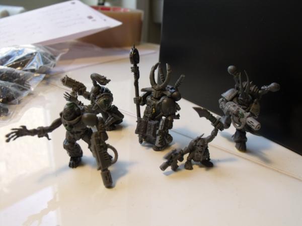
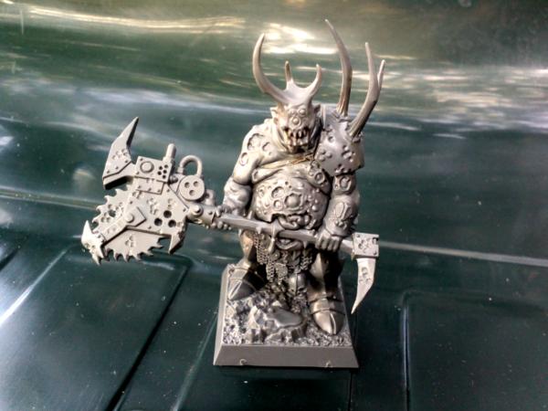
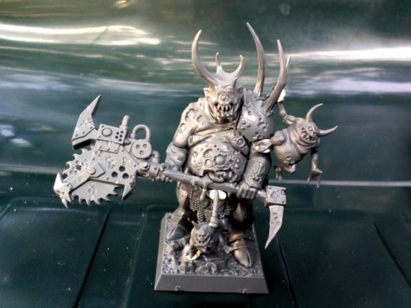
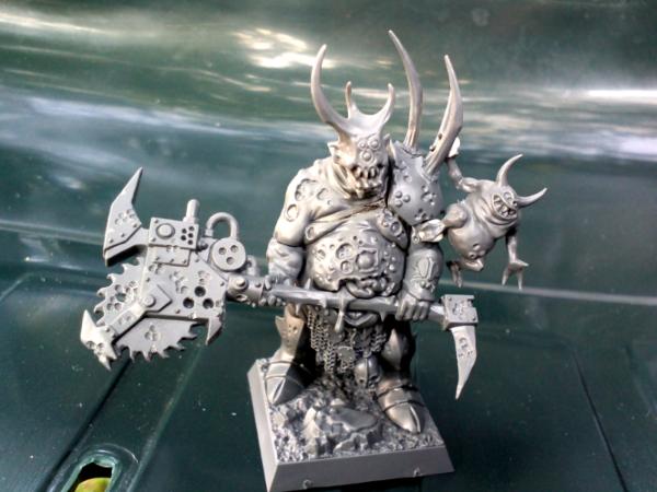
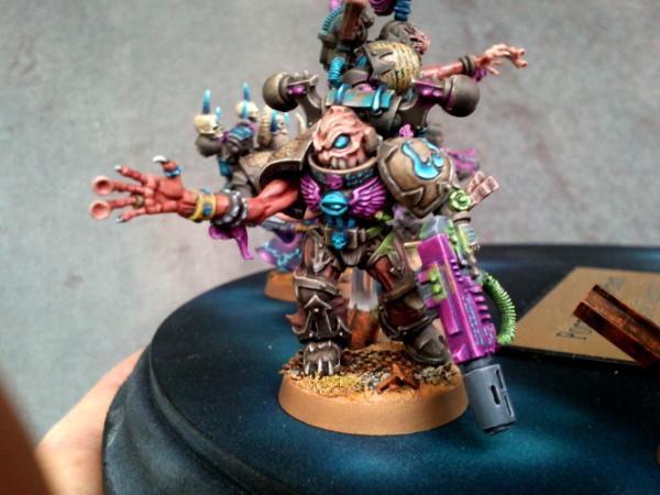
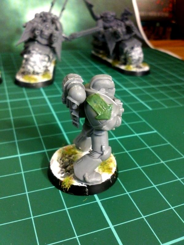
Here's today's update :
Retainer #1 ready to be glued on base (well, almost). Some pics from almost all angles, for those who want to see the "bizarre" proportions lol...
I'm still looking for something to put on that pierced, protruding thing on the backpack...
A close-up of the augmetic "arm/elbow"
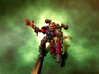
And, as I was on a good streak, started another Retainer... but a Servitor, this time! Still very WIP, but the concept is here :
Ok, so... Not so cool uh? I didn't want a balanced mini, hence the nailed plate that seals where his left arm should have been, and I had thought the Ork projector would do a nice head... But it seems kinda crappy like that, don't you think?
Any idea that could make it work? Could it even work?
While the spotlight easily works great for a ramshackle solutions deal like orks, it just doesn't quite click with me as a human construct. Perhaps if it was smaller and had a neck, like a dive helmet or some such, it would have greater appeal to me. Now the first retainer is still rather cool, even if he does have some wonky proportions. What even is the back pack on him from? I see an Inquisition symbol...
Get a picture of a FACE, then apply that to the 'lens' of the head via transparent decal sheet that you print up, after painting the lens white or bright greenopr bright purple or...
The effect will be ZOMG.
Alternatively:
Hollow out the head, put a color micro led inside (blue!), a couple of leads (you can leave them exposed! SERVITOR!) to the bottom of the base and a button cell battery. Then, put a clear piece of plastic sheet to be the new 'lens', but use SUPERGLUE, so the plastic cracks and frosts.
Great conversions. I'm really liking the =][= and retinue so far. I think DD had it right, for the latest retainer:
Dakka_Dok wrote:
Also, for the base, I think the uneven, non-round edge is better. Maybe add some plumbing or other "underground" features under the tiles (like a rat tunneling away from the squid).
Very cool.
Edit: The scouts are awesome, too, by the way... wait a tic! Is that a grot with a flamer!?
Lord Kaesar II wrote:While the spotlight easily works great for a ramshackle solutions deal like orks, it just doesn't quite click with me as a human construct. Perhaps if it was smaller and had a neck, like a dive helmet or some such, it would have greater appeal to me. Now the first retainer is still rather cool, even if he does have some wonky proportions. What even is the back pack on him from? I see an Inquisition symbol...
Kaesar II
Hey, thanks for the feedback... I think I'll leave that idea for a bigger frame, anyway, as the pics make me realize how awful it is... Well...
For the first retainer, the upper part of the backpack is a bit from the Ork Trukk kit (but I wouldn't know which part, as I've never built a Trukk lol), and the tank is the prometheum tank from a Grey Knight Incinerator... Hence the =I= icon!!!
Matt.Kingsley wrote: to the inquisitor (thank you insaniak for the jawdrop image )
and for retainer 1
and to retainer 2
Lol... Love that jawdrop!!!
And thanks!
Dakka_Dok wrote:The servitor made me think of the lenzers from Chronicle of Riddick. Cool stuff, love it!
Well, I hadn't thought about it, but yeah, that totally matches!!! Only they are a bit more "twisted" in Chronicles of Riddick, aren't they? Would probably fit better with ghouls I think...
Briancj wrote:Okay!
Get a picture of a FACE, then apply that to the 'lens' of the head via transparent decal sheet that you print up, after painting the lens white or bright greenopr bright purple or...
The effect will be ZOMG.
Alternatively:
Hollow out the head, put a color micro led inside (blue!), a couple of leads (you can leave them exposed! SERVITOR!) to the bottom of the base and a button cell battery. Then, put a clear piece of plastic sheet to be the new 'lens', but use SUPERGLUE, so the plastic cracks and frosts.
BAM!
--Brian
2nd idea seems pretty cool, but beyond my reach for now... and I have no access to a DIY store in here lol... But that's pretty nice!!! And the trick on the superglue is something to remember, thanks!
The Good Green wrote:Great conversions. I'm really liking the =][= and retinue so far. I think DD had it right, for the latest retainer:
Dakka_Dok wrote:
Also, for the base, I think the uneven, non-round edge is better. Maybe add some plumbing or other "underground" features under the tiles (like a rat tunneling away from the squid).
Very cool.
Edit: The scouts are awesome, too, by the way... wait a tic! Is that a grot with a flamer!?
I think he was right too, lol... But in a much worse version than in the movie, sadly...
For the base, I might try to add some "plumbing" as you said, could be cool... But I'm afraid I might screw it up, so... I'll have to think and try... Oh, by the way, I managed to source a small amount of bluetack on the base, so it will be easier now to figure out what I'm doing!!!
As for the grot... yeah, he's been recruited as a "slippin' eidgent" by the scouts... And wields a flamer pistol with crosshair / counts as the expendable flamer shot from the Sergeant's combi-flamer....
Some hints of fluff a few pages back!
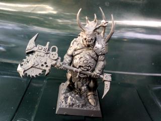
As for a quick update, I decided to put an antenna on the first retainer backpack, and finished the base, so here it is :
I've also tidied up my "hobby area" (yeah, that's an A3-sized area, so I cannot model AND paint, it's model OR paint, not both), as I've given up the second retainer...
Paint should be coming in the next days, but I'm still searching for a paint scheme... Any suggestion?
How about sort of mustard yellow, khaki and orange tones? All dusty and desert coloured. The mask on that guy makes me think of Sand People from Star wars.
Too bad about that servitor, I liked the concept. As for paint, maybe a lighter brown overcoat, a darker brown tunic and red on his collar thing and the hems?
for some reason I didn't catch you said he would be a henchman! I feel stupid haha
I love the backpack and the goggles of the shitgun wielding henchman.
I'm not feeling the servitor's head though. Plumping would be awesome.
On terms of painting scheme I would go for the same colors as your chaos marines, but less pink, maybe a red, or a dark blue. I see these models as needing a dark look. Just me personally.
inmygravenimage wrote:I like the da theme. Much as I love your Tzeentch theme, I think it needs to be distinct from that.
Mr.Malevolent wrote:I agree with inmygravenimage definitely go with the DA scheme and try to keep distinct from your Tzeentch scheme.
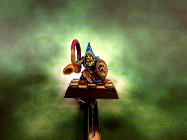
Ok for distinct... I begun trying the beige & green scheme yesterday, but I think it won't be "flashy" enough for such a small piece, and will tend to be quite dull...
What if I turned to a Flesh Tearers - like one ? Robes in red, smaller fabric in black, details in flashy green? I'm almost set on that one, and will be a good test...
Of course, that means I'll have to re-do what I've done so far, but...
PDH wrote:The Inquisitor and the first Retainer are
The retainer is great and reminds me of the painting in the Dark Heresy rulebook of the Imperial Guardsman.
Peter
Yeah, somewhat!! I hadn't thought about it, but might have inspired me! That pic is, as far as I remember, the best drawing I have ever seen for a guardsman... So Epic!!
Sageheart wrote:for some reason I didn't catch you said he would be a henchman! I feel stupid haha
I love the backpack and the goggles of the shitgun wielding henchman.
I'm not feeling the servitor's head though. Plumping would be awesome.
On terms of painting scheme I would go for the same colors as your chaos marines, but less pink, maybe a red, or a dark blue. I see these models as needing a dark look. Just me personally.
Don't feel stupid, on the contrary : you were spot on!!!!
Given up the servitor (wrong proportions) and the plumbing (too complicated, no "suitable" parts in here)...
As for the paint... What do you think of the one I've just thought of? Ok, I knew I mentioned I didn't want the white / black / red, but... "only fools cannot change their mind" (that's a French expression, do you have the same?), and "there is no white in the one I'm thinking of"
Changing your mind in the U.S. = weakness or lack of moral character. Of course this does not invalidate the truth of the French saying... but myopic single-mindedness is generally considered a virtue in the 'States.
Gitsplitta wrote:Changing your mind in the U.S. = weakness or lack of moral character. If course this does not invalidate the truth of the French saying... but myopic single-mindedness is generally considered a virtue in the 'States.
Is that why you kept hammering Iraq even after you knew there were no WMDs in there? Sorry, that's just a free payback for the anti-French flak I weathered a month or so ago...
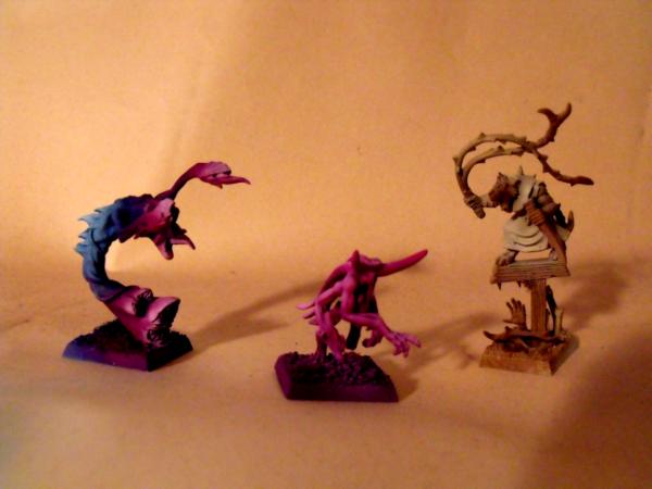
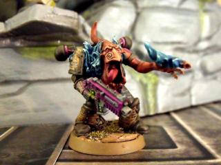
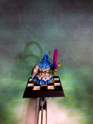
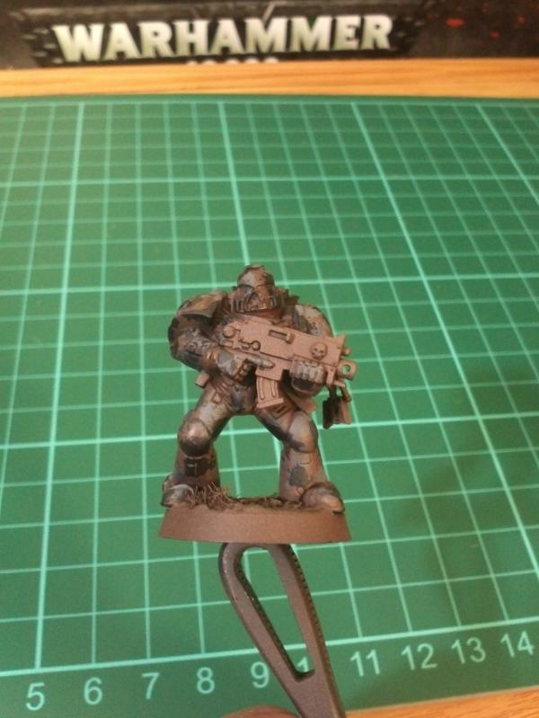
More seriously, I've tried another paint scheme on a "test model for the test model", and here they are...
Bad lighting & awful background (the sheets of my bed were hanged up to dry, sorry), but I hope you get the colours....
Yeah, it is that bad... Both of them.
So I don't know what colours to try... Or do I try my Achlysian Reavers scheme? Beige, Brown & Teal/Turquoise?
Gitsplitta wrote:Aren't those Sponge Bob Square Pants sheets?? My 7-year old has a set of those. Are those standard issue in the French military now??
*right back at 'cha!*
Actually, no, that's only the regular mattress, which is standard issue for BOTH the US & French armies in here
Oh, btw, as mentioned in my previous post, the "sheets where hanging up to dry", but I guess I cannot expect a backwater, grumpy Wisconsin-dweller to know how to read properly ....
Gitsplitta wrote:I like teal/turquoise... on pretty much everything. Offset it with the subtle shades on the henchmen... or go with a sea-green as the alternate color.
Green was close to that I wanted, but I'm not sure I could pull it off properly...
Maybe I'm a bit rusty after those months without painting...
Yggdrasil wrote:Actually, no, that's only the regular mattress, which is standard issue for BOTH the US & French armies in here
Oh, btw, as mentioned in my previous post, the "sheets where hanging up to dry", but I guess I cannot expect a backwater, grumpy Wisconsin-dweller to know how to read properly ....
Actually that part was an honest mistake on my part (intentional flaming aside), I thought that pattern in the back was the sheets that were hanging up to dry. Never seen a patterned mattress before.
I think you could pull off ocean greens and blues with no problems, and given your current situation... you might find it rather fulfilling.
I don't mind the guy on the right. The red robes ended up looking better than I thought they would.
ocean greens and blues, as Git says, wouldn't be a bad idea either. I am kinda interested in that red thought, I think it can look pretty good if you find out what colors to pair it up with. Maybe a gray instead of black?
The 1st retainer looks very very nice with the finished base. Can't wait to see him finished!
I do like the concept for the second retainer a lot. Maybe a sturdier body - like an ork's - would be a more natural combination?? A huge ammo hopper bolted where the other arm should be? But who cares, 40k is about finding that odd ground between well fabulously odd and too odd
I think that the second retainer looks good with the smaller body, to more strongly contrast the big arm and head, though the ammo hopper idea is fantastic.
I'm just catching up on threads I've missed... The henchman is looking brilliant. A squad of those done up with hotshot lasguns would make great stormtroopers.
As for colour scheme... I really like the sand/green colours for the henchman. Maybe swapping the green for a turquoise would be interesting?
Yggdrasil wrote:Actually, no, that's only the regular mattress, which is standard issue for BOTH the US & French armies in here
Oh, btw, as mentioned in my previous post, the "sheets where hanging up to dry", but I guess I cannot expect a backwater, grumpy Wisconsin-dweller to know how to read properly ....
Actually that part was an honest mistake on my part (intentional flaming aside), I thought that pattern in the back was the sheets that were hanging up to dry. Never seen a patterned mattress before.
I think you could pull off ocean greens and blues with no problems, and given your current situation... you might find it rather fulfilling.
Well, I guess they must be cheap, locally-made (or China-imported) mattresses, hence the colours & overall low quality... But, hey, better than a camp bed!
I might try blue instead of green, yeah... Will try that probably...
Sageheart wrote:I don't mind the guy on the right. The red robes ended up looking better than I thought they would.
ocean greens and blues, as Git says, wouldn't be a bad idea either. I am kinda interested in that red thought, I think it can look pretty good if you find out what colors to pair it up with. Maybe a gray instead of black?
Lol... Thanks... Actually the black is heavily highlighted to grey (or gray? Is that a UK/US issue again?)... I think the red looks better on the pic than in reality though...
inmygravenimage wrote:Leaving aside for the moment the fact that you are far too hard on yourself, how about either a kind of prussian blue scheme, or a French WWI scheme, as many folk do dkok?
Lol... I've always found the WWI French scheme pretty awful - and silly. Did you know the French generals considered the use of camouflage "dishonourable" at that time? How silly is that? Of course, our back-then foes had a much more sensible approach to warfare...
The Good Green wrote: THat's a fantastic idea to model the one-shot combi weapon! Consider it stolen... and I'm ashamed I haven't thought of it already
Great work.
Lol... Sure mate, consider it yours! Am I'm pretty sure you'll receive less "eyebrows" than me!!
migsula wrote:The 1st retainer looks very very nice with the finished base. Can't wait to see him finished!
I do like the concept for the second retainer a lot. Maybe a sturdier body - like an ork's - would be a more natural combination?? A huge ammo hopper bolted where the other arm should be? But who cares, 40k is about finding that odd ground between well fabulously odd and too odd
Thanks. I like the concept too, and I've always liked people using Ork (or Orc) bodies for overmuscled mutants... The bearded Zombie head is also very fitting with the "all brawn, no brain" concept... Unfortunately I don't have many Ork parts here aside from the Runtherdz I got with the Grots box, but he's in a pretty static stance, so I'm not sure...
And I also agree with you on the 40k universe... You have that magical ability to "walk the line" with great vision!! I just... try and make do!
prime12357 wrote:I think that the second retainer looks good with the smaller body, to more strongly contrast the big arm and head, though the ammo hopper idea is fantastic.
As for the ammo hopper thing, I'm not sure I get the concept... How would the rounds go from one side to the other?
endtransmission wrote:I'm just catching up on threads I've missed... The henchman is looking brilliant. A squad of those done up with hotshot lasguns would make great stormtroopers.
As for colour scheme... I really like the sand/green colours for the henchman. Maybe swapping the green for a turquoise would be interesting?
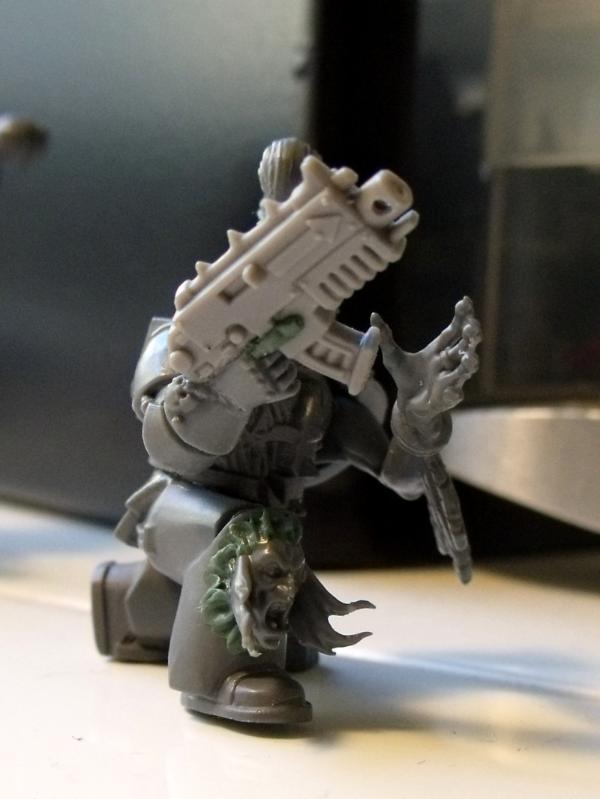
I think part of the charm of that retainer is the fact that it's (I think) the champion's body : his right arm is raised, probably supposed to wield a sword or something, whereas his subordinates have pikes. That raised right arm allowed the shotgun to be much more angled down than on most minis.
Also, that makes me notice I forgot about sculpting the forefinger off the trigger... Damn !
On a more general term... I haven't been able to get myself to paint : as I am not happy with either scheme, nor do I want to screw the first retainer, I'm pretty much stuck...
I'll probably try and turn the green basecoat into a Necron Abyss basecoat, and see what happens... What colour for the details then? Purple? Red? Flashy Green?
I like the color scheme. Clean and crisp and bright. But I'm wondering... aren't Inquisitors supposed to be all grim-dark-on-the-brink-of-madness-holy-avenger and all? This guy looks like he could sell balloons at an amusement park.
I like that color scheme a lot. I think he does look a bit cheery as inmygravenimage stated, but I don't mind. I think the weapons and skulls and other such tid bits can make him look less like a nice friendly neighbor and more like a killer. Maybe if you dirty up his clothes as well, give him a base full of messedup landscape, etc.
The Inquisitor's dark-and-mad-and-bad-and-grim, his retainers are nice and bright and cheery so the bad guys don't bother about them till they get a las-bolt in the neck from one "I thought you'd be nice, you're wearing a Wallace & Grommit tie..."
I also feel like the whole concept of an inquisitor is to be grim dark but have a entourage of various unusual characters. Some flashy colors could also give that off-worldly concept that comes along with the grim dark view of the inquisitors.
Gitsplitta wrote:I like the color scheme. Clean and crisp and bright. But I'm wondering... aren't Inquisitors supposed to be all grim-dark-on-the-brink-of-madness-holy-avenger and all? This guy looks like he could sell balloons at an amusement park.
Thanks for the visual metaphor Git, I can only see him as a clown by now...
inmygravenimage wrote: I agree though, he's a bit... cheery.
Sorry, we're not helping much, are we?!
Indeed, that's not helping much...
Sageheart wrote:I like that color scheme a lot. I think he does look a bit cheery as inmygravenimage stated, but I don't mind. I think the weapons and skulls and other such tid bits can make him look less like a nice friendly neighbor and more like a killer. Maybe if you dirty up his clothes as well, give him a base full of messedup landscape, etc.
Well, the bases should be the now-usual tiles, sand, rusted fence & dried grass... Would that be enough?
monkeytroll wrote:I like that scheme.
The Inquisitor's dark-and-mad-and-bad-and-grim, his retainers are nice and bright and cheery so the bad guys don't bother about them till they get a las-bolt in the neck from one "I thought you'd be nice, you're wearing a Wallace & Grommit tie..."
I'm not sure that reference is helping me either... lol...
PDH wrote:Nicely painted but I preferred the earlier colour scheme.
Thanks Peter, that's quite honest...
Sageheart wrote:I also feel like the whole concept of an inquisitor is to be grim dark but have a entourage of various unusual characters. Some flashy colors could also give that off-worldly concept that comes along with the grim dark view of the inquisitors.
That's a really, really good point Sage, thank you... At first I had planned to have all the retainers be in the same colours, but I now realize I was mistaken all along ! As you mentioned, the "unusual characters" look much better when they look like a "ragtag bunch of misfits", especially for Inquisitors of Radical inclination...
So, in all I both hate & thank you...
Hate you, for now I'm still stuck with an unpainted Inquisitor and no paint scheme for him.
Thank you, for without your warnings, I would've ended up with a clown-looking Radical Inquisitor, whose favourite combat technique would be to make his opponents die out laughing at him / not really grimdark...
So, the question still stands : how can I paint it? Do I stick with the plain, usual red robes / black (or grey or gold) armour ?
tipios wrote:Maybe you should try a darker blue scheme.
Well, considering today's trial, I don't really know anymore, honestly...
inmygravenimage wrote:Perhaps a motley? A mix of ragtag colours? Indeed, they could be his motley crew
That would probably be funny if I knew what a motley was (I know the band, but never thought "mötley" actually meant something )
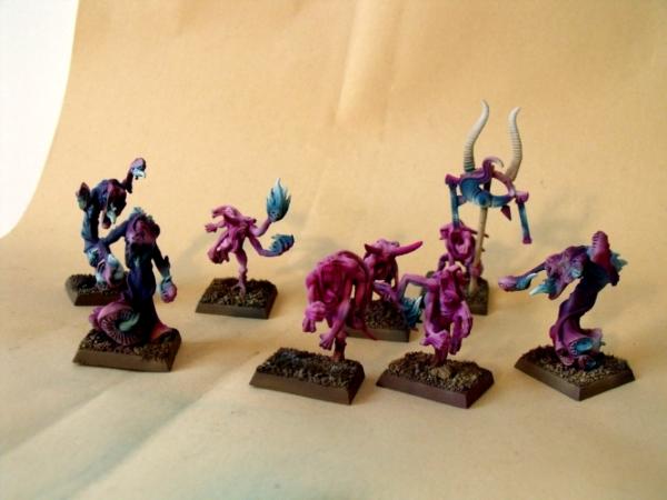
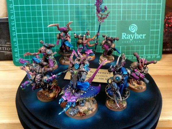
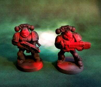
I tried another test model, and I feel quite... depressed & fed up with those, actually... I think I'm going to give up that Retainer, that Inquisitor, and all the stuff around... At least I know how to paint my Tzeentchian Marines & Achlysian Reavers...
Or I might try the *few* Skavens I've brought along?
Anyway, here's the latest disaster :
I think I'm done with them.
[edit : if someone can link the youtube video of Slipknot - Disasterpiece, I'd be grateful... This would be the perfect song of the day]
I'm happy I can alter your thoughts Hopefully the good was better than the bad XD
Dark blue seems nice for the inquisitor. Maybe a combat-swat look, with dull grays and browns. I think you should go for a darker scheme for the Inquisitor, try to get a grim shadowy look to him, and then have the other characters who follow him around be whatever the mood strikes you so that they get that feeling of unusual characters.
Though I think if you go brown, you have to go with darker colors, that red and brown scheme on that last model doesn't fit for me.
Here is some pics I thought might help, they are not my own:
This is kinda what I was thinking in terms of Combat-squad look, or a darker very police-man look instead.
And here is some flashy colors I think look great:
Just for those of us who are being a little slow Yggs, could you explain why these are a 'disaster'?
Unless the Inquisitor has a fixation on 'shock and awe' tactics I see no need for his personal retinue to be colour co-ordinated, just because most units we paint tend to be that way. Your only real issue seems to be coming up with a scheme for the =I= himself.
inmygravenimage wrote:I quite like that actually! A motley is a muddle, a mix of scraps of fabric, a patchwork - that make more sense?
Ok, thanks ... "patchwork" is the same word in French, so that I can understand at least lol...
But... What do you like? The latest red/brown model?
Gitsplitta wrote:Excellent. My thought was just lose the white. Your solution is an excellent one.
What if I don't like it?
Sageheart wrote:I'm happy I can alter your thoughts Hopefully the good was better than the bad XD
Dark blue seems nice for the inquisitor. Maybe a combat-swat look, with dull grays and browns. I think you should go for a darker scheme for the Inquisitor, try to get a grim shadowy look to him, and then have the other characters who follow him around be whatever the mood strikes you so that they get that feeling of unusual characters.
Though I think if you go brown, you have to go with darker colors, that red and brown scheme on that last model doesn't fit for me.
Here is some pics I thought might help, they are not my own:
This is kinda what I was thinking in terms of Combat-squad look, or a darker very police-man look instead.
Hope this helps!
Yeah, thanks for the trouble Sage! I like the one I've kept in the quote, but I'm not really onto the dark blue... And the "flashy" Eisenhorn would suit graven's description of a mötley nicely, don't you think?
I don't like the red/brown either, so don't worry... Though I'm not sure I can manage the same effect as on the first Inquisitor Lorr : the brown being blended into a red in the highlights, and the black into purples... Pretty nice TBH...
monkeytroll wrote:Just for those of us who are being a little slow Yggs, could you explain why these are a 'disaster'?
Unless the Inquisitor has a fixation on 'shock and awe' tactics I see no need for his personal retinue to be colour co-ordinated, just because most units we paint tend to be that way. Your only real issue seems to be coming up with a scheme for the =I= himself.
Well, the issue is I'm trying to find a scheme for the Inquisitor by testing some on the Bretonnian Men-at-Arms... And I still haven't found one that I like, either for the Inquisitor, or even for the Retainer with shotgun....
And I'm beginning to get sick of that... I'd like to paint them, but I'm pretty stuck now... And don't want to waste another model with yet another crappy paintjob...
My will for painting seems to be temporarily fading away, and that saddens me...
I would just prime the inquisitor, and start figuring out painting for part of him at least, maybe the rest will come as you go?
I like the flashy look, but can see what it may not work. (IT would def fit Graven's concept, which is why i posted it)
I'm happy you liked at least one of the pics I posted I love that model for the slight color changes/blending that you pointed out. Though that would be insanely hard to do, (at least from my POV) I still the model shows an interesting use of black and brown to give him a rugged look.
Your will for painting will come back! I lose it all the time, but it always scrabbles back by the end of the week . My issue is gather photos for any sort of P&M bloog lol.
I like the red brown very much; crucially, I can also really see it on a Chimera - which is a worthwhile investment btw. Re: frustration - change tack, do something different (I appreciate you're limited in terms of raw materials though) - I dealt with burnout on the Mentors by switching to GKs for a bit. I think, though, your frustration is the palette problem.
Like PDH said, I think that the red might be more suited for Inquisitorial forces than the blue, or maybe something darker and more gothic with one or two striking colours.
Gitsplitta wrote:Excellent. My thought was just lose the white. Your solution is an excellent one.
What if I don't like it?
Therapy my friend, therapy.
Yggdrasil wrote:Well, the issue is I'm trying to find a scheme for the Inquisitor by testing some on the Bretonnian Men-at-Arms... And I still haven't found one that I like, either for the Inquisitor, or even for the Retainer with shotgun.... And I'm beginning to get sick of that... I'd like to paint them, but I'm pretty stuck now... And don't want to waste another model with yet another crappy paintjob... My will for painting seems to be temporarily fading away, and that saddens me...
Then set it down Yggs. I do that frequently. If something just isn't working or I'm uninspired on a figure that is important to get right... I just lay them by for a while until I have a "fresh mind" and am ready to come back to them. Go back to your scouts for a while... let the inquisitor just roll around in the back of your head for a bit.
First, sorry for the late replies, it's been quite rude... But I didn't have the heart to look back at that Plog - a bit depressing, TBH...
Still, here we go :
Sageheart wrote:I would just prime the inquisitor, and start figuring out painting for part of him at least, maybe the rest will come as you go?
I like the flashy look, but can see what it may not work. (IT would def fit Graven's concept, which is why i posted it)
I'm happy you liked at least one of the pics I posted I love that model for the slight color changes/blending that you pointed out. Though that would be insanely hard to do, (at least from my POV) I still the model shows an interesting use of black and brown to give him a rugged look.
Your will for painting will come back! I lose it all the time, but it always scrabbles back by the end of the week . My issue is gather photos for any sort of P&M bloog lol.
Well, he is primed... But I really don't wanna screw him... And I've given up trying to find a solution for the Pimp My Wizard contest, so I think I'll just leave him aside until I get home... Not that it brings joy to me, but I don't see any other way! I also don't think I could pull out the paint scheme of that inquisitor... My grey / light brown / black paintings always seem dull to me, though I do love them... Can't figure out why!
PDH wrote:
Thanks Peter, that's quite honest...
Sorry I was in a rush but wanted to post . Perhaps I should have added my reasoning:
I think the red looks much more inquisitorial than the blue.
Agreed on that, at least... I didn't want some classical, inquisitorial red, but I'm afraid I'll have to get to it!
inmygravenimage wrote:I like the red brown very much; crucially, I can also really see it on a Chimera - which is a worthwhile investment btw. Re: frustration - change tack, do something different (I appreciate you're limited in terms of raw materials though) - I dealt with burnout on the Mentors by switching to GKs for a bit. I think, though, your frustration is the palette problem.
Indeed... Though I brought a lot of paints with me ! Much more than I'll use, yet I still can't decide which to choose... But your advices has been taken into account, and I've changed with doing something different : begun to play Command & Conquer 3 (I fell in love with Jennifer Morrison lol... I thought she was... quite ok in Dr. House, but in that game I find her more than really pretty lol), begun reading The First Heretic (awesome book... I'm devouring it!), and... the small side project below lol...
LiveforFun666 wrote:Like PDH said, I think that the red might be more suited for Inquisitorial forces than the blue, or maybe something darker and more gothic with one or two striking colours.
And yes nice models : D eagerly awaiting more
Cheers
Thanks, here's more (though not really =I=-ish lol)...
Gitsplitta wrote:Then set it down Yggs. I do that frequently. If something just isn't working or I'm uninspired on a figure that is important to get right... I just lay them by for a while until I have a "fresh mind" and am ready to come back to them. Go back to your scouts for a while... let the inquisitor just roll around in the back of your head for a bit.
As I said, I took your advice into account : I've worked on a Plague Marine, that I bought from Mannahinn a few weeks back...
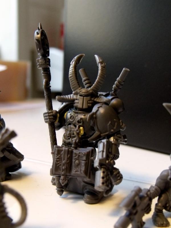
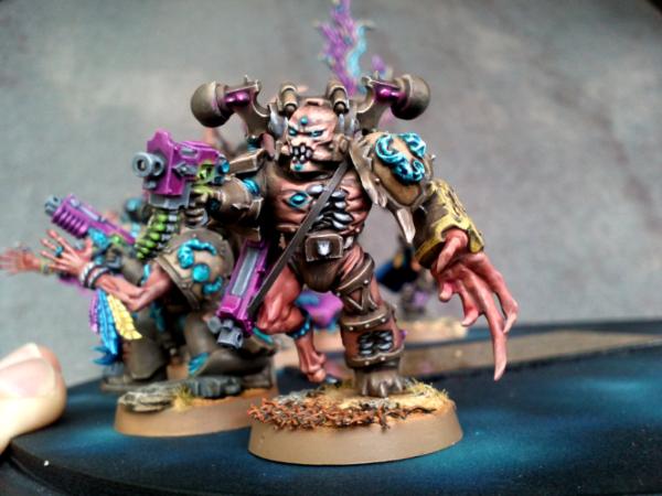
I didn't want the quite usual thing, so I added a few GS things... And yes, he's having a few BA bits, but that's because of the Chalice thing... I intend to base part of my fluff on a gigantic Space Hulk called "the Chalice of Void" : Eldar would revere it as a key to one of their prophecies, the Achlysian Reavers as their... well, youl'll know later, the Plague Marines as one of their wards on their path to decay... Hence the BA chalices on his shoulder pad & backpack !
Enough talk, here are the pics ([edit]FOUR[/edit] of them, but... you know!) :
As usual, I still don't know how to paint them... But suggestions & comments are welcome!!!
Oh, see?? He's just way cool Yggs.... you just needed a mental break from your conundrum. The extra GS work really makes him stand out while bringing all the disparate bits together into a cohesive piece. Very well done!
I like the white/bright blue colours, though it does scream ultra puritanical... which doesn't quite fit the more radical slant for your actual inquisitor model. As a henchman though, I think it's fine. In some of the DH books it suggests that the more radical an inquisitor gets, the mode he surrounds himself with puritanical henchmen in order to distract people. Alternatively he could be conscripted from a Royal guard somewhere, where a bright uniform would be expected.
For the inquisitor though...
Red/white has likely become the traditional inquisitor colour scheme as historically they were richer colours for the nobility, or people with enough money to show off.
The browns, to me at least, represent a more honest, level headed inquisitor that doesn't go in for showy entrances, they work on the streets where rich colours would single them out and make it easier to track them.
How about investigating more of a rich purple/grey/turquoise colour scheme with lots of dirt? It's still in the same "Royalty/Rich folk" area, but it's darker and fits the more heretical/falling/possibly on the run stance of your inquisitor?
I can understand needing to take a break from painting something while you rethink an approach. Why do you think my guard aren't painted properly yet? Nothing is ever a failure, it's all a learning experience... so don't feel down about it all.
Good to see back mon frère. Love the plague marine - please do the spike on the bolter as a Tongue, or worm, or something - just not a tusk, the way they always are! I always fancied doing White nurgle scheme, something like bestial brown/liche purple/skull White, in an attempt to make something really worm-like and pallid. Would love to see that in your expert hands - also, green/brown nurgle is so passé...
Gitsplitta wrote:Oh, see?? He's just way cool Yggs.... you just needed a mental break from your conundrum. The extra GS work really makes him stand out while bringing all the disparate bits together into a cohesive piece. Very well done!
Hey, maybe I did need a break... I'm still sad at the retainers, especially since they keep taunting me, unfinished, from where I left them on my desk...
But thanks ! Hope you'll like the colours !
tipios wrote:Thats nice work Yggs. How about simliar colour to your tzeentch, the armour colour looks nurgly, or you want to go for something different?
Hey, I think I might try that for another one... Well, honestly, your post did make me consider it, while it hadn't even crossed my mind ! Wait for the next one, this one will be different lol !
endtransmission wrote:I like the white/bright blue colours, though it does scream ultra puritanical... which doesn't quite fit the more radical slant for your actual inquisitor model. As a henchman though, I think it's fine. In some of the DH books it suggests that the more radical an inquisitor gets, the mode he surrounds himself with puritanical henchmen in order to distract people. Alternatively he could be conscripted from a Royal guard somewhere, where a bright uniform would be expected.
For the inquisitor though...
Red/white has likely become the traditional inquisitor colour scheme as historically they were richer colours for the nobility, or people with enough money to show off.
The browns, to me at least, represent a more honest, level headed inquisitor that doesn't go in for showy entrances, they work on the streets where rich colours would single them out and make it easier to track them.
How about investigating more of a rich purple/grey/turquoise colour scheme with lots of dirt? It's still in the same "Royalty/Rich folk" area, but it's darker and fits the more heretical/falling/possibly on the run stance of your inquisitor?
Well, I hadn't thought of the Puritan retainers for radical Inquisitor either (nor had I noticed it in the DH books I've read), but that's quite interesting indeed.
The red / white you pulled out on your amazing pimped Inquisitor screams =][= out loud, but I wanted something less... "flamboyant"?
I'd be tempted by browns, blacks and greys, but I'm not sure I could do something good with that... As the "brown" retainer taught me.
I also had thought about a purple robe, but it'd probably look too Chaos-y... As for the grey, when I imagine grey coat / robe, I just picture Covenant (as he was painted by GW for the Inquisitor 54mm game), which I... didn't like.
But yeah, something decadent would be the way to go... I just have to find how !
endtransmission wrote:I can understand needing to take a break from painting something while you rethink an approach. Why do you think my guard aren't painted properly yet? Nothing is ever a failure, it's all a learning experience... so don't feel down about it all.
Well, I'm not sure I learnt something from those three retainers. Except maybe how faster it is to paint models without details ! It's too bad I take hours to customize my models : I could have them way quicker to be painted lol !
inmygravenimage wrote:Good to see back mon frère. Love the plague marine - please do the spike on the bolter as a Tongue, or worm, or something - just not a tusk, the way they always are! I always fancied doing White nurgle scheme, something like bestial brown/liche purple/skull White, in an attempt to make something really worm-like and pallid. Would love to see that in your expert hands - also, green/brown nurgle is so passé...
Sorry bro, it's already too late... Well, not the painting, but the modeling... Or maybe I should try and do it as a deep red tongue ?
Your white & purple scheme appeals to me to, I might try that for another model... I still have three bare ones here lol ! ! !
Rogue Wolves wrote:aww Yggdrasil we've missed you! Model looks great a very nice change from the usuall Plague marine
Hey thanks ! I didn't know I would be... missed ? But that's nice words, so thanks !
Dakka_Dok wrote:Love the plague marine!!
How do you like it now ?
Here are the pics of the paint in progress. Don't expect your regular, sickly Nurgle colours, though... Please just don't tell me he looks as a clown, as it was how someone heartbreakingly described the beige & turquoise retainer - well, he was quite right, sure, but that hurt lol...
I'm feeling like calling it a day for both the turquoise & plain armour parts, what do you think ?
I'd still have to deal with the charadon granite parts, and put a bit more fleshy colours (red, purple) into the armour holes / wounds... I'm thinking of adding a few sick green details, but I'm not sure it'd be nice... Any other suggestion ?
some more red maybe? Especially in the wounds so it seems like they are weeping. I feel like maybe red and green would pull that color scheme together but you're really challenging yourself! But not a sickly green, more like a verdigris weathering or wash? It makes me think of old copper which kind of ties into Nurgle in weird way.
Looks good so far Yggs. I'm thinking red/purple will help bring it together, not sure about a bright green, but meade's idea of a verdigris type tone is interesting.
Day then month in the title makes my American mind confused
Love this latest model... brown/blue is my favorite color combinations and I love the unique tones you chose. Especially for nurgle... I really dislike seeing the standard green used on them so frequently.
Looking forward to seeing it finished (I'm guessing just the shoulder pad and the weapons to go?)
Gitsplitta wrote:He looks really good Yggs. Yeah, I think the turquoise and armor can be considered done. The challis on his shoulder pad is especially well done.
Hey, thanks... I do enjoy the chalice on the shoulder pad, much less the one on the backpack... Do you feel the same ?
Meade wrote:some more red maybe? Especially in the wounds so it seems like they are weeping. I feel like maybe red and green would pull that color scheme together but you're really challenging yourself! But not a sickly green, more like a verdigris weathering or wash? It makes me think of old copper which kind of ties into Nurgle in weird way.
Actually I've already trying gaping wounds with sticky blood coming out of it on a previous model :
But it didn't seem to "please the crowd" that much (see votes)... And I don't have my magical Tamiya Blood Paste in here, and cannot go off it now that I've tried it lol !
But, yeah, I still think that scheme was pretty cool ...
As for the verdigris, I'm not sure it would look good, as it would be *yet* another layer of Hawk Turquoise, while there's already plenty on the model...
monkeytroll wrote:Looks good so far Yggs. I'm thinking red/purple will help bring it together, not sure about a bright green, but meade's idea of a verdigris type tone is interesting.
You're right, bright green would probably look off... I'm thinking of rusty orange, whaddya think ?
RiTides wrote:Day then month in the title makes my American mind confused
Love this latest model... brown/blue is my favorite color combinations and I love the unique tones you chose. Especially for nurgle... I really dislike seeing the standard green used on them so frequently.
Looking forward to seeing it finished (I'm guessing just the shoulder pad and the weapons to go?)
Sorry mate... At first I had done it the other way round, but then I was the one confused lol... And I've seen plenty of threads with the date in "European" style, so I thought it was not that important... Or I could go back to the "nato" writing : 10SEP2011 ?
I don't like the usual green on Nurgle models either... That's why I chose something a bit different !
And I still have to paint the base too... Shouldn't be too long, but my current technique for the base includes lots of washes layers, so it takes time to dry between each layer...
Anyway, I made some progress on it this afternoon. He's still unfinished, but I decided that the third contrasting color would be a rusty orange, on most metallic parts (chainsword teeth, cables, etc...). TBH it looks better than I thought, and matches the turquoise in a great way !
As for the shoulder pad, I'm less happy... I tried to blend the "wounds" from the base Charadon Granite to Dwarf Flesh, then highlighted with Bleached Bone, but it just doesn't click... I should try and take a pic for advice....
I'll try to get them tomorrow... Well, no, probably the day after tomorrow...
Ok, lol... Still, I got a bit lazy, and didn't want to do it all over again... So it'll stay as is lol... Maybe on the next model, I'll try and do it with the orange rust ?
RiTides wrote:Rusty orange sounds like a perfect complement to the colors on the model! Looking forward to seeing it
And no problem about the date format, it just caused me a moment's panic of "Wait, is it October already!?"
I've taken the pics, just have to download them from the camera & upload in the gallery... Should be up tomorrow !
inmygravenimage wrote:Looking superb mate, and old papa nurgle allows for rainbow corruption I'm sure! What about the blood drop details? Pus, perhaps?
Have you seen blood drops somewhere ? Well, except on the chalice of course
Model is actually finished, looks better than what I expected. I'm still unhappy about the flesh on the shoulders, but I've tried 3 times to correct them, and it just doesn't work... Maybe next time ?
Your plague marines look great Yggdrasil! I really like the fact that you're also deciding not to go with the average nurgley green, and that handkerchief/bandana you've got on the guy looks ace. I'll be looking at this thread as I keep building my army
nikolakhs wrote:Your plague marines look great Yggdrasil! I really like the fact that you're also deciding not to go with the average nurgley green, and that handkerchief/bandana you've got on the guy looks ace. I'll be looking at this thread as I keep building my army
-Nikolakhs
Thanks nikolakhs ! As I've been saying many times, I just didn't want the "usual" green for my Nurgle troops... And, to be honest, the feathering was partly inspired by Nemissary's awesome renegades... So a bit of the credit is due for him!
As for the bandana, I really had to whip myself to try it, as I really love the "gasmask" look of the Plague Marines... So I managed to convince myself by trying to keep the shape of the "exhausts" underneath the bandada, and... I'm pretty glad I did something like this, I find it unusual !
tipios wrote:Thats a really cool blue. Shame you don't have your blood effect with you:(
Indeed, though I'm not sure it would've matched the rusty orange well...
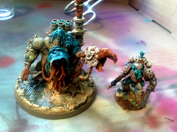
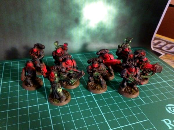
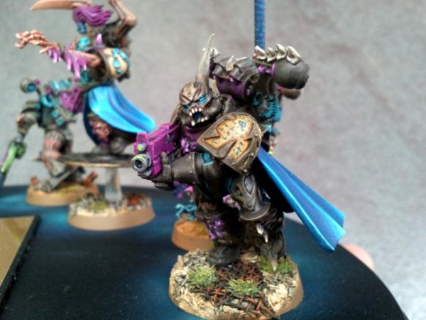
Well, so I promised some pics today : here they are !
There are still a few details I'm unhappy with : - the wounds on shoulder pads and on the armour - the Nurgle seal on backpack (both the three bubons and the parchment - on which nothing is written, yeah, I know). - the colours on the base (though I used the same technique as "usual")
Things I like : - the stance - the bandana & cloth on the backpack - the orange / turquoise contrast - the white, feathered armour [edit : - the right forefinger along the gun looks great, maybe one of the best proportioned I've sculpted so far !]
So please, let me know what you think of them. Specifically, do you feel the same about the three details mentioned above, and if so, do you have any idea about how to fix them ?
He's looking really stunning, I love the turquoise and brown combination. the rust works really well in there too as it helps the turquoise pop.
Going back to the inquisitor colours, if you went for a reddish purple, more like a dark wine, rather than your regular purple it might look less chaos-y. Here's a nice selection of palettes that might work for a less traditional inquisitor:
Yggs, he looks positively badass! I like him a lot. The only thing you mentioned that I agree with are the colors on the base. I just feel like he gets kind of lost in it, but it still looks sweet!
The wounds miss something oozing from them. I also think the base is well done but perhaps a dirtier aspect could possibly improve it (some dark washes on the sandy spots would be enough).
Nothing more to say except it's a brilliant paintjob and the contrasts are particularly original and good looking (I wouldn't have bet much on the turquoise before seeing this).
Can I dump some love on that plague marine too? Love what you've done with the old metal model, how you've tweaked out the ol' CSM pistol / chainsword (finger off the trigger ), and the very groovy use of BA iconography as well. Lovely color palette too (same goes for your earlier CSM, if I haven't heaped praise on them yet).
Gitsplitta wrote:I love the way the blue and cream colors work with each other.
I absolutely LOVE the streaking on the armor.
As we discussed, the shoulderpad chalice is expertly executed.
The rust effect scattered around gives a vital counter to the blue.
The base is outstanding. (I love good base-work)
Wow, thanks Gits... Nice words...
endtransmission wrote:He's looking really stunning, I love the turquoise and brown combination. the rust works really well in there too as it helps the turquoise pop.
Going back to the inquisitor colours, if you went for a reddish purple, more like a dark wine, rather than your regular purple it might look less chaos-y. Here's a nice selection of palettes that might work for a less traditional inquisitor:
As if the turquoise really needed help for *popping* ?
As for the palette, they look nice, but I'm really not comfortable with the grey... For unknown reasons, I love it on armour (Revilers SM, Pre-Heresy Word Bearers, etc...) but I think it looks terrible on robes, clothes & coats...
Still, thanks for the trouble and the links, that might be inspirational !
tipios wrote:Yggs - I agree with all the things you have listed as things you like, but the base like Gitts, I think looks fantastic!
The wounds, maybe green?
I didn't want to add another colour to the palette, to be honest... So I wanted to blend in the "fleshy" parts into the armour, but it just doens't match my vision...
It looks nice on the pics, though, lol...
Moltar wrote:Yggs, he looks positively badass! I like him a lot. The only thing you mentioned that I agree with are the colors on the base. I just feel like he gets kind of lost in it, but it still looks sweet!
What do you mean by "lost" ? Is it too... sketchy ?
inmygravenimage wrote:He's fantastic. Tais-toi.
D'accord
PsychosisPC wrote:That's great looking. Love the blues for contrast.
Thanks !
neil101 wrote:Beautiful work yggs again your choice of colours is refreshingly different but still appropriate somehow. The blue almost jumps off the screen
I'm glad you like it... I agree it's a bit weird for a Nurgle follower, but I hoped it'd click, and, surprisingly... It does !
Hyenajoe wrote:The wounds miss something oozing from them. I also think the base is well done but perhaps a dirtier aspect could possibly improve it (some dark washes on the sandy spots would be enough).
Nothing more to say except it's a brilliant paintjob and the contrasts are particularly original and good looking (I wouldn't have bet much on the turquoise before seeing this).
A song of the day perhaps?
I think the sandy spots are already not that large, I'm afraid they will not be noticeable if I darken them more...
As I said, it was quite a daring shot with the turquoise lol...
Haven't had the chance for listening to it (low connection), what is it ?
Ogryn wrote:Amazing models, especially the Plague marine. Keep painting.
Thanks !
Boss Salvage wrote:Can I dump some love on that plague marine too? Love what you've done with the old metal model, how you've tweaked out the ol' CSM pistol / chainsword (finger off the trigger ), and the very groovy use of BA iconography as well. Lovely color palette too (same goes for your earlier CSM, if I haven't heaped praise on them yet).
- Salvage
I don't know if you had, so that praise is more than welcome lol ! !
Yggs, what I was referring to was that it looks like the color of his armor and the sand and stones are too similiar, so they kind of run together. If you're going back to darken the sand a bit, then I think that will correct the issue.
That Plague Marine is looking great, Yggs! I like the turqoise and bone/cream color on him... How'd you do the bone-look on his armor? I'm really digging the texture on it...
HF Izanagi wrote:That Plague Marine is looking great, Yggs! I like the turqoise and bone/cream color on him... How'd you do the bone-look on his armor? I'm really digging the texture on it...
-Remi
Thanks ! It was actually some "simple" feathering, with bone-like colours...
Base is Dheneb Stone, edge-highlighted with Bleached Bone, then washed with Gryphonne Sepia.
Once dry, crude feathering with Dheneb Stone, then half Dheneb / half Bleached Bone, then Bleached Bone, each layer being thinner and thinner...
And voilà !
Matt.Kingsley wrote:I really like it, Yggs (in case I haven't already said it)
I'm not sure either, but it's always nice to know it lol ! Thanks
Hyenajoe wrote:
Yggdrasil wrote:
Hyenajoe wrote:A song of the day perhaps?
Haven't had the chance for listening to it (low connection), what is it ?
Your connection isn't responsible...the link didn't work...
Hope you'll like it!
Hey, sure I like it ! It brings fond memories back !
No pic update, as I've been through Hyenajoe & Moltar's advice of darkening the sand a bit more, and making the rocks stand out some more : it does look better, so thanks !
I've also begun assembly work on a Tzeentch Havoc, while The Fifth Element was playing, and I'm not that happy with the result so far... I don't know what's wrong, I thought I had a good concept, but it just seems off... As I won't know how to put it with words, I might try and upload the pic before scratching it !
In the mean time (well, "those past two weeks" would be more accurate), I wrote the beginning of a story about the Tranch world, in the Calixis system (Dark Heresy RPG setting).
It's not related to my Traitor Guard at all, which I'll probably move from Tranch anyway, as now the fluff for that war-torn planet is too developed to fit my needs.
But as it has a link with Tranch, I posted it in my Renegade IG Plog anyway. I am conscious the story might not be that exciting, but I see it as a kind of English practice for me, and I can tell it's pretty hard to write in another language !
PDH wrote:The blue is a really nice contrasting colour and unusual too. Really like the finished model looks good.
So when will your Inquisitor be finished?
Peter
Thanks Peter, I agree it is most... unusual lol ! But ain't it what Chaos is about ?
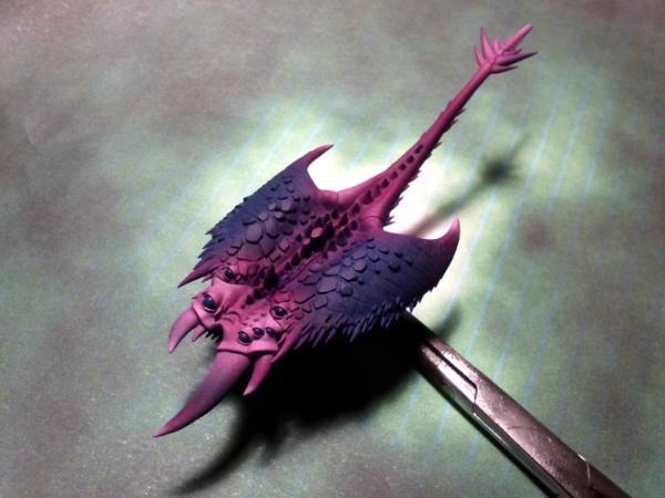
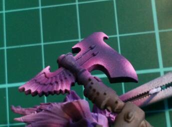
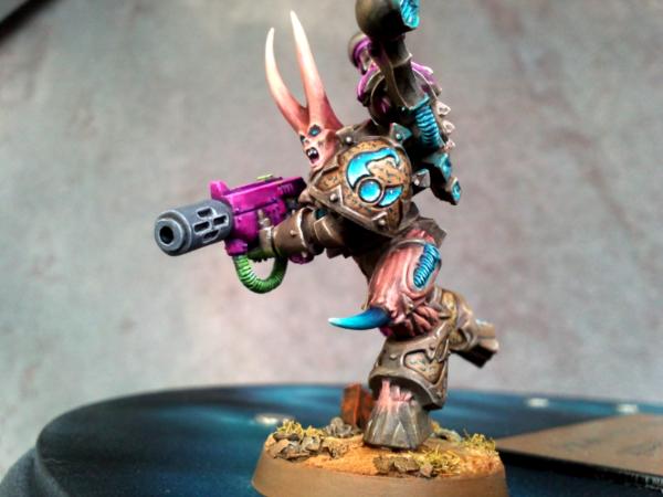
Nothing much to add, except two pics of the Tzeentch Marine I've assembled yesterday... I feel like somethng is wrong, but I couldn't tell what... Any idea ?
Yea... was gonna say the standard SM torso with the Chaos parts... other than that, the head? I like it! (Where is it from, by the way?) But it doesn't say "Tzeentch" to me. (Unless you want to go with the "Cubes of Tzeentch" ever-changing, no-form argument)...
inmygravenimage wrote:Bigger hat maybe? I think it's actually just that it looks a bit odd without shoulder pads, that's all.
Gitsplitta wrote:Tac the pads on him and then see what you think.
Ok, I've tried with shoulder pads - forgot to take pics, sadly - and it looks better, but it still felt wrong...
Briancj wrote:No actual Tzeentch symbology on the miniature?
Lol, the shoulder pad was supposed to get rid of that, and doesn't the mutated / changing armour give a feel of Tzeentch?
Asylum_Inmate wrote:loyalist body? it does clash with the other obviously chaos-y parts
HF Izanagi wrote:Yea... was gonna say the standard SM torso with the Chaos parts... other than that, the head? I like it! (Where is it from, by the way?) But it doesn't say "Tzeentch" to me. (Unless you want to go with the "Cubes of Tzeentch" ever-changing, no-form argument)...
Agreed about the Mk8 chestplate, but I needed that part to conceal the fact that the head has no lower jaw. It's a cut-in-half Horror head, btw... Which I hoped would give away a bit of Tzeentch feeling too... Taking your advice into account, I decided to have a go at sculpting a few fleshy parts on the abdomen of the chestplate, and maybe, if I manage to do it, a few flames on the high collar. The aquila could represent Tzeentch's love of feathers, and I would need to sculpt something instead of the central grille... I'm thinking of an lidless eye, maybe ?
tipios wrote:I don't likey the head:(
I also have to admit it looks less spectacular than when I had imagined it... I think the fact that I kept one fang "out" of the collar gives it more of a silly aspect than a menacing one... So I switched it back, and now everything is within the armour. It does look more threatening like that, I think.
Thanks for the suggestions guys ! I've also cut both arms, and have replaced them : the right one is now a Pink Horror one, and the left one will be the one wielding the meltagun !
No pic yet, I'll try and go for that tomorrow !
*****
On a side note, I'd like to introduce the concept of the mob Endtransmission and I should be leading for the Waaaagh Dakka. (I say should, because since the rules disallow us to "call dibs" on a mob, bad things can still happen !)
If you don't have any idea about , then have a look at those articles and threads :
Endtransmission shall start it soon, and I'll join him as soon as I get home - it should be in a month or so.
So Da Redd Skurpionz should soon be recruiting, as a Cybork Kommando mob (if all goes well) ! ! ! We'll be on the lookout for Painboyz wannabes, painted in the colours of the Red Scorpions schemes. We'll be chemical warfare specialists (gasmasks IZ mandatory), and fight with toxic weapons, syringes, buzzsaws... All the things you'd see in a Painboy's Aid Steshun!
Hey... It seems Waaagh Dakka doesn't raise a lot of enthusiasm... I think some people a taking it the wrong way.
I see it as a great opportunity to model & paint something else, while being able to take part in a large community project.
The point of this thread is to represent the awesomeness of this site, by building an Ork army where every Dakkaite (or Dakkanaut) has the chance to contribute a model to the army.
The admin & mods team did set up some restrictions, indeed. But we have to think the other way around : if there was no restriction, most people would model a Warboss, a special character, a Mek, or a Nob. Great, but it wouldn't give the feeling of a regular Waaaagh!, as there would be more leaders than troopers !
I was at first startled that I couldn't be a Mek or a Painboy. But again, it's another opportunity to think out of the box, and not get stuck in the same old mental schemes!
In addition, being far from any proper civilization, I knew I couldn't call "dibs" on any mob first-hand. So after the initial dust settled, I looked for an open slot, and got away with it!
I have no experience with Orks (nor Orcs, for that matter), but I think I'm going to enjoy building a wannabe Painboy, leading a squad of like-minded Kommandos into chemical wastes...
If any of you want to join in, then feel free to do so ! At worst, you'll have had a good moment trying to model something unusual, in a different paint scheme !
***********
Da Redd Skurpionz iz recruitin' now
***********
Wot ya need ta join Da Redd Skurpionz, "Da Painkillaz" Skwad, Cybork Kommandos : - a Gasmask, fer we iz bashing 'umies in toxik wastes, with toxik dakka ! - a toxik shoota / slugga - 'ollow ammo wiv kemical liquid, needle-slugga, syrinj-chukka, Grey Knightz Rad-grenadez launcherz, be kreativ !
- sum' Painboy gubbinz - toolz, sawz, cablez, medik kitz.
- bioniks & cables, as we'v all been kustomized by Da Big Mekboy ! - Redd Skurpionz 'umies colourz : grey body armour, yellow trims, a red Skurpion insigna on a white shoulder, white gasmask (as per Red Scorpions apothecaries / sergeants)
Wot da iz mob lookin' fer : - a burna specialist - can be a kemical thrower instead, for kleansin' da 'umie bunkerz - a Big Shoota specialist - so dat we kan pin da umies down, and get klose to hack & smash dem - a Kommo specialist - so dat wez can kall D'ambulanz or Da Fighta-Bommaz - a Spotta specialist - so dat we kan dezignate targitz to da Boomgunz - a Demolishun specialist - so dat we kan open da 'umie bunkerz & metal bawksez - any other specialists - feel free to kome wiv' unusual skillz !
- a wannabe mekboy woz building a Looted Red Scorpionz Rhino az a Looted Wagon, kalled "Da'mbulanz" !
I've taken into account the comments about the first one. Head is now all within the collar, some more Tzeentch iconography & reference (Horror arm). He'll get a left Tzeentch shoulder pad, and I still have to tzeentchify (yes, that verb does exist ) the chest plate...
Any other suggestion / comments before I start greenstuffing things ?
I plan to :
- add some mutated / fleshy parts in the lower abdomen, as in the possessed leg junctions between armour (hopefully it won't look too nurgley) ;
- sculpt an eye or jewel in the center of the Aquila
- maybe, add flames around the collar.
Good luck on your mob. Ours in coming along pretty darn well though I'm not sure we'll ever get enough grots to "field" all 3 runt herders. Sounds like you've got a good start going!
1st marine: definitely looks better. I would gs fangs on to the collar skull and turn the front boss into an eye, I think.
Melta havoc: love him. Great, great execution.
Good look with Da Redd Scorpiunz. Pm me of you want a termie apothecary arm for him.
Good luck on your mob. Ours in coming along pretty darn well though I'm not sure we'll ever get enough grots to "field" all 3 runt herders. Sounds like you've got a good start going!
Thanks Gits...
As for the mobs, I understand Kommandos are a "legal" unit once they've reached 5 Kommandos, so that should do it... Obviously, Da Redd Skurpionz go by 15, coz da 'umies 'av 10-umiez skwads but dey alweiz git krumped so fast ! So itz sez we shood be moar dan 10 !
inmygravenimage wrote:1st marine: definitely looks better. I would gs fangs on to the collar skull and turn the front boss into an eye, I think.
Melta havoc: love him. Great, great execution.
Good look with Da Redd Scorpiunz. Pm me of you want a termie apothecary arm for him.
How about the fangs, upside or downside ? Thanks still..
As for the bitz, that's really nice of you, but I'm afraid I'm already way back in trades with you, I wouldn't want to get indebted even more
tipios wrote:Yes, Yggs the first marine head looks 100% better in that position
Lol... Thanks for the song, I've only known Disturbed (or was it Dysturbed) for a few months, but I really like what they're doing - from the few songs I've heard...
Also, work will not start on my Nob until I get home, which is about 1 month now... So spare you some efforts : by the time the letter gets in there, I'll already be back home lol !
Holy hell these are ridiculously awesome! Love the crazy eyes on the first one, and that sorcerer head looks wicked.
Concerning your earlier Plague Marine, pure win! I love those Blood Angels chalice bitz.
Cannot wait to see what you brainstorm next my friend.
I agree the new version of the Tzeentch marin looks better this way. As for the GSing you have in mind: GO FOR IT! I think it's relly going to link him to your other tzeentchian marines.
The Melta havoc is fething good too, the dynamic effect and the expression on the sorcerer's face are really fitting IMO.
Mr.Malevolent wrote:Holy hell these are ridiculously awesome! Love the crazy eyes on the first one, and that sorcerer head looks wicked. Concerning your earlier Plague Marine, pure win! I love those Blood Angels chalice bitz. Cannot wait to see what you brainstorm next my friend.
Hey, thank you... The BA bitz are inspiring indeed, I love them... Though trying to strap them on a Plague Marine was quite of a gamble, TBH
As for what's next, I need some help for the brainstorming (well, in French, brainstorming requires two or more people actually lol)!
See rest of post below
Hyenajoe wrote:I agree the new version of the Tzeentch marine looks better this way. As for the GSing you have in mind: GO FOR IT! I think it's relly going to link him to your other tzeentchian marines.
The Melta havoc is fething good too, the dynamic effect and the expression on the sorcerer's face are really fitting IMO.
Thanks mate ! I'm glad I managed to get it better... I'm quite awed at the thought of having to GS a lot of details though...
As for the sorcerer head, I knew when I dismissed it for the Pimp My Wizard contest that I would HAVE to use it on my CSMs... Though it might fit better on a Slaanesh Marine...
***********
UPDATE !
Worked on another of my Havocs, this one has the torso already built, he's supposed to be in the process of reloading his bolter... Only thing is, I don't know which pair of legs would suit him best !
Version 1 (Running) :
Version 2 (Kneeling) :
Either way, I'll have to add some GS details to make him more Tzeentch-like.... Phewwww... Couldn't it be simple, for a change ?
So... Version 1 (Running) or Version 2 (Kneeling)?
I like him running more. I think it keeps the torso pose more dynamic. Although, if he is running in the end, you might want to turn the top knot... but, then again, maybe the winds of change are just that strong.
Running for sure, but second the top-knot direction change.. Love that feathery hand too... as for the other head, I never would have realized it was a horror cut up at all!
And awesome use of the Tzeench sorcerer head for the Melta guy. Probably my favorite bit in that single frame... only to lose it somewhere under my painting desk.
Man I love how these Tzeentch marines are coming along. Mixing with the Horrors bitz works really well. For your newest guy I'd say I like the kneeling pose, looks like hes just slapped a fresh mag into the boltgun. Edit: As I see that was your intention I will say it looks more like he IS relaoding and keeping low out of fire. Now I'm going to have to go out and buy some Possessed Marines and a Horror set. I still want to do a Tzeentch warband thanks to you Also on the BA chalice pad/chalice symbols, couldnt you GS some maggots crawling out of it? I think that would be the shiznit!
I guess (now that I look at it) it's the running position that bothers me the most... there's wind action going in too many different directions, just doesn't seem right to me. The feathers on the arm seem out-of-place but then it is Tzeentch... I'm just not used to looking at feathers on a marine.
Automatically Appended Next Post: Perhaps you should name him "Brother Prisciilla".
Before I read the description, I thought he looks like he is reloading!!! so thats cool. I like the idea of the running while reloading, maybe a repostion of him so he dosn't look like he's toppling, and it would be easy to change the tassels on his head so everything is moving in the same direction! The kneeling position is great, no ajustments needed to make that one
I think the running adds much needed movement to the model, but does make him look like he is toppling, and the wind does throw his stuff in many different directions as gitz stated.
The kneeling looks too static for me though, and that arm is way too big, in some of the shots it can look a bit overbearing, though I love the way you got the arms to make him look like he's reloading. And who said mutations have to be a certain size!
The Good Green wrote:I like him running more. I think it keeps the torso pose more dynamic. Although, if he is running in the end, you might want to turn the top knot... but, then again, maybe the winds of change are just that strong.
Thanks for the knot direction thing... As most have commented on it, but I probably wouldn't have realized !
I like your "winds of change" explanation though.
HF Izanagi wrote:Running for sure, but second the top-knot direction change.. Love that feathery hand too... as for the other head, I never would have realized it was a horror cut up at all!
And awesome use of the Tzeench sorcerer head for the Melta guy. Probably my favorite bit in that single frame... only to lose it somewhere under my painting desk.
-Remi
The Horror head on a CSM was something I wanted to do ever since I had put my hands on the box... It's not as awesome as I thought it would be, but it's still quite unfamiliar to be... disturbing ?
That's 2 for running...
As I said, the Chaos Sorcerer head looks fine to me (and fits nicely on a hollowed BA head lol), but I have a problem with the two teeth, which somehow remind me of a ... rabbit ?
Also, I think the face almost looks female, so it would make me think of Slaanesh more than Tzeentch... Well, I hope the painting will cope with that !
Mr.Malevolent wrote:Man I love how these Tzeentch marines are coming along. Mixing with the Horrors bitz works really well. For your newest guy I'd say I like the kneeling pose, looks like hes just slapped a fresh mag into the boltgun. Edit: As I see that was your intention I will say it looks more like he IS relaoding and keeping low out of fire.
Now I'm going to have to go out and buy some Possessed Marines and a Horror set. I still want to do a Tzeentch warband thanks to you Also on the BA chalice pad/chalice symbols, couldnt you GS some maggots crawling out of it? I think that would be the shiznit!
Gitsplitta wrote:Figure looks odd to me... Can't put my finger on it though...
Gitsplitta wrote:I guess (now that I look at it) it's the running position that bothers me the most... there's wind action going in too many different directions, just doesn't seem right to me. The feathers on the arm seem out-of-place but then it is Tzeentch... I'm just not used to looking at feathers on a marine.
Automatically Appended Next Post: Perhaps you should name him "Brother Prisciilla".
Lol...
Though I don't get the "too many directions for the wind". To me, only the top-knot could be influenced by wind, the rest... Would be as it is ?
I chose that arm specifically for the feathers, so as to reinforce the "Tzeentch" feeling (as some thought there wasn't enough Tzeentch iconography on the previous one)...
So you'd choose kneeling ?
inmygravenimage wrote:I agree with gits; he also seems to be toppling slightly. I would go with kneeling.
"Toppling", really ? Well, ok... +1 for kneeling, then....
Hyenajoe wrote:
inmygravenimage wrote:I agree with gits; he also seems to be toppling slightly. I would go with kneeling.
I fully agree there!
+2 for kneeling...
tipios wrote:Before I read the description, I thought he looks like he is reloading!!! so thats cool. I like the idea of the running while reloading, maybe a repostion of him so he dosn't look like he's toppling, and it would be easy to change the tassels on his head so everything is moving in the same direction! The kneeling position is great, no ajustments needed to make that one
Great, I'm glad I at least managed to capture the pose of a reloading marine !
Actually running while *trying* to reload is kind of a hard trick, but I guess 10000-year old Marines could pull that out lol?!?
So that's +0.5 for running, +0.5 for kneeling, if I understand your post correctly
Sageheart wrote:Can I go with a standing pose? lol
I think the running adds much needed movement to the model, but does make him look like he is toppling, and the wind does throw his stuff in many different directions as gitz stated.
The kneeling looks too static for me though, and that arm is way too big, in some of the shots it can look a bit overbearing, though I love the way you got the arms to make him look like he's reloading. And who said mutations have to be a certain size!
Yeah, as with the other ones, I want to try and capture a bit of the "old school" chaos thing... So "oversized limbs" ain't a valid point to me lol !
What do you mean by "overbearing" ? Is that a positive or negative thing, in your opinion ?
******
***
*
Ok, so until now it seems I'm more tempted by the kneeling one... Mostly because the pose is more original & more "realistic" to me (as in, you duck to cover when you reload, instead of staying in open view ), and also because you seem to find the "running" pose more like "stumbling / toppling" than running... Which I cannot see, but I trust your judgment in that it looks awkward.
I probably won't work on him until 1 or 2 days, so I still have time for thinking about it... So any point of view is again welcome !
Thanks for the kind comments mates - and for the honest criticisms. It's not always easy to provide constructive comments on other people's work, so I thank you for that.
I don't know if overbearing is really a negitive or a positive thing. I just noticed it, some of the shots there really just brought out the large arm to me, I think this could take away from the rest of the model, or be really cool haha.
i want to see how you paint it since I think that will have a big say in if I think the large arm is overbearing in a good or bad way
Maybe I'll try to model some cover on the base, if there's enough room for it...
Sageheart wrote:I don't know if overbearing is really a negitive or a positive thing. I just noticed it, some of the shots there really just brought out the large arm to me, I think this could take away from the rest of the model, or be really cool haha.
i want to see how you paint it since I think that will have a big say in if I think the large arm is overbearing in a good or bad way
Maybe what I've done on the previous models will help you decide ?
Likely one of the weirder projects I've seen you start. Not feeling the love on the conversions yet, but I also know from prev. experience with your work a touch of paint changes the model completely. I'll keep the faith on this one and keep checking in.
(and of course, I liked the running pose better... ha)
Sageheart wrote:I've always loved those models you painted, never really noticed that one arm was bigger than the other so that shows it cant be too overbearing
Lol... Then I guess there's still hope !
Skalk Bloodaxe wrote:Likely one of the weirder projects I've seen you start. Not feeling the love on the conversions yet, but I also know from prev. experience with your work a touch of paint changes the model completely. I'll keep the faith on this one and keep checking in.
(and of course, I liked the running pose better... ha)
Well, at least that's fair thought. I'll probably go for the kneeling pose, though. But thanks for the comments Skalk !
+++++++
No update for a month, but I've been busy packing up my stuff and am currently on my way home (writing from an undetermined location) !
A bit sad to leave the theatre, TBH (yeah, I know : ), but still happy to get home in a few days...
Thank you all guys, I've got home safe & sound ! Hopefully we had some time in the US base Bagram & in Cyprus to "relax" before coming home...
Your kind words warmed my heart !
MajorTom11 wrote:Enjoy a baguette and some foie gras, or whatever other french deliciousness you haven't been able to have in months!
I received your package btw, thanks very much for the letter along with it!
Well I've been eager to enjoy some non-French food, actually... US breakfasts in Bagram, tapas & Mojitos in my hometown, japanese food... That was what I needed the most actually lol !
Glad you got the letter...
++++++++++++++++++++++
Hobby-wise, I'm trying to get myself to buy a compressor + airbrush... But the choice is hard to make, and the price isn't the kind that makes you take the leap easily !
http://www.chicagoairbrushsupply.com/ go here as they have amazing deals. Also you should look into Harder & Steenbeck as they are one of the best out there honestly. Far better then Iwata.
I'm right there with you on the airbrush debate. I so want one, but I'm trying to find enough projects / applications to justify the purchase. I'm getting a lot of support from people that already use one, so that helps.
It seems inspiration managed to crawl its way back into my skin
After a looooooong break, I feel like toying with my models once again uh ...
Nothing new to show yet, but.... I hope soon !
These last monts have been full of video games experiences (Gears of War, Space Marine, Batman : Arkham Asylum, being the keystones), and a return to a somewhat "student's life", full of nights out, restaurants, etc....
So much for the Hobby
I haven't spent a lot of time in here too, much has changed ! I hope I'll still find my marks uh ;-)
I'm also eager to see what's everyone has been modelling (and painting) for the last months.... But the prospect of delving into probably more than 200 pages from Gitsplitta's Plogs is rather daunting
Wish me luck !
Vitruvian XVII wrote:Glad to hear youre safe home.
I can only imagine the stuff youd produce with an airbrush! Take the leap, theyre a blast.
I've bought one, eventually.... A kinda cheap one, part of a package with a compressor, so we'll see... I'll be sure to post pics uh !
Gitsplitta wrote:Enjoy the comforts of home Yggsie... I'm sure you've earned it 100 times over.
Hey, "there's no place like home" ;-)
Empchild wrote:http://www.chicagoairbrushsupply.com/ go here as they have amazing deals. Also you should look into Harder & Steenbeck as they are one of the best out there honestly. Far better then Iwata.
I'll be sure to remember that when I'll "upgrade" mine... As I probably will !!!
Hyenajoe wrote:Bon retour
Merci.... We still need to see each other someday when I come to Paris ! And chat about models around a Starbucks or something !!!
inmygravenimage wrote:Congrats on le retour buddy! Bet the woman's pleased to have you back.
Well, she did... Now all she wants is to have me back on deployment ASAP
Skalk Bloodaxe wrote:Welcome back Yggs.
I'm right there with you on the airbrush debate. I so want one, but I'm trying to find enough projects / applications to justify the purchase. I'm getting a lot of support from people that already use one, so that helps.
Hey Skalk, did you get yours ? What's new with your models ?!
+++++++++++++++++++++++++++++++++
As for the projects, I'm still debating about where to start again....
- My two 9-strong Tzeentch Marines squads ;
- My bone, orange & turquoise Plague Marines ;
- My bone, brown & turquoise Space Marines (including the Scouts, and their Gretchin Militia) ;
- My Skavens...
I know I have to focus on one at a time, but I have so much to do....
Not including the other projects that sprouted in my head with the new models released since I came back... That I've (mostly) resisted buying lol...
And Tzeentch is maybe the next step, actually.... Maybe for a "squad entry" at French GD in october ? That would be motivating ;-)
@ Vitruvian : Thanks ;-)
I think I probably keep the skaven as a side project anyway.... I would like to be able to paint a lot in a "tabletop" standard... But that is the hard part :-(
Welcome back Yggs, prepare to see almost nothing from me, except maybe a few necrons also I've combined everything into one new blog, to make it easier
tipios wrote:Oh yes, thats a good goal to go for!!
They're not mine yet, but next order will see them get on top of the list
monkeytroll wrote:Glad you're back and motivated Yggs
My vote obviously goes to the grot militia (and their beaky 'masters' I suppose ), but it's all good wherever you take us
Tzeentch squad for GD seems as good a place as any to start.
Hey, I guess both of your choices will be fulfilled in today's progress
Briancj wrote:Yyyyyyyyyyggggggggggs! Welcome back to the land of the unliving. Another vote for Tzeentch!
Also, you missed Adepticon. Be sure and check out the plans for a UK Dakka Detachment.
And, if you're out of everything else to read, I'm building an Ordinatus in 40K scale.
--B.
PS: 200+ pages of Gitsplitta is why you should NEVER STOP READING DAKKA.
Ever.
Ordinatus ?!? OMG !!
I'll have to check that !
Gitsplitta wrote:Good to have you back Yggs! Guess I'll put your GMS marine back on the short list.
Those are pretty incredible figures...
Erh... Yeah, I guess you can... After 2-ish years, I think my GMS will be pretty nice lol
inmygravenimage wrote:It's... alive! Good to have you back again, matey.
Well, I was rather half-alive, as you can see from the delay I've spent before replying
Still, I'm kinda motivated by now, so everything should go back on track !
Matt.Kingsley wrote:Welcome back Yggs, prepare to see almost nothing from me, except maybe a few necrons also I've combined everything into one new blog, to make it easier
Can't wait to see what have up for us next!
There you go ....
(Also... "Necrons" ?!? Ok, I have to admit it : their new models (and backstory) are rather appealing... and much more characterful than the previous versions !)
Hyenajoe wrote:Hey Yggs!
Welcome back to Dakka!!! Now get back to work you lazy !!!
Don't forget to PM me the next time you'll come around Paris (I might have more stuff for you ).
Cheers!
Joe
Ha ha, sure... It's been long since I last came to Paris... I'll have to think about it, now that my sister is on an internship in Boulogne-Billancourt (IIRC)
Any plans for GD 2012 ?
Skalk Bloodaxe wrote:Hey Yggs, good to see you back. Looking forward to seeing whatever you wind up working on / presenting.
I saw this at the top of my subscribed list and thought some new guy bumped your thread. Really glad to see it's you.
Great to see new work from you. The Henchman is really creepy, kind of like one of those little nameless things that are always in the background of a John Blanche drawing. *shudder*. Great work all around.
In case you haven't heard this, the Chaos Cult is about to have rules. Like REAL rules, not some inadequate bastardization of the IG. 6th Edition is almost everything I had hoped for, and that's saying a lot. I have played 2 games so far and they were excellent.
Welcome back Yggs. Looking forward to whatever twisted madness you share w/ us next.
Looking great to see your stuff again, and to know the other half of you is now alive. As for the figs, only thing I'm not quite sure about is the book at the front of the sorcerer it looks... Off, somehow.
It doesn't look like you lost any skills while you were out on the edge of the world.
Keep it coming! Plogs have been way too quiet lately.
Lol, I did keep training even when I was deployed... But I could have lost more since I came home... 9 months without touching a single model is too much !
Skalk Bloodaxe wrote:I saw this at the top of my subscribed list and thought some new guy bumped your thread. Really glad to see it's you.
Great to see new work from you. The Henchman is really creepy, kind of like one of those little nameless things that are always in the background of a John Blanche drawing. *shudder*. Great work all around.
In case you haven't heard this, the Chaos Cult is about to have rules. Like REAL rules, not some inadequate bastardization of the IG. 6th Edition is almost everything I had hoped for, and that's saying a lot. I have played 2 games so far and they were excellent.
Welcome back Yggs. Looking forward to whatever twisted madness you share w/ us next.
Hey, thanks ! I built the Twist on a hunch, and it worked pretty good, I agree... I'm also fond of the "additional" cast of the 40th millenium : servitors, henchmen, scribes, adepts, etc... They're some of the most flavourful characters in the 40k background !
whalemusic360 wrote:Woo, fresh pics! Looking good man.
inmygravenimage wrote:Looking great to see your stuff again, and to know the other half of you is now alive. As for the figs, only thing I'm not quite sure about is the book at the front of the sorcerer it looks... Off, somehow.
I quite agree with you, graven... Sadly. I'm still debating over this model, actually. Since all Tzeentch Marines will be quite dynamic, I'm pondering whether to add a bit of dynamism to the Sorcerer, or further increase the contrast by modelling it as static as possible... And the book was an additional gear I had kept around for such models, so I tried to strap it on !
Still don't know uh...
tipios wrote:Good to see you back on those models
Thanks !
HF Izanagi wrote:Seriously! Great to have you back, Yggs! Love that little Inq henchman!
-Remi
He he !!
GiraffeX wrote:Welcome back, looking forward to your next update.
Here it comes ! Something quite different !
Matt.Kingsley wrote:Love it! Excelent work!
Thanks Matt !
Hyenajoe wrote:
Yggdrasil wrote:
Any plans for GD 2012 ?
You can be sure I'll be there!
Your marines are awesome! I especially like the one with a half hidden pink horror head
My "modelling buddy" did bring my ticket for GD2012 yesterday.... So I'm in !
Thanks for that one, I knew I had to try and add a pink horror head to one of them, but it was quite hard to pull off, due to their large size ! I'm quite happy with the result, I'm glad you like it too !!
I finally got to try the compressor + airbrush combo I had ordered last year, when I was in 'Stan ! With my "modelling buddy", Rama, acting as a technical advisor, I began painting some Incendiaries that were lying forgotten in a wardrobe...
I'm quite pleased with the result, for a start. I'm just disappointed with the white "flecks" that spread all over the model when I did the last highlight on the flames on the Incendiaries' back (see 2nd pic). It kinda spoilt the rest of the models, but I still think it looks promising !
Congrads on the air brush. I'm looking at getting one this fall. The results you are getting are pretty awesome already, and I'm sure once you have it dialed in you'll be highly proficient with it in no time.
Just wondering... remember that Penal Legion with the amazing conversions and awesome fluff? Yeah. Just 'wondering'.
GiraffeX wrote:I think the flamer is looking really nice once the small details like the teeth and basing is done they will stand out more I think.
The Skaven is really nice, the different tones look just how I think a Skaven should look like.
Sure, that's what I'm going to do... In a few minutes lol !!!
Thanks for the Skaven, though I still have a lot of work on them :(
Gitsplitta wrote:Not exactly. More like "don't make mountains out of mole hills".
Well... that's going to be my biggest issue, I'm afraid
Skalk Bloodaxe wrote:Congrads on the air brush. I'm looking at getting one this fall. The results you are getting are pretty awesome already, and I'm sure once you have it dialed in you'll be highly proficient with it in no time.
Just wondering... remember that Penal Legion with the amazing conversions and awesome fluff? Yeah. Just 'wondering'.
You definitely need one ! I can't wait to try it on vehicles, this might be what I've always waited for to paint more tanks & iron canz !!!
As for the Penal Legion... yeah... I know... I'm sure the "soon-to-come" Chaos Codex will ignite the spark again !!!!
Close-up view on OSL Looks nice, doesn't it ?!? The best point is, the OSL is just "collateral damage" from the airbrushing, great uh ?
Different views of the Flamers :
Next step is : teeth, horns, nails & tongues on the Horrors & Flamers ! I hope they will be finished in 3 hours time, which will amount up to 8 hours for 8 models ! A personal record lol !!!!!
Off to finish the Flamers... teeth & eyes shouldn't take long....
But... wait...
There are dozens of them on each models raaaagh....
[On a side note : what do you think about the new daemons? I was pretty excited at first, but I'm quite disappointed by the new plastic Nurgle range.... Tzeentch re-birthed ones are nice, but not so different from the metal ones :(
The Slaanesh chariot looks promising though, if only for variety on the Daemonette models Just my 2cents.... ]
edit : Results !
3 hours of tedious brush painting of teeth, nails & tongues, not to mention a quick drybrush on the bases, and here they go :
3 Flamers, 5 Horrors :
Details on the Flamers :
Details on the Horrors :
I'm especially proud of the hanging runes on each side of the Icon. IRL, they look pretty cool !!
So that makes 8 models painted in 8 days... A personal record ! Sure, they may not be as proficiently painted as my regular ones, but I think I'll cope with it, considering the amount of time I've saved ! And they're still better than a lot of "tabletop-standard" models I've seen... So that's a win-win !
So those tools are really must-haves :
- an airbrush & compressor (have to buy a gravity-fed one though) ;
- a wet palette (saves a lot of time, and eases the consistency of your paint mixes !)
Any remark or suggestion is, as always, welcome, before I put the last layer of varnish on them ! Cheers !
They're looking great mate and I too love the standard bearer. The only one I'm not quite convinced by is the 4th horror (left to right) as he's just a wall of pink rather than being broken up by the blue; however that may be the pic. Flamers are very neat, although I always think a spot of really bright green can jazz up Blue/purple flames (for comparison, think of the purple at the heart of a candle flame). Just being picky though, they atelier a lovely bunch!
inmygravenimage wrote:They're looking great mate and I too love the standard bearer. The only one I'm not quite convinced by is the 4th horror (left to right) as he's just a wall of pink rather than being broken up by the blue; however that may be the pic. Flamers are very neat, although I always think a spot of really bright green can jazz up Blue/purple flames (for comparison, think of the purple at the heart of a candle flame). Just being picky though, they atelier a lovely bunch!
Thanks Sam !
Actually the Horror IS just a chunk of pink matter lol... But no flame on the model, and I didn't take the time to sculpt any
I'll keep your green idea for another time, I think it might work !
Skalk Bloodaxe wrote:
Yggdrasil wrote:[On a side note : what do you think about the new daemons? ... The Slaanesh chariot looks promising though
Of all the things missing from the GW40K miniature lineup, I'm quite sure no one would have put "parade float" at the top of the list.
Graven said it first- the standard bearer is ace, really good job! And I agree on the Pink Horror. Other than that, you're looking really solid!
What do you mean by "parade float" ? The Exalted on the Chariot ? Looks good to me
Thanks !
PDH wrote:Good to see you back Yggs!
Really like the Tzeetchian Daemons.
Hey hey.... Time for a change (yeah, pun intended) : Nurgle Daemons !!
Right before going on holiday, I went through my FLGWS (yes, that exists) and bought "a few" boxes of the new Daemons...
Here's a family portrait :
7 Plaguebearers, and 2 Heralds of Nurgle !
The Plaguebearers are pretty straightforward, so I won't dwell on them (though the sprues are pretty nice), but I think the two Heralds deserve some more attention :
Ethereal Herald of Nurgle :
I definitely wanted to use the new plastic VC Wraith, and through some simple head & weapon swap, I think I got an interesting concept... Or did I ????
More conventional Herald of Nurgle :
This one went through a few experimentations, mainly depending on the Nurglings that will be "hanging" from him, and an extra concept on Palanquin... Juste let me know what do you think is best :
My opinion is pretty close to Vit's. The palanquin is cool, but my concern is that the basic lines of the palanquin look much to "clean and neat" when compared with all the nurgle around it. Sometimes stark contrast is good... but this looks incongruous which isn't particularly good.
Of the non-palanquin options, I also like #1 the best... though #2 (without the nurgling on the base) is also fine.
Nice to see an update from you Yggs. Miss your regular contributions.
Vitruvian XVII wrote: Hmm, i quite like the palanquin, but i do think it looks a little unsupported by the nurglings as it stands at the moment.
I think my preferred one is the first.
I love the new nurgling models, and this planquin being held by them! but as stated above it does look a little unsupported. The guy on top looks awesome! Can't wait to see you paint that decaying flesh
I'm going w/ option 1 as well, unless you have some old Nurglings. I think the new sculpts are an embarrassment to GW. The manager / QA guy that approved the new Nuglings for production should be publicly fired (like full page WD apology) and the sculptor sent back to Grimdark Sculpting 101.
As for the base of the palanquin, my recommendation is to subject it to the same sort of love you've done on your other Nurgle projects (corrosion holes, divots, chunks missing, random scrapes / etc). The idea is solid, it just needs that special Yggs touch.
Vitruvian XVII wrote:Hmm, i quite like the palanquin, but i do think it looks a little unsupported by the nurglings as it stands at the moment.
I think my preferred one is the first.
Gitsplitta wrote:My opinion is pretty close to Vit's. The palanquin is cool, but my concern is that the basic lines of the palanquin look much to "clean and neat" when compared with all the nurgle around it. Sometimes stark contrast is good... but this looks incongruous which isn't particularly good.
Of the non-palanquin options, I also like #1 the best... though #2 (without the nurgling on the base) is also fine.
Nice to see an update from you Yggs. Miss your regular contributions.
monkeytroll wrote:Nice to see you Yggs!
I have to go with my esteemed colleagues above
#1 and more nurglings on the palanquin. Perhaps three groups, one at the front, two at the back, in a trike-style configuration?
MajorTom11 wrote:You're back? You're back!
All is right in painting and modelling again
And more nurglings on the palanquin
GiraffeX wrote:I'm going to go for option 1 as well, I'm not too keen on the new Nurgling models.
Sageheart wrote:
Vitruvian XVII wrote: Hmm, i quite like the palanquin, but i do think it looks a little unsupported by the nurglings as it stands at the moment.
I think my preferred one is the first.
I love the new nurgling models, and this planquin being held by them! but as stated above it does look a little unsupported. The guy on top looks awesome! Can't wait to see you paint that decaying flesh
Skalk Bloodaxe wrote:I'm going w/ option 1 as well, unless you have some old Nurglings. I think the new sculpts are an embarrassment to GW. The manager / QA guy that approved the new Nuglings for production should be publicly fired (like full page WD apology) and the sculptor sent back to Grimdark Sculpting 101.
As for the base of the palanquin, my recommendation is to subject it to the same sort of love you've done on your other Nurgle projects (corrosion holes, divots, chunks missing, random scrapes / etc). The idea is solid, it just needs that special Yggs touch.
Wow, so that's a general agreement :
- No Nurgling on the Herald (I thought it added a bit of Nurgle-like humor) ;
- More Nurglings supporting the palanquin ;
- New Nurgling models are crap...
I'm not sure I can put more Nurglings underneath the Palanquin though, their assembly is quite straightforward, but hard to adjust & customize We'll see !
My best option might yet be to forfeit that palanquin idea... Thanks for the kind comments & critics guys, that's nice of you !!
I've not been idle these last weeks !!! On top of working on my entry for the French GD (no pics though yet ), I've also worked on :
Nurgle Daemon Prince :
Ok, this one is far from new, but I had never found the will to paint it... Now it's corrected ! Base is still WIP though
Dark Vengeance Tactical Squad.
My GW store celebrates its 10-years birthday on Saturday, and there is a painting competition for a 10-strong unit...
That was the perfect opportunity to test some new techniques with my airbrush
Here are a few shots :
Sling & greenstuffed finger out of the trigger (took me 1 hour to sculpt 10 fingers !) :
Before & After (thanks to a masking paste, applied with blister foam & 3 layers of black / grey / brown) :
Airbrush OSL (ok, I was a bit heavy on that part) :
And I'll be joining a huge Apocalypse game on Saturday, playing 1000pts of Daemons ! Wish me luck !!!!
Thanks again for the kind comments, I miss you all guyz... But haven't had much time for coming in here lately...
Until next time !!!
[EDIT : OMFG I'm not a DCM anymore ! (Expired on 11/09 ) But paypal saved the day ! ]
Gitsplitta wrote: Great job on the Demon Prince. I really like the over-enthusiastic OSL... must mean those guys are REALLY evil!
Can't wait to see what your GD entry is.
Lol, actually I'm thinking of some fluff about a successor chapter of the Dark Angels, who, upon "questioning" a Fallen one, might have been led to believe that the Lion had betrayed the Emperor, the Imperium of Man, and Caliban.
Thus, they would now be forced to undertake a mostly dangerous endeavour : seek out the truth during the Horus Heresy and the destruction of the Dark Angels homeworld, whatever the cost... It would definitely lead them to
1. hunt more Fallen in search of information,
2. struggle with the Dark Angels & successor chapters who would think they had betrayed them,
3. undertake drastic measures to root out the truth.
So, the aim is to have :
1. A quickly playable force ;
2. A non-manichean Space Marine force, declared Traitoris but still loyal (or so they think) to the Emperor ;
3. A way to try out new techniques with an airbrush
As for the GD entry... Since YOU, Git, are the one asking, I might give you a hint
Gitsplitta wrote:That's a pretty good hint!! Looks really cool... good AB work on that one for certain.
Really like the fluff, should be a very interesting project... especially for we viewers!
Another hint would be to say there should be 9 of them in total
As for the fluff, still have to work on it, but now that I've finally found a way to paint some models quickly, I need something that appeals to me ! And a plain, loyalist chapter is out of the question
Oh, and weren't the Dark Angels traitors from the start ?
monkeytroll wrote:The prince is looking great, love the fact you have large areas of turquoise that still don't overpower the rest.
Love the weathering on those marines and interesting fluff too.
Nice work with the airbrush on your entry hints
Thanks, I knew I had something when I painted the Marine last year, when I was deployed... I can now go & model a whole Nurgle force (that is, cultists, marines & daemons)...
Skalk Bloodaxe wrote:Some things are worth the wait.
Thanks Skalk... Actually it did strike me that the DP dates back from February 2011 ! I've been a bad hobbyist, lately
Thank you guys for the support, I still have to get back to reading your Plogs, but I WILL !!
In DA fluff, the stoops stationed on Calbian got pissed at Lion, and went traitor. Lion came home, and blew up his planet. That is obviously the super condensed version. But the answer is no, the DA were not a traitor legion per say, but totally hide it from everyone (No one has asked "Hey, why'd you blow that up?") which is why the hunt the fallen, as much for info as to silence them against giving others info.
And the Horus Heresy books tend to portrait the Lion as a more duplicitous figure than the earlier, GW fluff...
He might have been the one causing the Calibanites to turn against him. But I think they were still loyal to the Emperor & Caliban, even though they betrayed their primarch : he definitely is not THAT innocent, IMHO...
Throughout the day, there were many events that allowed people to win "lottery" tickets, and I won 1 for being there, one for a good answer on the 40k background, and 3 during the Apocalypse game (held two objectives myself, and my side held the primary objective of the table)...
So, at the end, they just drew names & tickets, and I won first prize !!!
Moltar wrote:Congrats on the win! Free DV box can never be a bad thing. I love how that pic shows a horde of plaguebearers bringing home a giant Christmas present.
That was the point of the pic lol
Too bad I forgot to photographe the heroic capture of the other objective
monkeytroll wrote:Nurgle in a box! Every home needs one
Nice win Yggs, look forward to seeing what you do with the minis.
I'll turn them into more Night Stalkers : camouflaged & OSL-ed Dark Angel-successor turncoats !
inmygravenimage wrote:Bravo matey, look forward to seeing what you do with it!
god, seems your store is a lot more generous than mine, the only thing they gave away were small trophies (for the paint a hobbit competition) and imperial dog-tags if you spent 100 dollars...
no lottery...
though last year they did...
Actually, I've read a few posts somewhere about double printing of those letters, and mishaps during the packing... That may be that uh...
I'm actually really stoked to see what you turn out for your GD entry. The teasers already have me pumped.
inmygravenimage wrote:That's just so ridiculously pretty I want to cry salt, salt tears of envy.
Hey thank you guyz.... To show I'm not such a bad boy, I'll show you the Chosen that didn't make the cut into the final layout :
Lighting's not perfect for taking a shot, but... it's kinda late in 'ere !!
So ? Happy ?
As an afterthought, he MIGHT be better than some I've chosen... But I still think he lacks the "cool" factor of the others, even though I was pretty proud of my idea of sticking a Pink Horror head on a Marine
Still have OSL effects (blue & pink), and glue him on his base... And done !!
It's almost done by now, I'm just pondering whether to seal the models...
What do you guys think ? I'd like the extra protection, but fear some effects might get lost in the process (standard, pricey, GW Matt varnish spray, btw)...
And, once this is settled, glue the magnets on the wooden base, then done !!
One day is more than enough for this uh
[edit : another solution would be to simply add him to the squad... But then they would be 10, which isn't really... Tzeentch-y )
It's finally done ! After (yet) a few mishaps - like magnets being glued the wrond way up grrr...
AND the model I said was rejected, eventually got to replace one after a friend resorted to "common sense"...
Thus, Melta-toting dude replaced G'chaaclethu the Ancient in the squad...
I really liked the concept of the Pink Horror body, and it held a special place in my heart, but it's technically far inferior than the latest... So had to go out
I'm glad to see your "rejected" mini gets some more love. I really like the look he has going on. That head is perfectly crammed in there. Best of luck to finish on time and then again at the actual competition!
Yeah, he's been quite upset since this afternoon... Now he's gone back, mumbling, in the Porphyr Library... Probably in search of an ancient text on "How to compete with 1-year younger models" ?
But new guy was more up to the "current" standard !
I actually struggled to fit the head into that Mk.8 armour, but it was worth the trouble, uh ?!
I think that's a good decision. I love the old guy... but the new one is much more vibrant and dynamic, thus more likely to tweak the judges (from what I can gather).
GiraffeX wrote:The melta dude looks really nice, thats a great conversion his head fits perfectly.
Thanks ! As mentioned before, it was hard to make it fit, and the Mk8 front torso was the only way I've found to make it work...
Moltar wrote:Wow saw a sneak peek of your GD entry on a blog. They look awesome. Hope you had a great time!
Uh ?
Since I'm not posting besides here & FB, could you tell me where you've seen them ?
So, now that the competition is done, and before going to bed (the day has been pretty exhausting : 4hrs drive, 1h before finding where to park the car in ****ing Paris, GD2012, 4hrs back), I'll be posting a picture of my entry... You'll have to wait for more detailed pic of each model, but I guess it'll make do :
So, the result was.... that I got selected among the 5 "finalists" (which I'm pretty psyched about !!!), but didn't rank to the top 3 (which I'm pretty about)...
Anyway, that was pretty awesome just to reach that level, so I'm really happy to have gone such an endeavour (and, I have to admit, equally frustrated by stumbling right before the podium) !!!!
Other significant facts :
- I finally got to meet Hyenajoe, who WON the Scrap Demon 2012 (that's 2 Scrap Demons for the French Dakka Team, mates ) - and gave me the GD2011 Skaven Warlord he had pledged to give me last year, when I was being deployed (how kind of you, François ) ;
- I got my copy of A Thousand Sons signed by Graham McNeill (pretty nice to chat with), and Promethean Sun by Nick Kyme ;
- I bought a crapload of stuff from FW, GW and BL (including the GD2012/2013 anthology, and the new PARIAH novel by Dan Abnett) ;
- I got my eyes on wondrous models in each and every category... "Individual models" really are the king of categories, more like works of art than models, IMHO... Crappy pics due to be uploaded someday - took them with my phone, when my camera passed away ;
- Had a lot of fun with my buddies !!!
I'll try to post more pics of both my entry & the others ASAP...
Congratulations Yggsie!! Well done man! Top 5 is no small feet and something you should be proud of. Those models are fantastique! (sorry for mangling the French)
If I may add something an objective comment, Yggs' work deserved to end on the podium (all his support team agreed ), I had the luck to see his models from close, and the look even better IRL than on the pics he's been posting. If it was not for this year, it'll be for next year.
Congrats on making it as a finalist, Yggs!! That's pretty awesome. Sounds like you had a good time. I saw a pic of a few of your guys on Wolferine's blog which he linked to in the Painting & Modeling forums:
RiTides wrote:Congrats on being a finalist, Yggs!!! Next time you decide to try, you will place
Lol, maybe... If I ever try again !
Briancj wrote:How many entrants were there, aside from the top five?
In the "40k Squad" category, we were something like 15-20... And a dozen were really top-notch ! I can consider myself lucky to have ranked among the finalists
Gitsplitta wrote:Congratulations Yggsie!! Well done man! Top 5 is no small feet and something you should be proud of. Those models are fantastique! (sorry for mangling the French)
That's not mangling the French, that is correct !!!
And I am proud of it, don't worry
Hyenajoe wrote:If I may add something an objective comment, Yggs' work deserved to end on the podium (all his support team agreed ), I had the luck to see his models from close, and the look even better IRL than on the pics he's been posting. If it was not for this year, it'll be for next year.
Lol, that's not objective, mate... But thanks though
Moltar wrote:Congrats on making it as a finalist, Yggs!! That's pretty awesome. Sounds like you had a good time. I saw a pic of a few of your guys on Wolferine's blog which he linked to in the Painting & Modeling forums:
Gitsplitta wrote:Hey Yggs, one of the pics of your GD entry made it to the front page of the Gallery. Congrats!! That'll get it some good views!
Hell yeah ! Not my favourite pic sadly, but it's still nice ! Thanks for pointing it out
monkeytroll wrote:Doh, missed the news
Well done for hitting the top five Yggs, the squad looks fantastic, look forward to more pics and details.
Incoming !!! (and thanks )
**********************************************
DOWNLOADING MAJOR UPDATE
**********************************************
UPDATE PART 1 : BIRTHDAY GIFT FOR A MUSICIAN FRIEND
Spoiler:
Back when I was prepping my squad for GD, I came to a point where I needed a break from Tzeentch Marines... And here came the birthday of a friend, who's a musician teacher in a nearby high school...
I don't really know her much, but we tend to chat quite often on FB, so I thought it might be nice of me to get a present for her...
Here what I came up with :
Since I was all in purple, blue & pink, I went for the same colours on the Musician Gobbo, and here's the final result :
It took me 5-6 hours to complete, was really fun to paint, and quite striking IMHO ! So a nice, small project...
UPDATE PART 2 : GAMES DAY FRANCE 2012 GALLERY
Pretty self-explanatory
Spoiler:
I've uploaded the pics I took there with my phone (my camera died on that day ) in that gallery.
I'm not going to re-post everything in here, except maybe my favourite few !
My absolute favourite being that one :
Ok, erh... It seems I've been rambling a bit too much, I have to go to a ceremony for remembrance (11th November - WW1 victory day)...
I'll be leaving you now, I'll upload PART 3 (MY GOLDEN DEMON ENTRY) and PART 4 (NEXT ARMY PROJECT) later today !!!
Gitsplitta wrote: Love that gobbo Yggs... that tile floor on the base was a great idea too!
Thanks Gits ! Was really a fun model !!! As for the tile floor, it was supposed to be quicker that way, but I ended up spending a lot of time highlighting each tile, eventually
**********************************************
DOWNLOADING MAJOR UPDATE (yeah, again )
**********************************************
UPDATE PART 3 : 40K SQUAD ENTRY - GD FRANCE 2012
As some have requested additional pics, I've uploaded all the ones I've taken in here.
As for posting in here, here are Pics I'd like you to vote on (it cannot hurt to ask lol), clockwise :
- Chosen with Meltagun 1 :
- Chosen on Disk of Tzeentch 1 :
- Sorcerer on Screamer of Tzeentch (counts as a Disk)
- Charging Chosen with Power Fist :
Fun fact about this one : it was build wayyyyyy before the first pics of Dark Vengeance were leaked, even it has nearly the same pose that one of the Chosen in the starter set ...
It seems I ninja'ed GW !!!
- Reloading Chosen :
Apart from the Sorcerer, I think this one might be the one I'm the most proud of... The mix of colours (the feathers might help) & pose work insanely good to me ! (But maybe it's just me )
- Chosen with Meltagun 2
This one almost didn't make it to the final entry, but I had to finish him nevertheless, in case of a "category" shenanigan with the GD judges (like, the Sorcerer on Screamer not being a "legal" choice for a Chosen squad)...
And it ended up being far more appealing than what I had thought possible at first !!!
- Chosen on Disk 2
Model painted in 2011 (or was it 2010 ?), for those who've been following my Plog... However, I repainted completely the robes (on some friends advices) for the competition !
- Icon Bearer
This one is pretty hard to capture with a camera... In case you're wondering, yes, writing the scriptures on the "wand" was a painstakingly tedious....
- Charging Chosen with Bolter
As for the Chosen on Disc 2, this model was painted in 2011, I only repainted the cloak to match the "current" painting standards of the others...
So here it is, eventually... All those efforts for a pin !
If you guys could vote on a few of those pics, I'd be really grateful !!!
Any criticism / comment / suggestion would also be welcome, so as to help me improve for another such challenge (maybe next year ?)..
UPDATE PART 4 : ARMY CHALLENGE 1500pts IN 7 MONTHS
I've already mentioned it a few posts earlier, but I've committed to painting a full 1500pts army, along with my FLGWS manager and another friend, by June 2013.
As an additional treat for me ( ), the squad I've already painted in september doesn't count towards that total !!! (Yeah, I've been duped on that one)
So the 3 Armies are :
- Pink (!) Necrons for Julien (the GW Hobby Centre Manager). Yeah, don't ask - Slaaneshi CSM for Denis (the friend from my regiment)
- Dark Angels successor chapter (will be fielded as regular SM until the new DA Codex is released)
So before the end of December, we're supposed to paint the first 500pts of the army...
I've settled for :
- a Librarian (100pts) ;
- a Tactical Squad (~230pts), maybe with a Rhino or DP ;
- a 5-strong Bike Squad.
Here's the progress so far :
- Librarian : not even begun...
- Tactical squad : test model in under way. I wanted to lighten the camo colours a bit, so tried a different colour combination than the first squad...
Yeah, my "finger off the trigger" OCD is still seizing me
Also tested a "squad marking" in GS...
You might wonder why the arrow is sculpted downwards ? ("No, you in the back row, it's not because I was holding it the wrong way when I sculpted it " )
Correct answer is : I have always thought it would be nice to make the pod-dropping squads stand out from the others... As such, I have thought of a downwards arrow as the marking for "Death From Above" squads !!!
I'm not really happy with the result (arrow is too large IMHO), so I'm not sure I'll be doing it squad-wide, but I think I'm onto something promising !!
And here's with the "lighter" camo scheme... Still not perfect, so I'll be doing yet another test model before I get to the whole squad !!
As for the OSL, I'll be trying to reduce it, as I've definitely been overdoing it on the first squad. As a reminder, here are the first two models :
Spoiler:
- Bike squad : 3 bikers are built from the DV set, paintjob is started.... Still have to build two more (from a Ravenwing Bike squad bought on saturday) to have various poses, and decide on the "camo recipe" !!!
Built & based
Finger OCD
Progress so far....
Same as before, criticism / suggestions would be welcome...
Please remember however, is that the aim is to get a tabletop-standard army, so don't expect them to be as nice as previous models (which were mostly individual models)....
Wow soooo much goodness. That goblin is awesome. I hope your friend appreciates it. Your GD entry pics show off a lot more than I had previously seen. They look amazing, Yggs. On my way to vote on them. Thanks for sharing.
The whole squad looks lovely. I'm a huge fan of the blue/purple contrasting with the original armour colour, beautiful work.
A few of the highlights for me are the shoulder icons (especially on the first melta gunner!), the axe on the icon bearer, the turquoise mask on the sorceror and all the sriptures. Plus the head on the knee of the reloading guy along with his arm feathers..all superb.
Nice idea for the death from above tac signs!
I'll reserve judgement on the camo scheme till later, I think camo can be really hard to pull of well on marines - it tends to be the more outre schemes (red/black oxide wastes, orange/red/black tiger stripes etc.) rather than more conventional schemes that do work in my mind - but that's just my mind
edit: oops, forgot the little gobbo - he's cool too
That squad is just fantastic Yggs... simply amazing! Thanks so much for sharing. I know it was a secret but it's too bad we couldn't see it coming to fruition.
Moltar wrote:Wow soooo much goodness. That goblin is awesome. I hope your friend appreciates it. Your GD entry pics show off a lot more than I had previously seen. They look amazing, Yggs. On my way to vote on them. Thanks for sharing.
Actually, she's a friend's friend, and doesn't know much about the Hobby, besides what we post on facebook !!! So I'm just crossing fingers... She should receive her present on Tuesday... I guess I'll hear from her then ! I'll keep you posted !
Thanks for the kind words on the Marines
monkeytroll wrote: Gorgeous Yggs!!
The whole squad looks lovely. I'm a huge fan of the blue/purple contrasting with the original armour colour, beautiful work.
A few of the highlights for me are the shoulder icons (especially on the first melta gunner!), the axe on the icon bearer, the turquoise mask on the sorceror and all the sriptures. Plus the head on the knee of the reloading guy along with his arm feathers..all superb.
Nice idea for the death from above tac signs!
I'll reserve judgement on the camo scheme till later, I think camo can be really hard to pull of well on marines - it tends to be the more outre schemes (red/black oxide wastes, orange/red/black tiger stripes etc.) rather than more conventional schemes that do work in my mind - but that's just my mind
edit: oops, forgot the little gobbo - he's cool too
Thanks for noticing those little details, monkeytroll... I've went a long way to convert each and every one of them in its own unique way, I'm glad some do notice ! (Apparently, the judges didn't lol)...
Some were born out of sheer luck (turquoise mask) and/or "hardware experiments" (greenstuff, airbrush...), others through tedious work (scriptures, gems, etc...)
One of the most important things is that I've learned things by being curious and daring... That's a lesson to learn for me, as I tend to stick to methods & colours I know I can work with...
My GF hates my AB work, btw... So I just cannot ask for advice on the camo, it just keeps ending by "I prefer when you use a brush, I think those are crappy"
Thanks
[edit :
Gitsplitta wrote: That squad is just fantastic Yggs... simply amazing! Thanks so much for sharing. I know it was a secret but it's too bad we couldn't see it coming to fruition.
Yes, I'm not sure there are a lot of French dakkaites, or if it matters to keep the WIP a secret... Any experience in that ?
Thanks again for the nice comments, Gits ]
[edit #2 : Here are the two newest test models next to the first squad camo style...
Which one do you think looks best ?
From left to right : 1st, 2nd and 3rd colour schemes...
Your chosen squad look fantastic ygg's so many conversions going on their and an epic paint job.
I'm not convinced on your camo marines though, the colours your using are too similar. Sounds strange but marines are very hard to do with camo as they have big bulky flat surfaces.
I think the camo needs to flow along the surfaces of the marine rather than in blotches so to speak or in interesting patterns likes Git's tranquillity marines.
As for the camo, I have to agree with your view of the "striking" patterns rather than the "blotchy" ones...
But, I don't want them to "stand out", and am more leaning towards a "realistic" camouflage idea... Even if it means it's less appealing from a distance...
And if, by chance, it makes it hard to make out the details and / or shape of the models.... wouldn't that mean that the camouflage is effective ?!?
I think the one in the center has the best gradient and differential between source and glow, but it's too large an area. The one on the left looks best but I think the center of the glowing thing needs to be a shade or two brighter. (i.e. advice I got from MjrTom) The gradients on the left and right models arent big enough (in color change).
I agree with Moltar on the eyes, way too much glow. Also there's no color change gradient which makes it look less like glow and more like an airbrush accident.
Automatically Appended Next Post:
Man that sounds harsh... sorry Yggs. You know I've been struggling with the airbrush OSL too. It takes an incredibly delicate touch to get it right (a touch I don't have yet, though my last experiment was the closest I've ever gotten). I think Tom's right though... you really need a significant gradient in shade between the source and the glow if it's going to be convincing. That middle one really nailed that part.
Wow, cool stuff Yggs. Awesome Chosen guys. As for the camo guys I'm going to agree with GiraffeX and will also add. I don't think you should go with red guns. Red helms only, go with one of the darker camo colors for the gun color.
The problem you are having with your osl is the glow is equally as intense as the light source, what you want to do is reduce the glow by like 70-80% outside of the eyes and plasma coil themselves... Give that a try and I bet you will be happier with the results.
Think of a lightbulb next to a whit wall, the bulb itself is intensely bright white, but the wall, even a few inches away is always a dull orange ish color.... It is never, ever as bright as the bulb.

 I totally forgot to comment about your tentacled base...

 (I have a tendency to be polite and kind when I'm tired - but that's ok, tomorrow I'll re-write my post in a less praising way
  )
)
 I was just trying to learn some french
 I totally forgot to comment about your tentacled base...and that was probably better this way...
 Heretic!!!
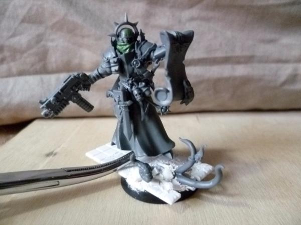
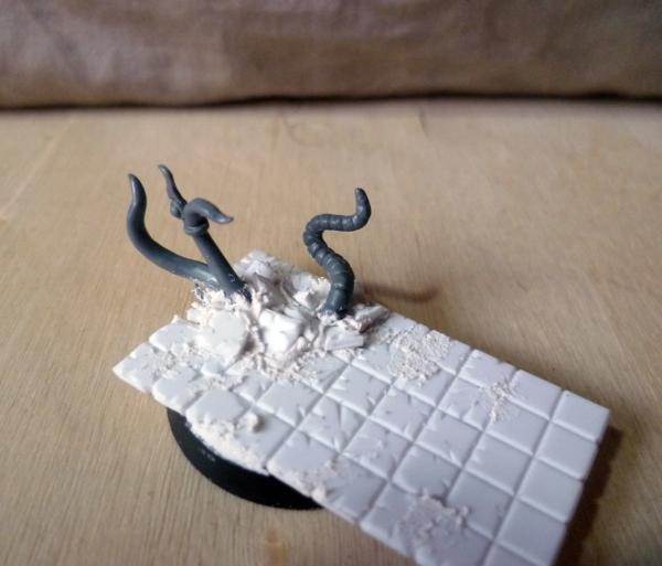
 .
.


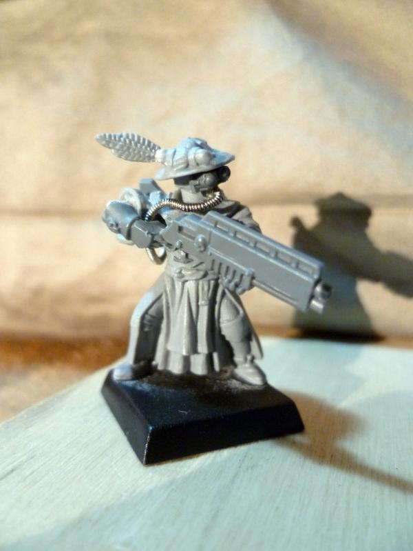
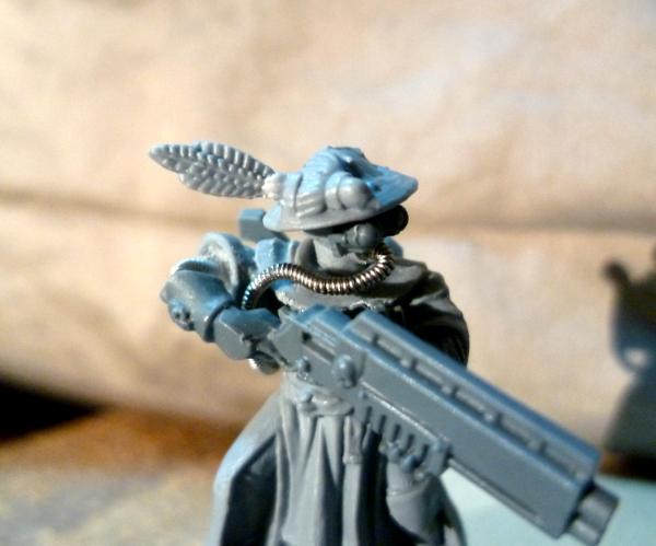

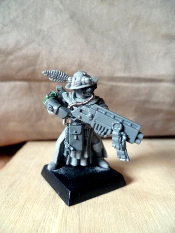
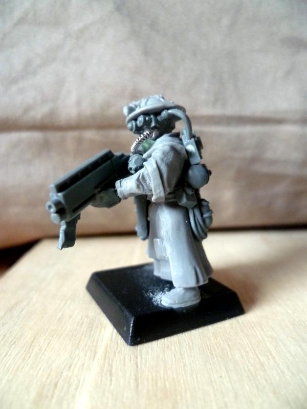
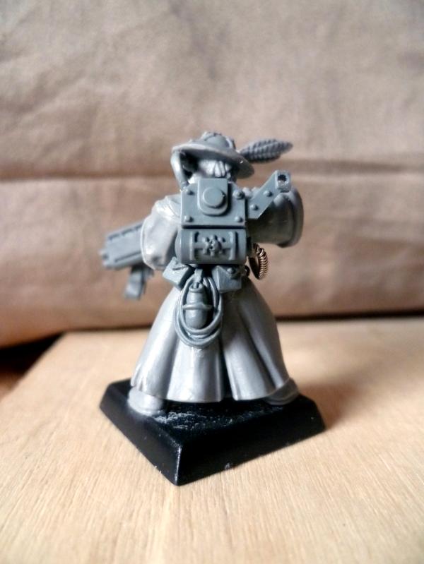
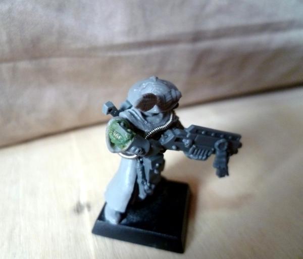
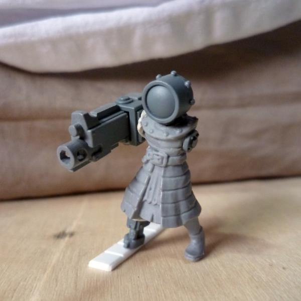
 to the inquisitor (thank you insaniak for the jawdrop image
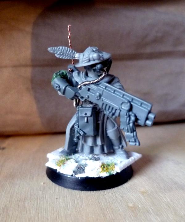
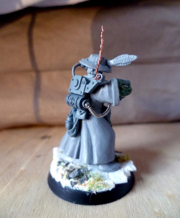
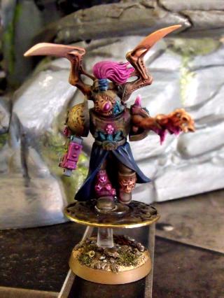
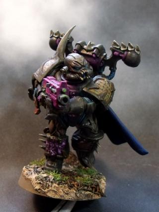
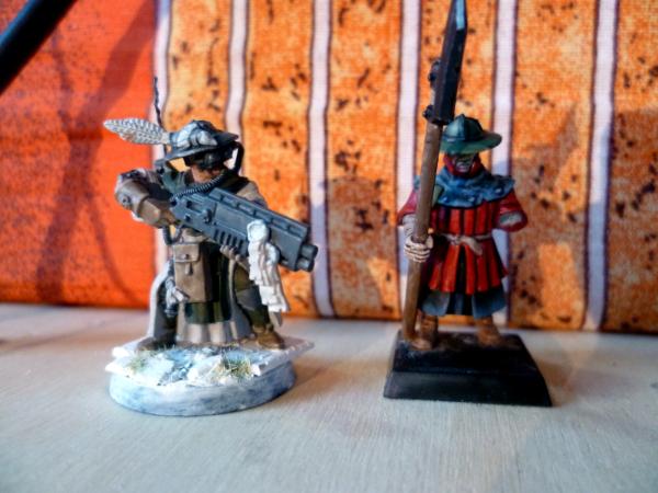

 THat's a fantastic idea to model the one-shot combi weapon! Consider it stolen... and I'm ashamed I haven't thought of it already
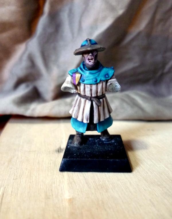
 Indeed, that's not helping much...
 )
)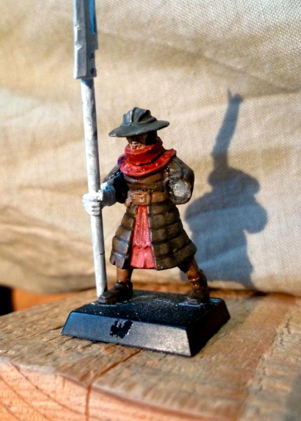

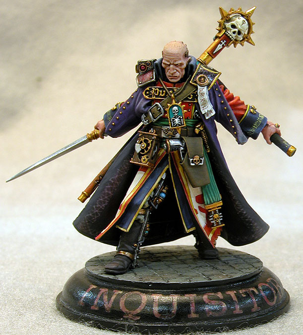

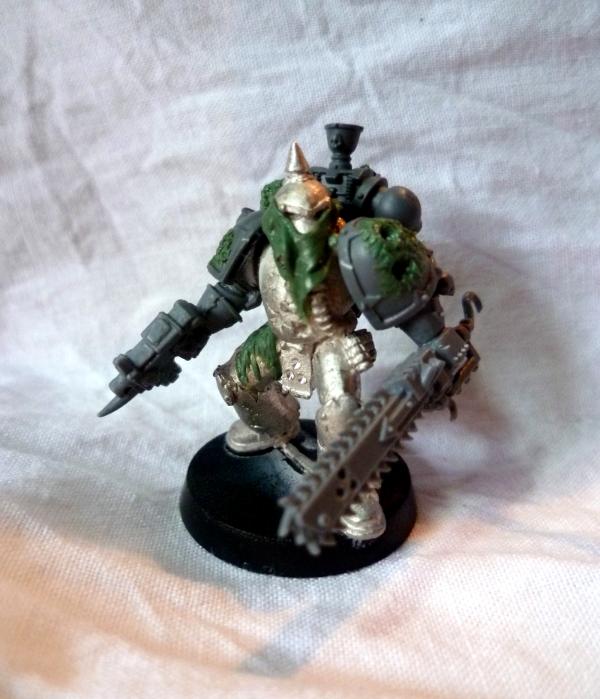
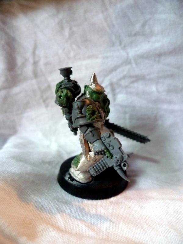
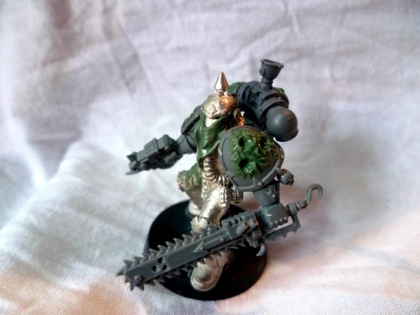
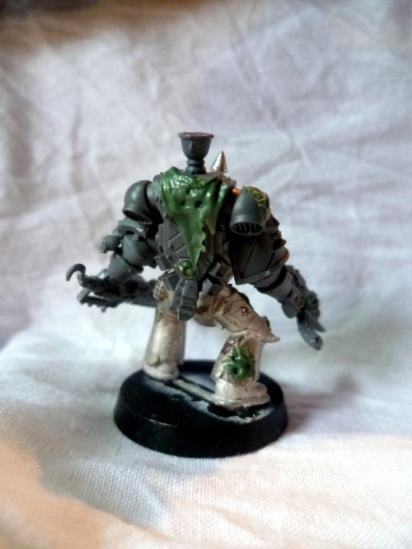
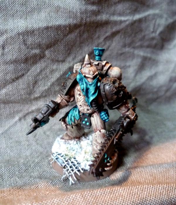
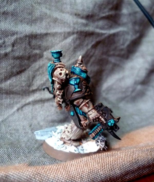
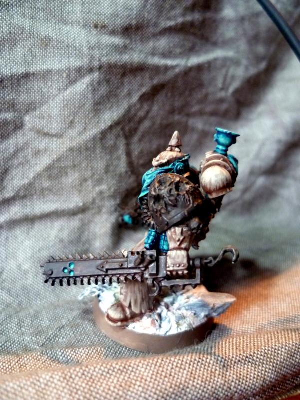
 (I'm guessing just the shoulder pad and the weapons to go?)

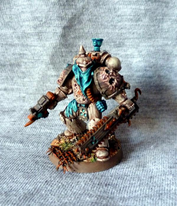
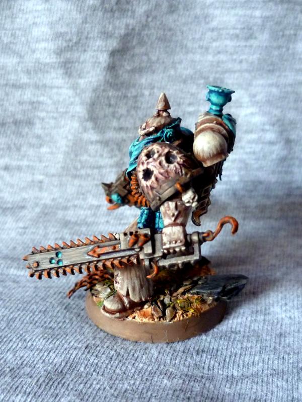
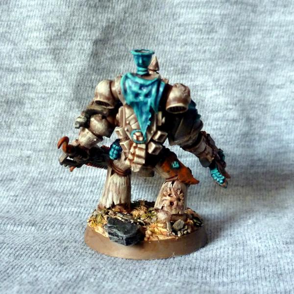
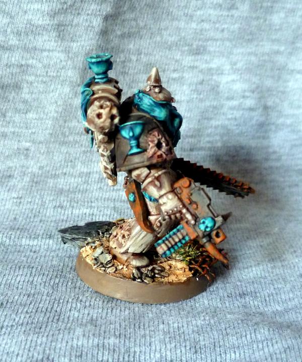
 ), and the very groovy use of
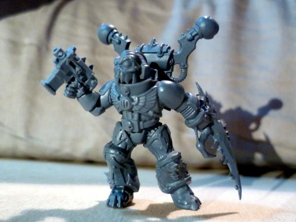
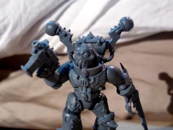


 - so dat we kan pin da umies down, and get klose to hack & smash dem
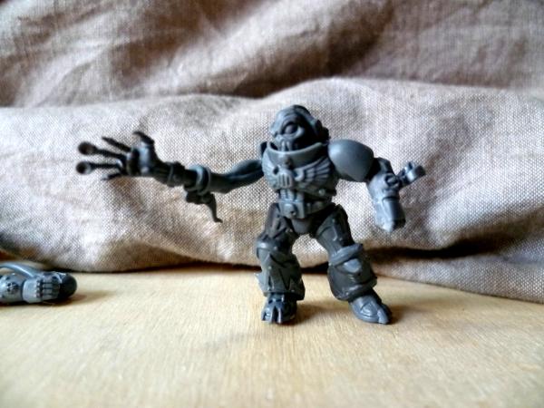
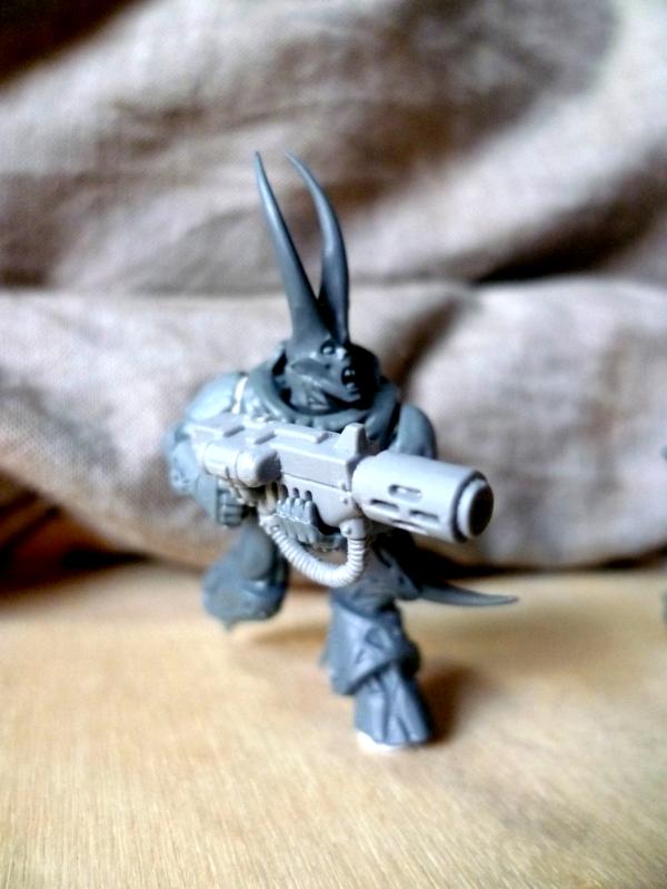
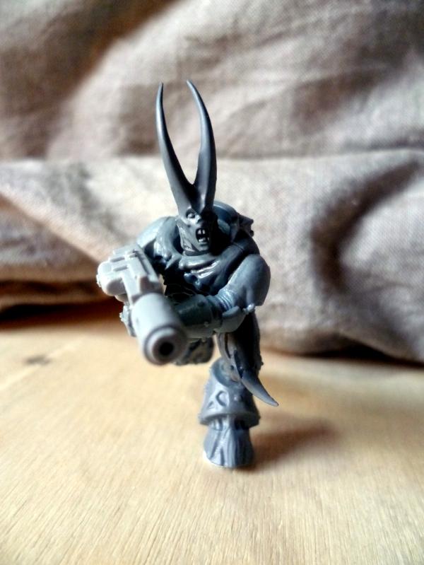
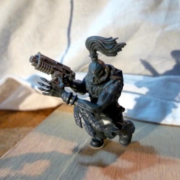
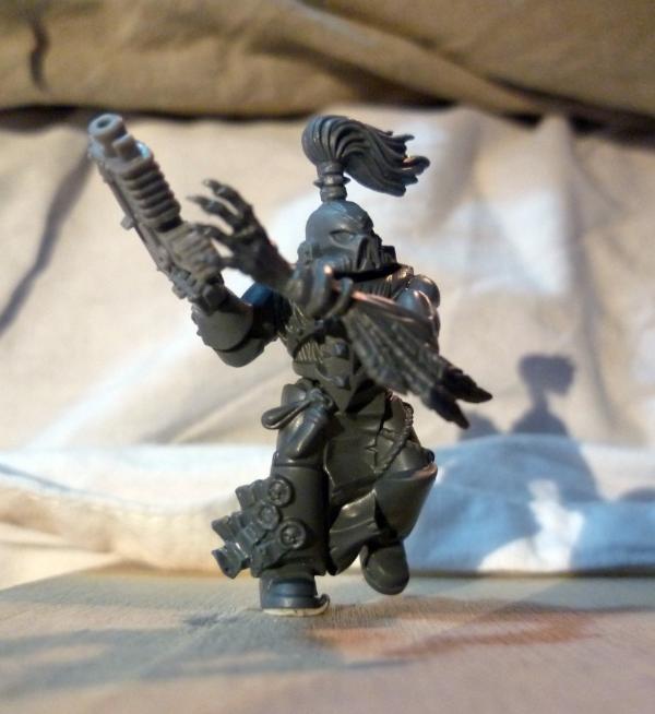
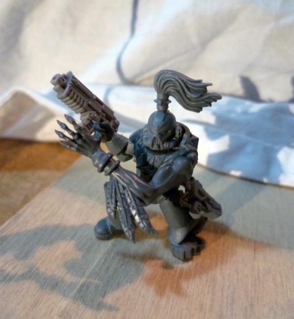
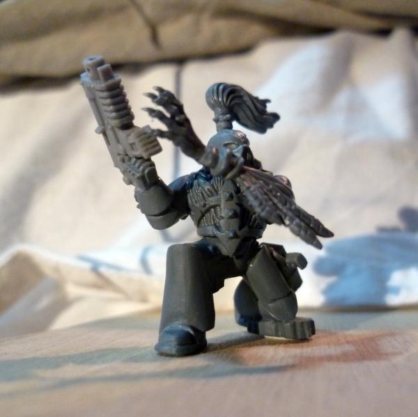


 !!!
!!!