51446
Post by: J-paint
San! Having had no internet i've been deprived of all the awesome going on here, Your praetor is simply stunning! The level of detail is breath taking! The zenith highlighting technique works really well, and yet I still slightly prefer your original method, looks slightly cleaner. (No offence meant!)
The jet pack engine glow looks amazingly good by the way, so realistic 
Also the dark IF armour works really good too, making the fists a bit grimmer is always a good thing, can appease all the haters who say they have no depth!
Keep it up sir, also as the others said, thanks for the yellow tips!
46466
Post by: San76
J-Paint! welcome back sir.
thanks very much man. yeah the praetor was an experiment. i know what you mean, the shading definitely makes for a grimier model. i should put up a photo of the test marine finished next to my usual technique. mostly i was happy with his face, the armour...well, it was so-so.
im really torn now on how to proceed. the old style was like you say, so clean and crisp but the new style looks (to me) way more textured? detailed? maybe i should put some side-by-side pics up for comment.
in any case hoping to get some new pics up this weekend.
how are your Dolosians coming along?
51446
Post by: J-paint
Actually pretty well, I will put some pics up on my thread in a sec, I agree, before you continue you need some side by side shots to compare like with like, I for one would really like to see the difference, its interesting how two different methods give such drastically different results.
46466
Post by: San76
Will try and get a side by side up soon.
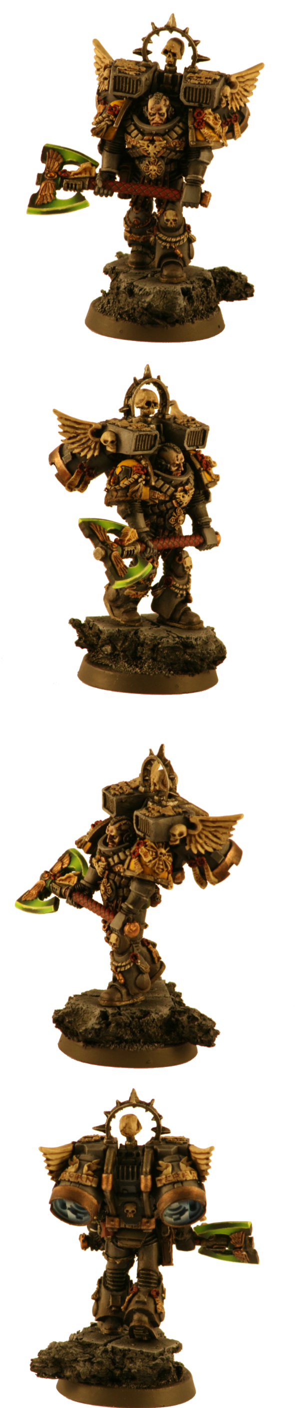
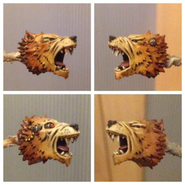
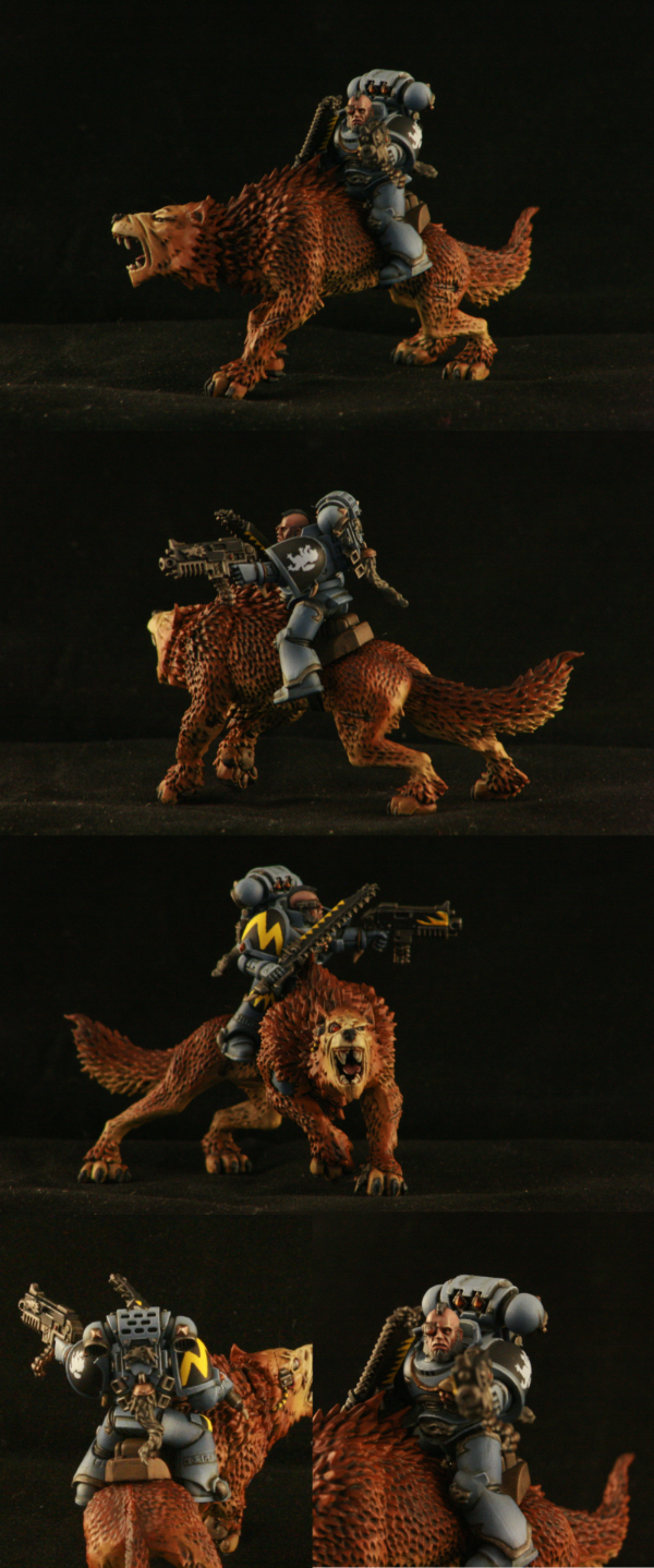
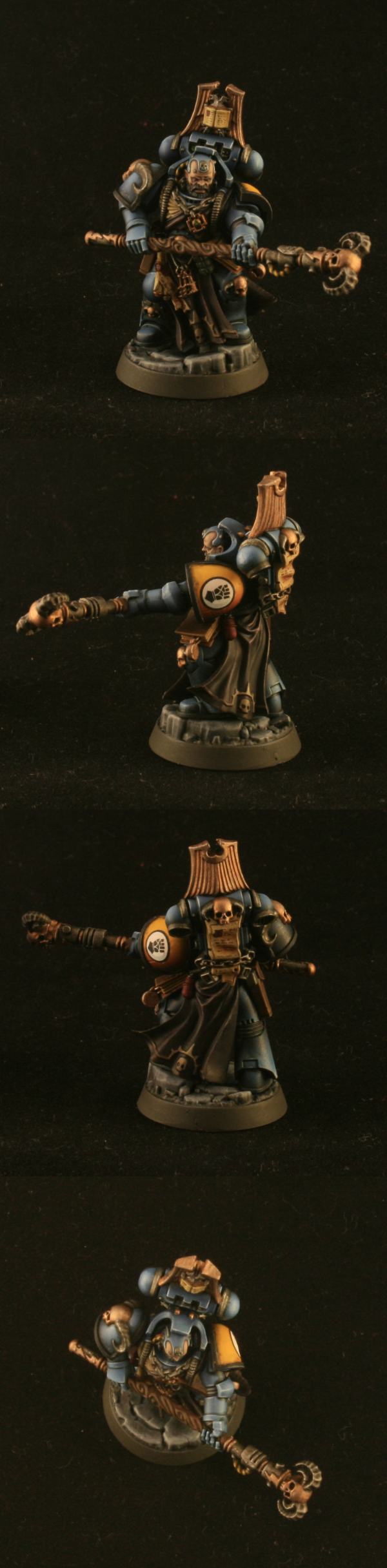
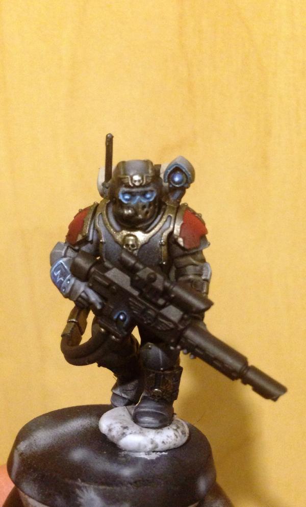
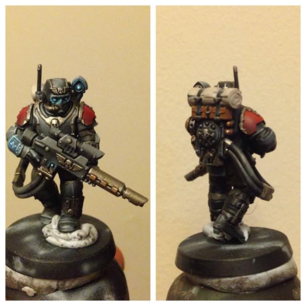
in the meantime, i finally finished my base for my Executioner. when i first saw this model in the store i thought it was full of the kind of grimness for which we all love 40k . I wanted to do something different for him though than an all yellow outfit - it just didn't seem to fit.
I was hoping with this model to concentrate on just a couple of focal points that tell the story. in this case, mainly the face and the axe. i figure, those two parts tell you nearly everything you need to know about this guy. most of the armour i painted with zenithal highlighted series of greys (which are bloody hard to photo it turns out!).
anyways, hope you like him. hopefully this time next week i will have his squad done as well and will get some group shots up.
19143
Post by: IceAngel
Wow, that guy is awesome. Great job. You are right though, one downside to having such a detailed model is that the zenithal lighting does tend to get lost.
Doe that model come with any other head options? I'm already thinking about my own use for that guy.
51446
Post by: J-paint
You just keep raising the bar San, that axe head is simply stunning! I am starting to run out of patience with the blending on my power weapons, you have the patience of a saint!
I agree that it looks nicer than full yellow armour though, and it fits your grey assault theme nicely.
46466
Post by: San76
Thanks very much guys - he was a bit of a risk so I'm stoked to hear it came out ok.
@iceangel - sadly, the Mohawk is all comes with. I tried to put a beaky helm on him and found that a plastic beaky was actually far too large for the model. If you have any FW helmets they might work - the ones I got from FW were quite a bit smaller than the GW plastics
@ j-paint - cheers mate. I know what you mean with the blends. Mostly I was happy with the red gem - haven't done many 
17710
Post by: Yggdrasil
 San, you've done that model a lot more justice than the GW team... Especially the face !!!
Those colours are really outstanding, and the axe is close to perfect... Damn you !!!
As for a replacement head, it seems the model has a Mk.8 gorget, it could explain the difficulties with changing the helmet !
46466
Post by: San76
Thanks so much Ygg! You know, I really should have noticed the gorget...../facepalm
27147
Post by: Solar_lion
Excellent looking figure..
17710
Post by: Yggdrasil
 San76 wrote: San76 wrote:Thanks so much Ygg! You know, I really should have noticed the gorget...../facepalm
Lol... I hope you did take it as a pun uh ? Because it was... I wouldn't have dared to imply you hadn't noticed it... 
46466
Post by: San76
cough...sadly, i hadn't put two and two together on that one. ahh well, live and learn 
73180
Post by: Fenry
Stunning mate, absolutely stunning. That Axe is a masterpiece and the face is stunning, you’ve certainly nailed the grim dark on this one. 
29345
Post by: Nashbashem
He does indeed look very grim. Love it
46466
Post by: San76
Cheers guys, I really appreciate it!
75552
Post by: MagosBiff90
Awesome work mate..... really exuding menace and really grim! Glad i am not the one on the receiving end of that!
Cheers,
46466
Post by: San76
Thanks very much MagosBiff90!
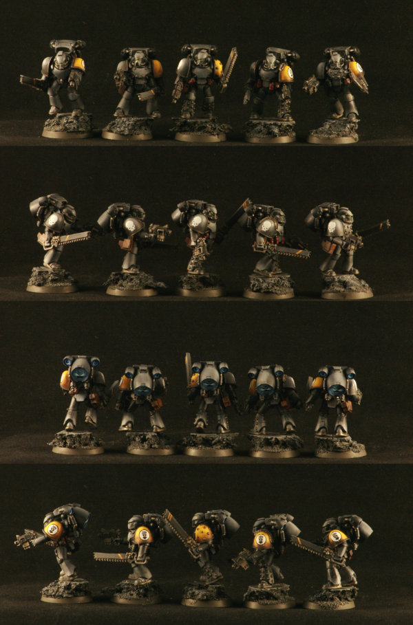
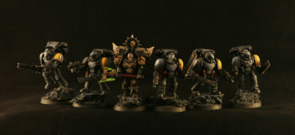
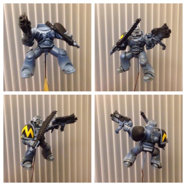
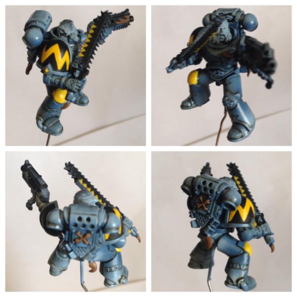
Well, in an almost unprecedented moment i actually finished a squad today. to be fair, its a squad of five...but still, i feel it counts!
These guys i painted up to be the personal retinue of the Lord Executioner i put up last week. The squad is a set of MkIV armour i got from forge world. very nice models. I wanted to give them a similar colour scheme to the Exec, distinctive from other Fists. i'm not great at writing backgrounds, but i kinda imagine them as a body guard/ hand picked kinda squad. So, like the Exec i painted them with a series of zenithal highlights in grey, then used a blend of washes to give them some tone. Unlike the Exec, i didn't put the assault symbol on and instead when for a skull motiff. i figure, if the jump pack doesn't give their gig away, then nothing will, and the skull looked great on the grey
anyways, i hope you like them. im afraid you will need to click and zoom to seem them properly - i just cannot seem to find a good size to post these things.
MkIV assault squad
Lord Executioner and retinue
51446
Post by: J-paint
San! oh my word San! To say that this is awesome is a massive understatement, they are just so cleanly painted, they are perfect, do you mind if I pick your brain on the zenith technique? I know the basic concept (light from one angle) but how well would it work on black armour do you reckon?
The group shot is beyond cool, the grey with just the spot of yellow makes them look so grim and mean, simply gorgeous! You have outdone yourself, and also congratulations on a whole squad!!!
Because we all have to be super critical here on dakka, the only minor fault I could find was one of the transfers, but again thats not your fault, thats the problem of putting a round shape onto a curved surface! Have you ever heard of decal softener? I have no idea what it does, but I heard someone talking about it once when discussing this exact problem.
46466
Post by: San76
mate - after such effusive praise, how could i possibly say no? i think the zenith technique would actually work really well for black armour - i think with black its easy for the model to lose depth and interest and zenithal is a great way around that. one thing to remember though is unless you are super good with the airbrush the grey will diffuse across the black a fair bit and you may end up with a duller, more natural look. like this example from KaraDavut - i dont think they did use zenithal but its a larger model and the actual lighting is giving you much the same effect:  personally, i really like this look. to be honest, that's what the original plan for the executioner was, but the grey/back i mixed up as the base turned out to be more grey than black...and here we are. i think if i had started with a much darker grey (say 10:1 black to white, or even 12:1 - i started with 5 or 6:1) as the "main colour" these guys would have looked black. personally, these days i dont use pure black for anything. i have found that to my eyes, the dark dark greys look black and seem to "sit" with the other colours better than the pure blacks. maybe its a hue saturation or something...or maybe im just seeing things of course, you dont have to have an airbrush...careful dry brushing/wet blending with thin paint will give you much the same effect, especially if you wash it with thinned wash afterwards. the great thing about zenithal black is that you can do the whole thing in grey scale, then make a thin wash/filter of black, brown and your tint of choice (i used blue here, purple on my first chosen) and wash the whole thing - the tint will change the greyscale subtly and you don't have to worry about mixing colours into your greys to get black armour with some colour tone. one important thing to remember is if you are going to paint first then assemble, maybe tack the model together, put him under a light and take a photo - so you have something to reference when you are painting each piece. nothing worse than realising you got the lighting angle wrong on just one bit...yes...it has happened :( also, you don't have to do anywhere near as much edge highlighting - which i always find a drag! anyways, thanks again for your kind words mate - stoked you like them. as for the decals...i used both micro sol and micro set on this model..i am just terrible at decals. i really am. micro sol etc are great products though and i highly recommend them - without them these would look much, much worse.
27147
Post by: Solar_lion
Great figures. A very nice group shot and addition to your Army.
As always good advice as well.
29345
Post by: Nashbashem
Thanks again for the advice on yellow I bought the codex today so I can plot my first IF army and hope to make you proud with the paint job
46466
Post by: San76
Always great to see more sons of Dorn bro! Looking forward to seeing them
27147
Post by: Solar_lion
Excellently dark squad.. now get painting!!
46466
Post by: San76
Thanks very much Solar!
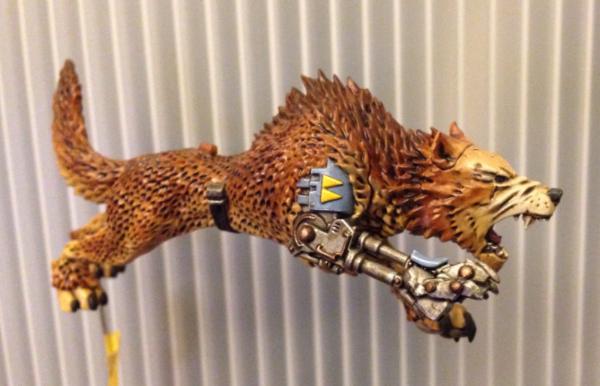
Well, now for something different. Some time ago my good friend asked me To paint up a couple of his thunderwolf cavalry as he is short on time at the moment. I thought I might put up some WIP shots as I go as it's a different type model.
Primed!
First coats done (I totally didn't mean for the wrapping paper to be in the shot...yet, I kind of like it...)
Will be trying to get some more progress shots up over the weekend
51446
Post by: J-paint
Oh nice! the blends are very soft and very smooth! Even though I love your marines its always nice to see something a bit different, just highlights how well rounded a painter you are!
29345
Post by: Nashbashem
Looks almost real
46466
Post by: San76
Cheers guys! My apologies for the couple of weeks of radio silence- have been working away.
Well, since I got back have had a bit of time to work on the wolves for my friend. So far I've washed the fur and then spent sometime working on the faces. He doesn't want the fur highlighted beyond the blend/wash and personally, I think he has made a good call. Not highlighting the fur gives it a softer look I think.
Still far from complete but here they are for your amusement. At the moment have been working on blending up the face to make it an area of focus.
51446
Post by: J-paint
Ooh yes, now that is a very purty wolf! how many are you doing for him in total?
29345
Post by: Nashbashem
That is some beautiful paintwork right there 
46466
Post by: San76
Cheers guys.
There are three wolves (with riders) in the unit. If they turn out well I think he has plans for some additional wolves without riders.
One rider and wolf is actually mostly done (just needs decals and dull coat) but that's with my friend so I can't show you pics. My friend was pretty happy with it though, which was gratifying.
They are great fun models to paint. Outrageous in that makes us love 40k; I mean really, marines riding wolves ... It's pretty OTT
17710
Post by: Yggdrasil
Agreed with the OTT part...
But hell, that's the 40k universe !!! That's just so ludicrous, it even seems reasonable !! 
46466
Post by: San76
Hehe I know what you mean! I Do so love that aspect of things though.
17710
Post by: Yggdrasil
Sure, I guess we all do....
Even the whining boyz secretly love those things they're rambling about
46466
Post by: San76
To be honest, I've never understood the forum folks that complain.
The hobby is so diverse, the mythology so complicated and varied that it really does seem like there is something for everyone to enjoy. Well, to me at least...
17710
Post by: Yggdrasil
Well, I just don't like people who don't understand people who complain...

46466
Post by: San76
So, another update on the wolves today.
Spent a fair bit of time on their faces today - I think they might be nearly done.
As always, any and all thoughts gratefully received. I will apologise in advance for the bad, blurry photos. The old camera phone isn't the best for these.....
Each row is one of the faces - left and right
17710
Post by: Yggdrasil
Looks really, really awesome... The blending is astonishing !! Kudos mate
66045
Post by: Radu Lykan
pretty doggy arrrrrrrrgh get off my arm!
looking really good
51446
Post by: J-paint
Nice progress San, I know that technically its not the most impressive of the techniques you have used on these, but I really like the gums, they have a very natural look to them, weird comment I know!
46466
Post by: San76
thanks very much folks, i really appreciate it.
J, i'm thrilled you liked that aspect as i spent ages mixing up a colour for them. Probably not the most efficient thing, but hey, someone noticed!
27147
Post by: Solar_lion
Very imperssive thou I'm not suprised. Beautiful blending and a nice change from the Grey standard.
46466
Post by: San76
Thanks by much solar! I can't take credit for the colour scheme, my friend chose it. I agree though, the warmer tones are nice.
Finally got a chance to paint this afternoon, so I thought I would post an update. Been working on the cybernetic parts. Tried to mix up the tones a bit to add interest. The leg is a great model. Can't say I in love with the pose but it was the only option. As always, any tips greatly appreciated.
47942
Post by: bebopdrums2424
Hi San! Beautiful work in here mate. I havent commented before because i just somehow kept missing the stuff. Stumbled on afew of your photos in the gallery and here i am! Youre a great painter! I love the green weaponry especially. Nice and smooth makes it pop against the grim model. Really Striking.! And the wolves are off to a fantastic start as well...They look slightly airbrushed? Is that the case or are you building up very thin coats? Either way theyll look better for it at the end.
Cheers
BB
46466
Post by: San76
thanks very much bebop! i love the green power weapons too - i need to try other colours, but i keep coming back to green...
as for the wolves, glad you like them! the fur is completely airbrushed mate, then washed and very lightly dry brushed (so lightly, im wondering if it was worth it). The faces I then built up with thin coats.
29345
Post by: Nashbashem
Now that is a really nice paintjob! I hope your proud of that model
46466
Post by: San76
Thanks very much Nashbashem! I am a bit pleased with how the blending on the face has come out, to tell the truth so glad you like how they are going.
Well, tonight's progress report: marines!
With these marines I have used some zenithal techniques to break up the panels. You can see the post airbrush stage in first pic; I then used a glaze to change the tone and hue as well as even out the gradient. I know it might no longer be codex approved colours but I think the glaze really adds a depth to the colour tone (one thing to note though is that the whole pic is emphasising the browns more than they are in real life - the back ground is actually grey if that helps).
You can also see the freehand for the right shoulder. Still have to do the knee pad. Honestly, I would like to meet whomever thought yellow on black was a good idea. Preferably, while armed!
Anyways, would love to hear your thoughts. Tomorrow: glaze the second marine and work on highlights!
64336
Post by: Brokksamson
Great effect on the wolf's muzzle and fur, very well executed! My only comment being that I think they could use a little green stuff on the heads where the pieces fit together, I had to do this previously on my own wolves and it is a tedious process :(
17710
Post by: Yggdrasil
I don't know how you manage to pull out such gradients on Space Marine armour... It might be my airbrush, or my airbrushing skills, but that's beyond my current capabilities...
And it looks awesome.
27147
Post by: Solar_lion
Amazing as always. Do you run a wash through your airbrush?
47942
Post by: bebopdrums2424
San, lovely mate. Shoulder pad is very very well executed!! However, might i simply request that you not use that back ground when photoing your minis? Its extremely distracting and your work deserves much much better Even in the WIP stage
Gracias mi amigo.
BB
46466
Post by: San76
Thanks very much guys!
@broksammon - you are too kind mate, they need A LOT of green stuff. I don't know how I didn't notice that when I put the models together. I'm hoping I can dazzle my friend with the paint work and he won't notice P)
@yggdrasil - generous as always! i wish I could do more I really do. Thinking about getting a new airbrush, I have an Iwata eclipse, and it's Been great, but only has a 0.33 tip. Wouldn't mind a 0.2 for detail work. Besides, I've seen your work (I'm thinking that purple cape you did recently) so believe me when I say you could easily do anything I do
@solar - when painting my fists I do, cause it's a heavier tint. With these guy I put the wash on a panel with a brush, then remove it more or less straight away (except recesses) with a clean brush. To my eye this gives a more subtle result. I my be creating unnecessary work though....wouldn't be the first time....
@bebop - thanks very much mate. I've found if I look at the freehand from at least 2 m away I don't hate it as for the back ground, I had no idea! Very sorry, will try for something less annoying for next update.
Speaking of which, nothing today I'm afraid because my copy of the new FW heresy book (massacre) arrived today and I am busy dreaming I could paint like the images. Already, I can feel the urge to paint salamanders....
Hopefully tomorrow I will get something done to show you all. Must say, I have found pestering the world with my gradual progress has actually helped me move the figures along - also, I'm a sucker for the kind works of my fellow dakka-ites
29345
Post by: Nashbashem
Loving the zenith armour on your Space Wolf
17710
Post by: Yggdrasil
San76 wrote:
@yggdrasil - generous as always! i wish I could do more I really do. Thinking about getting a new airbrush, I have an Iwata eclipse, and it's Been great, but only has a 0.33 tip. Wouldn't mind a 0.2 for detail work. Besides, I've seen your work (I'm thinking that purple cape you did recently) so believe me when I say you could easily do anything I do
Well, then I must be lacking in technique...
Hopefully tomorrow I will get something done to show you all. Must say, I have found pestering the world with my gradual progress has actually helped me move the figures along - also, I'm a sucker for the kind works of my fellow dakka-ites
We're waiting for the "something to show"
46466
Post by: San76
@ Nashbashem - thanks mate!
@Yggdrasil - mate, i doubt that very much!
well, i know i promised more progress....and failed to deliver. what can i say, BF4 came out and i got fully engrossed in my virtual laser tag/murder simulator. to my shame, this means i made very little progress. i do have a couple of pics for you though.
this one shows the space wolves with what progress i did make (now with back packs!) as you can see, very little change - just blocked out the knee pads for the next round of free hand, started blocking in the sword and undercoating the various fetishes.
this one is an unrelated project that i started sometime ago and havent progressed. am putting it up to help me get motivated. i had this land raider in my cupboard for nearly a year before i finally got the nerve to build him. had a massive block around it, was forever waiting to get the skills up to painnt such a larger piece. then i decided "what better time", built it and got the base coats down (which is pretty much where this is up to).
asides from being my first proper vehicle, i have decided to try using some oil paints for shadows and weathering. its been a really interesting experience. i have only done one side, and i think they might be too subtle at this stage, but i am actually really liking the streaking effect that can be achieved relatively easily. i will probably put halt to the weathering for now, block in the other colours and then go back to it.
the other thing i found, and thought i would share is something to fix "wobbly gunner syndrome'. i found that the marine gunner had a tendency to tip forward if not glued in. well, turns out a one euro cent piece fits exactly into the slot. so i glued a couple to the base of the gunner and now he doesnt tip over and sits quite solidly without gluing
as always, any and all comments appreciated. i am stuck in the field for two weeks - so no painting ( :( ).
27147
Post by: Solar_lion
San76 wrote:this one is an unrelated project that i started sometime ago and havent progressed. am putting it up to help me get motivated. i had this land raider in my cupboard for nearly a year before i finally got the nerve to build him. had a massive block around it, was forever waiting to get the skills up to painnt such a larger piece. then i decided "what better time", built it and got the base coats down (which is pretty much where this is up to).
asides from being my first proper vehicle, i have decided to try using some oil paints for shadows and weathering. its been a really interesting experience. i have only done one side, and i think they might be too subtle at this stage, but i am actually really liking the streaking effect that can be achieved relatively easily. i will probably put halt to the weathering for now, block in the other colours and then go back to it.
as always, any and all comments appreciated. i am stuck in the field for two weeks - so no painting ( :( ).
Remakably good yellow. I like the oil weather technique, I find it very easy to use, clean up and touch up.
Field? Farmer or soldier?
17710
Post by: Yggdrasil
Streaks look awesome already on the Raider.. And the "gunner tip" is nice to know, thanks !!
46466
Post by: San76
Cheers guys
Maybe a subtle look will be ok.
@solar - I'm far too soft to be either mate (although I come from a family of farmers and soldiers). Im an archaeologist by trade.
27147
Post by: Solar_lion
Awesome.
You have to play with the right amount. I have been way to subtle and I wish I had gone more dramatic. Especially when it comes to Shading and Highlighting.
Looking at some folks work it seems in order to get the contrast to be accentuated you almost have to go more than less.
When you get back you can look at it with a fresh set of eyes. We await your results.
29449
Post by: weetyskemian44
Lovely painting! Very smooth and subtle.
46466
Post by: San76
Thanks weety!
Well, I'm back from the field and had time this evening to do some painting. Got to get these wolves done, so the land raider is back on the back burner.
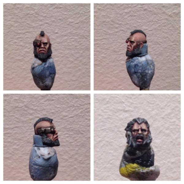
Tonight I painted the faces for the two wolves. Decided to go for steel grey hair, I imagine that only veterans get to ride the thunderwolves. The beard on the bald model was modelled kinda flat, so I tried to add some texture in the painting.
As always, thoughts gratefully received. Sorry they aren't the best photos, suffering from an epidemic of blown light bulbs here....
47942
Post by: bebopdrums2424
Nice work on the faces San thanks for switching that background on your updates also
BB
26790
Post by: Gitsplitta
Boy San, have I dropped the ball on your blog. Don't know how I missed it. Your yellows are impeccable, your eye for design and color outstanding, and your airbrush skills are excellent. Consider me both subscribed and embarassed...
29345
Post by: Nashbashem
The faces look epic like all of your work
46466
Post by: San76
As always, you are all too kind.
@Gits - no embarrassment needed mate! Thank you for taking the time to stop by (and thanks heaps for the sub).
I hoping to get some more work done on the wolves in the next couple of days, so with any luck I should have updates soon.
In the meantime, thought I would ask a question of my fellow airbrush users. I am using an iwata eclipse HP-c at the moment. It's been a great first airbrush, but I'm aware there are better ones out there. I was thinking of looking into getting a newer one, something with a finer than 0.33 needle, and I was wondering if anyone had any recommendations?
73518
Post by: BrotherTitus
thanks man, needed this thread to galvanise my own hobby interests. really awesome work man, look forward to readfing more when i can (only got to page 5 at the mo)
Courage and Honour.
46466
Post by: San76
Brother Titus you really are too kind mate! I hope you like the more recent models as well.
Speaking of which I have a small up date today. Have done some more work on the space wolves. The armour is highlighted and most of the bronze done as well. Still to do: metal highlights, bone and gems. Oh, and the claws on the wolves. With any luck I will have some completed pics by this weekend.
14392
Post by: nerdfest09
San! wowzers dude! the space wolves are really coming along nicely, especially the heads! I do love a good head and you've got some seamless skin tones there! very impressed (yes, impressed= Jealous) I also like the armour on them, the blue is a nice balance between the popular baby blue look and the older greys you used to see, great use of almost reverse highlights on the legs :-)
27147
Post by: Solar_lion
So what formula are you doing for your faces?
46466
Post by: San76
Thanks guys! Shocked by the quick responses....
@nerd- cheers man but I can't take credit for the choice of blues, that's all my friend the space wolf player. I just apply the paints
@solar - it's a bit of a process but I use a recipe I got from 'eAvy metal (recipe in old paints) 1) tallarn flesh, 2) thin wash of dark flesh 3) wash of scorched brown and black 4) 2:1:1 tallarn flesh: fortress grey : bleached bone to all but recesses 5) 1:1 tallarn flesh : bleached bone to raised areas, 6) final highlight bleached Bone. Thin paints for the win
26790
Post by: Gitsplitta
Very nicely done San. Love the way he looks.
29345
Post by: Nashbashem
He looks amazing Envious of the painting quality
46466
Post by: San76
Gits and Nash- thanks very much! Those two wolves are finally finished and I am hoping I can get some photos up tomorrow.
In the meantime, something totally different. I got my new airbrush the other day and decided that rather than finishing one of the dozen or so projects I've got going, I would instead start something totally new. So, inspired by Yggdrasil I went to the store and picked up a box of tau fire warriors . Despite being totally ignorant of tau I set about building a test model. Sadly, turns out badger and iwata use different sizes threads ski didn't get to try any of the fancy airbrushing I was hoping to. Should rally have checked that before I picked up the box.
I any case, here is a WIP shot of the first of my tau. I love the model, and I would say he is about 75% done. I went with a green and tan scheme, tried for grey at first but he looked very bland.s might reserve that for stealth guys. Have decided to stretch myself a bit with these guys and I intend to use weathering and even some OSL if I can.
Before I commit to painting up dozens of these guys I would love some input. The symbol on the shoulder I was going to do as a bronze. It's just under coated at the moment. Black seems to be popular but I tried that and it wasn't working for me. Before you do comment though, I now realise that he should have had an antennae and that I should have pained the sept markings (?) before I did he chipping. Poor test model :(
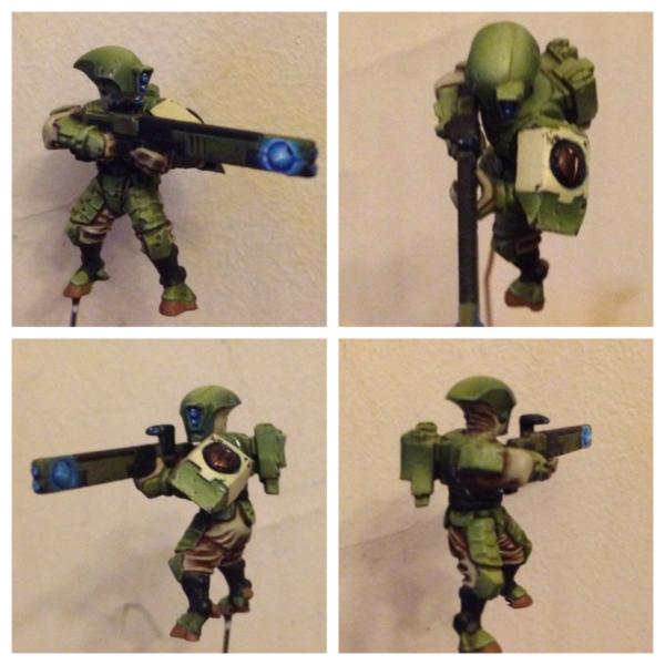
Thanks in advance.
47942
Post by: bebopdrums2424
You're a better man than I sir. I'm not a fan at all of those old sculpts and is the impetus behind my Kroot rebellion. With that said, you've done a bang up job with it. Nice subtle color scheme with pop of bright blue (which you know I like). I'd say go for it. I'd love to see a full army of these on the table! Ill assume those you did not airbrush...or did you?
Either way, awesome
BB
46466
Post by: San76
Cheers bebop!
No no he is airbrushed, just with my old brush. Any thoughts on a base? My natural inclination is to go with a dark, rubble strewn type base ( because that's what I do for my marines and also, the dark colours should contrast nicely) but I'm not 100% sold. I do intend to bring some weathering powders etched on him....
As for the models, I didn't think they were too bad. Kinda dynamic in posing. I looked at some of the broadside (?) models (xv8 I think) and they looked very chunky.
26790
Post by: Gitsplitta
Nice airbrushing work San. I like your green transition. Very well done.
33919
Post by: Moltar
The airbrushing on that tau looks great! Wonderful color palette too.
22192
Post by: whalemusic360
Maybe a more greyish black, like you did on the Chaplain bodyguard unit for the guns? What color for the sept markings? A light blue or orange would look good.
Stick with the same basing, gives you the option for allies without looking super disjointed.
46466
Post by: San76
Thanks very much everyone.
@gits - green is far more forgiving than yellow!
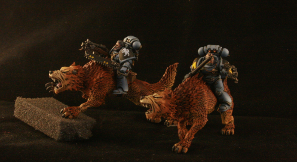
@whalemusic360- great idea with the basing. As for the sept colours, I was intending to use the same as the central panel in the left shoulder to keep the palette close together. Will definitely look at blue and orange though ! Automatically Appended Next Post: Finally got the Thunderwolf cavalry finished! well, my part anyways...my friend wants to do the bases. since one of the models wont stand up without a base (the leaping wolf) most of the pics i have are of the model that is free standing.
its been great fun to paint these models many thanks to my mate for letting me have a go at them. They are awesomely over the top 40k.
learnt a bunch of stuff with painting the animals, and I very nearly succeeded in using transfers!
anyways, i hope you (and he) like them. once again, i have failed to get the scaling right so you probably will need to click and zoom. sorry.
27147
Post by: Solar_lion
Seriously nice looking TW's. Love the shot of the wolf looking right at ya!
26790
Post by: Gitsplitta
So San, what did you learn about painting animals? I ask because I have a pile of Fenris Wolves and one Wolf Lord on T-wolf that I need to paint and have no idea what I'm doing...
46466
Post by: San76
well, one of the things i learned was that they aren't nearly as daunting as i thought they would be. after just painting armoured figures, i was pretty nervous about fur.
if you like the way they look i can PM you the details on how to get them like that. i imagine greys would be pretty straight forward too.
Automatically Appended Next Post: @ Solar-lion - thanks mate
26790
Post by: Gitsplitta
Please do!
29345
Post by: Nashbashem
The tau looks great and your Thunder Wolves blew my mind
39666
Post by: GiraffeX
Nice Thunder Wolf, its nice to see a different colour to the normal GW version.
46466
Post by: San76
Thanks folks! My friend was happy with the TW and that's the best part
As for the tau, I'm glad you liked him Nash; I actually really enjoyed painting him. Not sure if it was just because it was something different. Got to work on OSL as a technique....I think the way I went about it was far too heavy handed. When I get back I will try two more - one with my new airbrush that's waiting and one using bebop's glaze based technique.
Any tips anyone might have be gratefully received
51446
Post by: J-paint
I'm afraid I can't help with tips, what with you being a sublime painter already, but I just wanted to pop in and say that I really like the tau colour scheme, especially looking forwards to the weathering powders, that and chipped armour make a refreshing change for tau, and the fact that you chose green, well that's what i would have done too! I think for the shoulder thing the brass idea is still worth baring in mind, green and brass always looks nice together in my opinion.
By the way the TWs are simply....well, simply perfect in every way, you have outdone yourself!
46466
Post by: San76
Thanks heap J! I'm very much looking forward to finishing him. I think the weathering powders should go ok over those colours....
How's the doctorate going mate?
51446
Post by: J-paint
Slowly! How is the ...archaeology? Do you do archaeology? or is that my mind inventing things? , your blog has given me the kick i needed to update my blog btw, so thank you, what weathering powders have you bought btw? and from where?
46466
Post by: San76
Haha yeah, for my sins I do archaeology. It's all ok thanks, but at the moment I'm on holiday which is far better
I use the forgeworld powders myself and have found them really nice. They have a few different browns which blend together well. I can get the colours for you when I get home if you like. I'm sure there are heaps of other choices out there...I'm just a beginner in that sort of thing.
Looking forward to see some updates man, but I imagine its difficult with your studies..
63129
Post by: Littletower
Those wolves are mindblowing, and the weathered Tau look great.
17710
Post by: Yggdrasil
Awesome Thunderwolves, San...
Nice contrasts, crisp colours... Love'em !
46466
Post by: San76
Thanks Littletower and Yggdrasil, I really appreciate it
Decided to take a leaf from you Ygg and weather the tau.
17710
Post by: Yggdrasil
Sure, go ahead !!!
I think it works best with dark grey or dark brown than black...
Let me know how it goes !
46466
Post by: San76
I agree, been using charadon grey (?) so far
17710
Post by: Yggdrasil
'Twas Charadon GrANITE
46466
Post by: San76
Haha, of course!
46466
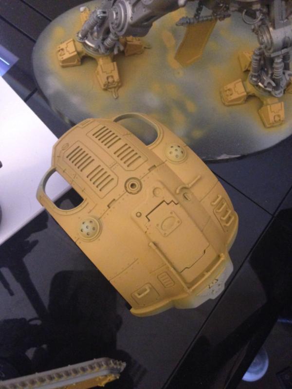
Post by: San76
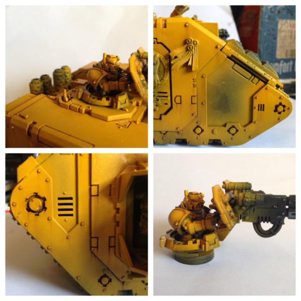
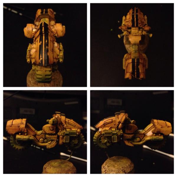
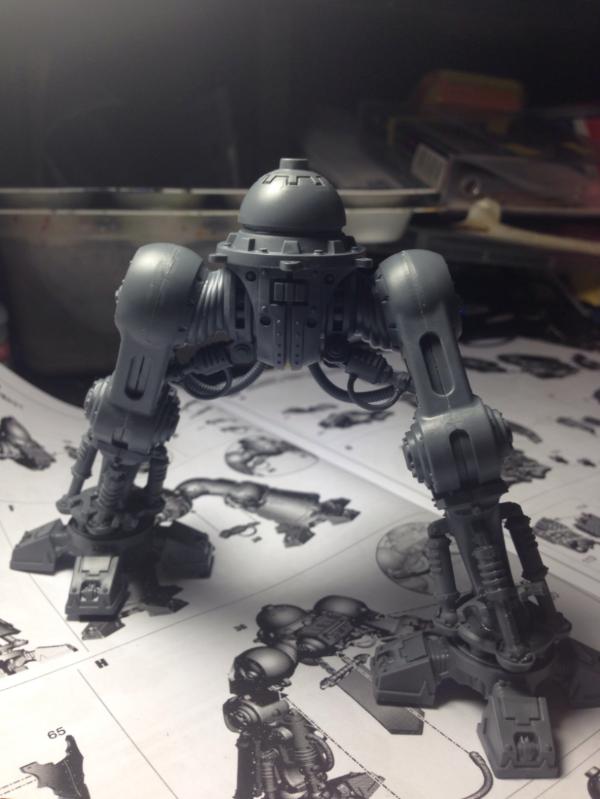
Its been a while since i painted yellow, so i thought for my next project i should get back to the Fists. I picked up the Mk IV outrider squadron from Forgeworld a ways back, so i thought they might be a cool project to test a few new techniques on. trying for an increase in overall speed and weathering techniques on this one.
In an effort to actually finish a vehicle I'm going to try and post quite a few WIP shots. my apologies in advance if some of the updates are fairly mundane.
anyways, first up here is the test bike blocked in yellow. i decided to try and paint him mostly assembled for once - normally i paint the models in parts which is great for access but is harder on storage and frankly, i suspect i end up taking longer. we shall see...if it gets too frustrating i might try and get him off the bike. The colour in this photo is pretty much right (sadly, the camera phone white balance in some of the others isn't as good).
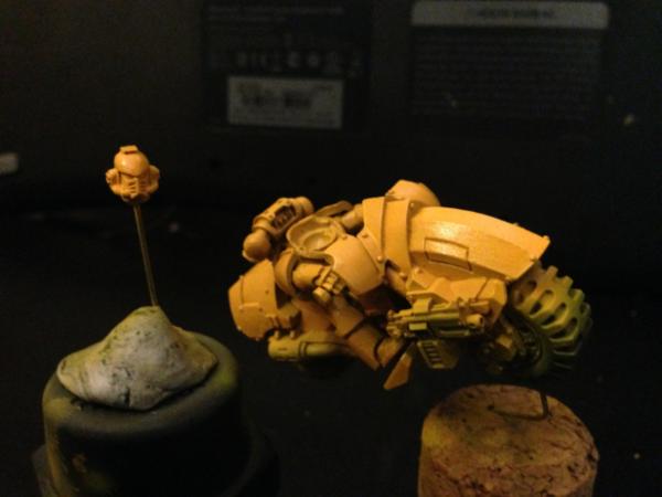
so, given i want to use oils on this guy (which will involve pre and post varnishing) i sat down and tried to work out a schedule of steps post block colour. first things off the block are some stripes (cause i cant resist the chance to make a bumble bee) and some paint chips. to weather the black stripes i shamelessly copied Yggdrasil and sponged some liquid mask on before laying down the black. it worked ok...i think it might have worked better if i had sprayed the stripes rather than painted them with a brush..
the varnish is drying at the moment....then onto oils for shading and weathering! a bit nervous but fingers crossed
14392
Post by: nerdfest09
yay more yellow! :-) that looks great already damn you! *shakes fist* looking forward to watching this progress, techniques I won't try but am very intrigued by!
46466
Post by: San76
haha cheers Nerdy. the stripe isnt too naff? i know its not very imperium (cause its not a skull) but it was just crying out for racing stripes....
51446
Post by: J-paint
No san! it would have been a crime not to make it a bee!!! Its awesome!!! I am really looking forwards to seeing the results you get from the oil washes, been tempted to try it myself a few times now, but not quite brave enough!
26790
Post by: Gitsplitta
Really like that bike... where'd it come from?
46466
Post by: San76
Thanks Gits, you can grab them at Forgeworld ( http://www.forgeworld.co.uk/Warhammer-40000/Space_Marines/Space_Marine-Infantry-and-Accessories/LEGION_MKIV_OUTRIDER_SQUADRON.html).
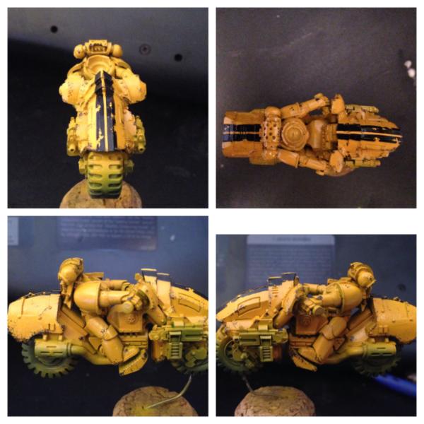
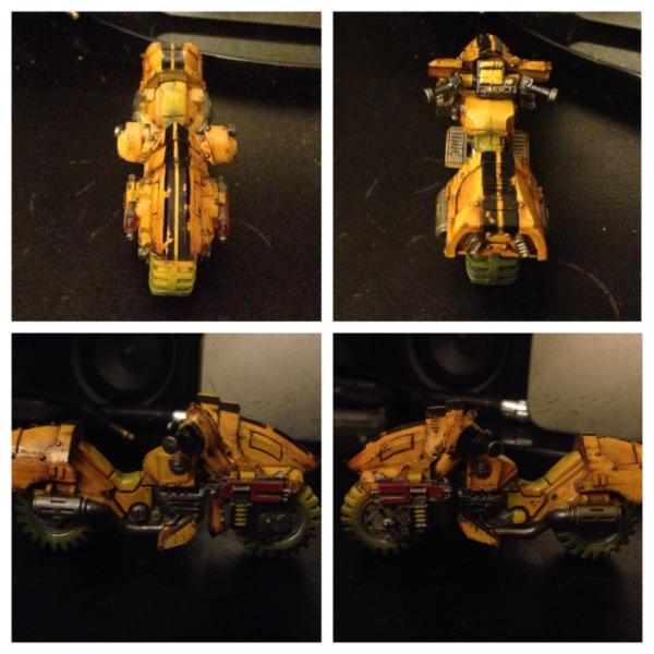
Well progress this afternoon. I hit up the oils for both the pin striping/recesses and to do some weathering.as you can see my plan to paint the model assembled didn't last long...
I have only worked with oils once before (on part off land raider which is looking at me reproachfully from the cupboard) so it took a bit to get going again.
I found the oil great for doing the recesses. Because the oil doesn't dry for sometime it was very easy to clean up. In fact, I need up washing the entire model and the cleaning the oil off of the armour plates. This changed the hue slightly and seemed to incorporate the striping better. I think it is mor the grim dark end of the imperial fists spectrum, but I'm happy with that.
So, enough preamble...the update photo (sorry it's so dark).
27147
Post by: Solar_lion
Excellent. I use the oil technique all the time now on my Lamenters. I use a Sepia oil paint as I Like the red/ brown look over the black. I think that it helps transition the Yellow better to the darker resess. I also think it blends in well the bronze/ tin/ brass and other metals used on my pipes and engine parts. You also should consider finding some accents to paint that arn't so complemtary. Such as Purity seals. These are great for breaking up the simular color pallet. Using bright red, whites or even Light green or even purple ( Yellows opposite color on the wheel) are all good. Search " Johnnyhorse" 's Lamenters. He uses Green Purity seals that I thinkshow what I talking about.
The black strips look great. I wouldn't worry about using a brush on it if your intending to " weather" it. I think the contrast would look to clean for a bike that has been put through its paces.
My problem also is time. You have to let things dry and I'm alway wanting to move to the next step.
Amazing work as always! Pretty soon your gonna have enough figures to actually play the game!
46466
Post by: San76
Hehe well, to be honest I've played a few games now. Enough to fear Longfangs
Thanks for your kind words. I used a burnt umber oil paint on this guy, I have a sepia though...perhaps I will try that next time.
The waiting is a pain, though I've found that since I got airbrush ready gloss varnish I'm far more inclined to go through the while process. It still takes a while to dry, but it takes no time to apply and is a nice thin coat
As for other colours, I definitely know what you mean. Will be looking to break up the colour of the bike once I get past the armour plates. I have seen johnny horse's work and it is awesome.
27147
Post by: Solar_lion
I'll have to try Brurnt Umber. Seems like it's a touch darker.Might be better for me as well . Thanks for sharing!
26790
Post by: Gitsplitta
Well, I've heard SM bikes are all the rage now as troop units (with the appropriate chapter tactics to make them scoring). So you're going to have not only cool but functional units as well!
46466
Post by: San76
Really? Well that's some welcome news!
46466
Post by: San76
Sadly, very little progress made today but I'm trying to stick to my commitment to regular updates. Got some of the first coat for the metals down, that's about it. Decided to make the bolts steel instead of yellow - just wanted to break up some of the panels.
Have opted for the red bolters to tie in with many of my marines. Still just undercoats at this stage. i want to incorporate some copper tones. I know really it wouldn't be the right material, but colour wise I think some of the pipes might look good as a light copper. If anyone has any advice I'm all ears.
Also, got to use the metallic black that nerdfest so kindly donated. It doesn't show in the pics but it's pretty cool. Used it on the handle bars, the magazine casing and some other engine. Just to offer a different base tone than the led belcher (a paint I loathe.....I miss the old bolt gun metal).
26790
Post by: Gitsplitta
I like them a lot. Man you've got me thinking about bikes now da*n you!
53506
Post by: GaussGuy
Wow that looks fantastic. It looks like a few more steps then my yellow for my fists. Here is a contemptor comparison, although yours greatly outshines mine.
1
46466
Post by: San76
Cheers Gits....you know...these would look great with orks....
@GaussGuy - your're very kind, but the shade of yellow we are both using looks pretty similar to me is the contemptor fun to paint? Been thinking of getting one....
53506
Post by: GaussGuy
San76 wrote:Cheers Gits....you know...these would look great with orks....
@GaussGuy - your're very kind, but the shade of yellow we are both using looks pretty similar to me is the contemptor fun to paint? Been thinking of getting one....
It is very easy with the large surfaces and easy to magnetize. I would HIGHLY recommend an air brush as with large surfaces you can't hide the strokes as easy but I did do that on with a brush. All you need is a plan for the metal and it comes together very easily.
46466
Post by: San76
Hmmm...tempting....
47942
Post by: bebopdrums2424
Nice stuff. Love the akira like bike. Its a great model. Your a yellow master san. And i mean that in the good way And i hear you with leadbelcher. it. SUCKS. GW is the only company i can think of that purposefully worsens their product and then charges more for it. Them and EA might just be the two worst companies for nerds around the world
74514
Post by: Phutarf
Just found this thread San and I'd like to add my admiration for your IF's - your yellows are very nicely done! Makes me wonder whether I should invest in an airbrush...
46466
Post by: San76
@bebop - cheers mate! glad its not just me with the leadbelcher...to be fair their golden yellow and gryphonne sepia replacements were pretty good...just the metal one...urgh..anyone got any tips on an alternative im all ears.
@Phutarf - many thanks and welcome aboard i can not recommend an airbrush strongly enough. especially for yellow, but for any colour really. you can get some nice brushes relatively cheaply and they make such a difference. not compulsory by any means, but i do hug mine from time to time
47942
Post by: bebopdrums2424
San76 wrote:@bebop - cheers mate! glad its not just me with the leadbelcher...to be fair their golden yellow and gryphonne sepia replacements were pretty good...just the metal one...urgh..anyone got any tips on an alternative im all ears.
NMM? lol. Or seek out vintage metals.
BB
17710
Post by: Yggdrasil
Wow, great job on the outrider bike, San !!!
The stripe looks better than mine uh though I think it would probably have been even better with your airbrush.
And the weathering is top notch ! Keep it up !
46466
Post by: San76
Thanks very much Ygg. I think it might have been better with the airbrush, just because when I put the coat on with a regular brush the acrylic black paint formed a thicker skin that caused problems when I went to remove the liquid mask. Also, if I had thought about it I could have sprayed a highlight. Ahh well.
So today's update: did some work on the metals. Got the main exhaust pipe to look a bit brighter (though of course, it's getting weathered anyways.
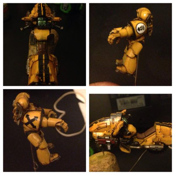
have decided to go for a brown leather seat, you can't see much of it when the guy is on the bike and it seemed to fit colour wise. Just blocked in at the moment. Added decals to the trooper (pictured for the first time since I removed him from the bike).
More excitingly, started work on the console. I haven't painted many of these....so we shall see. Have decided to go for a mix of greens and blues....all green or all blue seemed a bit boring. Have painted the two green screens so far, which took me a surprisingly long time. Hopefully it doesn't end up looking like Xmas lights
26790
Post by: Gitsplitta
Looking great San... keep plugging away!
46466
Post by: San76
Slowly slowly ....
37597
Post by: sparkywtf
Man I wish my console screens looked that good. Those things like fantastic.
And the overall paint job looks fantastic too
53506
Post by: GaussGuy
Can't wait to see the finished bike.
17710
Post by: Yggdrasil
Wow... The weathering is perfect, as are the screens...
Damn you San !!
60955
Post by: bossfearless
Loving the biker so far, excellent contrast in the yellow and the weathering effect on the freehand work is top notch as well. I cast fist!
27147
Post by: Solar_lion
Very nice .. on 4 more bikes too go!
46466
Post by: San76
Thanks so much everyone. hope you all had a great new years.
@solar_lion - fortunately for me only three came in the pack
well, its taken me a while but my first bike is done! thanks for your patience with the many WIP shots but it really did help move me along to completion. I am pretty happy with how he came out - bright yellow can sometimes feel a bit more festive than grim dark but i think hes getting there.
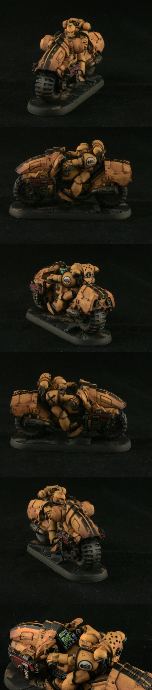
edit: i had to change the image as it turns out it was red shifted (many thanks Gits). its a shame cause i had actually gotten a vote (sorry Dr H - but thank you!). hopefully this is better...i am terrible with photo editing but it loosk about right to me...on this monitor...under these lights..urgh...
17710
Post by: Yggdrasil
Wow... Probably one of the best Imperial Fist I've seen... Your yellow feels just right, and the weathering is simply oustanding...
Thanks for sharing that, San ! I'm awed.
46466
Post by: San76
Thanks so much Ygg- compliments from someone with your command of colours means a lot!
29449
Post by: weetyskemian44
That's very cool - I like the stripes. I think that's a perfect yellow too, it looks ochre, which is much subtler than the other yellows.
47942
Post by: bebopdrums2424
Fantastic work San Nice chipping and weathering adds alot of depth to the model! A unit of them will be fresh!
46466
Post by: San76
@weetyskemian44 - thank you , I had to go the stripes, just for fun really. Glad you like the shade.
@bebop - cheers mate. I started the model to practice weathering so I'm gal it looks ok .
17916
Post by: Miss Dee
They rock
34339
Post by: STC_LogisEngine
Nice work! very nice.
17710
Post by: Yggdrasil
San76 wrote:Thanks so much Ygg- compliments from someone with your command of colours means a lot!
Ha ha now you're flattering me  (Not sure I deserve it  )
29345
Post by: Nashbashem
Those guys look great. I can only hope the technique I got for hand painting from you looks just as good on my fists
31618
Post by: Eggroll
Bike looks great San! You should try throwing a layer of gloss coat over those screens to make them pop a bit more. The detailing on them look very nice.
39666
Post by: GiraffeX
Really like the bike San, the racing stripe breaks it up nicely.
73518
Post by: BrotherTitus
Epiiiiiic.
46466
Post by: San76
Thanks so much folks!
Sorry I haven't posted in a while - works been a pain. Glad to be back
Haven't been totally idle though hobby wise, recently played my first games of kill team (which were fantastic) and am most of the way through painting up my first librarian (pics once the base is done).
when the knights came out I said to myself "resist! You still haven't finished your land raider! You never play more than 1000 points!"
Then I saw one in store and a new project begins:
This will be a totally new type of thing for me; one rhino and a half done LR is pretty much my vehicle experience. So, any tips along the way please pipe up. I am pretty excited though, it's a hell of a model.
Also, I'm Looking for input regarding colours. Got a brief look in store at the hawkshroud colour scene (sadly the companion book is $120 here in Oz, which is too rich for my blood) which looked pretty good. He will be walking with the Imperial Fists so yellow won't be too out of place?
26790
Post by: Gitsplitta
And so it begins...
26416
Post by: Young_Logan
My advice would be the fact that it is a walker means that you can paint it like 'infantry' there aren't 'huge' long armour panels like the side of a land raider and there is a lot of metal on that thing. Just dont over clutter the models with colour etc, keep it to a theme (look at some of the other ones on the net/GW website)
Best of luck with it, looking forward to seeing the completed project
Young Logan
27147
Post by: Solar_lion
Always a good source of inspiration would be traditional Heraldry. Mid to late European Medieval period. Great examples of heraldic themes will translate well with these figures. Thou you don’t have to use a direct source they will provide you with great example of the colors and designs if you want to create your own.
73174
Post by: BrotherOfBone
You have no idea how jealous I am right now, I paint Black Templars and I can't imagine what it's like to have to paint layer after layer of yellow...
I literally put down a base, then a single highlight and call it done xD Astounded by your dedication and how good your models look, consider me subscribed!
14392
Post by: nerdfest09
Oh San! you are just about to tip over the edge of modeling sanity dude! next thing you'll be converting and buying models just in case :-) I'm really looking forward to the knight! i'd love to get one and have it as a centerpiece to a HH Mechanicus army...
36667
Post by: Markillius08
My suggestion is paint it up differently from your primary army. It helps it to stand out and look more eyecatching. If you paint it too similar to your primary force, it will still look good but a fair portion of it's imposing nature will be lost to the crowd.
I like a lot of the paint schemes they have shown so far, and there are more to come in the dex and companion book so don't worry too much right now about painting it.
IF I can make a suggestion, you may also consider making up your own paint scheme. I've seen some great ones online. I'm actually doing my first Freeblade in a Boba Fett theme.
Just relax and don't worry too much about it though.
46466
Post by: San76
cheers for your encouragement guys! i am really looking forward to it.
totally torn on the paint schemes...totally get where you are coming from Markillius (and house Fett would look great) but i just don't know.
ahh well, fortunately it takes me ages to build things so ive got some time
what i have decided is that im going to go heavy with the oils this time round. really enjoyed using oils on my bike so ive decided that im going to try making oil washes for the metal parts of the Knight. what could go wrong with a new technique on a giant model? nothing, right?
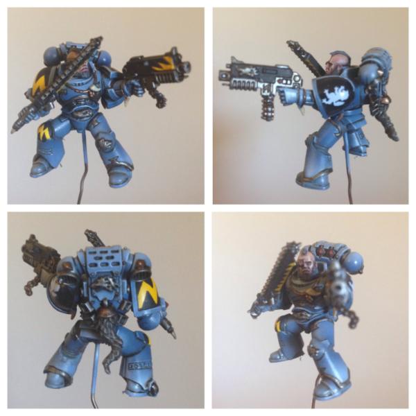
46466
Post by: San76
Well, small update for you guys today.
i decided that before i could get too into my knight i would have to finish my librarian. He is finally done - i hope you like him. Its a fantastic model and i really enjoyed painting him.
with this guy i tried to be more ambitious with the highlighting on the armour. i can at least say most of the shadows you are seeing are painted.
i also struggled a while to find a blue that would sit with the yellow (which i tried to blend down using burnt umber). its probably not the "right" blue but i found this was a bit more desaturated and didn't class with the yellow so much. to my eyes anyways.
i was at a bit of a loss with what to do with the stave - didnt look like i could do a good glowing effect, so i went with wood. maybe its an antique?
as always, thoughts gratefully received.
26790
Post by: Gitsplitta
I think it's a superb job San. Understated the way most 40k paint jobs (including my own) aren't. Great concept, beautifully executed.
19143
Post by: IceAngel
I think it's great San. I like the fact that you didn't do any OSL. I think glowing effects have gone a bit crazy as of late. It's refreshing to see an awesome model without it.
17916
Post by: Miss Dee
Looks fantastic .
27147
Post by: Solar_lion
Another great piece.. the stave looks great. Nice touch.
Thanks for keeping us mortals inspired!
47942
Post by: bebopdrums2424
Agreed! Fantastic work as always San. I love the subdued effect. Totally opposite from my hand lol. The staff, especially, looks like old wood. A really cool effect.
34339
Post by: STC_LogisEngine
Very nice blending on the librarian, a bit of a light tone on the blue (I like them darker ) but it's a very nice paintjob.
Looking forward to the Knight. I got to buy me one of those... 
46466
Post by: San76
Thanks very much everyone! im glad he seems to have passed muster
progress update on the Knight in the next few days - promise!
52425
Post by: Elnibbus
Dayum...
46466
Post by: San76
So, two updates today.
Firstly, my MegaMat arrived! well, i say mine but really its a joint purchase with my mate Fenry (please feel free to pressure him into blogging). These are made by Frontline Gaming and i have to say, its even better than i thought it would be. normally, we play on an old blanket thrown across a couple of tables. scenery is a couple of buildings (and some hills made of books) but generally...its not very immersive.
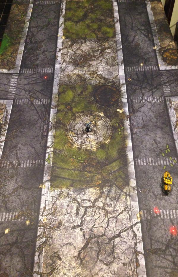
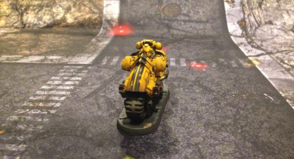
well....no longer! behold the war torn cityscape of future Imperial Fists victories! the mat was fantastic - rolled out flat; no wrinkles or anything. seems sturdy (time will tell).
now...to get some busted up buildings and we are on our way
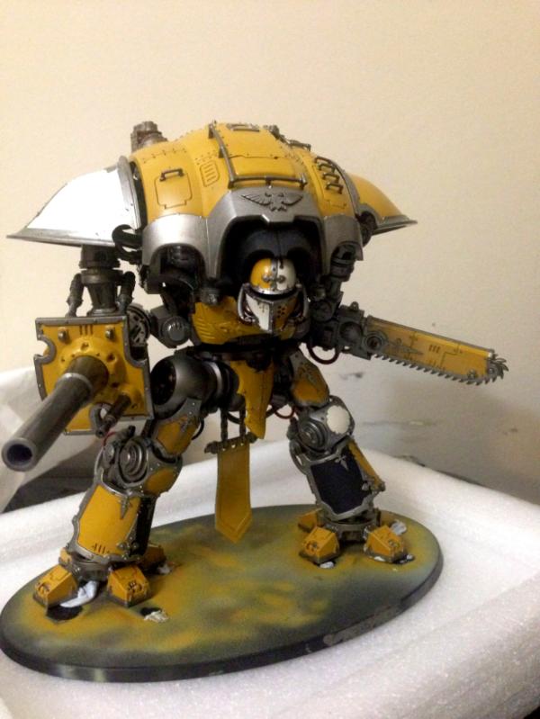
as promised...some progress has been made on the Knight. i decided to go with Hawkshroud as my house - i was reading the background and there is a group of them seconded to the Imperial Fists...they are all ready yellow...i have yellow paint...i am a sucker for punishment.....it was a natural fit. anyways, he is built, primed and the first of many coats begun
i do want to get the A4 decal sheet but cant seem to order it from GW webpage. anyone know what the deal is there? surely they havent stopped making it already?
54496
Post by: bubble
Hey San!
I've been AWOL for a long time... first day back I check out your thread and see that librarian!!! :O AMAZING. You've scared me with your skill, I'm never picking up a brush again now Great job!!! xxx
46466
Post by: San76
Hey bubble, welcome back! You painting again? I hope so...
Thanks for the kind words
54496
Post by: bubble
I am indeed but you might scare me away again if you don't stop being exceptional haha xxx
46466
Post by: San76
Well, it's been too long between updates - real life is being imposing but hopefully I can get back to painting more
In any case, had a bit of time to paint lately so made some progress on my knight (also, local store can't seem to get scions so no distractions ).
Here he is mostly blu- tac'd together. So far just getting the colours in. Still waiting for decals, and I wanted to get the decals on before I did washes and weathering on this guy. I'm seeing a lot of weathering powder in his future.....
Hopefully soon..something more exciting
27147
Post by: Solar_lion
Very good start.. Looking forward to seeing how you finish him.
54374
Post by: Chemical Cutthroat
White and yellow, you really are a glutton for punishment chief.
But it is coming out nicely, and the colors are rich and smooth. So rock on. I'm sure it'll look killer when its all done.
46466
Post by: San76
Cheers for the support guys. Easily biggest project I've ever tackled, so I'm going to need it
26790
Post by: Gitsplitta
Looks great San. Nice work on the yellow (of course).
17710
Post by: Yggdrasil
As those before mentioned, not surprised at the smoothness of your yellow...
He'll be awesome, mate, don't you worry ! 
46466
Post by: San76
Thanks very much Ygg and Gits....
Well, I have been doing some painting on my Knight but I don't have pics today sadly. In the next couple of days I should start getting decals on and I will post another update.
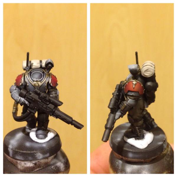
I do have something for your consideration today - I picked up a box of Sions on Thursday. Awesome models with some great poses; I couldn't resist. I wanted to do something a bit different with these guys, so I tried a bit of zenithal and I thought I would even try some red armour. Any tips when it comes to painting red please speak up. Anyway, would love some feedback on this test model colour scheme (other than the red and the general zenithal the colours are just blocked in for the most part). I was thinking blue for the lenses?
54374
Post by: Chemical Cutthroat
I'm a zenithal idiot, so I'm no help there.
These models are really too-damn-cool. I have no business picking them up, but I keep feeling the tug on my wallet every time I walk by a box.
Please someone stop me.
I think the scheme is looking good. The red shoulderpads give him some visual punch and a little menace, and the gold looks well placed as well. Which helmet did you decide on?
26790
Post by: Gitsplitta
Beautifully silky looking there San. An excellent job with the medium.
46466
Post by: San76
Thanks very much Chem and Gits!
Today's shot is a progress on the scion test scheme. I rally wanted to work on the knight but was too tired to safely work on the more epic project. Sadly, the lowly trooper is more expendable...
In any case, to answer your question Chem I quite like the helmets. I thought I would really try and force myself out of my comfort zone and try a bit of OSL. Here is my first ever attempt. Worthwhile do you think or would it look better without (in theory I mean, I know that my OSL is pretty amateur)?
54374
Post by: Chemical Cutthroat
I'm biased on OSL personally, but that's just me. I think yours looks fine, but I don't really like it in general, so I'm the wrong guy to ask.
BUT
I love the little blip-line on the screen on his right arm. It is subtle and awesome, and it should totally stay.
Otherwise I think he's shaping up nicely, other than the black gun. I'm assuming you painted the osl on the gun just to see how it looked while you were at it with the other stuff?
46466
Post by: San76
Spot on chem. The gun and the back pack aren't done. Glad you liked the arm monitor !
26790
Post by: Gitsplitta
Very nice!
27147
Post by: Solar_lion
I find OSL tough to do, and after seeing Major Tom's OSL work. I'm even more impressed by those who can do it.
In general I dislike when it's over powers the figure. I think you have a good start.
46466
Post by: San76
Thanks solar and Gits.
I agree solar, generally I think subtle OSL looks amazing.
Well, today's update is a bit more on the scion. I worked mostly on the rifle today. I decided to try and keep the main body of the gun kinda matte, the model feels like it should have a less shiny gun. The barrel isn't finished - my armour wash came out a bit greener than I hoped, I will have to dry brush some more led belcher on it.
I'm any case, he is coming along. I hope you all like him. Any thoughts on basing be gratefully received, I think painting a grey stone base like I normally do might be a bit much grey.....
54374
Post by: Chemical Cutthroat
He looks excellent. The muted armor colors just make the OSL and red stand out all the more. His bedroll still needs work but I figured you haven't touched that yet.
I'd say go stone for the base, or maybe something with that 40K Shrine World sort of look. With a paintjob of that sort of quality and all the muted tones I think it'll look good, like there is some intentional subtle camo goin' on.
46466
Post by: San76
Cheers chem! Your right, haven't started bedroll yet
Hmmm I do want to paint a streetscape type base. Maybe some brassy pipes etc thrown in the rubble to break it up? That...or snow. I have no snow material though....
27147
Post by: Solar_lion
My thought .. tile or some interior looking floor. something not too dark.
17710
Post by: Yggdrasil
Your Scion test model looks awesome.
(Sorry I wasn't there this week, so couldn't offer comments).
As for the OSL, I think you nailed it right ! I think you are quite close to what I can (could?) achieve, if you need another point of view, you can have a look here. I doubt it, but maybe you'll find something useful in it !
As for the rest, I especially like :
- the red armour plates ;
- the zenithal grey parts - something I'm trying to achieve, but haven't found how yet...
- TBH, I think the most appealing thing is its "apparent" simplicity & limited palette. It makes for a straightforward model, & efficient paint scheme.
A whole squad (army ?) would look terrific !
27147
Post by: Solar_lion
Whole heartily agree with Ygg's.. I like the more practical look rather than some of the GW painted gaudy color armor.
Looks ok on some things ( like Moonpies Emperors fools ) and other marines. Your scheme makes them look professional & serious rather than pompous.
Looking forward to the finish squad!.
54374
Post by: Chemical Cutthroat
 Solar_lion wrote: Solar_lion wrote:Whole heartily agree with Ygg's.. I like the more practical look rather than some of the GW painted gaudy color armor.
Looks ok on some things ( like Moonpies Emperors fools ) and other marines. Your scheme makes them look professional & serious rather than pompous.
Says the guy who plays Lamenters.
27147
Post by: Solar_lion
Space Marines have alway been different animals.. They have their own livery based on their traditions and uniqueness. Other imperial troops are more conformed to imperial standards. As one would expect the great mass 's needing ways easier to control and supply.
Thou I don't always like some of the marine color schemes I understand their attachment to different schemes.. Rainbow Warriors anyone?
I also understand using the different shemes. I personally dislike the more brazen Imperial schemes. Each to his own.
46466
Post by: San76
Thanks so much guys.
im glad the model came across as a bit more "real". i was looking to do something along those lines so im stoked to see it came through! honeslty thoguh, a lot of credit goes to the model. the pose (at least on this guy) looks very natural to me and the scale is quite good.
sadly, wont get to paint today but i am really enjoying painting this model. i will definitely be painting up the rest of the squad. i was just going to load them with the lasguns at this stage because i dont know if i will play them as such, but i think the lasguns look really good and add to that "real" feel a bit.
@Ygg - mate, RL takes me away all the time! thank you for commenting. despite your kindness, i am nowhere near your colour or OSL skills. have bookmarked your tutorial though - thanks!
@ Solar and Chem - i think that's one of the great things about 40k - the grim seriousness of the guard, the craziness of the marines. i read a quote in one of the BL books which went: " The uniforms of the Imperial Guard are camouflaged in order to protect their wearers by hiding them from sight.
The principle is that what the enemy cannot see he cannot kill. This is not the way of the Adeptus Astartes. A Space Marine’s armour is bright with heraldry that proclaims his devotion to his Chapter and the beloved Emperor of Mankind. Our principle is that what the enemy can see, he will soon learn to fear…." To me that the seriousness and the insansity works side by side is magic. in any case, after painting IF so much (the original canaries) i thought i should try my hand at something a bit more subtle...
also, wanted to ask....i have this issue where half the threads im subscribed to dont send me updates anymore. this is embarrassing when folks who are kind enough to comment on my work update and i dont even know. anyone else out there having this issue and if so, got any fixes?
17710
Post by: Yggdrasil
Lol yeah, play the humble guy
Totally agree with you on the SM livery part : I think it's part of the larger-than-life nature of the Adeptus Astartes ! Their appearance is supposed to inspire awe & dread in their opponent's hearts, so why would they camouflage ? In addition, it is not unknown for them to get camouflage patterns when the fighting conditions REALLY require stealth and subtlety... It kinda makes sense to me.
As for the issue with thread updates, what kind of update are you talking about ?
When I log in on dakka, I just go to "My subscribed threads", then open as many tabs in my browser as there are threads with "First Unread" button...
But maybe you rely on automatic mails for that ?
76493
Post by: moonpie
Got name-dropped by Solar, so I thought I would drop a note. Looking good on the work. Can't wait to see the finished yellow knight. That's my favorite color for knights. The scion is really rad too. I'm getting almost tired of OSL, but this is working for me.
The smoothness of your yellow is hardcore. I've read your technique and must take a lot of patience. Maybe someday I'll get an airbrush. You guys seem to love them.
54374
Post by: Chemical Cutthroat
Yeah, I do what Ygg does. I stopped bothering with email replies (since they can crush my inbox on a busy day) and just check my Subscribed Threads tab at the top.
If that is way too busy, there's another dropdown tab at the bottom labeled My Own Threads, and that is the best way to keep track of your own stuff if it is getting lost in a lot of other updated threads.
And I agree about the bright colors on the marines guys. I think it is awwwwesome. Your Imperial Fists, Solar's Lamenters, and moonpie's ridiculous pink and yellow chaps are all excellent work. Was just pokin' a little fun.
46466
Post by: San76
Great idea Ygg, will check things that way.
Thanks very much Moonpie. i cant recommend an airbrush strongly enough. especially for yellow....i remember using a brush to get the base coats and...shudder....
27147
Post by: Solar_lion
Moon.. I drop your name everywhere, I'm counting on it someday paying off big time....not let's see some more EF's
CC.. mo worries, Your Marines ( when you painted marines.)
Were fabulous. Have to admit your balance of crispness and weather are perfect. I also have to say you have a great balance again for overall color. I particulary like your chaplain.. I'd take critque from you anyday!
Sans... you'll have to get a game in with them. they are too cool not to see some action..
54374
Post by: Chemical Cutthroat
I still paint marines! I'm just not building armies anymore. I don't think I'll ever stop enjoying them in that respect, even if I don't roll the dice with em' anymore.
Maybe a killteam or two. That's always fun.
Thanks for the kind words! (NowbacktoSans'blog).
46466
Post by: San76
@solar - maybe with this new edition I can just take one squad
Well, busy weekend so not much time to paint. Did some small work on the knight getting him ready for decals and washes. Thought I would go for some brass sections in all the metal to break it up a bit. The knight head model is outstanding...I can't help but spend some time on it even though it will get covered . No washes are in yet, just block colours sorry.
26790
Post by: Gitsplitta
Hey San, how'd you get that thin white line along the side of those plates? (kind of in the middle of the airbrushed area... sorry, it's in a tough spot to explain).
46466
Post by: San76
I think i know the one you mean mate
It's done with a fine brush (0 or 2/0) and very thin codex followed by thin fortress. Load only a small amount of paint, just a bit more than a drybrush. Then, I drew it on with very very light strokes, heading away from the front of the part.
It was I would say midway between regular wet painting and dry brushing.
That's it really, other than my usual stand by of having a clean brush nearby to clean up the inevitable screw ups there are probably better ways to get this effect, but I hope it helps !
17710
Post by: Yggdrasil
Well, TBH I hadn't noticed until Gits pointed it out... But it's a very nice & smooth effect !
Good luck on that one
27147
Post by: Solar_lion
San76 wrote:@solar - maybe with this new edition I can just take one squad
Well. next time your in the US state of Wisconson, look us up for a game!
46466
Post by: San76
for sure! likewise, next time your in Perth AUS....
54374
Post by: Chemical Cutthroat
San76 wrote:for sure! likewise, next time your in Perth AUS....
...flee in terror from all the flora and fauna that is trying to murder you?
46466
Post by: San76
Hahah... True enough. It's the drop bears that you've really got to watch out for
Well, some progress on the knight - started in on the decals. I've got to say, these are probably the best decals I've seen from GW - very little empty space around the design, which is good. Personally, I usually struggle with these things and this time is no exception.
Still I persevered and got roughly half of them on tonight. Once they are all on. Then it's another coat of varnish and onto washes and weathering! Speaking of which...I'm going to try and use a lot of oils for the washes and the weathering; do you think he needs some chipping as well?
54374
Post by: Chemical Cutthroat
I heard if you put Vegemite behind your ears it'll keep the drop bears away.
The decals look great. I also struggle with the things as well, but that looks splendid. I really like the fist logo with the laurels, it really ties it with the rest of the Imperial Fists, (though yeah, I know they're not part of the Marines and all that fluff stuff).
I imagine that depending on loadout, these guys would have most of the chipping lower on the model, and the big flat surfaces on top would just have your typical weathering. The legs and stuff would be chipped from crashing through terrain and small arms fire, as not too many things are going to be in a good position to hit the top of the thing since it is so tall.
Whatever happens, its gonna look geeewd.
27147
Post by: Solar_lion
And worse if you go into the water!
Looks good . The only distraction is the white background on the carapace eagle. Thou that is just me nitpicking.
Looking forward to the next phase.
17710
Post by: Yggdrasil
Solar_lion wrote:Looks good . The only distraction is the white background on the carapace eagle. Thou that is just me nitpicking.
Agreed on the white outline of the upper hawk decal, looks a bit out of place... But nitpicking indeed !
As for the weathering.... Chipping is mandatory !
46466
Post by: San76
Cheers guys. Well, the verdict is in...chipping plus oils. I'm kinda glad - this whole project is about pushing myself so no point backing off
As for the white trim on the emblem , I totally know what you mean. There really isn't a need for it, the designers went for it on purpose. Maybe once it's under the oil wash it won't stand out as much.
Thanks for posting guys, really helps me along
59386
Post by: Imperial Templari
Love IPs and you are doing a great job, subscribed.
17710
Post by: Yggdrasil
Imperial Pists ?
Pies ?
Pigs ?
46466
Post by: San76
hope everyone is having a great weekend.
well, i've followed Chem's advice and chipped the paint on the lower parts of the Knight. i also added pretty heavy chipping to the chainsword and some light chipping to the main gun as i figure they would see some hard use. as always, after spending so long getting the yellow smooth its a heart breaker to chip the paint, but i think it was a good idea - there is no way this guy is going to be super shiny. i think this has also had the unexpected side effect of keeping the upper parts brighter, drawing the eyes up.
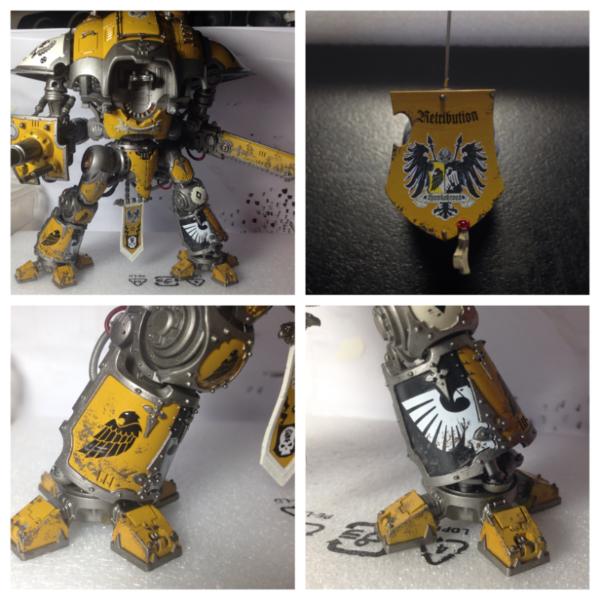
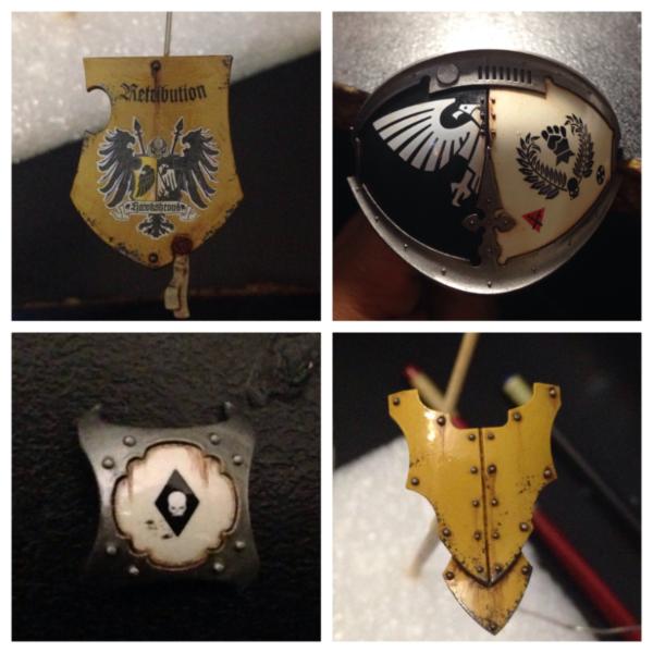
I've also chipped the shield a little. i know its up quite high..but it just felt a bit necessary.. mostly because it was looking a bit plain without anything around the edge. in retrospect, i probably should have drawn some scroll work or something around the edges. ahh well. I have also given him a name - the Retribution. my payback for my friends pack of Long Fangs and their missile launchers!
at this stage the chipping looks a bit more like mud than i might like. but hopefully once i do the highlights etc (couple of steps down the road) they will be sharpen up.
anyways, next up....washes. im going to try and use oils for this to try and get a different kinda finish. also, oils are fantastic for streaks etc. fingers crossed.
17710
Post by: Yggdrasil
Well, chipping starts nicely ! I definitely understand the fact that you only weather the lower parts, on a realistic base, but it still bothers me (a bit) to have the legs all worn while the upper plates are bright & clean... Maybe the "oil" weathering will make up for that fact ?
Awesome work as usual, he'll be a stunning piece once done !
46466
Post by: San76
thanks Ygg...thats the plan...the upper panels will still get weathering..just oils and powders rather than the chipping....
fingers crossed...
21254
Post by: lipsdapips
I love the Scion scheme, the subtle OSL effect is a nice touch and the pose is badass Sorry its a bit late just checked this blog out now. Subbed!
LDP
49179
Post by: Valhalla130
That's a nice-looking Knight. After I've gotten the Guard up to snuff, and gotten an airbrush and finished my Imperial Fists, I'm looking forward to adding a Knight to my Imperial forces also. To go with the Baneblade I've always wanted. I hope it looks half as good as your's does.
46466
Post by: San76
Thanks guys, you are very kind.
Well, I have finally moved onto washes for the knight. I am trying to do oils for all my washes, not sure how that will go for the non-armour plate parts but it's a challenge.
In any case - the first nights effort! I really think the oil adds something to the chipping to make it look more realistic.
26790
Post by: Gitsplitta
Just love the weathering effects. Really helps to sell them as authentic and NOT overdone... which is a trap I always fall into.
46466
Post by: San76
As always Gits you are too kind. It is exiting to be moving beyond the block colour phase though, he's slowly coming together.
The base will be a whole nother challenge
17710
Post by: Yggdrasil
Well, the oils definitely add a little something that turns a model into a jewel... Well started, mate
54374
Post by: Chemical Cutthroat
What they said.
It looks excellent so far, I can't wait to see it all come together.
I haven't experimented with oils myself, as what I've been painting lately tends to be bright and colorful. Looks like its working out swimmingly for you.
46466
Post by: San76
Thanks so much guys for taking the time to comment and your kind words.
Well, another day ... Another minor update. I do apologise for these minor updates but I don't have a lot of time each day, and I don't paint anywhere near as fast as most folks; however, if I keep updating I might actually get this project done (unlike my poor land raider).
Anyways, worked I the beetle carapace today. Have done a basic oil glaze and some streaks. Trying to do this with a bit of a light touch...hes been fighting but he's not an ork vehicle (nowhere near enough dakka!). The metals are all still just base coated.
In case any one who doesn't use oils is interested, I included the bottom right pic which is the carapace before any oils so you could see what they do. Even with removing most of the wash the oil seems to add a slight filter that deepens the colour, but in a different way to an acrylic glaze. Least to my eye
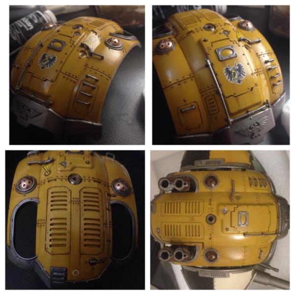
52425
Post by: Elnibbus
Nice work San. I'm just getting to grips with oils myself except I'm experimenting with the mapping method. I look forward to seeing more shots of this as you progress
27147
Post by: Solar_lion
Meph uses a lot oil work in his figures. Checkout his BA blog.
Looks good. It really does a nice job of shading the crevice’s as well as provides a nice transition between similar color shades.
17710
Post by: Yggdrasil
Still outstanding... I'll have to try those oils someday...
27147
Post by: Solar_lion
Nudge! progress?.. I got my own IK and I want to see the litmus test..
46466
Post by: San76
Thanks guys!
my apologies for the delay..work has been full on and i only have minor updates on the knight that i figured noone would want to see.
i also have taken on a new project; Orks! a mate of mine has wanted an Ork force for sometime but he has no time to paint. He kindly is letting me paint them up for him.
I am starting with the Orks from the AoBR kit. FIrst guy was fantastic fun to paint. He wants Badmoons, so its more yellow...but also heaps of green
hope you like him. will try and get some work done on the knight soon...annoyed i've lost momentum there.
26790
Post by: Gitsplitta
Very nice San, love the work on the skin especially.
27147
Post by: Solar_lion
And ... ( Long Pause )... you can kindly paint my Orks for me if you want!
Seriously thou.. looks great .. the leather straps are very realistic. So now that you jumped on the Ork wagon, this means only 120 figures more to go. Once this is complete you and your mate play and post some battle reports. Ork vs IF marines.. Classic!
46466
Post by: San76
Haha that be awesome. Truth is, I'm happy to paint for anyone...anyone patient enough to put up with my slowness....
Thanks for your kind words guys. Tonight I built another 9 boyz and primed. Tomorrow...work on knight and more orks!!
27147
Post by: Solar_lion
As well as you paint... you'd better be charging!
46466
Post by: San76
Lol... No of course not! I'm grateful actually... Would never get to paint orks (or space wolves otherwise ) .
54374
Post by: Chemical Cutthroat
You're a madman San. Your painting could catch a pretty penny for sure.
Even if he just pays you in beer, that's still something.
How long do you think you spent on that ork?
46466
Post by: San76
Well payment in beer sounds ok to me!
I think all up I spent 5-6 hours on him chem. I know that's prob too much for a rank and file in an horde army, but he was the first one and I wanted to get the scheme nice.
I'm hoping to do the next lot in a batch, hopefully be a bit more efficient.
27147
Post by: Solar_lion
That be a lot of beer. and I worry that the quality would decrease as the consumption increased. Still this is a big country and we have a lot of beers?
17710
Post by: Yggdrasil
Great job on that Ork... Skin is nice, weathering subtle but effective...
Your friend is lucky !!!
39666
Post by: GiraffeX
Thats a very nicely painted Ork San.
29345
Post by: Nashbashem
Your Librarian was epic, the Knight is coming along nicely and your first Ork is cool Looking forward to the finished Knight
46466
Post by: San76
Thansk so much guys.
sorry its been ages between updates - i have been painting though. Sadly, no further work on the knight but i have had a bit more success on the Ork front: i give you my first ever Flash Gitz and a couple more of the boyz (is that what they are called?). Ive tried to make them bright and crazy, but still kind of grimy. i cant imagine orks as too clean.
i have to say, these models are amazing. Was great fun to paint. Tried to incorporate a bit of background into the model - well, unofficial anyways - as I figured these guys be mostly fighting one particular marine army. i hope it isn't too cheesy P)
speaking of which, got to play a match on the weekend - victory to the Fists!
in any case, would love your thoughts on the Orks.
27147
Post by: Solar_lion
Awesome job. Your green skin color is well defined and looks great. However the most amazing and creative part was the pants. Striped pants.. I kid you not!
You really make these models very realistic. Stunning indeed!
26790
Post by: Gitsplitta
Just love that ork San. Really outstanding job and looks SO good mixed in with the regular boys.
46466
Post by: San76
Cheers guys!
@solar - stoked you noticed the pants...for me thats a lot of freehand. i thought...this guy is too fabulous for regular pants my friend was happy with the pin stripingso that's good.
@Gits - praise from warboss Gitsplitta is high praise indeed, thank you!
17710
Post by: Yggdrasil
Can't point out a single thing that I don't like... Pants are awesome, weathered armour is awesome, IF insigna is awesome, skin is awesome...
I'm sooooooooooooooooo jealous !!!
22619
Post by: inmygravenimage
I like this a lot, it's almost... muted. It's hard to explain, because the colours really pop, and yet it's grubby and grimy at the same time.
32676
Post by: Meph
Solar_lion wrote:Meph uses a lot oil work in his figures. Checkout his BA blog.
Looks good. It really does a nice job of shading the crevice’s as well as provides a nice transition between similar color shades.
I'm awake! I'm awake! ANd I do. I love oil paints...
And San76, you're absolutely right, an oil wash leaves a sheen on the colour that no acrylic can achieve. It's like insta-oomph for any model.
17710
Post by: Yggdrasil
Hey San, serious question for you...
Would you accept a commission for one Ork model ?
33919
Post by: Moltar
San, the orks look great. The striped pants are a total win in my book.
88204
Post by: Doppler
Well I've been looking through this all day and I'm blown away by the quality of it all. Its been said before but ooo DEM yellows!
46466
Post by: San76
Thanks so much for your responses guys, i really appreciate it!
inmygravenimage wrote:I like this a lot, it's almost... muted. It's hard to explain, because the colours really pop, and yet it's grubby and grimy at the same time.
makes me happy you said this mate - thats exactly what i was hoping people would think! all credit to the glory of weathering powders!
Meph wrote:Solar_lion wrote:Meph uses a lot oil work in his figures. Checkout his BA blog.
Looks good. It really does a nice job of shading the crevice’s as well as provides a nice transition between similar color shades.
I'm awake! I'm awake! ANd I do. I love oil paints...
And San76, you're absolutely right, an oil wash leaves a sheen on the colour that no acrylic can achieve. It's like insta-oomph for any model.
I think when i finihs these guys i mihgt start using oils on figures too..not just vehicles.
Yggdrasil wrote:Hey San, serious question for you...
Would you accept a commission for one Ork model ?
ygg, be my pleasure to paint up a figure for you! will send a message
Moltar wrote:San, the orks look great. The striped pants are a total win in my book.
im glad you like them!
Doppler wrote:Well I've been looking through this all day and I'm blown away by the quality of it all. Its been said before but ooo DEM yellows!
Too kind Doppler!
46466
Post by: San76
Hi everyone,
sorry its been so long between posts.
Recently, Yggdrasil was kind enough to ask me to paint up a Kaptin Badrukk for him. This has been a really interesting project for me, and as it was for someone of Yggs skills - i really tried to put in some effort.
I hope you all like him.
40392
Post by: thenoobbomb
Badrukk's looking great!
17710
Post by: Yggdrasil
so many details, I just can't wait to see him...
Thanks a lot mate, I'm going to have a hard time matching his Flashgitz to that level of awesomeness !!!!
He's perfect !!!
51446
Post by: J-paint
Dear god San! Dear dear god that is simply beautiful! The freehand on the map is simply astounding and the zingy-ness of the blue feather is lovely! I know i say this everytime I comment but you really have outdone yourself again! If your doing commissions I may well have to send you a PM, to actually own something painted to this standard would be...well, incredible.
46466
Post by: San76
@thenoobbomb - thanks mate!
@yggdrasil - mate, im stoked you like him. i've sent you an email with the full rez photo. it was a fingers crossed situation for me as i glued him together...will the colours work? will it be too busy. i've really got to start planning these things!
@J-Paint : welcome back mate and thank you for the kind words! hope the doctorate is going well. as for painting..mate..send me a message. i be more than happy to help you out if its something i can do- as long as you know how slow i am (Yggs can testify to this!). glad you noticed the feather..just wanted one thing in there that wasnt totally grimy...it really is bright..but if Badrukk cant be ostentatious..who can?
64844
Post by: oguh7
Nice work man (apart from the part were you play those loyalist dogs ), keep it up!
33919
Post by: Moltar
Great Badrukk! I love the pop of color from his blue feather.
39666
Post by: GiraffeX
He looks really good, excellent work San.
26790
Post by: Gitsplitta
Really good job San. He's really going to enjoy that. Nicely done my friend.
46466
Post by: San76
Thanks very much everyone, I really appreciate you taking the time to read and comment.
Well, the next project will be a shadowseer for J-paint. Should be a very interesting project; pretty daunting though. A lot of cloth, a lot mor delicate than the orks and SMimused to painting. Very kind of him to let me try though, I've got a few ideas. If anyone out there has any tips though, I'm Eldar ignorant, so please speak up - you might save J-paint the inconvenience of a totally wrong model in his forces!
While the model is on order (which her in australia can take some time) I decided to break open my forgeworld stash. Have been having the urge to paint up some more Fists lately, so I thought I would take a look at my Javelin.
To be honest, this model was horrible to build. Just...horrible. Chucks of the trim came out during clipping, flash everywhere and several of the large, chunky bits that make up the body and engine were slightly warped and would not go together right. On the other hand I am totally in love with the design! As with my bikes....I'm thinking racing stripes. What you think?
17916
Post by: Miss Dee
Yes go for it but dont get the spartan why they cant find a better place to insert the resin.
46466
Post by: San76
Cheer miss dee.
Well, Inbetween the family visits (it was Father's Day here in Oz) I got to do a bit of painting today on the javelin so I thought I would post an update.
Yellows are down and varnished. Still undecided on the colour scheme - torn between black stripes, no stripes with metal front inset panels; and no stripes with black inset panels.
Tomorrow is the day for stripes if they are going to happen, before decals and chipping....could be I want to do stripes but am just feeling lazy because they are harder to weather...
22192
Post by: whalemusic360
My vote is single stripe, then if you get more later, add additional stripes for each one.
46466
Post by: San76
Hey ... Nice idea whale! Thank you
74514
Post by: Phutarf
Must get round to doing my javelin at some point too... Just a quick question San, hate to bring it up, but did you put the rear fin on top back to front deliberatly...?
17916
Post by: Miss Dee
How about kill markings?
46466
Post by: San76
@phutarf - ahhh no I did not! Damn....that thing is super glued on too; oh well, hopefully it doesn't look too silly
Miss dee, I think couple if kill markings could be great. Will have to see what the decal sheets have
46466
Post by: San76
Small progress update on the speeder (as the shadowseer is still in the mail). In the end I decided to go with the two stripes (chipped), but in deference to Miss Dee's suggestion I have put in some kill markings! With the front insets I decided to go with the forgeworld approach and go for a steel look. At the moment, these just have a first coat of ledbelcher, so they look a lot darker than they will.
Any thoughts / tips gratefully received.
51446
Post by: J-paint
Looking really good San, I do like the stripes alot, plus they are immaculately straight! did you do them free hand?
I think the steel insets are a nice way to break up the yellow, will look really good when its all been weathered etc. keep it up!
Also I have to say i think i prefer that rear fin on back to front anyway! makes it look more streamlined and sleek.
46466
Post by: San76
Cheers man. I'm glad to hear you say that bout the fin, I've been stressing over it.
As for the stripes - no way do I have that steady hand! I use tape
Got to work out how I'm going to mount this thing. With the kit is the standard landspeeder base, but the model is a solid block of resin and I can't see the base being strong enough.
17710
Post by: Yggdrasil
Ohhhh ok, THAT kind of speeder... Looks great for a start !!!
47942
Post by: bebopdrums2424
Hey San. Long time!! Musics been keeping me from brush but im hopefully back in the mix soon. Just wanted to say, i absolutely adore the orks you painted. Just simply fantastic work man. Your yellows are gooey and warm like melted cheddar!! The best though, is that the lower half of the models are really dark and dirty, almost soot covered. Deep shadows, in contrast to a totally giddy upper half of the model. How did you get everything to look like it was covered in oil grease. Even the yellows have a soot, dirty look that is so smooth. Am i imagining it? Help a pal out!
46466
Post by: San76
bebop! welcome back mate. glad to hear you in demand; that's got to be nice!
Really glad you liked the orks. to get the effect i think you are chasing i used a few different light shadings of raw pigments (a black, a brown, a red/brown). thats it really, no magic (sadly).
85702
Post by: SNxWMxN
I just spent the last few hours looking over your thread. EVERYTHING in it is amazing! I am totally stealing your yellow recipe for if and when I can ever paint my Goliath Necromunda gang.
78261
Post by: Tiptopperoo
It was a bit of round about googling, but the first thing I saw was those IF backpacks and I immediately thought 'this guy has done it'. That is the IF yellow I've been looking for.
I have been contemplating IF's for the past 5 years. At the last model release I bought up big and have close to $1k of models sitting about in boxes. I also bought an Iwata Eclipse - CS airbrush which has never seen paint.
After reading through your thread, I'm re-inspired and can't wait to have a crack at some IF yellow goodness.
I know you have repeated your paint's a number of times in this thread, but can I ask what changes you have made for airbrushing? Are you thinning the GW paints (Averland Sunset by now due to changes in the citadel line) or have you gone with an airbrush ready line? I did see you mentioned you have been using a Vallejo yellow close to the Citadel yellow, can I ask which one?
Also are you still building from a black undercoat? Is this a GW or other spray can or have you got one for the airbrush?
Just amazing work man, your progression through the thread is really inspiring stuff. Out of interest, did you mess around with the airbrush much before having a crack at the models, or did you just get stuck in?
Could I be so bold as to request your current paint scheme? Have you abandoned standard washes for oil washes, even on basic troops?
46466
Post by: San76
Well....its been ages.
Sorry for the absence folks but RL took me on some strange and paint free paths this last year. cant say it was much fun, but its over now (fingers crossed) and i can resume my geekery!
in any case, recently i've been getting back into it and thought i should dust off the blog to inspire me to keep going.
Firstly, Tiptoperoo and SNxWMxN: thank you very much. you are both very kind.
Secondly, i thought i would post pics of my contemptor. A very good friend of mine bought this for me for xmas after a 6 month drought of creativity. i think he believed the model would get me back into it - he was totally right. always loved dreadnoughts...something so very 40k (or 30 k) about them. the model was a great piece and very posable. its the only model ive finished since August of 2014! how time flies.
Anyways, I hope you like him and i hope to have a lot more posts up soon.
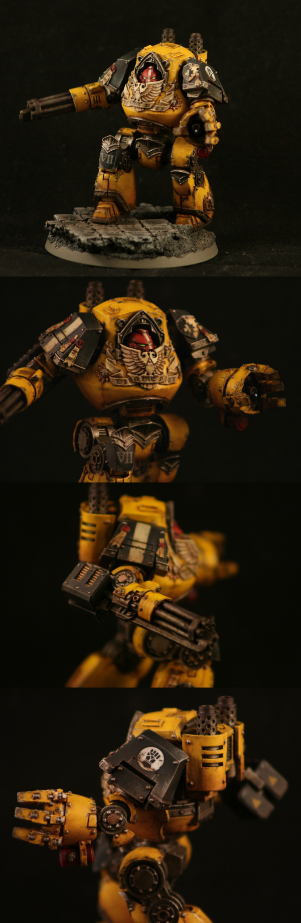
51376
Post by: Zambro
I love it! Welcome back! If your freehand is that good after being away for a long time then you're putting us ALL to shame.
Excited to see more!
22192
Post by: whalemusic360
Glad to see the boys in yellow return. Do you have plans for expansion, or something new on the horizon?
27147
Post by: Solar_lion
He lives again! Welcome back. Dread looks great. You truly have mastered the IF yellow.
I too think the the dread is uniquely 40k. There has been quite a bit of changes to them since the first "egg" style.
What's up next? Did you finish the speeder?
46466
Post by: San76
Zambro, thank you very much.
Whale music and solar lion - good to hear from you again !
The Fists will return definitely - I have a crazy masochistic thing going with yellow - but they won't be next. Sadly, I haven't progressed the speeder or my knight :(
Next up will be some Mechanicus. I don't have any proper photos, but here are some wip taken with my iPhone. You might have to zoom in a little, for some reason they are blurry until you do.
Trying to a bit more ambitious with my shading. These castellan seem to be polarising but I think they are great fun. As always, love any thoughts you might have.
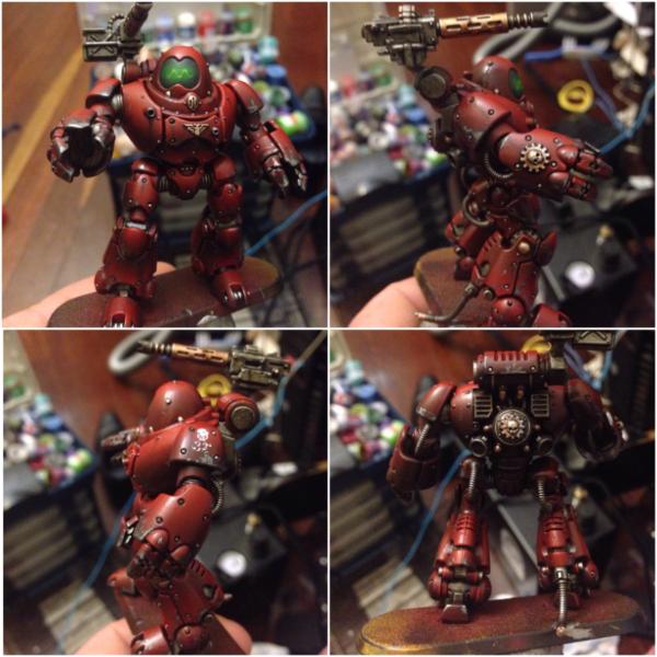
26790
Post by: Gitsplitta
Glad to see you back San, we've missed you. That contemptor is achingly beautiful. Perfect balance between the golden yellow and the black, with the weathering tying it all together perfectly.
46466
Post by: San76
Thanks much gits! As always, you are too generous. Feels good to be back, have missed the dakka-naughts ! Hopefully will be able to speed up my output....but I doubt it lol.
27147
Post by: Solar_lion
IMHO, I think the color red need a higher contrast to make it " pop". I use various shades or red orange to grade it up to the edging. Yellow is already bright and you could go white, but I've have more success with starting from a rust up to yellow.
Great job on weathering the hands. Spot on!
46466
Post by: San76
Cheers solar, will give it a go
100928
Post by: Alaricuk
Think that robot looks pretty good. Like the green screen affect, very effective.
22192
Post by: whalemusic360
The face screen is a wonderfully retro vibe for him. I think the red could be a bit brighter for Mechanicum (looks more Blood Angel-y), but would be happy with how it turned out.
39666
Post by: GiraffeX
Welcome back, really love the Contemptor your weathering is always spot on.
19143
Post by: IceAngel
Very nice indeed. Yes, more speeder please!
51446
Post by: J-paint
San! This is fantastic stuff, I kept zooming in on different parts of the dread to get better looks at the detail, its incredible quality! I also cant tell you how much I approve of the display on the mechanicum robot's face, its a lovely touch.
Cannot wait to see more sir!
Fantastic to see you posting again.
31618
Post by: Eggroll
Welcome back San! I just came back to the hobby recently as well after awhile away. Feels great painting again and great to see another fellow gamer in the same position. Look forward to seeing you paint up more stuff and the IF dread looks awesome!
46466
Post by: San76
Thank you guys so much!
@iceangel...mate...if i can find all the bits i will get it done soon!
@eggroll...welcome back to you too! i saw that titan....blown away. im nervous to be painting red with Eggroll around...
@GiraffeX adn Alaricuk - many thanks
@J-Paint and Whalemusic...im so glad you guys dig (and understood) the retro-bot visor! the model is just such a different aesthetic to the usual 40k stuff,...i had to do it. the question is - can i do it a second time for the next robot?
with the Robot - i guess it probably isnt the right red. i knida like it though...and should i ever want to paint up some blood angels well i guess i got a recipe
im in the process of painting up the second bot and their techno smith handler atm. I cant believe how much detail GW squeezed onto the smith. they really are fantastic models.
anyways, ive promised myself im going to post more pics this year. this will likely mean a great many progress pics. sorry guys, but i paint too slowly for it to be any other way! it's all iPhone work tonight...far too tired for setting up light box im afraid.
well, first up we got the second bot. shading and base coat of metals are done. i feel i should say at this stage that a mate and i have decided to try and add a bit of light narrative to our games. to that end i decided my Ad Mech would be part of a sub group (clade? chapter? sub directory? crazy admech...) of the Brass Cog . as such, you will see a lot of brass highlights, and the mechanicum symbol wont be black and white. just wanted a small point of difference....
so the bot...well, i cant decide if i like the guns or not (design wise) but i figure..one shooty, one punchy is the way to go hopefully this shows how ive tried to be more ambitious with my colour gradients. as you guys can see the red is quite a different shade before the varnish goes on. i havent had that kind of change with any other colour...anyone else have that happen? i mean...i prefer the red it changes to...i was just a bit surprised!
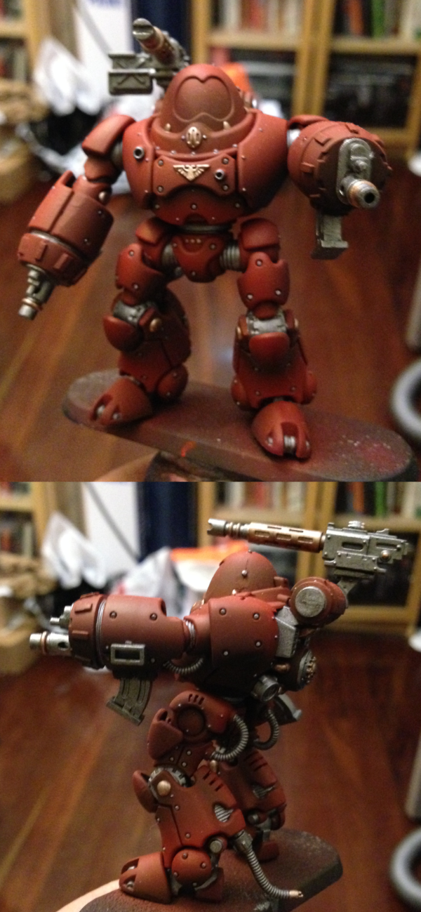
the next one is actually the model that got me interested in Ad MEch. well...mostly the ridiculousness of the gun. its outrageous and awesome. this guy is actually finished so you can see the basing i have planned. i kept it grey so they can field next to the Fists ok...but tried some different textures. the detail on these models are fantastic. i must apologise for the amount of glare..like i said they are quick iphone pics.
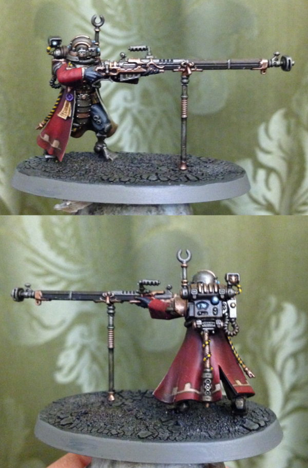
be well and happy painting
26790
Post by: Gitsplitta
That ranger is absolutely beautiful!
46466
Post by: San76
Thank you gits!
51376
Post by: Zambro
Stunning stuff!
46466
Post by: San76
@zambo - thank you very much!
Well folks, just a quick update photo today of my tech smith. Still very much in the middle stages, hopefully I will get a chance to progress him this weekend . No idea how I'm going to do the eyes on this one...tips welcome!
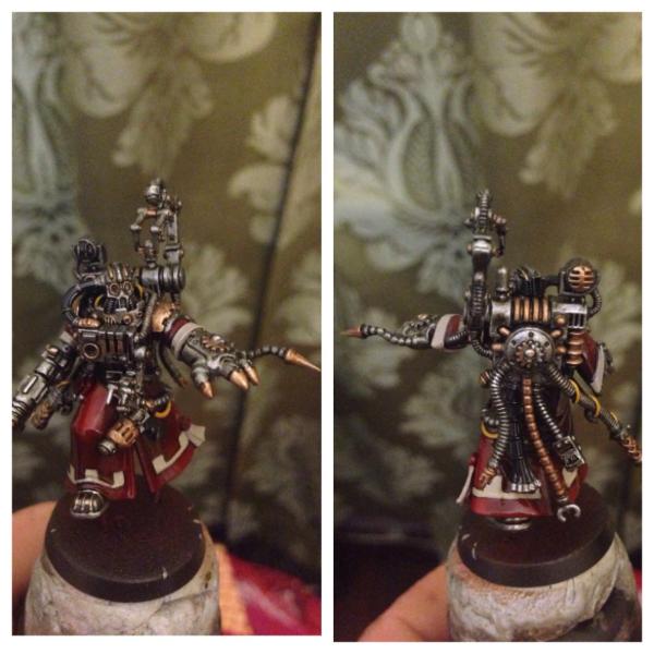
27147
Post by: Solar_lion
I like the metals together. Nice balance of brass and steel.
26790
Post by: Gitsplitta
Oh, that's nice. Is that a conversion?
46466
Post by: San76
@solar lion - ty mate. There is a lot of metal on the top half of the figure and I thought I would try and break it up a bit.
@gitsplitta - sadly I lack conversion skills of any kind; this is the model that comes with the two castellan bots.
31618
Post by: Eggroll
Very nice San. Really like how your ad mechs are turning out.
52201
Post by: evildrcheese
Good god that Tech Smith is cool!
EDC
46466
Post by: San76
@eggroll and EDC - think you both very much,
Well just a quick update on the tech smith tonight. Worked the brass a bit more to try and bring a bit of lustre. Also, ,made a decision on the eyes and lamp. Ended up going fairly light to try and counter the overall dark tones.
Though it might be fun to show this weeks progress as a triptych so you could see the weeks changes at once
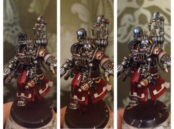
27147
Post by: Solar_lion
The Light/ Lens effect works well. A bit subtle but that's because we are use to the brighter effect everyone does. Nice.
46466
Post by: San76
Thanks solar, I thought about going the full saturated colours but....got try something different
31618
Post by: Eggroll
Bravo! The lights definitely bring more focus to the head of the model. Well done.
26790
Post by: Gitsplitta
Excellent work San.
10667
Post by: Fifty
I love the oscilloscope trace face on the robot, that is absolutely inspired!
27147
Post by: Solar_lion
Are you anywhere near Nerd? ( Like its a tiny country!!! ) You'll have to get a game in!
2 Aussies slugging it out - nothing better.
46466
Post by: San76
Eggroll wrote:Bravo! The lights definitely bring more focus to the head of the model. Well done.
Thanks mate, that was very much the idea!
Gitsplitta wrote:Excellent work San.
Thanks Gits
Fifty wrote:I love the oscilloscope trace face on the robot, that is absolutely inspired!
haha cheers mate. im glad you like it. the whole aesthetic has that kinda 50's robot from mars aesthetic...
Solar_lion wrote:Are you anywhere near Nerd? ( Like its a tiny country!!! ) You'll have to get a game in!
2 Aussies slugging it out - nothing better.
we are a tiny continent! i wish we could...but sadly, no, Nerdy lives on the other side of the country to me. in fact..i think it would be hard for us to live further apart and still both be in Australia
well...today's upgrade is the last of the WIP for the smith. i think i'm ready to call it on him and move to basing. updates since last time: finished up a few of the finer details, dusted down the robe/skirt and gave him a spray of dullcoat. to be honest, the photos dont really capture the dusting on the coat well..but hopefully now you guys can see the shading etc. better. hope you like him - now onto finishing the other bot and building some bases!
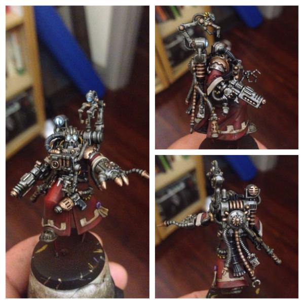
46466
Post by: San76
Well folks, couple of wip shots for you today. Firstly, I started putting together some bases for the robots. These are just base coated at the moment.
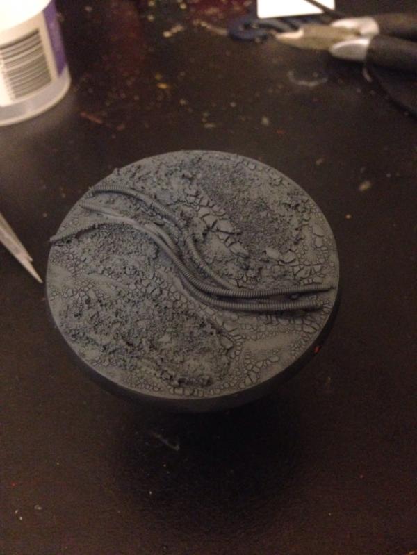
Secondly, a good friend of mine bought me one of the tech smith dominus models. It is an absolutely amazing piece. I love the detail and the sense of menace the sculpt gives.
For kicks I thought you might like to see the base coating process. Honestly, I loved the initial greys so much he almost stayed that way.
|
|
