| Author |
Message |
 |
|
|
|
|
Advert
|
Forum adverts like this one are shown to any user who is not logged in. Join us by filling out a tiny 3 field form and you will get your own, free, dakka user account which gives a good range of benefits to you:
- No adverts like this in the forums anymore.
- Times and dates in your local timezone.
- Full tracking of what you have read so you can skip to your first unread post, easily see what has changed since you last logged in, and easily see what is new at a glance.
- Email notifications for threads you want to watch closely.
- Being a part of the oldest wargaming community on the net.
If you are already a member then feel free to login now. |
|
 |
2009/11/10 15:15:48
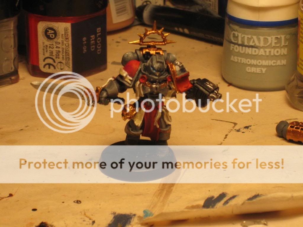
Subject: How can I improve on this?
|
|

Decrepit Dakkanaut
|
|
|
|
 |
|
2009/11/10 15:46:04
Subject: Re:How can I improve on this?
|
|

Decrepit Dakkanaut
|
First thing I noticed is your metals are thick looking. What I do for metal is bas it black, then dry brush boltgun metal on for the silvery parts. I drybrush it so it covers evenly and doesnt blob up anywhere, you can better control where you want the metal to go. And for golds/bronzes I do the EXACT same thing, except after the boltgun metal (you can use silver instead if you want it shineier) I dry brush the gold/bronze ontop of the boltgun metal. BUT I do it with as little paint on my brush as possible. That way your mostly just dusting the gold pigment onto the metal.
It never looks blobed on or thick. Give it a try. I like how you used grey for the armor. Thats a nice change to see on a GK
|
|
|
|
|
2009/11/10 16:01:32
Subject: How can I improve on this?
|
|
Horrific Howling Banshee
|
Shading looks like a good start. Did you mix any paint? It looks like you could use a few more intermediary colors. I've found that a good shade takes between 5 and 7 shades. And rarely do you go straight from one pot to the next. Usualy theres at least a 50/50 mix inbetween.
Try it a few times and see what you think of the results.
|
|
|
|
|
|
2009/11/10 16:12:51
Subject: How can I improve on this?
|
|

Lord of the Fleet
|
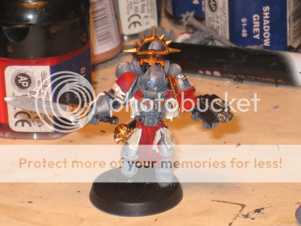
Nice use of NMM, but something that keeps bugging me is his eyes, they could do with a darker colour. I like the contrast of the metals of the blade and the armour. Well done.
|
|
|
|
|
2009/11/10 16:13:28
Subject: How can I improve on this?
|
|
Dakka Veteran
|
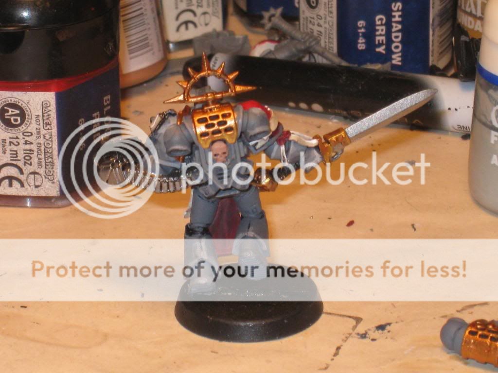
The layering on the grey looks fantastic, apart from the really bright streak down the left thigh.
|
Why must I always choose beween certain death and probable death. |
|
|
|
|
2009/11/10 17:58:11
Subject: How can I improve on this?
|
|
Sword-Wielding Bloodletter of Khorne
|
The first thing that i notice is that you used NMM grey for the armor, but the sowrd and gold is real metal. this ends up giving contrasting effects that I don't really think work well together.
Also on the back of the legs and the bottom of the power pack you went for a more hardline highlighting method, whereas on the tops and arms of the model you went for a NMM light source reflective highlighting.
I would just do the whole model the same, and not try to mix styles to make the whole thing a little more unified.
|
|
|
|
|
|
2009/11/10 18:47:32
Subject: How can I improve on this?
|
|
Guard Heavy Weapon Crewman
In the everlasting battle for eternia prime
|
I dont know much about painting really, but I think that the eyes are abit of focus. I usually paint them in the same way you would paint gems.
|
|
|
|
|
|
2009/11/10 19:20:59
Subject: Re:How can I improve on this?
|
|

Longtime Dakkanaut
|
good start.
You use actual grays rather then the boring boltgun metal everyone else uses.
1: Start with a darker grey, that way the highlites can be more dynamic and give "scale" to the mini.
2: Dont use this bright metallic colours, they steal away from the dark and gothic look of the mini and make it alarm bright instead.
3: Do with the metallics as you did with the armour. Dont use metallics, use normal colours instead. Regular brown and yellow look better then metallic, just like that grey armour you did.
I can post some of my GKs for you too see what I mean a bit later but you are on the right track with this one.
|
Salamanders W-78 D-55 L-22
Pure Grey Knights W-18 D-10 L-5
Orks W-9 D-6 L-14
|
|
|
|
|
2009/11/10 19:22:32
Subject: How can I improve on this?
|
|
Hardened Veteran Guardsman
|
Go through your old WD mags and read all the painting tutorials, as well as tutorials on this site, I have found some great tips in articles, both printed and on the web. It looks like your grey knight could use a wash. I usually paint in all my base colors, then wash my model with the appropriate color wash ( I use devlan mud a lot ) then go back and highlight or drybrush the model with the original base colors, then lighten these same colors for more highlighting, then add in the detail bits, like eyes or gun barels, etc..
|
|
|
|
|
2009/11/10 19:51:10
Subject: How can I improve on this?
|
|
Frightnening Fiend of Slaanesh
|
I like the highlighting on the models except for the metal bits. KingCracker has it right. Maybe ink the silver and golds to add a little depth. Maybe 50/50 Delivn Mud and water. But for the rest of the model works. Try finishing off the base, that adds a lot to the overall finished look of the model.
Chris
|
40k - 
WFB - 
Sounder Nation Member |
|
|
|
|
2009/11/10 20:01:14
Subject: How can I improve on this?
|
|
Decrepit Dakkanaut
|
hey guys, thanks for the replies so far, and i can see what most of you are talking about. Just a couple words from me, and ill step back again, to let the critiques roll in.
the base of the model, i know isnt done, however at this current juncture, i am not sure what i will put on the base/how it will be painted, so its black for now. and with the way that had normally painted, washes were the last step of any mini that i paint.
|
|
|
|
|
|
|