| Author |
Message |
 |
|
|
|
|
Advert
|
Forum adverts like this one are shown to any user who is not logged in. Join us by filling out a tiny 3 field form and you will get your own, free, dakka user account which gives a good range of benefits to you:
- No adverts like this in the forums anymore.
- Times and dates in your local timezone.
- Full tracking of what you have read so you can skip to your first unread post, easily see what has changed since you last logged in, and easily see what is new at a glance.
- Email notifications for threads you want to watch closely.
- Being a part of the oldest wargaming community on the net.
If you are already a member then feel free to login now. |
|
 |
2009/12/31 04:08:58
Subject: My nids for comment and criticism
|
|

Regular Dakkanaut
|
I've been working on these for a while now, (since September I think), and now have a 600 point force, which is the cost my friends tend to play to for now since most of us have only gotten into the hobby recently and are still building up our armies. I'd gotten most of it done before I heard the that the 'nids would be getting a new codex, so I decided to finish what I had rather than waiting to see what would change. I won't be adding to the army any more 'til I've gotten my hands on the new codex and worked out what I want to do with them. In the meantime, I thought I'd throw them up here and see what people think.
Tyranids are my second army, but my chaos daemons are on the back-burner at the moment while I plan out some conversion ideas. I'm still fairly new to miniature painting, but I'm pretty happy with how these guys have turned out. If anyone has any advice on how to make them better, questions, or has anything else to say about them, please post.
On with the pictures 
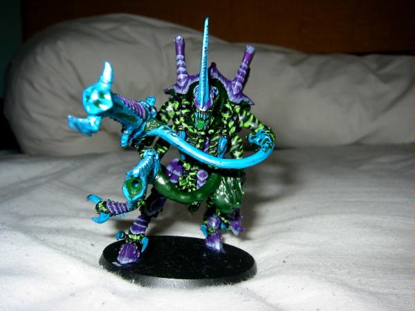
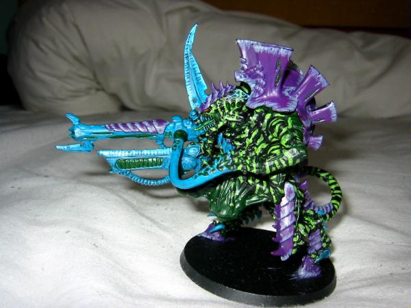
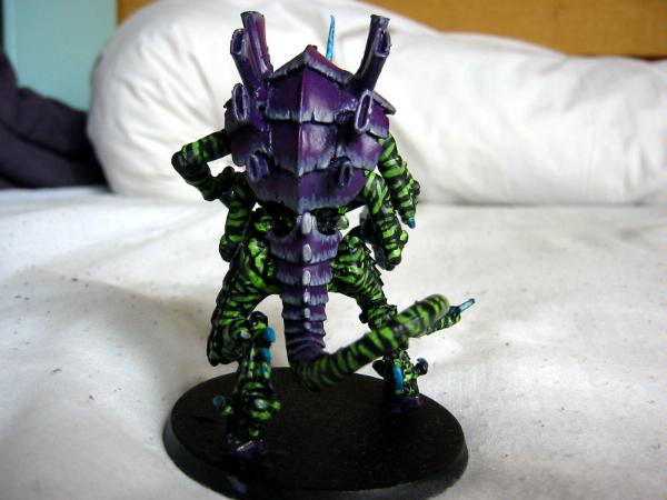
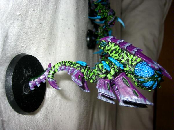
Hive Tyrant (the venom cannon and barbed strangler are magnetized for easy removal)
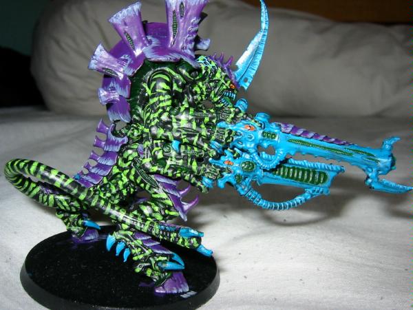
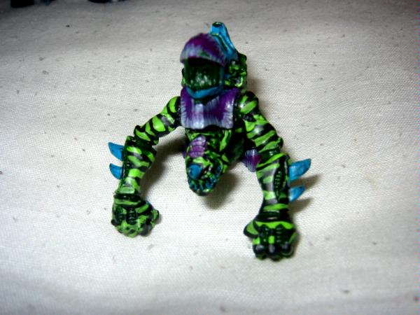
Zoanthrope
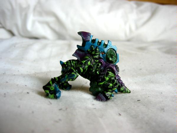
Biovore (I just noticed in the picture that I got some green on the tip of the carapace over the gun  ... I'll have to fix that)
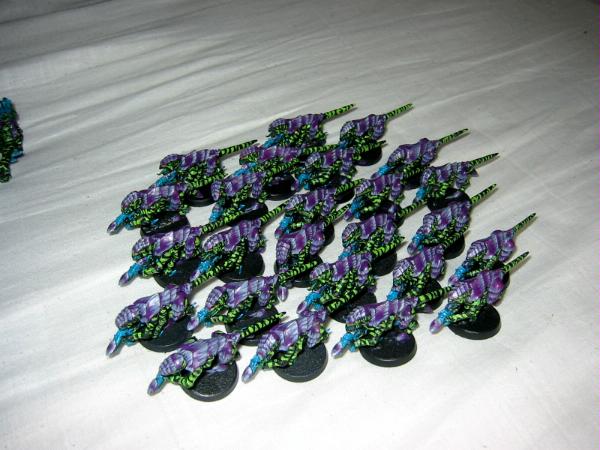
Termagaunts
Hormagaunts
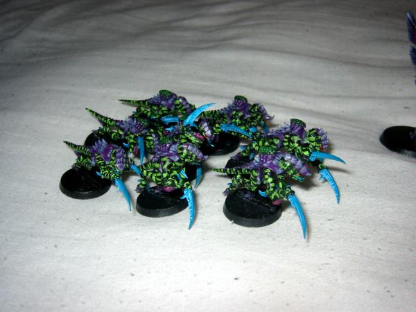
This picture's kinda dark, but it shows their flesh hooks (shortened from the warrior sprue) which I'll probably have to remove if they can't have them in the new codex 
|
|
|
|
 |
|
2009/12/31 04:12:38
Subject: My nids for comment and criticism
|
|

Courageous Questing Knight
|
hey, they're awesome.
Your own fleet?
If I may, Change the blue weapons for somthing a little less 'exotic'
Other then that, they look really good.
|
DR:90S+++G++MB+I+Pw40k096D++A+/areWD360R+++T(P)DM+
3000 pt space marine 72% painted! 
W/L/D 24/6/22
2500 pt Bretons 10% painted
W/L/D 1/0/0
http://www.dakkadakka.com/dakkaforum/posts/list/337109.page lekkar diorama, aye? |
|
|
|
|
2009/12/31 04:20:47
Subject: My nids for comment and criticism
|
|

Fresh-Faced New User
|
I kinda like the blue.
|
|
|
|
|
2009/12/31 04:48:43
Subject: Re:My nids for comment and criticism
|
|
Regular Dakkanaut
|
Thanks for the comments
I went with the turquoise/blue weapons because I wanted them to stand out and look threatening (Also because I really like Hawk Turquiose and Ice blue, and wanted to include them ). My 'nids are intended to be similar to animals such as wasps or certain poisonous frogs and octopuses, which forgo camouflage for advertising their deadliness to ward off would-be attackers. Hence they have the bright green markings, and the highly-visible blueish weapons. (My first colour for the weapons was yellow - the gaunt claws looked a little to much like bananas).
When I get my first lictor, I'm considering doing him a little differently, I'd like him to look like a part of the army, but still have the feel of something which can blend in and hide. I'm thinking of using a much darker blue (maybe regal blue or a mix of regal blue and chaos black?) for the weapons, and going the markings in snot green rather than scorpion, but I really don't know. Any suggestions would be great.
I still need to base these guys. I'm planning on a mix of static grass and some green flock I have a few bags of.
Oh, and there will be rippers magnetised onto the base of all the multi-wound models, so that I can remove one ripper for each wound taken except the last, which removes the model. Seems like a good way to keep track.
|
|
This message was edited 1 time. Last update was at 2009/12/31 04:56:02
|
|
|
|
|
2009/12/31 04:48:53
Subject: Re:My nids for comment and criticism
|
|
Death-Dealing Ultramarine Devastator
Portland, OR
|
I think the blue looks pretty good. I like them.
|
 2000 points 2000 points |
|
|
|
|
2009/12/31 04:52:26
Subject: My nids for comment and criticism
|
|
Khorne Veteran Marine with Chain-Axe
|
HOLY gak IM BLIND. Thats an awesome paint job. Really bright and colorful just like poisonous bugs should be.
|
Refer to Page 5
PLAY LIKE YOU GOT A PAIR!!
 World Eaters 5000 pts World Eaters 5000 pts |
|
|
|
|
2009/12/31 05:26:18
Subject: My nids for comment and criticism
|
|
Tough Traitorous Guardsman
|
O.O awesome.
|
|
|
|
|
2009/12/31 06:22:36
Subject: My nids for comment and criticism
|
|
Prescient Cryptek of Eternity
Mayhem Comics in Des Moines, Iowa
|
I like the colors, and the skill (or at least patience) in painting that stripe pattern on is obvious, but I don't like it. It makes it nearly impossible, at least in the pictures, to see the details on the models themselves. The carapace and the horns and the guns are nice, I just don't like the skin.
|
|
|
|
|
|
2009/12/31 16:20:06
Subject: My nids for comment and criticism
|
|
Sneaky Kommando
|
It obvious that you have spent alot of time on your painting. The skin is very creative. I think the blue weapons clash abit with the scheme. The purple and green work very well.
|
 M: "You are the universe, alpha and omega, the beast with a thousand young, do what thou whilt shall be the whole of the law. NOW GO FORTH AND MUTILATE!!" M: "You are the universe, alpha and omega, the beast with a thousand young, do what thou whilt shall be the whole of the law. NOW GO FORTH AND MUTILATE!!"
 "Samus. That's the only name you'll hear. Samus. It means the end and the Death. Samus. I am Samus. Samus is all around you. Samus is the man beside you. Samus will gnaw upon your bones. Look out! Samus is here." "Samus. That's the only name you'll hear. Samus. It means the end and the Death. Samus. I am Samus. Samus is all around you. Samus is the man beside you. Samus will gnaw upon your bones. Look out! Samus is here."
Armies:
 :3000 + :3000 +
 Fantasy: Gettin Started Fantasy: Gettin Started |
|
|
|
|
2009/12/31 16:39:54
Subject: Re:My nids for comment and criticism
|
|
Long-Range Ultramarine Land Speeder Pilot
|
Congrats at these first models! If only my first minis were like this.
I would agree with the bright blue weapons. At least with the claws, i would try a different color, like red. It looks pretty good on the hive tyrant though.
And as striking as the skin looks, I cant help but think the scheme would look better overall flip-flopped. That is, the skin could be bright blue(which would give the models amazing detail plenty of room for highlights and washes), and the carapace would be the camoflauge pattern of greens.
|
 The difference between commitment and involvement is like eggs and ham; the ckicken was "involved", the pig was "comitted". The difference between commitment and involvement is like eggs and ham; the ckicken was "involved", the pig was "comitted".
NOW ACCEPTING COMISSIONS
Check out some of my best works at my Tumblr account: http://brotherzach.tumblr.com/ |
|
|
|
|
2009/12/31 18:23:43
Subject: My nids for comment and criticism
|
|
Servoarm Flailing Magos
|
They look fine, by my estimation, because if you ever look at critters in a rainforest, many of them may be brightly colored with contrasts of green, blue, and purple. It usually announces they are toxic, or posionous. Therefore, give as many bugs Toxic Sacs as can take them and you have a perfectly fluffy reason for the bright colors! I like they way they are painted as well. The striping adds a nice quality to them.
|
http://www.teun135miniaturewargaming.blogspot.com/ https://www.instagram.com/teun135/
Foxphoenix135: Successful Trades: 21
With: romulus571, hisdudeness, Old Man Ultramarine, JHall, carldooley, Kav122, chriachris, gmpoto, Jhall, Nurglitch, steamdragon, DispatchDave, Gavin Thorne, Shenra, RustyKnight, rodt777, DeathReaper, LittleCizur, fett14622, syypher, Maxstreel |
|
|
|
|
2009/12/31 19:39:08
Subject: My nids for comment and criticism
|
|
Squishy Squig
|
Pay no attention to the naysayers. If those are the colors you like and you enjoy seeing it on the field of battle then by all means stick with it.
Personally, it's a little bright for my tastes, but it is nicely done. I especially like the termagaunt photo as it gives a nice sense of a horde instead of individual models grouped together.
One thing that would help would be to finish the bases. I think someting neutral would help your paint scheme a lot.
|
WAAAGH! Urtyzod - 750pts |
|
|
|
|
2009/12/31 20:06:32
Subject: Re:My nids for comment and criticism
|
|
Khorne Veteran Marine with Chain-Axe
|
They look well painted. They are a bit garish for my taste, but the color scheme seems to work well when grouped together. The only thing I would suggest would be to tone down the light green stripes(make them thinner and spread them out a little). Less is more in that aspect.
|
|
|
|
|
|
2010/01/01 13:29:09
Subject: Re:My nids for comment and criticism
|
|
Regular Dakkanaut
|
Thanks for the comments. Seems like the weapon colour isn't to everyone's taste, but it's a favourite colour of mine, so I'm gonna stick with it.
I do agree that the bright patterns distract from the detail on the model, that does seem to be a disadvantage of this scheme. It wasn't so noticeable on my first test models, which were the cheap two-part termagaunts, which have less detail on them. But they were cheap (NZ$1 each) and I was poor. I've noticed it more on the zoanthrope and especially the tyrant, which was the last model I painted. But I've done so many of them in the scheme now that I'm going to stick with it and accept that it will distract from the detail in some cases (although I think this seems worse in pictures than seeing the models themselves).
brother_zach, I like your idea of an inverted version of the scheme, with the patterns on the carapace plates, I think that'd look really stricking as well, and has the bonus that the patterns aren't covering the detailed parts. Like I said, I'm gonna stick with my version now, but if someone wants to do something similar to mine, then that's probably a better way to do it.
|
|
|
|
|
|
2010/01/01 13:51:55
Subject: Re:My nids for comment and criticism
|
|
Lady of the Lake
|
They look pretty cool
I think they actually work out. The purple goes well with the black stripes, while the blue goes well with the green.
|
|
|
|
|
|
2010/01/01 14:52:02
Subject: Re:My nids for comment and criticism
|
|
Stabbin' Skarboy
|
I really like that striping. Great job on that. I agree with some of the other posters that the bright blue doesnt seem to fit but after reading your explanation I am on board now.
Great work and keep them pictures coming.
|
 Oi!! Which Butt'n makes dis ting go!?! Oi!! Which Butt'n makes dis ting go!?!
|
|
|
|
|
2010/01/01 20:38:27
Subject: My nids for comment and criticism
|
|
Awesome Autarch
|
That army seriously pops! Nice work man, I like it.
|
|
|
|
|
|
2010/01/01 21:07:28
Subject: My nids for comment and criticism
|
|

Roarin' Runtherd
|
I like the ambitious paint job. Though i think the blue guns (especially the larger one on the hive tyrant) could use some more contrast. Perhaps a wash and drybrush would really make the details pop while keeping the lavish colour.
|
"Yep dats the one fer you" 
"Yeah, wots so good about it den" 
"Dat iz the new exploading leg Mk2, no extra cost needed"
"WAT MK2"  |
|
|
|
|
2010/01/01 23:04:14
Subject: My nids for comment and criticism
|
|

[DCM]
Procrastinator extraordinaire
|
Now I like that!Very nice colours.I think the blue looks great with the rest of the model.
|
|
|
|
|
|
2010/01/01 23:10:23
Subject: My nids for comment and criticism
|
|
Decrepit Dakkanaut
|
Your colour scheme looks amazing from a distance but when you get up close it obscures all detail and looks kind of silly.
I cant decide if i like it or not...
|
|
|
|
|
2010/01/02 00:22:39
Subject: My nids for comment and criticism
|
|
Huge Hierodule
United States
|
So this is what Tyranids look like when you're on an acid trip....
Sersiously though, very nice. Defenitely says "don't touch us, we're poisonous".
|
|
|
|
|
|
2010/01/02 00:34:07
Subject: Re:My nids for comment and criticism
|
|
Wraith
O H I am in the Webway...
|
I like the color scheme. My only suggestion would be to maybe hit the model with a wash to to contrast it a little, it all kinda stands out at the moment but maybe a medium black wash could really help it.
|
He who fights with monsters might take care lest he thereby become a monster and if you gaze for long into an abyss, the abyss gazes also into you |
|
|
|
|
2010/01/02 01:08:07
Subject: My nids for comment and criticism
|
|
Enigmatic Sorcerer of Chaos
|
corpsesarefun wrote:Your colour scheme looks amazing from a distance but when you get up close it obscures all detail and looks kind of silly.
I cant decide if i like it or not...
I actually thought the exact opposite.. From afar it almost looks hard to tell what they are but once you get closer and see what they are they look really cool... this also might be the pictures where as irl it would be esier to identify even from farther away... I like it alot though! Will look awsome as a whole army!
|
|
|
|
|
2010/01/02 01:08:52
Subject: My nids for comment and criticism
|
|

Avatar of the Bloody-Handed God
|
I shall gave them a name...
Hive Fleet Night Shade
|
Paused
◙▬▬▬▬▬▬▬▬▬▬▬▬▬
◂◂ ► ▐ ▌ ◼ ▸▸
ʳʷ ᵖˡᵃʸ ᵖᵃᵘˢᵉ ˢᵗᵒᵖ ᶠᶠ |
|
|
|
|
2010/01/02 01:21:17
Subject: Re:My nids for comment and criticism
|
|
Mekboy Hammerin' Somethin'
|
some reason they remind of me of The Fast and The Furious movies... just need some led lights mounted to point down at the ground
|
|
|
|
|
|
2010/01/02 17:00:58
Subject: Re:My nids for comment and criticism
|
|
Mad Gyrocopter Pilot
Scotland
|
Very... vivid and ambitious colors. But must say Ive never seen such a scheme used before. I initially didn't like them but (much like spore bombardment ) they've grown on me. They have a very slimy look to them which fits them well and the blue claws have good detail. Any chance of more close up pics from other angles? Nice work!
|
|
|
|
|
2010/01/02 17:08:01
Subject: My nids for comment and criticism
|
|
Bonkers Buggy Driver with Rockets
|
theylook good
|
  
looted moonz 6000 pts and still growing and building |
|
|
|
|
2010/01/02 17:09:20
Subject: Re:My nids for comment and criticism
|
|
Long-Range Ultramarine Land Speeder Pilot
|
CodGod wrote:Thanks for the comments. Seems like the weapon colour isn't to everyone's taste, but it's a favourite colour of mine, so I'm gonna stick with it.
I do agree that the bright patterns distract from the detail on the model, that does seem to be a disadvantage of this scheme. It wasn't so noticeable on my first test models, which were the cheap two-part termagaunts, which have less detail on them. But they were cheap (NZ$1 each) and I was poor. I've noticed it more on the zoanthrope and especially the tyrant, which was the last model I painted. But I've done so many of them in the scheme now that I'm going to stick with it and accept that it will distract from the detail in some cases (although I think this seems worse in pictures than seeing the models themselves).
brother_zach, I like your idea of an inverted version of the scheme, with the patterns on the carapace plates, I think that'd look really stricking as well, and has the bonus that the patterns aren't covering the detailed parts. Like I said, I'm gonna stick with my version now, but if someone wants to do something similar to mine, then that's probably a better way to do it.
Thank you very much! I have considered jumping into another army, and with the new bug release, it just might be tyranids. I do love your paint scheme, it really shows how much work you put into your minis. Many would take the lazy way out of painting an army, especially with a hoard style army like bugs.
|
The difference between commitment and involvement is like eggs and ham; the ckicken was "involved", the pig was "comitted".
NOW ACCEPTING COMISSIONS
Check out some of my best works at my Tumblr account: http://brotherzach.tumblr.com/ |
|
|
|
|
2010/01/03 12:56:26
Subject: Re:My nids for comment and criticism
|
|
Regular Dakkanaut
|
Lexx wrote:Very... vivid and ambitious colors. But must say Ive never seen such a scheme used before. I initially didn't like them but (much like spore bombardment ) they've grown on me. They have a very slimy look to them which fits them well and the blue claws have good detail. Any chance of more close up pics from other angles? Nice work!
Thanks!
I'm moving over the next couple of days, but I might have time to grab a few more shots. was there anything in particular you wanted a better look at?
brother_zach wrote:
Thank you very much! I have considered jumping into another army, and with the new bug release, it just might be tyranids. I do love your paint scheme, it really shows how much work you put into your minis. Many would take the lazy way out of painting an army, especially with a hoard style army like bugs.
Well, if you end up doing anything like this, make sure to post pics in the forum for us all to see.
|
|
|
|
|
|
2010/10/08 12:21:09
Subject: My nids for comment and criticism
|
|

Shroomin Brain Boy
|
well the weapons aren´t my taste but if you like them thats cool. i like your idea and touch of biology as to how you made their skins, really logic thinking that is.
|
|
|
|
|
|
|
|