| Author |
Message |
 |
|
|
|
|
Advert
|
Forum adverts like this one are shown to any user who is not logged in. Join us by filling out a tiny 3 field form and you will get your own, free, dakka user account which gives a good range of benefits to you:
- No adverts like this in the forums anymore.
- Times and dates in your local timezone.
- Full tracking of what you have read so you can skip to your first unread post, easily see what has changed since you last logged in, and easily see what is new at a glance.
- Email notifications for threads you want to watch closely.
- Being a part of the oldest wargaming community on the net.
If you are already a member then feel free to login now. |
|
 |
2011/04/03 02:28:25
Subject: Chiaroscuro + OSL Space Hulk (Pic heavy)
|
|

Speedy Swiftclaw Biker
|
Therion wrote:I like these a lot. I like monochrome models and all other dark themed shadowy figures. Well done.
Thank you
I have read an article about monochromatism long time ago - but I assume since monochrome you use only white/black (correct me if I'm wrong) so I didn't want to call it that way.
Monochrome models are cool - but I still can't think of the way to photograph them so that they look 'done' in the photo.
Would be a good way to practice your technique nonetheless.
fiddler6291 wrote:The videos help a lot in appreciating the outcome of the technique, thanks for uploading them!
The fact you used infected mushroom as background music for the first vid makes it worth watching 
Cheers - the vids have always been there. I just found out how to add youtube links last night haha.
I tried to use whatever music I painted to at the time as the bg music, but some of them have copyright issues so couldn't be viewed in some countries.
Infected Mushroom are just awesome!
Fasai
|
|
|
|
 |
|
2011/04/04 09:41:14
Subject: Re:Chiaroscuro + OSL Space Hulk (Pic heavy)
|
|

Lone Wolf Sentinel Pilot
|
DODcrazy wrote:Holy crap the hate in here is ridiculous. Just because he chose an alternative style (FOR A CUSTOMER NO LESS) doesn't mean these aren't amazing miniatures. If you don't like a particular style, keep it to yourself; don't let personal opinion get involved when it comes to judging something based off of skill.
Err...Excuse me? The whole point of putting miniatures up on the showcase is to have them critiqued by the unwashed masses. If people find something not to their liking they are fully within their rights to say so. Furthermore, I don't think a single person here (including myself) has denied the sheer amount of skill involved to pull off these techniques, we just don't find the finished product to our liking.
I suggest you keep your own opinions about our opinions to yourself next time, and focus your comments purely on the models themselves.
L. Wrex
|
|
|
|
|
|
2011/04/05 01:09:15
Subject: Chiaroscuro + OSL Space Hulk (Pic heavy)
|
|

Gargantuan Gargant
|
Agreed, Lycaeus. The OP seems quite responsive to criticism and I've yet to see an even remotely hateful comment. Sure, "not my cup of tea" without elaboration isn't terribly useful feedback, but even those posts were rare in this thread. No white knighting necessary.
To the OP: My issue is primarily with the models without some light source attached to them. The first LC termie you posted displays a far more convincing effect, I think, because there's color more or less everywhere, even if it's incredibly muted. I can understand why models without glowing claws or hammers wouldn't have the same close, tinted light cast on them, but I feel like going mostly or completely in grayscale does more to harm the "dim lighting" immersion than enhance it.
The thing is, there has to be some ambient light striking the figures for them to be visible. The variation present in the grays of the 'nid already give evidence of far more light than the minimal amount of color would suggest. The bolter termie has a similar issue. There are near-whites present in metallic areas, suggesting the sheen of the metal. The nearby nonmetallic parts, however, are all shades of gray. The light levels are correct, to my eye, it's the balance of color and grayscale that's off.
I'd be most curious to see a few untouched shots of the librarian. That picture is chiaroscuro in a nutshell, but I can't possibly tell how much is paint and how much is photo manipulation.
With all that said, I applaud you for undertaking and satisfactorily completing such an uncommon and difficult commission. Since the customer liked it, perhaps you should have stopped with that. Dakka's full of critics today, it seems. Thanks for sharing. 
|
The Dreadnote wrote:But the Emperor already has a shrine, in the form of your local Games Workshop. You honour him by sacrificing your money to the plastic effigies of his warriors. In time, your devotion will be rewarded with the gift of having even more effigies to worship.
|
|
|
|
|
2011/04/05 02:58:10
Subject: Chiaroscuro + OSL Space Hulk (Pic heavy)
|
|
Speedy Swiftclaw Biker
|
No problem - I'm happy with the result but at the same time I want to be able to improve my work and go beyond my comfort zone.
I can totally see your points about the lack of consistency and 'realism' in the level of dark/grey/white.
Having received many criticisms, next time I'll definitely work on the areas that needed improvement.
As for the Librarian, I'll try to find an untouched photo and post later. That picture wasn't manipulated that much (on the model), I just blackened the bg to get rid of the reflection from the light sources just to make everything pitch black and suit the concept of the model.
Cheers
Fasai
|
|
|
|
|
|
2011/04/05 03:17:42
Subject: Chiaroscuro + OSL Space Hulk (Pic heavy)
|
|

Blood Angel Chapter Master with Wings
|
I am not a huge fan either...
Not because the style is bad in and of itself, but because of the minis it was used on. I think the exact same thing applied to pa marines would be entirely more convincing due to smoother less detailed surfaces.
The sh termies are some of the most textured and detailed plastics to date, to pull off the effect convincingly would have required a ridiculous amount of hand done occlusion shadowing, that only a handful of painters could pull off. It is a problem more with the canvas than the painter if that makes sense?
If I were you, I would study some baroque master paintings, and try again on a regular marine. You have started walking down an interesting path, and though there is ways to go, it will be worth it i think!
|
|
|
|
|
|
2011/04/05 05:29:23
Subject: Chiaroscuro + OSL Space Hulk (Pic heavy)
|
|
Speedy Swiftclaw Biker
|
MajorTom11 wrote:I am not a huge fan either...
Not because the style is bad in and of itself, but because of the minis it was used on. I think the exact same thing applied to pa marines would be entirely more convincing due to smoother less detailed surfaces.
The sh termies are some of the most textured and detailed plastics to date, to pull off the effect convincingly would have required a ridiculous amount of hand done occlusion shadowing, that only a handful of painters could pull off. It is a problem more with the canvas than the painter if that makes sense?
If I were you, I would study some baroque master paintings, and try again on a regular marine. You have started walking down an interesting path, and though there is ways to go, it will be worth it i think!
Thanks for the suggestions - checking out baroque paintings sounds good. I'm quite keen on learning how to identify paintings from different era the same way I can sorta tell in classical music. I have my own set of SH so I might try and execute this technique again once I've had enough training with cheaper subjects.
So far this has been really educational, so thanks for your input!
Fasai
|
|
|
|
|
|
2011/04/05 15:48:13
Subject: Chiaroscuro + OSL Space Hulk (Pic heavy)
|
|
Gargantuan Gargant
|
If you're looking for reference paintings, Caravaggio is the posterboy for tenebrism, a style utilizing incredibly stark chiaroscuro. Even Rubens played around with a somewhat exaggerated style of shading. Joseph Wright, Fuseli, and Delacroix carried on the "single candle night scene" tradition in some of their works, so the style kept cropping up to some extent, even in England and the Low Country, into the 19th century. If you want more famous/archetypal examples, I'd have to dig out my reference material. Haven't studied baroque/romantic painting in a few years, now.
The main difference that I think will become immediately apparent is that the tenebristic style differs from what you were trying to achieve, here, in that there is very little soft (perhaps "partial" is a better word, here) lighting. It's the stark delineation between light/color and almost absolute shadow that defines the style. That's why I was curious about untouched photos of the librarian - he alone appears to have portions completely "removed" by shadow, but I couldn't tell what was paint, natural shadow, or photo manipulation, hence my curiosity. If you can achieve that shading effect by paint alone, you're halfway to becoming a god.
MajorTom's point about the "canvas" in interesting, but if you're going for the baroque/tenebristic effect, I feel like PA marines might be a bit too smooth and round. They'd be great for the OSL half of this, but I feel like protruding detail and moderately sharp edges break up the lines to create a necessary variety and interest in the shadows. I agree that the SH termies have so much detail as to make a full application of the technique nearly impossible, but I think something in between - with undulating surfaces and detail like these minis, just fewer of them - would be the best candidate.
|
The Dreadnote wrote:But the Emperor already has a shrine, in the form of your local Games Workshop. You honour him by sacrificing your money to the plastic effigies of his warriors. In time, your devotion will be rewarded with the gift of having even more effigies to worship.
|
|
|
|
|
2011/04/06 00:32:08
Subject: Chiaroscuro + OSL Space Hulk (Pic heavy)
|
|
Speedy Swiftclaw Biker
|
Hi Oadie Thanks for the ref list - will be looking into their works. I'm not sure if the problem lies in the process of photographing or the way light shines at the mini - but it's impossible for me to achieve the desired effect of chiaroscuro when presenting them through photography. Even the parts that are painted black appear to be somewhat grey. In naked eyes, I think we can see the difference between the brightly painted parts and the shadowed part quite easily. But as you can see in the photos below, even the black bg appears grey. To solve this and enhance the photos, use the 'burn' tool in PS to blacken the bg while avoiding touching on the mini. Then I boosted the contrast of the pic so that you can see the intended effect more easily.    note - these pictures are at their original stage and I didn't use dakka auto balance either. I'm assuming there must be a difference between the way light shines on a flat painting and a 3D miniature - making it easier for us to see whatever is painted on a painting more easily because there's no protruding parts catching on the light - unlike a miniature. I wish I did art so that I know the technical side of this. Fasai
|
|
This message was edited 1 time. Last update was at 2011/04/06 00:43:01
|
|
|
|
|
2011/04/06 05:01:35
Subject: Chiaroscuro + OSL Space Hulk (Pic heavy)
|
|
Gargantuan Gargant
|
Thanks for uploading the pics. The more I look at and talk about this stuff, the more interested I get!
nuclealosaur wrote:I'm not sure if the problem lies in the process of photographing or the way light shines at the mini - but it's impossible for me to achieve the desired effect of chiaroscuro when presenting them through photography. Even the parts that are painted black appear to be somewhat grey.
In naked eyes, I think we can see the difference between the brightly painted parts and the shadowed part quite easily. But as you can see in the photos below, even the black bg appears grey. To solve this and enhance the photos, use the 'burn' tool in PS to blacken the bg while avoiding touching on the mini. Then I boosted the contrast of the pic so that you can see the intended effect more easily.
Ah, the many shades of black. I would have done the exact same thing if I wanted the picture to look good, but I'm glad that I can now see the mini in untouched photos. Even still, I have a hard time telling what is natural light and what is paint. However, once I remember the scale of the figure, I realize that it must be the paint, which really is a testament to your skill. Trompe-l'oeil, indeed! 
nuclealosaur wrote:I'm assuming there must be a difference between the way light shines on a flat painting and a 3D miniature - making it easier for us to see whatever is painted on a painting more easily because there's no protruding parts catching on the light - unlike a miniature.
Oh, definitely. The most interruption from light a painting ever gets is a glare on a glossy finish. It's like pure color behind a sheet of glass. Curvature and texture are why the background and painted shadows didn't look quite right, to you. Light catching the fuzzy texture of the cloth made it look gray and the curved surfaces of the mini, even if painted jet black, would still have a gradient somewhere, as light caught one part or another. That's the hardest part about trying this - you really are applying a 2-D technique to a 3-D model. It would be (relatively) simple if the model was kept in perfectly even, soft lighting and only ever viewed from a single angle, but that's no fun!
nuclealosaur wrote:I wish I did art so that I know the technical side of this.
I'd much rather make art than talk about it. Sadly, I don't really have much talent, so I mostly settle for talking about it. That's partly why I studied Art History and partly why I spend so much time on Dakka instead of painting. 
|
The Dreadnote wrote:But the Emperor already has a shrine, in the form of your local Games Workshop. You honour him by sacrificing your money to the plastic effigies of his warriors. In time, your devotion will be rewarded with the gift of having even more effigies to worship.
|
|
|
|
|
2011/04/06 17:35:10
Subject: Chiaroscuro + OSL Space Hulk (Pic heavy)
|
|
Blood Angel Chapter Master with Wings
|
Wow that new pic is a world of difference from the first bunch! I still have reservations about some of the other models, but, that librarian is full of win and quite successful!
|
|
|
|
|
|
2011/04/09 17:40:09
Subject: Chiaroscuro + OSL Space Hulk (Pic heavy)
|
|
Speedy Swiftclaw Biker
|
@Oadie and Major Tom
I've started a new project a few days back and there're a whole lot of progress pictures in this link:
http://www.facebook.com/album.php?fbid=121891721220106&id=100001978352988&aid=23967
After pondering about how to retain the similar style while improving in the areas that my previous project lacked, I've decided to do as follows:
- less light illumination and try not to cover to much of the space of the model - This way some painted detail won't be completely covered by the illumination, avoiding that 'unfinished' look.
- add more than 1 light source as been suggested
- use many colors of wash (oil color) to shade and reduce the contrast b/w the midtone and extreme HL.
- use less shadow. Since it's impossible to achieve 'complete blackness', it might be a better idea to just darken certain areas a slight bit, rather than completely painting them black like in my previous project.
Please follow the link to my project log - it's easier for me to upload via facebook (for an apparent reason)
Will post the finished product here once it's finished
Cheers
Fasai
|
|
|
|
|
|
2011/04/10 03:50:49
Subject: Chiaroscuro + OSL Space Hulk (Pic heavy)
|
|
Happy We Found Our Primarch
|
Love these minis, they're completely different to anything i've ever seen before, which in itself is to be applauded. People will love them or hate them, but that's often the case with distinctive / unique styles in anything. My hat off to you, sir.
|
 3000 3000
 2000 2000
"We don't stop playing because we grow old; we grow old because we stop playing." - George Bernard Shaw
|
|
|
|
|
2011/04/10 03:59:33
Subject: Chiaroscuro + OSL Space Hulk (Pic heavy)
|
|
Speedy Swiftclaw Biker
|
nathaniel_garro wrote:Love these minis, they're completely different to anything i've ever seen before, which in itself is to be applauded. People will love them or hate them, but that's often the case with distinctive / unique styles in anything. My hat off to you, sir.
Thank you very much - being applauded for having a unique style means so much to me!
|
|
|
|
|
|
2011/04/10 07:07:41
Subject: Re:Chiaroscuro + OSL Space Hulk (Pic heavy)
|
|
Long-Range Ultramarine Land Speeder Pilot
|
The librarian is a much better example of your technique! I'm most certainly impressed with this!
|
 The difference between commitment and involvement is like eggs and ham; the ckicken was "involved", the pig was "comitted". The difference between commitment and involvement is like eggs and ham; the ckicken was "involved", the pig was "comitted". 
NOW ACCEPTING COMISSIONS
Check out some of my best works at my Tumblr account: http://brotherzach.tumblr.com/ |
|
|
|
|
2011/04/10 07:54:56
Subject: Re:Chiaroscuro + OSL Space Hulk (Pic heavy)
|
|
Speedy Swiftclaw Biker
|
brother_zach wrote:The librarian is a much better example of your technique! I'm most certainly impressed with this!
Thanks! Possibly because that was the last model from the set to be painted so my technique changed a bit.
---
here is what I've been working on this week.
Straight from my camera - no PS, no dakka auto balance thingy
I've taken a different approach with this project as been mentioned before.... still WIP but almost done (some more shadows and lights on the base)
What do you guys think so far?
|
|
|
|
|
|
2011/04/10 20:47:31
Subject: Re:Chiaroscuro + OSL Space Hulk (Pic heavy)
|
|
Troubled By Non-Compliant Worlds
|
Great work  second video shows how awesome they must look irl , they look like they'd fit perfectly with the spacehulk board / idea of very little light being there.
Keep up the awesome work 
T-M
|
|
|
|
|
|
2011/04/10 23:58:30
Subject: Chiaroscuro + OSL Space Hulk (Pic heavy)
|
|
Gargantuan Gargant
|
Ooh, interesting new project! Loving the juxtaposition of the figure(s) and the base. The bright double light source on this guy works quite well, too.
In the vein of our earlier posts, I think the more subtle shading is quite effective. I can't decide which I find more impressive, though: the interplay between the two light sources or the treatment of the larger shadows. Having seen the whole thing to put it in context, I could probably spend an hour drooling over that book, alone (best of both worlds!).
After reading the post about the planned changes to your method, I thought you were going in a good direction. This confirms it, for me, 100%. Although, I wouldn't totally abandon the previous style. It'll take a lot of tweaking, but there's a lot of promise, too. If you keep cranking out projects like this, at least I know I'll always have something interesting to talk about!
|
The Dreadnote wrote:But the Emperor already has a shrine, in the form of your local Games Workshop. You honour him by sacrificing your money to the plastic effigies of his warriors. In time, your devotion will be rewarded with the gift of having even more effigies to worship.
|
|
|
|
|
2011/04/11 00:41:42
Subject: Chiaroscuro + OSL Space Hulk (Pic heavy)
|
|
Deranged Necron Destroyer
|
I love how it makes the whole scene of being in a space hulk. A dark, broken down ship that really adds to the freakyness. In daylight, the models would look out of place but how you photographed them, they look really good like that. Def. diorama quality pieces.
|

malfred wrote:Buy what you like.
Paint what you love.
|
|
|
|
|
2011/04/11 04:14:02
Subject: Re:Chiaroscuro + OSL Space Hulk (Pic heavy)
|
|
Speedy Swiftclaw Biker
|
TungstenMonkey wrote:Great work second video shows how awesome they must look irl , they look like they'd fit perfectly with the spacehulk board / idea of very little light being there.
Keep up the awesome work
T-M
Thanks - yep, videos do help a lot. Might need to improve on the quality of the video however.
oadie wrote:Ooh, interesting new project! Loving the juxtaposition of the figure(s) and the base. The bright double light source on this guy works quite well, too.
In the vein of our earlier posts, I think the more subtle shading is quite effective. I can't decide which I find more impressive, though: the interplay between the two light sources or the treatment of the larger shadows. Having seen the whole thing to put it in context, I could probably spend an hour drooling over that book, alone (best of both worlds!).
After reading the post about the planned changes to your method, I thought you were going in a good direction. This confirms it, for me, 100%. Although, I wouldn't totally abandon the previous style. It'll take a lot of tweaking, but there's a lot of promise, too. If you keep cranking out projects like this, at least I know I'll always have something interesting to talk about!
Thanks man - I agree, subtle shading is really effective as it doesn't cover all the details. I've also found that by using multiple colors of oil wash, the mini is more unified and more interesting as the shades consist of more colors than just black - boring. It's also really fun just pulling oil wash around the model, mixing on the spot here and there and ultimately - turp smells so nice!
Mewiththeface wrote:I love how it makes the whole scene of being in a space hulk. A dark, broken down ship that really adds to the freakyness. In daylight, the models would look out of place but how you photographed them, they look really good like that. Def. diorama quality pieces.
Thank you!
-----
New project is up now - officially my 3rd attempt on this. The Tzeentch sorcerer will have to wait for brass chains which I ordered online to arrive.
http://www.dakkadakka.com/dakkaforum/posts/list/360055.page
|
|
|
|
|
|
2011/04/11 04:38:19
Subject: Chiaroscuro + OSL Space Hulk (Pic heavy)
|
|
Blood Angel Chapter Master with Wings
|
Now you're talking! Looks great!
Btw, I hope you saw my post about the librarian and my retraction!
You should really start a new thread about the Daemons in the P&M blog section though!
|
|
|
|
|
|
2011/04/11 04:45:29
Subject: Chiaroscuro + OSL Space Hulk (Pic heavy)
|
|
Speedy Swiftclaw Biker
|
MajorTom11 wrote:Now you're talking! Looks great!
Btw, I hope you saw my post about the librarian and my retraction!
You should really start a new thread about the Daemons in the P&M blog section though!
Thanks for the compliment! Unfortunately them termies aren't with me anymore, otherwise I would take more photos of them in natural light for you to see.
If you want to see unedited pics, I'll upload them upon request.
I'll post the demon chariot once it's finished - it's easier to upload WIP stuff on facebook so I just upload my log there instead.
|
|
|
|
|
|
2011/04/26 18:56:13
Subject: Chiaroscuro + OSL Space Hulk (Pic heavy)
|
|

Fresh-Faced New User
|
I really like the colors. They look realistic evil and they are far away from the evi metal style of painting that is so popular. I really like this.
|
|
|
|
|
2011/04/26 19:34:55
Subject: Re:Chiaroscuro + OSL Space Hulk (Pic heavy)
|
|
Fixture of Dakka
|
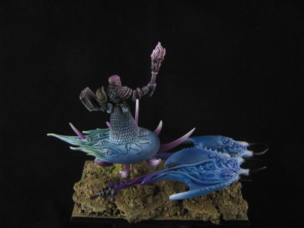
I really love what you have done with the terminators and the disc rider.
I want to try painting a moonlit army (Vampire Counts) at some point in the future when I build up the courage and painting skills. I'll defiantly be using some of your models as inspiration.
|
|
|
|
|
|
2011/04/26 20:14:15
Subject: Re:Chiaroscuro + OSL Space Hulk (Pic heavy)
|
|
Slippery Ultramarine Scout Biker
|
I would love my whole army painted in this style... IDK if I could justify a tank though. How would it fit in the hulk? LoL Either way, I love these models.
|
We follow in the footsteps of Guilliman.
As it is written in the Codex, so shall it be.
- Marneus Calgar
 1000pts 1000pts
Matches(W/L/T):
5/8/0
|
|
|
|
|
2011/04/27 09:12:09
Subject: Chiaroscuro + OSL Space Hulk (Pic heavy)
|
|
Speedy Swiftclaw Biker
|
Thanks for all your comments!
I think in order to pull this sorta effect out on a tank you'd have to add some sorta light source... maybe a laser beam coming out from the barrel or something like that.
For my own army, I've modelled a spacewolf with a powersword poking out from a vindicator and I might try to do a similar effect on it.
|
|
|
|
|
|
2011/04/27 10:20:46
Subject: Re:Chiaroscuro + OSL Space Hulk (Pic heavy)
|
|
Strider
|
I really like these, given the nature of Space hulks closed environment and harsh point lighting the effects are very nice. I would say the genestealer looks rather unpainted tho, Could have given him some colour reflections from second source lighting.
But very refreshing and cool.
|
|
|
|
|
|
2011/04/27 14:31:39
Subject: Chiaroscuro + OSL Space Hulk (Pic heavy)
|
|
Speedy Swiftclaw Biker
|
Thanks for you suggestion - I'm trying to find a way to achieve a 'painted' impression and at the same time execute the technique of chiaroscuro.
Still have a box of Spacehulk of my own - do you guys reckon the value would go up in the future? Or should I just paint them soon for the sake of my education?
I would love to put them termies on 40mm but I think it would be easier to sell as they are, what do you guys think?
|
|
|
|
|
|
2013/05/21 19:06:20
Subject: Chiaroscuro + OSL Space Hulk (Pic heavy)
|
|
Blood Angel Chapter Master with Wings
|
The value will go up, I just sold my extra set for 250, they are becoming rarer.
That being said, if you want the value to really sky-rocket, and be safe if/when they ever release the models again, paint them up! You could sell a set painted to your recent standards for quite a bit!
|
|
|
|
|
|
2011/04/28 23:03:48
Subject: Chiaroscuro + OSL Space Hulk (Pic heavy)
|
|
Stern Iron Priest with Thrall Bodyguard
|
Very nice work. I've always loved monochromatic miniatures and these are exceptionally well done.
I just acquired an airbrush myself and the first model I tested it on will be done in the monochromatic style. I finished spraying the figures last night and now I need to touch up the light source and apply some hard highlights. I didn't do any painting to the figure at all prior to spraying except for black primer, and I'm going for a hard contrast with a bright light source for a figure standing in a dark room/dungeon. Going to build a diorama for it because, as has been pointed out, the effect looks REALLY out of place on the table top. It's best suited for single display pieces or roleplay miniatures.
Very nice work. I'll be using these for reference when I do my final hard highlights.
|
|
|
|
|
|
|
|

 Death Guard Guard Blog


