| Author |
Message |
 |
|
|
|
|
Advert
|
Forum adverts like this one are shown to any user who is not logged in. Join us by filling out a tiny 3 field form and you will get your own, free, dakka user account which gives a good range of benefits to you:
- No adverts like this in the forums anymore.
- Times and dates in your local timezone.
- Full tracking of what you have read so you can skip to your first unread post, easily see what has changed since you last logged in, and easily see what is new at a glance.
- Email notifications for threads you want to watch closely.
- Being a part of the oldest wargaming community on the net.
If you are already a member then feel free to login now. |
|
 |
2015/06/22 12:50:14
Subject: The artwork of John Blanche
|
|

Deadshot Weapon Moderati
|
I think they both, his paintings and miniatures, look awful.
|
|
|
 |
|
2015/06/22 12:56:45
Subject: Re:The artwork of John Blanche
|
|

Utilizing Careful Highlighting
|
I'm not really fond of his artworks. Definitely not my cup of tea.
|
|
|
|
|
|
2015/06/22 13:00:05
Subject: The artwork of John Blanche
|
|

Blood-Raging Khorne Berserker
I don't even KNOW anymore.
|
Don't much care for it, but I appreciate his finished pieces - in particular the old SoB cover, wonky perspective and all.
|
|
|
|
|
2015/06/22 13:28:55
Subject: The artwork of John Blanche
|
|

Dogged Kum
|
 PsychoticStorm wrote: PsychoticStorm wrote:I too struggled with it, but you must leave back the time you were young and entered the hobby (myself joined the hobby and GW at 10) the times and customers have changed as has social life and the value of time.
People these days want to get what they see.
I do not know how old you are but I suspect you transfer your experience of your personal circumstances to teens in general.
And didn't you rather want to say "People these days want to see what they get"? Because the "want to get what they see" is precisely the motivation to go out, start scratch-building etc. and one of the best arguments for weird and not-related-to-existing-products artwork.
|
Currently playing: Infinity, SW Legion |
|
|
|
|
2015/06/22 13:43:45
Subject: The artwork of John Blanche
|
|
Ghastly Grave Guard
|
For better or for worse, Blanche's stuff is different...
And yet, there are facets of it that are recognizable and familiar. Isn't that what 40K is in essence? A thousand fantasy and sci-fi tropes and cliches all combined with a unique spin...
|
|
|
|
|
2015/06/22 13:43:55
Subject: The artwork of John Blanche
|
|

Stormin' Stompa
|
I am not a fan.
I prefer cleaner lines and colours other than orange. Also I like my grim darkness a bit less gothic.
|
-------------------------------------------------------
"He died because he had no honor. He had no honor and the Emperor was watching."
 18.000 18.000  3.500 3.500  8.200 8.200  3.300 3.300  2.400 2.400  3.100 3.100  5.500 5.500  2.500 2.500  3.200 3.200  3.000 3.000
|
|
|
|
|
2015/06/22 13:58:09
Subject: The artwork of John Blanche
|
|

Dakka Veteran
South East London
|
He does openly admit that his style has changed significantly over the years.
His earlier art works were inspired by great artists such as Leonardo Da Vinci but over the years his style has graduated to more of an expressionist style.
I will admit I prefer his earlier works but then again I can accept that his later work is trying something different for a sci-fi artist.
However I think some of the greatest 40K art was done by people like Ian Miller, who really captured the "grim dark" aesthetic of 40K.
|
"Dig in and wait for Winter" |
|
|
|
|
2015/06/22 14:03:33
Subject: Re:The artwork of John Blanche
|
|
Missionary On A Mission
|
I am a big fan of his work.
Everything from his weird creepy depictions of humanity to the large scale battles that I could stare at for hours as a kid.
I keep wanting to build some techno barbarians and all I keep thinking is "got to make them Blanche styled"
In fact that is a term I use a lot to describe even physical models sometimes.
|
 Anvils Hammer wrote: Anvils Hammer wrote:
@MrFlutterPie - That's not currently a service we offer, but you can purchase quality miniatures from us..
|
|
|
|
|
2015/06/22 14:19:26
Subject: The artwork of John Blanche
|
|

Thermo-Optical Spekter
|
 treslibras wrote: treslibras wrote: I do not know how old you are but I suspect you transfer your experience of your personal circumstances to teens in general. And didn't you rather want to say "People these days want to see what they get"? Because the "want to get what they see" is precisely the motivation to go out, start scratch-building etc. and one of the best arguments for weird and not-related-to-existing-products artwork.
Slightly younger than you it seems, so I am afraid the teen years have passed me a long time ago. What I do is observing the conversations in groups around me both online and local, see what consumers really want (within our hobby) and observe what companies who are open to discussion discuss about their products and what consumers want, at present, the vast majority of consumers are time starved and usually use more than a single line of products. they want to get what the illustration they see show and not craft themselves the images they see, the community has moved from the time of the old people (old when we were young) who had plenty of time balanced their games themselves and made half of the troops they needed themselves and moved to people who don't have the time to invest in such a things and want or need as much end product as they can get.
|
|
This message was edited 1 time. Last update was at 2015/06/22 14:31:04
|
|
|
|
|
2015/06/22 14:30:43
Subject: The artwork of John Blanche
|
|
Raging Rat Ogre
|
Can I just say, Dakkadakka rocks hard. I never expected so many thoughtful replies... maybe I should have, as that seems to be Dakkadakka's trademark 
Someone mentioned that "the stars aligned" when Blanche did Mordheim and Necromunda. That says it perfectly. Blanche's work is unsurpassed at the maddened, creepy horror that belongs around the corners of a page. He's terrific at creating images of lunatics and weirdos. He is old-school, like early 80s style, a Realm of Chaos artist.
Unfortunately while he's good at illuminating pages darkly, I feel he falls apart when drawing at the wider scale. Yeah he's produced classic art (didn't realise the Black Templars pic was him but it's obvious when you look), but it isn't exactly what I want to see in an army book I paid £30 for. I still contend that when seen side by side against someone else's "illustration" (good word for some of the art they use), Blanche's style seems somewhat amateurish to me, like he sketched it out in ten minutes while delirious. It's not what I'd define as "art".
Guess that's how the world works though - to each his own, with nobody being right or wrong.
|
Upcoming work for 2022:
* Calgar's Barmy Pandemic Special
* Battle Sisters story (untitled)
* T'au story: Full Metal Fury
* 20K: On Eagles' Wings
* 20K: Gods and Daemons
|
|
|
|
|
2015/06/22 14:36:33
Subject: The artwork of John Blanche
|
|
Stubborn Dark Angels Veteran Sergeant
|
Blanche, when asked "whats the first thing you do when you start painting?" his response "start drinking".
His art I like for the pure grim dark nature of it and it certainly fits SOME of the setting but not all of it. The extreme grim dark nature of the majority of the art he is known for has its places but I wouldn't be interested in seeing Blanche grim dark for a lot of it.
|
RoperPG wrote:Blimey, it's very salty in here...
Any more vegans want to put forth their opinions on bacon?
|
|
|
|
|
2015/06/22 18:17:10
Subject: The artwork of John Blanche
|
|
Regular Dakkanaut
|
I've always loved his artwork. The Ratspike book is one of my most treasured possessions.
Some of the pictures in Ratspike have small birds tied up hanging from strings. I always thought that was so strange and bizarre, at one point in my Nurgle army I had them hanging from the army banners.
I was able to meet him once when he went on the tour for the book. He was very friendly and when I was showing him a sculpt I was working on he was very helpful and showed me a few tips. I guess it helped that I was sculpting the female warrior from the Krokodil Tears book!
One of the sketches he was working on that day was a large Tyranid creature (looked like the predecessor for the Carnifex) for the new range, but the actual drawing he made was used as a prize for a Space Hulk competition.
As naive as it sounds, my whole career path had been to one day be able to work with those guys at the design studio. Since I don't work digitally, it doesn't look like that's going to happen. *sadness*
|
|
|
|
|
|
2015/06/22 20:32:42
Subject: Re:The artwork of John Blanche
|
|
Longtime Dakkanaut
|
 Paradigm wrote: Paradigm wrote: treslibras wrote: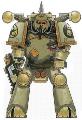 Achaylus72 wrote: Achaylus72 wrote:Hate to say it but John Blanche was yesterday's man, new artists are blasting past him and was saddened that they kept his artwork in Chaos Daemons, essentially they printed it in colour and not the previous B&W.
Hopefully when they update the Deamon Codex/Army books they have modern young artists to take up his legacy.
I am no expert, WH40K being only a minor hobby of mine. Can you direct me some young artists that bring to life the sense of decay, corruption and ugliness that made WH40K such a unique take on sci fi? (i.e. "rotten fantasy in space")
All I see in newer publications seems to follow the "bling-bling-pew-pew-CINEMAAA!-generic-'Murica!-art-in-space" mantra.
Granted, I do not buy a lot of GW paperwork, so maybe I am just not well-informed enough. Hence my question.
The thing these days, and the reason Blanche and his style has been somewhat sidelined, is that 40k is now largely complete as a setting. Blanche helped define that in the early days, he and the other artists at GW at the time basically invented grimdark as we know it today, but now there work is somewhat done. The blank corners are filled in, the setting is fleshed out to the extent that the dark spaces and blurred edges where Blanche's style thrived are gone. These days GW's art isn't part of building a universe, it's just to show what's in it, if that makes sense.
So the brief for a new piece of Codex art might not be 'draw what you think a Magos might look like' (although there would still be that in the concepting phase), it would be 'this is what the new Magos looks like, draw it doing something cool!'
Wrong way around, John works 5 years ahead of the studio, so it's more like 'this is the concept sketch that became the magos'
|
|
|
|
|
|
2015/06/22 20:36:15
Subject: Re:The artwork of John Blanche
|
|
Imperial Guard Landspeeder Pilot
On moon miranda.
|
 DarkLink wrote: DarkLink wrote:I'm not a fan. It's skilled art, but I dislike that aesthetic. Fewer terminators with nose tubes and topknots and more stuff like, well, the current codex covers.
See, to me at least, the newer art looks less and less " 40k", often something more stylistically appropriate to something like League of Legends or World of Warcraft.
I'm all about that weird, funky 80's-esque asthetic. That's what defines 40k's visual theme to me.
|
IRON WITHIN, IRON WITHOUT.
New Heavy Gear Log! Also...Grey Knights!
The correct pronunciation is Imperial Guard and Stormtroopers, "Astra Militarum" and "Tempestus Scions" are something you'll find at Hogwarts. |
|
|
|
|
2015/06/22 20:51:06
Subject: Re:The artwork of John Blanche
|
|
Regular Dakkanaut
Vancouver, WA
|
I've never been a fan of his work. It just comes across as 'messy' to me, and completely unattractive. I know there are many fans of his work out there, but to each his own.
'Different', as someone else mentioned earlier in this thread... that would be a good word for it. But for me, 'unappealing' also goes hand-in-hand with that.
|
"Wheels within wheels, in a spiral array, a pattern so grand and complex.
Time after time we lose sight of the way, our causes can't see their effects."
 
|
|
|
|
|
2015/06/22 20:57:01
Subject: The artwork of John Blanche
|
|
Douglas Bader
|
 BrookM wrote: BrookM wrote:Funny enough, John Blanche has two styles: the scribbles a lot of people dislike him for and then there's this stuff:
Actually, that second one is exactly the kind of Blanche art I hate. It's just a pile of space marines without any thought given to artistic composition or pesky details like what the marines are supposed to be standing on or how far away they are. And it looks just like every similar "pile of space marines" picture he's made. It's just bland, unappealing work regardless of how many tiny skulls he added.
The first one is pretty good though, it has all of the obsessive fine detail but it's used well. There's actually empty space and good composition to get your attention, and TBH that's the reason why the BFG picture is an iconic piece of art while the pile of marines isn't.
|
There is no such thing as a hobby without politics. "Leave politics at the door" is itself a political statement, an endorsement of the status quo and an attempt to silence dissenting voices. |
|
|
|
|
2015/06/22 21:03:42
Subject: Re:The artwork of John Blanche
|
|
Is 'Eavy Metal Calling?
|
 JamesY wrote: JamesY wrote: Paradigm wrote: treslibras wrote: Achaylus72 wrote:Hate to say it but John Blanche was yesterday's man, new artists are blasting past him and was saddened that they kept his artwork in Chaos Daemons, essentially they printed it in colour and not the previous B&W.
Hopefully when they update the Deamon Codex/Army books they have modern young artists to take up his legacy.
I am no expert, WH40K being only a minor hobby of mine. Can you direct me some young artists that bring to life the sense of decay, corruption and ugliness that made WH40K such a unique take on sci fi? (i.e. "rotten fantasy in space")
All I see in newer publications seems to follow the "bling-bling-pew-pew-CINEMAAA!-generic-'Murica!-art-in-space" mantra.
Granted, I do not buy a lot of GW paperwork, so maybe I am just not well-informed enough. Hence my question.
The thing these days, and the reason Blanche and his style has been somewhat sidelined, is that 40k is now largely complete as a setting. Blanche helped define that in the early days, he and the other artists at GW at the time basically invented grimdark as we know it today, but now there work is somewhat done. The blank corners are filled in, the setting is fleshed out to the extent that the dark spaces and blurred edges where Blanche's style thrived are gone. These days GW's art isn't part of building a universe, it's just to show what's in it, if that makes sense.
So the brief for a new piece of Codex art might not be 'draw what you think a Magos might look like' (although there would still be that in the concepting phase), it would be 'this is what the new Magos looks like, draw it doing something cool!'
Wrong way around, John works 5 years ahead of the studio, so it's more like 'this is the concept sketch that became the magos'
Yeah, I was more talking about the stuff that actually gets published in codexes. I have no doubt that a great deal of the stuff that gets produced in both art and models starts off in Blanche's sketchbook, just that we as the end consumer get very little of that in the final product. The emphasis on most new art seems to be entirely on the stuff you can buy as minis, right down to weapon designs matching the ones on the sprue ect.
That said, there has been the odd great piece in the newer style, like the double page Terra spread in the 6th Ed rulebook and the Raven Guard Thunderhawk pic from the last SM book.
|
|
|
|
|
2015/06/22 21:15:51
Subject: Re:The artwork of John Blanche
|
|

Glorious Lord of Chaos
The burning pits of Hades, also known as Sweden in summer
|
|
|
|
|
|
2015/06/22 21:18:36
Subject: The artwork of John Blanche
|
|
Is 'Eavy Metal Calling?
|
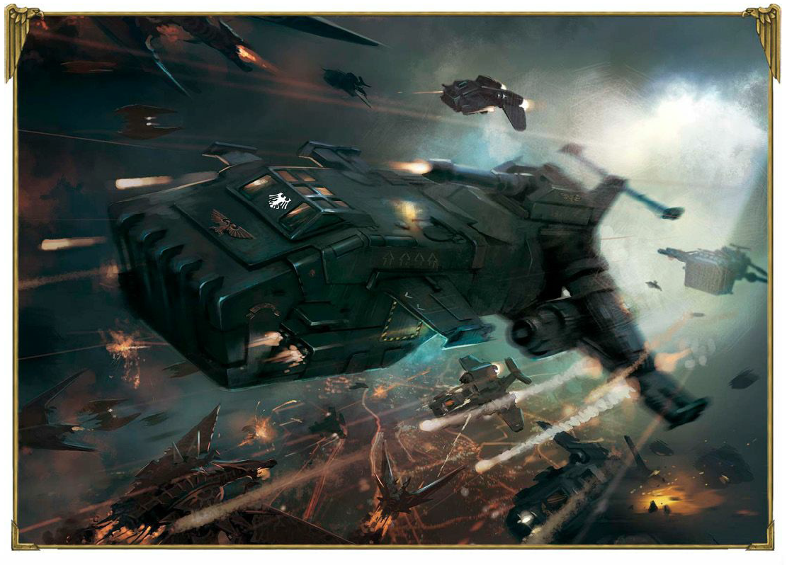
On the RG pages in the fluff section in the 6th ed book, it's a landscape full page with a T-hawk, stormeagles and Stormravens.
This one:
|
|
|
|
|
|
2015/06/22 21:28:19
Subject: The artwork of John Blanche
|
|
Glorious Lord of Chaos
The burning pits of Hades, also known as Sweden in summer
|
Ah, that one.
Yes, it's good.
|
I should think of a new signature... In the meantime, have a  |
|
|
|
|
2015/06/22 23:51:45
Subject: Re:The artwork of John Blanche
|
|
Regular Dakkanaut
|
I always liked this pic, with the coins nailed to his pauldron like they were trophies.
|
|
|
|
|
|
2015/06/23 09:31:50
Subject: The artwork of John Blanche
|
|
Raging Rat Ogre
|
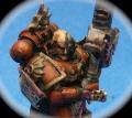
Mechanicalhorizon, that picture encapsulates what I've always felt about Blanche: it's perfect grimdark, very old-school, but as a Space Marine? He looks more like Albert Steptoe. And the flying things above his head remind me of Nurgle imagery.
|
Upcoming work for 2022:
* Calgar's Barmy Pandemic Special
* Battle Sisters story (untitled)
* T'au story: Full Metal Fury
* 20K: On Eagles' Wings
* 20K: Gods and Daemons
|
|
|
|
|
2015/06/23 09:51:06
Subject: The artwork of John Blanche
|
|

[MOD]
Making Stuff
|
He's not a space marine. Note the Inquisitorial rosette on his breastplate...
|
|
|
|
|
|
2015/06/23 12:20:43
Subject: The artwork of John Blanche
|
|
Thermo-Optical Spekter
|
And in the ring and on the shoulderpad, he is an inquisitor.
I never thought about it before, but Blanche may be the reason why 40k fell from the great post apocalyptic theme it had when it started to the mess it is now, where almost everybody is a walking shrine.
|
|
|
|
|
2015/06/23 14:30:15
Subject: The artwork of John Blanche
|
|
Enginseer with a Wrench
|
 Peregrine wrote: Peregrine wrote:
Actually, that second one is exactly the kind of Blanche art I hate. It's just a pile of space marines without any thought given to artistic composition or pesky details like what the marines are supposed to be standing on or how far away they are.
I think that's a bit unkind (emboldened section in particular). Remember that the image had to work in a number of ways...
As a landscape box cover with a large logo:

As a portrait rulebook cover with the (then-standard) frame:

...as well as a standalone background.
In fact, I think that image is a pretty good example of what JB does very well; and that's effectively communicate the mood of the setting. From the colour palette to tonal contrast to the multiple-triangle composition (look how the central 'cone' of figures leads the eye up into the logo, for example), there's a huge amount of work gone into communicating the pseudo-dark age feel of the 40k galaxy, as well as harking back to the desperate last stand feel of John Sibbick's original Rogue Trader art.
Compare it with the Warzone box cover from roughly the same period:
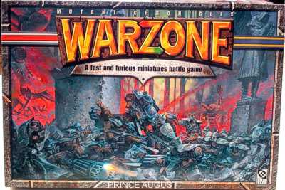
Whether you like the style or not, there's a lot of technical points in favour of Blanche's composition, colour choice and tonal structure.
Les Edwards' Heroquest's box cover is an iconic piece; and here the styles are hugely different. I highlight it because it's a good example of a similar colour palette to that 3rd ed 40k cover. While it's a fantastic painting, I don't think it communicates the chaotic mood of the Warhammer universe – these figures, while beautifully rendered, could easily be from another setting; which is at the heart of why I like Blanche's art so much – it is indivisible from the Warhammer worlds in a way few other artists were. As an aside, I always felt Gary Harrod's, Wayne England's and (to a lesser extent) Paul Bonner's work always felt 'properly Warhammer' in a way that Ian Miller's (as an example) did not (though I also like Miller's work a great deal).

The Heroquest could of course be argued that it's not in the Warhammer world at all, so on the same theme, Jim Burns' Space Crusade box art is similar to my objections to Heroquest's box art – that while it's beautifully executed, it doesn't 'feel 40k'.

In both, the composition is very carefully – classically – structured by master artists; but it doesn't communicate the universe like Blanche's art does.
Anyway, that was giant wall o'text! Sorry. Just wanted to point out that the 3rd ed. cover has had a lot of thought and experience poured into its composition.
|
|
This message was edited 1 time. Last update was at 2015/06/23 14:31:30
|
|
|
|
|
2015/09/04 21:05:01
Subject: The artwork of John Blanche
|
|

Imperial Agent Provocateur
Poland
|
 NoPoet wrote: NoPoet wrote:his work looks like doodles from a bored child's math book?
Sounds like people who were never drawing anything at school or never were drawing anything at all.
From looking at his work, it is clear to me that he finished an art school and puts a lot of effort in his work. His drawings have lots of detail and are coloured with washes - it's an absurd to compare them to primary school doodles or any school doodles at all.
Not to mention his paintings like Inquisitor Tannenberg and Adepta Sororita and Black Templars covers. (Though the Black Templars suffer from the remains of the 2nd Edition ultra-tackiness). (though it's interesting that for example something as important as HH: Collected Visions wasn't considered to warrant as much work as Inquisitor Tannenberg and they only put in his drawings and not paintings.)
NoPoet wrote:There is sometimes decent imagery in his work but I've always felt he pales next to everyone else.
To me, he pales only to Rees (in the Rogue Trader period) and maybe to Miller. The rest is horribly generic (except the one who made that painting of Ultramarines fighting tyranids. Oh God! Was it a single thing or are there more Wh40k paintings like this one D: ?).
NoPoet wrote:Now his models are something else. He captures the grim, gothic nightmare feel of 40K in a way that nobody else does, it's hard to tell the good guys from the bad guys which is EXACTLY in the spirit of 40K. The Imperium is a terrible regime of repression and murder, its armies are made up of brainwashed genocidal maniacs and uneducated slaves, not a bunch of heroic freedom fighters battling for justice, unless there's some kind of justice in destroying anything that isn't the same as you.
Yeah, his miniatures are absolutely sick. I find them fascinating.
|
|
|
|
|
|
2015/09/04 23:13:05
Subject: Re:The artwork of John Blanche
|
|

[MOD]
Anti-piracy Officer
Somewhere in south-central England.
|
Personally I don't like John Blanche's style but it clearly is the product of an educated mind and trained hand.
|
|
|
|
|
|
2015/09/05 09:23:06
Subject: Re:The artwork of John Blanche
|
|

Norn Queen
|
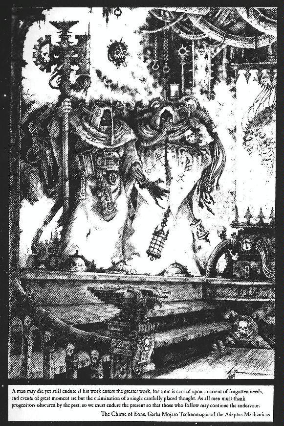
I always liked this one
|
Dman137 wrote:
goobs is all you guys will ever be
By 1-irt: Still as long as Hissy keeps showing up this is one of the most entertaining threads ever.
"Feelin' goods, good enough". |
|
|
|
|
2015/09/05 09:47:41
Subject: The artwork of John Blanche
|
|
Lady of the Lake
|
He's very hit or miss really, a lot of his stuff I don't really like like the stuff in the Daemon 5th book. But then other stuff he has done has looked good or almost good.
This for example had decent potential, but suffered from the blob of people thing he continually did. Not to mention the random heels that take away more than they give to the aesthetic.

PsychoticStorm wrote:
And in the ring and on the shoulderpad, he is an inquisitor.
I never thought about it before, but Blanche may be the reason why 40k fell from the great post apocalyptic theme it had when it started to the mess it is now, where almost everybody is a walking shrine.
And the book thing on his forehead.
|
|
This message was edited 1 time. Last update was at 2015/09/05 09:50:29
|
|
|
|
|
2015/09/05 10:55:58
Subject: The artwork of John Blanche
|
|
Repentia Mistress
|
John Blanche is up there for me with H.R. Giger, Salvador Dali, and Francis Bacon as one of the greats of dark surrealism. As with those other artists' works, many people do not enjoy them because they betray some traditional rules of art. Whether consciously or subconsciously, our eyes naturally want to find a place to rest, and as a result, compositions usually have some negative space. Because Blanche's paintings and sketches tend to be hyperdetailed with hardly any breathing space, the normal reaction is an uncomfortable one. It's hard not to feel claustrophobic when every possible space is filled by skulls and aquilas, but that's part of the reason why I like Blanche's style. It's pretty reflective of how I view the 40k universe, with its floating skulls, teleporting demons, crusading priests in space, and abundance of hungry xenos.
|
|
|
|
|
|
|
|