| Author |
Message |
 |
|
|
|
|
Advert
|
Forum adverts like this one are shown to any user who is not logged in. Join us by filling out a tiny 3 field form and you will get your own, free, dakka user account which gives a good range of benefits to you:
- No adverts like this in the forums anymore.
- Times and dates in your local timezone.
- Full tracking of what you have read so you can skip to your first unread post, easily see what has changed since you last logged in, and easily see what is new at a glance.
- Email notifications for threads you want to watch closely.
- Being a part of the oldest wargaming community on the net.
If you are already a member then feel free to login now. |
|
 |
2010/07/18 23:08:18
Subject: First khorne lord (WHFB)
|
|

Implacable Skitarii
|
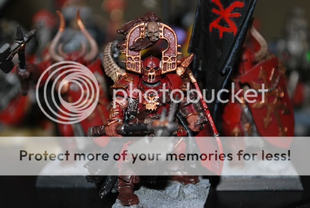
So I saw this model at GWs website and knew i had to have it. well now i do and this is what if became. Unfortunately his right horn piece was bent to oblivion and with some bending got it to look better.
front
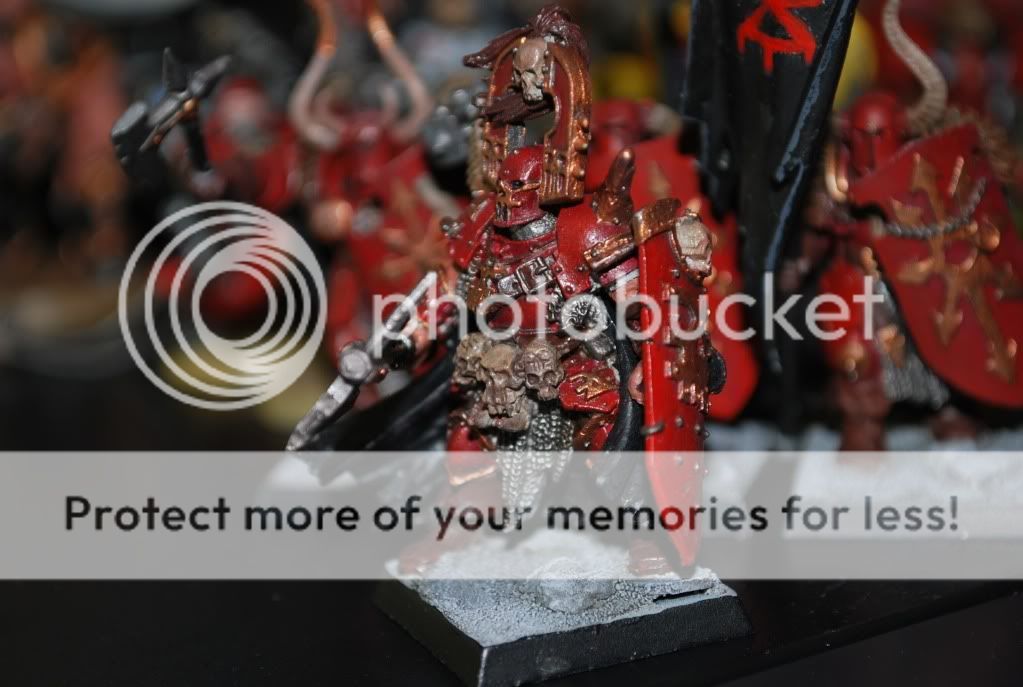
better view of chest
|
You know you're spending too much time on 40k when... you worry about the Gets Hot! rule when turning on a plasma tv. - frightenedfreddie 
原子炉へつれていって。 |
|
|
 |
|
2010/07/18 23:10:05
Subject: First khorne lord (WHFB)
|
|
Crafty Bray Shaman
|
With the thinnest line of orange on the very sharp edges of his armor, I think it will look fantastic, but it is off to a great start.
|
|
|
|
|
|
2010/07/19 01:11:34
Subject: Re:First khorne lord (WHFB)
|
|
Stormin' Stompa
|
Try bleached bone for the skulls, it'll look better
|
|
|
|
|
|
2010/07/19 02:27:17
Subject: First khorne lord (WHFB)
|
|
Spawn of Chaos
|
Maybe throw in a little (more?) black wash on the chainmail to fill in the gaps. Need to lighten up the skulls a little. Maybe use bleached bone and skull white on the edges. It'll make it look more realistic.
|
 Ryan4tor Ryan4tor |
|
|
|
|
2010/07/19 06:52:06
Subject: First khorne lord (WHFB)
|
|
Ultramarine Master with Gauntlets of Macragge
|
That looks alright. I always think that model looks better as a champion than a full-on lord though. The above advice is very good, but you also should work on lighting for your photography. Two desklamps and a big piece of white paper are a poor man's lightbox, and will make your minis look 10 times better when they're photographed.
|
Check out my Youtube channel!
 |
|
|
|
|
2010/07/19 07:11:06
Subject: First khorne lord (WHFB)
|
|

Renegade Inquisitor with a Bound Daemon
Tied and gagged in the back of your car
|
He looks good already, udging by the quality of the brass lining, you definetly have the skill to make him look a lot better. Go back over with more details and highlights, take your time. You definetly have the skill, just a bit of patience can take this guy from tabletop quality to something great.
|
|
|
|
|
2010/07/19 15:47:13
Subject: First khorne lord (WHFB)
|
|
Drop Trooper with Demo Charge
|
One of my favorite schemes I've ever seen for those guys actually ran a very, very thin line of various colors around the shield and armor edges to denote various units. So a unit of berserkers would have a slight blue line all around their armor bits, another unit would have a slight line of orange, or yellow etc. Very bright color edging looked absolutely fantastic.
When he told me about it, I was like "Here's a repaint waiting to happen..." but in the end I loved it, and it was so simple! Made his army unique from every other Khorne force out there! Wish I had a picture of the technique... sometimes ultra contrasting colors work, contrary to conventional painting advice.
|
Paperhammer40K FTW!
Khornholio wrote:I sometimes think Jesus manifests in gaming stores as a weirdo to test other people's patience.
John Lambshead said...
Never read 40K forums. They are populated by trolls. |
|
|
|
|
|
|
 My CF blog