Switch Theme:

Tyranid bone-ish carapace! help!  [RSS] Share on facebook Share on Twitter Submit to Reddit
»
Author Message
Advert


Forum adverts like this one are shown to any user who is not logged in. Join us by filling out a tiny 3 field form and you will get your own, free, dakka user account which gives a good range of benefits to you:
  • No adverts like this in the forums anymore.
  • Times and dates in your local timezone.
  • Full tracking of what you have read so you can skip to your first unread post, easily see what has changed since you last logged in, and easily see what is new at a glance.
  • Email notifications for threads you want to watch closely.
  • Being a part of the oldest wargaming community on the net.
If you are already a member then feel free to login now.


Made in gb
Fresh-Faced New User


Hi guys,

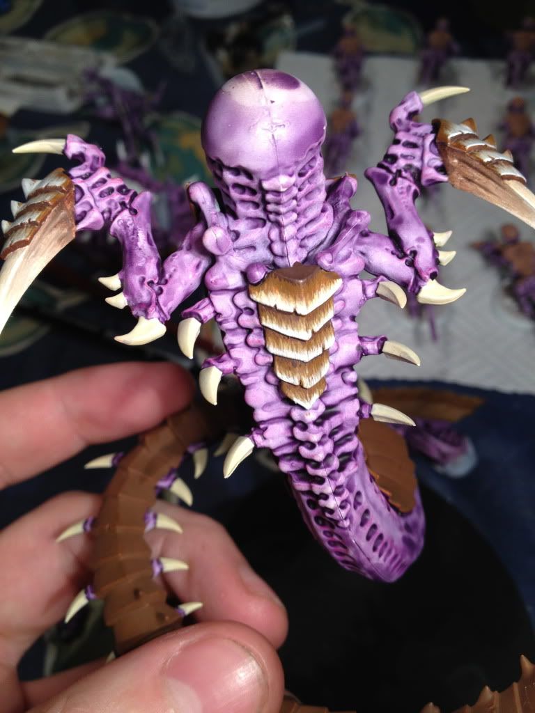
I was wondering if anyone had any advice on a simple but effective carapace technique that looks somewhat bone-ish (starting quite dark). Ive just returned to painting after a ten year hiatus and was trying to mimic the effects achieved in this tutorial (at the bottom of the page) http://www.figurepainters.com/tips-tutorials/. Ive taken my general colourscheme from a man called Nicho on Warseer with his permission but wanted to make the carapace my own style with little success so far! C/C welcome on the colourscheme. Ive looked at quite a few other carapace guides but am at a loss as to how to execute the triangular/streaky pattern which arises without making it look artificial.

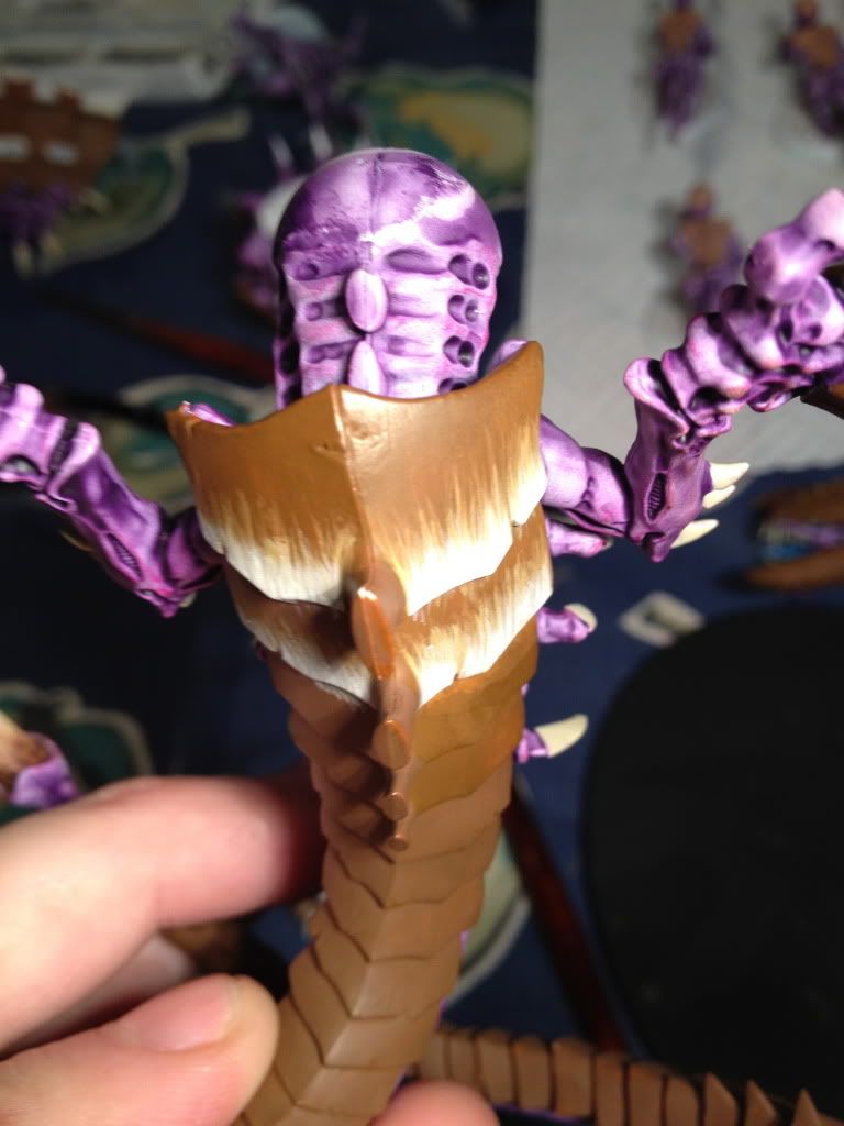
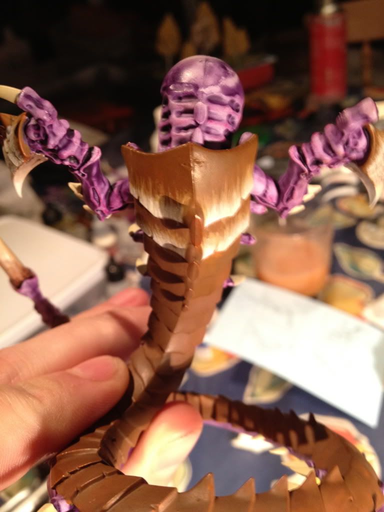
Ive tried several tests and none to satisfactory standards, i cant seem to get the paint to streak in one consistent even colour the way his do. I got to the chestplate and realised i hated my execution :/, i can easily repaint it as its applied very thinly. Ive added a couple of pictures of other techniques id like to be able to copy which may be simpler if anyone had any advice on how to go about it. I have several good brushes, a wet pallet, drying retarder and flow improver, ive read guides on how to use it and played with them alot but i just cant seem to achieve those even balanced lines that i want/think i need to achieve :/

HALP!

Thanks


Genestealer colour scheme


This message was edited 1 time. Last update was at 2012/01/30 10:24:59


1500 - Since Jan 2012
 
   
Made in gb
Lone Wolf Sentinel Pilot


Coventry

What you have looks pretty good to me mate. The feathering technique can be quite tricky to get right. Perhaps extend the lines on the armour a little and make each successive layer a little thinner? Just so the previous layers can almost be seen all the way to the edge of the plates. If that makes any sense at all to you!
   
Made in za
Thunderhawk Pilot Dropping From Orbit


South Africa

Looking Great too me.

Shadow Legion's lost warmachine http://www.dakkadakka.com/dakkaforum/posts/list/382008.page

2750 point - Space marine
750 point - Ork
1250 point - Wood Elves
750 point Brettonia
 
   
Made in gb
Fresh-Faced New User


Thanks for the compliments, but the photos seem rather forgiving, in reality they look very brushed on and patchy.

In true 'bad workman blames his tools' style I went out and bought a windsor and newton series 7 brush, and low and behold its actually working! the lines are so much more precise! will post up more soon to deliberate :S

1500 - Since Jan 2012
 
   
Made in us
Regular Dakkanaut


i'm a horrible painter but i'll go along with you on the higher end tools...they make a difference! I read a ton of articles and watch a ton of videos, there are only two things that I'd ever suggest to anyone trying to match the skill you see on these websites.

#1, Thin your paints. Can't say it enough. Multiple semingly crappy layers of see-through paint end up quite smooth and balanced after sufficient layers have been made.

#2, When highlighting the top layer of paint, use your best quality brushes. They'll hold more paint and draw smooth, skinny lines.

Do this and most things will come together. Oh, thin your paints. Can't say it enough.


Automatically Appended Next Post:
as far as your work is concerned, I love it. great job!

This message was edited 1 time. Last update was at 2012/01/31 02:58:54


"Nothing is so exhilarating in life as to be shot at with no result."
- Winston Churchill
 
   
Made in gb
Fresh-Faced New User


So W&N Series 7 size 0 in hand and i think theyve turned out much nicer. I'll take more balanced pictures soon but from what i see, the brush stroke/mark problem is gone. Is this a careful enough blend or do i need to add more stages? Go higher up the carapace or is this sufficient?


1500 - Since Jan 2012


Forum Index » Painting & Modeling
Go to: