| Author |
Message |
 |
|
|
|
|
Advert
|
Forum adverts like this one are shown to any user who is not logged in. Join us by filling out a tiny 3 field form and you will get your own, free, dakka user account which gives a good range of benefits to you:
- No adverts like this in the forums anymore.
- Times and dates in your local timezone.
- Full tracking of what you have read so you can skip to your first unread post, easily see what has changed since you last logged in, and easily see what is new at a glance.
- Email notifications for threads you want to watch closely.
- Being a part of the oldest wargaming community on the net.
If you are already a member then feel free to login now. |
|
 |
2012/04/11 16:07:30
Subject: terminator WIP; need feedback
|
|

Morphing Obliterator
|
good morning dakka,
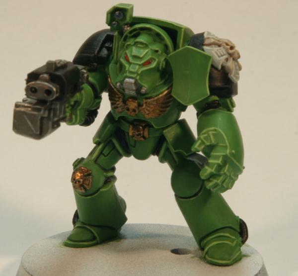
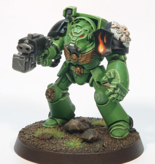
here's the current state of the 4th terminator for my salamanders army:
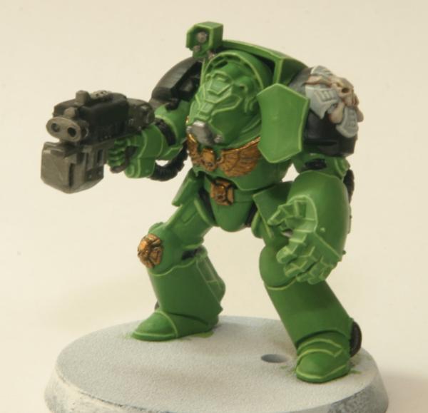
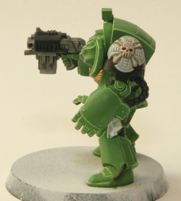
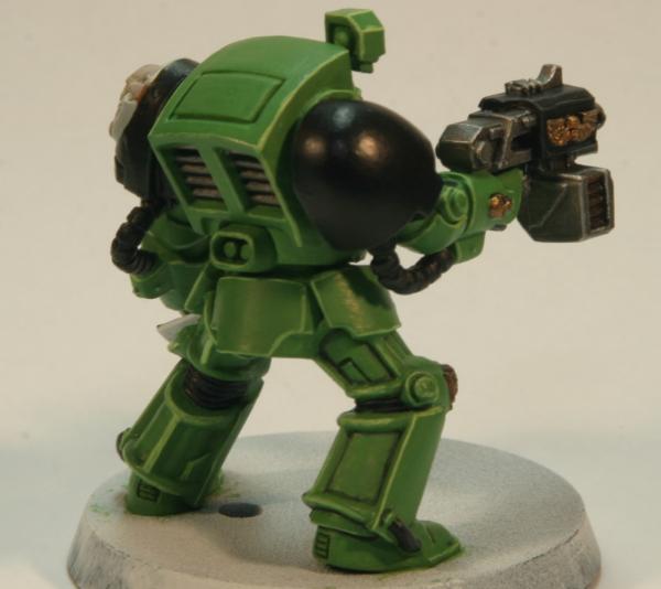
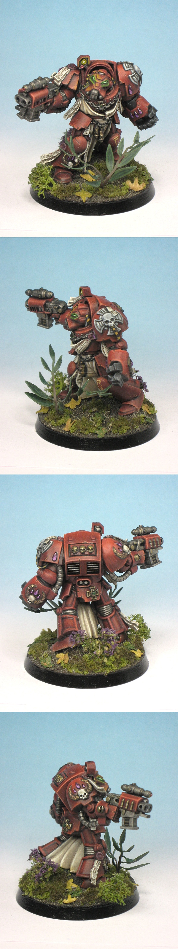
and here's one of my earlier termies for comparison:
there's still a lot of work left on termie #4; I need to highlight all the metal, gold & black bits, paint the lenses and eyes, paint the vents on his back, paint the purity seal, add decals and scripture, do a light wash (probably oil-based) and then go back and clean up whatever I borked along the way. oh, and do the base 
here's what I'm doing differently this time, and what I'd like some feedback on:
1. much bolder edge highlighting. I've heard from a few folks that my highlighting was too subdued, so I tried mixing some white into my usual scorpion green highlight color. what do people think? too bold? still too subtle? should the highlights be more lined-in instead of just done on the edges? also, how about the highlights on the legs? there aren't a lot of sharp edges there so I ended up painting stripes of highlight color down the center of each of the raised bars along the leg plates instead. good or bad?
2. I took a completely different route with the crux terminatus and painted up the skull to look more like actual bone and the base of the crux to be gray highlighted with white/bleached bone. do you like this better than a metallic (boltgun or gold) version? does it need a wash? if so, should it be the same light, black wash I'll be using everywhere else or something?
cheers,
v
|
|
|
|
 |
|
2012/04/11 16:08:50
Subject: terminator WIP; need feedback
|
|
Irked Necron Immortal
Dayton, Ohio
|
Its puts my skill to shame .. i like them.
|
|
|
|
|
2012/04/11 16:12:14
Subject: terminator WIP; need feedback
|
|

Infiltrating Naga
|
The edging is very nice, get a lot of good edging these days though if you want to up it a little more try gradual blend to a lighter shade of that green if you want to introduce a realistic lighting effect, beyond that the model looks very neat.
|
|
|
|
|
|
2012/04/11 16:21:33
Subject: Re:terminator WIP; need feedback
|
|
Nurgle Veteran Marine with the Flu
Norwich - England - usually in the pub
|
I like the one that is finished, the only thing is the shield on the left shoulder could do with a little 'something' painted on it. The colours on your latest one look good but if never actually taken the approach of highlighting before shading - the crux looks good - perhaps a little more shading required? I think you may ideally be after something somewhere between the two - the highlights on the latest one need building up a bit more to try and blend them in with the existing colour a bit but otherwise it's looking good. Finish this one and see which you like best.
|
|
|
|
|
|
2012/04/11 16:29:04
Subject: terminator WIP; need feedback
|
|

[MOD]
Anti-piracy Officer
Somewhere in south-central England.
|
Yes, it could do with an emblem on the shield part.
|
|
|
|
|
|
2012/04/11 16:43:47
Subject: terminator WIP; need feedback
|
|
Longtime Dakkanaut
|
Extremely clean start (and nice precise drill work, too). You need to add shading to up the contrast - I'd suggest using a directed wash to keep your clean finish. Artificially high contrast is what makes a mini 'pop' and paradoxically look more 'realistic'.
A directed wash (as opposed to a splosh wash) is applied with very little wash on the brush, slightly away from the area of deepest shade. You then pull the brush tip into the deep recess to drag the wash with it. This prevents tidemarking to some extent (with the old washes). The new shade paints apparently work with this technique better due to a slightly higher viscosity.
After the shade, it's just details and possibly some flame freehand. You certainly do seem to have the brush control for it.
|
|
|
|
|
|
2012/04/11 16:57:43
Subject: Re:terminator WIP; need feedback
|
|
Longtime Dakkanaut
|
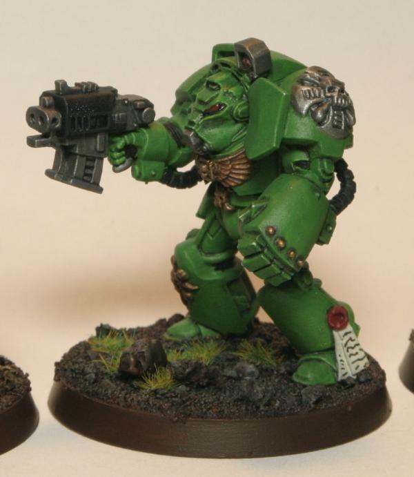
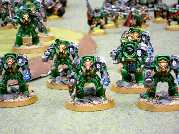
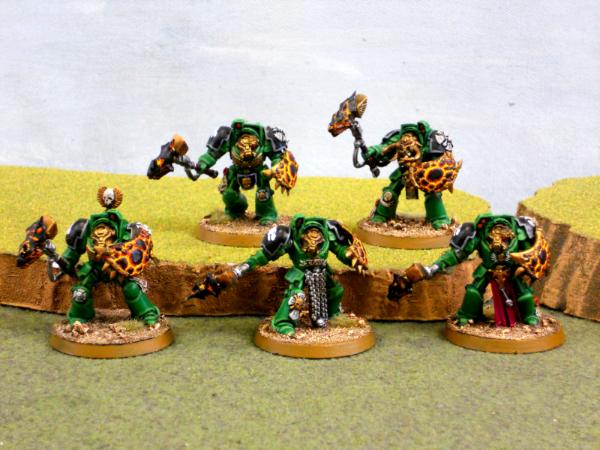
First off your edging is superb  . I wish I could edge that accurately! I think the armor could do with a bit more depth though. I would suggest, rather than washing since a wash on green Salamanders never worked out well imo, using a .005 black micron pen and dawing black into the recesses of the armor. That is how I did my Salamanders, which aren't as good as yours, and the black penned recesses along with the simple green and a lighter highlight looks fantastic. I would also suggest a flame, lava, flaming meteor motif or two on the squad somewhere. I'll post two examples of my termies below for reference to the black Micron pen technique and if you want ideas on fire based emblems etc peruse my Salamander gallery.
|
|
This message was edited 1 time. Last update was at 2012/04/11 16:58:30
Las Vegas Open Head Judge
I'm sorry if it hurts your feelings or pride, but your credentials matter. Even on the internet.
"If you do not have the knowledge, you do not have the right to the opinion." -Plato
|
|
|
|
|
2012/04/11 18:05:42
Subject: Re:terminator WIP; need feedback
|
|
Morphing Obliterator
|
so far, it sounds like the bolder edge highlights are a positive change!
@winterdyne: thanks  I plan on doing a black, oil-based pin wash to keep the wash off the armor plates and just in the recesses. I've had mixed success with this to date, but have learned a bit more about how to properly apply it since my last try. hrm... I wonder if a dark brown would work better?
@overwatch: you should give yourself more credit! I've referred to your salamanders as inspiration more times than I can count I'll definitely be doing something with the shield, though I haven't decided on what, yet. at the very least, some scripture, but possibly a flame or maybe a hammer icon (vulkan's sigil) if I can find a good reference.
would love to get some more opinions on the crux. love it or hate it? is it missing something aside from a wash?
|
|
|
|
|
|
2012/04/11 18:46:51
Subject: terminator WIP; need feedback
|
|
Longtime Dakkanaut
|
A brown would be warmer, and is probably where I'd look, perhaps with a little green and black in there too. The problem with oil washes is the need to gloss before hand to keep it clean, and the effort of the cleanup afterward. On anything short of a tank, this is often more effort than a simple wash and touch up with the base colour.
This said, I think you need a slight gradient rather than a pin wash, which would give a hard line.
|
|
|
|
|
|
2012/04/11 18:59:41
Subject: terminator WIP; need feedback
|
|
Morphing Obliterator
|
hrm. can you elaborate a bit on what you mean by "slight gradient"? does that mean within the recesses or on the edges leading up to the recesses? Automatically Appended Next Post: @winterdyne: here's my take at what I think you meant by a directed wash:
I applied badab black very carefully, with just the tip of a small brush, to the termie's right leg and then went back and cleaned up any areas that pooled too heavily with my base color. success?
|
|
This message was edited 1 time. Last update was at 2012/04/12 06:40:42
|
|
|
|
|
2012/04/12 15:40:21
Subject: terminator WIP; need feedback
|
|
Morphing Obliterator
|
shameless bump for feedback on shading :p
|
|
|
|
|
|
2012/04/12 16:35:13
Subject: terminator WIP; need feedback
|
|
Stoic Grail Knight
|
Looking good !
|
Hydra Dominatus
World Wide War Winner |
|
|
|
|
2012/04/12 16:49:04
Subject: terminator WIP; need feedback
|
|
Monstrous Master Moulder
|
Sexy is all that comes to mind.
|
|
|
|
|
|
2012/04/13 03:42:53
Subject: terminator WIP; need feedback
|
|
Longtime Dakkanaut
|
Looking better. The shield definitely needs some sort of emblem. I also like my Powerfists to look somewhat powerful and distinctive from the rest of the armor.
3 suggestions on how to do this. 2 easy 1 more difficult.
1. Mithril Silver the fingers and palm, then wash in Badab Black. Super simple mechanical fist look, you can then go back and highlight or not. More detailed version, paint black, drybrush boltgun, light drybrush Mithril, wash black.
2. Skull White the fingers and palm, then wash in Asurmen Blue. That's how I did my Salamanders fists.
3. Necron Abyss the Fingers and palm. Then starting with Enchanted Blue create a random lightning style pattern, then highlight Ice Blue, with a final high light of White. The highlighting would of course be on the lightning bolt sections only.
All 3 are relatively simple and create a nice effect.
|
|
This message was edited 1 time. Last update was at 2012/04/13 03:43:41
Las Vegas Open Head Judge
I'm sorry if it hurts your feelings or pride, but your credentials matter. Even on the internet.
"If you do not have the knowledge, you do not have the right to the opinion." -Plato
|
|
|
|
|
2012/04/13 03:50:46
Subject: terminator WIP; need feedback
|
|
Nigel Stillman
|
Looks very good except for the gold, which looks very thick.
|
|
|
|
|
|
2012/04/13 03:56:30
Subject: terminator WIP; need feedback
|
|
Humorless Arbite
Outside the DarkTower, amongst the roses.
|
Really well done imo, including the gold.
|
Every Dakkanaught gets a 4+ Pinch of Salt save.
When you suffer a Falling Sky hit, roll a D6 - on a 4+ the hit is ignored as per the Pinch of Salt save. On a 1-3 panic insues - you automatically fail common sense tests for the next 2 weeks and get +7 to your negativity stat. -Praxiss
|
|
|
|
|
2012/04/13 10:13:55
Subject: terminator WIP; need feedback
|
|

Esteemed Veteran Space Marine
|
varl wrote:hrm. can you elaborate a bit on what you mean by "slight gradient"? does that mean within the recesses or on the edges leading up to the recesses?
Automatically Appended Next Post:
@winterdyne: here's my take at what I think you meant by a directed wash:
I applied badab black very carefully, with just the tip of a small brush, to the termie's right leg and then went back and cleaned up any areas that pooled too heavily with my base color. success?
i think th means a more gradient highlight, which is the more realistic look.
i really like your directed wash, i do that sometimes but i think your doing a much better job.
exalt + follow
|
|
|
|
|
|
2012/04/13 16:27:40
Subject: terminator WIP; need feedback
|
|
Morphing Obliterator
|
yeah, after re-reading what winterdyne suggested I realized that I'd misunderstood him. I'll have to give that a whirl on my next model and see how it works out
|
|
|
|
|
|
2012/04/14 05:32:10
Subject: Re:terminator WIP; need feedback
|
|
Morphing Obliterator
|
aaaannnddd... done!
few more shots in my P&M blog (link is in my sig).
cheers and thanks for all the suggestions
|
|
|
|
|
|
2012/04/14 09:13:12
Subject: terminator WIP; need feedback
|
|

Dipping With Wood Stain
|
winterdyne wrote:Extremely clean start (and nice precise drill work, too). You need to add shading to up the contrast - I'd suggest using a directed wash to keep your clean finish. Artificially high contrast is what makes a mini 'pop' and paradoxically look more 'realistic'.
A directed wash (as opposed to a splosh wash) is applied with very little wash on the brush, slightly away from the area of deepest shade. You then pull the brush tip into the deep recess to drag the wash with it. This prevents tidemarking to some extent (with the old washes). The new shade paints apparently work with this technique better due to a slightly higher viscosity.
After the shade, it's just details and possibly some flame freehand. You certainly do seem to have the brush control for it.
The edge-highlighting is superb. Very clean and very precise. Winterdynes idea of adding contrast with washes is excellent and will take your mini to the next level. Might I suggest to gloss varnish the figure before applying the wash? That way, you get a much smoother surface, on which the wash flows much easier into the recesses. Another benefit is, that you can correct your mistakes without fear of damaging your paintjob.
Cheers,
IK-Painter
|
|
|
|
|
|
2012/04/14 15:20:10
Subject: terminator WIP; need feedback
|
|
Longtime Dakkanaut
|
I wouldn't gloss, but would direct the wash to get a gradient leading into the shade (this is the reverse of a gradient leading to the highlight). In general, shadows are 'soft' and highlights are 'hard'. Blending up to the highlight tends to soften the edges and make things look a little rounded off or worn.
Sorry I didn't drop back in before you finished off, but I think this is a superb, clean result. If you want to push things on, try a little bas-relief chipping - use your edge highlight tone to put scuffs on, then put little dabs of the dark brown above to shade and provide the 'chip'. A tiny dot of metallic in the centre of these can represent bared metal.
|
|
|
|
|
|
2012/04/14 16:38:17
Subject: Re:terminator WIP; need feedback
|
|
Morphing Obliterator
|
cheers guys, thanks for dropping in I'll be giving the gradient effect a shot on my termie sarge.
@winterdyne: any photos you can point me to that demonstrate this technique well?
weathering is definitely something lacking in my work. I haven't tackled it yet mostly out of fear of "ruining" a finished model by doing a shoddy job of it. kinda silly, I know
|
|
|
|
|
|
2012/04/14 16:44:26
Subject: terminator WIP; need feedback
|
|
Giggling Nurgling
|
Wow, a very clean, professional looking paint-job... I like it... 
|
 Deathguard army Deathguard army  |
|
|
|
|
2012/04/14 16:50:41
Subject: terminator WIP; need feedback
|
|
Screaming Banshee
|
You should colour the lenses; both on the eyes, top of head and on the shoulder-lights.
Then they'll be awesome 
|
|
|
|
|
|
2012/04/14 16:57:53
Subject: terminator WIP; need feedback
|
|
Morphing Obliterator
|
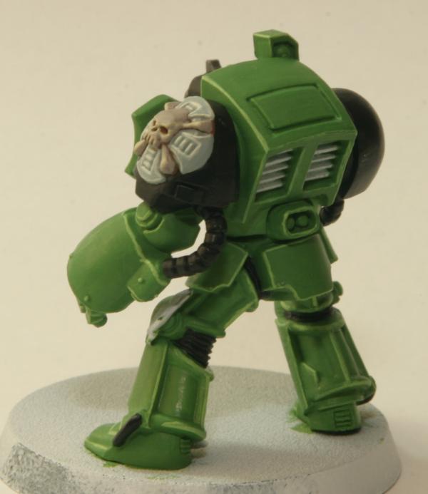
@Henners91: were you looking at one of the earlier WIP photos, 'cause they are both painted in the most recent photo in this thread
|
|
|
|
|
|
2012/04/14 17:57:39
Subject: Re:terminator WIP; need feedback
|
|
Longtime Dakkanaut
|
varl wrote:cheers guys, thanks for dropping in I'll be giving the gradient effect a shot on my termie sarge.
@winterdyne: any photos you can point me to that demonstrate this technique well?
weathering is definitely something lacking in my work. I haven't tackled it yet mostly out of fear of "ruining" a finished model by doing a shoddy job of it. kinda silly, I know
Here; the shading is primarily a directed asurmen blue wash, over a standard dark-red to peachish red sort of colour. Minor glazing towards red again after that, with hard edge highlights and the same colour used for the chipping method I mentioned. Using a complimentary colour (get a colour wheel and stick it up on your wall!) for shading, rather than a straight dark shade keeps the saturation of the miniature up, giving it a bit more 'life'. For green, try using a red/brown (scorched brown) as your wash. You'll want some glaze medium and/or flow improver if using a paint rather than an ink of sorts for this to keep the flow up. Devlan Miracle will do fine too. Not sure on the new GW shades yet as I don't have enough hands-on experience of them, but their behaviour certainly seems to lend itself to this sort of technique.
|
|
|
|
|
|
2012/04/15 05:20:06
Subject: Re:terminator WIP; need feedback
|
|
Morphing Obliterator
|
wow, that's gorgeous! something for me to aspire to
it looks like the armor plates have been washed as a whole, but with the wash more concentrated at the recesses. is that right, or am I seeing blending in addition to the wash? the highlights are added post-wash?
regarding complimentary colors, I've got the old baal red wash as well as devlan mud, so I'll mess about with those and see how each turns out. on a side note, did you do the script on those purity seals with a brush or a pen?
|
|
|
|
|
|
2012/04/15 07:17:23
Subject: Re:terminator WIP; need feedback
|
|
Stalwart Dark Angels Space Marine
|
I never did bold edge highlighting until recently, but if you're actually playing, it looks much better on the tabletop. I'm going back over my entire army and re-highlighting everything with the new layers and glaze, looks amazing!
|
|
|
|
|
|
2012/04/15 16:20:02
Subject: terminator WIP; need feedback
|
|
Longtime Dakkanaut
|
The wash does go almost half of the way along the outer panels (and covers more of the recessed ones), but it's very very subtle at those places, you literally pull it away from where you want. It's a good idea to thin the wash down a lot (add glaze medium / water / whatever), as it makes it easier to buld the shade up in a few layers rather than overdoing it. Let each layer dry, or you'll end up getting an uneven result as you'll thin and pull away the layer underneath if it's not dry.
|
|
|
|
|
|
2012/04/15 17:37:39
Subject: terminator WIP; need feedback
|
|
Screaming Banshee
|
varl wrote:@Henners91: were you looking at one of the earlier WIP photos, 'cause they are both painted in the most recent photo in this thread
D'oh.
|
|
|
|
|
|
|
|
 Night Lords P&M Blog:
  Salamanders P&M Blog:
 &
& 


 Redemption in Death