| Author |
Message |
 |
|
|
|
|
Advert
|
Forum adverts like this one are shown to any user who is not logged in. Join us by filling out a tiny 3 field form and you will get your own, free, dakka user account which gives a good range of benefits to you:
- No adverts like this in the forums anymore.
- Times and dates in your local timezone.
- Full tracking of what you have read so you can skip to your first unread post, easily see what has changed since you last logged in, and easily see what is new at a glance.
- Email notifications for threads you want to watch closely.
- Being a part of the oldest wargaming community on the net.
If you are already a member then feel free to login now. |
|
 |
2012/05/09 21:53:02
Subject: Emperor's Children : FW Assault Marines [Updated Pics]
|
|

Thinking of Joining a Davinite Loge
|
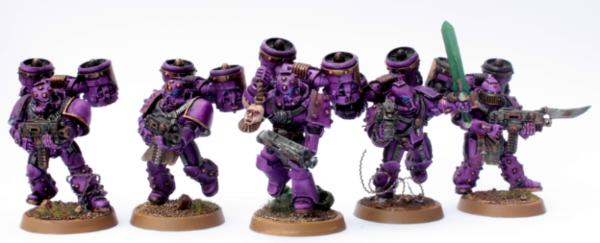
Finally finished the squad of five. Mixed up various FW parts plus some citadel... I've found purple a real challenge to do correctly, it's taken me several months just to decide on the correct shade and application. I'm not the neatest of painters, it all looks quite messy, part of me can accept that being their Chaos orientation but another is craving something a little more perfect. I think the problem perhaps stems in the way I shade with a wash, tends to be quite heavy?
I will gladly accept all comments, criticisms and slander. My lenses are really weak, as are my power weapons. I really want to improve with my painting and opening up for harsh criticism is the best way to improve. Bit of a masochist, I s'pose... Comes part and parcel of being a photography student and artist. Also; Slaanesh corrupts deep... PLEASE! Give some criticism to improve and if possible, how...
|
|
This message was edited 6 times. Last update was at 2012/05/10 17:48:19
|
|
|
 |
|
2012/05/09 21:53:37
Subject: Emperor's Children : FW Assault Marines
|
|
Fixture of Dakka
|
I like, I like...
|
BlapBlapBlap: bringing idiocy and mischief where it should never set foot since 2011.
BlapBlapBlap wrote:What sort of idiot quotes themselves in their sigs? Who could possibly be that arrogant?
|
|
|
|
|
2012/05/09 21:56:00
Subject: Re:Emperor's Children : FW Assault Marines
|
|
Thinking of Joining a Davinite Loge
|
@ BlapBlapBlap :
Thank you, good chap! I do appreciate your comment but figured I would throw this at you...

|
|
|
|
|
2012/05/09 22:02:10
Subject: Emperor's Children : FW Assault Marines
|
|
Fixture of Dakka
|
That's all i gotta say. Nice painting...
|
BlapBlapBlap: bringing idiocy and mischief where it should never set foot since 2011.
BlapBlapBlap wrote:What sort of idiot quotes themselves in their sigs? Who could possibly be that arrogant?
|
|
|
|
|
2012/05/09 22:34:10
Subject: Re:Emperor's Children : FW Assault Marines
|
|

Drop Trooper with Demo Charge
|
Great job on everything, I really like the the front model holding the head. My only critique is the bases are extremely plain.
|
 2200+ points guard 2200+ points guard
 WIP 3000+ point praetorian renegade army. WIP 3000+ point praetorian renegade army.
 500+ points tyranid all OOP and wip 500+ points tyranid all OOP and wip
For more artwork like my avatar check out deviantart http://sharpwriter.deviantart.com |
|
|
|
|
2012/05/10 01:31:27
Subject: Emperor's Children : FW Assault Marines
|
|
Nasty Nob on a Boar
Inside of a CRASSUS ARMOURED ASSAULT TRANSPORT
|
If you want the flat truth, they're good. If you want the hard truth, the purple is too dark, the gold is too dark, the bases lack anything eye catching, and the skin tone on the severed head isn't phenomenal. But that is if I'm really trying to find anything wrong.
|
 angel of ecstasy wrote: angel of ecstasy wrote:
You take a dump, you flip through the Dark Eldar codex, the concept art for Lelith Hesperax shows up and you pee on the floor.
2000  |
|
|
|
|
2012/05/10 01:38:29
Subject: Emperor's Children : FW Assault Marines
|
|
Ancient Space Wolves Venerable Dreadnought
The oceans of the world
|
Very nice.
|
|
|
|
|
2012/05/10 05:04:10
Subject: Emperor's Children : FW Assault Marines
|
|
Stoic Grail Knight
|
Looks fine from here maybe a closer shot. Looks good man over all.
|
Hydra Dominatus
World Wide War Winner |
|
|
|
|
2012/05/10 05:22:28
Subject: Re:Emperor's Children : FW Assault Marines
|
|
Boosting Space Marine Biker
|
They look good. Better pictures would help. Maybe find a tutorial on taking pictures if you need to.
|
|
|
|
|
|
2012/05/10 05:53:28
Subject: Emperor's Children : FW Assault Marines
|
|
Unfortunate Ungor
|
The level of criticism you're looking for is difficult to give with just one dark group shot. It might just be because the photograph is so dim, but they do look really dark.
From what I can see, they do look good though. The first thing you should do is take some better photographs (should be easy, photography student + tons of tutorials on here) so you can get some more useful criticism.
Those FW kits are really nice, and you've done a great job working with them and creating natural, dynamic poses.
|
|
This message was edited 1 time. Last update was at 2012/05/10 05:54:05
|
|
|
|
|
2012/05/10 06:15:12
Subject: Emperor's Children : FW Assault Marines
|
|

Death-Dealing Ultramarine Devastator
Brisbane Aust
|
Models look good with the blurry photos.
|
|
|
|
|
|
2012/05/10 10:42:05
Subject: Emperor's Children : FW Assault Marines
|
|
Thinking of Joining a Davinite Loge
|
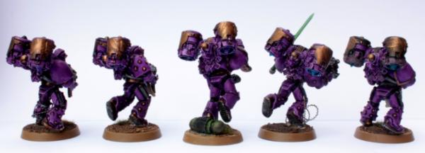
Gak! That'll teach me for taking the picture at 11pm with a ladyfriend who wanted more attention than my models. I've edited the OP with three new photos from three angles. I hope they serve better for your eyes. Unfortunately I cannot afford any studio lamps right now however the natural daylight has served well today, despite the battle against the wind. Thank you all so far for your comments. It really does help motivate me to work harder and improve, no matter how harsh the comments (lookin' at you AngrySquig!) No really, thank you!
|
|
This message was edited 2 times. Last update was at 2012/05/10 10:44:41
|
|
|
|
|
2012/05/11 15:12:27
Subject: Emperor's Children : FW Assault Marines [Updated Pics]
|
|
Nasty Nob on a Boar
Inside of a CRASSUS ARMOURED ASSAULT TRANSPORT
|
Sorry, but you said you wanted as harsh as possible so I tried to find any little thing I could
|
angel of ecstasy wrote:
You take a dump, you flip through the Dark Eldar codex, the concept art for Lelith Hesperax shows up and you pee on the floor.
2000 |
|
|
|
|
2012/05/11 18:00:05
Subject: Emperor's Children : FW Assault Marines [Updated Pics]
|
|
Thinking of Joining a Davinite Loge
|
Of course mate, it's well received on my part. Thank you. ^_^
|
|
|
|
|
2012/05/13 13:15:12
Subject: Re:Emperor's Children : FW Assault Marines [Updated Pics]
|
|
Is 'Eavy Metal Calling?
|
I like the purple tone you've done with these guys. The gold looks a little dark to me, but I could understand if it is the lighting. Would like to see you tackle the chapter symbol on the shoulders.
|
LOL, Theo your mind is an amazing place, never change.-camkierhi 9/19/13
I cant believe theo is right.. damn. -comradepanda 9/26/13
None of the strange ideas we had about you involved your sexual orientation..........-Monkeytroll 12/10/13
I'd put you on ignore for that comment, if I could...Alpharius 2/11/14 |
|
|
|
|
2012/05/13 13:51:47
Subject: Re:Emperor's Children : FW Assault Marines [Updated Pics]
|
|
Shrieking Traitor Sentinel Pilot
|
The purples really need to be brought to a starker highlight. The models (great use of the FW kits btw) details are lost in the sea of purple. Deeper tones in the shade areas as well to create the feel. The blue you have on the eyes is a great spot color. More of that could really create a standout. Lastly, I always imagine the EC w/ really clean weapons and armor. As such, your bolters look fine for ork guns but I think cleaning them up with sharper highlights and purer toned metals may help invoke a feeling of very "proper" EC. (I'm assuming you are going pre-heresy).
|
|
|
|
|
2012/05/13 14:01:28
Subject: Emperor's Children : FW Assault Marines [Updated Pics]
|
|
Dakka Veteran
|
They are all great. However, the power sword is not up to par with the rest of your work. Maybe add some lighting or a brightness variant?
|
Current Armies: Chaos Space Marines(Building), Orks(Completed), Vanilla Marines(Near Completion), Trollbloods(Completed), Axony (Building)
"Nobody ever defended anything successfully, there is only attack and attack and attack some more."
George S. Patton
“Courage isn't having the strength to go on - it is going on when you don't have strength.”
― Napoleon Bonaparte |
|
|
|
|
2012/05/13 14:25:13
Subject: Emperor's Children : FW Assault Marines [Updated Pics]
|
|
Virus Filled Maggot
|
Those are great figs keep the good work up.
|
|
This message was edited 1 time. Last update was at 2012/05/13 14:25:25
 Plague,Plague every where. Plague,Plague every where. 
I play  , ,  and and  . . |
|
|
|
|
2012/05/14 11:53:45
Subject: Emperor's Children : FW Assault Marines [Updated Pics]
|
|
Thinking of Joining a Davinite Loge
|
@ jgemrich
Thanks, I appreciate the comments. I am often hesitant to take the highlighting to a brighter stage for fear of going too far. I have quite a strong aversion to really poppy highlighting [think light grey on black ala Black Templars] but I shall most certainly endeavour to brighten it a tad more. I agree with the sentiment regarding the shading, although it is the stage I find most difficult. Really quite unsure how to approach it spare a relatively messy use of a wash. I think this will be something that I'll develop with practice.
Regarding their armour and boltguns, my PLOG thread in the signature details what I plan for my Emperor's Children but in short for here; I am placing them post-heresy. Thus, I imagine that their devotion to polish, cleanliness and perfection to armour care has perhaps been pushed aside for the pursuit of other more pleasurable things.
@ Igloo
Agreed. Power swords are a consistent weak point on my models. I'll really be trying to improve on them over the coming weeks.
@ ericcartmen
Thanks, chap! Much appreciated.
|
|
|
|
|
2012/05/14 17:03:34
Subject: Emperor's Children : FW Assault Marines [Updated Pics]
|
|
Nurgle Predator Driver with an Infestation
|
OK, you desire constructive criticism (fair enough, I used to be an art student too!) so here are my thoughts:
Sharper highlights are needed on the Power Armour. Mix in a smidge of white to whatever you used for the previous highlights and and only do the most prominent edges. I see you are afraid of overdoing it, glazing those edges with the first highlight colour should take the contrast down a bit.
Secondly, I really think the power sword needs to be blue, as per the eye lenses. If I remember my colour theory right then three different colours are all you need for a solid paint scheme (so here; purple, brass and blue) The extra green on the Aspiring Champion however pushes that total over to four (bad times) which makes the model look too busy colour-wise.
As for bases, perhaps a light drybrush / glaze of grey to break up the brown a bit?
Still, the purple is lovely shade, and the helmet lenses are looking great as well.
Hope that helps. 
|
|
|
|
|
|
2012/05/14 18:06:19
Subject: Re:Emperor's Children : FW Assault Marines [Updated Pics]
|
|
Longtime Dakkanaut
|
Lenses: I'm just finishing some emperors children (the corrupted kind) but I would highly recommend using red for the lenses. Here is my reasoning, first of all it is warm color as opposed to the cool purple, and the purple has red in it too. You need the warm to cool contrast, using blue is deadly because it is cooler than purple so it just blends in with everything else. For the lenses I always basecoat white, then I put a thinned down layer of something like blood red to go around the edges, then a translucent bright red color like VMA scarlet red goes over that, with a little touch of orange in the middle.
On the power sword I would recommend some kind of bluish/turquoise glowing effect, probably a mix of ice blue and hawk turquoise or some combination. Getting a little bit of green in there would really make the scheme pop. Also on the jetpacks. With the sword you just need some sort of gradation, the easiest way is with an airbrush.
Hope that helps.
|
|
|
|
|
|
2012/05/14 18:13:30
Subject: Emperor's Children : FW Assault Marines [Updated Pics]
|
|
Thinking of Joining a Davinite Loge
|
@ Mister Feral
Thank you. There's nothing better to improve than criticism, however harsh or softened it may be. Would you be so kind to have a look at this model here that I completed earlier this afternoon. I rolled with a much brighter highlight and, despite initial concerns, I am really quite chuffed with it.
Yes. I agree. It makes sense and, to be honest, I am a fool not to follow the age old rule. I'll go back to this power sword at some point and repaint it.
These bases were weak-sauce on my part. I don't normally have a problem with them, I'm going to put this one down to being fething lazy and not bothering much with them. Gah! Thanks, though, points duly taken.
@ Meade
Red? Interesting. I must admit to having tried it on a very early model, it did pop out quite nicely, although I was using a much darker purple at the time for my EC. I'll definitely try it out in the future.
|
|
This message was edited 1 time. Last update was at 2012/05/14 18:13:43
|
|
|
|
|
2012/05/14 18:49:30
Subject: Emperor's Children : FW Assault Marines [Updated Pics]
|
|
Jealous that Horus is Warmaster
|
Beautiful job
|
|
|
|
|
|
2012/05/17 03:55:40
Subject: Emperor's Children : FW Assault Marines [Updated Pics]
|
|
Longtime Dakkanaut
|
Eiríkr wrote:
@ Meade
Red? Interesting. I must admit to having tried it on a very early model, it did pop out quite nicely, although I was using a much darker purple at the time for my EC. I'll definitely try it out in the future.
Yeah, depends on your style though. I put pics up and my avatar as well <--
|
|
|
|
|
|
2012/05/25 14:38:01
Subject: Re:Emperor's Children : FW Assault Marines [Updated Pics]
|
|

Khorne Chosen Marine Riding a Juggernaut
|
Hmm, now you managed to lure me to a Slaanesh thread  I hope you're proud of yourself
Great models, though! Especially like the Icon Bearer! He adds a subtle but nice dash of Chaos to the squad
...
..don't think I didn't notice you using a Juggernaut part though! Heresy!
Update: Whoa, I just realised that the Icon Bearer is part of another squad. Seems like I posted in the wrong thread -- how embarrassing  My opinion still stands, though: He's great
|
|
This message was edited 1 time. Last update was at 2012/05/26 09:22:20
|
|
|
|
|
2012/05/25 14:52:11
Subject: Re:Emperor's Children : FW Assault Marines [Updated Pics]
|
|
Dakka Veteran
Eye of Terra.
|
I've always thought it takes a lot of guts to put ones hard work on display.
In this case I think you've captured The Emperors Children pretty well. My two gripes would be the shade of purple, though you broke the mold by NOT going pink I guess which is cool.
The other being that the photo isn't really clear enough to see all the Chaotic goodness.
|
|
|
|
|
2012/05/26 04:37:04
Subject: Emperor's Children : FW Assault Marines [Updated Pics]
|
|
Dakka Veteran
Everywhere I'm not supposed to be.
|
I'm really diggin the purple you achieved for the armor. Now for what I think could be done, yay opinion time! I suggest picking out the four small exhaust(?) ports on the backpack a different color, can't go wrong with boltgun/gunmetal metal. Painting the bolters blue may help tie them in with the rest of the mini, seeing as you chose that for the lens color. Also, I'm going to jump on the "use a different color for the power weapons" bandwagon, so use a different color. Other than that, I really like them, and would take them for pre- or post-heresy EC.
|
If you need me, I'll be busy wiping the layers of dust off my dice. |
|
|
|
|
2012/05/27 13:07:29
Subject: Emperor's Children : FW Assault Marines [Updated Pics]
|
|
Deadly Dark Eldar Warrior
|
I love how you did the purple and I really love the jump packs, it helps with the whole pre-heresy idea. I think if there's anything I would change it would be the grren power weapon, I love how you did it and I think it looks great it's just different that's all imho.
|
|
This message was edited 1 time. Last update was at 2012/05/27 13:07:46
 Dark Eldar 3000 Dark Eldar 3000
DKOK 1000
 Empire 3000 WIP Empire 3000 WIP
 |
|
|
|
|
|
|


 My
My  My
My  My
My  My
My