| Author |
Message |
 |
|
|
|
|
Advert
|
Forum adverts like this one are shown to any user who is not logged in. Join us by filling out a tiny 3 field form and you will get your own, free, dakka user account which gives a good range of benefits to you:
- No adverts like this in the forums anymore.
- Times and dates in your local timezone.
- Full tracking of what you have read so you can skip to your first unread post, easily see what has changed since you last logged in, and easily see what is new at a glance.
- Email notifications for threads you want to watch closely.
- Being a part of the oldest wargaming community on the net.
If you are already a member then feel free to login now. |
|
 |
2013/01/02 01:18:25
Subject: Space Marine Bike Commander
|
|

Regular Dakkanaut
|
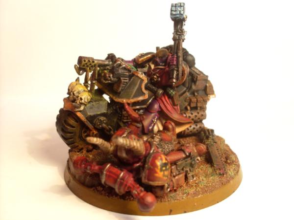
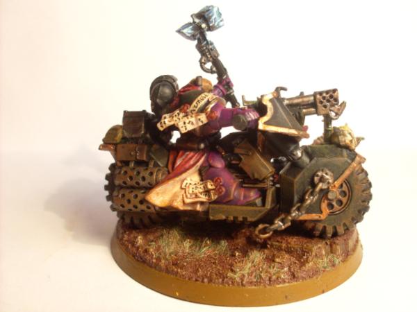
Hi Guys Im not very good at taking photos but would appreciate c&c on my Bike Commander.
He is part of my 2000 point Bike army I will be painting over the next month ot 2.
main thing I'm not happy with is the OSL from the headlight.
|
|
This message was edited 2 times. Last update was at 2013/01/02 01:19:56
|
|
|
 |
|
2013/01/02 01:26:37
Subject: Space Marine Bike Commander
|
|

Nigel Stillman
|
Looks really good imo.
|
|
|
|
|
|
2013/01/02 02:43:31
Subject: Space Marine Bike Commander
|
|

Judgemental Grey Knight Justicar
|
The purple armor clashes with the bike really well, good job 
|
|
|
|
|
2013/01/02 07:37:53
Subject: Space Marine Bike Commander
|
|
Armored Iron Breaker
|
"Don't Mace me bro!"
I like this model a lot. Looking forward to seeing more
|
|
|
|
|
|
2013/01/02 08:15:25
Subject: Space Marine Bike Commander
|
|

Esteemed Veteran Space Marine
Sheppey, England
|
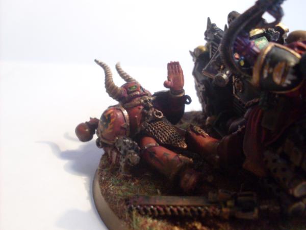
Love the Chaos Marine and the rusty chainsword. A whole army with scenic bases like that would be staggeringly awesome.
|
|
|
|
|
|
2013/01/03 00:41:40
Subject: Space Marine Bike Commander
|
|
Fixture of Dakka
|
Nice Commander. Is the chapter symbol hand painted? Its really neat.
|
|
|
|
|
|
2013/01/03 00:56:33
Subject: Space Marine Bike Commander
|
|
Been Around the Block
|
Honestly I felt like there is maybe a little too much going on in this mini.
|
 No Pity, No Remorse, No Fear No Pity, No Remorse, No Fear |
|
|
|
|
2013/01/03 18:01:53
Subject: Space Marine Bike Commander
|
|
Crazed Gorger
Illinois, United States
|
I sort of agree with this, but I think its more that all the values of the colors are too similar. If there was more shading and highlighting it would make it less confusing and busy looking. Right now everything seems to blend together and makes it hard to figure out whats going on.
With that said, still a very awesome paint job! 
|
-Magless
 2000 2000 |
|
|
|
|
2013/01/03 18:26:36
Subject: Re:Space Marine Bike Commander
|
|
Death-Dealing Devastator
|
Soul Drinkers chapter, right? I'm just finishing up the last book in that series, I really enjoyed it.
Anyway, I love your scenic base. Models with narrative are the best models, in my opinion.
In terms of constructive criticism, I agree that the piece looks a tad cluttered. I think this can be resolved by adding more contrast to your color scheme. Currently, the model has a muted, gritty color palette, which causes the purples, reds, browns, and even the metals to all run together. By brightening up the scheme and adding more highlights, it will be easier for the eye to pick out the component parts of your fantastic model, and will hopefully make it appear less cluttered.
I really like what you're doing, keep up the good work!
|
|
|
|
|
|
2013/01/03 21:48:47
Subject: Re:Space Marine Bike Commander
|
|
Hellish Haemonculus
|
There is no technical aspect of this model that fails. Your paint application is great, your basing skills are professional-grade, and your conversion work is top-notch. My worry is that you have a similar brown-ish color palette, and a whole truckload of fiddly details on the model which makes it hard to focus on any one aspect. If there were one single detail of them model which were in some way emphasized over the others, I think it would provide a nice keystone detail for the piece. A focal point, if you will, that would allow the eye to pick up the other details gradually and naturally. If it were my choice, I would clean up the hammer and make it much brighter than the rest of the model. As a centrally located aspect of the piece, it has a good position to draw the eye from any angle, and it still has enough contextual relevance that it wouldn't be weird to make it stand out the most.
Still, great model!
|
|
|
|
|
|
2013/01/03 22:27:23
Subject: Space Marine Bike Commander
|
|
Regular Dakkanaut
|
Thanks guys. One of the main problems I have found which will have affectected the critisism here greatly is either due to my sub par photography skills or the model itself not being very photogenic. Ideally it needs the good ol 360 video treatment or better.
I find it so had to take the photo as thre is 2 points of view from the commander and the chaos marine. I can try and get a good picture of the bike but the Chaos guy is in a bad position for the photo, or I could get a good picture of the chaos marine but then the bike doesnt look right.
Also my Camera is horrible and cheap and just doesnt do what I want it to do.
As for it looking too busy Its only for my commander, the rest of the army will be pretty much stock standard in the way of conversions and basing.
And the colour sheme looking to bland.. I have a problem and I do it with most my armies I try to make look realistic.
I paint them and they look pretty good but too clean so I drybrush prown everywhere which gives me that more realistic look but takes all the pop from the model. Maybe I just go too overboard with things like that and source lighting....
|
|
|
|
|
|
|