| Author |
Message |
 |
|
|
|
|
Advert
|
Forum adverts like this one are shown to any user who is not logged in. Join us by filling out a tiny 3 field form and you will get your own, free, dakka user account which gives a good range of benefits to you:
- No adverts like this in the forums anymore.
- Times and dates in your local timezone.
- Full tracking of what you have read so you can skip to your first unread post, easily see what has changed since you last logged in, and easily see what is new at a glance.
- Email notifications for threads you want to watch closely.
- Being a part of the oldest wargaming community on the net.
If you are already a member then feel free to login now. |
|
 |
2013/06/23 20:21:50
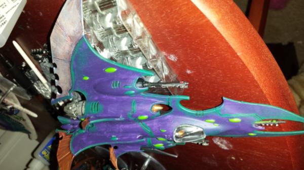
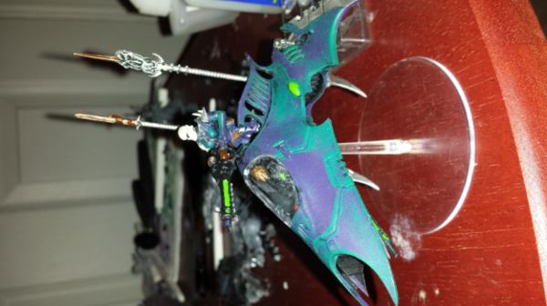
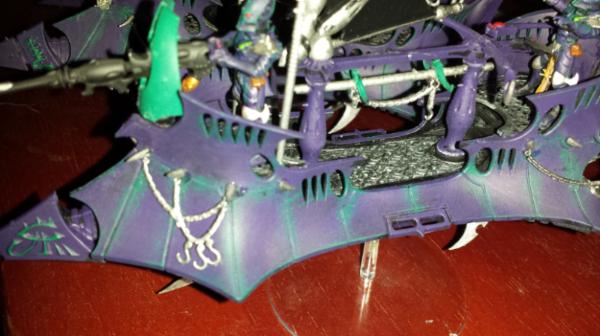
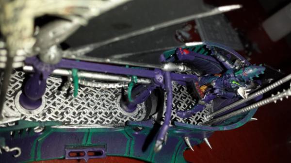
Subject: Opinions on my Dark Eldar vehicles?
|
|

Daring Dark Eldar Raider Rider
|
|
|
|
|
 |
|
2013/06/23 22:02:49
Subject: Re:Opinions on my Dark Eldar vehicles?
|
|
Martial Arts Dāturazi
Philadelphia, Pensylvania
|
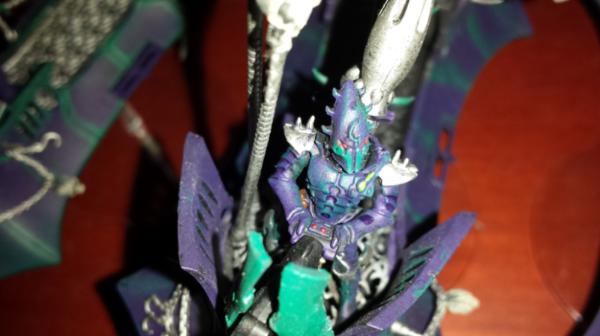
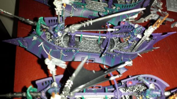
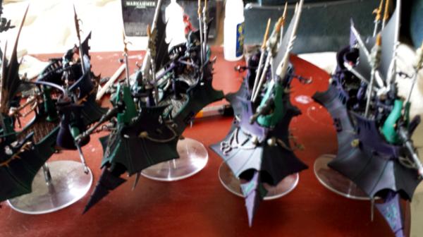
They are looking good from what i can see, as far as how to improve from this its hard to start without more direct photos.
However with these pics I would say to work on the gems a bit next they are easy to do and you can simply go back to old models and spiff them up a bit in the process. You really only need 1 colors to do it in a basic way, base the gem, highlight the gem 60%ish with the mid color then highlight that with the lightest color and they will look decent in the end, better than 1 color anyhow. Alternatively you could learn about wet blending and essentially plop two colors on the object and blend them back and forth across the object until the gradient from color 1 to color 2 is smooth and seemless with both colors strong on opposite end. The second method gives much better results but also will take a bit of time to get good at and it becomes harder to do on smaller areas so its a practice thing but a good skill to learn!
If you have an specific questions about painting feel free to pm me and ill help you out best i can.
great models keep painting!
|
|
|
|
|
|
2013/06/24 03:31:26
Subject: Opinions on my Dark Eldar vehicles?
|
|
Reverent Tech-Adept
New York, Technocratic People's Republic of Vinnland
|
Looks interesting, the start of something that needs just a bit more. It's very hard to make any determination on what's going on with the photos provided (the harsh lighting is creating too much reflection on the surface of the models).
I agree about the gems, but a solid background/starting surface will make the gems pop nicely. Contrast with simple colors can make great effects without too much investment in blends and all that crazy airbrush stuff people do on some of the Eldar vehicles.
Looks like the purple and green interplay could be really awesome, just hard to see in the pics!
|
|
|
|
|
|
2013/06/24 06:03:32
Subject: Re:Opinions on my Dark Eldar vehicles?
|
|
Daring Dark Eldar Raider Rider
|
|
|
|
|
|
|
2013/06/24 11:19:54
Subject: Opinions on my Dark Eldar vehicles?
|
|

Fresh-Faced New User
|
The one big thing that I would say is in your purple in the first photo. It looks streaky/brush strokes. Perhaps paint with a larger brush and add another coat next time. Otherwise they aren't bad 
As victor was saying as well, try adding some layers to them. Dry brushing/highlights and the sort. Perhaps some gradient in the purple to make it a little more interesting to look at
|
Tyranids (1500/not completed)
Ogre Kingdoms 1500 |
|
|
|
|
2013/06/24 20:20:07
Subject: Re:Opinions on my Dark Eldar vehicles?
|
|
Masculine Male Wych
|
I really like the color scheme, it's nice to see colorful Dark Eldar. I wish I had been as brave when I did mine. Let me share something helpful I found out - when you're doing your edge highlights, it's ok if they come out too thick. Just go back over with the base color to thin them down a little bit. I kept trying to get them the right thickness the first try and it was frustrating until I figured, "Eh, forget it - I'll just clean them up after".
|
|
|
|
|
2013/06/24 20:55:16
Subject: Opinions on my Dark Eldar vehicles?
|
|
Daring Dark Eldar Raider Rider
|
Oh, good idea on cleaning up the lines. I don't know why I didn't think of that, much like you I just tried to get them right the first time.
I wanted them to be a bit more colorful than standard, but not too bright. I felt the Nagarroth Purple and Kabalite Green and then the dulled out metallics made them bright enough to stand out, but dark enough they still feel sinister.
Thanks for the additional suggestions guys! I really appreaciate it.
|
|
|
|
|
|
|
|
 1850
1850
 2000
2000
 3000
3000
 2000
2000