| Author |
Message |
 |
|
|
|
|
Advert
|
Forum adverts like this one are shown to any user who is not logged in. Join us by filling out a tiny 3 field form and you will get your own, free, dakka user account which gives a good range of benefits to you:
- No adverts like this in the forums anymore.
- Times and dates in your local timezone.
- Full tracking of what you have read so you can skip to your first unread post, easily see what has changed since you last logged in, and easily see what is new at a glance.
- Email notifications for threads you want to watch closely.
- Being a part of the oldest wargaming community on the net.
If you are already a member then feel free to login now. |
|
 |
2013/08/07 04:41:11
Subject: Advice needed
|
|

Fresh-Faced New User
|
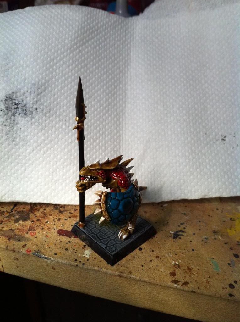
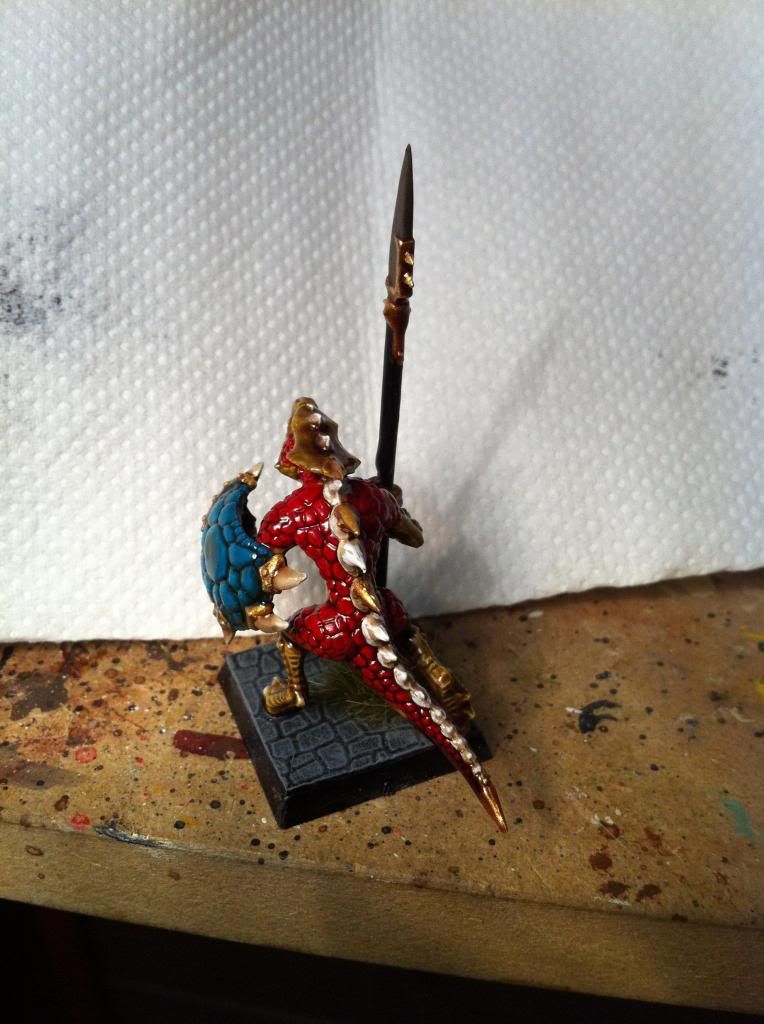
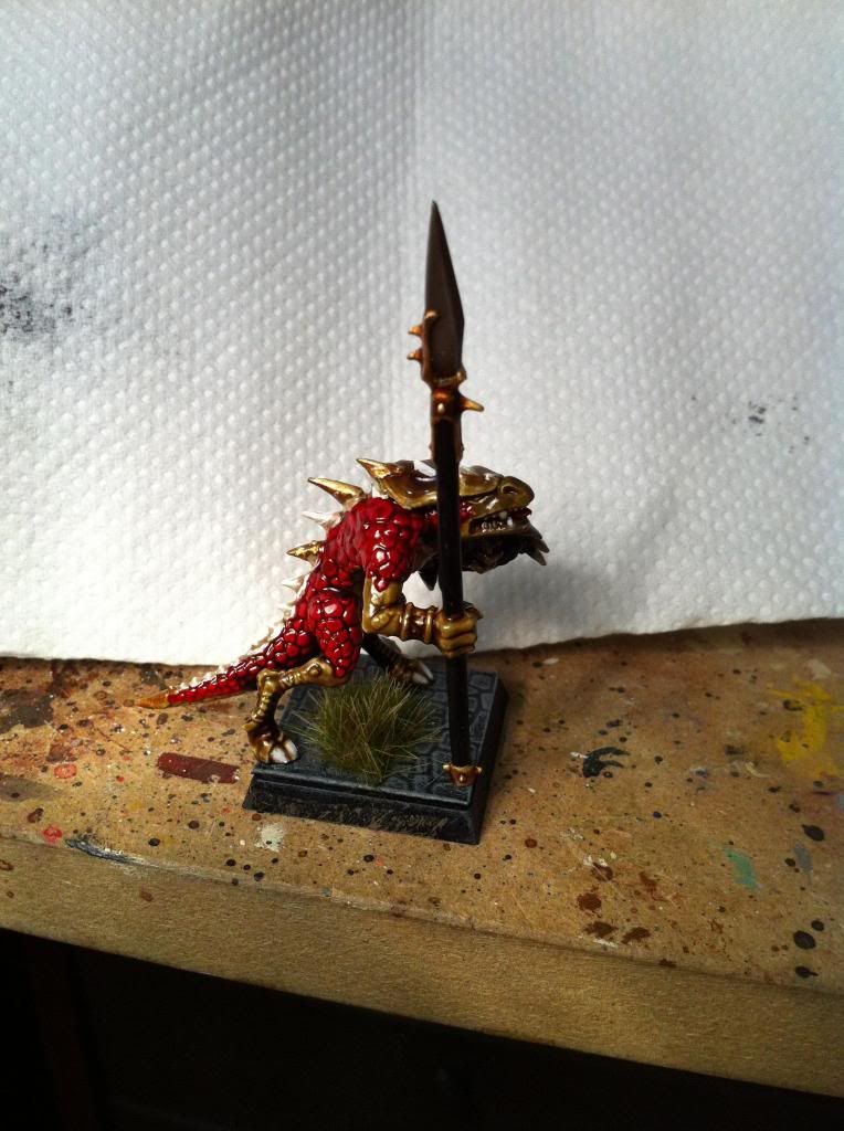
Its been many years since I painted any lizard men.... Back in 5th edition I had an army but I sold it two years ago and since then I haven't touched any lizard men figures....
All this however changed with the new releases and book....
Unfortunately I am no longer a student and I don't have the free time required to paint a decent looking army in the time I have available... So I chose to paint my army using the army painter method - aka the dip !
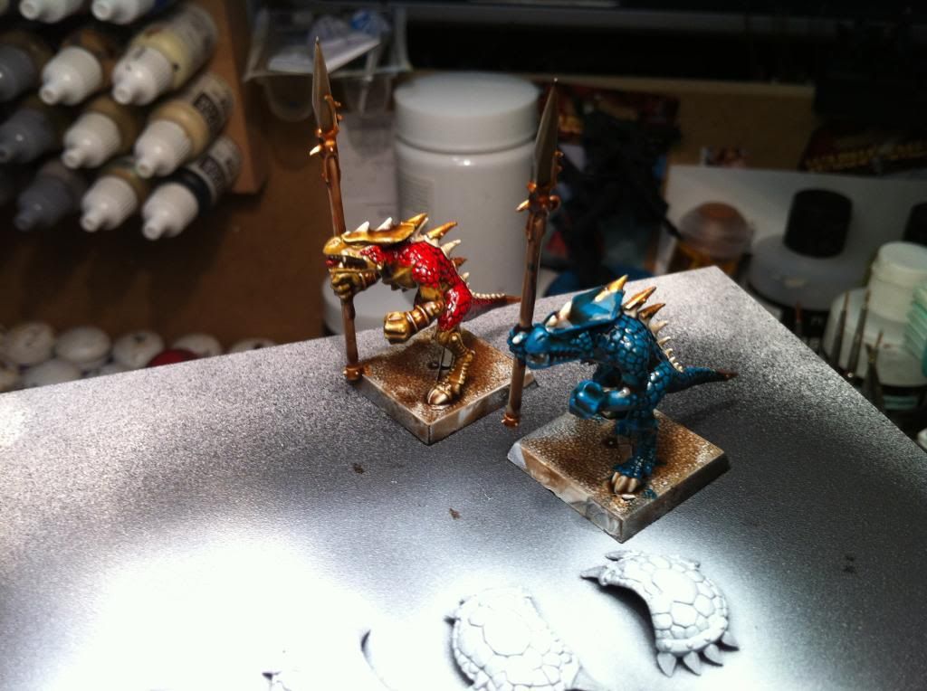
I would really appreciate if you could give me some thoughts and opinions on two colour schemes I am considering;
one is desert yellow skin and blood red for the scales and the other one is hawk turquoise all over....
Please feel free to comment or even suggest other colours 
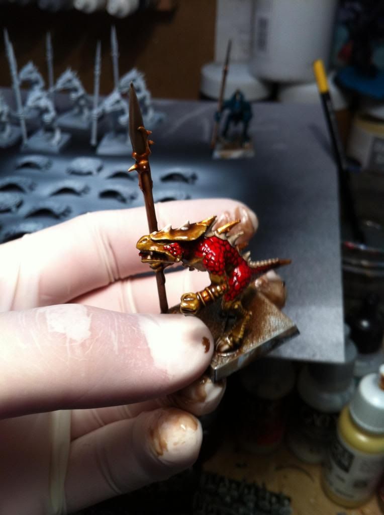
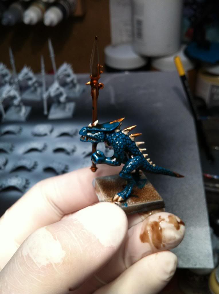
Please note that the above two are by no means complete; I still need to paint the spear shafts a matching colour (probably black) and apply a coat of matt varnish...
|
|
|
 |
|
2013/08/07 04:43:52
Subject: Advice needed
|
|

Stabbin' Skarboy
|
I feel the blue one is better. This is because you can always come back and add quick light blue highlights to the scales and the model will REALLY pop. I feel it would be harder to get a visually interesting model with minimal effort with the brown and red scheme.
|
All my work is done using StyleX, Professional Model Tools
http://www.stylexhobby.com
 My 1850 pt. Ork army: Big Boss Badonk-a-Donk and 'da Dakka Dudez My 1850 pt. Ork army: Big Boss Badonk-a-Donk and 'da Dakka Dudez
Eye of Terror San Diego Tournament: Best Painted
Game Empire Pasadena RTT : Best Painted x 4
Bay Area Open: 2nd Best Presentation
Anime Expo '14: Best Presentation/Hobbyist
Feast of Blades Qualifier: Best Presentation(Perfect Score)
|
|
|
|
|
2013/08/07 05:01:48
Subject: Advice needed
|
|
Sneaky Kommando
Austin, Texas USA
|
Like the red one more - blue is ye olde stock color. But, why not do both?
|
Eating and sleeping are the only activities that should be allowed to interrupt a man's enjoyment of his cigar. S. Clemons
|
|
|
|
|
2013/08/07 05:06:26
Subject: Advice needed
|
|
Ragin' Ork Dreadnought
Deep in the Outer Boroughs of NYC
|
I really like the red and yellow one. The dip compliments both colors very nicely and the extra color adds a beautiful variation. Plus the red really pops. It just feels more saurian and aggressive to me.
|
|
|
|
|
|
2013/08/07 05:07:30
Subject: Advice needed
|
|
Fresh-Faced New User
|
Both look great, but the red and gold model looks more appealing. I think the blue would look just as good with an additional color like a complimentary orange highlight. What are your thoughts?
|
|
|
|
|
2013/08/07 06:27:20
Subject: Advice needed
|
|
Fresh-Faced New User
|
Thank you guys for your comments! I really appreciate it!!!
I should mention two things. The yellow-red saurus will get a blue or green shield and the blue saurus will get a red or yellow shield...
Another important factor is that the models will be based on a copplestone/ paved road kind of look so their colours must match the colours of the base. I have painted a couple of bases already using charadon granite drybrushed with khemri brown and finally with kommando khaki so I should be able to take some pics of the based saurus tomorrow evening... For some reason I think that the desert yellow-blood red combination ties better with the base.
MikeFox wrote:I feel the blue one is better. This is because you can always come back and add quick light blue highlights to the scales and the model will REALLY pop. I feel it would be harder to get a visually interesting model with minimal effort with the brown and red scheme.
I agree with you but I like both colour variations equally so I am really counting on what people prefer. In other words I will probably chose the scheme that gets the most likes
nineteen73 wrote:Both look great, but the red and gold model looks more appealing. I think the blue would look just as good with an additional color like a complimentary orange highlight. What are your thoughts?
Actually for the turquoize I was thinking to compliment it with dark gray or dark blue-green scales. I am just planning to paint those on the model after the dip dries...
Hopefully I should have some pics later tonight with the models based on their proper bases
|
|
|
|
|
2013/08/07 06:54:43
Subject: Advice needed
|
|

Perfect Shot Ultramarine Predator Pilot
|
I prefer the yellow one.
But did you try mixing both schemes ? I think a yellow body with turquoise scales would look great.
I painted lots of models using the dip and if you use it to save time, I'd recommend you to paint everything before dipping the model. The less steps you have to do after the dip, the more time you save. Personnally, I only paint the bases after the dip.
|
|
|
|
|
|
2013/08/07 07:27:33
Subject: Advice needed
|
|
Fresh-Faced New User
|
 Minus wrote: Minus wrote:I prefer the yellow one.
But did you try mixing both schemes ? I think a yellow body with turquoise scales would look great.
I painted lots of models using the dip and if you use it to save time, I'd recommend you to paint everything before dipping the model. The less steps you have to do after the dip, the more time you save. Personnally, I only paint the bases after the dip.
Actually I tried painting the body yellow and the scales blue but I didnt like the outcome... something didnt look right to me...
I agree with painting everything before dipping but I was in a hurry to post something on the forums 
What do you use for matt varnishing your figures? The citadel or army painter matt varnish?
|
|
|
|
|
2013/08/07 08:21:21
Subject: Advice needed
|
|
Perfect Shot Ultramarine Predator Pilot
|
Meraklis wrote:Actually I tried painting the body yellow and the scales blue but I didnt like the outcome... something didnt look right to me...
Do you have any pix ?
I'd be interested in seeing the result. 
If you don't like it, then I'd choose the yellow and red one.
Meraklis wrote:I agree with painting everything before dipping but I was in a hurry to post something on the forums
Yup, I know these are test models. No problem.
I said that because you suggested that you might highlight the turquoise one after dipping. It would indeed look good, but if you want to save time, don't do that. 
Meraklis wrote:What do you use for matt varnishing your figures? The citadel or army painter matt varnish?
I use Pébéo spray mat varnish for acrylics. I'd recommend not to use GW's one, because it is satin instead of matt so it won't remove all of the shine.
I never tried Army painter's varnish but I am happy with their paint sprays and bottles.
|
|
|
|
|
|
2013/08/07 08:27:41
Subject: Advice needed
|
|
Fresh-Faced New User
|
Unfortunately I didnt take any pics of the yellow-blue saurus because I painted over him the red colour... :(
It was too bold for my taste so I chose to avoid it..
Thx for the comments though! It really helps!
I am still torn between the two styles though...arghhhhh
|
|
|
|
|
2013/08/07 12:23:51
Subject: Advice needed
|
|

Rotting Sorcerer of Nurgle
|
I like the red one but the gold gets a bit lost compared to the other skin tone you've used.
|
Check out my gallery here
Also I've started taking photos to use as reference for weathering which can be found here. Please send me your photos so they can be found all in one place!! |
|
|
|
|
2013/08/07 12:40:57
Subject: Advice needed
|
|
Tough-as-Nails Ork Boy
|
Green and White !
Wait what ...... Oh the blue and yellow one gets my vote.
CW
|
AIRBORNE AND BREAD!!!! 
THE BEATINGS WILL CONTINUE UNTIL MORAL IMPROVES!
 |
|
|
|
|
2013/08/07 13:34:07
Subject: Advice needed
|
|
Morphing Obliterator
|
Blue one for me.
|
|
|
|
|
|
2013/08/07 14:12:16
Subject: Advice needed
|
|
Beast of Nurgle
|
Both of them look just as good as one another. I suppose it would come down to personal preference.
|
 1500 Pts Alaitoc/Exodite Eldar 1500 Pts Alaitoc/Exodite Eldar
 1500 Pts Nurgle Marines and counting 1500 Pts Nurgle Marines and counting  |
|
|
|
|
2013/08/07 14:17:32
Subject: Advice needed
|
|
Stabbin' Skarboy
|
Simply red
|
 3500pts 3500pts 1500pts 1500pts 2500pts 2500pts 4500pts 4500pts 3500pts 3500pts 2000pts 2000pts  2000pts plus several small AOS armies 2000pts plus several small AOS armies |
|
|
|
|
2013/08/07 15:40:38
Subject: Re:Advice needed
|
|
Tough-as-Nails Ork Boy
|
simply red
'Holding back the tears' after that quote. 
CW
|
AIRBORNE AND BREAD!!!!
THE BEATINGS WILL CONTINUE UNTIL MORAL IMPROVES!
|
|
|
|
|
2013/08/08 04:44:43
Subject: Advice needed
|
|
Fresh-Faced New User
|
thank you people for your comments. I have decided to go for the red version and I proceeded to add the shield and base to the miniature. I still need to matt varnish the thing though...
I was wondering if you could share your ideas about the base? Maybe I could add something more or do you like it as it is now?
(sorry for the lousy pics...I didnt have time to take proper photos...)
|
|
This message was edited 1 time. Last update was at 2013/08/08 04:45:38
|
|
|
|
|
|
|