OK, will try and offer some useful feedback!
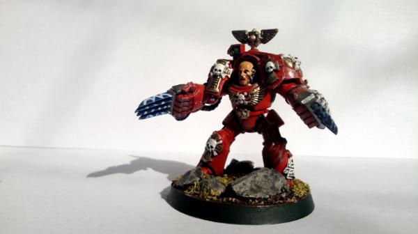
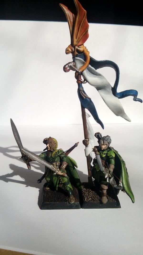
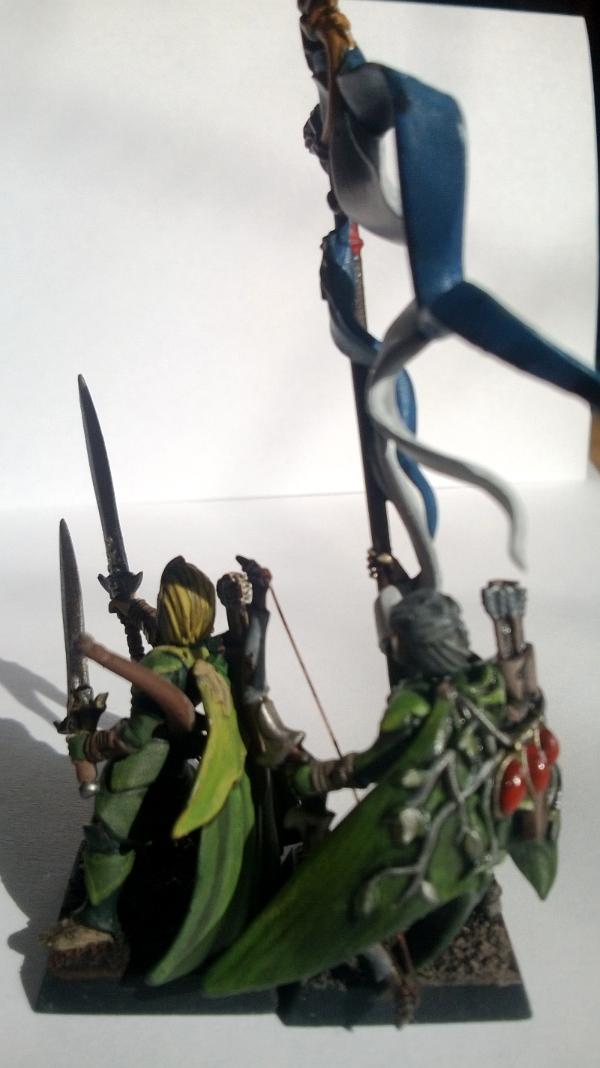
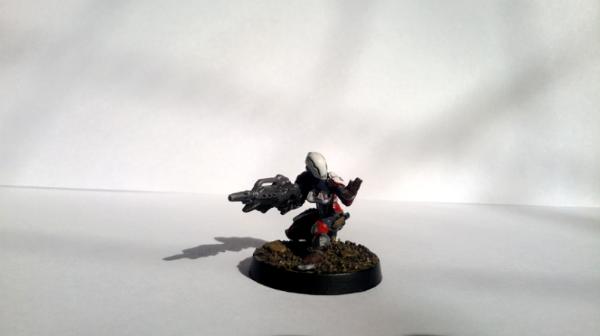
Firstly, photos! Think these could definitely benefit from some closer, tighter, more vivid photos. You don't need an amazing camera to do this, even a small digital compact can great results. I won't say a smart phone, even though those have some amazing capabilities these days, I've found the very slow lense speeds make macro and close range use very difficult.
Here is a great guide if you want to go all the way with your photos
https://www.google.co.uk/search?q=classic+white+dwarf+cover&source=lnms&tbm=isch&sa=X&ei=aGJHUpufL8iltAbTl4CIAQ&ved=0CAcQ_AUoAQ&biw=1366&bih=643&dpr=1#q=white+dwarf+magazine+covers&tbm=isch
Although, if you don't want to do that, you can get some great results with a bit of grey card for background (rather than white), and even a single daylight bulb.
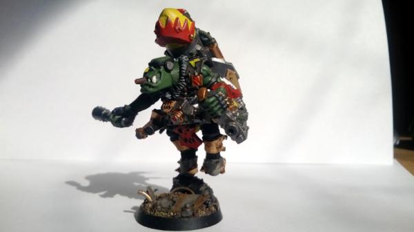
Otherwise, these look great! Love the base on the Ork also.
Obviously you have a very steady hand, you've done some very neat and clean brushwork which I think is 80% of the battle straight away. Nice colour combinations, again very important, it's amazing sometimes that you get even pro-standard stuff painted where they've mixed clashing colours. Otherwise the only other thing I could think to add would be to make the guns/swords a bit more detailed, rather than just drybrush with a metal colour.
Hope that helps! Like I have said, I think the photos/composition of the shots could make a big improvement to how these look.


 A Heretic may see the truth and seek redemption. He may be forgiven his past and will be absolved in death. A Traitor can never be forgiven. A Traitor will never find peace in this world or the next. There is nothing as wretched or as hated in all the world as a Traitor. - Cardinal Khrysdam, Instructum Absolutio


