| Author |
Message |
 |
|
|
|
|
Advert
|
Forum adverts like this one are shown to any user who is not logged in. Join us by filling out a tiny 3 field form and you will get your own, free, dakka user account which gives a good range of benefits to you:
- No adverts like this in the forums anymore.
- Times and dates in your local timezone.
- Full tracking of what you have read so you can skip to your first unread post, easily see what has changed since you last logged in, and easily see what is new at a glance.
- Email notifications for threads you want to watch closely.
- Being a part of the oldest wargaming community on the net.
If you are already a member then feel free to login now. |
|
 |
2014/05/18 01:32:17
Subject: Learning to Paint NMM, Advice Wanted
|
|

Archmagos Veneratus Extremis
On the Internet
|
So I've started playing around with NMM and want to share some early attempts and get some potential feedback. Now these are both the same blade, only I horribly screwed up my blending on one side when trying to touch up blade a bit. This is quite honestly my 3rd attempt at NMM (I had one failure with trying to bite off more than I could chew by doing Celestine in NMM Gold before realizing I had no idea how to do it well, and a much more recent attempt were I mucked up a spear blade I was playing with and now it needs to be stripped before I try using it again).
So the side I goofed on:
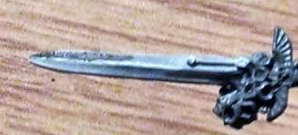
The side I didn't screw up so badly:
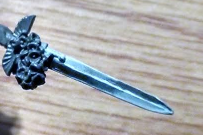
Obviously for the first one the solution is to not screw up so much, but for the second, does it come across as too dark? Should I be looking to draw the lighter grays out more? Anything really would be nice for advice as I'm still learning here (I'm actually considering picking up a box of Grey Knights just to use their weapons to practice on since they have such nice, large blades). Automatically Appended Next Post: I gave it another go with a different sword this time:

I think it's a bit better since I've got more grays in there, but I also think I've got a long way to go too. I don't know, I think I'm not quite nailing it.
|
|
This message was edited 2 times. Last update was at 2014/05/18 04:45:46
|
|
|
 |
|
2014/05/18 08:12:10
Subject: Re:Learning to Paint NMM, Advice Wanted
|
|

Grey Knight Purgator firing around corners
|
think it is not the point of "too dark", rather it is a question of gradients. For starters, I am not 'too' confident about nmm (not much time => not many time-consuming attempts), though I think the key is in glazing. Start with a medium colour base, then glazeblend the dark parts, then again, maybe after another base glaze, glazblend to lights.
This should lead towards a wwide gradient and narrower extremes.
|
 2270 (1725 painted) 2270 (1725 painted)
 1978 (180 painted) 1978 (180 painted)
 329 (280ish) 329 (280ish)
 705 (0) 705 (0)
 193 (0) 193 (0)
 165 (0) 165 (0)
:assassins: 855 (540) |
|
|
|
|
2014/05/18 08:25:17
Subject: Learning to Paint NMM, Advice Wanted
|
|

Shas'la with Pulse Carbine
|
Here's the thread from a similar thread of mine quite a while ago, a lot of good nmm advice there: http://www.dakkadakka.com/dakkaforum/posts/list/538358.page
Once I finally "got" the technique, I made this tutorial:
http://www.dakkadakka.com/dakkaforum/posts/list/538500.page
|
|
|
|
|
2014/05/18 09:03:50
Subject: Re:Learning to Paint NMM, Advice Wanted
|
|
Longtime Dakkanaut
|
I think the best way to understand NMM reflections is to begin by looking at Sky + Earth stuff like this:
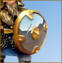
Put simply: the areas that face upward reflect the sky, and the areas that face downwards reflect the ground, Convex shapes like the shield in the picture appear the correct way up. Concave shapes however, the ground would be at the top because that is the part that faces the ground. You can see this when you look at your face in a spoon, the image is upside down on the concave side.
Cylindrical objects tend to always reflect longways with the horizon parallel to the curve. This can make legs a bit tricky because they are usually perpendicular to the horizon.
You can actually cheat at this by using an airbrush, or spray. If you spray dark from the bottom and light from the top you get a pretty good map of how the reflections would fall because the spray acts kind of like a ray trace.
The important thing to take away from this is that all surfaces are reflective. Even something like a matte green piece of paper which you wouldn't normally consider "reflective" does by definition reflect green, otherwise you wouldn't be able to see it. If you place something colorful on a white piece of paper you can usually see this, the paper will subtly reflect the coloured light where they touch.
What makes a pieces of paper different from a mirror is that the surface is rough, so reflections get blurred to the point of being uniform. Some surfaces like chrome don't blur reflections at all, so you get the perfect Sky+Earth effect. Others such as gold and dull metals blur reflections a little bit, but not so much that you can't make out the light and dark areas. What you tend to see with these is a gradient where the light sky blurs into the dark ground. For this blurred area I would recommend using a colour like a muted purple because I think it is quite metallic, and it's a good shorthand for blue reflections mixing with earthy brown colours. Obviously for gold you would use all yellows and browns.
If you take a look at this suit of armour you can see these ideas at work, and just about make out the blurred sky and earth.
With regards to your sword. I actually think they look pretty good, though I'm not sure which way up they are going to be on the model? I think a good order for your gradient tones would be:
- Medium blue at the top (representing the sky)
- Lighter blue / white towards the middle (this represents fog on the distant horizon)
- (Purple/grey would go here for blurring)
- Darker brown under the middle (This represents the horizon. Even though objects on the horizon should be lighter than the foreground, the contrast with the light sky gives the illusion of them being darker, so I would go with darker to emphasize this.)
- Lighter brown for the foreground.
- Perhaps going slightly darker again (for extreme foreground)
Obviously you can use different colours to represent different environments or materials (gold/copper). And as I said the order would be reversed for concave shapes.
Hope that's helpful 
|
|
This message was edited 1 time. Last update was at 2014/05/18 09:07:04
|
|
|
|
|
2014/05/18 11:29:51
Subject: Learning to Paint NMM, Advice Wanted
|
|
Is 'Eavy Metal Calling?
|
Practice is the key. Try it on as many spare swords and even bits of sprue as you can. Early attemots may not work well, if at all, but practice will always help. You're off to a good start already, so just keep going.
I tend to use paint at half the normal thickness when using NMM, to build up layers while not obscuring detail. As mentioned above, using a glaze helps tie the shades together.
If in doubt, increase the contrast. Keep it too monochrome and you'll get a flat look, and that's the worst that can happen with NMM. If you'lre going for Sky-Earth (as outlined in the above post) then use the colours of the environment to change the shade, if you're going for plain NMM then I suggest going brown -> white for Gold and Black-> white for steel/silver.
Try and have something metallic on hand for reference, preferably in a similar colour to what you're paintin. Nothing will give you a better idea of what to aim for than the real thing.
Hope that helps, and keep practicing.
|
|
|
|
|
|
2014/05/18 14:05:33
Subject: Learning to Paint NMM, Advice Wanted
|
|
Archmagos Veneratus Extremis
On the Internet
|
I wasn't really looking to go Sky-Earth (too chrome for my tastes on most things in the 40k universe) but I think I see what I wasn't quite nailing. I'm using pure grays which aren't quite conveying the look completely.
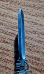
I'll need to make a paint run and get some thing today but I'll give it another go later. Automatically Appended Next Post: Gave it another go, this time with more bluish grays and a glaze of Guilliman Blue:

And it does fade all the way to black, I just can't find a good compromise that lets me show that and show the more bluish grays as anything but a hard to see blob at the moment. I seem to be able to get one or the other but not both in a photo at the same time.
|
|
This message was edited 1 time. Last update was at 2014/05/18 15:29:48
|
|
|
|
|
2014/05/18 19:29:11
Subject: Learning to Paint NMM, Advice Wanted
|
|
Is 'Eavy Metal Calling?
|
Already much better, the blue adds a lot. Just a question, are you mixing the paints shade-by-shade or just using the colours from the pot? Because for NMM, mixing is the best way to get coherent colour. It's hard to tell from that pic.
|
|
|
|
|
|
2014/05/19 00:21:23
Subject: Learning to Paint NMM, Advice Wanted
|
|
Archmagos Veneratus Extremis
On the Internet
|
 Paradigm wrote: Paradigm wrote:Already much better, the blue adds a lot. Just a question, are you mixing the paints shade-by-shade or just using the colours from the pot? Because for NMM, mixing is the best way to get coherent colour. It's hard to tell from that pic.
Lots of slow gradient building but adding the lighter or darker paint as I work on each progressive layer.
I'm playing with Russ Grey, The Fang, and Ferensian Grey now as they're naturally a bit blueish and should do the trick nicely. I picked up some Grey Knight Terminators for practice (since they have a LOT of swords to play with and the Terminators themselves are prime for also practicing the NMM on) so when I get a sword done with those greys I'll post it up for people to critique as well. Automatically Appended Next Post: An experiment with using The Fang, Russ Grey, Ferensian Grey and a slight glazing of Guilliman Blue:
|
|
This message was edited 1 time. Last update was at 2014/05/19 01:27:23
|
|
|
|
|
2014/05/19 18:11:13
Subject: Learning to Paint NMM, Advice Wanted
|
|
Is 'Eavy Metal Calling?
|
Again, good stuff. If anything, I'd say you could do wuth throwing in a bit more white on the highlights (although, looking at it again, it may just be the picture), but to be honest, it's perfectly servicable as-is.
|
|
This message was edited 1 time. Last update was at 2014/05/19 18:12:03
|
|
|
|
|
2014/05/20 08:34:19
Subject: Learning to Paint NMM, Advice Wanted
|
|

Deadly Dark Eldar Warrior
|
What I find usefull myself is using a "tinted white" to work up to. If you are going for steel use Ulthuan grey instead of white. It is not as stark as pure white as contrast from black so you will need more layers yet the blue tint in it helps from making it seem flat. If you are going for gold then something like bleached bone together with white is a good start.
The most important thing is that you find a technique that suits your own painting style. All the Dakkanaughts in the world could tell you what to do and not two of those will be exactly the same.
So the only thing that really helps is practice, practice, practice and create your own technique. (even if it is something as crazy as only painting upside down during a full moon, as long as it helps  )
|
|
|
|
|
2014/05/20 10:44:07
Subject: Learning to Paint NMM, Advice Wanted
|
|

Veteran Wolf Guard Squad Leader
|
Your last attempt has a really nice transition between the colours, but you need to push your shadows and highlights into higher contrast.Go at the very least to pure white and if you feel you need it pure black. That is honestly all that final blade needs.
This was my first attempt and you can see where the transitions and contrast are better (check the halo) than others (armour and sword).

|
|
|
|
|
|
2014/05/20 21:38:40
Subject: Learning to Paint NMM, Advice Wanted
|
|
Archmagos Veneratus Extremis
On the Internet
|
Honestly I am pushing all the way to pure white and pure black, but I guess the images just don't convey that very well.
I ordered the Vallejo NMM set to give Vallejo paints a try and to use some colors basically tailor made for NMM silver and gold.
With luck eliminating the color issue will help me nail the effect.
And I have to say Celestine's sword is a PITA to do any kind of effect with. I never noticed it had such a flat edge to it until I was trying to edge highlight it and found that it was just not as nice as the sword looks from a distance. A disappointment honestly with how many great swords GW has made back in the day on the old metal models.
|
|
This message was edited 1 time. Last update was at 2014/05/20 21:39:34
|
|
|
|
|
|
|


