| Author |
Message |
 |
|
|
|
|
Advert
|
Forum adverts like this one are shown to any user who is not logged in. Join us by filling out a tiny 3 field form and you will get your own, free, dakka user account which gives a good range of benefits to you:
- No adverts like this in the forums anymore.
- Times and dates in your local timezone.
- Full tracking of what you have read so you can skip to your first unread post, easily see what has changed since you last logged in, and easily see what is new at a glance.
- Email notifications for threads you want to watch closely.
- Being a part of the oldest wargaming community on the net.
If you are already a member then feel free to login now. |
|
 |
2014/05/19 20:52:40
Subject: Opinions Please
|
|

Been Around the Block
|
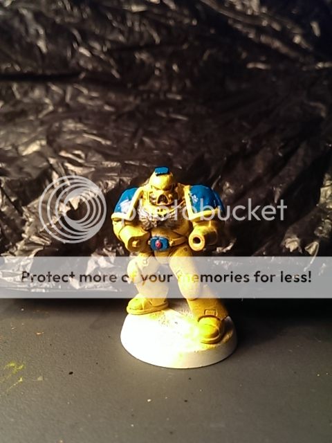
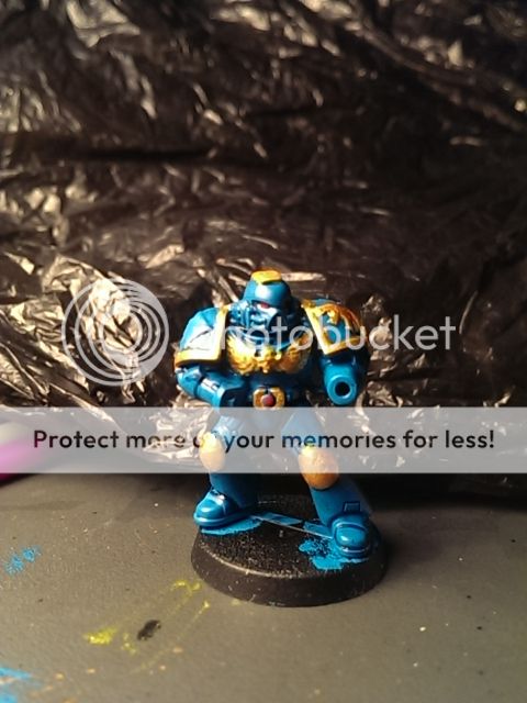
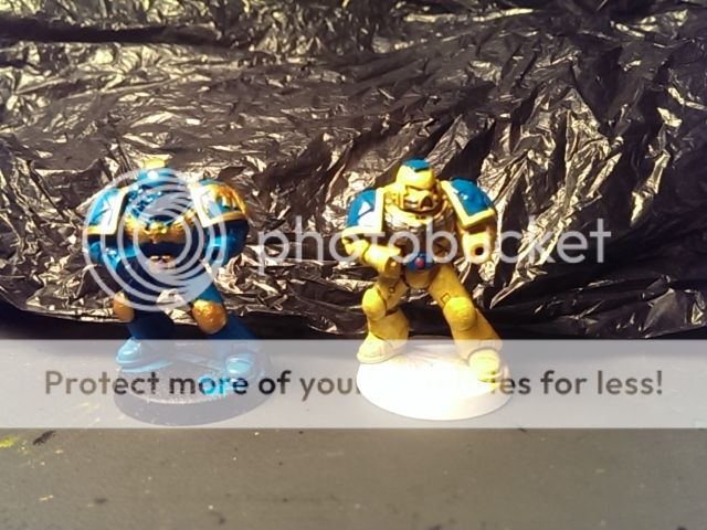
Looking for peoples opinions on these two colour schemes. Please excuse the poor painting skills lol ive not painted in a long while haha
|
|
|
 |
|
2014/05/19 21:10:59
Subject: Opinions Please
|
|

Fluttering Firewyrm of Tzeentch
Hamilton, New Zealand
|
No offence intended, but the blue with gold trim screams thousand sons to me. I realise that is not the intent.
Either way, I prefer that scheme over the predominantly yellow.
|
|
|
|
|
|
2014/05/19 21:21:01
Subject: Re:Opinions Please
|
|

Sword-Bearing Inquisitorial Crusader
Eindhoven, Netherlands
|
I think either the blue or the gold/yellow should be a few shades darker; the overall result looks to bright on both models IMO
|
 1400 points of EW/MW Italians (FoW) 1400 points of EW/MW Italians (FoW)
 2200 points of SoB and Inquisition (40K) 2200 points of SoB and Inquisition (40K)
 1000 points of orks (40K) 1000 points of orks (40K)
 Just starting out with Ultramarines (30K) Just starting out with Ultramarines (30K)
 Four 1000-2500 point forces for WHFB (RIP) Four 1000-2500 point forces for WHFB (RIP)
 One orc team (Blood Bowl) One orc team (Blood Bowl) |
|
|
|
|
2014/05/19 21:25:57
Subject: Opinions Please
|
|
Keeper of the Holy Orb of Antioch
avoiding the lorax on Crion
|
Hmm maybe lessen the bling, I use on my sterguard / officers and they are channeling Mr T somewhat
Just tone it down a bit, bit too bright, use a more muted palette
|
|
This message was edited 1 time. Last update was at 2014/05/19 21:27:27
Sgt. Vanden - OOC Hey, that was your doing. I didn't choose to fly in the "Dongerprise'.
"May the odds be ever in your favour"
Hybrid Son Of Oxayotl wrote:
I have no clue how Dakka's moderation work. I expect it involves throwing a lot of d100 and looking at many random tables.
FudgeDumper - It could be that you are just so uncomfortable with the idea of your chapters primarch having his way with a docile tyranid spore cyst, that you must deny they have any feelings at all. |
|
|
|
|
2014/05/19 21:35:41
Subject: Re:Opinions Please
|
|

Long-Range Land Speeder Pilot
Schofield Barracks Hawaii
|
I think they both look alright. As far as just the color scheme goes, i think the blue with gold trim will be easier on you in the long run. You wont have to layer up as much to get a good color.
I believe what the other guys here are saying is that the colors are to bright so they look like legos. I had the same problem when i started painted (only two years ago so im no pro myself) I find
that if you base coat your models black and layer up to about a shade brighter than you want it and then apply a wash it really helps round it out and also helps the highlights on the edges of your
model pop really nicely. Like i said im still an infant myself when it comes to painting but thats my bit of constructive advice for what its worth. Either way they both look decent i just think
the blue will save you some time and frustration.
|
Into the fires of battle, unto the anvil of war!
DS:90S++G++MB-I+Pw40k11+D++A+++/fWDR+++T(D)DM+ |
|
|
|
|
2014/05/19 21:50:30
Subject: Opinions Please
|
|
Keeper of the Holy Orb of Antioch
avoiding the lorax on Crion
|
I've only been painting year n a bit but just tone down, blue and gold works but just too bright,
Maybe add wash to gold, thinned out red or brown wash to make it more a rose gold and make detail stand out. Learnt a lot off a friendly black templers player on forum
and maybe metal knee plates vs gold you have?
|
|
This message was edited 2 times. Last update was at 2014/05/19 21:53:22
Sgt. Vanden - OOC Hey, that was your doing. I didn't choose to fly in the "Dongerprise'.
"May the odds be ever in your favour"
Hybrid Son Of Oxayotl wrote:
I have no clue how Dakka's moderation work. I expect it involves throwing a lot of d100 and looking at many random tables.
FudgeDumper - It could be that you are just so uncomfortable with the idea of your chapters primarch having his way with a docile tyranid spore cyst, that you must deny they have any feelings at all. |
|
|
|
|
2014/05/19 21:55:17
Subject: Opinions Please
|
|
Legendary Master of the Chapter
|
I much prefer the blue with yellow trim. but as others have stated if it was a little darker it would look a little less cartoonie.
|
 Unit1126PLL wrote: Unit1126PLL wrote: Scott-S6 wrote: Scott-S6 wrote:And yet another thread is hijacked for Unit to ask for the same advice, receive the same answers and make the same excuses.
Oh my god I'm becoming martel.
Send help!
|
|
|
|
|
2014/05/19 21:56:34
Subject: Opinions Please
|
|
Jealous that Horus is Warmaster
|
I much prefer the blue scheme over the yellow scheme.
|
|
|
|
|
|
2014/05/19 22:57:06
Subject: Opinions Please
|
|
Been Around the Block
|
Well ive only gone and changed my mind already!
Im going to go with a dark red scheme, kind of similar to khorne berzerkers
|
|
|
|
|
|
|


