| Author |
Message |
 |
|
|
|
|
Advert
|
Forum adverts like this one are shown to any user who is not logged in. Join us by filling out a tiny 3 field form and you will get your own, free, dakka user account which gives a good range of benefits to you:
- No adverts like this in the forums anymore.
- Times and dates in your local timezone.
- Full tracking of what you have read so you can skip to your first unread post, easily see what has changed since you last logged in, and easily see what is new at a glance.
- Email notifications for threads you want to watch closely.
- Being a part of the oldest wargaming community on the net.
If you are already a member then feel free to login now. |
|
 |
2014/11/08 00:18:52
Subject: Having problems with blending from dark to lighter similiar colors, help needed
|
|

Fresh-Faced New User
|
As the topic says i'm having problems with the blending from lets say a dark red and then slowly move up to a lighter red the higher up i paint. Thats the right way to do it isent it?
I realy having problems with that and if someone could give me some hints or a good homepage to study this
|
|
|
 |
|
2014/11/08 01:02:45
Subject: Having problems with blending from dark to lighter similiar colors, help needed
|
|

Thane of Dol Guldur
|
Without an airbrush, i find 2 colour blending the most effective way. To do this i just get the 2 colours i want to blend, paint them on with a definitve border, then once its dried, take both colours again, and just work them back and forth over the line to get a smooth blend
|
  Heresy World Eaters/Emperors Children Heresy World Eaters/Emperors Children 
Instagram: nagrakali_love_songs |
|
|
|
|
2014/11/08 01:46:30
Subject: Having problems with blending from dark to lighter similiar colors, help needed
|
|

Grizzled Space Wolves Great Wolf
|
Do you have a picture of what you've currently done?
There's tons of pages out there that explain blending. Just google "blending paints miniatures", you'll find lots of tutorials.
If you show us your work we might be able to offer more specific suggestions.
One suggestion I can make, sometimes it's easier to blend from the lighter colour to the darker colour, especially if the lighter colour has very poor coverage.
|
|
|
|
|
2014/11/08 02:37:07
Subject: Re:Having problems with blending from dark to lighter similiar colors, help needed
|
|

Fixture of Dakka
|
The three techniques you want to look at are layering, feathering and wet-on-wet blending.
Layering may produce banding, which can be diffused with glazes or washes.
Feathering is softening the edges, diffusing one paint by adding water to the edge while one paint is wet.
Wet blending is blending 2 paints on the surface while both are still wet.
All three techniques can produce good-looking results.
|
|
|
|
|
2014/11/08 03:36:48
Subject: Re:Having problems with blending from dark to lighter similiar colors, help needed
|
|
Fresh-Faced New User
|
i will take some picture later today and trow em up.
but dont know if the picture's will be good enough since they will be taken with a iphone 5 so.
I got an airbrush dual, but i'm afraid of useing it 
|
|
|
|
|
2014/11/08 05:59:39
Subject: Having problems with blending from dark to lighter similiar colors, help needed
|
|

Gargantuan Gargant
|
An airbrush is a tool well worth practicing with, generally, and can also be used to lay down amazingly smooth gradients. It still has limitations, though, and I'd heartily recommend learning to blend (however you achieve the transition - Talys gave a nice, concise summary of the main methods) by brush.
To that end, I'd echo one of Skink's points - you may have an easier time adding shadows to a light base than adding highlights to a dark base. Darker colors generally sport better coverage at full strength, but also tend to "stain" more evenly when applied very thinly, as when glazing down areas in shadow. When highlighting up with weaker colors, it can be tricky to build even coverage without compromising the smoothness of the blend.
|
The Dreadnote wrote:But the Emperor already has a shrine, in the form of your local Games Workshop. You honour him by sacrificing your money to the plastic effigies of his warriors. In time, your devotion will be rewarded with the gift of having even more effigies to worship.
|
|
|
|
|
2014/11/08 18:48:32
Subject: Re:Having problems with blending from dark to lighter similiar colors, help needed
|
|
Fixture of Dakka
|
Drp wrote:i will take some picture later today and trow em up.
but dont know if the picture's will be good enough since they will be taken with a iphone 5 so.
I got an airbrush dual, but i'm afraid of useing it
An airbrush is really nice for doing gradients on certain surfaces, and a poor choice on others. Often, with something like cloth robes or a cloak, it's just easier and faster to do it with a brush (and the result is more convincing).
Look forward to seeing your pic! 
|
|
|
|
|
2014/11/08 20:27:05
Subject: Having problems with blending from dark to lighter similiar colors, help needed
|
|
Boosting Ultramarine Biker
|
Prime black for dark areas, white for light and use a thin base coat.
|
|
|
|
|
2014/11/08 22:10:14
Subject: Having problems with blending from dark to lighter similiar colors, help needed
|
|
Posts with Authority
|
 oadie wrote: oadie wrote:
To that end, I'd echo one of Skink's points - you may have an easier time adding shadows to a light base than adding highlights to a dark base. Darker colors generally sport better coverage at full strength, but also tend to "stain" more evenly when applied very thinly, as when glazing down areas in shadow.
Yarp. Thirded. I recently painted up a few Napoleonic redcoats, washing burgundy over a red base. Looked so nice (if I say so meself) that it was almost a shame to work the red back up.
Also, red can be a tricky colour to highlight, being one of the brightest, most vivid colours in the human visual spectrum as it is. Added white or yellow can easily turn out too pinkish or orangey respectively, and wash out the red to some degree. Unless that's the effect you're trying for; although I can imagine the effect adding to the blending problem anyway, with a noticeable stripe of pink lying on top of the red. For bright reds, I've read tips to let red be the highest layer, and with a mote of experience I'd agree with them. Use a particularly bright red as a highlight if you feel like it - some paint ranges usually call them 'scarlet' (what's GW's wild rider red like?) - or add a touch of caucasian flesh colour to lighten the base red. If it still goes a bit pinkish for tastes after that, maybe brush a bit of red ink or glaze over it, as Talys mentioned.
|
|
|
|
|
|
2014/11/08 23:24:01
Subject: Having problems with blending from dark to lighter similiar colors, help needed
|
|
Grizzled Space Wolves Great Wolf
|
If I want to highlight red to be even brighter than the brightest red I have in my collection, I'll mix in a orangey flesh colour to lighten it. I think it used to be Dwarf Flesh in the old GW range, not sure what it is now. I actually mixed up a pot of my own concoction which was basically orange + flesh colour. That way it doesn't go too pink nor does it go too orangey.
You can also mix in grey to make it more pale for highlights. Depends what you're aiming for I guess.
Another option is bone.
|
|
This message was edited 2 times. Last update was at 2014/11/08 23:25:04
|
|
|
|
|
2014/11/08 23:49:25
Subject: Having problems with blending from dark to lighter similiar colors, help needed
|
|
Infiltrating Naga
|
Get the color you want as your darkest color
Get the color you want as your lightest color
Start with the darkest
- 2:1 dark to light
- 1:1 dark to light
- 1:2 dark to light
Finish with your lightest color.
Aquire and use a Glaze medium. Make sure all your paints are milk-like in consistency. Add each stage in tin layers with an almost dry brush. If the brush is wet it then becomes a shade / ink-like application and you will get blotches of dark and light.
Add in some patience. Several coats will be required and depending on how fine you want the gradient of change perhaps even more stages then that.
Red is a rather sinful color, I suggest towards the edges of the highlights (not before) introducing orange to yellow to a final white sharp edge highlight. Introducing orange too early though will take away from the red so be careful with that.
Automatically Appended Next Post:
Note: Edge highlighting doesn't follow the same rules of Zenith highlighting so be aware of that. Your edging can be sharper and brighter with less attention to gradient, vs the alternative Zenith which will require much longer stages.
-----
Examples
Zenith:
I started with a BRIGHT red, which ment that I would inevitably have to use orange
You can see the gradual build up towards orange. Required lots of thin additions of color using a Glaze medium.
An example video of what I mean, to get it across better.
https://www.youtube.com/watch?v=ABIvvayN2NY <--- not my video, but useful.
Automatically Appended Next Post:
I did change that head in the end...
Was sinful, have to post this for my own sanity.
Automatically Appended Next Post:
Picture of my most recent blending would be this

It's in the tau ocre color series, and some red. It should give the idea.
|
|
This message was edited 5 times. Last update was at 2014/11/09 00:02:54
|
|
|
|
|
2014/11/09 00:55:24
Subject: Having problems with blending from dark to lighter similiar colors, help needed
|
|
Longrifle
|
The few things I've learned with red depend heavily on the choice and consistency of the paint. I almost exclusively work my red from a white or grey base. I also will give a black wash to the surface before adding the colour. Often, when working with a thinner red, the white base - black wash - colour - highlight finishes it. You might do a wash over that to get the shadows darker.
Also, I tend to pick my highlight on reds according to the intended material, not the shade. So for metals, I'll use a glossy highlight on a matte paint, or wear it down to the metallic.
|
|
|
|
|
|
2014/11/09 06:54:37
Subject: Re:Having problems with blending from dark to lighter similiar colors, help needed
|
|
Shas'la with Pulse Carbine
|
I made this video on a glazing / feathering technique for red blending without an airbrush, hope this helps: https://www.facebook.com/photo.php?v=484340208336878
|
|
|
|
|
2014/11/09 16:57:37
Subject: Having problems with blending from dark to lighter similiar colors, help needed
|
|
Regular Dakkanaut
|
http://forum.reapermini.com/index.php?/topic/32050-how-to-blend-by-olliekickflip/page-5?hl=blending#entry924951
This is a good tutorial. There are many if you search for keywords on google about blending. I have so I know they are out there. Good luck. I can't wait to see your results.
|
|
|
|
|
2014/11/09 17:20:11
Subject: Having problems with blending from dark to lighter similiar colors, help needed
|
|
Is 'Eavy Metal Calling?
|
Not sure how much it adds to the info above, but to give another example of red highlighting that doesn't go to orange or pink, here are some of my recent attempts that I think have worked quite well:
These were done from a black primer, with a base of Mechrite red (not sure what the new version is, but it's pretty dark. The recipie was:
M. Red base
3:1 M. Red:Vallejo light grey
2:1 Red:grey
Agrax Earthshade wash to the recesses
2:1 Red:grey
Hope that helps somewhat.4
|
|
|
|
|
|
2014/11/09 19:18:18
Subject: Having problems with blending from dark to lighter similiar colors, help needed
|
|
Posts with Authority
|
AllSeeingSkink wrote:If I want to highlight red to be even brighter than the brightest red I have in my collection, I'll mix in a orangey flesh colour to lighten it. I think it used to be Dwarf Flesh in the old GW range, not sure what it is now
Possibly bestigor flesh, though it seems a bit more orangey than even dwarf flesh.
|
|
|
|
|
|
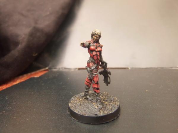
2014/11/10 17:39:20
Subject: Having problems with blending from dark to lighter similiar colors, help needed
|
|
Fixture of Dakka
|
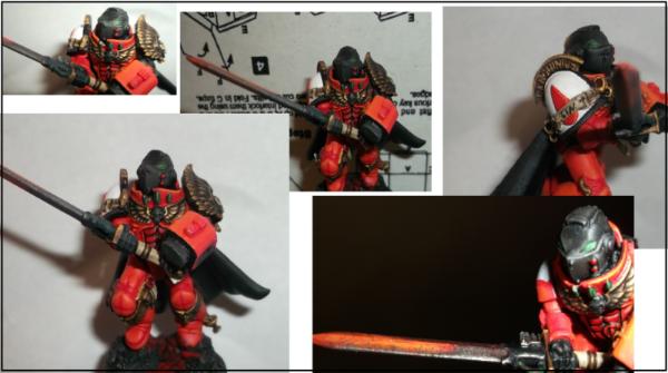
 Vermis wrote: Vermis wrote:AllSeeingSkink wrote:If I want to highlight red to be even brighter than the brightest red I have in my collection, I'll mix in a orangey flesh colour to lighten it. I think it used to be Dwarf Flesh in the old GW range, not sure what it is now
Possibly bestigor flesh, though it seems a bit more orangey than even dwarf flesh.
Orange is the correct color to highlight red, as mixing white yields pink, which is not desirable.
If you use the Citadel reds, there is a wonderful progression of tone-ups to choose from. Personally, mine for Blood Angels is:
- Mephiston Red (Base & main armor color)
- Evil Sunz Scarlet
- Wild Ryder Red
- Fire Dragon Bright (main edge highlight)
- Lugganth Orange (final highlight -- for corners)
The last two colors are very orange; Lugganth comes from the Edge paints selection. Because three red shades (Mephiston, Evil Sunz, Wild Ryder) are quite close, I soften (wet blend) all my edges by putting down a fat stripe of Evil sunz, blending it to Wild Ryder, and then blending back from Evil Sunz to Mephiston. Then, I highlight the edge with a thin stripe of Fire Dragon Bright, and finish the corners with Lugganth Orange.
This is an image I uploaded for another post, so ignore the green circles, but the helmet shot clearly shows all the different paints, while the knee shows a wet blend from mephiston to Evil sunz, to wild ryder.

|
|
This message was edited 1 time. Last update was at 2014/11/10 17:44:15
|
|
|
|
|
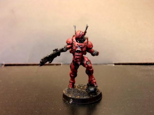
2014/11/12 03:18:04
Subject: Re:Having problems with blending from dark to lighter similiar colors, help needed
|
|
Fresh-Faced New User
|
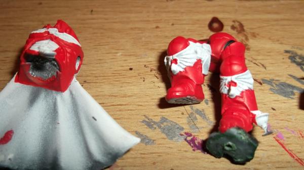
Talys wrote:The three techniques you want to look at are layering, feathering and wet-on-wet blending.
Layering may produce banding, which can be diffused with glazes or washes.
Feathering is softening the edges, diffusing one paint by adding water to the edge while one paint is wet.
Wet blending is blending 2 paints on the surface while both are still wet.
All three techniques can produce good-looking results.
Feathering do you draw the brush in any specefik way on the edges?. like left and right or up and down. couse i guess that you want the paint to spread out alittle from the edges and towards the middle were ever you paint or am i wrong?
and another question would be about Layering, i use citadel paints and when you say useing this technique i should be useing washes and glazes.. if i wanna use hawk turquies for exampel do i thin this one down until its like a Nulin Oil for exampel?. trowing some pictures up now. what am i doing wrong?. not to thinned down paints so it looks more like its painted rather then that its hes actuall color?
Automatically Appended Next Post:
http://imgur.com/bJMqQZi
http://imgur.com/Hxnrtjh
http://imgur.com/pMr3YZN
http://imgur.com/cL2GmEP
On the third picture i've made some questions mark and thats me showing what i would like to do next on these "Areas"
the arrows going to the number 1 i am thinking if you think it would be looking okay doing these to those Areas, ![]() http://fantasygames.com. pl/blog/turquoise-stone-tutorial/" border="0" />.
The Number 2 and 3 arrow and of course the icon in the middle with the square plate its on... would it distract to much going greens? or would blues be better since of the color going with the armor plate
and btw were the other arrow towards the leg is it going to work out being an armor part?
The thing in the middle of the back hes "Spine" lets call it that. i think it would look best with ye well to be honest Blighted Gold from p3 comes with the cryx color set since its a cold gold color but then my question is should i wash it down and then highlight the tops with drybrush but with what color then?
and the vents on hes stomach the same?
And you see those pipe things almost all the way down before going to hes feet should i paint em in some kinda rusty color or give it a dirty metallic look? how do i do that
My first real post with picture's to show on my first working progress 
so have patience on me 
|
|
This message was edited 4 times. Last update was at 2014/11/12 03:43:48
|
|
|
|
|
|
|