| Author |
Message |
 |
|
|
|
|
Advert
|
Forum adverts like this one are shown to any user who is not logged in. Join us by filling out a tiny 3 field form and you will get your own, free, dakka user account which gives a good range of benefits to you:
- No adverts like this in the forums anymore.
- Times and dates in your local timezone.
- Full tracking of what you have read so you can skip to your first unread post, easily see what has changed since you last logged in, and easily see what is new at a glance.
- Email notifications for threads you want to watch closely.
- Being a part of the oldest wargaming community on the net.
If you are already a member then feel free to login now. |
|
 |
2015/09/06 20:23:27
Subject: [13th Sept] Back into the hobby: A "Khorne-y" daemon log - AoS and 40k
|
|

Fresh-Faced New User
|
Hello Dakka!
I've decided to get back into the hobby (after a while out) and needed somewhere to start. With the release of AoS, I've decided for a multi-purpose Khorne daemon army - for AoS and 40k use. The aim of the blog is to keep me motivated to get these models (and any further purchases) fully painted and gamed with.
Therefore, my first stop was get down to my LGS and get modeled up. The following listed show the 'progress'
To do:
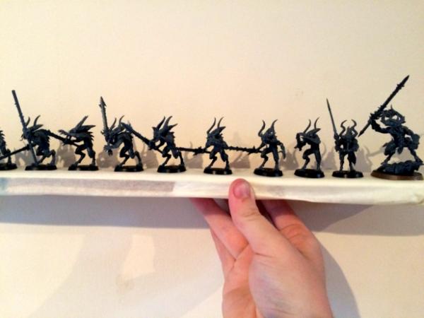
- 14 Bloodletters
- 1 Skull Cannon
WIP:
- 2 Bloodcrushers
- 1 Herald of Khorne
- 1 Demon Prince
- 2 Bloodletters
Completed:
- 1 Bloodcrusher
Automatically Appended Next Post:
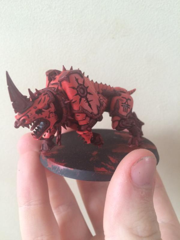
I decided the best place to start is with the cooler looking models - therefore it was only natural to begin with the Juggernauts.
A black base, follow with Mephiston and a Carroburg Crimson wash.
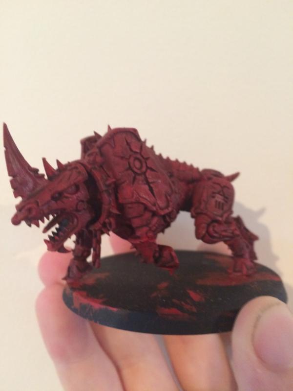
I then followed this with a Evil Sunz Scarlet.
I've also based a bunch of the 'letters and the Herald
I know its not much so far, but Rome wasn't built in a day. I should have more up tomorrow - including a start on the rider and demon prince himself.
Thanks for reading!
Automatically Appended Next Post:
Oh, and if anyone has any ideas on how to take better photos of the models or any other advice, feel free to post.
|
|
This message was edited 9 times. Last update was at 2015/09/13 21:02:13
E.P. |
|
|
 |
|
2015/09/07 06:45:45
Subject: Back into the hobby: A "Khorne-y" daemon log - AoS and 40k
|
|
Slaanesh Havoc with Blastmaster
|
http://www.dakkadakka.com/dakkaforum/posts/list/649242.page
I use a grey sheet and desk lamp. Not amazing but beats holding them.
|
|
This message was edited 1 time. Last update was at 2015/09/07 06:46:34
 black legion 2000pts black legion 2000pts
 Kabal of the shattered soul 1000pts Kabal of the shattered soul 1000pts
Empire WIP
https://www.facebook.com/ARGMcLeod?ref=hl. Check out my novel!
 |
|
|
|
|
2015/09/07 08:46:58
Subject: Re:Back into the hobby: A "Khorne-y" daemon log - AoS and 40k
|
|
Fresh-Faced New User
|
@Darkmoonlight - I'll have to try that with the next lot of photographs. Don't know if you have a preference, but do you prefer white LED lights or a standard bulb?
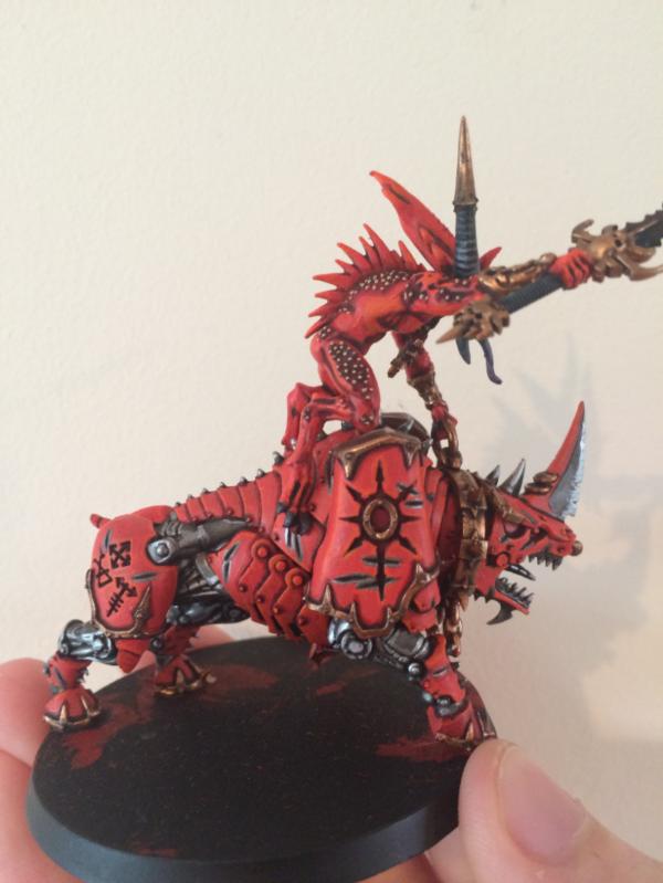
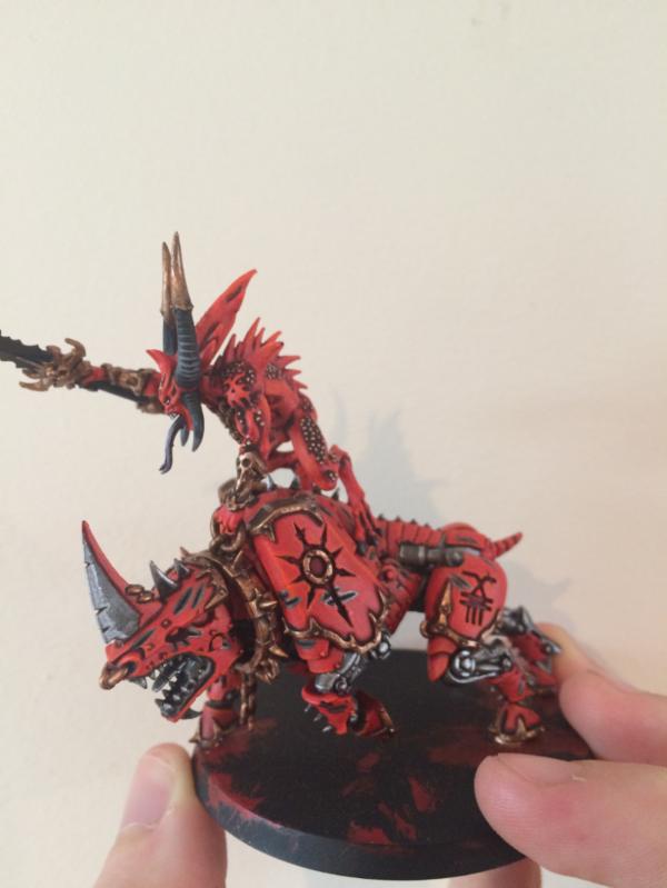
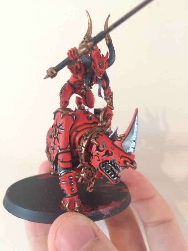
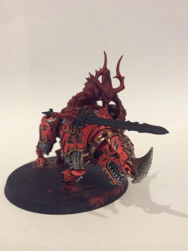
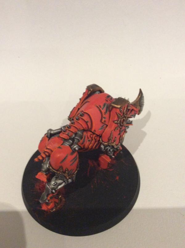
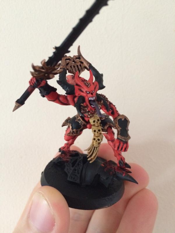
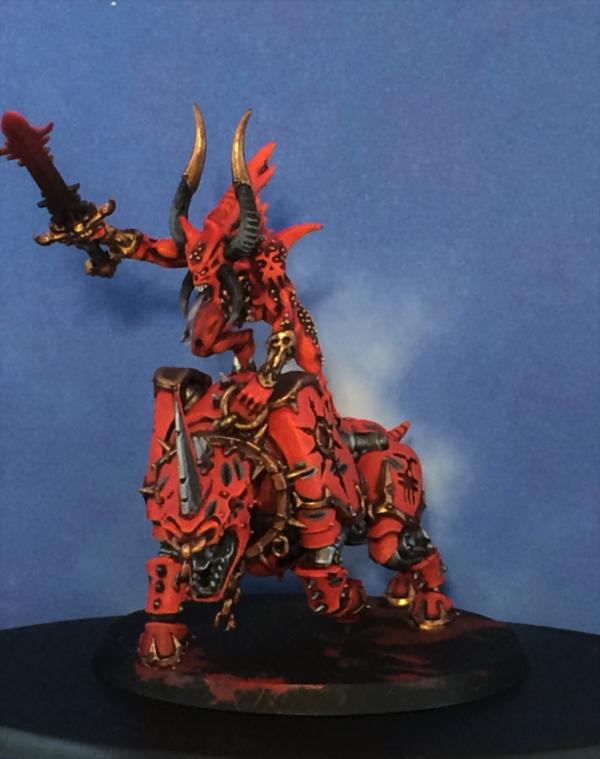
I've been busy, get the juggernaut and rider pretty much completed.
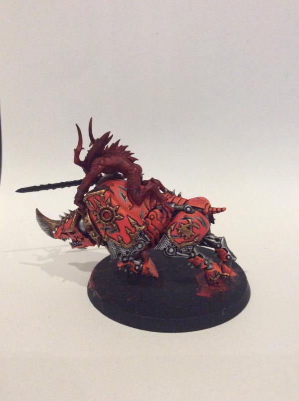
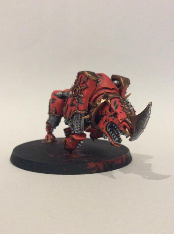
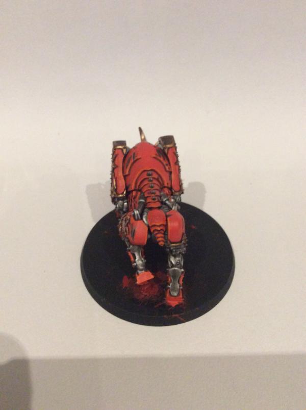
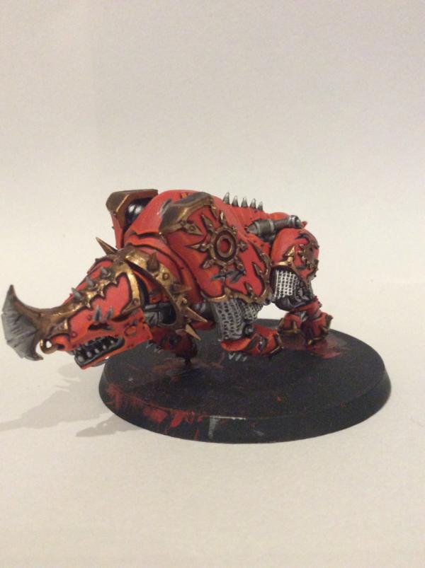
Wild Rider Red was applied next, followed by Troll Slayer Orange edge highlights (which don't seem to show up to well in these pictures). Hashnut Copper is applied to the trim.
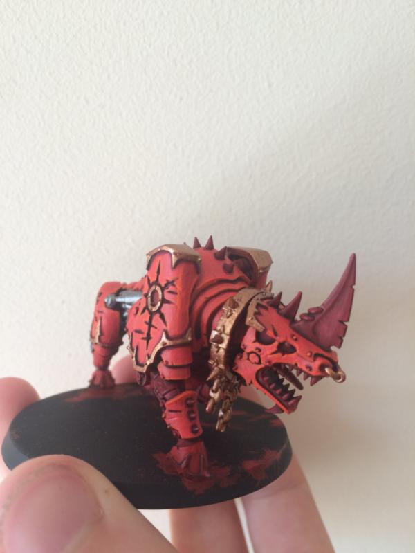
A Nuln Oil wash is applied to the Hashnut to darken it down, the re-highlighted with a further coat of Hashnut in selected areas. Leadbelcher is applied to the metallic regions, washed with Nuln Oil and then highlighted with Runefang Steel.
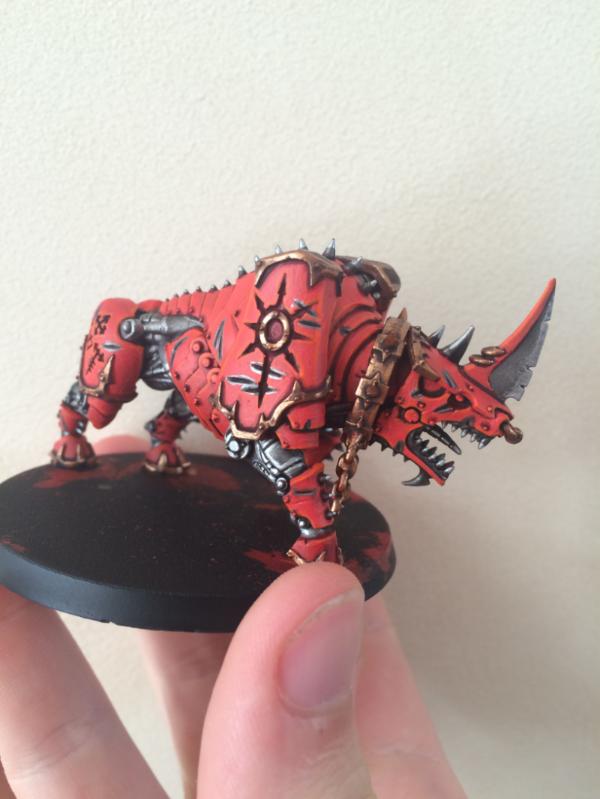
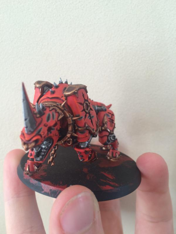
The 'letter was painted in pretty much the same way; using a range of reds and oranges to hopefully achieve lighter and darker areas.
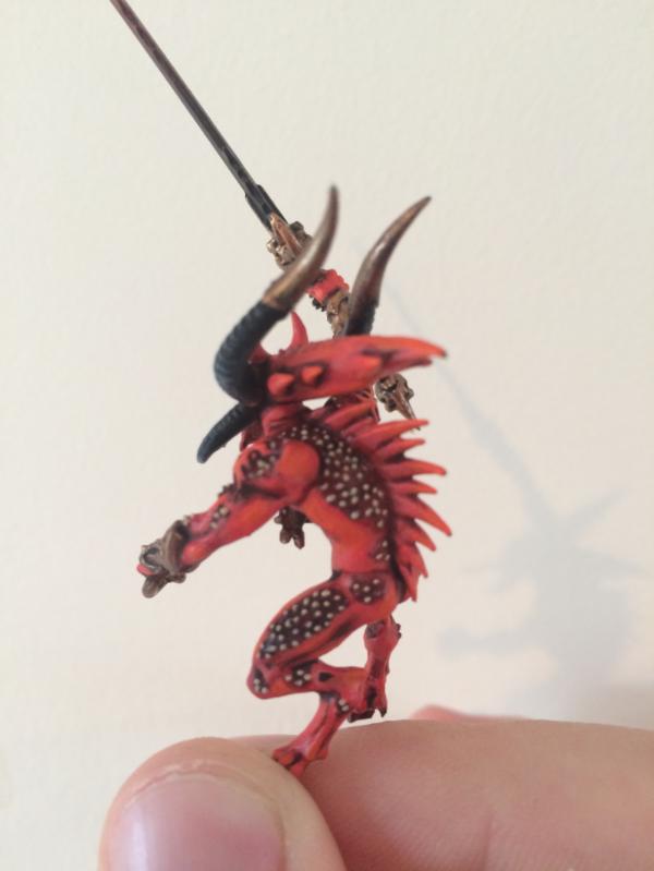
And the 'finished' piece (unless I want to make changes)
I'll hopefully get some better lighting to take some better pictures but I feel that they've come out well. I've also started on the Herald and the Prince, so I'm hoping to get some pictures up sooner rather than later.
However, I'm still undecided about the bases. Any idea on interesting ways to base a Khorne army? Or any tips on just doing effective/flat basing would be much appreciated.
Thanks for reading! Automatically Appended Next Post: Good news! Painting has started on the Prince!
I've also started to rig up a photographing areas of my workbench, so I should have some decent images soon.
|
|
This message was edited 1 time. Last update was at 2015/09/07 16:52:06
E.P. |
|
|
|
|
2015/09/07 22:40:11
Subject: Re:[7/9] Back into the hobby: A "Khorne-y" daemon log - AoS and 40k
|
|

Strategizing Grey Knight Chapter Master
|
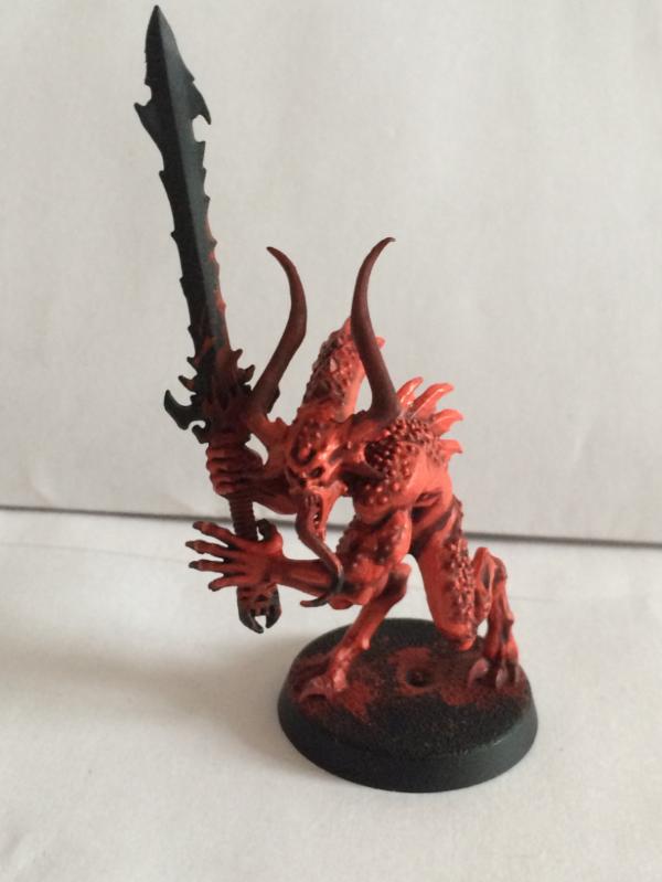
Awesome red on the bloodcrusher! it screams Khorne!
|
IceAngel wrote:I must say Knightley, I am very envious of your squiggle ability. I mean, if squiggles were a tactical squad, you'd be the sergeant. If squiggles were an HQ, you'd be the special character. If squiggles were a way of life, you'd be Doctor Phil...
The Cleanest Painting blog ever!
Gitsplitta wrote:I am but a pretender... you are... the father of all squiggles. .
|
|
|
|
|
2015/09/08 21:47:45
Subject: Re:[7/9] Back into the hobby: A "Khorne-y" daemon log - AoS and 40k
|
|
Fresh-Faced New User
|
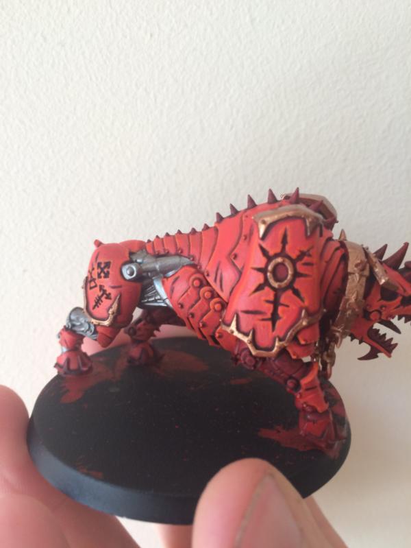
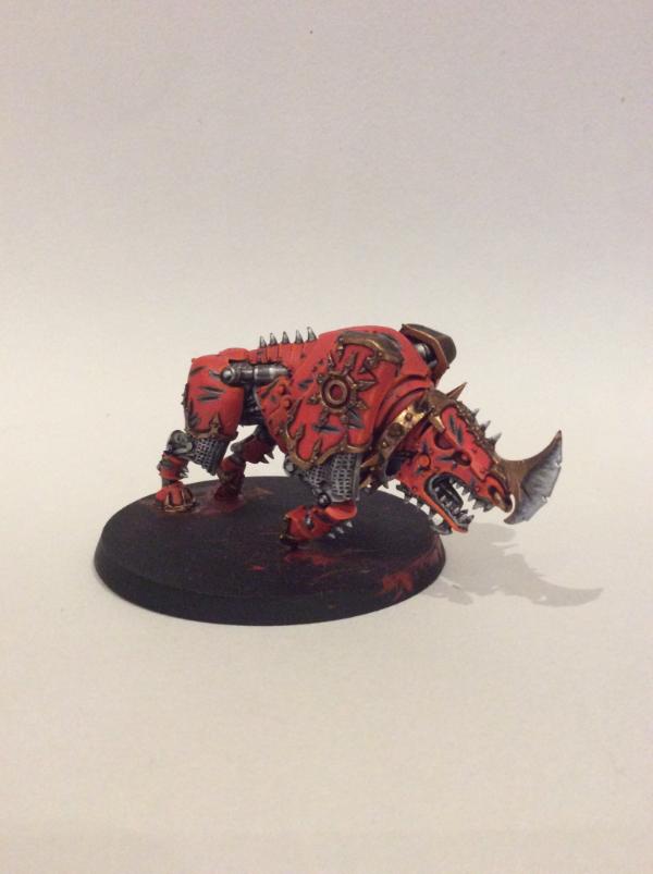
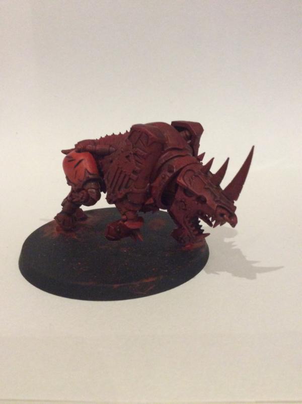
Thanks. That's the idea anyway - blood for the blood God and all that. However, I'm still undecided as to whether or not I should put 'ard coat onto the armour of the bloodcrusher to distinguish between the flesh of the 'letter and the armour plating. The only thing I'm worried about is the possibility of brush strokes. Here's a test and comparison:
Thoughts by yourself (and anyone else reading) are welcomed.
P.s. Knightley, I really enjoy your blog - look time lurker.
---------------------------------------------------------------------------------------------------------------------------------------------------------------------------------------
Now, back to the updates. Today I've been busy painting a house and models. I've managed to get another bloodcrusher completed (apart from the rider) and started the third one.
It's a shame about the picture quality, however I have an LED lamp on order to brighten it up and give better quality photographs. As well as completing a dedicated area on the desk for photographing.
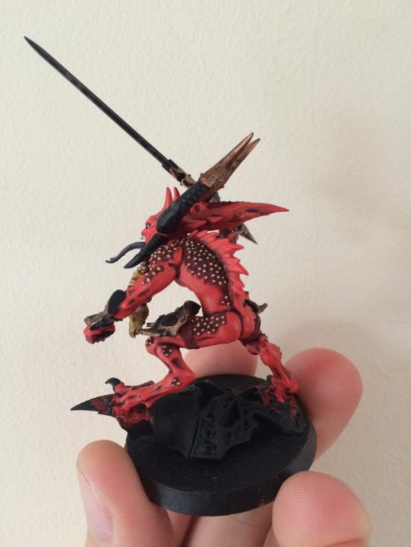
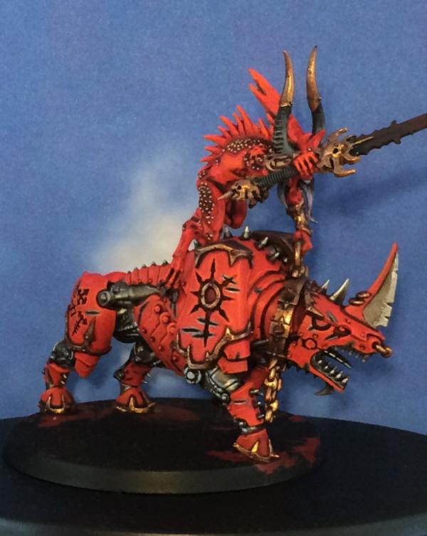
Bloodcrusher #3 - undercoated, based, washed and first coat going on.
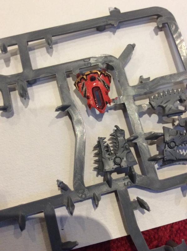
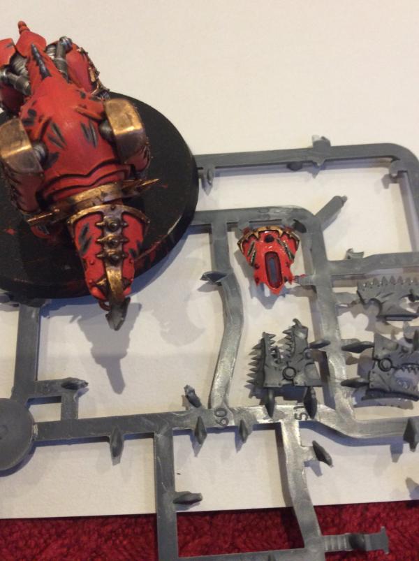
I also started some of the individual 'letters today, so I'll hopefully have something to report on them by the end of the week. And Prince has taken a slight backseat as I need to collect a few more colours for him - but the aim is to have him finished before the week is out also.
In regards to bases, I'm still unsure. I cannot decide on a good contrast to the models - or perhaps considering the use of clear bases. Has anyone had any experiences with these?
Expect the next update tomorrow. Happy painting everyone!
P.s sorry for big picture heavy, still deciding in how many pictures is 'enough'.
|
E.P. |
|
|
|
|
2015/09/09 04:23:35
Subject: Re:[9th Sept] Back into the hobby: A "Khorne-y" daemon log - AoS and 40k
|
|
Strategizing Grey Knight Chapter Master
|
No worries on the lurking, I'm trying to be better with posting more to blogs I like.
With a gloss varnish, you could run into a couple of issues in my opinion.
1. Brush strokes - You've already identified this, however there is a small range of aerosol varnishes and I personally have used the Matt spray varnish from Army painter (on the Ultramarines/Dark angels) and would rate this quite good, I'm sure there is a gloss option as well.
2. Clouding - Even with brushing on a varnish if the humidity or the varnish isn't thinned enough you run the risk of the varnish going cloudy and spoiling your excellent model.
Even with those concerns I would still vote going for the gloss, I like the 'Wet' look and makes the model look less normal (perfect for daemons)
|
IceAngel wrote:I must say Knightley, I am very envious of your squiggle ability. I mean, if squiggles were a tactical squad, you'd be the sergeant. If squiggles were an HQ, you'd be the special character. If squiggles were a way of life, you'd be Doctor Phil...
The Cleanest Painting blog ever!
Gitsplitta wrote:I am but a pretender... you are... the father of all squiggles. .
|
|
|
|
|
2015/09/09 17:01:45
Subject: Re:[9th Sept] Back into the hobby: A "Khorne-y" daemon log - AoS and 40k
|
|
Fresh-Faced New User
|
 Knightley wrote: Knightley wrote:No worries on the lurking, I'm trying to be better with posting more to blogs I like.
With a gloss varnish, you could run into a couple of issues in my opinion.
1. Brush strokes - You've already identified this, however there is a small range of aerosol varnishes and I personally have used the Matt spray varnish from Army painter (on the Ultramarines/Dark angels) and would rate this quite good, I'm sure there is a gloss option as well.
2. Clouding - Even with brushing on a varnish if the humidity or the varnish isn't thinned enough you run the risk of the varnish going cloudy and spoiling your excellent model.
Even with those concerns I would still vote going for the gloss, I like the 'Wet' look and makes the model look less normal (perfect for daemons)
I'm still really tempted to do so. However, I think I'll hold off on making any decisions until I've finished all 3 models (and their riders) so see what they look like as a unit.
Think I'll do some more research on possible products to use - including the one you've suggested.
---------------------------------------------------------------------------------------------------------------------------------------------------------------------------------------------------------------------------------------------------------------------------------
Today's update - small progress has been made on a range of things.
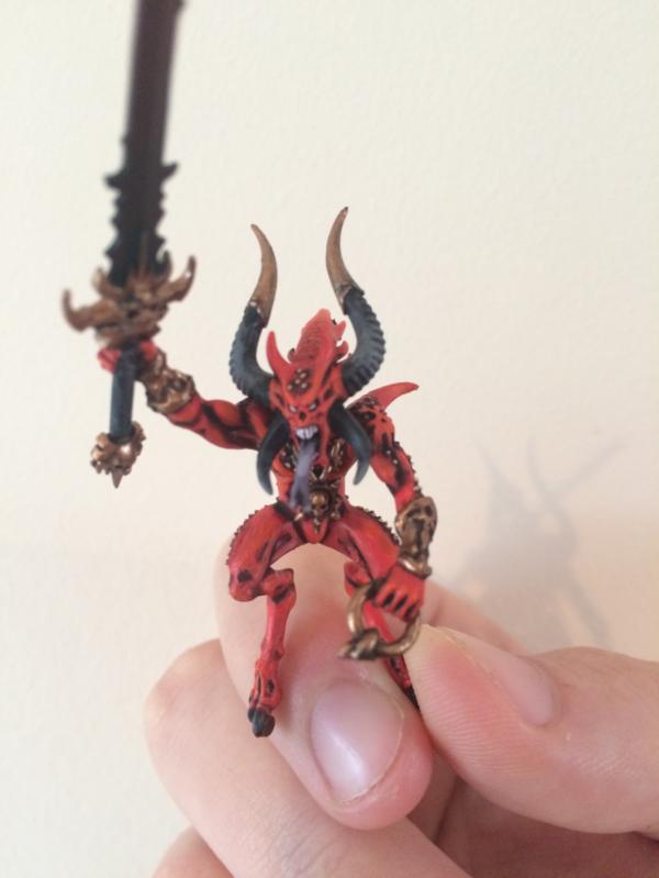
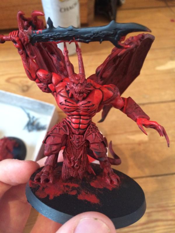
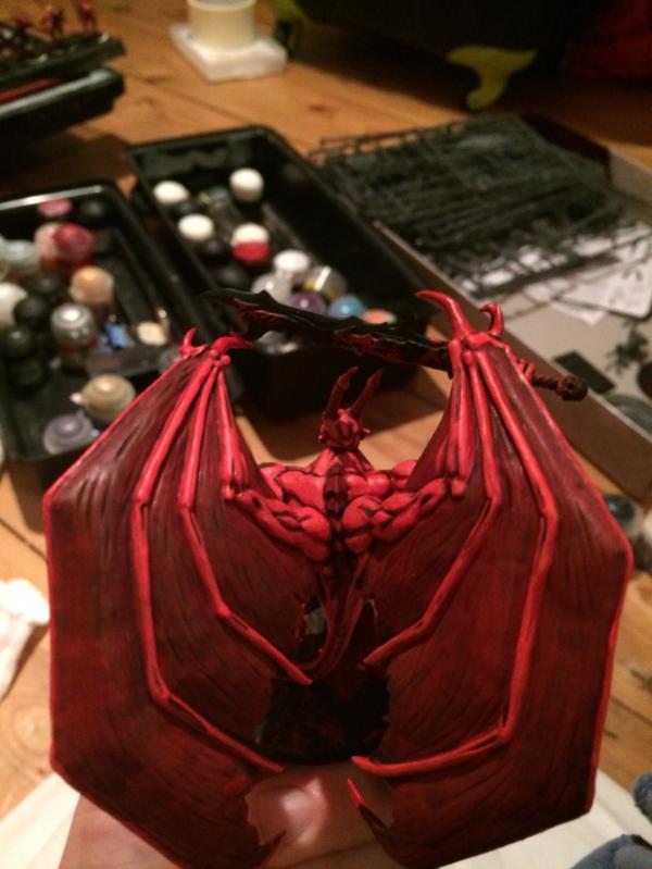
First off, Prince has now had him first two layers of red all over and is now awaiting other colours to be used and highlighting to be done.

Not sure how to do the wings; whether to apply a very light drybursh, washes or something else - never painting large wings before so ideas will be welcomed
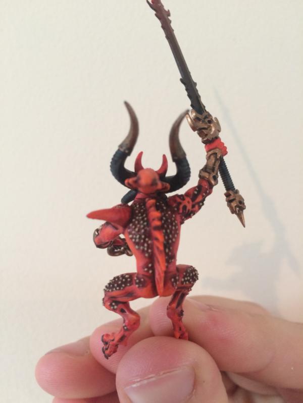
Progress on the Herald has also been made. He's now ready for highlighting and tidying up. I've also noticed a few areas where the paint needs to be more 'natural' and more rough edging - but it should look good once the top highlights are on.

Finally, I started a 'letter earlier. Only the reds have been done - with highlights and detail yet to go.
Still awaiting delivery of my lamp but once its here, I'll get some "decent" photographs posted. I'll also try and get a photograph of everything that needs doing and is done.
Thanks for reading!
P.s. Does anyone have a link to a thread that displaces a range of different base ideas? Thanks 
|
E.P. |
|
|
|
|
2015/09/11 15:48:41
Subject: Re:[9th Sept] Back into the hobby: A "Khorne-y" daemon log - AoS and 40k
|
|
Fresh-Faced New User
|
Good morning/afternoon/evening dakka!
Sorry for the silence yesterday, but the release of the Destiny 2.0 patch kept me somewhat busy. However, after finishing work early today, I was able to get a few bits and pieces completed.
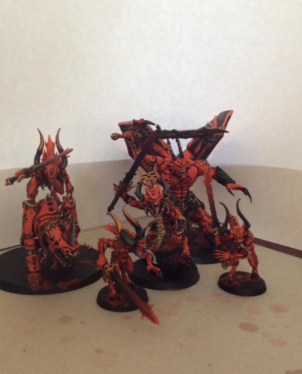
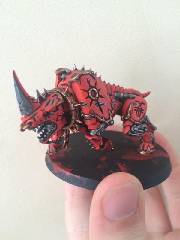
This is pretty much everything that is completed (apart the Prince needing a few more highlights). Sorry for such the poor photograph, but I'm still waiting on the lamp. Hopefully it'll be here later today - then I'll get some better snaps of what has been completed. Although you can't see much, what the first impressions?
In regards to the bases, I'm tempted to go with using Martain Ironearth to get some definition on the base. Then I'll either go for a wasteland look, or go for a hell look with dark bases and the cracks filled to make it look like lava pouring out. I'll have to get a few test bases on the go and then see what you guys think.
Sorry for such the short update, but I've got a full packed evening later. I'll try and get something more substantial to show tomorrow.
On another note, does anyone know of any decent freeware for photo-editing so that I can touch up the white and colour balance on photographs (or perhaps a link to a tutorial).
Thanks for reading!
|
E.P. |
|
|
|
|
2015/09/11 18:10:23
Subject: [11th Sept] Back into the hobby: A "Khorne-y" daemon log - AoS and 40k
|
|

Potent Possessed Daemonvessel
|
Woaw, those are brilliantly painted, Blood for the blood god !
Regarding photo editing, have a try at Gimp, it is the free and open source alternative to photoshop, and is decently documented online.
I will be following this blog, keep up the blood work !
|
|
|
|
|
|
2015/09/13 21:01:56
Subject: [11th Sept] Back into the hobby: A "Khorne-y" daemon log - AoS and 40k
|
|
Fresh-Faced New User
|
 KernelTerror wrote: KernelTerror wrote:Woaw, those are brilliantly painted, Blood for the blood god !
Regarding photo editing, have a try at Gimp, it is the free and open source alternative to photoshop, and is decently documented online.
I will be following this blog, keep up the blood work !
Thank you. I'll have to try playing about with 'Gimp'. Until then, I'll have to make do with standard photographs.
---------------------------------------------------------------------------------------------------------------------------------------------------------------------------------------------------------------------------------------------------------------------------------
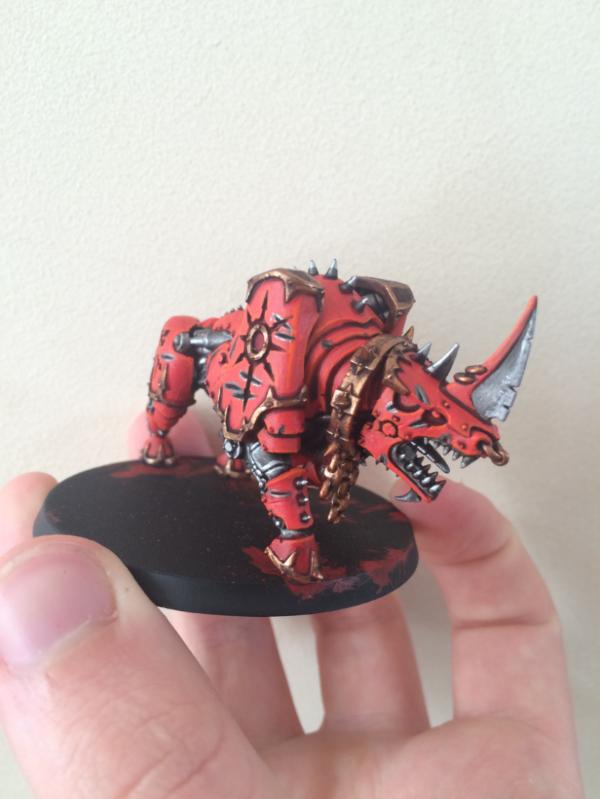
Apologies for not getting an update out this weekend, but I found myself so busy that modelling had to take a back seat. Although, I've continued work on the third bloodcrusher - but not enough to warrant putting up a photograph. However, I did manage to get my photograph-box made up (apart from a block to place the models on) and the lamp in place so started to take a few photographs of completed models. They're still a bit grainy, off-colour and low-resolution here and there but I think once I still using 'Gimp' to get the colour balance right, it should improve them (or perhaps look into getting a proper camera). Anyway, here they are:
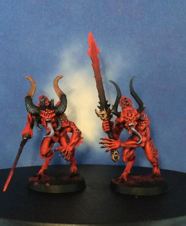
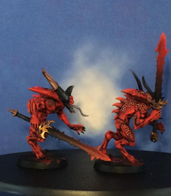
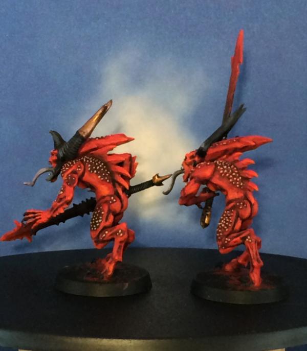
On a side note:
That's all I've got to show on this update. However, tomorrow should bring a fruitful update - in terms of the bloodcrushers.
Thanks for reading!
|
|
This message was edited 1 time. Last update was at 2015/09/13 21:22:21
E.P. |
|
|
|
|
|
|