| Author |
Message |
 |
|
|
|
|
Advert
|
Forum adverts like this one are shown to any user who is not logged in. Join us by filling out a tiny 3 field form and you will get your own, free, dakka user account which gives a good range of benefits to you:
- No adverts like this in the forums anymore.
- Times and dates in your local timezone.
- Full tracking of what you have read so you can skip to your first unread post, easily see what has changed since you last logged in, and easily see what is new at a glance.
- Email notifications for threads you want to watch closely.
- Being a part of the oldest wargaming community on the net.
If you are already a member then feel free to login now. |
|
 |
2017/01/25 22:35:05
Subject: Please Critique my SM Rhino + Ideas appreciated (fists successors)
|
|

Storm Trooper with Maglight
|
Hey guys
i was wondering if you all had any tips and tricks to help me get my rhino to the next level.
As it stands i think the scheme is striking but lacks something?


Below you can see i've attempted a freehand fists icon, (my homebrew are fists successors) but it doesn't contrast well with the yellow, any ideas on how to make it pop more?
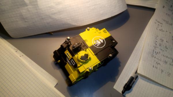
Also i'm aware the colours are very flat? how can i acheive a highlight on a large flat surface with very little edges to edge highlight on?
cheers dakka
|
|
|
|
 |
|
2017/01/25 22:52:04
Subject: Please Critique my SM Rhino + Ideas appreciated (fists successors)
|
|

Powerful Phoenix Lord
|
The yellow looks like it could use a wash...it's extremely bright. Maybe some light scrapes/damage? I find the more cheddar-orangey yellows work better alongside black.
|
|
|
|
|
2017/01/25 22:55:11
Subject: Please Critique my SM Rhino + Ideas appreciated (fists successors)
|
|

Fresh-Faced New User
|
Hi STG,
Your colour scheme is very striking and would look very impressive across a whole army!
In terms of creating contrast, this can be achieved both ways - that is, through highlighting and by creating shadows. The easiest way to do this on large surfaces like tanks is by using an airbrush. Another great option is glazing, which uses lots of thin layers of paint to create a smooth blend. Check out Kujo's tutorial about 'fat glazing', which he describes as being inbetween glazing and highlighting. He even does yellow in his tutorial! http://www.dakkadakka.com/dakkaforum/posts/list/713704.page
|
|
|
|
|
2017/01/25 23:00:00
Subject: Re:Please Critique my SM Rhino + Ideas appreciated (fists successors)
|
|

Fresh-Faced New User
|
Well not much to critique, you're a better painter then I 
Seriously though, it looks like it's fresh out of the factory, not that that's a bad thing, but you would be amazed at how fast stuff gets dirty, even with light use.
I would recommend a bit of weathering, even just a very light wash, I've found it makes things look nice and used. Not sure what would make your freehand emblem pop out more, haven't had much experience with freehand painting (I usually just make decals on my home printer  )
For the best weathering advice, look into diorama and model railroad techniques - it's smaller scale than 40k and thus more delicate, allowing for subtlety.
Overall I'm curious where you go with this, love your colour scheme, and as the owner of a homebrew imperial fists successor chapter, might have to borrow the scheme for a relic type vehicle (something old, epic and dating from the horus heresy) it really reminds me of the old 30k imperial fists legion colours...
|
|
|
|
|
2017/01/25 23:10:48
Subject: Please Critique my SM Rhino + Ideas appreciated (fists successors)
|
|
Storm Trooper with Maglight
|
PiPaPo wrote:Hi STG,
Your colour scheme is very striking and would look very impressive across a whole army!
In terms of creating contrast, this can be achieved both ways - that is, through highlighting and by creating shadows. The easiest way to do this on large surfaces like tanks is by using an airbrush. Another great option is glazing, which uses lots of thin layers of paint to create a smooth blend. Check out Kujo's tutorial about 'fat glazing', which he describes as being inbetween glazing and highlighting. He even does yellow in his tutorial! http://www.dakkadakka.com/dakkaforum/posts/list/713704.page
Cheers dude, that links very helpful, sadly i dont have an airbrush though.
Elbows wrote:The yellow looks like it could use a wash...it's extremely bright. Maybe some light scrapes/damage? I find the more cheddar-orangey yellows work better alongside black.
It certainly is bright, i think i will tone it down in areas, not too big of a fan of the cheddar-ish yellow though. I agree that weathering is needed,noted. cheers!
hotshot wrote:Well not much to critique, you're a better painter then I
Seriously though, it looks like it's fresh out of the factory, not that that's a bad thing, but you would be amazed at how fast stuff gets dirty, even with light use.
I would recommend a bit of weathering, even just a very light wash, I've found it makes things look nice and used. Not sure what would make your freehand emblem pop out more, haven't had much experience with freehand painting (I usually just make decals on my home printer )
For the best weathering advice, look into diorama and model railroad techniques - it's smaller scale than 40k and thus more delicate, allowing for subtlety.
Overall I'm curious where you go with this, love your colour scheme, and as the owner of a homebrew imperial fists successor chapter, might have to borrow the scheme for a relic type vehicle (something old, epic and dating from the horus heresy) it really reminds me of the old 30k imperial fists legion colours...
`Thanks for the kind words, will look into weathering. I will be doing a small kill team of marines with this scheme, will keep you posted.
|
|
|
|
|
|
2017/01/25 23:17:45
Subject: Please Critique my SM Rhino + Ideas appreciated (fists successors)
|
|
Leader of the Sept
|
Good solid consistent colours and crisp lines between. Looks goos so far. I think the black could do with some highlights at leadt. Maybe some grey edge highlights, stepped up to white on a few prominent corners? Ive always found Marine vehicles to be tremendously forgiving on hard edge highlighrs.
|
Please excuse any spelling errors. I use a tablet frequently and software keyboards are a pain!
 Terranwing - w3;d1;l1 Terranwing - w3;d1;l1
 51st Dunedinw2;d0;l0 51st Dunedinw2;d0;l0
 Cadre Coronal Afterglow w1;d0;l0 Cadre Coronal Afterglow w1;d0;l0 |
|
|
|
|
2017/01/25 23:40:34
Subject: Please Critique my SM Rhino + Ideas appreciated (fists successors)
|
|

Veteran Knight Baron in a Crusader
|
The black could do with a grey edge highlight, and the yellow needs a shade, but that's all been said before.
About your white Fist icon, you could try painting the part that's on the yellow black so it contrasts, but then it may look strange. Perhaps use a company colour (e.g. red for the third company or green for the fourth).
|
3000pts Blood Angels (4th Company) - 2000pts Skitarii (Voss Prime) - 2500pts Imperial Knights (Unnamed House) - 1000pts Imperial Guard (Household Retainers)
2000pts Free Peoples (Edlynd Fusiliers) - 2000pts Kharadron Overlords (Barak Zilfin) - 500pts Ironweld Arsenal (Edlynd Ironwork Federation) - 1000pts Duardin (Grongrok Powderheads)
Wargaming's no fun when you have a plan! |
|
|
|
|
2017/01/26 01:59:38
Subject: Re:Please Critique my SM Rhino + Ideas appreciated (fists successors)
|
|
Posts with Authority
|
Very neat, accurate painting, to begin with. 
Agreed that an orange-brown shade in the yellow would add a bit of depth of colour, moreso than other shades, maybe. With that vetoed, perhaps think about accent colours. I'm not sure the white is cutting it, unless you applied it to more features or areas. Maybe another colour alongside, something that'd stand out but wouldn't clash with the yellow too strongly - a bit of red, dark green or dark blue in a few small places?
On the matter of the contrast of the fists icon, I'd agree with TheMan: give it a solid background of black. I don't think the overlap will matter too much if it's part of the icon, not the quartering!
On that note, I feel the reversed half-colours on the view slits and cupola might be muddying the simplicity and boldness of the quartered colour scheme; making it look a little less heraldry, a little more motley. It's something I've obsessed about with a split colour scheme, so on that note, it is just a bit of a personal thing.
|
|
This message was edited 3 times. Last update was at 2017/01/26 03:35:44
|
|
|
|
|
2017/01/26 17:25:48
Subject: Re:Please Critique my SM Rhino + Ideas appreciated (fists successors)
|
|
Storm Trooper with Maglight
|
 Vermis wrote: Vermis wrote:Very neat, accurate painting, to begin with.
Agreed that an orange-brown shade in the yellow would add a bit of depth of colour, moreso than other shades, maybe. With that vetoed, perhaps think about accent colours. I'm not sure the white is cutting it, unless you applied it to more features or areas. Maybe another colour alongside, something that'd stand out but wouldn't clash with the yellow too strongly - a bit of red, dark green or dark blue in a few small places?
On the matter of the contrast of the fists icon, I'd agree with TheMan: give it a solid background of black. I don't think the overlap will matter too much if it's part of the icon, not the quartering!
On that note, I feel the reversed half-colours on the view slits and cupola might be muddying the simplicity and boldness of the quartered colour scheme; making it look a little less heraldry, a little more motley. It's something I've obsessed about with a split colour scheme, so on that note, it is just a bit of a personal thing.
Thanks man, i didnt realise that you meant an orange brown for a shade, i thought that was a 'change the colour' statement. i do agree now, that sort of colour in the recesses would help.
i could try red as an accent colour, and i do agree that the reversed colours on the view slots looks a bit off
|
|
|
|
|
|
2017/01/26 18:05:10
Subject: Please Critique my SM Rhino + Ideas appreciated (fists successors)
|
|
Fireknife Shas'el
|
Highlighting (whole model) and painting the headlights the same way would be my suggestion
|
|
|
|
|
|
2017/01/26 18:55:18
Subject: Re:Please Critique my SM Rhino + Ideas appreciated (fists successors)
|
|
Irked Necron Immortal
|
Only suggestion that has been said before on the icon is to highlight in black.
Maybe Black for the yellow bits and white for the black bits?

|
|
This message was edited 1 time. Last update was at 2017/01/26 18:55:51
|
|
|
|
|
2017/01/26 19:15:53
Subject: Re:Please Critique my SM Rhino + Ideas appreciated (fists successors)
|
|
Ancient Venerable Black Templar Dreadnought
|
I think the single best change to be made is the black.
You made it a full light sucking matt black.
Try and "Payne's Grey" (in artist colour terms) which is some black with some blue in it.
If you wish to shade, you have nowhere to go.
I would suggest looking at the colour wheel.
Make the black with a "hint" of purple/violet (complimentary colour to yellow).
Use a very dark red to edge highlight and blue shade (Drakenhof) for the crevasses.
For yellow, add a about 2 parts white to one part yellow for edge highlight, I am undecided between the Fuegan Orange or Casandora Yellow for the shade.
|
A revolution is an idea which has found its bayonets.
Napoleon Bonaparte |
|
|
|
|
2017/01/26 21:31:47
Subject: Please Critique my SM Rhino + Ideas appreciated (fists successors)
|
|
Storm Trooper with Maglight
|
`Very helpful tips, i will post it up once its done! thanks all!
|
|
|
|
|
|
|
|