Switch Theme:

Deathwatch Watch Master  [RSS] Share on facebook Share on Twitter Submit to Reddit
»
Author Message
Advert


Forum adverts like this one are shown to any user who is not logged in. Join us by filling out a tiny 3 field form and you will get your own, free, dakka user account which gives a good range of benefits to you:
  • No adverts like this in the forums anymore.
  • Times and dates in your local timezone.
  • Full tracking of what you have read so you can skip to your first unread post, easily see what has changed since you last logged in, and easily see what is new at a glance.
  • Email notifications for threads you want to watch closely.
  • Being a part of the oldest wargaming community on the net.
If you are already a member then feel free to login now.


Made in gb
Is 'Eavy Metal Calling?


UK

Painted this guy up for the Space Marine round of the unofficial painting challenge. It's a lovely model that I've had my eye on for some time, the static and measured pose really stands out among GW's SM character sculpts. Great fun to paint up.


Any thoughts, comments and gallery votes are very much appreciated. Thanks for looking!


Made in us
Homicidal Veteran Blood Angel Assault Marine


Very clean painting, but the model looks flat. I don't see a big difference between the armor color(it looks gray in the pictures) and the silver, and in general the colors are all very close together so details get lost.

4500
 
   
Made in us
Sinewy Scourge


Boulder, Colorado

As per usual, your painting is quite controversial, which is a good thing I think.

Personally I am a fan, I think you are one of the best painters out there when it comes to weathered and realistic models.


Made in ca
Ancient Venerable Black Templar Dreadnought


Canada

I honestly think the picture taken is low on colour saturation.
I any case: the painting is very neat and detailed.
I like how the DW left arm is such a contrast to the backpack.
The "spear" is very subdued looking, many would have had a bit more glow to it.
The face really draws the eye, it seems to have a greater splash of colour than the red bolter housing.
I am utterly unsure why this is but I REALLY like that trim on the cape being that grey: it just looks right.

I have this model and am getting up the nerve to give it a go.
My problem is points-wise I am unsure I can justify fielding the guy.
You got a hint of the Blanche painting method for looking old and worn without all the insane variations of brown.

A revolution is an idea which has found its bayonets.
Napoleon Bonaparte 
   
Made in nz
Been Around the Block


Have you got a picture without the photo filter or post effects? Looks really low in saturation and I want to see those vibrant reds!
   
Made in us
Rampaging Carnifex


South Florida

Fantastic job, Paradigm! Your work is always so moody - perfect for the grim dark!

   
Made in gb
Is 'Eavy Metal Calling?


UK

Thanks all.

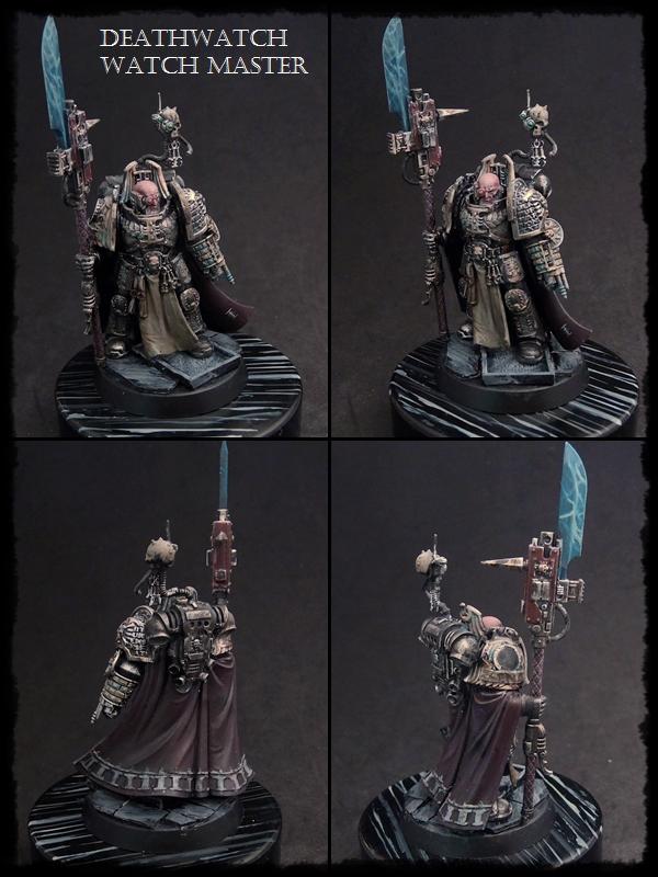
As usual, it seems my style is a bit like Marmite!* Honestly, though, the saturation levels are pretty accurate to the mini in my hand, the spear haft and bolter casing are very 'grey' reds. This was a deliberate choice to keep the emphasis on the face and chestplate, by flanking it with more subdued colours in the red weapon haft and purple and grey cloak. With such a static model, the face really has to be the focal point, and I think I've actually managed that quite nicely here.

I'll definitely concede Talizvar's point about the spear blade being a bit too muted, I definitely wanted to take that brighter but I'm still experimenting with this style of power weapon (as opposed to ones with alternating bright and dark bands, or just very sharply highlighted edges) so as I get more experienced with the method I'll almost certainly go back and sharpen that up a bit.


*By which I mean you either love it or hate it, not that it's god's gift to the cheese sandwich.


Forum Index » Painting & Modeling Showcase
Go to: