| Author |
Message |
 |
|
|
|
|
Advert
|
Forum adverts like this one are shown to any user who is not logged in. Join us by filling out a tiny 3 field form and you will get your own, free, dakka user account which gives a good range of benefits to you:
- No adverts like this in the forums anymore.
- Times and dates in your local timezone.
- Full tracking of what you have read so you can skip to your first unread post, easily see what has changed since you last logged in, and easily see what is new at a glance.
- Email notifications for threads you want to watch closely.
- Being a part of the oldest wargaming community on the net.
If you are already a member then feel free to login now. |
|
 |
2017/06/02 10:20:23
Subject: Painting [SM] – need opinion on color scheme
|
|

Adolescent Youth with Potential
|
I was thinking on my own color scheme for Space Marines.
I like desert color so it’s main.
As a complementary color I took purple. Going to use it on shoulder pads and some equipment like fists different accessories and banners.
This what it looks like:


What do you think?
The bolter’s and base’s color is a filler, ignore it. ))
|
|
|
 |
|
2017/06/02 11:10:19
Subject: Painting [SM] – need opinion on color scheme
|
|

The Marine Standing Behind Marneus Calgar
|
First, welcome to Dakka.
I might have gone with a richer, deeper purple. You have a light, pale beige, and a light, pale lavender. So your “accent” color seems to blend in with the base, rather then pop out.
At least in my eye. Color selection is a very subjective thing.
|
|
|
|
|
|
2017/06/02 12:29:10
Subject: Re:Painting [SM] – need opinion on color scheme
|
|
Adolescent Youth with Potential
|
Thanks! Know this site for like decade, just have no posts here. ) 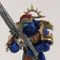 Nevelon wrote: Nevelon wrote:I might have gone with a richer, deeper purple. You have a light, pale beige, and a light, pale lavender. So your “accent” color seems to blend in with the base, rather then pop out. ...
Some thing like that? 
|
|
This message was edited 1 time. Last update was at 2017/06/02 12:29:31
|
|
|
|
|
2017/06/02 13:08:19
Subject: Painting [SM] – need opinion on color scheme
|
|

Sneaky Kommando
|
Are you painting over the top of another scheme, the paint seems very thick.
I prefer the pastal colour its goes with the sandy colour better.
|
|
|
|
|
|
2017/06/02 18:34:36
Subject: Re:Painting [SM] – need opinion on color scheme
|
|
Legendary Master of the Chapter
|
Its very pastel if that is what you are going for then you got it. But personally id rather do a color next to the base color like red/orange or green for the shoulders, and use the complimentary color purple on the lenses and power weapon type things.
|
|
This message was edited 2 times. Last update was at 2017/06/02 18:35:26
 Unit1126PLL wrote: Unit1126PLL wrote: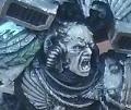 Scott-S6 wrote: Scott-S6 wrote:And yet another thread is hijacked for Unit to ask for the same advice, receive the same answers and make the same excuses.
Oh my god I'm becoming martel.
Send help!
|
|
|
|
|
2017/06/02 20:58:21
Subject: Painting [SM] – need opinion on color scheme
|
|
Adolescent Youth with Potential
|
Megaknob wrote:Are you painting over the top of another scheme, the paint seems very thick.
I am. I quickly just sketch a couple to see the result
Desubot wrote:
Its very pastel
...
But personally id rather do a color next to the base color like red/orange or green for the shoulders, and use the complimentary color purple on the lenses and power weapon type things.

First I tried just sand and it looked kind of sad for a space marine.

I used “Color Calculator” and it said: use purple.
A lighter Genesteler Purple or darker Xereus Purple.
I see you guys also no sure about these scheme. May be I should try something different.
|
|
|
|
|
2017/06/04 03:48:59
Subject: Painting [SM] – need opinion on color scheme
|
|
Utilizing Careful Highlighting
|
I think the problem is that your shades aren't dark enough. That guy at the end's power fist looks good, but the armor isn't defined enough and looks muddy in comparison. Try a darker wash in the crevices, like a brown or even black.
A very easy way to do it would be to prime the whole model white, then give it a good wash like agrax earthshade, and then do your base coat over that while not hitting the crevices. Everything will pop a lot more.
|
|
|
|
|
2017/06/10 16:14:00
Subject: Re:Painting [SM] – need opinion on color scheme
|
|
Adolescent Youth with Potential
|
According to your advice, I decided to make some changes.
To make it less pastel and more sharp I moved to extreme highlights instead of dry brushing. I also dropped the Idea of making purple shoulder pads on all of them and use purple only on standout things. Like banners, some weapons etc.
What do you thing, is it better that way?


|
|
|
|
|
2017/06/10 18:20:41
Subject: Painting [SM] – need opinion on color scheme
|
|

Bounding Assault Marine
|
I feel like purple doesn't compliment the desert scheme too much and the guys without the purple look better imo. If it were me, I'd do the sandy colour and black as a secondary colour. Just a tiny bit of black here and there and on the trim of the shoulder pads would suit this colour scheme well i think.
|
|
|
|
|
2017/06/10 18:30:05
Subject: Painting [SM] – need opinion on color scheme
|
|
Powerful Phoenix Lord
|
I'll agree with most of the folks here - a darker/deeper purple would set it off better, but it's your scheme. If you like it, roll with it.
|
|
|
|
|
|
|
 Ultramarines, 3rd Co. and friends, 16k+
  4k
4k  4k Points
 Competition Index