| Poll |
 |
| Which Entries Are Your Favourites? |
| Nevelon |

|
1% |
[ 5 ] |
| u971 |
|
1% |
[ 3 ] |
| TheDraconicLord |
|
0% |
[ 2 ] |
| ZergSmasher |
|
4% |
[ 16 ] |
| Appolinaire |
|
2% |
[ 8 ] |
| Whitllesey40k |
|
1% |
[ 4 ] |
| CREEEEEEEED |
|
7% |
[ 30 ] |
| Straken619 |
|
7% |
[ 29 ] |
| Drummernathan |
|
1% |
[ 3 ] |
| NinjaPirate |
|
1% |
[ 5 ] |
| GulGog Tuftoof |
|
2% |
[ 7 ] |
| Moolet |
|
7% |
[ 29 ] |
| Power Elephant |
|
2% |
[ 7 ] |
| AUGmaniac |
|
0% |
[ 2 ] |
| Modock |
|
12% |
[ 53 ] |
| feltmonkey |
|
8% |
[ 34 ] |
| ChaosDad |
|
3% |
[ 15 ] |
| Jetpack_Octopus |
|
3% |
[ 13 ] |
| Guildenstern |
|
2% |
[ 8 ] |
| n1ceguypaul |
|
10% |
[ 42 ] |
| ZoBo |
|
1% |
[ 5 ] |
| Elbows |
|
1% |
[ 5 ] |
| Midget Gems |
|
8% |
[ 36 ] |
| Chris56 |
|
6% |
[ 28 ] |
| PossumCraft |
|
5% |
[ 22 ] |
| Vejut |
|
1% |
[ 3 ] |
| Paradigm |
|
4% |
[ 16 ] |
| keezus |
|
2% |
[ 11 ] |
| Total Votes : 441 |
|
|
| Author |
Message |
|
|
|
|
|
Advert
|
Forum adverts like this one are shown to any user who is not logged in. Join us by filling out a tiny 3 field form and you will get your own, free, dakka user account which gives a good range of benefits to you:
- No adverts like this in the forums anymore.
- Times and dates in your local timezone.
- Full tracking of what you have read so you can skip to your first unread post, easily see what has changed since you last logged in, and easily see what is new at a glance.
- Email notifications for threads you want to watch closely.
- Being a part of the oldest wargaming community on the net.
If you are already a member then feel free to login now. |
|
|
2018/01/02 15:29:14
Subject: VOTE For the winner of the Unofficial Painting Challenge Round 34: Open Round
|
|

Is 'Eavy Metal Calling?
|
Happy New Year, all! Let's belatedly ring it in by picking a winner from this fantastic set of entries into December's Open Round. As usual, please cast as many votes as you like and for any reason you feel deserves recognition, whether that's paintjob, conversion work, effort, a cool technique or neat concept, anything that catches your eye. Please also feel free to leave some feedback for the entrants you picked either here or on their gallery/blog pages, it's always appreciate!
The entrants:
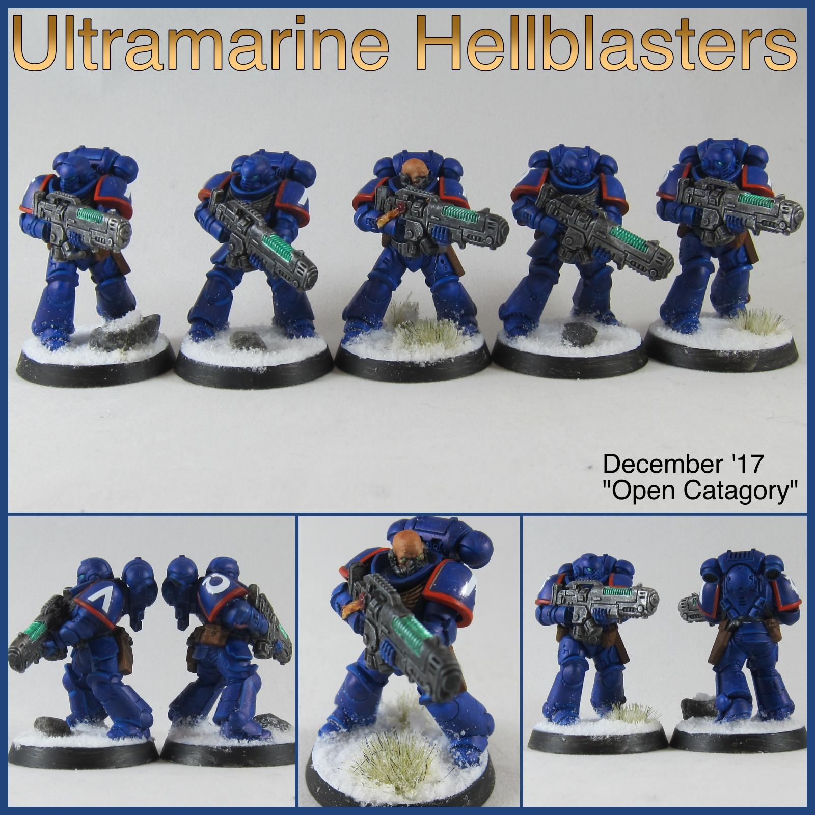
Nevelon: Ultramarine Hellblasters
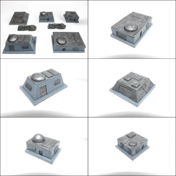
u971: Urban Terrain
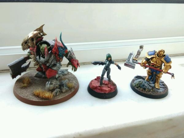
TheDraconicLord: Assorted Characters
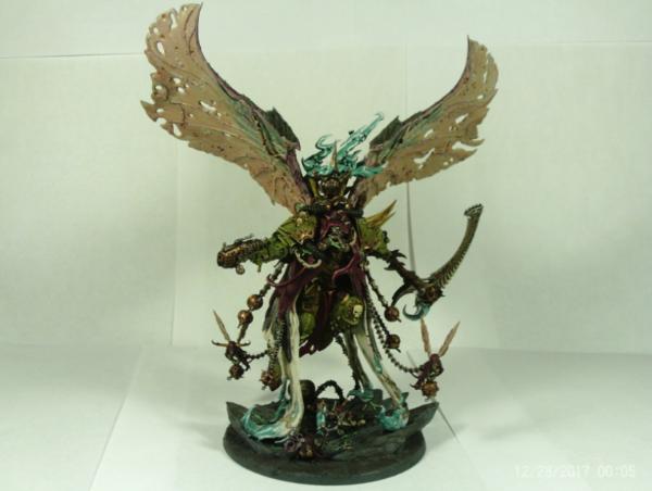
ZergSmasher: Mortarion, Primarch of the Death Guard
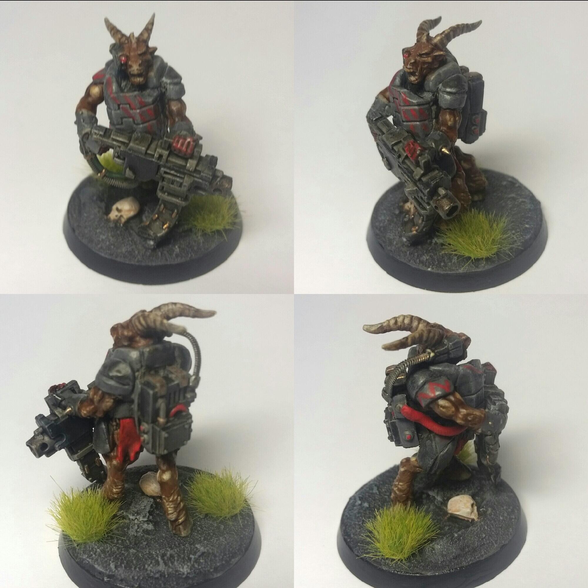
Appolinaire: Ordo Hereticus Warband
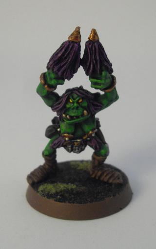
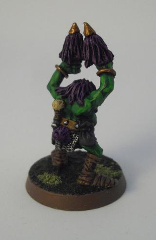
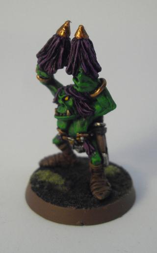
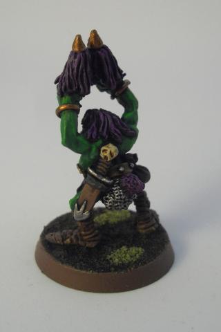
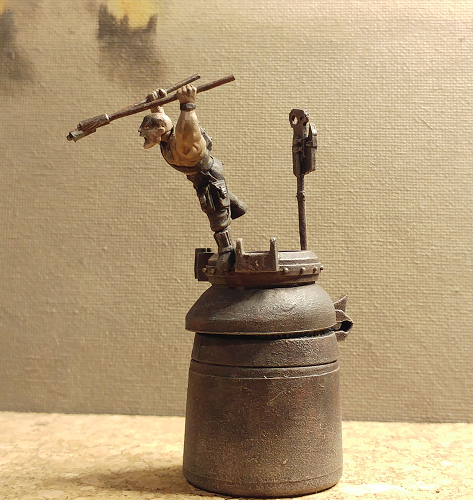
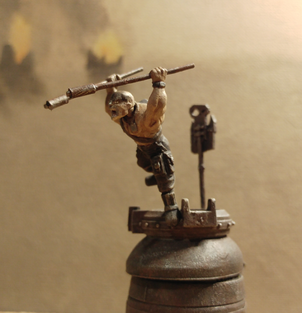
Whitllesey40k: Blood Bowl Orc Cheerleader
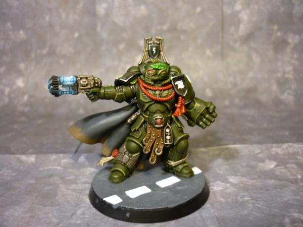
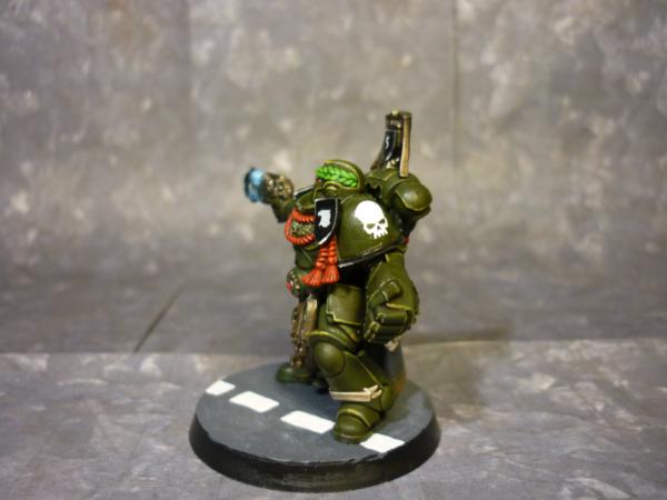
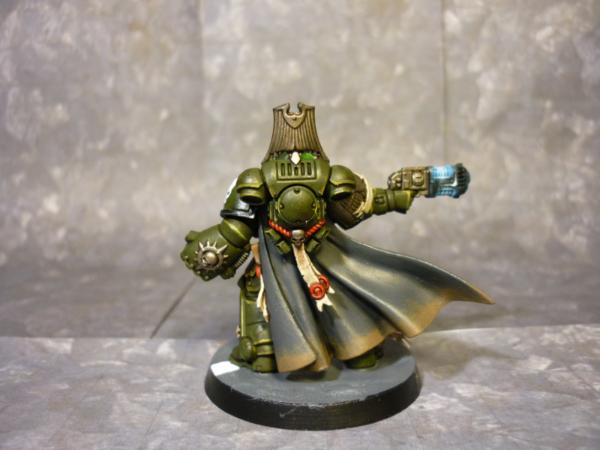
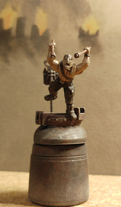
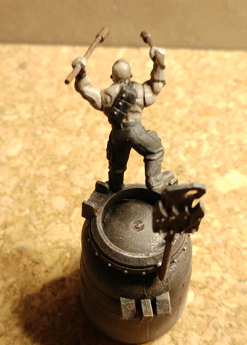
CREEEEEEEED: Raptors Primaris Captain
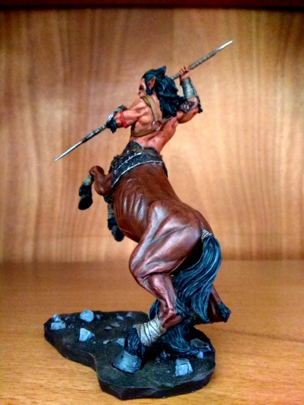
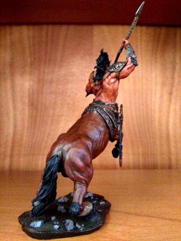
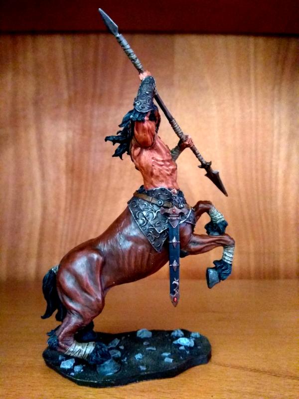
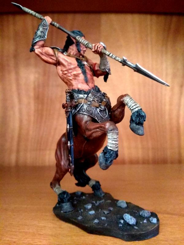
Straken619: Centaur Warrior
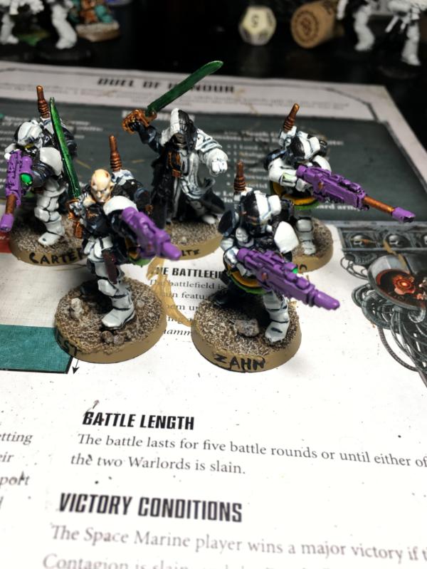
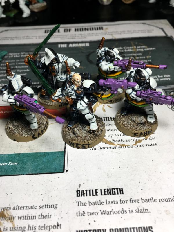
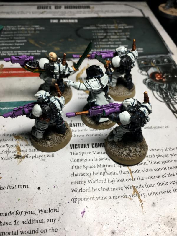
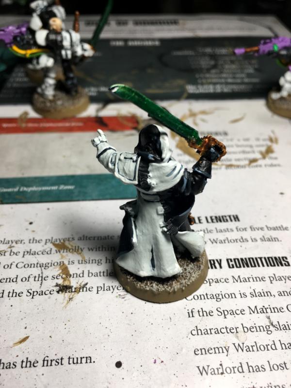
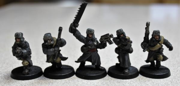
Drummernathan: Inquisition Kill Team
NinjaPirate: Beastman Mercenary
GulGog Tuftoof: Ork Freeboota
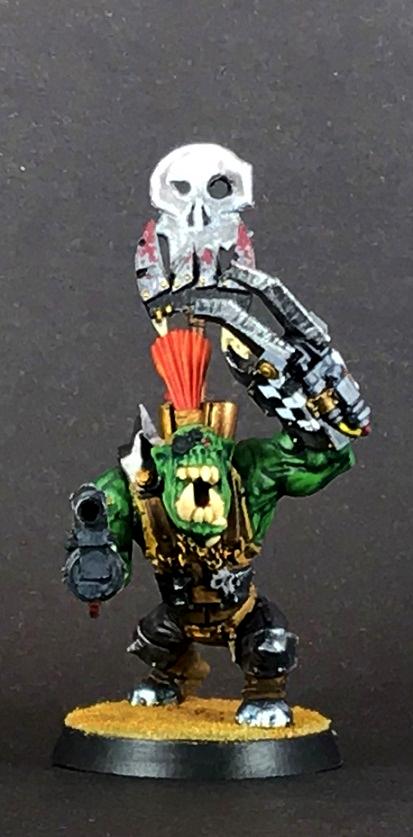
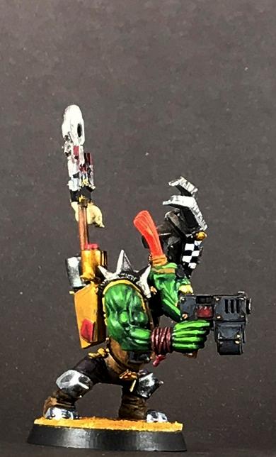
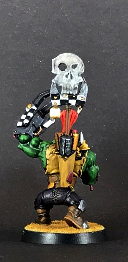
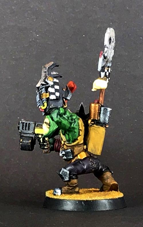
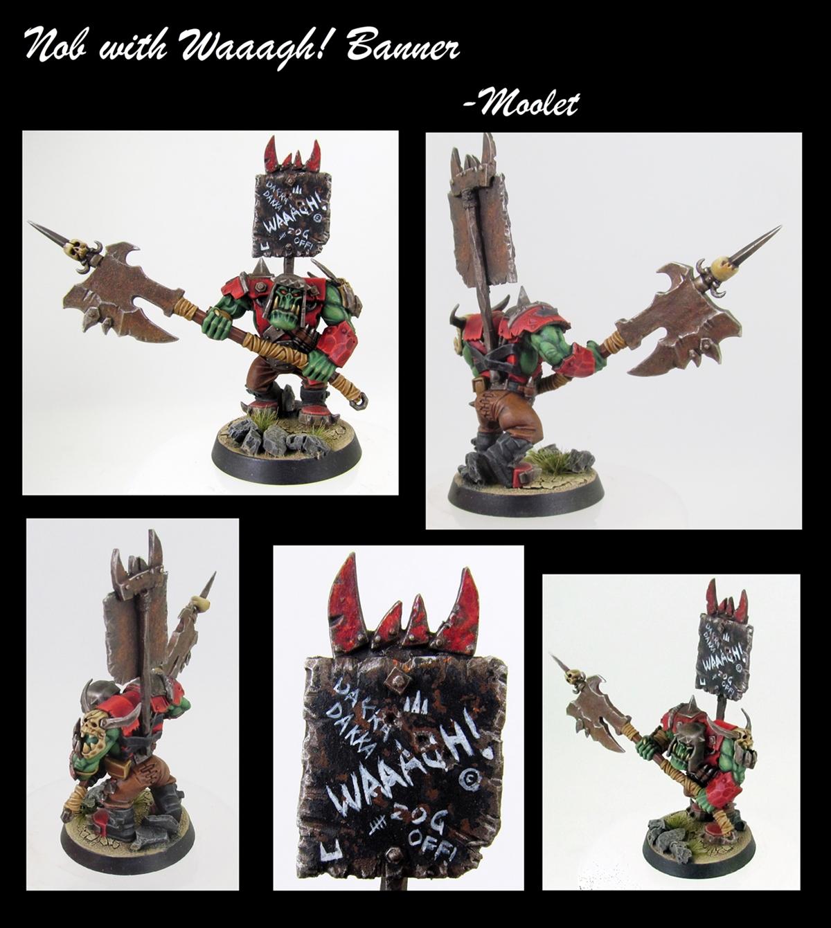
Moolet: Ork Nob with WAAAAGH! Banner
Power Elephant: Chaos Cultist
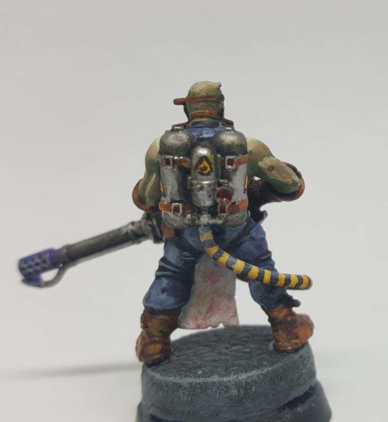
AUGmaniac: Valhallan Ice Warriors
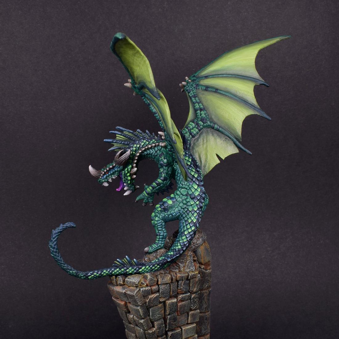
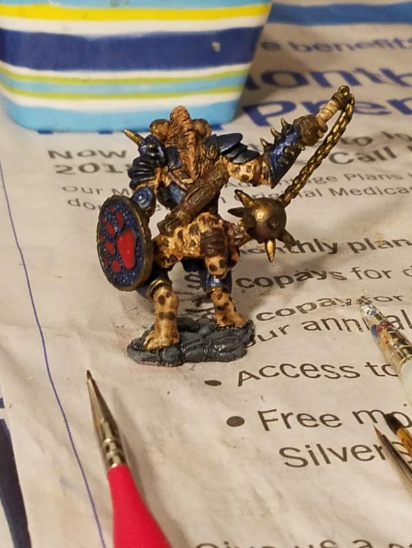
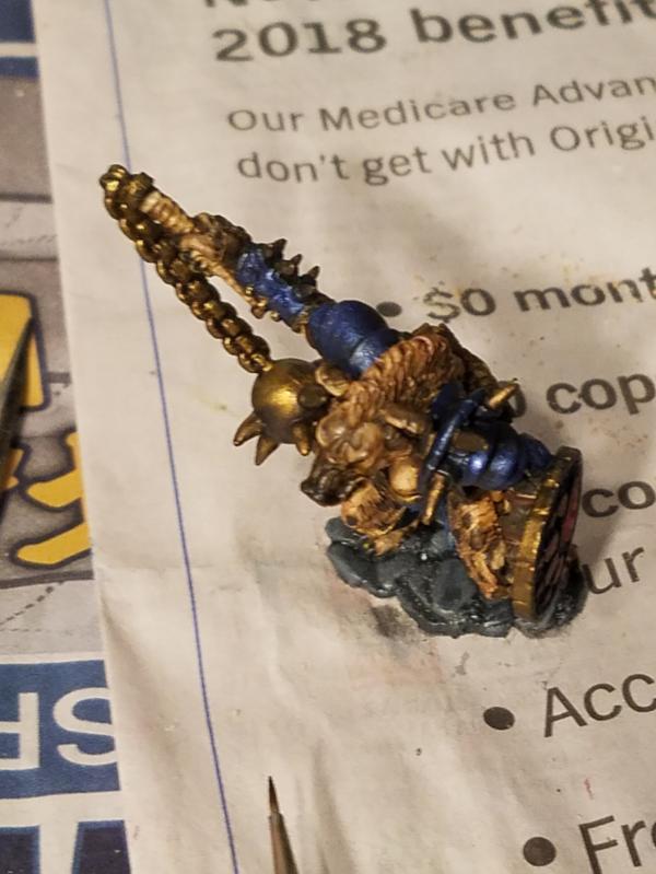
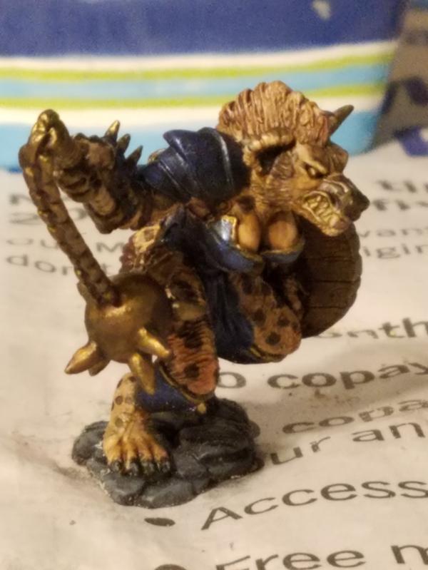
Modock: Dragon
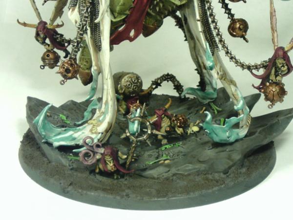
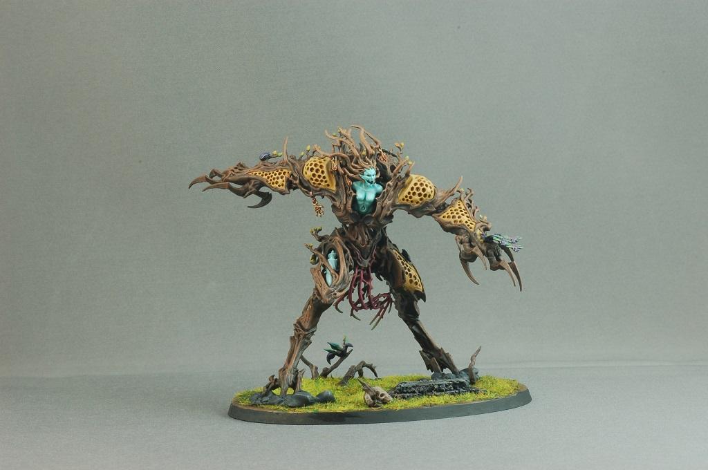
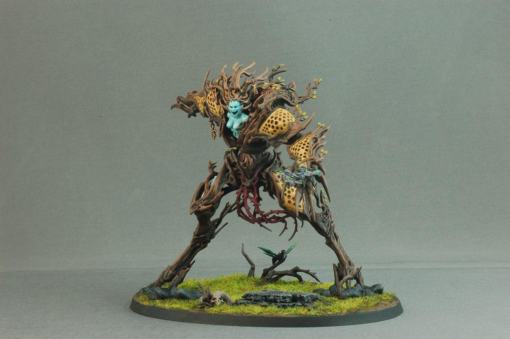
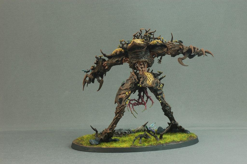
feltmonkey: Drycha Hamadreth
ChaosDad: Alpharius
Jetpack_Octopus: Dystopian Wars Aircraft Squadron
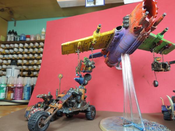
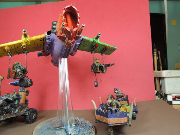
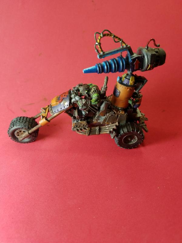
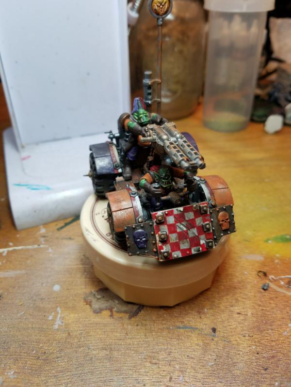
Guildenstern: Dakkajet and War Buggies
n1ceguypaul: Santa Dwarf
ZoBo: ‘Mad Max’ Warrior
Elbows: Dire Avengers
Midget Gems: Grot Carol Singers! (We WAAAAGH! You A Merry Christmas?)
Chris56: Elven Shrine Guardians
PossumCraft: Toad Wizard
Vejut: Gnoll Warrior
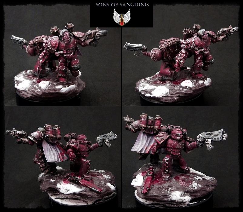
Paradigm: Blood Angels
keezus: Widowmaker Marksman and Cutthroats
|
|
|
|
 |
|
2018/01/02 15:39:23
Subject: VOTE For the winner of the Unofficial Painting Challenge Round 34: Open Round
|
|

Powerful Phoenix Lord
|
Voted for a couple which stood out to me.
The Creeeeed Marine, the Centaur, the lovely Purple Jets, etc. Some nice and sporadic entries from this month.
|
|
|
|
|
2018/01/02 15:45:22
Subject: Re:VOTE For the winner of the Unofficial Painting Challenge Round 34: Open Round
|
|
Boosting Ultramarine Biker
|
That took a while,12 people got my votes on the poll,about to vote on everyone's pictures,that's going to take longer.
I do have a fair bit of fun joining in these challenges,hopefully i will be able to enter most of this years challenges too. 
|
|
|
|
|
|
2018/01/02 17:11:07
Subject: VOTE For the winner of the Unofficial Painting Challenge Round 34: Open Round
|
|

Jealous that Horus is Warmaster
|
There are so many gorgeous things this month!
The three that really stood out for me:
Straken, that centaur is magnificent!
Mordok, the dragon is striking!
Midget gems, the diorama is very well executed!
Looking forward to a new year with even more gorgeous things from all of you!
|
Work in progress p&m blog :
United Colors of Chaos , Relating my ongoing battle with grey plastic...
2022 hobby running tally: bought: 71, built: 45, painted: 17, games played: 3
 10000pts 10000pts  4000pts 4000pts  5000pts 5000pts  1500pts 1500pts |
|
|
|
|
2018/01/02 20:22:02
Subject: VOTE For the winner of the Unofficial Painting Challenge Round 34: Open Round
|
|
Stabbin' Skarboy
|
My votes are in, absolute favorites (in no particular order) are:
CREEEEED, Power Elephant, Modock (of course), ChaosDad, Possum (I think this was my #1 favorite this month), and keezus.
Also, as usual, if I could click through to the gallery on your images, then you got a gallery vote too (let's see some of these models on the home page!).
Sadly, I don't think I'll be able to paint 3 models in just one month for "A Few Good Men", but great job on this month everyone, and I'll see you again in February!
|
|
|
|
|
|
2018/01/02 20:44:58
Subject: Re:VOTE For the winner of the Unofficial Painting Challenge Round 34: Open Round
|
|
Focused Dark Angels Land Raider Pilot
The grim darkness of far Fenland
|
I tried to vote quickly, so one word descriptions for each I voted for (except for Nevelon, because I couldn't think of one word to say that it's your best work yet!).
@Nev - best yet
@Zerg - wings
@CREEEEEEEED - cape
@Straken619 - hide
@Moolet - Waaagh!
@Modock - scales
@feltmonkey - detail
@Guildenstern - colour
@n1ceguypaul - concept
@Midget Gems - festive
@Chris56 - lion
|
|
|
|
|
|
2018/01/02 22:39:25
Subject: Re:VOTE For the winner of the Unofficial Painting Challenge Round 34: Open Round
|
|

Dakka Veteran
|
I voted for Modock and Paradigm because their work just stands out above the rest. I'll give you a vote in the gallery too later.
|
|
This message was edited 1 time. Last update was at 2018/01/02 22:40:08
|
|
|
|
|
2018/01/02 23:40:21
Subject: VOTE For the winner of the Unofficial Painting Challenge Round 34: Open Round
|
|
Fireknife Shas'el
|
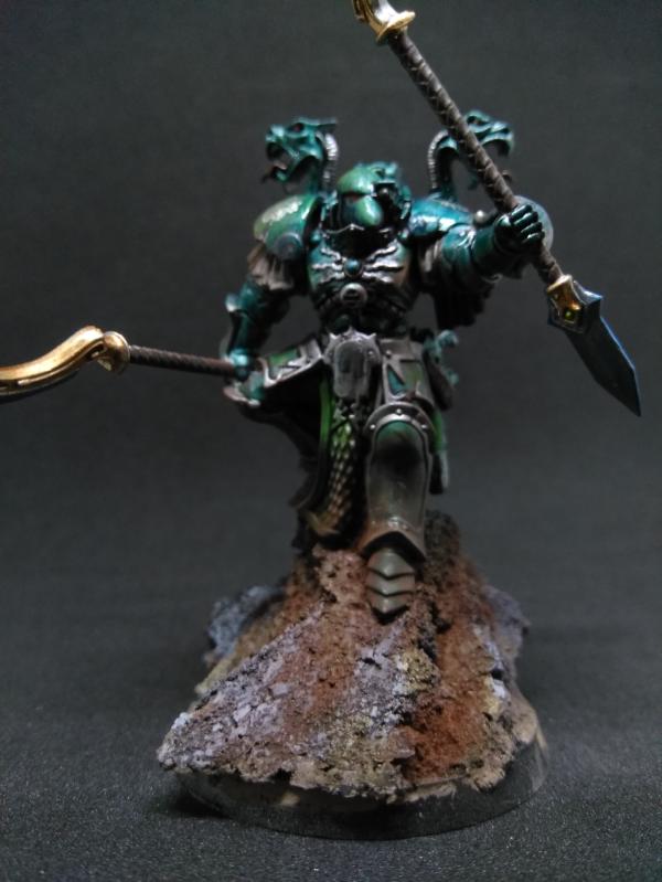
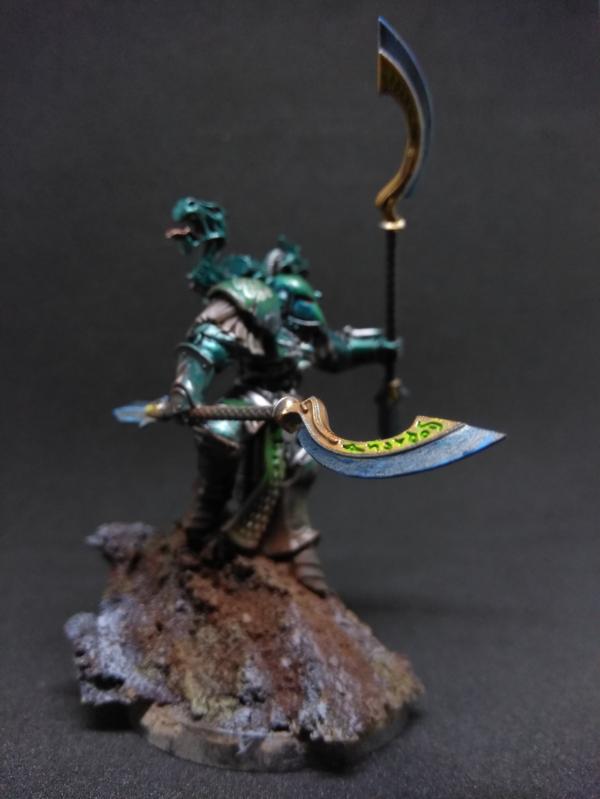
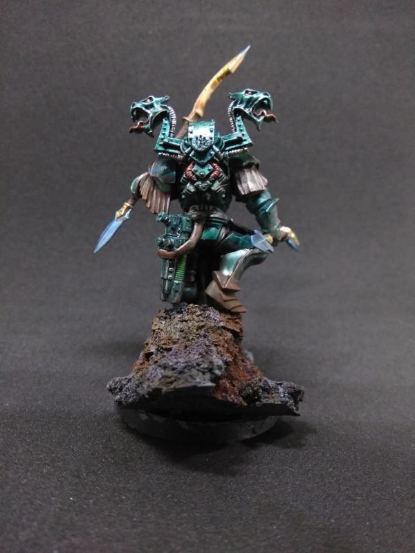
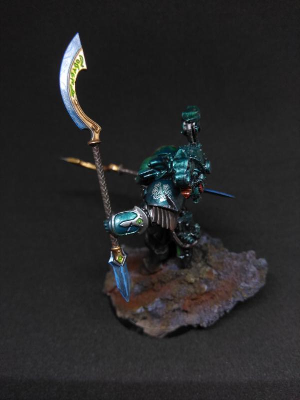
I voted for eight or nine different entries, but my favourite of the month is Chaos Dad’s excellent interpretation of Alpharius; a really well thought out and characterful conversion with a very nice paint job.
|
|
|
|
|
|
2018/01/02 23:57:02
Subject: Re:VOTE For the winner of the Unofficial Painting Challenge Round 34: Open Round
|
|
Grim Dark Angels Interrogator-Chaplain
|
Okay, after much deliberation and a lot of hmming and hawing, I managed to whittle it down to 5 votes. They went to:
Moolet: That Ork Nob is full of character, lookin' like 'es reddy ta krump sum 'umie gitz wit dat ded shiny ax!
Modock: The colors and blending on the dragon as well as the awesome work on the base make this the standout entry of the month, in my opinion. Really awesome model you should be very proud of!
feltmonkey: That is one well-executed angry tree lady! The honeycombs are my favorite part, as I said in the actual challenge thread.
Jetpack_Octopus: I've always loved the models from Dystopian Wars (shame the game company went belly up  ), and you've really made them look amazing!
Midget Gems: The idea of a Grot choir is pretty funny, and as always you executed it well!
I sure had a blast doing my entry. I don't care how many votes I get, it's always fun to paint something awesome alongside you guys! Shout out as always to Paradigm for managing these little displays of talent while also dealing with busy college life and still managing to get models painted! See you all in the next challenge!
|
|
|
|
|
|
2018/01/03 09:16:35
Subject: VOTE For the winner of the Unofficial Painting Challenge Round 34: Open Round
|
|
Jealous that Horus is Warmaster
|
 Jadenim wrote: Jadenim wrote:I voted for eight or nine different entries, but my favourite of the month is Chaos Dad’s excellent interpretation of Alpharius; a really well thought out and characterful conversion with a very nice paint job.
Thank you, you're making me blush... 
|
Work in progress p&m blog :
United Colors of Chaos , Relating my ongoing battle with grey plastic...
2022 hobby running tally: bought: 71, built: 45, painted: 17, games played: 3
10000pts 4000pts 5000pts 1500pts |
|
|
|
|
2018/01/03 10:36:45
Subject: Re:VOTE For the winner of the Unofficial Painting Challenge Round 34: Open Round
|
|
Longtime Dakkanaut
|
As it's the end of year, I'll go through them all, those in red got a vote:
Nevelon - Since I also did a primaris marine with plasma, I'm reluctant to big up the competition, but they look really good, especially the snow bases.
u971 - They look like they'd be good for 6mm, but I find it hard to get excited over 6mm, just a personal thing.
TheDraconicLord - The models look good, the bases look very good on the AoS models, but with one blurry picture it's hard to comment further.
ZergSmasher - Some of it, like the wings and the blue smoke, look really good, but other bits look very flat, or like you forgot to paint some of the details on, especially with the right arm.
Appolinaire - Suffering from the same sort of problem as the draconic lord, the picture is quite blurry, but it does look like a very solid grungy set of characters.
Whitllesey40k - This model takes me back to the first yogsquest, instant vote (also a solid paintjob but mainly great choice of model).
Me - Looking back, the base kinda sucks, and I knew at the time I was just being lazy. Also I didn't push myself in any way or try anything new, just executed what I already knew how to do to a higher standard than usual.
Straken619 - The human flesh and horse's fur both look great, especially the definition around the legs.
Drummernathan - The bases are cool, but the main paintjob feels quite messy and the paints look like they could do with some thinning.
NinjaPirate - A very cool conversion very well executed.
GulGog Tuftoof - I love the skin and the shock of orange hair.
Moolet - The weathered metal is superbly done, and the skin is excellent.
Power Elephant - definitely the best I've seen of you so far, keep it up.
AUGmaniac - All model and no base makes AUGmaniac a dull boy. Paint bases kids!
Modock - Sexy stone (odd choice of words I know but I think it fits), the scales all look great, I'd say though the wings, whilst still great by any standard, aren't that smooth. It looks very obviously painted, if that makes sense, whereas some of your other stuff has looked far more real. Actually the stone for example, which looks more real than most stones.
feltmonkey - A very smooth, very cool paintjob, especially the honeycomb and the ghostly flesh of the dryad. (I don't know if it's actually a dryad but I haven't touched AoS yet so that's what I'm calling it.)
ChaosDad - The painting is fine, but the model just doesn't do it for me, again, personal taste.
Jetpack_Octopus - They look very cool, especially the metallic purple.
Guildenstern - solid all round, but the grots hanging from the missiles is the best bit.
n1ceguypaul - Not the best painted, but one of the best concepts.
Elbows - Good bases and a good paintjob. Amazing you managed to restore the models to this point from where they were.
Midget Gems - I, and apparently most other people voting, love a well executed ork diorama.
Chris56 - Blending, NML and some of the best stone on offer (minus Modock's)? Chris you're spoiling us.
PossumCraft - I love the robe, the skin and the little familiar's eye.
Vejut - I certainly wouldn't be brave enough to paint that much cleavage.
Paradigm - solid, but not as good as some of your other stuff. If I were you I'd have fudged the rules and entered the raven guard marine.
keezus - The axe is really cool, and the rest is an all round solid paintjob.
|
 iGuy91 wrote: iGuy91 wrote:You love the T-Rex. Its both a hero and a Villain in the first two movies. It is the "king" of dinosaurs. Its the best. You love your T-rex.
Then comes along the frakking Spinosaurus who kills the T-rex, and the movie says "LOVE THIS NOW! HE IS BETTER" But...in your heart, you love the T-rex, who shouldn't have lost to no stupid Spinosaurus. So you hate the movie. And refuse to love the Spinosaurus because it is a hamfisted attempt at taking what you loved, making it TREX +++ and trying to sell you it.
 Elbows wrote: Elbows wrote:You know what's better than a psychic phase? A psychic phase which asks customers to buy more miniatures... 
the_scotsman wrote:Dae think the company behind such names as deathwatch death guard deathskullz death marks death korps deathleaper death jester might be bad at naming?
|
|
|
|
|
2018/01/03 13:49:45
Subject: Re:VOTE For the winner of the Unofficial Painting Challenge Round 34: Open Round
|
|
Fireknife Shas'el
|
 CREEEEEEEEED wrote: CREEEEEEEEED wrote:
Me - Looking back, the base kinda sucks, and I knew at the time I was just being lazy. Also I didn't push myself in any way or try anything new, just executed what I already knew how to do to a higher standard than usual.
I have to say you missed a vote from me because of that; the miniature is really nicely done, but the base was just too flat and simple.
|
|
|
|
|
|
2018/01/03 20:53:48
Subject: Re:VOTE For the winner of the Unofficial Painting Challenge Round 34: Open Round
|
|
Utilizing Careful Highlighting
|
I tried to vote on everyone's entries who had stuff in the dakka gallery, if you didn't you should 
After three pages of notes I think I ironed out who all I cast my votes for in the competition too lol
As always, none of my comments are meant to be anything but constructive, we can all improve. Well, ok maybe not Paradigm, but everyone else... so please don't take anything personally. It's simply my opinion, as I see your picture of your miniature. And I'll be the first one to say my photography sucks, so a lot may be related to the picture itself. On to my comments!
@Nevelon - that is a lovely blue you have, I thought the snow bases were really well done, the leather especially stood out to me and I thought the OSL was well done too
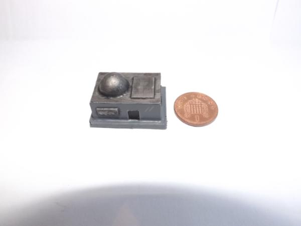
@u971 - this is one of the times I wish you'd stuck a figure in, or a penny or something, so I could tell the scale :( Overall I really liked them though I think there's a couple places that you may have needed to do another coat of metal
@TheDraconicLord - You have some nice colours and great basing going on there. I wish you had a close up picture though :( I'd have liked to see them individually as it was tough to judge from just the one
@ZergSmasher - Don't shoot me  but your colour is really "clean" (not a bad thing), well done on an impressive model. My only useful critique is maybe I'd go over the veins in the wings one more time with wash? to help them stand out a bit more? but yeah otherwise, just brilliant.
@Appolinaire - it was a bit hard to see your minis, I liked the muted colours but would have loved to seen a larger version as well
@Whitllesey40k - brilliant idea, loved the colours, really a solid job. I might suggest using a bit of yellow to HL up the flesh areas you want to emphasize (nose, brow ridge, cheek bones etc)
@CREEEEEEEED - beautiful job, the leather and the rope especially look really good, nice edge HL as well. Bit of base cleanup, lil wash on it, you're great
@Straken619 - I thought your flesh tones were really nice, as well as the horse hide, not an easy look to do. My only critique is the slight misalignment of the spear
@Drummernathan - I think if you took your pics from a bit further back and then cropped them, they'd be a bit less fuzzy. I think your white is nice although I was thrown by the purple guns the bases looked good as well. Maybe use slightly thinner paint next time as it looked like it was covering some detail in a few spots (but that could also be the picture)
@NinjaPirate - I almost think a darker background would have helped a bit, but I thought you did really solid work and the colour is very nice. Great base as well!
@GulGog Tuftoof - lovely job, some great colours/model - I do think maybe I'd have done the quiver (bomb bag) a bit of a different colour it kind of blended in with the shirt but over all a great job
@Moolet - great colours, loved the subtle but clear basing job, especially enjoyed your banner
@Power Elephant - A good solid job, I feel like the HL on the flesh is maybe a bit off, the metal is really good as is the burnt effect on the barrel. Best touch was the apron though the blood splatters looked really good. The symbol on the tank though is the best bit really, just awesome
@AUGmaniac - these will look so good with winter basing, lots of snow/ice =D I wish the picture was a bit bigger but overall a nice solid job
@Modock - have to say wasn't expecting this. That dragon is just so freakin awesome. The basing is lovely, your painting is lovely and the best parts to me were the purple tongue and the alternation of scales, brilliant idea to tie all the colours in
@feltmonkey - a beautiful job, I felt like all the elements worked really well together. I can't believe those little insects too, you really made them stand out
@ChaosDad - a very characterful model/job. Lovely base, works really well with the mini without detracting from it
@Jetpack_Octopus - this is another one I wish had included something to show the scale - these are so awesome! Lovely crisp job and a great colour scheme I thought, well done!
@n1ceguypaul - great paint job, slightly scary scene, but a great job lol
@ZoBo - just a great conversion, could use a little gap filling but a lovely job. Also really liked the weathering, very fitting for the theme.
@Elbows - lots of nice bright colour to these, very clean and crisp. I thought the basing was well done, as was the painting especially of the masks.
@Midget Gems - I swear GW needs to just hire you. You and Paradigm - now that'd be awesome! Somehow you always manage to top yourself. Needless to say I thought this was hilarious and awesome.
@Chris56 - really smoothly painted, quite liked the small diorama of it as well. Well done on that lion and shield especially! I thought the shrine looked very well done as well
@PossumCraft - those eyes are great, as is the colours. Really nice to see a not-green Toad/frog mini. The fire and staff are especially fine I thought.
@Vejut - I thought the spots giving it a hyena feel were really well done, my only critique is the metals - I would have prefered a colour with a bit more contrast to the mini itself, it kind of blends into the fur sadly =/
@Paradigm - mutters grumbles I hate you. Beautiful. Again. sigh.
@keezus - some nice detail on yours, good basing. I thought the muted colours did really well too
|
|
|
|
|
|
2018/01/03 21:14:05
Subject: Re:VOTE For the winner of the Unofficial Painting Challenge Round 34: Open Round
|
|
Dakka Veteran
|
Some great entries again. As I sometimes do, if you made the effort to enter, I'm going to make the effort to give a comment.
Nevelon - Good consistent colours, and the snow bases are excellent. I like how you've got bits of snow clinging to the marines' legs.
u971 - An interesting entry, some presumably tiny terrain. They could do with a bit of colour, but I like how you've defined the areas with the shade.
TheDraconicLord - Nice work on the big Orc boss in particular. Your photo is a bit out of focus, which makes it difficult to see the detail, and a few other angles to show off what you've done would have been nice.
Zergsmasher - Very nice. Particularly good work picking out all the little details like the spikes on the armour (always a pain) and the nurglings on the base.
Appolinaire - A cool, grim-looking warband. I'm a big fan of this side of 40K - weird quasi-religious figures with weird tubes coming out of their heads. You've captured it nicely.
Whitllesey40k - I love that old model. One of the oddest GW ever produced, in some ways. Nice shading and highlighting job. I see I wasn't the only one who found themselves awkwardly highlighting some boobs this month.
CREEEEEEEED - A nice neat job. Good details, good edge highlighting. I like the muted colours, too.
Straken619 - You've done a really nice job on the horse's skin and the metal. Not the first time you've had excellent metal tones on your entries, I think I'm right in saying.
Drummernathan - I like the black and white quarters colour scheme. I'd have to question why anyone would go into battle with a bright purple gun though.
NinjaPirate - I like the markings you've put on the armour, and the overall pose of the model. A bit more refinement on the shading and highlighting would really push it a step further, but nice work.
GulGog Tuftoof - Great bold colours. You always have very vibrant orc skin tones, and placing them next to the black really makes them stand out.
Moolet - Lovely neat work. The banner is just great.
Power Elephant - Good stuff. The skin tone is interesting, and all the little details like the bloody apron and the warning symbol on the tank are nice.
AUGmaniac - A good-looking little squad. I quite like the muted colours. With blank bases they look a bit unfinished, though.
Modock - Spectacular work. I admire your commitment to highlighting every individual scale. I did not go to such lengths on the dragons I've painted. As others have mentioned, the wall looks very realistic too.
ChaosDad - A really nice entry. The pose is good, and I like the way you've done the mud on Alpharius' feet. Really nice greenish tone to the armour, too.
Jetpack_Octopus - I don't know the scale, but it looks like those are pretty small planes. You've got an insane amount of detail on there. Great work.
Guildenstern - Really great colourful, orky stuff. The positively garish jet is a stand-out.
n1ceguypaul - I really like this. The concept is hilarious, the modelling on the base is great, the repetition of the red creates a really coherent look to the diorama, and you've created a santa whose knee no-one wants to sit on.
ZoBo - Nice concept, I love that film. There's something not quite right about the pose, though.
Elbows - Nice, neat, and super-bright colours. A good rescue job.
Midget Gems - Great stuff. This and Paul's entries were my favorites this month, for the Christmas humour. I like the little touches like the grots' halos, and how much they look like they're belting out the carols. I can only imagine how appalling they must sound.
Chris56 - Understated compared to some of your little dioramas, but little touches like the shield elevate the piece. Great work as ever.
PossumCraft - Really characturful, colourful stuff. I love the toad's skin-tone.
Vejut - Nice work, particularly the spotty fur. I think colouring the weapons gold when the skin is also gold was a mistake though. It's too similar to the fur colour, and takes away some of the interest from the model.
Paradigm - I like the pose of the two models, and the way you've done the helmetless guy's face. I also like the reddish tone on the stone on the base, which makes the whole thing look almost monotone.
keezus - A nice little realistic-looking warband.
Congratulations to everyone who finished an entry this month. Particular congratulations to anyone who feels they have pushed themselves this month - that's what the challange is all about for me. I try to enter every month, and some months it can be tougher than others. There's always the temptation to phone it in, but I personally try to make the effort to produce something I'm proud of each month rather than just something I've finished. Some months I fall flat on my face, but those are learning experiences. We all have the capacity to improve, whether it's someone trying a bit more with the highlighting, or someone like Modock, who is already a great painter, taking on a really ambitious project with his dragon.
See you next month! (When I finally decide what on earth I'm going to paint!)
|
|
This message was edited 2 times. Last update was at 2018/01/03 21:16:46
|
|
|
|
|
2018/01/03 22:34:15
Subject: VOTE For the winner of the Unofficial Painting Challenge Round 34: Open Round
|
|
Powerful Phoenix Lord
|
Thanks for the comments guys - this was just a "this is what I'm painting at the moment" month for me, so I'm not expecting big things.
Just needed more troops.
|
|
|
|
|
2018/01/04 00:22:09
Subject: Re:VOTE For the winner of the Unofficial Painting Challenge Round 34: Open Round
|
|

Camouflaged Zero
|
This year's painting challenge is coming to an end, two more months. I can't believe how fast this is going! I enjoy painting like
never before and thanks to this challenge and to this small community who I grew fond of.
OK, enough emotions let's get down to it.
And yes...thanks to ChaosDad, Gulgog TufToof, Whittlesey40k, Power Elephant, ZergSmasher, CREEEEEEEEED, Guildenstern
and to my buddy Feltmonkey for commenting and voting for my entry.
Creed : Yeah, the wings aren't my best job by far. They were a bit tricky to paint due to them being quite big (wet blending still gives me trouble) and
honestly I was a bit annoyed after painting all those scales. I painted some subtle lines to mimic a kind of texture but it is what it is.
Votes:
ZergSmasher: Great job on Mortarion. Classic scheme done well! Nice color variation on the wings and congrats on finish him in one month!
CREEEEEEEED: Pimped up your skill didn't you?! I love it, OSL on spot. Clean, precise, great all around actually. Like peeps have said, that
concrete isn't working very well, but  nonetheless.
Straken619: Very imposing figure. I really like the tones you used espeacially on the horse part of the centaur. The one thing that goes into my
eyes a bit too strongly is the glossiness of the body.
Moolet: Flawless mini mate, can't fault it. I'm fond of your painting! You nailed it, the rust is looking perfectly rusty.
feltmonkey: Impressive in every way! The best parts are the Drycha ghostly torso, the chest has perfect highlights ( you spent quite some time there mate )
and the honeycombs! How the hell did you achieve the look of the honey inside. It looks real, just the right tone and has the right sheen
Guildenstern: My oh my, where did you find all that time to paint all that!?! I must say I like buggies the most, especially the last one, those red checkers is looking
really sharp. But man you need to improve your pictures, those photos don't give you justice. What's with the pinkish background ? You have so many colors
going on and a dark background would go a long way.
n1ceguypaul: A nice jolly diorama. Very cool idea, I like it!
Midget Gems: You have the best ideas mate! Your dioramas are a treat to behold. You're a master at converting!!
Chris: Great blends, great everything! So much attention to details! One minor thing I would like to say is those stones could use a bit of brown tones. It would
make a great impact on overall picture!
PossumCraft: Funny looking wizard toad with excellent paint job to boot!
Thanks again to everyone who participate in one way or another and to the man who makes this happen, Paradigm!
|
|
This message was edited 2 times. Last update was at 2018/01/04 04:50:37
|
|
|
|
|
2018/01/04 00:55:00
Subject: Re:VOTE For the winner of the Unofficial Painting Challenge Round 34: Open Round
|
|
Grim Dark Angels Interrogator-Chaplain
|
It's funny how so many people (here on Dakka and in real life) are saying that Morty's wings look good; I actually feel like they turned out the worst of the model myself.
@CREEEEEEEEED: I can see what you're saying about the arm looking flat. The angle of a couple of the photos make it look way worse than it actually is. The only thing I wish I'd done in that area is to add more shade to the little pits and holes in the armor.
@Guildenstern: Thanks for the kind words, and as for the wings I was afraid I'd make them worse if I did anything else to them. That's one area of the model where I definitely decided to cut my losses.
@felmonkey: Thanks! And you are right, picking out all those little details is kind of a pain. I got kind of lazy toward the end, which is probably why I haven't gotten more votes.
@Modock: Very high praise coming from you!
Thanks for all the comments guys! It really is helpful both to realize that other people like my painting and to have areas where I screwed up pointed out to me so I can do better next time.
|
|
|
|
|
|
2018/01/04 11:35:22
Subject: VOTE For the winner of the Unofficial Painting Challenge Round 34: Open Round
|
|
Dakka Veteran
|
A few people have mentioned the honeycombs on my model. There's no real magic trick to them, I just painted the whole thing a nice honey brown first. I think it was a mix of brown and yellow. (for some reason I have about a dozen browns and I can't remember which one I used, but I definitely mixed in some yellow, and maybe some orange to get a honey colour.) Then I painted the top part yellow, mainly Yriel Yellow I think, with perhaps a touch of brown and orange. I mixed white in to this for the highlights, and orange/brown for the shadows. The most painstaking part was highlighting the edges on the holes where they might catch the light. After all this dried I think the crucial step was just using some thinned Ardcoat, and putting a tiny blob into each honeycomb hole to simulate the liquid sheen on the honey. A simple idea and technique that really worked out well. 
|
|
This message was edited 1 time. Last update was at 2018/01/04 11:35:52
|
|
|
|
|
2018/01/04 18:42:24
Subject: Re:VOTE For the winner of the Unofficial Painting Challenge Round 34: Open Round
|
|
Boosting Ultramarine Biker
|
Ohh there small alrighty,scale shot below as suggested!
|
|
|
|
|
|
2018/01/04 21:48:51
Subject: Re:VOTE For the winner of the Unofficial Painting Challenge Round 34: Open Round
|
|
Mekboy Hammerin' Somethin'
|
Well done everyone.
Thank you for the mention ChaosDad, Whittlesey, Zerg, Creed, Guildenstern, Felt, Modock
I always like a festive scene. I would have liked to have added a few more touches to mine e.g. candles and/or song books for the Grot Choir to hold but time is always my enemy.
I've lost the bit of paper I had with all the entries I voted for on, it was quite a few so I'll pick out a few that drew my attention now.
Zerg - Congrats on finishing such an impressive model, He is going to fit right in with your other death guard. Its very hard to maintains a colour scheme across an army but you seem to be doing it so they will all look great together.
Creed - This model comes together really well, I feel like you have really excelled in your painting this month.
Straken619 - You have done really well to get the tones on the horses body and its a very well posed model
Mootlet - The rust effect you have on the metalwork is brilliant
ChaosDad - Really like what you have done with the model and the conversion, how you have blended the mud into the armour on the lower half is also very good.
Jetpack_Octopus - Beautiful colours
n1ceguypaul - Top points for doing an Xmas themed entry, and you have put in a few extra nice details.
Glad you got your entry in Chris56, even though you said its been a bad month for you. The stone work and blending on the shield is particularly good.
PossumCraft - Toad wizard is awesome
and there are the ones a almost always vote for too but I'm running out of words to keep describing their entries
P.S. On another note my second child was born today, just got back from the hospital. Its a very healthy little girl
This means the league tables might be a little late in being updated lol
|
|
This message was edited 1 time. Last update was at 2018/01/04 21:49:26
|
|
|
|
|
2018/01/04 21:50:35
Subject: VOTE For the winner of the Unofficial Painting Challenge Round 34: Open Round
|
|
Is 'Eavy Metal Calling?
|
Congrats Midget!
|
|
|
|
|
|
2018/01/04 21:58:24
Subject: Re:VOTE For the winner of the Unofficial Painting Challenge Round 34: Open Round
|
|
Utilizing Careful Highlighting
|
Grats Midget Gems!! that's awesome =D
|
|
|
|
|
|
2018/01/04 22:14:32
Subject: VOTE For the winner of the Unofficial Painting Challenge Round 34: Open Round
|
|
Powerful Phoenix Lord
|
Well done Midget Gems...I feel like that's kinda taking advantage of the "Open Round" month. Did you plan it precisely 9 months ago? That's a lot of work. How you going to base her?
|
|
|
|
|
2018/01/04 22:30:53
Subject: VOTE For the winner of the Unofficial Painting Challenge Round 34: Open Round
|
|
Focused Dark Angels Land Raider Pilot
The grim darkness of far Fenland
|
Congrats Midget!
|
|
|
|
|
|
2018/01/04 22:44:45
Subject: Re:VOTE For the winner of the Unofficial Painting Challenge Round 34: Open Round
|
|
Camouflaged Zero
|
Congratulation MG!
Another entry! You're late for december...this is cheating...
|
|
This message was edited 1 time. Last update was at 2018/01/04 22:50:55
|
|
|
|
|
2018/01/05 00:40:59
Subject: VOTE For the winner of the Unofficial Painting Challenge Round 34: Open Round
|
|
Dakka Veteran
|
Congratulations Midget Gems! How are you going to find the time to make intricate dioramas now?
|
|
|
|
|
2018/01/05 00:59:51
Subject: VOTE For the winner of the Unofficial Painting Challenge Round 34: Open Round
|
|
Longtime Dakkanaut
|
Congratulations Midget!
|
iGuy91 wrote:You love the T-Rex. Its both a hero and a Villain in the first two movies. It is the "king" of dinosaurs. Its the best. You love your T-rex.
Then comes along the frakking Spinosaurus who kills the T-rex, and the movie says "LOVE THIS NOW! HE IS BETTER" But...in your heart, you love the T-rex, who shouldn't have lost to no stupid Spinosaurus. So you hate the movie. And refuse to love the Spinosaurus because it is a hamfisted attempt at taking what you loved, making it TREX +++ and trying to sell you it.
Elbows wrote:You know what's better than a psychic phase? A psychic phase which asks customers to buy more miniatures...
the_scotsman wrote:Dae think the company behind such names as deathwatch death guard deathskullz death marks death korps deathleaper death jester might be bad at naming?
|
|
|
|
|
2018/01/05 08:37:07
Subject: Re:VOTE For the winner of the Unofficial Painting Challenge Round 34: Open Round
|
|
Basecoated Black
|
Congrats on the little one. As a father of 3 horrible little gremlins (love you) I wish you all the best congrats
|
|
|
|
|
2018/01/05 16:39:38
Subject: Re:VOTE For the winner of the Unofficial Painting Challenge Round 34: Open Round
|
|
Tough-as-Nails Ork Boy
|
Congrats Midget Gems on the midget Midget Gems!
Great entries from everyone again, lots of variety.
I'm back at work at the moment with a terrible cold, so rather than doing stuff I should be doing I commented on every ones entry instead.
Thanks to everyone who liked my entry and commented, I describe the different way I did the rust effect below under Moolet:
Nevelon: Brilliant squad of Hellblasters. I think your painting is improving a lot and you’ve done these models a great justice. The bases set them off beautifully and the skin tone and eye lenses are done brilliantly.
U971: not sure of the scale of these so it’s hard to comment. The metal parts look like it’s something like leadbelcher with a wash of nuln oil. A quick and easy metal effect i like, is to do leadbelcher, nuln oil, then agrax earthshade, then a quick light dry brush of leadbelcher again. It gives a variety of nice tones to the silver. You can also do few corners or edges with a light edge highlight of stormhost. It really draws the eye in.
DraconicLord: lots done this month but being an ork lover the warboss is my favourite. Its a model I really want and never could bring myself to buy him yet. You’ve done a great job of him and I don’t think the picture shows him in his full glory. Nice skin tones and armour in a novel colour scheme, nice.
Zergsmasher: I’m not at all a fan of this model but you’ve done a great job. The abundance of details looks daunting. The green armour could do with a touch more depth (contrast) for my tastes but some parts are the model are stunningly well done. The scythe particularly, I think the wings are great as they are, because on such a busy model it’s nice to have some areas of continuity.
Appolonaire: Very nice gritty warband. The reds contrast so well with the neutral tones of the rest of the models and the flash of the yellows of the bases also serve to draw the eye. I think these are let down by the photographs as from what i can tell the brush work is top notch. Nice entry.
Whitllesey: You’ve done a good job of bringing all the details out on this model with a nice contrasting colour scheme of green and purple. There is not much opportunity for your painting to shine on this mini but i think you’ve given the old cast some life. Unfortunately yellow eyes don’t do it for me; i think making them red would add as a better focal point. This is an old model given a good makeover, well done.
CREEEED: your painting is going from strength to strength. This is fantastically well done. The highlights are great (though my personal preference is to not go quite so white with my edge highlights of black). As you said the base could have done with a bit more love, even just a quick black around the rim to tidy it up. I do tend to prefer bases on the simple side rather than overly complex though (that’s just my personal preference).
Straken: This is a great example of contrasting textures. You’ve given the metals, fur, hair, flesh, leather and binding’s nice consistent and distinctive texture and tone. This is a masterfully painted model. I agree with what i saw in another comment that the satin sheen of the horse body makes it difficult to tell what is painted highlights and what is the reflection of the light. A more diffuse light may help, (a thin sheet of paper in front of the bulb often helps me but others could advise better im sure).
Drummernathan: Brilliantly vibrant models. The black white combination is brave and you’ve pulled it off well. I think some of the shading on the white could be more subtle and the purple weapon casings could be toned down a little (start with a darker less saturated purple and just catch the edges with a colour as light as this). Great kill team though they are striking and will look brilliant on the battlefield.
Ninjapirate: Nice mini with a very nice highlighting of the neutral tones of the grey armour and green heavy bolter. The gold adornments really go well with that tone of green. My only criticism is the choice of base, with such a predominance of greys and green on the model it would be best to steer away from a grey base. I think that red Martian iron earth GW do would look fantastic with this mini. A well painted mini with a gritty colour scheme, i like it!
Gulgog: I’d love to see all your freebootas together sometime, they must look awesome. The claw is brilliantly done and the hair and skin well highlighted. The metallics of the knee and shoulder pads are very well done. My only gripe is the teeth need some more shading for my preference and the base a touch more contrast. Treat us to a picture of the warband sometime. =)
Moolet: I was pleased with how this mini turned out overall as it looked terrible for a long time. I tried something different for my rusts this time. I started off the same with leadbelcher, nuln, agrax then drybrush leadbelcher i usually do. This time i used some typhus corrosion for texture then 3 different coloured rust weathering powders (i think they were imaginatively called red rust, orange rust and brown rust) dabbed on with a drybrush. It looked terrible at this point. I then very slightly dampened the drybursh with some alcohol and dabbed around a bit on the powder. After a while it seemed to look good. I then just edge highlighted with leadbelcher/ironbreaker then stormhost silver. The banner i made out of plasticard and was great fun to do and my only regret is you can’t see the bullet holes very well, i agonised for a good while over their placement and size heh.
Powerelephant: Very nicely done. The metals look great and the highlight positioned well. The heat fatigue of the metal is a little too blue for my tastes and adding in a red or sepia could give a more natural look (i use black-blue-purple-sepia in that order from the tip but want to experiment with some red next time). The flammable sign is a magnificent addition, very cool and well done in such a small space, its instantly recognisable. Great mini and will look impressive on the tabletop.
Augmaniac: I don’t think the photo shows these off as well as it could. The scheme conveys the gritty cold of Valhalla well and the highlights of the overcoats and fatigues look great. The paleness of the faces also adds to the feel of this great looking squad. A blanket of white snow around them for the bases to finish them off. Very nice squad!
Modock: What to say. There are some really excellent painting entered in this challenge but for me this stands above them all. The level of detail and the cohesion, tone and texture of the highlights are spot on. The choice of palette is very interesting too, choosing a monochrome green for the dragon itself teasing it towards warmth and cold with the yellows and blues and even neutrality with the underbelly is fascinating and very cleverly done. The overall feel of the dragon is cold though and this is all contrasted yet again by the base, (or should i say sculpture) warm reds and browns to really set it apart. You then tease us again with some both warm and cold greens around the base of the base.
Feltmonkey: Another brilliant entry from another brilliant painter. All the natural brown tones you achieve are contrasted so well with ethereal green/blue of the spirit. The little touches of colour here and there keep the eyes moving around the model seeking out lots of little visual treats. As said before, the little glossy honeycomb bits are simple but so visually satisfying. Beautiful entry.
Chaosdad: This is a great Alpharius, the armour colour is great and is set apart really well from the base colours, a contrast of cold alpharius to warm base tones. The blades and runes all look very mysterious and very well executed. A stunning centrepiece model!
Jetpack_Octopus: I don’t know these models at all but they look fiddly (no sure of the scale) but great fun to paint. Metallic purple is a brave choice and you’ve done it great justice with the shades well positioned. The contrast with the white is very well done and the other metallics give the models a great steampunk type feel.
Guildenstern: So much to comment on.... The buggies are brilliant conversions and look very orky. . The dakkajet is a very brave scheme executed very well with brilliant weathering. The grot gunners are just genius. The fact they are attached to the rockets conjures the idea of a rocket zooming towards the enemy with a grot gunner attached strafing the battlefield as it goes. 1/10 for being effective dakka, but 10/10 for style.
N1ceguypaul: Very nice scene brilliantly done. I keep asking myself, is the dwarf just an angry bad tempered crazy bastard who chopped the head off a kids snowman, or was the snowman actually a demonically possessed monster of malefic intent. The painting and the composition is very well done with my favourite treat being the ‘axe’ is in fact an iceskate on a stick.
ZoBo: I don’t think the photo shows it off well enough. The modelling is done very well and captures the film nicely. The grey tones and metallic’s are done well but the model lacks anything that pops out. Difficult to do when
you’re emulating a scene from a film and I’ve no idea what the solution would be.
Elbows: I have loved all your classic Eldar models over the last year. These dire Avengers look great with a bright striking colour scheme that will look amazing from across the table. The rebasing works for them really well in my opinion making them appear a bit different to the models we’ve become so accustomed to seeing and the neutral colour contrasts very well with the primary colours of the model.
Midget Gems: Great use of runtherd (my least favourite of all the ork models- no idea why just don’t like it). The scene brings back vivid memories I have of a carol service i once went to in the middle of a snowy forest in Brandenburg around Christmas time. It was practically identical to this (minus the green skin of course). The lights are very cute and very well done, the santa conversion is brilliant and the painting is all round very good. I love your ork skin tones. The warmth of them strikes a great contrast to the cold of the scene. Bravo!
Chris56: Very nice NMM. The shading and highlights, especially on the shield are wonderful. As previously mentioned a little earthy tones in the stone work would make it appear more natural and also work to show off your great NMM silver against the stone a little better. Your painting is excellent and the scene you present is very well put together.
Possumcraft: This entry keep making me come back to look again. I think the figure is great but you’ve done a brilliant job of making the model colourful yet cohesive. The non classic red frog skin is great and well done especially as you then tease us with some greens elsewhere. The blue robes are so rich in colour and beautifully highlighted. The frog eyes are also brilliantly done too.
Vejut: I think the skin on your gnoll is great and reminds me of the picture out of the D&D monster manual (3rd ed i think). The metallic blue armour is very interesting and contrasts well with yellow-brown of the fur. The gold is not a great choice in my opinion but could work better if perhaps there was less of it. Nice little mini, the leather on the back of his hand and the shield straps are very nicely done too.
Paradigm: I’ve a soft spot of BA so I probably like this more than most. I think the scene you have set is fantastic and tells of a desperate struggle. I don’t think the painting is your best but you likely painted the whole thing in the time it took me to do my base. Your entry is so thematic and stylized working off a monochrome palette that i can’t help but love it. I mean the guy has had his hand severed and he shoots back with his bolter (2 handed weapon) with his left hand. That guy deserves a piece of parchment and a small blob of wax after the battle for his courage.
Keezus: These models have been done in really nice earthy colours but distinctive enough from the base to ensure they don’t clash. As always your eye for colour is remarkable and your brushwork is impeccable. The blue axe head is a nice touch to wake us up from the soothing palette you’ve chosen.
|
|
|
|
|
2018/01/05 16:54:23
Subject: VOTE For the winner of the Unofficial Painting Challenge Round 34: Open Round
|
|
Is 'Eavy Metal Calling?
|
Lots of very strong entries this month. In no particular order, votes to:
Zergsmasher: Really nice work on that model, you've absolutely nailed the appropriate tone.
CREEEEEEED: Very neat work. The only thing that bothers me slightly is the grey that spilled over onto the rim of the base. Neaten that up and maybe stain the base with a wash to add some texture and you've got a really nice model there!
Straken619: Nice to see something different here, not just in the scale but also in the subject matter, I find centaurs are very under-represented in miniatures. And all topped off with a lovely paintjob to boot!
ChaosDad: That model is very well put together. All to often, attempts to make Primarchs on par with the existing ones from kitbashes fall apart, but this one really works. Top stuff.
Modock: You've really outdone yourself here. Lovely model, lovely base, excellent use of colour and an impressive amount of work to get done in a month as well!
Thanks to everyone who commented on my entry. I fully admit it was a little bit of a last-minute panic one like last month and I really didn't think parts of it through (from certain angles it's just a big block of red on a big block of grey!) but hopefully I'll be a bit less busy over the next few months and can really start to up my game a bit more.
|
|
|
|
|
|
|
|


 Dark Angels/Deathwing - just getting started!
 Space Marines -
 Eldar - Biel Tan 2000pts

 ~1200 | Imperial Knights:
  ~2300 | Leagues of Votann:
  ~1300 | Tyranids:
  ~5000 | Kruleboyz:
  ~3500 | Lumineth Realm-Lords:
  ~700
~700