Switch Theme:

Critique for AOS Deathrattle Color Choices - saffron + blue?  [RSS] Share on facebook Share on Twitter Submit to Reddit
»
Author Message
Advert


Forum adverts like this one are shown to any user who is not logged in. Join us by filling out a tiny 3 field form and you will get your own, free, dakka user account which gives a good range of benefits to you:
  • No adverts like this in the forums anymore.
  • Times and dates in your local timezone.
  • Full tracking of what you have read so you can skip to your first unread post, easily see what has changed since you last logged in, and easily see what is new at a glance.
  • Email notifications for threads you want to watch closely.
  • Being a part of the oldest wargaming community on the net.
If you are already a member then feel free to login now.


Made in us
Fresh-Faced New User


Howdy folks,
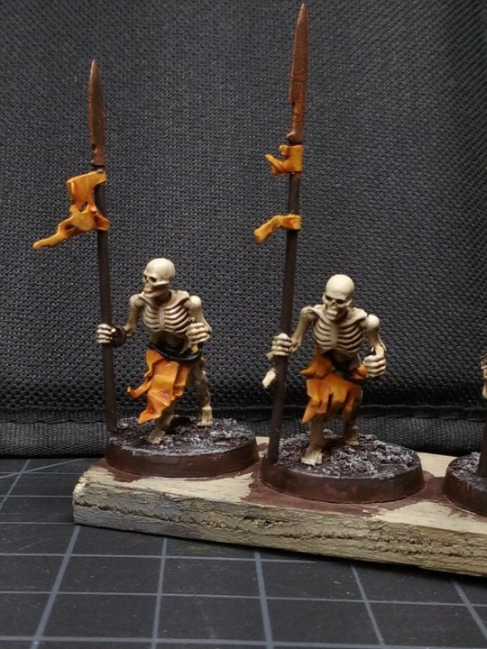
I have been painting a block of 40 skeleton spearmen and I wanted to go with a unique color for traditionally drab skeletons.
I have decided to paint them with saffron (faded orange yellow) textile scraps to contrast with dark rusty armor and black belts.

I like the orange so far and think it will look better after final highlighting and mud drybrushed on edges.
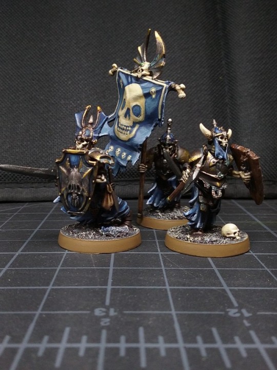
The problem is that I have already done a unit of ten graveguard + wight king with faded blue fabric and dark grimy bronze.
I was thinking that I could add some accents to the spearmen with some blue scraps but I thought this might be too much garish contrast.
Should I go with the spearmen all saffron and keep it good or try and add in the blue accents for army coherency?

Saffron = Averland Sunset/Fuegan Orange/Averland
Blue = Kantor/Altdorf/?lighter

See below...


Automatically Appended Next Post:

See below for test models. Thanks for feeding my hesitation.


This message was edited 1 time. Last update was at 2018/12/03 06:06:40


Made in nz
Dakka Veteran


The contrast is VERY strong, but if you keep it to just very small patches it looks fine.

You don't have any other major contrasts, so it doesn't become a mismatched pile of contrast colours.

I would, personally, say that what you have so far looks pretty damned good, and doesn't need changing - meaning the orange with a few touches of blue.

   
Made in us
Fresh-Faced New User


I think it looks fine with both. The trick will be keeping the blue minimal on yellow models, using blue as just a spot color, and possibly think about using yellow as a spot color for blue themed units, so they share a bit of a common palette.
   
Made in pl
Beast of Nurgle


Europe

In my opion orange without addons looks better than orange + blue accents 
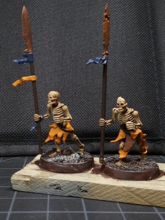
Maybe there should be other color to get better contrast :/

But remember thats its totally up to you because everyone have different taste in color mix

Blog mostly about fast painting miniatures for WH40k and AOS

www.wishwargaming.com

Instagram: Wish Wargaming
YouTube Channel: Wish Wargaming
 
   
Made in us
Fresh-Faced New User


Thanks for the feedback folks. This is one of those potential errors I might make just to get the two units cohesive. I don't think it is worth it to make the 40 spearmen look too cartoony.
Maybe an accent color of parchment and dark red instead? I think the blue will fight too much.
   
Made in nz
Dakka Veteran


dark red is likely to dominate the orange and detract from it, I think


Forum Index » Painting & Modeling
Go to: