| Poll |
 |
| Which Entries Are Your Favourites? |
| Jamie Shred |

|
4% |
[ 16 ] |
| MobileSuitRandom |
|
2% |
[ 6 ] |
| Jjohnso11 |
|
1% |
[ 5 ] |
| Nevelon |
|
2% |
[ 9 ] |
| Yorkright |
|
3% |
[ 10 ] |
| MacPhail |
|
2% |
[ 9 ] |
| Captain Brown |
|
4% |
[ 16 ] |
| Rybrook |
|
4% |
[ 14 ] |
| Viterbi |
|
2% |
[ 9 ] |
| DV8 |
|
8% |
[ 31 ] |
| Keezus |
|
5% |
[ 20 ] |
| queen_annes_revenge |
|
6% |
[ 21 ] |
| Llamahead |
|
1% |
[ 3 ] |
| Modock |
|
10% |
[ 36 ] |
| Maharg |
|
3% |
[ 10 ] |
| Elnibbus |
|
4% |
[ 14 ] |
| SmallChanges |
|
1% |
[ 5 ] |
| Arkanid |
|
2% |
[ 7 ] |
| Deadshot |
|
4% |
[ 15 ] |
| ShadowsAndDust |
|
1% |
[ 4 ] |
| Midget Gems |
|
4% |
[ 15 ] |
| Feltmonkey |
|
9% |
[ 33 ] |
| Paradigm |
|
3% |
[ 12 ] |
| dukeofbeer |
|
5% |
[ 18 ] |
| Jadenim |
|
2% |
[ 6 ] |
| Chris56 |
|
6% |
[ 22 ] |
| Pneumo |
|
2% |
[ 6 ] |
| Vejut |
|
1% |
[ 5 ] |
| Total Votes : 377 |
|
|
| Author |
Message |
|
|
|
|
|
Advert
|
Forum adverts like this one are shown to any user who is not logged in. Join us by filling out a tiny 3 field form and you will get your own, free, dakka user account which gives a good range of benefits to you:
- No adverts like this in the forums anymore.
- Times and dates in your local timezone.
- Full tracking of what you have read so you can skip to your first unread post, easily see what has changed since you last logged in, and easily see what is new at a glance.
- Email notifications for threads you want to watch closely.
- Being a part of the oldest wargaming community on the net.
If you are already a member then feel free to login now. |
|
|
2020/03/02 21:56:51
Subject: Vote for the winner of the Dakka Painting Challenge Round 60: Final Boss
|
|

Is 'Eavy Metal Calling?
|
The time has come for you to vote on the final round of the 1019-20 rotation of the Dakka Painting Challenge!
Ominous music starts playing, someone’s left some powerful health potions surprisingly unguarded, and you step into a suspiciously large, empty circular room… That’s right, it’s Final Boss time! This month, the entrants were tasked with bringing out their biggest, best and most badass minis for a climatic showdown, and their last chance to grab some points before the League table is tallied up.
As usual, please feel free to vote for as many entries as you like, for any reason, be that the quality of the paintwork, the effort on show, the approach to the theme or anything else that catches your eye. Likewise, you're encouraged to leave some feedback for the entrants if you wish, and many of the images link through to the Dakka gallery if you want to cast a vote there.
Without further ado, the entrants:
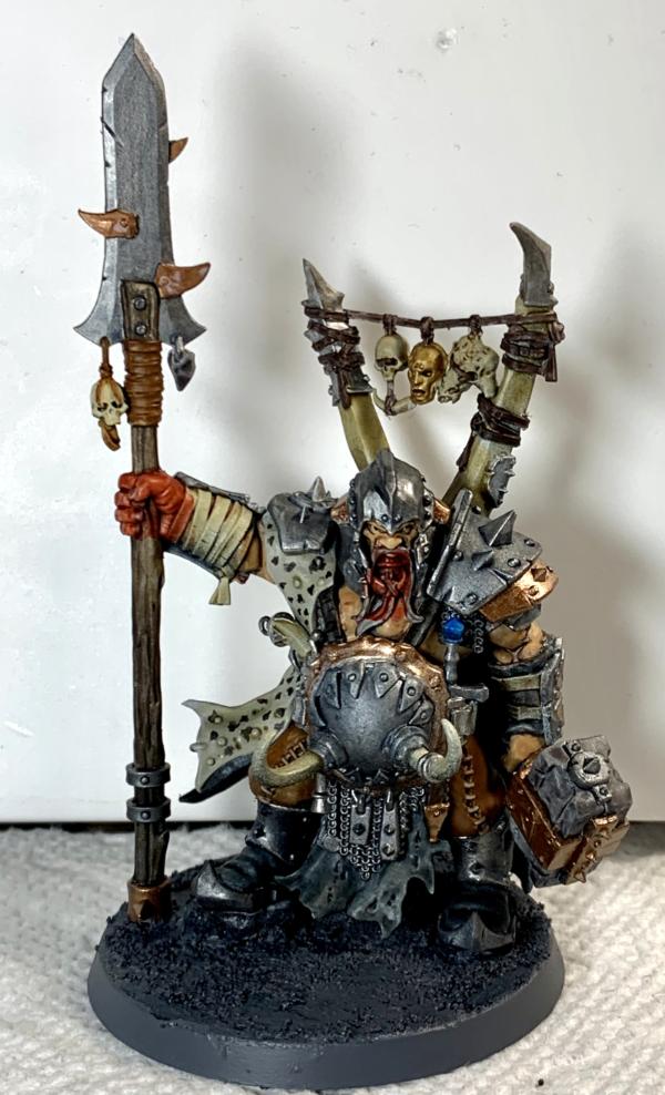
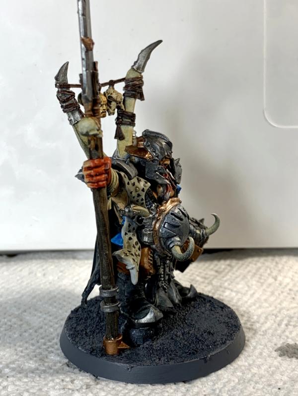
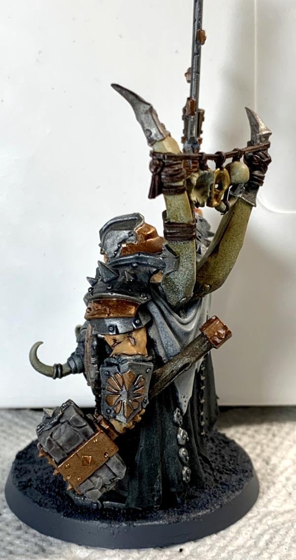
Jamie Shred; Morgraur rashaar
MobileSuitRandom: Ork Warboss
Jjohnso11: Ogre Tyrant
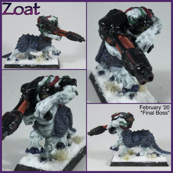
Nevelon: Zoat
Yorkright: Chaos Space Marine Sorcerer
MacPhail: Sisters of Battle Cannoness
Captain Brown: Escher Gang Leader
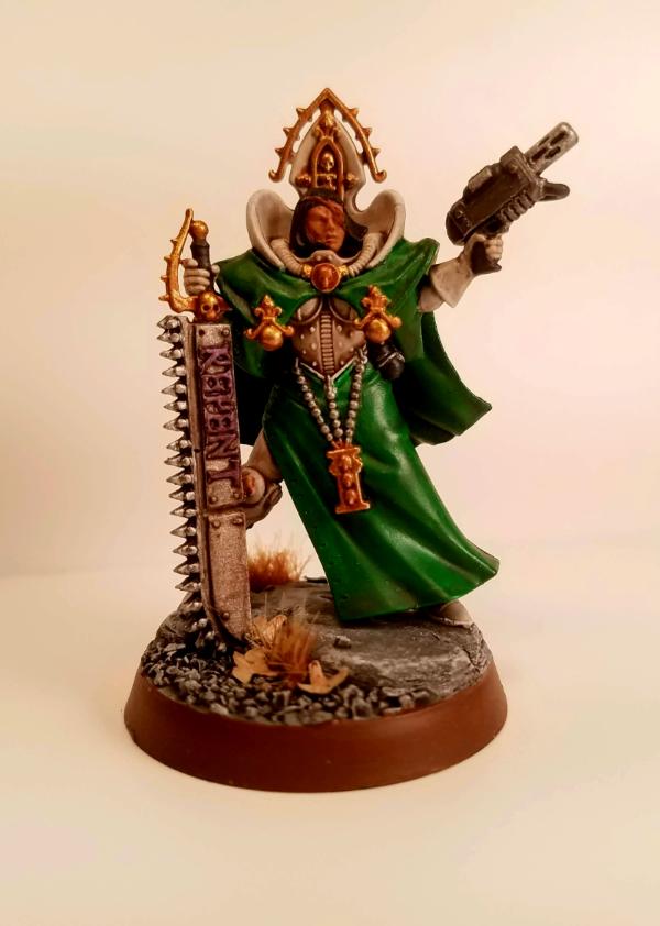
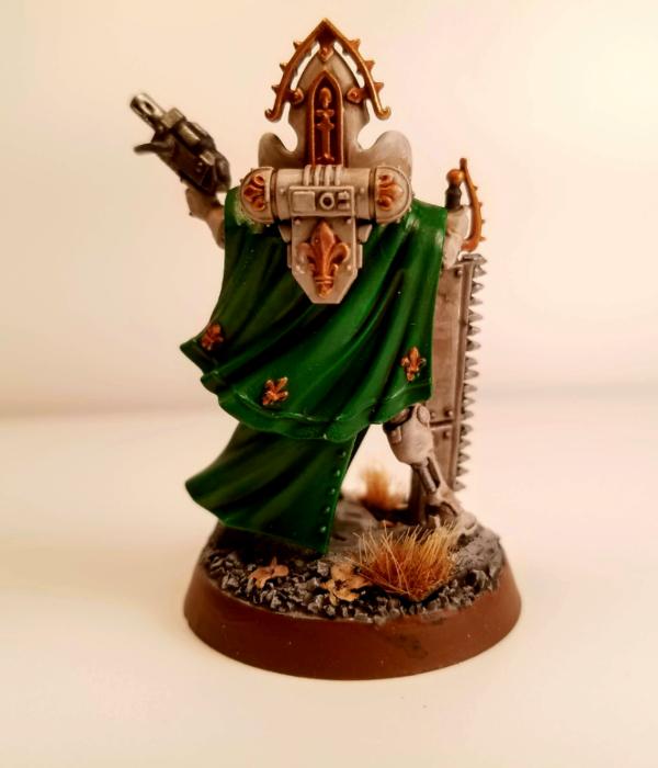
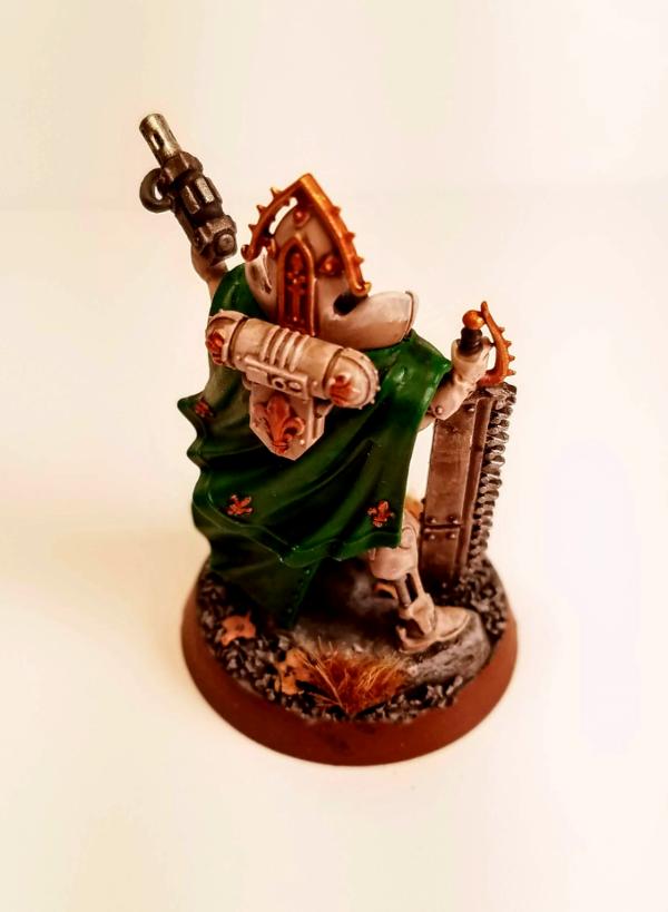
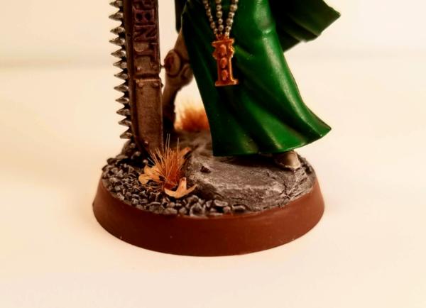
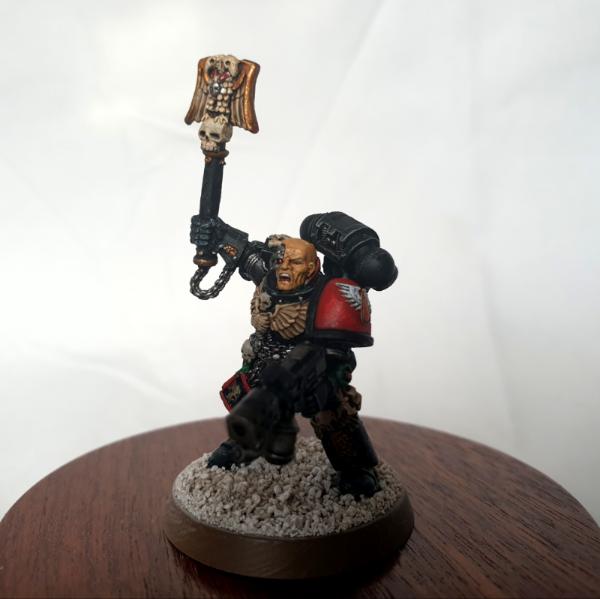
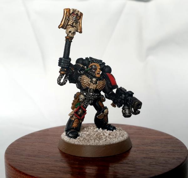
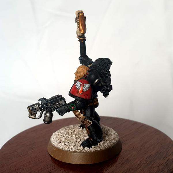
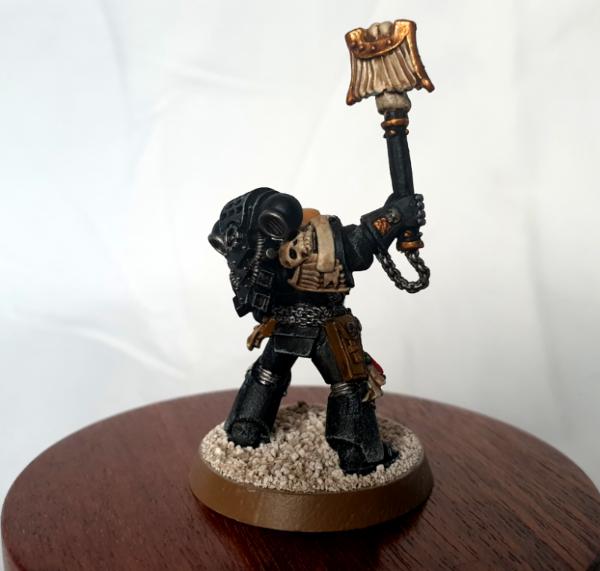
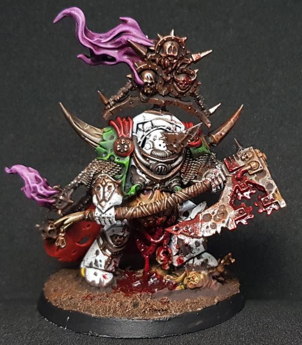
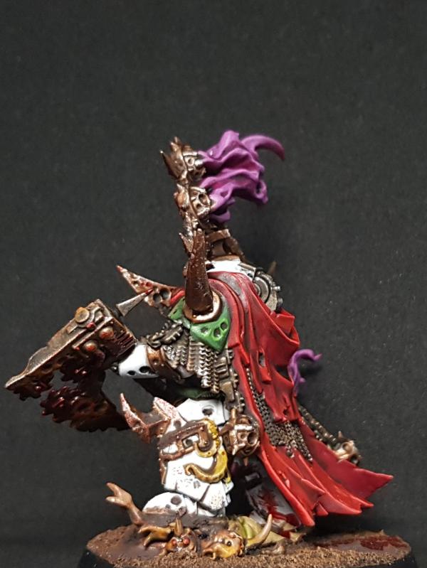
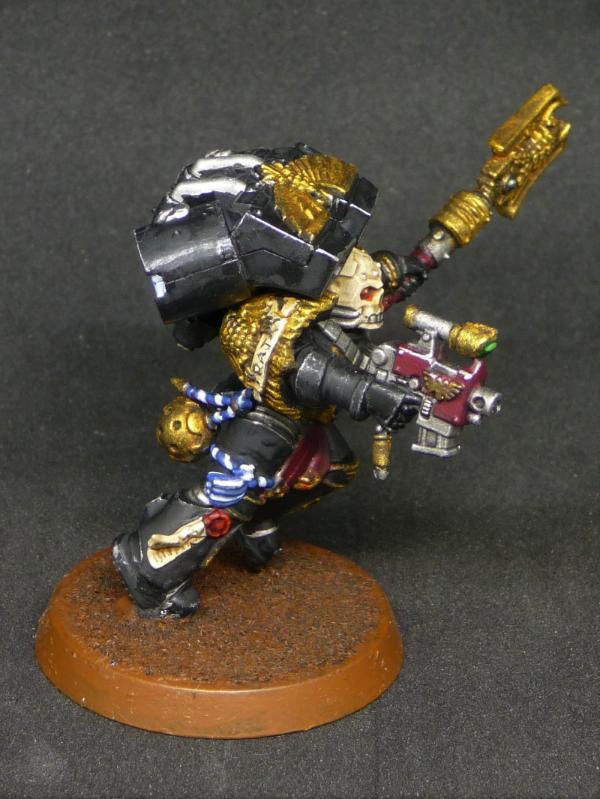
Rybrook: Blood Angels Chaplain
Viterbi: Genestealer Kelermorph
DV8: Custodes Shield-Captain
Keezus: The Iron Butcher
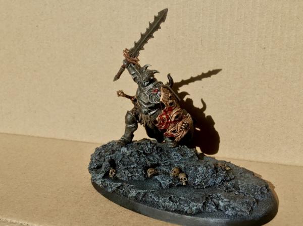
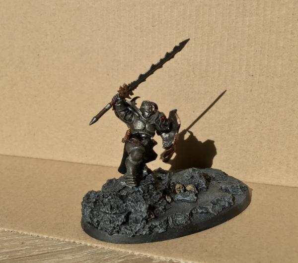
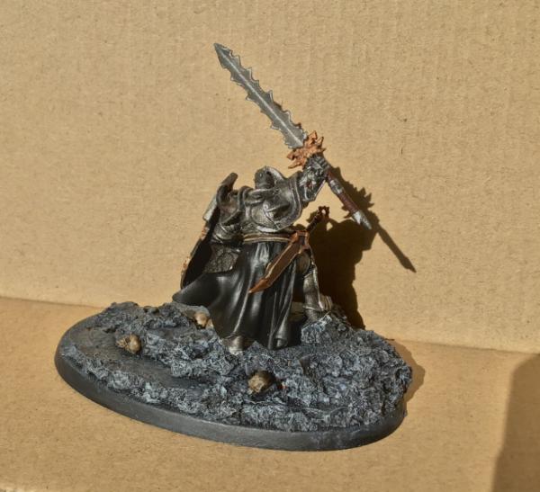
queen_annes_revenge: Calas Typhon
Llamahead: Undead Dragon
Modock: Szalamandra
Maharg: Demon Prince
Elnibbus: Blood Angels Praetor
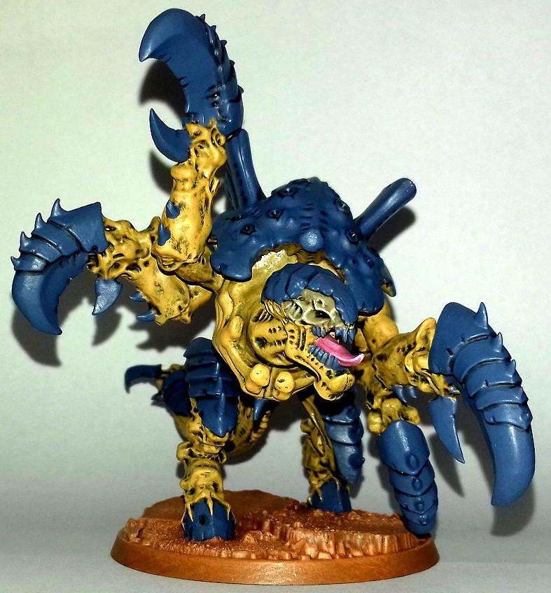
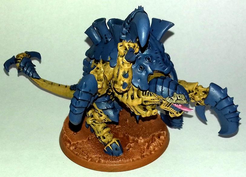
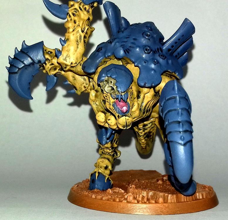
SmallChanges: Old One Eye
Arkanid: Chaos Hellbrute
Deadshot: Death Guard Champion
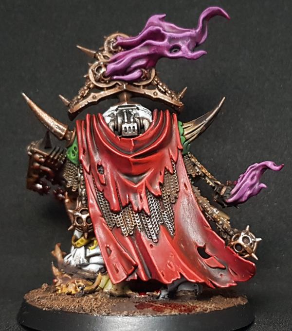
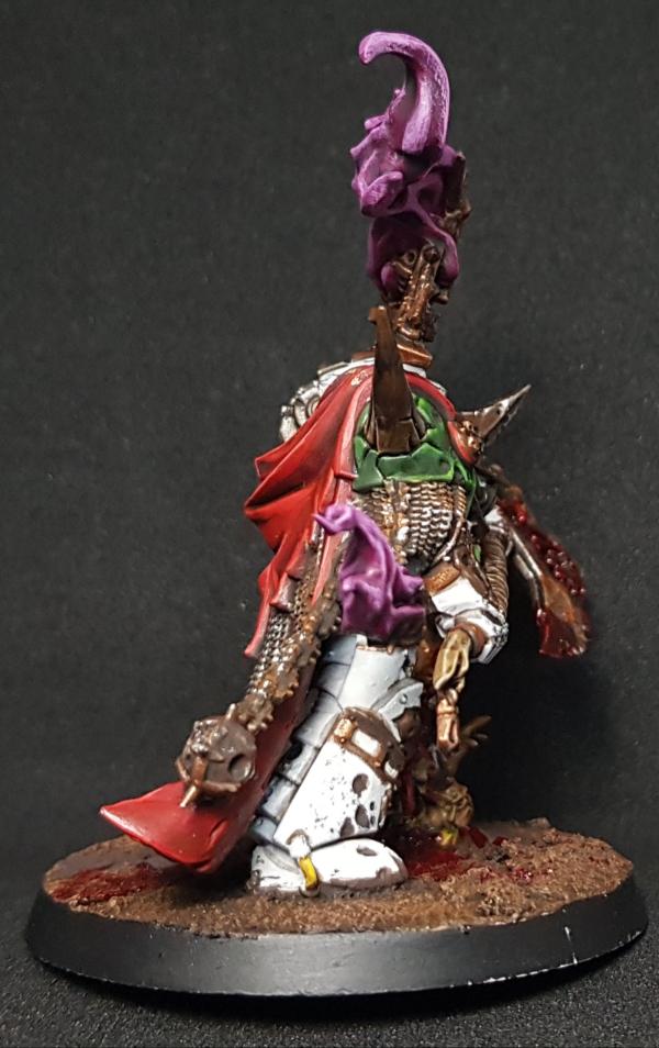
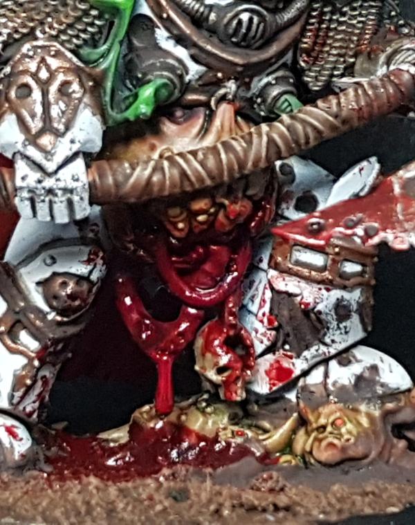
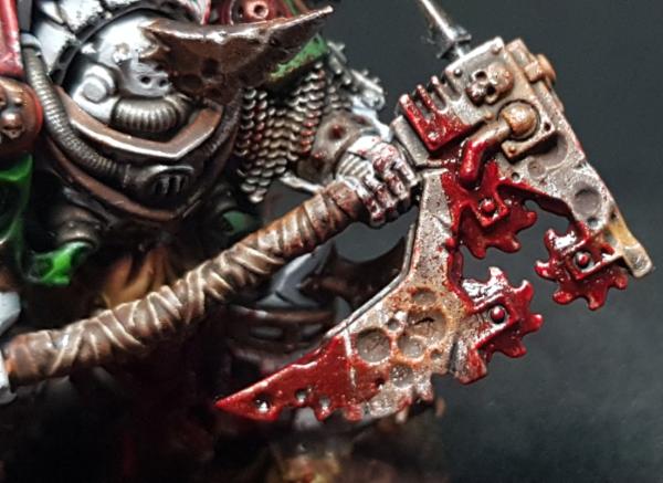
ShadowsAndDust: Master Lazarus
Midget Gems: Big Mek Bike
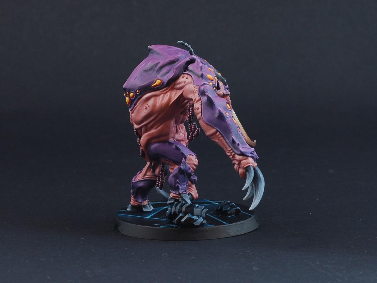
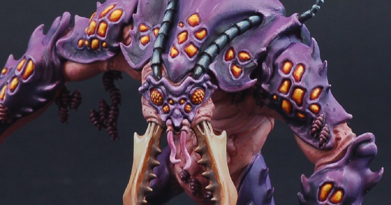
Feltmonkey: Dreaded Ambull
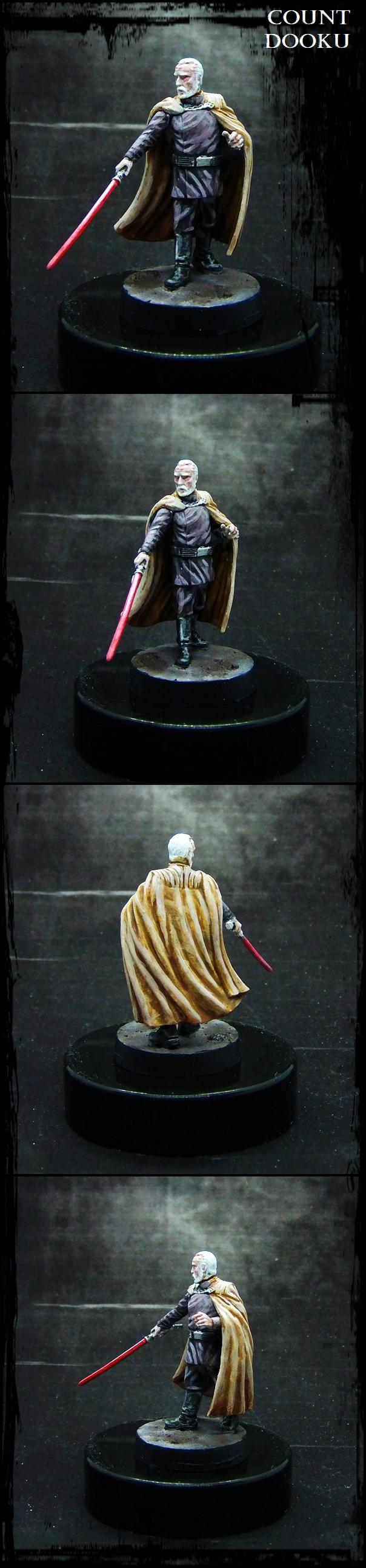
Paradigm: Count Dooku
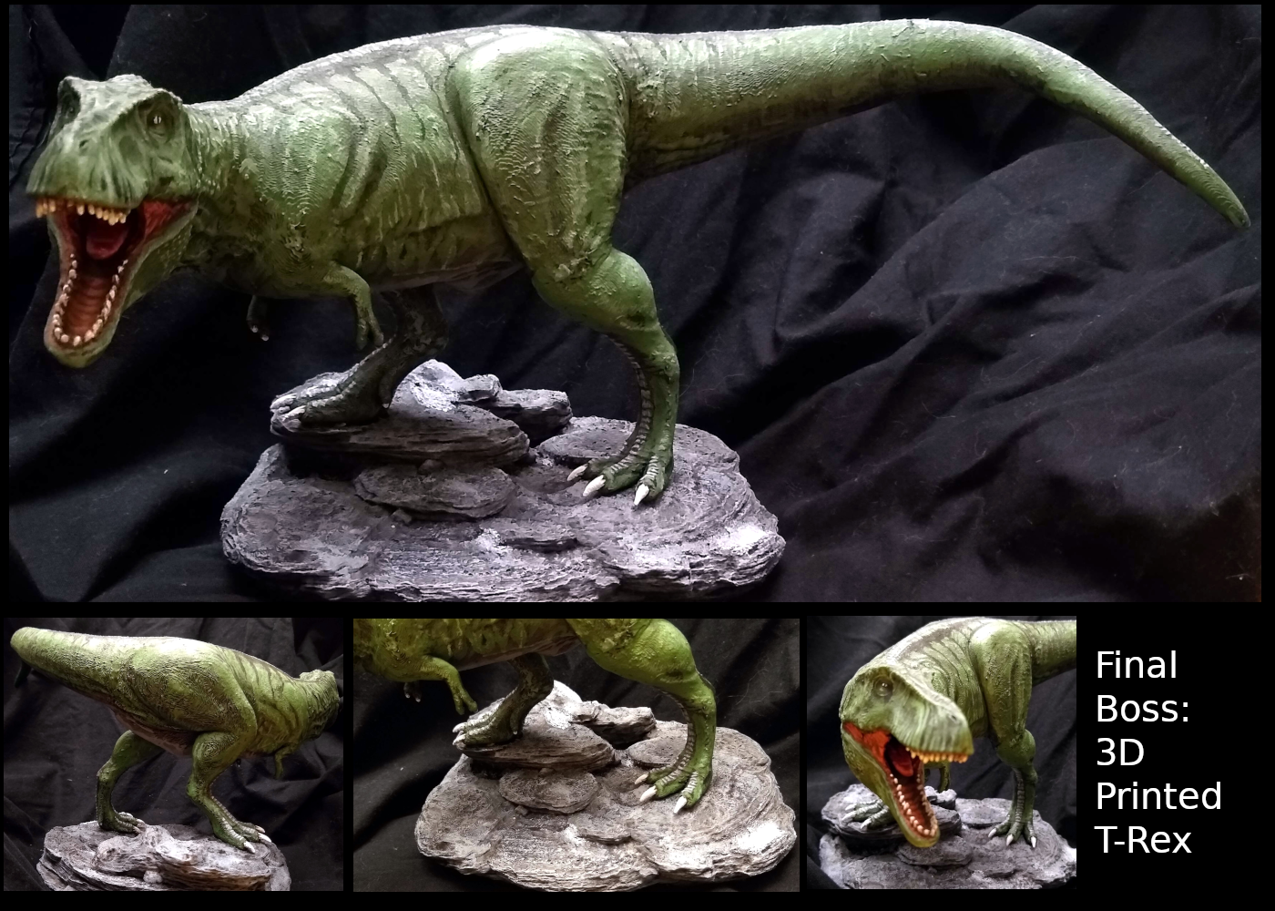
dukeofbeer: Tyrannosaurus Rex
Jadenim: Space Marine Chaplain
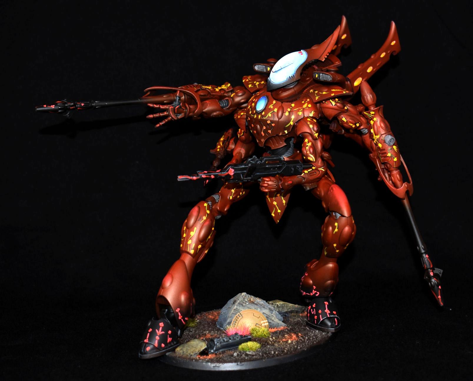
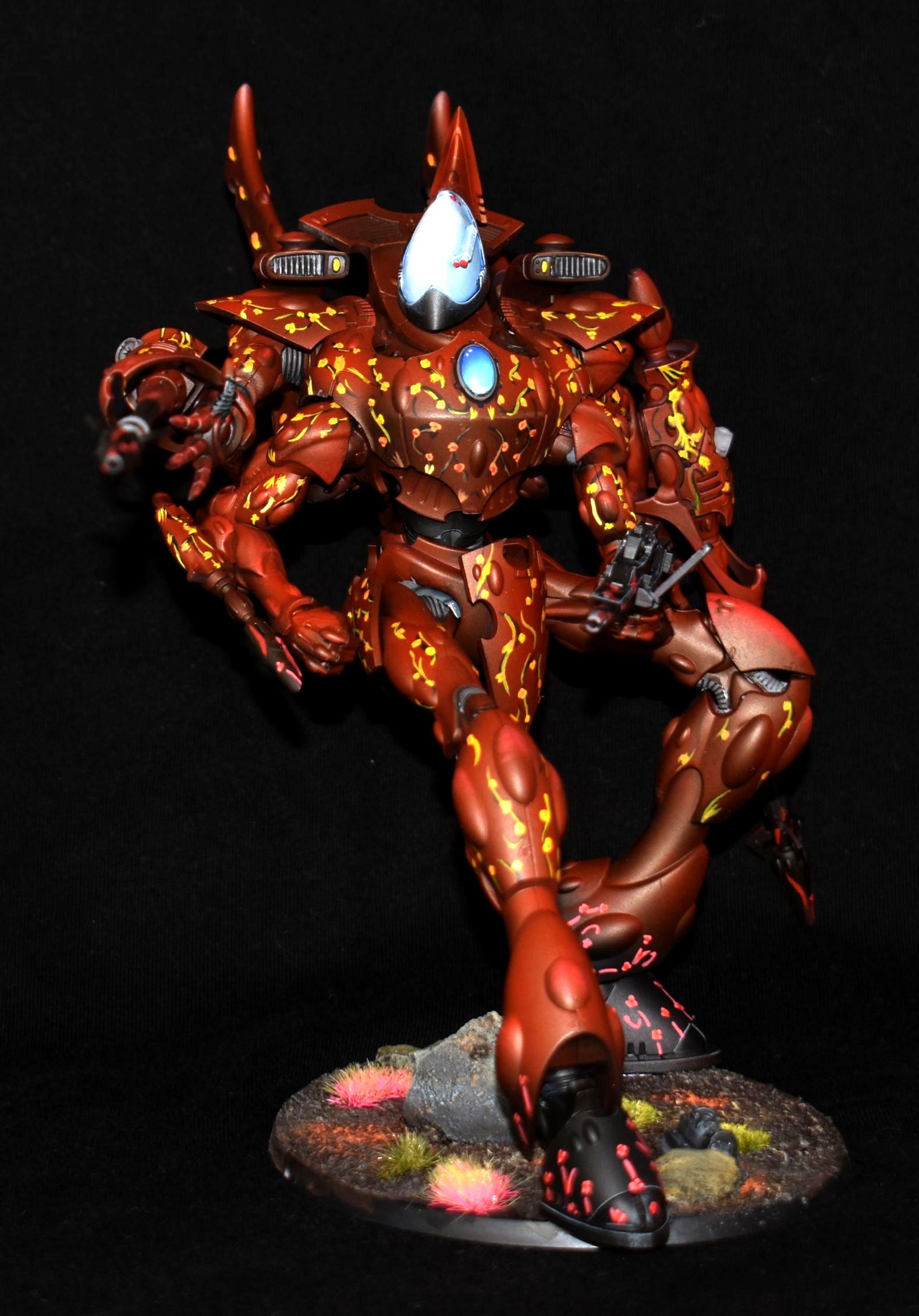
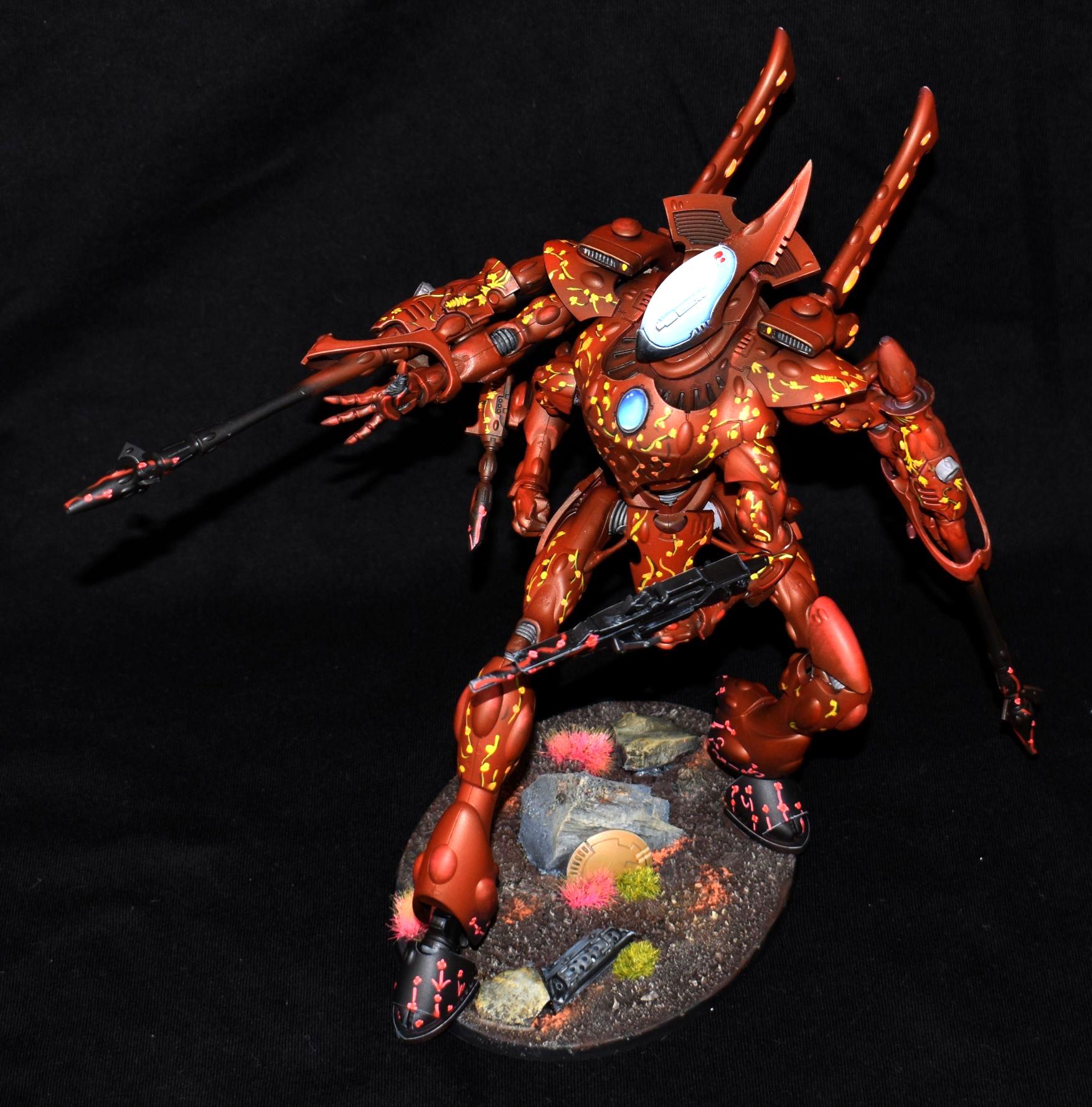
Chris56: Eldar Wraithknight
Pneumo: Chaos Champion
Vejut Copper Dragon
|
|
|
|
 |
|
2020/03/03 01:08:00
Subject: Vote for the winner of the Dakka Painting Challenge Round 60: Final Boss
|
|

Speed Drybrushing
|
My top 3, in no particular order (just as post)
@Keezus: The Iron Butcher - Lovely piece with great tones, although a value check on the piece finds it very flat overall. I think pushing some of the highlights on the head and traps while deepening some of the shadows around the pecs, arms and belly would really accentuate the piece more.
@Modock: Szalamandra - What can I say; clean and sharp, and I love how vibrant your colors are! I think the edges of your bases could do with a bit of cleanup (esp the edge where the green ooze begins), as I think it detracts a bit from the overall crispness of the piece.
@Feltmonkey: Dreaded Ambull - I love the colors on this piece, and the base work is simple but super effective (I can't tell if it's sculpted or free-hand painted). I don't know why, but I feel like some "spots", esp where the purple plating meets the skin, would just add that extra bit of oomph detailing!
And as always, congrats to everyone who finished this month!
|
|
|
|
|
|
2020/03/03 01:21:58
Subject: Vote for the winner of the Dakka Painting Challenge Round 60: Final Boss
|
|
Walking Dead Wraithlord
|
Great work ya#'ll!
I'll be joining you on the next one as im back to paining  .
My favourite three in no particular order:
That szlamandra ! - Simply excellent.Clinical job ont hose patterns!
Ambull - Just Fantastic. The colours, the execution... 
Shield Captain - So much detail!
Bravo gents. the usual suspects are knocking it out the park as usual
|
|
|
|
|
|
2020/03/03 01:38:01
Subject: Vote for the winner of the Dakka Painting Challenge Round 60: Final Boss
|
|
Buttons Should Be Brass, Not Gold!
|
 DV8 wrote: DV8 wrote:
@Keezus: The Iron Butcher - Lovely piece with great tones, although a value check on the piece finds it very flat overall. I think pushing some of the highlights on the head and traps while deepening some of the shadows around the pecs, arms and belly would really accentuate the piece more.
Thanks. I agree that the values are fairly flat. I don't think that there is much more room to increase the contrast as the midtone is already so light that there isn't much further that the highlights can go (although I could sparingly push to pure white), and the max highlight will limit the depth of shadow, otherwise the low values will overpower the piece. I think an example of where I cocked up this balance can be seen on the cheek in particular, the shadow there isn't quite right and the balance is wrong (actually, this extends to a degree to the whole face). I received other feedback that tinting with additional colors will increase interest without upsetting this balance. I'm going to revisit and I'll probably bring to S+B Mini in April.
|
|
This message was edited 2 times. Last update was at 2020/03/03 01:42:17
|
|
|
|
|
2020/03/03 02:29:59
Subject: Vote for the winner of the Dakka Painting Challenge Round 60: Final Boss
|
|

Preacher of the Emperor
|
I knew from the start this would be an exceptional round. I held myself to five to upvote, because if I hadn't I'd have been hard pressed to find five NOT to vote for. Queen Anne's composition and base really spoke to me this time in addition to the painting; feltmonkey really nailed the depth and richness of the colors; DV8 got that guy to look right at me (and I'm the guy who left eyes off his entry entirely) and really got the different textures to pop; I could look at Modock's light effects for days; finally, a first time vote for Chris56... I just love the color palette, the high contrast, and that base, plus great photography to boot! Honorable mention to Nevelon and Captain Brown for delivering some great looking classics! Everyone delivered something to impress and inspire. I salute you, one and all... now, time to go dig out some mid-90s Marines for next month!
|
|
|
|
|
|
2020/03/04 09:16:57
Subject: Vote for the winner of the Dakka Painting Challenge Round 60: Final Boss
|
|
Blood Angel Terminator with Lightning Claws
|
Nev
Those old tyranids always intrigued me, good job
|
 DV8 wrote: DV8 wrote:Blood Angels Furioso Dreadnought should also be double-fisted.
|
|
|
|
|
2020/03/04 17:34:47
Subject: Vote for the winner of the Dakka Painting Challenge Round 60: Final Boss
|
|
Trigger-Happy Baal Predator Pilot
|
Wow thanks for all the votes everyone, while I did put a lot of effort into the piece I wasn't really expecting a new PB.
6 votes from me this time as I just couldn't decide between the last two.
DV8, QAR and Moddock, fantastic work as always, you three set an incredibly high bar to the top table.
Deadshot - I love the weathering and the guts
Feltmonkey - really clean work on a fairly large piece, well done
Chris 56 - I love the yellow vine pattern, reminds me of Bellerophon's thorn scheme
Quality entries all round really, there isn't a single bad model on show
|
|
|
|
|
2020/03/04 21:12:35
Subject: Re:Vote for the winner of the Dakka Painting Challenge Round 60: Final Boss
|
|
Courageous Space Marine Captain
|
First off, well done to everyone, was a phenomenal ending to the cycle and some incredible entries this month!
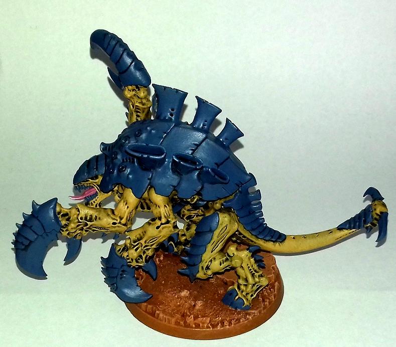
Jamie Shred: Really cool model and very much fits the theme! Great choice of colours, the shade of blue works really well, as does the contrasting orange stripe and really stands out! Also like the shadows under the statue and coils, although that may be just actual shadow. I think however, the transition on the spines could be a little smoother, and that the teeth could be more defined as they are an eyecatching part near the head. On that note, brightening the eyes would be another good shout as it gets lost in the wider piece.
MobileSuitRandom: A great model and very clean painting! I have never seen that one done as a Deff Skull before but you pull it off really nicely! The shading is nicely done and I think the next step is to highlight the skin some more and add weathering around the claw and armour.
Jjonson11:
A very intimidating model and fits the theme very nicely! I remember you meantioned wanting to try zenithal lighting? I think you've good a good basis hear as there is definitely a transition from bright top to dark bottom. I would say try to increase the contrast a bit more and really darken the shadows and brighten the highlights. Maybe on the topmost parts, such as the helmet and horns, highlighting all the way up to bright silver or white mixed with silver to add that gleam of light. I do however like the blood hand effect you got going on!
Nevelon:
A realy cool model and the white is impressively done which is very hard to do. I think however, the fce and weapon of the model get lost as they are both pure, shiny black which makes it hard to see. Consider using a dark grey, or even just black, and shading with Nuln Oil to add some definition. I know I just said "It's pure black!" but shading with Nuln Oil will actually darken the recesses and change the flats to be more dark grey. Apart from that, while I like snow bases and think its well made, it doesn't work for this piece as it doesn't contrast at all with the piece. Consider a darken base, or one with high saturation such as a lava base.
Yorkright:
Another great fit for the theme. very neat edge highlighting and the blue tone works very well with the gold and black! Perhaps a further highlight on the face would bring it out even more?
McPhail:
Again, the white on your mini is very smooth and even though it has some brown mottling on the backpack, it very much works for this model! I would say that next step would be to add definition to the face and hair as it comes across a little flat just now. A quick wash and highlight would really elevate this piece. I will say, the shading on the front torso is fantastic!
Captain Brown: Some rocking haircuts and bright yellow armour! I love the use of colours on these guys, particularly as Necromunda has a much grittier tone than even normal 40k. I would say as well that a soft grey highlight on the black would bring the best out of these.
Rybrook:
Really tidy paintjob for a badass chaplain! Clean and tidy paintjob and I like the use of bone and on the crozius to break up the gold, as well as the subtle heat effect on the gun.
I think maybe the lighting is letting you down here as its hard to see sometimes.
Viterbi: Great paintjob on a great model! The colour palette works very well, the brass on silver breaks the guns up nicely and the eyes look very intimidating to me! My one critique would be the helmet on the base, I almost missed it but its such a good detail. The blue chosen blends a little too much into the base and the adjacent leg and maybe a green or even a brighter blue?
DV8:
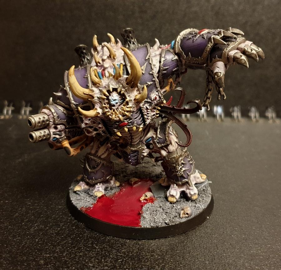
Beautiful sculpt and the votes so far (25/299 at time of writing) show how good it is! Everything beautifully done, the zenithal, the NMM, the blending on the spear, the richness of the reds! My only complaint is that it all gets lost a little in the similar colours around the shoulder and head, though I think that's more to do with the busyness of the sculpt than the paintjob. Amazing!
Keezus
Beautiful blending on the skintones and shadows, as well as the uneven scuffed leather! The metalwork is also beautifully done and with just the subtlest of highlight on key parts! Fantastic entry!
queen_annes_revenge:
Another incredible entry from you. Everything exquisite, including the decorative base which just oozes decadence and grossness. Amazing entry to round out the year!
Llamahead:
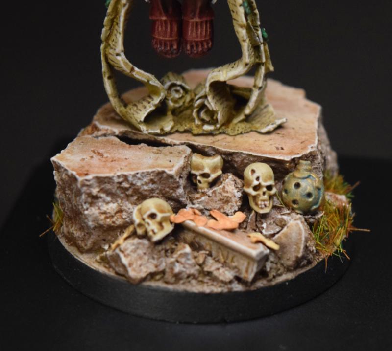
Very gross and disturbing model! Really loving the gorey effect and bloodstained bone! However, I think the base is a little plain, as its so large, and while it has a big rock in the middle, you could sprinkle some small pebbles, grass tufts or blood pools around to really enhance things!
Modock
As currently in the lead I don't think I need to give feedback on a completely unreal model. The orange, the blue, the highlighting and shading, the OSL on the rifle, the NMM. Flawless really.
Maharg:
Really cool conversion and I really like the pink tones going on! Reminds me a little of Majin Buu from Dragonball. It seems like this was intentional but I think the use of purple and pink tones just blends together a little too much for my liking. That might be personal taste though so take with salt! 
Elnibbus
A great conversion of a peronal favourite sculpt! The colours contrast very nicely, and the black wings are a particularly great spot, as is the sword and its shimmering effect! Also veyr much like the base, however, I'm not a fan of the head or hand. While I see you have removed the cup from the empty hand it looks somewhat out of place, and I feel as it using an open hand or maybe a different item to hold would have been a great idea. As for the face, while well painted and the eyes even looking forwards(!), it feels somewhat out of place in some photos? That might just be me. Either way, great job!
SmallChanges:
Great posing and really intimidating model than hits the theme in all the right ways for me! Firstly, your yellow is very smoothly done despite actually looking quite rough in palces. Itsa nice effect that lends well to the mini. I also really like the base as it contrasts so well in tone to the two main colours. My three main areas of improvement are to do with highlighting, shading and the skull. The base is lovely in colour but in some areas it lacks some definition, so would definitely suggest darkening it in crevices, particularly under the main Carnifex, would help out. On the opposite end, the carapace is a gorgeous shade but it really needs a lighten, turquoise or pale blue highlight, particularly around the claws as they have many sharp edges that are getting lost. Finally, I think that while the skull is well done, it gets lost as its far too similar to the yellow exoskeleton to stand out at a distance. I would suggest something every different to the yellow and blue (maybe a green or red-purple?) to help stand out, as well as really show off that alien nature with a bright green skeleton!
Arkanid:
Very tidy paiting and great choice of tone on the purple! I also really like the fleshtone but as with Maharg, I feel its in danger of being too close to the purple at times so maybe a slightly more saturated purple or pink would be the way to go?
ShadowsAndDust:
While hard to see, it appears you have some very tidy highlighting going on in the greens and the colour palette works very nicely! I think a highlight on the trim on the cloak, maybe with a light orange or cream, would really bring out the best in your work!
MidgetGems:
A beautifully wacky crazy ork project! Really great use of different weathering techniques to bring out the orkiness! The skin on both the driver and grot are lovely and the bluetone of the bike itself is perfect! However, I do think you are in danger of great lost on the base. WIth so many cold blues and greys going on, the cold grey rock base just gets sucked in, partiuclarly on a blue/grey background. Maybe it will look different on a different background but something to consider.
Feltmonkey:
A fantastic entry that smacks the Final Boss theme right in the kisser. Beautifully done piece with a very smooth transition on the flesh and carapace, and the amber eyes and nodes really many it pop! The dark base also lends itself really well to the piece and the "glowing effect" in the lines of the floor really help!
Paradigm: Really nice Star Wars mini and I'm a big fan of the heavy shadows under the cloak. Also really like the very subtle red tone from the lightsaber on the robes, as well as the eyes. However, I am not a big fan of the cloak, I thought the transition could be a little smoother and thinner, but if its an intentional effect then apologies!
dukeofbeer:
Great green tones going on here and the shadows are excellent, as is te mottled skin tone and particularly, the dark green spinal pattern that runs down the robes. It really reminds me of the Jurassic Park films in a good way! I would say a different tone for the belly might have worked nicely, maybe a paler green or dark beige, but it may also have made it too cartoony. Nice work!
Jadenim
Very cool model and very nice use of parts from the Vanguard and Sternguard kits. I particularly like the skull helmet, where did you get it from? I do think a slight touch of Stormhost silver or equivilent on the gold would take it up a notch, and the base is a little bit plain for a character model.
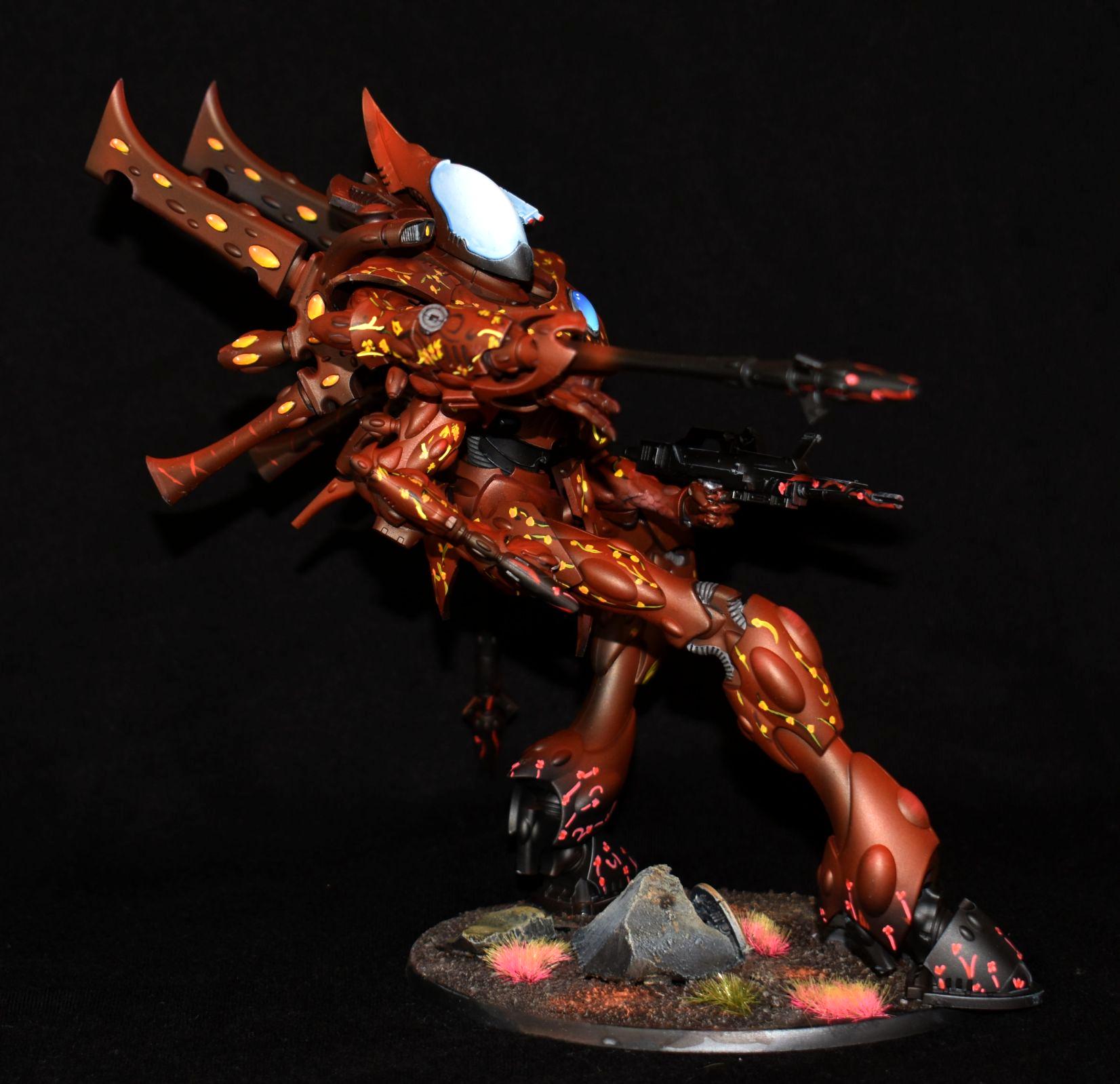
Chris56:
Beauitfully painted and that rich red and vibrant yellow scheme is to die for! I'm so impressed with the 4 armed conversion, I take it you were going for a Warp Spiders theme? The pattern on the armour is also very nicely done as are the head and genstone!
Pneumo:
Great conversion out of a stormcast figure and great use of Chaos parts to spice it up! Hits the theme really well IMO but again, as with others, the grey base and grey armour don't really stand out. The red shield is a highlight for me, but I think a different base colour is needed to get the most out of this piece.
Vejut:
Last but nnot least, Vejut, I love this model. It reminds me of something from Monster Hunter, a favourite game of mine, and the green and gold really mesh well. I think again maybe a slight silver touch on the metals would go a long way, but overall, a great piece!
|
I'm celebrating 8 years on Dakka Dakka!
I started an Instagram! Follow me at Deadshot Miniatures!
DR:90+S++G+++M+B+IPw40k08#-D+++A+++/cwd363R+++T(Ot)DM+
Check out my Deathwatch story, Aftermath in the fiction section!

Credit to Castiel for banner. Thanks Cas!
|
|
|
|
|
2020/03/04 22:51:39
Subject: Re:Vote for the winner of the Dakka Painting Challenge Round 60: Final Boss
|
|

Three Color Minimum
|
Great entries to finish the year!
I voted for seven or eight entries this month but Modock's Sally is my fave. That rich orange blending and nmm is awesome. Incredible work.
Thanks to those who made nice comments about my wraithknight - I really enjoyed this project.
See you all in Space Marine month!
|
Skirr and Skiver, Fancyman of Cornwall and Best Friend of your Mother's. |
|
|
|
|
2020/03/04 23:42:04
Subject: Vote for the winner of the Dakka Painting Challenge Round 60: Final Boss
|
|
Fireknife Shas'el
|
@Deadshot, thanks for taking the time to write all that out; the skull helmet is from the chaplain in the Reclusiam squad (that appears to be OOP now sadly)
|
|
|
|
|
|
2020/03/05 00:14:12
Subject: Re:Vote for the winner of the Dakka Painting Challenge Round 60: Final Boss
|
|
Dakka Veteran
|
Thanks for the votes everyone who voted for my Ambull, and for the kind comments DV8, Argive, MacPhail, Jamie Shend, and Deadshot.
COMMENTS! 
Jamie Shred - A really cool model. I like the blue gem things, you've done them really well. The turquoise skin could do with some brighter highlights though, I think, and I reckon the overall piece would benefit from a light gradient towards the top of the model. Very nice overall though.
MobileSuitRandom - Good bold colours, neat clean painting. Quite a nice gradient from cream to blue on the hair, too.
Jjohnso11 - I like the muted colours, which add to the realism, and the blood is nicely done.
Nevelon - I'm excited just to see a zoat! I love the colour scheme you've chosen for him as well, it looks really cool.
Yorkright - Good work on the gold trim. Those chaos guys are all about the gold trim. The blue of the tabbard is very effective, too.
MacPhail - A nice strong green, and some tidy painting overall. I reckon you could do with pushing the detail on the face. That's always the thing people look at first.
Captain Brown - Blue and yellow is always a strong colour scheme. The colours are nice and bold.
Rybrook - Good neat painting. Nice job on all the detail. The chest eagle and chapter symbol look great.
Viterbi - My eye keeps getting drawn to that poster in the background, but that's no criticism of the model, which is really nice. I like the dirty leather look, and I think you've nailed the wild west vibe of the model.
DV8 - Really great stuff. That muted gold with the rich red of the cloak is really gorgeous. Did you use metallic paints, or is it nmm? I know you usually do nmm, but I can't really tell this time. The axe blade is lovely too, and I like how the model reads, with the cold blade at one corner and the warm red cloak in the other.
Keezus - Great painting, with very smooth blends and nice textures on the leather and the key. It's really great, but my one criticism is similar to what DV8 said - that it could do with a bit more overall contrast to create interest and draw the eye to the parts you want people to see. I think you're on the right track when you were talking about putting some different contrasting colours in the shadows. Don't get me wrong though, I think it's excellent overall!
queen_annes_revenge - Good stuff, dark and nurgley. I love the base, obviously. The little bits of red make the whole thing work. A really nice piece.
Llamahead - Hilariously gruesome. That is a spectacular thing to put on a table. Great work.
Modock - No fricking idea how you've done this. The blends are absurdly smooth, the edge highlights ridiculously sharp. The parts that I really love though are the tiny bit of weathering on the backpack things, and how you've done the hexagon patterns. The fact that you vary the colour on these hexagons to follow the contours is crazy enough, but there's variation within many of the tiny hexagons themselves and even edge highlights on some of them. Ridiculous.
Maharg - Very nicely done, smooth highlights and I like the unified colour scheme. It could do with a spot colour on the face to draw the eye - perhaps glowing red eyes or something? Great work though.
Elnibbus - Great painting. The sword and the armour are particularly good. I don't remember seeing your proof pic - is that the original head? There's something odd about it that I can't put my finger on. It reminds me of someone. Jamie Vardy perhaps? I'm not sure.
SmallChanges - Super bold colours. Is that contrast paint? You're not far from something great. You've got good definition in the shadows, almost over-definition, which is not a bad thing. You just need some bright highlights on the edges of the armour panels and you'll have something that looks a bit like those cel-shaded tyranids a guy called Nard used to post on here.
Arkanid - I like the skin tones and the desaturated colours. The river of blood on the base creates an interesting focal point, but I worry that it perhaps draws the eye away from the model itself a touch. I don't know about the blue and yellow wires, I can see that you're making spot colours, but with this colour scheme you might be better off with just one rather than three? The red would be what I would choose personally, to link up with the base. It looks great overall, pretty atmospheric!
Deadshot - I like this a lot. Really good painting, with really nicely-done highlights. The time and effort you've put in shows on the model. I think what you've done with the guts works better than what I was suggesting on this model.
ShadowsAndDust - Good neat painting, good tabletop stuff. One bit of advice I'd give is that the photos need to be more from the model's eye-level. The golden angle of a model is rarely from above. You can show off all that detail you've done better from a bit lower down.
Midget Gems - A big, spectacular, fun piece. Your orks and goblins always have such great poses. Is that conversion work or just clever choices?
Feltmonkey - I'm pleased with this, which is sometimes rare for me, depending on my mood. It just went very smoothly, no major crap-ups, even repainting the teeth was fine. I'm pleased to end an up-and-down year for me paint-wise with a good one.
Paradigm - A very atmospheric Dooku. Great expressionistic highlights, and the face is excellent.
dukeofbeer - RAAAAARGH! Yaass, I love it. It's really nicely done overall with the marking on the skin particularly great, but I like how he sort of has a twinkle in his eye and a hint of a grin on his face. He looks like yeah, he'll probably eat you, but he'd also be a laugh down the pub.
Jadenim - An interesting model, and you've got all the detail on there well. The base is a bit plain though, unfortunately. The highlight for me of the model is the jet pack jets. They look amazing!
Chris56 - Really spectacular work that deserves more in the voting if you ask me. There's a lot to like here - That red tone, the freehand flowers, the blue glow, the dynamic pose. You could maybe do with some black lining around the armour panels to add definition in some places, but it would be churlish to criticise really. I also can't believe how quickly you painted this. Amazing.
Pneumo - A great conversion. The pose and the way you've put it together works great. The shield is really nice and adds a focal point on a gritty, desaturated model. It perhaps looks a bit odd that he's on such a big base. I can see that you're creating a scene, a mini-diorama, but the space on the opposite side of him is kind of empty, with just some rubble and skulls, so you wonder a touch why it's there. Lovely work though.
Vejut - A big old dragon. I like the colours, and the glow effect on the mouth.
A great finale to the year. I wonder who will win the dice! Maybe past winners should win a single die or something as they find themselves unable to repeat their success... 
|
|
|
|
|
2020/03/05 06:49:18
Subject: Re:Vote for the winner of the Dakka Painting Challenge Round 60: Final Boss
|
|

Longtime Dakkanaut
|
Yikes, it's so hard to come down to 5 choices, there's so much good stuff to choose from. But here goes:
Yorkright: I love that blue on the cloak, it really elevates the model, because it's usually not found on those chaos characters.
Maharg: The conversion work is seamless and the color choice is really bold and nicely executed.
Midget Gems: Red Onez may go faster, but I really like a subdued orc bike scheme. He must be the kunnin' kind who knows that he may be slower, but gets closer to the enemy for the maximum of krumpin', before they realize he's there.
Feltmonkey: I love that model (and fear, that I will need to buy it in the future, it really looks fun to paint) and you've done a wonderful job with the colors and textures.
dukeofbeer: IT IS A MOTHER  T-REX! That should be enough, but you've done a wonderful job with the skin and I already envy the party, that will encounter him at the end of a dungeon. Automatically Appended Next Post: Deadshot wrote:
Viterbi: Great paintjob on a great model! The colour palette works very well, the brass on silver breaks the guns up nicely and the eyes look very intimidating to me! My one critique would be the helmet on the base, I almost missed it but its such a good detail. The blue chosen blends a little too much into the base and the adjacent leg and maybe a green or even a brighter blue?
Thanks Deadshot and also for the time you took to give everyone feedback! I'm also ambivalent about the helmet. I painted it blue, because the Astra Militarum I have use variants of blue. And I tried to kind of imply that the helmet is lying there for ages, hence the heavy drybrush, when I did the base. But as you say, it gets lost that way.
feltmonkey wrote:
COMMENTS!
Viterbi - My eye keeps getting drawn to that poster in the background, but that's no criticism of the model, which is really nice. I like the dirty leather look, and I think you've nailed the wild west vibe of the model.
Thanks feltmonkey and here also for taking the time to comment everyone! Couldn't resist putting the poster in the background, even if it draws the eye, but I felt it really fits the mini, even if it is from AoS 
|
|
This message was edited 1 time. Last update was at 2020/03/05 07:10:34
|
|
|
|
|
2020/03/05 13:11:42
Subject: Vote for the winner of the Dakka Painting Challenge Round 60: Final Boss
|
|
Blood Angel Terminator with Lightning Claws
|
Cheers Deadshot/ feltmonkey.
Yeah the pictures weren't great, I used the daylight for this one but as you know the weather wasn't quite the sharpest last week
I did enjoy painting this chaplain but now he doesn't fit in with the others because of that winged droplet.
|
DV8 wrote:Blood Angels Furioso Dreadnought should also be double-fisted.
|
|
|
|
|
2020/03/05 14:06:22
Subject: Re:Vote for the winner of the Dakka Painting Challenge Round 60: Final Boss
|
|

Camouflaged Zero
|
First, let me say thank you to DV8, Argive, MacPhail, Jamie Shred, Deadshot, Chris56 and feltmonkey for commenting and votes, I really appreciate it guys.
DV8
What can I say; clean and sharp, and I love how vibrant your colors are! I think the edges of your bases could do with a bit of cleanup (esp the edge where the green ooze begins), as I think it detracts a bit from the overall crispness of the piece.
Thanks! Yes the toxic waste didn't turn out the best I hoped, It's only the second time I used it.
Feltmonkey
No fricking idea how you've done this. The blends are absurdly smooth, the edge highlights ridiculously sharp. The parts that I really love though are the tiny bit of weathering on the backpack things, and how you've done the hexagon patterns. The fact that you vary the colour on these hexagons to follow the contours is crazy enough, but there's variation within many of the tiny hexagons themselves and even edge highlights on some of them. Ridiculous.
Thanks again Felt...the blends got special attetion with lots of glazing over the transitions, I went back and forth multiple times until I was satisfied with the result. I used overbrush technique for the hexagons and honestly magnifying glasses makes a world of difference.
To the comments.
Jamie Shred - that's an impressive piece you got there. The scheme works well and very nice touch with the glossy gems. Pretty great looking model. 
DV8 - one of my favourite entry this month. The scheme with the muted colors does a great job of giving a 40k vibe. Very precise paint job and freehand on the ribbon is a perfect example of that.
The other elements are top notch like the exquisite weapon and the red cloak. The base is simple but very effective and the pigments do wonders.
Keezus - another great bust mate. I love the clean paint job on the skin. It's quite hard to paint and make a model interesting which has little detail and big flat surfaces, but you did it.
queen_annes_revenge - the paint job fit nicely on the mini, grim and dark. Various techniques and materials add to overall atmosphere. One thing I'd like to say is that the pictures
doesn't do justice to the mini. They are out of focus and washed out. I believe you should work on your photography because your work deserve good presentation.
Elnibbus - very smooth and clean paint job. The blade is my favourite part, but other elements are great as well.
Deadshot - I like that you chose a different color scheme for the death guard, It makes it quite unique. You pulled off just the right amount of gore and grittiness and the purple flames spices the mini nicely.
Midget Gems - I enjoy your conversions enormously and this is no exception. Very ingenious and funny. I think you should check your white balance because the pictures have a blue hue to it.
Should be easy to fix.
Feltmonkey - another favourite of mine. I see you implemented color theory on the mini perfectly. The analogous colors on the carapace and skin go together hand in hand and complementary
yellow add to perfection of scheme. You also took the time to make the blends very smooth and this is nicely noticeable on the skin. One of your top entries this year Felt.
dukeofbeer - 3D printed and painted ...amazing. Great execution...
Chris56 - very interesting take on eldar. Smoothly painted red and I like how striking the white visor is.
This is it from me and see you next year I mean next season. What a year!
|
|
This message was edited 2 times. Last update was at 2020/03/05 14:36:06
|
|
|
|
|
2020/03/05 14:14:01
Subject: Vote for the winner of the Dakka Painting Challenge Round 60: Final Boss
|
|
Thane of Dol Guldur
|
thanks modock! yeah I do the best I can with my crappy phone camera and lightbox...
Theres no way I'm going to buy a fancy camera..the hobby is expensive enough already! however I am looking into buying a new phone soon, that should hopefully give me better photos
.
|
  Heresy World Eaters/Emperors Children Heresy World Eaters/Emperors Children 
Instagram: nagrakali_love_songs |
|
|
|
|
2020/03/05 23:12:02
Subject: Re:Vote for the winner of the Dakka Painting Challenge Round 60: Final Boss
|
|
Raging-on-the-Inside Blood Angel Sergeant
|
 Deadshot wrote: Deadshot wrote:
ShadowsAndDust:
While hard to see, it appears you have some very tidy highlighting going on in the greens and the colour palette works very nicely! I think a highlight on the trim on the cloak, maybe with a light orange or cream, would really bring out the best in your work!
Thanks for the comments, Deadshot. I'm still getting used to using a light box with my camera, so the colors look dull as a result. I'll definitely keep the highlights in mind on my next project.
 feltmonkey wrote: feltmonkey wrote:
ShadowsAndDust - Good neat painting, good tabletop stuff. One bit of advice I'd give is that the photos need to be more from the model's eye-level. The golden angle of a model is rarely from above. You can show off all that detail you've done better from a bit lower down.
Thanks for the praise and the advice. I'll be taking photos from a bit lower of an angle, and not using the light box next time around.
|
|
This message was edited 1 time. Last update was at 2020/03/05 23:17:51
|
|
|
|
|
2020/03/06 00:58:26
Subject: Re:Vote for the winner of the Dakka Painting Challenge Round 60: Final Boss
|
|
Mekboy Hammerin' Somethin'
|
Hi All, A wonderful end to this years challenge
Thanks for the comments Deadshot, Felt, Viterbi, Modock
The base was the only one I had that would fit the model  I did hit a button on the camera by accident before taking these pics, i think it was the auto-white balancing one and it was aimed at the model which might explain the blue tint?
Jamie Shred- Very cool model, I like the contrasting orange on the tail of the model to contract the blue
MobileSuitRandom - A good old Warboss, nicely painted too
Jjohnso11 - Some nice details and effects you have painted, I like the attempt at leopard print.
Nevelon - Yay another one complete, you are a boss in yourself Nev.
Yorkright - Well done Yorkright, you have entered a few of these challenges in a row now and I can see your painting improving
MacPhail - The Green looks lovely, and a nice change to the normal colours on a SOB
Captain Brown - Nice birght clothing and hair as an Escher should have, you have done well again CB
Rybrook - Nice clean model and good choice of base to lighten the whole thing up.
Viterbi - very well done, I like the model, the painting and the background
DV8 - Wow you have done it again DV8, the colours are so smooth
Keezus - Great to see you back on these challanges Keezus, great skin tones and a very inventive plinth
queen_annes_revenge - Love it Queen Anne, beautiful weathering on the armor and base.
Llamahead - Quite a big model and hard to see it all, defiantly fits the "final boss" theme
Modock - holy cow thats good, such vibrant and smooth colours
Maharg - Nice work on a limited palette and cool model
Elnibbus- Great highlighting of the armour and wings and attention to detail
SmallChanges- He's big and mean and fits the challenge theme nicely, well done
Arkanid- lots of fiddly detail on that model you have done well to get it looking so good.
Deadshot - A nice bit of gore and weathering on the model
ShadowsAndDust - looks like a good model, photos make it hard to see much.
Midget Gems - Always rushing, need to better organize your time.
Feltmonkey - such a cool model and so well painted. you nailed it
Paradigm - Yay Para you are back and going strong, well done mate i know your eye inflection took a long time to mend
dukeofbeer- Thats a big beast, nice skin tone and markings
Jadenim - Good position for the model and solid painting
Chris56- not seen one like that before, the small details add a good level of interest to the model.
Pneumo - Well done for finishing, looks like a suitably epic model
Vejut - wow a big one from you, the gold and jade work really well together and the ice blue mouth is a nice touch
|
|
|
|
|
|
2020/03/08 20:55:54
Subject: Vote for the winner of the Dakka Painting Challenge Round 60: Final Boss
|
|
Trigger-Happy Baal Predator Pilot
|
Thanks for all the feedback everyone, some really useful tips there for me to use going forwards. The gems were done with the citadel gemstone paint over a base of leadbelcher, nuln, iron breaker and mithril silver. I'm glad I put the extra work in on the metal undertones as they really show through nicely.
|
|
|
|
|
2020/03/10 03:51:22
Subject: Re:Vote for the winner of the Dakka Painting Challenge Round 60: Final Boss
|
|
Longtime Dakkanaut
|
Congrats to all who finished, again so many great looking projects this month. Thanks for the comments and critiques it has pushed me to try and up my game.
|
|
This message was edited 1 time. Last update was at 2020/03/11 03:43:35
|
|
|
|
|
2020/03/10 21:10:48
Subject: Vote for the winner of the Dakka Painting Challenge Round 60: Final Boss
|
|
Is 'Eavy Metal Calling?
|
|
|
|
|
|
|
2020/03/12 09:00:54
Subject: Vote for the winner of the Dakka Painting Challenge Round 60: Final Boss
|
|
Dakka Veteran
|
Congratulations to DV8 and Modok, it's a privilege to share a podium with you guys. And of course congratulations to everyone who finished an entry and contributed to another spectacular month. Great work everyone!
|
|
|
|
|
2020/03/12 23:50:33
Subject: Re:Vote for the winner of the Dakka Painting Challenge Round 60: Final Boss
|
|
Mekboy Hammerin' Somethin'
|
Well done everyone, a wonderful final challenge to end the year
I will get the league table updated ASAP
|
|
|
|
|
|
2020/03/13 08:03:05
Subject: Re:Vote for the winner of the Dakka Painting Challenge Round 60: Final Boss
|
|
Camouflaged Zero
|
Big thanks guys for all the support and congrats to everyone for such a great ending of the season, also congrats to other two podium winners.
Feltmonkey and DV8, you clearly deserve to be on the winners stand.
Thanks to Para and MG for the dedication and passion you two are showing.
|
|
|
|
|
2020/03/13 11:21:21
Subject: Vote for the winner of the Dakka Painting Challenge Round 60: Final Boss
|
|
Trigger-Happy Baal Predator Pilot
|
Congrats to the winners and to everyone that entered
|
|
|
|
|
2020/03/14 00:52:26
Subject: Re:Vote for the winner of the Dakka Painting Challenge Round 60: Final Boss
|
|
Mekboy Hammerin' Somethin'
|
The League table is complete (2 small mistakes I've noticed, positions for me and Bell are wrong way around and missed blanking previous challenges for the new joiners on this challenge but not enough of a mistake to redo it)
https://www.dakkadakka.com/dakkaforum/posts/list/732117.page#9481149
Leave your thoughts for this years challenge here
https://www.dakkadakka.com/dakkaforum/posts/list/785975.page#10730344
I'll work on the bonus stats
|
|
|
|
|
|
|
|
|


 Eldar- 4436 pts