Forum adverts like this one are shown to any user who is not logged in. Join us by filling out a tiny 3 field form and you will get your own, free, dakka user account which gives a good range of benefits to you:
No adverts like this in the forums anymore.
Times and dates in your local timezone.
Full tracking of what you have read so you can skip to your first unread post, easily see what has changed since you last logged in, and easily see what is new at a glance.
Email notifications for threads you want to watch closely.
Being a part of the oldest wargaming community on the net.
If you are already a member then feel free to login now.
2022/09/12 22:33:19
Subject: Xpress Color - Vallejo entering the Contrast/Speedpaints game?
Garfield666 wrote: After the Army Painter Speedpaint disaster, this could be good.
Although I also like the regular AP paints and washes, so...
Speedpaint is not a disaster, you just need to know how to use it.
It's quirks are highly useful in the right circumstances. I use both Speedpaint and Contrast for different functions. The failed product is Scale 75's Potion series, because it is pissweak..
Automatically Appended Next Post:
stahly wrote: Vallejo entering the game? Wow, took them long enough! Really intrigued.
Vallejo is a paints only company and prides itself on getting their core competency right and producing the best quality product they can. I seriously doubt that were slow to react to Contrast paints, but they don't have the scale of economy to do anything ground breaking like GW can, so they generally react rather than innovate.
I suspect the reaction came swiftly, but they have taken their time to make sure their entry is a top tier product from day one. I expected Vallejo to join the contrast party, I expected them to arrive late and I expect their entry to be objectively superior when it comes.
Automatically Appended Next Post:
lord_blackfang wrote: I just put 8 Green Stuff World dipping inks in my cart... I'm not taking them out.
'Xpress Color' is a pre-existing brand name for a cosmetics line by Indola.
I didn't know this but searching the name brings me up those links to the pre-existing product line.
Not only is that unhelpful for both companies but as Xpress is not an actual word Vallejo are treading on another companies branding, this can get legal.
It is not too late to add an E.
2022/10/22 02:28:17
Subject: Xpress Color - Vallejo entering the Contrast/Speedpaints game? (Full Review Coming SOON!)
JHMiniatures wrote: Vallejo has listened to your feedback and we are already working on 20 more colours
This time I WILL take part in the selection and I will make sure we fill all the gaps
Another 20, that is wide. So please include, a second Caucasoid flesh tone, a Mongoloid flesh tone and two Negroid flesh tones please. Black flesh tones and oriental flesh tones are very much overlooked, the only company going all in with a set is Army Painter, and while that set is great it is not a contrast set.
You also need at least two more natural wood/leather tones, with the above flesh tones also filling the gaps.
The set above has lots of heraldic colours, but very few natural colours.
Please ask the boffins at Vallejo if it is possible to metalise contrast paints. again Army Painter do a set where there is a glitter pigment you can add to other paints to make them fabulous. Maybe you could add something or paint Xpress Color over a metal. Failing that please consider making Xpress versions of colours for NMM. Steely grey etc.
2022/11/02 02:38:43
Subject: Re:Xpress Color - Vallejo entering the Contrast/Speedpaints game? (Full Review - page 5!)
JHMiniatures wrote: Vallejo has listened to your feedback and we are already working on 20 more colours
This time I WILL take part in the selection and I will make sure we fill all the gaps
Another 20, that is wide. So please include, a second Caucasoid flesh tone, a Mongoloid flesh tone and two Negroid flesh tones please. Black flesh tones and oriental flesh tones are very much overlooked, the only company going all in with a set is Army Painter, and while that set is great it is not a contrast set.
Hmm... Triads for flesh have always been pretty easy to find.
Some great sets for non caucasian skin here.
I have the Army Painter Skin Tones boxset, and it covers me for non-contrast usage.
A contrast set for painting non-Caucasoid skintones would be a plus. Multiple skintones also serve double usage for other natural colours, as with a range covering Negroid and Caucasoid skin you also cover parchment, cloth and a lot of wood colours also.
I think asking for 1/5 of the new range to be explicitly named as skintones is probably unlikely. I agree that a couple of other names flesh tones is a good idea, but I think it stands that you don't need a paint to be named "skintone" for it to be useful for that purpose. And that's without mixing paints or contrasts (or Xpress paints!)
Not as ridiculous as you might at first think, five human skintones also covers a lot of other uses.
A few of those paints have "skin" or "flesh" in their names, but just as many don't. (Plus my skin-tone-ish Citadels and Coat'D'Arms' and P3s are in another container, and yet others in their range cases). My go-to for Caucasian flesh highlights is VMA Sand, along with several others that live on the paint desk.
It is a developing trend not to have a single labelled skin tone in your range.
I am a big fan of Daley-Rowney FW Acrylics. Very good inks with heavy pigmentation in decent 30ml dropper bottles at a low price.
Their main customers are schools, and so got negative feedback when the only fleshtone in their range was distinctly Caucasoid and labelled 'Flesh Tint'. While that was overly woke I do in part understand offence taken as the idea that flesh colour = Caucasoid is insensitive. 'Flesh Tint' is now called 'Peach Pink'.
When I got some I thought there was a mistake in the order, and other addition to the range to collect (it is well worth getting them all). Nope, same paint, different name.
This message was edited 1 time. Last update was at 2022/11/02 02:49:31
2022/11/02 15:53:06
Subject: Re:Xpress Color - Vallejo entering the Contrast/Speedpaints game? (New Game Color Review - pg. 6)
Osorios wrote: I recently bought my first contrast paints, imperial fist and baal red; while they are lovely, they are expensive.
My experience with Vallejo game color and model color paints is that they are very good.
I'm looking forward to buying some of these xpress colors.
I am too, but if you want cheap and can't wait there isn't much wrong with Army Painter Speedpaints, despite the moaning you hear. The reactivation can be an advantage dependant on application, and can be cured with varnish, mixing with regular AP pains, or as Juan told us Contrast Medium as a simple fix-all.
Or you could try Warcolours Antithesis range, another solid product line and woefully overlooked.
The only range of 'contrast' I do not recommend is Scale 75 Instant Colors, it works but does an inferior job.
This message was edited 1 time. Last update was at 2022/11/02 15:54:19
2022/11/04 14:00:58
Subject: Re:Xpress Color - Vallejo entering the Contrast/Speedpaints game? (New Game Color Review - pg. 6)
ekwatts wrote: Juan is kind of acting as a bit of an ambassador when it comes to the new Vallejo range, so I do think it's important that developments are covered in full in case anyone is coming to Dakka for clarification of anything that has been said elsewhere.
But the suggestion that he's been shilling or that any of this has been a coordinated attack by Vallejo and Juan is absurd and insulting both to him and to our intelligence.
Juan is an enthusiast for contrast-style paints. That's why he covered the Speedpaints and their reactivation issue (even coming up with ways to "fix" it in one video), and that's why Vallejo sought his expertise for their range. The two things are related only as far as Juan is effectively an expert in this field.
He even said earlier in this thread, I believe, that designing paints like this is going to be a compromise one way or another, with "improvements" in one range over another being only incremental at best. Kind of his point all along is that the Army Painter range isn't actually bad because it reactivates. It just does. The Xpress colours and GW contrasts do not. And that's that.
In the end, Juan is an incredibly skilled painter who wants to pass his expertise along to the rest of us. And Spikeybits is.... well.. Just one look at the site would suggest that maybe, possibly, perhaps, they rely on adverts for the revenue.
As for Vallejo, correct me if I'm wrong, but they produce a pretty extensive range of artists products, their miniature paints range being a slice of that (although I imagine still pretty sizeable). As a company I seriously doubt they felt their place in the market was being radically threatened or usurped by Army Painter (and I'm not trying to diss them, but they're a much smaller, more specialised company, we're talking about niches within niches here) such that they needed to pay someone to mount an assassination based on information that was *checks notes* true in the first.. place... uh.
I don't know what is going on here. But my You Tube feed yesterday showed a short clip about Juan standing against attempts to cancel him on the platform. The comments section below was supportive but evident that some people were trying to troll him.
Juan, if you are reading this. You are welcome here. Nothing you likely don't already know, but it is best to say it nonetheless.
2022/11/04 21:10:33
Subject: Xpress Color - Vallejo entering the Contrast/Speedpaints game? (New Game Color Review - pg. 6)
Ian Sturrock wrote: Yeah, if I had to pick between "Juan, one of the kindest and most generous and most skilled painters in the hobby, secretly being part of a big conspiracy" and "Army Painter, renowned for shoddy products that don't do what they claim, releasing a shoddy product that doesn't do what they claim", I know what my money is on.
Has Army Painter being doing that though. I am finding it hard to believe that company is toxic, though the internet is a big place and I could easily miss the words.
Surely this is due to fanbois trolling people who upset them, it fits the bill for the low IQ squad. Nothing (I have found) that Juan has done or said was to humiliate Army Painter, but some will take any commentary they find unpositive to be a threat of some kind.
This message was edited 1 time. Last update was at 2022/11/04 21:10:55
2022/11/05 12:10:24
Subject: Re:Xpress Color - Vallejo entering the Contrast/Speedpaints game? (Full Review - page 5!)
I think one of the issues is that caucasuan skin is an odd colour. Not quite sand, not quite salmon, and often not that useful for many other things. Once you get more brown or tanned, skin tones are more generically useful across a wide variety of things. I do think it's useful to have some though, especially for newer painters who will more naturally gravitate to paints with "flesh" in the name - and as I said a default of "paint African people's skin with Scorched Brown, highlighted with Bestial Brown" ain't a good look.
While long pre-woke I do believe this was the reason we saw Elf Flesh and Dwarf Flesh in the old Citadel range.
Unless you mean to not have only one? On that I agree it's just good business and went into that already (in this thread I think?) I'm not sure what "Mongoloid" flesh looks like. I work with many people from all parts of Asia (Japan, China, Vietnam, Burma, Phillipines) - not to mention Islanders from NZ, Samoa, etc) and their overall skin tones really aren't much different to others that can be found around the world. I've certainly never seen a "yellowish" skin as old racist media would have it.
That is it. It is bad business both ways. It is bad business to only have one human skin colour in your hobby range, it is a poor colour composition to do that. Sacrifice a secondary blue or a secondary red to get in an extra earth tone is a good idea, the 'boring' colours are the most useful.
However it is VERY bad business now to imply that human flesh is one colour, even if below skin this is true, and even if this oversight was accidental. Either have several paints labelled as human skin or none at all.
This is what Daley-Rowney found out.
I am a big fan of Daley-Rowney FW Acrylics. Very good inks with heavy pigmentation in decent 30ml dropper bottles at a low price.
Their main customers are schools, and so got negative feedback when the only fleshtone in their range was distinctly Caucasoid and labelled 'Flesh Tint'. While that was overly woke I do in part understand offence taken as the idea that flesh colour = Caucasoid is insensitive. 'Flesh Tint' is now called 'Peach Pink'.
When I got some I thought there was a mistake in the order, and other addition to the range to collect (it is well worth getting them all). Nope, same paint, different name.
Ahh... interesting take on it. I also have a nice little collection of DW inks. In an extensive range I'd have thought it more useful to have a good number of them named, even if they were more generically named - different markets, though - as Art students can probably figure these things out a bit better than the average newbie to model painting, that can skew a lot younger. I'm not a fan of "woke" in it's current form, but I think avoiding only having caucasian skin as the only skin tone in a range would be a smart thing to do. And I'm sure the current crop of young art students skew a little more woke than most of us here.
Daler-Rowney did not confide this to me, but the FW Acrylics is a well established product line, times are indeed changing and schools are trending towards woke in the UK. I asked my supplier why he didn't advertise for the wargaming market, as the product he sells is superior and at a better price. I only knew about them from a review here:
I bought them on the strength of that review and was instantly converted. Next to no one knows about them. My supplier kindly replied that while he does sell to hobbyists, he is constantly cycling stock in vast numbers to schools. I asked about the extra product line, and was informed that Peach Pink was a recent renaming due to pressure from clients, the only one Daler-Rowney has done. I did not need to ask why.
Not as ridiculous as you might at first think, five human skintones also covers a lot of other uses.
It doesn't really matter what they're named, but currently it looks like only one of the Xpress paints so far is something that could be used as a skin tone, and that one is very red/pink even for caucasian skin, so another 3 or 4 (regardless of whether they're named "skintone" or not) would be pretty reasonable.
Agreed, so long as they are there. One solution could be small print on the bottle for those colours with specific purposes, as there likely will be several. So a bottle of 'Dark Earthtone' could have in small print 'tanned leather, dark flesh, peat soil' as suggested uses. While 'Red Earthtone' could have in small print below 'ruddy flesh, rawhide' etc. I think this would help with the entire range, with heraldic colours mentioned, traditional colours like madder mentioned, whether a white ir tined or not etc.
In any case I would be very disappointed with less than ten earthtones out of the entire range of 43, with many of those doubling as a flesh colour.
I'd certainly go for more that can be used over the current one, and probably another two named ones. Ending up with Light/Mid/Dark (fit the current one in there where it best fits). Maybe "Ruddy" as well.
and as I said a default of "paint African people's skin with Scorched Brown, highlighted with Bestial Brown" ain't a good look.
Back to this. At Salute 2020, which occured only last year in London (Covid), a hobby group was showcasing Speedpaint on Army Painter's behalf. They were not employees just hobbyists like you and me. But they got hands on with the new range six months before release and we could sit and paint and try them out. I was too late for that, I had other things to do first and didnt get around to paint, but I did get to talk to them about painting and saw samples or minis left behind, and saw the range.
I asked at the time about non-Causcasoid skin tones and whether Army Painter covered them. I was told about the Flesh Tone set which had colour triads for three different skin groups and respective inks for all three. I took that on board and later managed to source them, they are very good.
But I also got a hot tip, so counter intuitive I would never have guessed it. When painting a very dark skin African, like a Zulu or West African, undercoat in green and paint straight over the green with a suitable dark brown paint, Dryad Bark is recommended for this. The combo makes it more real. I was shown pictures of some Zulus painted this way.
Insaniak, mentioning Speedpaint and Contrast here is fair, so long as it is in cross reference to this new product, in quality, availability, or value for money.
Naturally we do not have too much to say at the moment, but if this thread lives long enough people will be wanting to post comparisons and personal experiences. I hope you see fit to review your dictat at that time.
2022/11/06 13:10:00
Subject: Re:Xpress Color - Vallejo entering the Contrast/Speedpaints game? (New Game Color Review - pg. 6)
I bought all of the Antithesis range. They're ...usable, but not my favourites to use. I'm happy to pay a little more for Contrast, and have picked up the GSW Dipping Inks. I'll buy the Vallejo when they come out, and if the new/reformulated Army Painted ones actually don't reactivate, I might even pick them up as well. Maybe. .
I decided not to buy Warcolours as their formatting led to an all or nothing approach, if I buy blue 5, I will get the itch to buy blue 1-4. I dont want that itch. I was going to make an exception for Antithesis, but then Speedpaint was on special offer and I bought the Speedpaint Mage Set twice.
Warcolours is a small Cypriot company and access is lobsided, so I mention them to keep the option alive.
I bought my army Painter and Citadel paints from Alchemist Workshop in the UK, decent level of discount, topped up both from covid stock of e-businesses going under, some at high discount.. I bought Vallejo from Griffin Gaming. I bought the entire Contrast range from Alchemist relatively early, and when the range was expanded, post getting all the Speedpaints, twice, I paid for the upgrade bundle.
Steep entry to complete the range, and frankly by this stage is was completionism. But I was quickly glad I did. Full range of Contrast and Speedpaint grants a high palette of anything other than metals. Oddly enough I rarely use them for intended purpose, but over a single basecoat to replace layering.
I will be buying the new Xpress Color, and likely buy the lot because that is how I roll. Is that necessary, likely not, but it will widen the palette. The problem I might encounter is that I will have to think carefully over existing projects. I am working through my WHFB armies, painfully slowly, and if I start a faction with Speedpaint or Contrast, can I afford to retire either from my repertoire in favour of Xpress Color? I don't think so. We know nothing about mixing yet and the existing colour ranges do not overlap, each companies colours are subtlely different, I expect Xpress Color to have the same issue. At least with Old Citadel, (I still have some), Game Color and Army Painter main paint range there is a lot of overlap, I can start an army with Ultramarines Blue, Mithril Silver, Chaos Black and Goblin green base, 90's style and finish/add to/touch up the same army today with Army Painter and Vallejo Game Color alternatives. I don't think the same will be true of Contrast painted minis. I suspect it will be an all or nothing.
Agreed! Juan - feth those guys. Perhaps you can get more followers out of this childish behaviour as Naomi/Sword & Steele did a year or two ago. I'd never heard of her before that, but Steisland Effect and now I'm a subscriber.
I was completely unaware that Sword & Steele were having trouble, I subscribed long ago, but dont watch them often.
The original fleshing out of the Salamanders chapter had them with dark brown skin before that was reconned into coal black in what I thought was a rather baffling move.
The original Salamanders were blonde hair aryan types, or maybe that was just the officers. Consider the optics of that.
I much prefered the Vulcan was African to Vulcan was alienesque. As the Imperium is mostly Caucasian soup, it makes more sense for those who go it alone and have a distinctly different moral culture to also be ethnically distinct, either African, or Norse etc. It might be just enough to keep the bullgak away.
Back in the day I used to use WInsdor & Newton inks for washes and what we'd now call contrast. I found out about the Daler Rowney via Les Bursley's "make your own washes" tutorial here on Dakka over a decade ago (and they're good, as you know!) https://www.dakkadakka.com/dakkaforum/posts/list/261541.page
Thanks for the vid link - I'll check it out later. Vince has some good stuff in his vids.
I discovered by own form of Contrast two decades back, I called it the Dark Pastel technique, it was extremely crude.
The name had meaning, the baseline formula was one part paint, one part black paint and two parts water. I called that the baseline as you had to then add any of the three to the mix from baseline to get the colour with a workable consistency.
I called it Dark Pastel because the paint was diluted down to a pastel watercolour consistency by water dilution then brought back down in tone via the black paint.
Results were very mixed, it worked well on scales and fur, badly on flat surfaces, it worked well with Citadel Blood Red and other select colours, badly with any yellow.
I did the Descent Journey in the Dark dragons in under ten minutes each, to well above tabletop quality. I still have them.
I took my technique to Salute in 2008 and IIRC 2009 and talked about it. I found a new technique, so share. I made it clear that it does work but only on certain conditions, however when it does work it is transformative, and makes a excellent cover with minimal time and layering with only modest skill (I am an average painter, but a good innovator). It was absorbed as a selective technique, excellent in a narrow range of paint and surface combinations. The clincher was the ability to get excellent results quickly, with minimal skill, an eye opener.
I still wonder if this was the pebble that got the Contrast avalanche rolling. Citadel were there.
I did have some inks, from the old 80's Citadel dropper bottles, I still have about half left, I did use them for a boost, but did not record exact composition. Never though to entirely replace the heavy water dilution with them though but relied on the 50% black to do the job.
I don't think it's realistic that Vallejo will dedicate 1/4 of their new line to earth tones.
I do.
Let us start with four human flesh tones, which is the compromise position I am reading in the thread. Light, medium, dark and ruddy.
Then add bone and sand for six.
Bark, leather, and two soils a clay brown and a light grey brown for ten.
I think that leaves ample room if we limit to 40, which we are not.
Six 'heraldic' colour wheel colours.
Four other variations each of blue, red, and green.
A swatch of four camo colours (also mostly green and grey green)
Black, white and three greys.
A second purple, second yellow and a second orange.
That is forty.
We need some cross colours like aquamarine/turquoise which we can pad out with, maybe a third yellow.
Easily doable. However what we see often is a vast range of reds, nice colours to be sure but largely wasteful in the range. Browns are boring, but a wider range of earthtones is in my opinion essential.
But I also got a hot tip, so counter intuitive I would never have guessed it. When painting a very dark skin African, like a Zulu or West African, undercoat in green and paint straight over the green with a suitable dark brown paint, Dryad Bark is recommended for this. The combo makes it more real. I was shown pictures of some Zulus painted this way.
Very interesting. What lightness and intensity of green are we talking about as recommended to use? You can reference the citadel colour palette for an answer, since it's easly found/referenced by most people. Dryad Bark is a dark brown, though...?
I am sorry but I don't remember where I put the notebook I took to Salute. is. I took down notes. I do remember the Dryad Bark was specific, but also specific to Zulus, who are darker than most Africans. IIRC the exact green is actually less important, I do vaguely remember then saying so to me asking the same question as you.
Spoiler:
But last night I stumbled on a clue when looking at info on ancient colour palettes for a post on the Speedpaint thread.
The renaissance old masters used green as an undercoat for human flesh, and this was presumably more often Caucasian too.
A lot of renaissance era art was unfinished and we have undercoated angels on church walls and canvasses in vaults. With green faces.
Incomplete art was a big issue back then, the better the artist the more work they got and the more work they got the more work they started to secure the income stream, and consequently the less they finished.
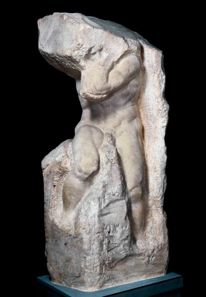
On aside there are also here are a lot of 'captures' in vaults under medieval Italian cities, captures are half completed sculptures.
Michelangelo had and still has a particularly impressive Pile of Shame. Here is one of his minis left on the sprue.
So don't feel bad.
Back to your question, try an ordinary modest earthy green.
Plaguebearer maybe.
This message was edited 3 times. Last update was at 2022/11/06 14:14:01
2022/11/08 13:46:10
Subject: Re:Xpress Color - Vallejo entering the Contrast/Speedpaints game? (New Game Color Review - pg. 6)
I do a little bit of (simple) blending (undead flesh tones) using Citadel Contrasts on a regular basis. The keys to doing so havce been using contrast medium and (occasionally) a touch of drying retarder. GSW's Dipping Inks also play nicely using this method, so I'd assume at the very least, Vallejo's Xpress would work using this sort of method. It's obviously not the same as blending traditional paints, Much more dropping some medium into the middle, then doing your blue and blending that into the medioum in the middle, then quickly doing the same with your red on the other side and then essentially mixing them to taste in the central area.
That sounds like a lot of faff, goes against the principle of Contrast frankly.
I do abuse contrast as a function by painting over a single, sometimes double basecoat and use the fluidity of Contrast to do secondary layering, but that is still a Contrast method. I don't however want the watercolour effect that a Contrast over undercoat has.
I do not expect Xpress Colour to differ in application.
However due to its quirks Speedpaint does, once the reactivation 'issue' is fixed I will have to label my current Speedpaints against any future Speedpaints, the ones that do a once over and the ones that have a longer work time and support blending. So long as I keep a sufficient stock of the current Speedpaint and renew, and above all relabel or otherwise mark the old bottles. So I have two choices per colour, a speedy once over or a mixer paint of the same hue. I think this could end up a colossal advantage.
I wonder if Vallejo could profit from Army Painters error and do a line of Xpress Colour Worktime, a retardant that you add a drop to on the palette, and load on your brush before dabbing in the paint. I think blending on the palette detracts from what Contrast style paints do, however loading a brush with some Xpress paint that works like current reactivating Speedpaint, then applying a completely different colour (without retarder) so you can blend on the model as you go.
Please remember that Speedpaint reactivation doesn't remove its 'Contrast paint style' credentials, it endangers colourfastness. If you don't desire colourfastness but want to blend while 'Contrasting' it is very versatile. This is why I tag team Contrast and Speedpaint, and will add Xpress to the tag team, but alongside the Contrast as one paint range on grounds of post application dynamics. Trouble here is that there is no palette overlap, so I can have one red that stays and another red that blends but cant switch roles. Mark my words there will soon come a day when hobbyists with new Speedpaint will be looking for old Speedpaint for blending because having two types of the same colour will be so so useful. I hope the label is distinctively different between the two.
2022/11/14 02:43:13
Subject: Re:Xpress Color - Vallejo entering the Contrast/Speedpaints game? (New Game Color Review - pg. 6)
NAVARRO wrote: Yes and hopefully we will get a box set with all the regular 80 as usual. I would then just add metallics and call it done. Im not totally sure if Xpress is for my style of painting. I mean I can add depth to the normal paint but the moment you wash all the mini with Xpress you lose control on the original opaque tone.
Wouldn't that be the boxed set he's holding in the video thumbnail? By my count it has space for exactly 80 paints.
I would like a special set of 160 over two boxes, because completionism.
This message was edited 1 time. Last update was at 2022/11/14 02:46:53
2022/11/26 19:30:49
Subject: Xpress Color - Vallejo entering the Contrast/Speedpaints game? (New Game Color Review - pg. 6)
Ghaz wrote: A video by Broadsword Wargaming comparing the Xpress Color, Contrast, Speed Paints and Dipping Inks.
Just been watching that and came to this thread afterwards.
Broadsword seems to have completely different experiences of Dipping Inks from Stahly.
Stahly recommended them on what he found of them, I bought the full set of 36 and they arrived this week.
There is a sizable discount from GreenStuffWorld at the moment and UK stock. Coast me £117 all in, which is very good for 36 large bottles.
Anyway now I am in a little bit of a panic because, at least from what Broadsword has showcased, most of them appear to be crap.
2023/02/03 01:18:57
Subject: Xpress Color - Vallejo entering the Contrast/Speedpaints game? (New Game Color Review - pg. 6)
JohnnyHell wrote: If you have them all, have you tried them before panicking?
No, but I am not at that stage yet. Currently I am assembling. Test miniatures for my new army (Skaven) will come soon.
I tend to research everything before I buy anything.
insaniak wrote: Yeah, the GSW stuff looks wildly inconsistent, based on those. Not entirely surprised given their method of promoting it using renders instead of actual painted examples...
Thank you, my point exactly.
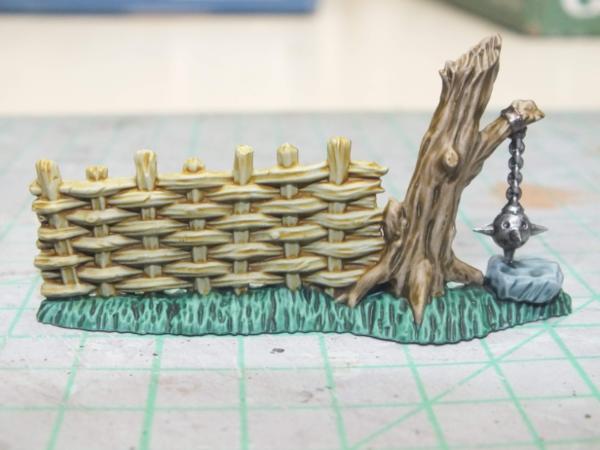
Vilegrimm wrote: Hey, Orlanth, here's a photo of a terrain piece I did with 3 GSW colors on it:
The fencing is Papyrus, the tree is Skeleton Brown and the grass is Ork Flesh. I also have a few other pictures if you're interested.
-Vilegrimm
Edit: I used Gray Seer spray primer for the basecoat, if that helps.
Thank you for your input.
Azazelx wrote: I have all of the GSW dipping inks, and they've been fine for me - but I'm probably not your typcial use case as I mainly use them over colours or mixed with things like Contrast to get various effects. I don't use the "official" method except for rarely.
I also haven't yet used all of them.
This highlights, indirectly my main problem with these products.
Since I moved on from (only) regular Citadel paints I have been mired by the underlying understanding of the inconsistency of paints both between and in brands.. I cant just look at a pot and say this goes on like this. With the contrast family I have to know before I use it is a colour is saturated or unsaturated, mixes well, is transluscent, reactivates, etc etc. It is a lot of information. In fact it is information overload.
Hence my panic. I do not ever think my purchase was a waste of money. I am sure that good use can be made from Dipping Inks, as Vilegrimm kindly demonstrated. But I haven't a clue which brown to put on which part of which rat. I could experiment, but how many combos do I need to test to gain The Knowledge, and is that knowledge transferable. Knowing how to paint fur is different from armour, or spears, or belts and so on and so forth.
I could test on sprue but that doesn't work in all applications, so I will have to test on rats, and unlike my Warlord, I do not have rats to waste
This message was edited 1 time. Last update was at 2023/02/03 01:20:04
2023/02/04 14:30:41
Subject: Xpress Color - Vallejo entering the Contrast/Speedpaints game? (New Game Color Review - pg. 6)
Hence my panic. I do not ever think my purchase was a waste of money. I am sure that good use can be made from Dipping Inks, as Vilegrimm kindly demonstrated. But I haven't a clue which brown to put on which part of which rat. I could experiment, but how many combos do I need to test to gain The Knowledge, and is that knowledge transferable. Knowing how to paint fur is different from armour, or spears, or belts and so on and so forth.
I could test on sprue but that doesn't work in all applications, so I will have to test on rats, and unlike my Warlord, I do not have rats to waste
Unless the rats are supposed to be clones, some variation in colouration and tones would be natural within a group. On that basis, I'd say the rats are perfect test subjects.
Trouble is I am not talking about the shade, but transluscence and a lot of other factors.
I am all for some variation within the pack between rats, but that is not what contrast gives, you get ranges from pastel to not-inkwash through to saturated flat colour.
Prior to this I could guess what effect a paint had by looking at the pot. Now that is no longer so.
Also I mentioned fur to start, but different paints in the contrast family and similar products have different effects. A pastel rat is essentially an illusion or ghost rat. I could do an entire army in a pastel style and benefit from the 'artistic' licence, this is not the effect I am looking for but it would be valid. I absolutely dont want the effect between units, within a unit or on different parts of the same model.
I have left over rat bits on sprue on spare bases, I will tast as far as I can on this before committing select paints for select purposes. I have a painting log, I document everything, mostly so I can add units later or repair models sometimes years after I do a faction. So I know what to do, I must test all the browns and flesh tones, record everything and then move onto other colours and purposes. I am just putting off the chore because essentially I will need to do a log for every paint combo I might need for the army. which might run to seventy plus colours total.


 .
. Consider the optics of that.
:strip_icc()/pic174259.jpg)