Forum adverts like this one are shown to any user who is not logged in. Join us by filling out a tiny 3 field form and you will get your own, free, dakka user account which gives a good range of benefits to you:
No adverts like this in the forums anymore.
Times and dates in your local timezone.
Full tracking of what you have read so you can skip to your first unread post, easily see what has changed since you last logged in, and easily see what is new at a glance.
Email notifications for threads you want to watch closely.
Being a part of the oldest wargaming community on the net.
If you are already a member then feel free to login now.
2018/01/22 00:58:25
Subject: Re:Dakka (Unofficial) Painting Challenge Round 35 January 2018: A Few Good Men
Thank you very much for taking the time to make that post Moolet very helpful. I'll try and take both your advice on board but also have a play and see what I can come up with.
Yeah Nev they are looking good.
Well done TheDraconicLord interesting you have done different skin tones, I like it. , the mud on the cloak looks good as well
Those models have turned out well KernelTerror, congrats on having some very cool models
Well done TheDraconicLord interesting you have done different skin tones, I like it. , the mud on the cloak looks good as well
Yeah, I'm a glutton for extra work my Ironjawz have 3 different skin tones to give them a more diverse and unique feel. Humans can feel very different even with the same skin-tone because of hair, sex, etc. but orcs almost look like a clone army sometimes.
"Fear is freedom! Subjugation is liberation! Contradiction is truth! These are the truths of this world! Surrender to these truths, you pigs in human clothing!" - Satsuki Kiryuin, Kill la Kill
2018/01/23 12:56:37
Subject: Re:Dakka (Unofficial) Painting Challenge Round 35 January 2018: A Few Good Men
Zed wrote: *All statements reflect my opinion at this moment. if some sort of pretty new model gets released (or if I change my mind at random) I reserve the right to jump on any bandwagon at will.
2018/01/23 21:07:29
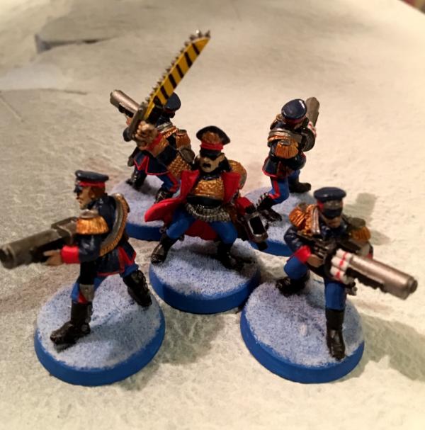
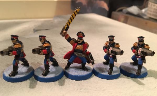
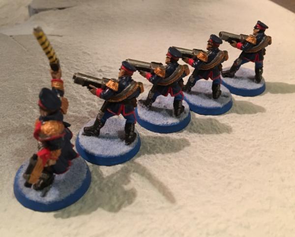
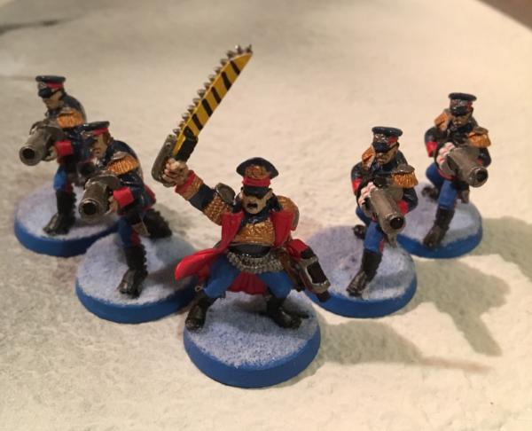
Subject: Dakka (Unofficial) Painting Challenge Round 35 January 2018: A Few Good Men
Cheers guys! I spent a lot of time trying to get these guys right, still not 100% happy with them but I was rapidly reaching the point of diminishing returns, so hopefully they're good enough!
2018/01/23 22:38:30
Subject: Re:Dakka (Unofficial) Painting Challenge Round 35 January 2018: A Few Good Men
still not 100% happy with them but I was rapidly reaching the point of diminishing returns, so hopefully they're good enough!
They're great, very characterful and thematic. In fact they are too good as it means I wont catch you up in the league table this month... haha.
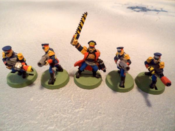
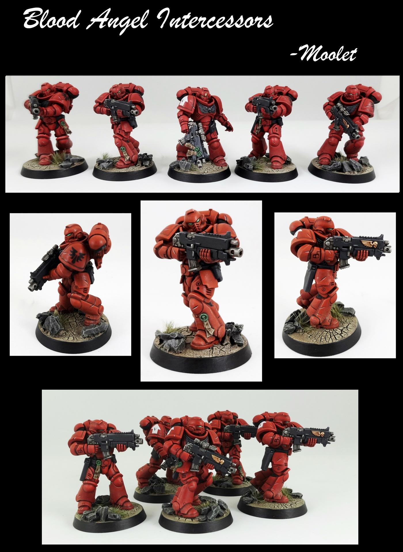
Here is my entry. Some pretty plain intercessors but I tried out doing my battle damage differently. I'm not too keen on the results to be honest but I enjoyed trying something new, I need a bit more practice + patience.
2018/01/23 23:09:28
Subject: Re:Dakka (Unofficial) Painting Challenge Round 35 January 2018: A Few Good Men
@Para - As always, your "muted" style looks so striking. Great work.
@Moolet - They already look pretty cool to me! That's some nice clean painting
This message was edited 1 time. Last update was at 2018/01/23 23:42:35
"Fear is freedom! Subjugation is liberation! Contradiction is truth! These are the truths of this world! Surrender to these truths, you pigs in human clothing!" - Satsuki Kiryuin, Kill la Kill
2018/01/24 08:40:49
Subject: Re:Dakka (Unofficial) Painting Challenge Round 35 January 2018: A Few Good Men
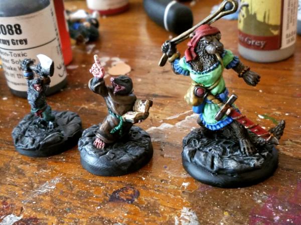
More or less done with three of the animal adventurers. Don't think I'm getting the raven done, which is funny as he was the reason I decided to do them this round. Kinda fighting with myself over if I should use some matte or satin varnish on the robes and fur at the minimum, especially on the mole. Also willing to listen to suggestions on the bases--not liking the way they came out for the shrew, and to a lesser extent the otter, both have feet that blend in, and the shrew is pretty much all the same color as the base, just not sure what to do about it while keeping a similar "dungeon rock floor" feel from the last few entries. Got new lights and such, will do more final pictures before the end of the month.
2018/01/24 09:42:30
Subject: Re:Dakka (Unofficial) Painting Challenge Round 35 January 2018: A Few Good Men
Excellent write up on the black Moolet! You always put a lot of effort commenting, kudos to you mate.
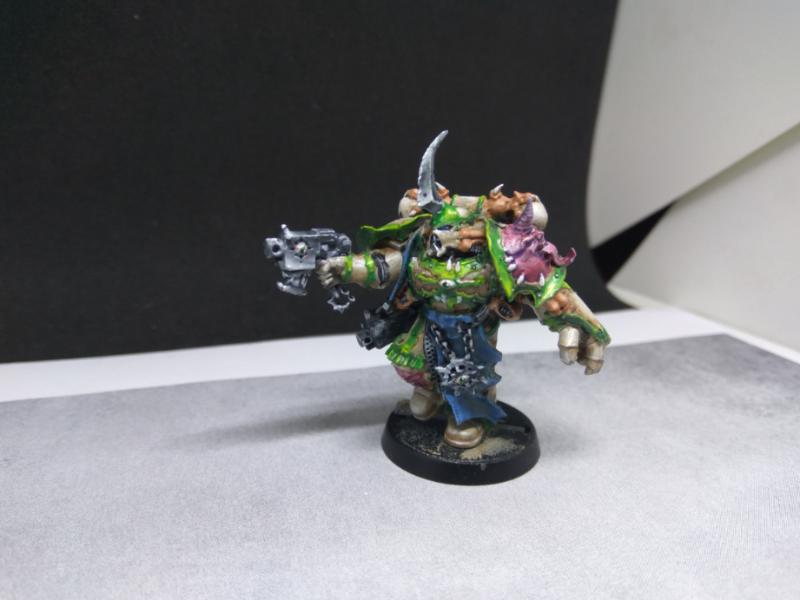
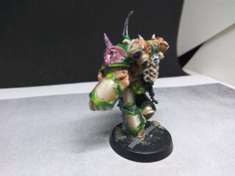
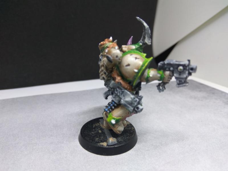
Very crisp and clean paint job on primaris. Sharp battle damage .
Which red is that, Mephiston Red?
2018/01/24 11:46:00
Subject: Re:Dakka (Unofficial) Painting Challenge Round 35 January 2018: A Few Good Men
Vejut wrote:
Also willing to listen to suggestions on the bases--not liking the way they came out for the shrew, and to a lesser extent the otter, both have feet that blend in, and the shrew is pretty much all the same color as the base, just not sure what to do about it while keeping a similar "dungeon rock floor" feel from the last few entries. Got new lights and such, will do more final pictures before the end of the month.
I think the one on the far right contrasts with the base well and I really like his cold highlights but the feet do merge with it a little with the base, the middle one looks fine to me, he doesn't pop like the one on the right but he stands out enough, the one on the left I cant see too well but could probably do with a splash of colour.
For the right one, you could perhaps give some warm/cold contrast in stead of colour changes. i.e. you could do this by adding a thin sepia or purple (redish purple) glaze to parts of the feet (I'd also tie in the hands and the face a bit with the same glaze), that might be enough to contrast it a bit or you may add to it by using a cool dark bluish grey to the floor. Many people on here have a better eye for colour on than me so they could perhaps advise better.
An idea for the one on the far left, as the paint job is really nice and changing his colour would be a PITA, perhaps a little 'blood for the blood god' or equivalent on his axe whilst standing in a small pool of it. Make sure its round his feet and it will really set him apart from the base, don't go too crazy with the blood, a small amount can add a lot interest (if you want to see how to detract from a paint job with too much blood see my entry for the slaughter priest side challenge, but oh boy I had fun with him). I don't think the blood would work as well for he one on the right as he has such a vibrant scheme already and bright red blood would detract from it. You could use the same idea though and put a green moss around his feet.
Modock wrote:Those look great Paradigm, neat photos too!
Yeah I'd love to know his set-up and what he does to get such great images, and yours too. I must admit I find it harder than painting the damn thing.
Modock wrote:
Excellent write up on the black Moolet!
Thanks, I spent a few months trying to improve and play around with my blacks, starting with the death company dread I entered, a trial by fire but it forced me to focus.. heh.. so I was happy to comment; also its a great distraction from work!
Modock wrote:
Which red is that, Mephiston Red?
The red is mephiston (spray), carrabourg shade, reapply meph to neaten up, then 3 layers/glaze of evil sunz covering 1/2 the panel, 1/3 the panel then 1/4 the panel (ish), then edge with wild rider, blood letter glaze, edge with wild rider then wild rider with a spot of ghost grey added. Its time consuming but I like how it gives tons of variation to the hue. Any criticisms + advice is greatly appreciated as I always suffer from looking at the same thing so long that it colours my judgement. All the grey areas were german grey, nuln, then adding in ghost grey to german grey for highlights. The images look a little weird to me as I tried out a different camera but the strange algorithms some of these cameras use to balance colour seems to have desaturated a few images. I have the raw images stored so i'll resubmit the images as I think the highlights aren't captured very well in these.
Modock wrote:
Sharp battle damage .
yeah, I'm not sold on it, but i think I know how I'll improve on it. My opponent is most often elder so I can sell myself that he didn't roll any 6s to wounds and these marks are made by shurikens glancing off the armour.
This message was edited 3 times. Last update was at 2018/01/24 11:51:31
2018/01/24 12:41:02
Subject: Re:Dakka (Unofficial) Painting Challenge Round 35 January 2018: A Few Good Men
Moolet wrote: [The red is mephiston (spray), carrabourg shade, reapply meph to neaten up, then 3 layers/glaze of evil sunz covering 1/2 the panel, 1/3 the panel then 1/4 the panel (ish), then edge with wild rider, blood letter glaze, edge with wild rider then wild rider with a spot of ghost grey added. Its time consuming but I like how it gives tons of variation to the hue. Any criticisms + advice is greatly appreciated as I always suffer from looking at the same thing so long that it colours my judgement. All the grey areas were german grey, nuln, then adding in ghost grey to german grey for highlights. The images look a little weird to me as I tried out a different camera but the strange algorithms some of these cameras use to balance colour seems to have desaturated a few images. I have the raw images stored so i'll resubmit the images as I think the highlights aren't captured very well in these.
Yeah the red looks good, but flat, no indication of those 3 layers of glaze having any effect.
iGuy91 wrote: You love the T-Rex. Its both a hero and a Villain in the first two movies. It is the "king" of dinosaurs. Its the best. You love your T-rex.
Then comes along the frakking Spinosaurus who kills the T-rex, and the movie says "LOVE THIS NOW! HE IS BETTER" But...in your heart, you love the T-rex, who shouldn't have lost to no stupid Spinosaurus. So you hate the movie. And refuse to love the Spinosaurus because it is a hamfisted attempt at taking what you loved, making it TREX +++ and trying to sell you it.
Elbows wrote: You know what's better than a psychic phase? A psychic phase which asks customers to buy more miniatures...
the_scotsman wrote: Dae think the company behind such names as deathwatch death guard deathskullz death marks death korps deathleaper death jester might be bad at naming?
2018/01/24 19:30:09
Subject: Re:Dakka (Unofficial) Painting Challenge Round 35 January 2018: A Few Good Men
The model is done, but these aren't the final photos as I will be basing the model and use better photograpy to take the pictures again. I would definently want to put some more work into him, especialy on the bolter. The race is on to finish the last guy.
I'm gonna have to bow out, I don't think I can realistically enter the competition until my A-Levels are over. Good luck to all, and don't worry, I'll still vote and comment.
iGuy91 wrote: You love the T-Rex. Its both a hero and a Villain in the first two movies. It is the "king" of dinosaurs. Its the best. You love your T-rex.
Then comes along the frakking Spinosaurus who kills the T-rex, and the movie says "LOVE THIS NOW! HE IS BETTER" But...in your heart, you love the T-rex, who shouldn't have lost to no stupid Spinosaurus. So you hate the movie. And refuse to love the Spinosaurus because it is a hamfisted attempt at taking what you loved, making it TREX +++ and trying to sell you it.
Elbows wrote: You know what's better than a psychic phase? A psychic phase which asks customers to buy more miniatures...
the_scotsman wrote: Dae think the company behind such names as deathwatch death guard deathskullz death marks death korps deathleaper death jester might be bad at naming?
2018/01/26 02:12:43
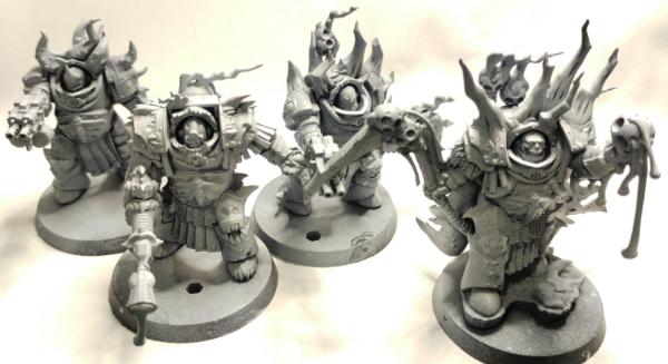
Subject: Dakka (Unofficial) Painting Challenge Round 35 January 2018: A Few Good Men
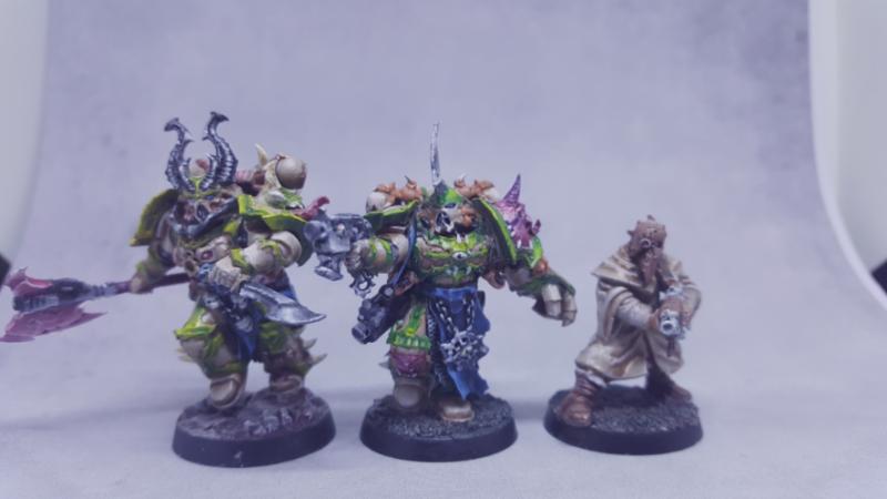
ZoBo wrote: hmm...not sure about this, but I might as well give it a go, if I don't finish in time, I don't finish in time, meh
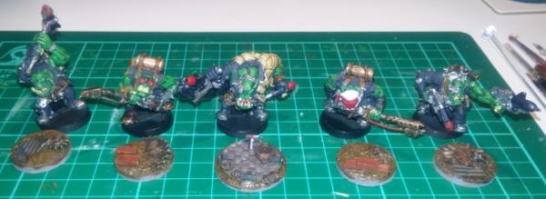
here's my proof: Lord Felthius and the Tainted Cohort...they look like a few good men to me...lovely lads, look at 'em!
I just bought and assembled those guys recently, so I look forward to seeing you paint them. Only thing I did different was to turn the axe guy's combibolter into a combiplasma so I could run a WYSIWYG Blightlord squad with 4 Combiplasmas.
My armies (re-counted and updated on 11/7/24, including modeled wargear options):
Dark Angels: ~16000 Astra Militarum: ~1200 | Imperial Knights: ~2300 | Leagues of Votann: ~1300 | Tyranids: ~3400 | Stormcast Eternals: ~5000 | Kruleboyz: ~3500 | Lumineth Realm-Lords: ~700
Check out my P&M Blogs: ZergSmasher's P&M Blog | Imperial Knights blog | Board Games blog | Total models painted in 2024: 40 | Total models painted in 2025: 25 | Current main painting project: Tomb Kings
Mad Doc Grotsnik wrote: You need your bumps felt. With a patented, Grotsnik Corp Bump Feelerer 9,000.
The Grotsnik Corp Bump Feelerer 9,000. It only looks like several bricks crudely gaffer taped to a cricket bat.
Grotsnik Corp. Sorry, No Refunds.
2018/01/26 12:18:00
Subject: Re:Dakka (Unofficial) Painting Challenge Round 35 January 2018: A Few Good Men
Moolet wrote: [The red is mephiston (spray), carrabourg shade, reapply meph to neaten up, then 3 layers/glaze of evil sunz covering 1/2 the panel, 1/3 the panel then 1/4 the panel (ish), then edge with wild rider, blood letter glaze, edge with wild rider then wild rider with a spot of ghost grey added. Its time consuming but I like how it gives tons of variation to the hue. Any criticisms + advice is greatly appreciated as I always suffer from looking at the same thing so long that it colours my judgement. All the grey areas were german grey, nuln, then adding in ghost grey to german grey for highlights. The images look a little weird to me as I tried out a different camera but the strange algorithms some of these cameras use to balance colour seems to have desaturated a few images. I have the raw images stored so i'll resubmit the images as I think the highlights aren't captured very well in these.
Yeah the red looks good, but flat, no indication of those 3 layers of glaze having any effect.
It's probably the photos. Digital cameras do some annoying things to colours and really flatten them. In the past I've painted red that goes through dozens of shades from near black to orange, and the photo makes it look like I just sprayed the whole thing with a can of mephiston red. The Drycha I painted last month had a lot of variety in the tone of the bark with blues and oranges, but in the photos? Just brown.
Moolet - I reckon they look great anyway. The weathering works because it looks stylised in a way that fits in with your own painting style.
2018/01/26 15:04:30
Subject: Re:Dakka (Unofficial) Painting Challenge Round 35 January 2018: A Few Good Men
Moolet wrote: [The red is mephiston (spray), carrabourg shade, reapply meph to neaten up, then 3 layers/glaze of evil sunz covering 1/2 the panel, 1/3 the panel then 1/4 the panel (ish), then edge with wild rider, blood letter glaze, edge with wild rider then wild rider with a spot of ghost grey added. Its time consuming but I like how it gives tons of variation to the hue. Any criticisms + advice is greatly appreciated as I always suffer from looking at the same thing so long that it colours my judgement. All the grey areas were german grey, nuln, then adding in ghost grey to german grey for highlights. The images look a little weird to me as I tried out a different camera but the strange algorithms some of these cameras use to balance colour seems to have desaturated a few images. I have the raw images stored so i'll resubmit the images as I think the highlights aren't captured very well in these.
Yeah the red looks good, but flat, no indication of those 3 layers of glaze having any effect.
It's probably the photos. Digital cameras do some annoying things to colours and really flatten them. In the past I've painted red that goes through dozens of shades from near black to orange, and the photo makes it look like I just sprayed the whole thing with a can of mephiston red. The Drycha I painted last month had a lot of variety in the tone of the bark with blues and oranges, but in the photos? Just brown.
Moolet - I reckon they look great anyway. The weathering works because it looks stylised in a way that fits in with your own painting style.
The same shiet happens to me. It flattens the colors and I loose the contrast on the way which I work hard painting. I've tried different set ups but with no avail.
Can't figure it out how to solve it.
This message was edited 1 time. Last update was at 2018/01/26 15:04:47
2018/01/26 20:46:55
Subject: Re:Dakka (Unofficial) Painting Challenge Round 35 January 2018: A Few Good Men
feltmonkey wrote:It's probably the photos. Digital cameras do some annoying things to colours and really flatten them. In the past I've painted red that goes through dozens of shades from near black to orange, and the photo makes it look like I just sprayed the whole thing with a can of mephiston red. The Drycha I painted last month had a lot of variety in the tone of the bark with blues and oranges, but in the photos? Just brown.
Modock wrote:The same shiet happens to me. It flattens the colors and I loose the contrast on the way which I work hard painting. I've tried different set ups but with no avail.
Can't figure it out how to solve it.
Thanks, I'm relieved to hear I'm not the only one that feels their photos can let down the paint job but I'm sorry for you woes. So if the minis from both you look even better in the flesh... my oh my... =)
This message was edited 1 time. Last update was at 2018/01/26 20:47:09
2018/01/26 21:09:58
Subject: Re:Dakka (Unofficial) Painting Challenge Round 35 January 2018: A Few Good Men
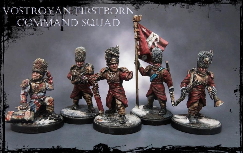
Ratius wrote: Finito!
And yes they are wearing shades (cant do dem eyes!).
Spoiler:
Better than my old bases?
Spoiler:
I hope you have this in your phone for when you play with them:
"Fear is freedom! Subjugation is liberation! Contradiction is truth! These are the truths of this world! Surrender to these truths, you pigs in human clothing!" - Satsuki Kiryuin, Kill la Kill
2018/01/26 22:14:42
Subject: Dakka (Unofficial) Painting Challenge Round 35 January 2018: A Few Good Men
No worries KernelTerror, praise where praise is due
Good luck Zobo, hope you get them done.
Shame your pulling out Creed, but understandable, Really hope your A-Levels go well for you.
Agree with you guys on the colours coming out in the photos I've also had the shame with my photos, spent hours getting nice glazing and subtle highlighting towards the edge and then it just looks like the base colour which is most frustrating.
Here is my entry. Some pretty plain intercessors but I tried out doing my battle damage differently. I'm not too keen on the results to be honest but I enjoyed trying something new, I need a bit more practice + patience.
Yeah that effect for the battle damage is very striking with the white which is very clean, I normally go for the highest level of that colours highlight for the scratch (assume that's how you normally do it as well)
Well this might be a late entry but I reckon I can do these in time, first time trying this as I'm really starting to enjoy painting a lot more and wanted a place to showcase and get feedback on what I do.
So here's my proof (think I've done this right):
2018/01/27 23:48:17
Subject: Re:Dakka (Unofficial) Painting Challenge Round 35 January 2018: A Few Good Men
Modock wrote:Those look great Paradigm, neat photos too!
Yeah I'd love to know his set-up and what he does to get such great images, and yours too. I must admit I find it harder than painting the damn thing.
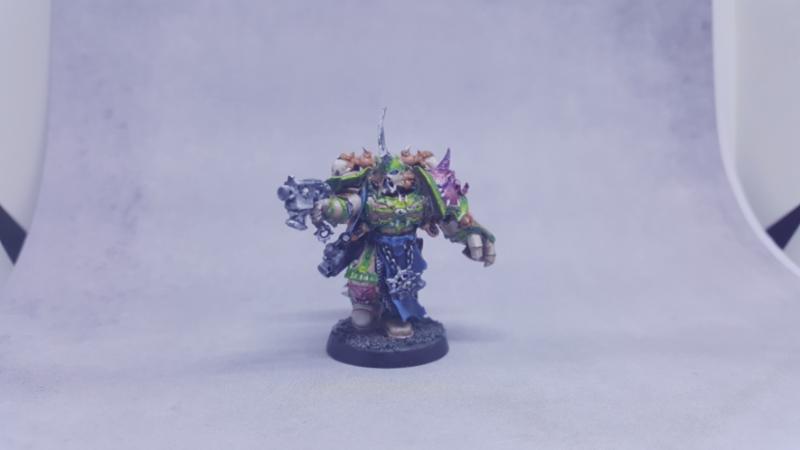
Funny you should say that, photos this month were a real slog... What you see is the result of over 100 photos being taken, edited and subsequently deleted, hours of fiddling with the lighting setup and even repainting a major colour across all the models (my initial red tones HATED the camera, so I redid all the coats for the final pics). Worth it though, as I'm particularly pleased with the end result, and they even got a feature on Anvil's FB page which, as a long-time fan of the company, is awesome.
https://www.facebook.com/AnvilIndustry/photos/pcb.1570235269724453/1570231723058141/?type=3&theater
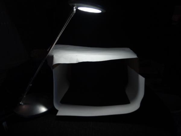
As for the setup, the big change this month is the background. Where before I was using a flat grey piece of 'funky foam', that was really killing the colours on these (and in hindsight, probably a lot of my past models as well...) so I downloaded and printed one from here: http://corvusminiatures.blogspot.co.uk/2010/04/cloud-backdrops-for-your-miniature.html Important thing to note is as it'll use a ton of ink, you'll want to use good quality paper to print it on. Not only does that make it more durable (between shoots I keep it in a card envelope to keep it flat) but it means the colour variation will be more notable, on regular printer paper it bled a lot and you just get a black page with a white blob in the middle. Just don't use photo paper, as you don't want a glossy background.
The setup itself is simple. Cardboard box, lined with paper for white balance, sheet of paper over the top to diffuse, single lamp.
The other useful thing is the plinth. By elevating the model, you let some light get underneath it, which stops your shadows getting washed out. I just use a pill bottle lid as I had one lying around, but anything neutral in colour and suitably shaped will do.
Hope that was of some help!
2018/01/28 20:56:28
Subject: Re:Dakka (Unofficial) Painting Challenge Round 35 January 2018: A Few Good Men


 my Ironjawz have 3 different skin tones to give them a more diverse and unique feel. Humans can feel very different even with the same skin-tone because of hair, sex, etc. but orcs almost look like a clone army sometimes.


 .
.


 ~16000 Astra Militarum:
  ~1200 | Imperial Knights:
  ~2300 | Leagues of Votann:
  ~1300 | Tyranids:
  ~3400 | Stormcast Eternals:
  ~5000 | Kruleboyz:
  ~3500 | Lumineth Realm-Lords:
  ~700
~700