| Author |
Message |
 |
|
|
|
|
Advert
|
Forum adverts like this one are shown to any user who is not logged in. Join us by filling out a tiny 3 field form and you will get your own, free, dakka user account which gives a good range of benefits to you:
- No adverts like this in the forums anymore.
- Times and dates in your local timezone.
- Full tracking of what you have read so you can skip to your first unread post, easily see what has changed since you last logged in, and easily see what is new at a glance.
- Email notifications for threads you want to watch closely.
- Being a part of the oldest wargaming community on the net.
If you are already a member then feel free to login now. |
|
 |
2013/06/22 16:21:32
Subject: Ctho - The Lost Eldar Army
|
|

Battleship Captain
|
finnan wrote:kick ass - nice job : )
(did you double up on the shoulder pads, or is that the kit? Cool keyboard too)
Yeah those are just parts from the kit, the hip bones to be exact. Thanks, NOW TO DO ALL THE TINY GEMS and some detail work.
Dr H wrote:Bone and Black. That's pretty much what I was planning for one of my latest guardians...
Good job, nice scheme.
Yeah finnan recommended it when we conversed. It is really striking! Your guardian will have a good time.
SelvaggioSaky wrote:Color scheme is top Panda.
Glad You made a decision that makes You happy with and give such a nice result 
About the Ork skin, I feel your pain mate 
Ork skin is never appreciated, just green, which is best.
Yeah thanks for the motivation, I have the other three well under way. And the wraith knight has suffered a priming disaster. Well, His legs did.
|
|
|
 |
|
2013/06/22 17:53:24
Subject: Ctho - The Lost Eldar Army
|
|
Stubborn Dark Angels Veteran Sergeant
|
Black, eh? Well played sir, excellent choice. May I suggest instead of black, use a deep gray and wash with Nuln oil? I find straight black obscures details. But that's just me. These guys are gonna rock just like the Guard and lads from Volra.
|
|
|
|
|
2013/06/22 20:17:33
Subject: Ctho - The Lost Eldar Army
|
|
Rogue Inquisitor with Xenos Bodyguards
|
The combo does work well.
|
"Your mumblings are awakening the sleeping Dragon, be wary when meddling the affairs of Dragons, for thou art tasty and go good with either ketchup or chocolate. "
Dragons fear nothing, if it acts up, we breath magic fire that turns them into marshmallow peeps. We leaguers only cry rivets!


|
|
|
|
|
2013/06/22 21:01:21
Subject: Re:Ctho - The Lost Eldar Army
|
|
Battleship Captain
|
At 40k. Yeah that balco is just a base coat it will be layered!
At sash- thanks! Now to read..
|
|
|
|
|
2013/06/22 21:07:26
Subject: Ctho - The Lost Eldar Army
|
|

Shroomin Brain Boy
|
40kFSU wrote:Black, eh? Well played sir, excellent choice. May I suggest instead of black, use a deep gray and wash with Nuln oil? I find straight black obscures details. But that's just me. These guys are gonna rock just like the Guard and lads from Volra.
hmmmm... the black surprised me quite a bit... it´s then rather monochrome...hmmm...indeed.... but i would follow 40kfsu suggestions... plain flat black... that would be quite a chep selling thing to do after you put all the work into the bone effect...
|
|
|
|
|
|
2013/06/22 21:30:36
Subject: Ctho - The Lost Eldar Army
|
|
Stubborn Dark Angels Veteran Sergeant
|
I think sometimes alternate schemes are good. All the eldar stuff is really bright. Looks nice, but bright. If I ever did Tau they would be really dark. Besides I like flat, nuetral colors. Too much HGTV probably. House Hunters anyone?
|
|
|
|
|
2013/06/22 23:37:51
Subject: Ctho - The Lost Eldar Army
|
|

Scarred Ultramarine Tyrannic War Veteran
|
The wraithknight resembles a very finnan-esque style of eldar painting, I like it! Subbed.
|
|
This message was edited 1 time. Last update was at 2013/06/23 01:05:30
|
|
|
|
|
2013/06/22 23:38:10
Subject: Ctho - The Lost Eldar Army
|
|
Battleship Captain
|
Viktor von Domm wrote:40kFSU wrote:Black, eh? Well played sir, excellent choice. May I suggest instead of black, use a deep gray and wash with Nuln oil? I find straight black obscures details. But that's just me. These guys are gonna rock just like the Guard and lads from Volra.
hmmmm... the black surprised me quite a bit... it´s then rather monochrome...hmmm...indeed.... but i would follow 40kfsu suggestions... plain flat black... that would be quite a chep selling thing to do after you put all the work into the bone effect...
Yeah i am going to highlight with a color like finnan does. I was thinking of bringing it up to a soft bright blue. with a black core. you will see!
40kFSU wrote:I think sometimes alternate schemes are good. All the eldar stuff is really bright. Looks nice, but bright. If I ever did Tau they would be really dark. Besides I like flat, nuetral colors. Too much HGTV probably. House Hunters anyone?
If i did tau they be dark... are tau eldar?!  . dont worry guys i near a finished product, just not there yet!
A grey with black wash isn't a bad idea, but not dark enough! haha
|
|
|
|
|
2013/06/23 00:22:35
Subject: Ctho - The Lost Eldar Army
|
|
Shroomin Brain Boy
|
don´t get my criticism the wrong way... i like that project very much and i am eager to see how you succed... thats why i ask and think so many questions
|
|
|
|
|
|
2013/06/23 01:07:15
Subject: Ctho - The Lost Eldar Army
|
|
Battleship Captain
|
 Viktor von Domm wrote: Viktor von Domm wrote:don´t get my criticism the wrong way... i like that project very much and i am eager to see how you succed... thats why i ask and think so many questions
Have no fear mate, i never take criticism the wrong way. But i want people to understand the black is not finished.
|
|
|
|
|
2013/06/23 01:08:07
Subject: Ctho - The Lost Eldar Army
|
|
Stubborn Dark Angels Veteran Sergeant
|
Bucket.
|
|
|
|
|
2013/06/23 01:16:55
Subject: Ctho - The Lost Eldar Army
|
|
Battleship Captain
|
|
|
|
|
|
2013/06/23 01:36:46
Subject: Ctho - The Lost Eldar Army
|
|
Stubborn Dark Angels Veteran Sergeant
|
Bucket I say!!
|
|
|
|
|
2013/06/23 03:09:30
Subject: Ctho - The Lost Eldar Army
|
|
Rogue Inquisitor with Xenos Bodyguards
|
Tau are definitely not Eldar, more a in between Lizard/Mammal like little dinosaurs who got advanced and make nice toys
|
"Your mumblings are awakening the sleeping Dragon, be wary when meddling the affairs of Dragons, for thou art tasty and go good with either ketchup or chocolate. "
Dragons fear nothing, if it acts up, we breath magic fire that turns them into marshmallow peeps. We leaguers only cry rivets!
|
|
|
|
|
2013/06/23 07:18:59
Subject: Re:Ctho - The Lost Eldar Army
|
|

Ferocious Blood Claw
|
I can't wait to see the Farseer with the spear painted!
Are you trying to stick with as much wraith stuff as possible?
|
|
This message was edited 1 time. Last update was at 2013/06/23 07:22:37
 I have no idea what I'm doing... I have no idea what I'm doing...
 Raginmund, Jarl of Sepp Raginmund, Jarl of Sepp |
|
|
|
|
2013/06/26 06:50:47
Subject: Re:Ctho - The Lost Eldar Army
|
|
Battleship Captain
|
Ok So i been working hard at this army haha,
Feels like I am going places, and then no where at the same time. Quick over view of what is on the bench. Got some legs, some guard, and some tanks rolling in. Wifey bought me a fire prisim! Not exactly what was needed for this army, but I wont complain.
I also wanted it to actually look like it was holding crystals. Did I win or fail!?
|
|
|
|
|
2013/06/26 12:08:33
Subject: Ctho - The Lost Eldar Army
|
|
Mastering Non-Metallic Metal
|
The crystal looks alright actually. Maybe a gloss finish would help finish it, or satin would be ideal. Or some very fine, light (possibly white), edge-highlighting might work, but would be difficult to do right.
|
     Mastodon: @DrH@dice.camp Mastodon: @DrH@dice.camp
The army-                   ~2295 points (built). ~2295 points (built).
 
* -=]_,=-eague Spruemeister General. * A (sprue) Hut tutorial *
Dsteingass - Dr. H..You are a role model for Internet Morality! // inmygravenimage - Dr H is a model to us all 
Theophony - Sprue for the spruemeister, plastic for his plastic throne! // Shasolenzabi - Toilets, more complex than folks take time to think about! |
|
|
|
|
2013/06/26 15:16:55
Subject: Ctho - The Lost Eldar Army
|
|
Battleship Captain
|
 Dr H wrote: Dr H wrote:The crystal looks alright actually. Maybe a gloss finish would help finish it, or satin would be ideal. Or some very fine, light (possibly white), edge-highlighting might work, but would be difficult to do right.
By a white highlight what parts are you talking about? I will definitely add a gloss coat that is a great idea!
Parts that come to mind, the red orby bits,
The actually edges of the crystal?
|
|
|
|
|
2013/06/26 15:51:48
Subject: Ctho - The Lost Eldar Army
|
|
Screaming Shining Spear
|
it doesn't look like crystal (yet) - it actually looks like stone, which is a cool idea in itself. I think the red and the blue is a bit jarring. Perhaps give it a wash of purple to get the colours working together a bit more, and then the highlights on the top of that to get some glow happening?
|

"Pit Crew! Take this box out back, throw in a rabid Honey Badger and SET IT ON FIRE!"
If I were an Eskimo, I'd build my igloo next to a supermarket on a tropical beach. |
|
|
|
|
2013/06/26 16:02:07
Subject: Ctho - The Lost Eldar Army
|
|
Battleship Captain
|
 finnan wrote: finnan wrote:it doesn't look like crystal (yet) - it actually looks like stone, which is a cool idea in itself. I think the red and the blue is a bit jarring. Perhaps give it a wash of purple to get the colours working together a bit more, and then the highlights on the top of that to get some glow happening?
hmm I am not sure I want it glowing. And haha i mistook crystal for quartz - 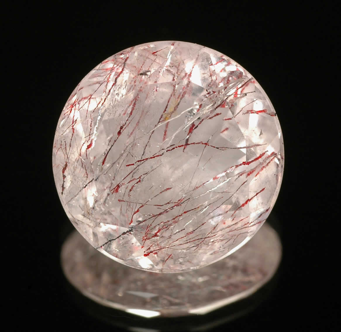
The purple wash is brilliant as well. So a purple wash, and a gloss will give it a polished look. I like where this is going. You and Dr. H have both said highlights, but I don't understand what to do with that.
Do you mean highlight my color spots or the edges of the crystal?
|
|
|
|
|
2013/06/26 16:10:39
Subject: Ctho - The Lost Eldar Army
|
|
Screaming Shining Spear
|
that's a cool reference pic.
Highlights - I think edge highlights. If you highlight in your lighter tones towards the edges, it'll look like the crystal is thinner and therefore more translucent, and the darker areas will be the 'deeper' parts of the crystal. You can kind of see it in your reference pic - it's lighter on the edges.
|
"Pit Crew! Take this box out back, throw in a rabid Honey Badger and SET IT ON FIRE!"
If I were an Eskimo, I'd build my igloo next to a supermarket on a tropical beach. |
|
|
|
|
2013/06/26 16:23:41
Subject: Ctho - The Lost Eldar Army
|
|
Battleship Captain
|
finnan wrote:that's a cool reference pic.
Highlights - I think edge highlights. If you highlight in your lighter tones towards the edges, it'll look like the crystal is thinner and therefore more translucent, and the darker areas will be the 'deeper' parts of the crystal. You can kind of see it in your reference pic - it's lighter on the edges.
Alright I get that, what color should i choose? A simple white or do a purple?
|
|
|
|
|
2013/06/26 16:24:51
Subject: Ctho - The Lost Eldar Army
|
|
Lit By the Flames of Prospero
|
I gotta say, I think it does look like a stone, but that's pretty cool in itself. I always kind of hated the whole 'Soulstone' (STONE) but it's a crystal for some reason?? Just confuses me xD
|
Muh Black Templars
Blacksails wrote:Maybe you should read your own posts before calling someone else's juvenile.
|
|
|
|
|
2013/06/26 16:26:10
Subject: Ctho - The Lost Eldar Army
|
|
Battleship Captain
|
 BrotherOfBone wrote: BrotherOfBone wrote:I gotta say, I think it does look like a stone, but that's pretty cool in itself. I always kind of hated the whole 'Soulstone' (STONE) but it's a crystal for some reason?? Just confuses me xD
Hahaha well played! I dont know if i can make that look for the rest of my soul stones. I used the clear plastic to my advantage.
|
|
|
|
|
2013/06/26 16:30:12
Subject: Ctho - The Lost Eldar Army
|
|
Screaming Shining Spear
|
if it were me, I'd go for a lighter purple on the purple bits and a brighter red on the red bits.
|
"Pit Crew! Take this box out back, throw in a rabid Honey Badger and SET IT ON FIRE!"
If I were an Eskimo, I'd build my igloo next to a supermarket on a tropical beach. |
|
|
|
|
2013/06/26 16:41:37
Subject: Ctho - The Lost Eldar Army
|
|
Battleship Captain
|
finnan wrote:if it were me, I'd go for a lighter purple on the purple bits and a brighter red on the red bits.
Ah thanks for the advice, it shall be done!
Heh just when i thought it was ok to pass off Finnan comes out to give me more to do. I don't mind.
|
|
|
|
|
2013/06/26 16:49:18
Subject: Ctho - The Lost Eldar Army
|
|
Screaming Shining Spear
|
(I'm a teacher, I'm never satisfied! [especially with my own work!] )
|
"Pit Crew! Take this box out back, throw in a rabid Honey Badger and SET IT ON FIRE!"
If I were an Eskimo, I'd build my igloo next to a supermarket on a tropical beach. |
|
|
|
|
2013/06/26 16:57:23
Subject: Re:Ctho - The Lost Eldar Army
|
|
Mastering Non-Metallic Metal
|
Yeah, I was taking about the edges of the crystal, to give them a more defined look.
As it is now, it does look a bit opaque (which probably isn't ideal for a laser type weapon), but that's because it has a matt finish. Hence giving it a gloss coat will help this. Yeah, quartz is a good way to describe it.
While looking for pictures to illustrate what I was thinking about telling you, I found:
This
Which kind of shows what you have there, where the colour is on the surface.
and this
Which if you look at it, you see how the colour fades and comes back in strong patches. It makes it look more translucent than the above example.
So, you can try fading the colours together as if the red, for example, has gone under the blue, or vice versa. A purple wash (if done slightly unevenly) may even do this for you.
And then use lighter shades of the red and blue towards the hard edges of the crystal and an edge highlight (very thin lines, maybe a light purple/violet) and the gloss coat and it could look awesome.
I could, however, be talking rubbish... 
|
Mastodon: @DrH@dice.camp
The army- ~2295 points (built).
* -=]_,=-eague Spruemeister General. * A (sprue) Hut tutorial *
Dsteingass - Dr. H..You are a role model for Internet Morality! // inmygravenimage - Dr H is a model to us all
Theophony - Sprue for the spruemeister, plastic for his plastic throne! // Shasolenzabi - Toilets, more complex than folks take time to think about! |
|
|
|
|
2013/06/26 20:45:16
Subject: Ctho - The Lost Eldar Army
|
|
Battleship Captain
|
finnan wrote:(I'm a teacher, I'm never satisfied! [especially with my own work!] )
Hah! I have much to learn, will be watching closely. And your progress is quite impressive.
Dr H wrote:Yeah, I was taking about the edges of the crystal, to give them a more defined look.
As it is now, it does look a bit opaque (which probably isn't ideal for a laser type weapon), but that's because it has a matt finish. Hence giving it a gloss coat will help this. Yeah, quartz is a good way to describe it.
While looking for pictures to illustrate what I was thinking about telling you, I found:
This
Which kind of shows what you have there, where the colour is on the surface.
and this
Which if you look at it, you see how the colour fades and comes back in strong patches. It makes it look more translucent than the above example.
So, you can try fading the colours together as if the red, for example, has gone under the blue, or vice versa. A purple wash (if done slightly unevenly) may even do this for you.
And then use lighter shades of the red and blue towards the hard edges of the crystal and an edge highlight (very thin lines, maybe a light purple/violet) and the gloss coat and it could look awesome.
I could, however, be talking rubbish...
Your rubbish is my kind of rubbish!
In other news I purchased some real brushes. Soon I will lay to rest my GW brushes and begin to use my Raphael 8404's. Then all the free hand will happen
|
|
|
|
|
2013/06/26 20:45:17
Subject: Ctho - The Lost Eldar Army
|
|
Shroomin Brain Boy
|
i would just add the purple wash as suggested and then some off white very thin highlights to the edges... then it will sell as a crystal...
in how many layers did you do the current washed look of all the bone parts? must´ve taken ages...
|
|
|
|
|
|
|
|

 ___________________