So I recently built myself a homemade lightbox (nothing too fancy, but serviceable and cheap

)
Anyway I've been experimenting with a few different background colours for taking photos with and I could use some feedback as to what looks best.
To get a reasonable range of comparisons, I've used both light (white) and dark (black) backgrounds and taken pics of a mini with a darker colour scheme (
DKoK Quartermaster)
and a lighter colour scheme (Eureka Frog Musician). All of these photos were taken in natural light.
So without further ado:
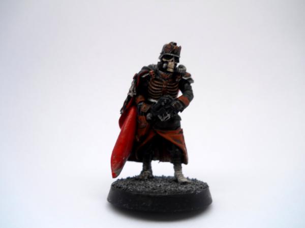
The Quartermaster on White BG, I'm not a huge fan of this shot, it seems like the background has washed out the photo leaving details darker and more obscure than they actually are.
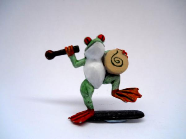
The Frog on White BG, While the model isn't as washed out as the Quartermaster is, I still think that the photo looks too flat and uninteresting
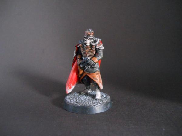
The Quartermaster on Black BG, This is
IMO MUCH better than the white BG, however the shot is lighter than I would want (although I suspect this is a problem more with my camera than the BG) and also it was an absolute

to get this in focus.
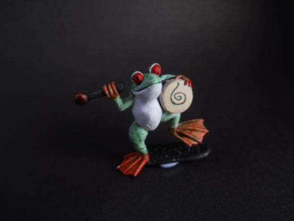
The Frog on Black BG, This is probably my favourite shot of the bunch, the mini looks pretty close to how it looks
IRL (as close as I'll get with my slightly rubbish Nikon anyway) and I like the way the black background looks, it seems quite professional to me.
As an experiment, I also tried a couple of coloured backgrounds for comparison. I only used the
DKoK model for these.
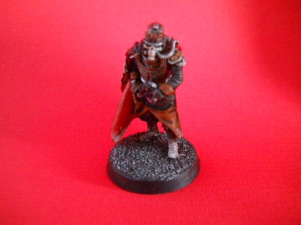
Red BG, I didn't really expect much from this colour and it definitely doesn't look great. I kinda just did it to see what would happen.
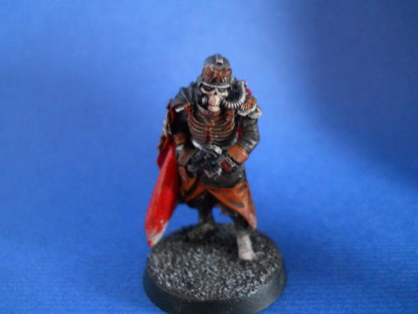
Blue BG, I was pleasantly surprised with the results of this one,
IMO it is the best shot of the Quartermaster that I have and was a lot less hassle to get in focus than the Black BG shot was.
My initial thoughts after this little test is that I should use the black background for lighter miniatures and the blue background for darker ones. What do you guys think?


 Cadre Coronal Afterglow w1;d0;l0
