| Author |
Message |
 |
|
|
|
|
Advert
|
Forum adverts like this one are shown to any user who is not logged in. Join us by filling out a tiny 3 field form and you will get your own, free, dakka user account which gives a good range of benefits to you:
- No adverts like this in the forums anymore.
- Times and dates in your local timezone.
- Full tracking of what you have read so you can skip to your first unread post, easily see what has changed since you last logged in, and easily see what is new at a glance.
- Email notifications for threads you want to watch closely.
- Being a part of the oldest wargaming community on the net.
If you are already a member then feel free to login now. |
|
 |
2013/12/28 22:32:06
Subject: Phutarf's painting blog... 31/12/13: Legion Preator WIP
|
|

Boosting Space Marine Biker
|
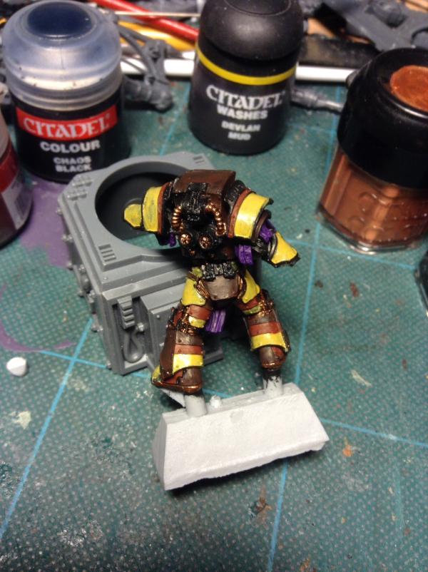
Ok, in an effort to force myself into doing some actual painting (as it's been nearly 6 months since I last did any - see my other blog for the reason why!) I thought I'd start this one, and take you through the stages of painting my as yet unnamed IF successor chapter, which one day I aim to present at Armies on Parade (hello 2015?)
So I've been sat on the FW Legion Preator since Gamesday, so where better to start than the termie one:
As I'm old school (for the time being at least) it's all brushwork, over a black undercoat. The base colours for those interested are:
Yellow: Iyanden Darksun
Light Brown: Dark Flesh
Dark Brown: Scorched Brown
Metallics: Brazen Brass
Purple: Liche Purple
NB: when I get time, I paint REALLY slowly, and there are about 5/6 stages to each colour, so on a figure this detailed we're looking at taking a LONG time to finish - prepare for the long haul if interested!!
(Oh yeah - btw, this is just the very first paint application to rough it out colour wise - well aware it looks crap ATM!!  )
|
|
This message was edited 5 times. Last update was at 2014/01/01 15:33:32
|
|
|
 |
|
2013/12/29 02:33:44
Subject: Phutarf's painting blog...
|
|

Dakka Veteran
|
always good to see more sons of Dorn in the mix !
even better to see someone else willingly take on the cross of painting yellow 
great model mate, looking forward to see him past the blocking in stage.
|
|
|
|
|
|
2013/12/29 10:07:14
Subject: Phutarf's painting blog...
|
|
Boosting Space Marine Biker
|
 San76 wrote: San76 wrote:always good to see more sons of Dorn in the mix !
even better to see someone else willingly take on the cross of painting yellow
great model mate, looking forward to see him past the blocking in stage.
Thanks San - just found Gorgrimm's thread too, go Dorn!!
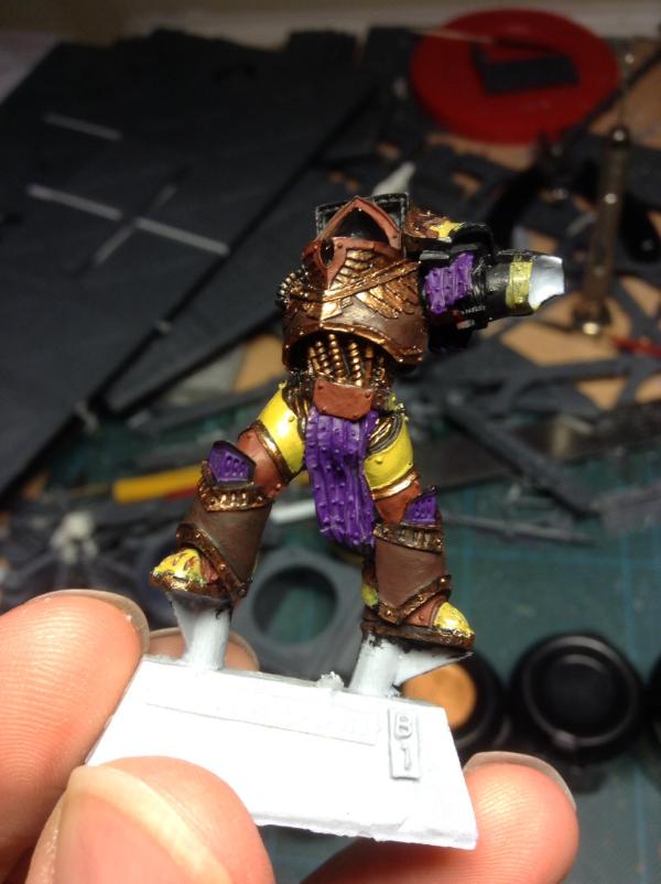
As for yellow - I've found it's not difficult per se, just annoyingly time consuming. And I'm still on the old GW paint couloirs - I really needc to investigate their new(!) formulations before I run out or mine dry up completely...! Automatically Appended Next Post: Now with 100% more arms:
I really hate the early stages as they make it look really crap. Trust me, things will get better, honest....
|
|
This message was edited 1 time. Last update was at 2013/12/29 17:12:35
|
|
|
|
|
2013/12/29 20:01:45
Subject: Re:Phutarf's painting blog...
|
|

Flashy Flashgitz
|
Yes it is always hard on the early stages. I am not a magnificent painter, so the early stages are always hard to see through. Just power forward!
That's a great model. And yes, seconded - always good to see more Sons of Dorn! A pity that the Sentinels of Terra book was written by a drunken 12 year old. But the Codex rules are good enough. Fists!
|
|
|
|
|
|
2013/12/29 22:17:30
Subject: Re:Phutarf's painting blog...
|
|

Longtime Dakkanaut
|
It's nice to see I'm not a special snowflake and other people also hate that initial stage of painting. I sometimes get really mad when I look at a miniature and it looks so... well, crappy, I just feel like putting it down and do something else
Best of luck, I'll be happy to see the final result
|
"Fear is freedom! Subjugation is liberation! Contradiction is truth! These are the truths of this world! Surrender to these truths, you pigs in human clothing!" - Satsuki Kiryuin, Kill la Kill |
|
|
|
|
2013/12/30 17:07:06
Subject: Re:Phutarf's painting blog...
|
|
Boosting Space Marine Biker
|
Gorgrimm wrote:Yes it is always hard on the early stages. I am not a magnificent painter, so the early stages are always hard to see through. Just power forward!
TheDraconicLord wrote:It's nice to see I'm not a special snowflake and other people also hate that initial stage of painting. I sometimes get really mad when I look at a miniature and it looks so... well, crappy, I just feel like putting it down and do something else
Couldn't agree more guys, especially wanting to do something else. I also suffer in my paint scheme in the metallics are so boring to do (at least the way I do them!) and certain bits HAVE to be done first (the joints basically) as otherwise I'd balls up the actual armour..
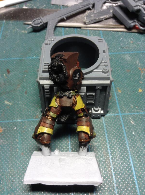
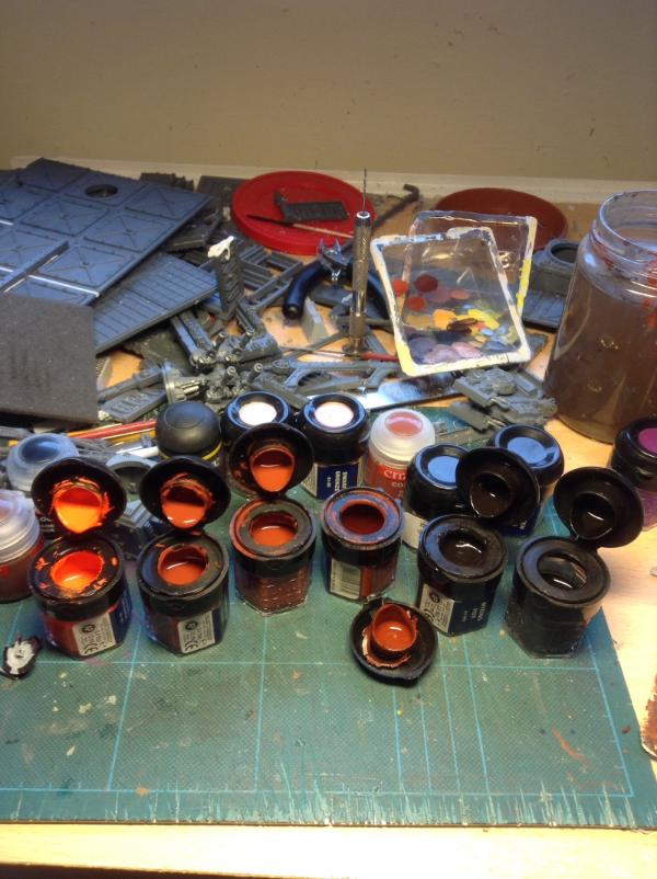
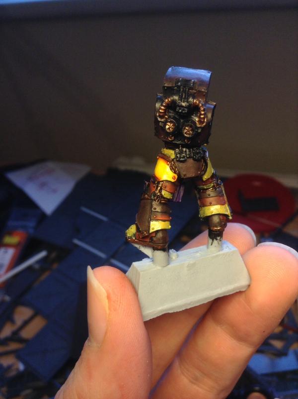
Anyway, here's some crappy pics (sorry - iPad and bad lighting don't help) to show today's progress - knees, hips, waist and front 'tubing' done:
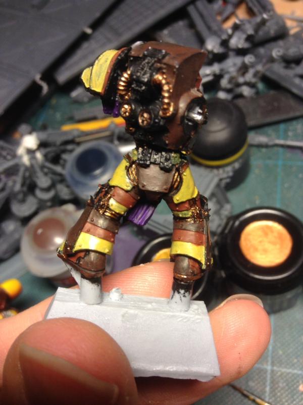
For those interested (assuming there are any), here the process:
1) Base: Brazen Brass
2) Shade pt1: 50:50 mix Chaos Black & Scorched Brown
3) Shade pt2: 75:25 mix Flesh Wash & Black ink (yeah, REALLY old school!)
4) re-apply Brazen Brass
5) Highlight 1: Dwarf Bronze
6) Highlight 2: Burnished Gold
7) re-apply ink mix as required
Nb - all this is painted directly onto or between the 'folds' respectively with a VERY fine detail brush - no dry brushing for me...
The pics don't really do it justice, especially for an hours tedious work. Still, onto more interesting bits next!
|
|
|
|
|
2013/12/30 18:29:16
Subject: Phutarf's painting blog...
|
|

Bane Lord Tartar Sauce
|
Paint is looking pretty thick on the purple and the yellows. I would try starting with something like a Vomit Brown and then working up to Yellow through successive drybrushes. The gold, on the other hand, is looking quite nice especially on the finished portions (joints, cables). Good job so far, I'm interested to see where this goes.
|
|
|
|
|
|
2013/12/30 19:28:42
Subject: Phutarf's painting blog...
|
|
Boosting Space Marine Biker
|
 bossfearless wrote: bossfearless wrote:Paint is looking pretty thick on the purple and the yellows. I would try starting with something like a Vomit Brown and then working up to Yellow through successive drybrushes. The gold, on the other hand, is looking quite nice especially on the finished portions (joints, cables). Good job so far, I'm interested to see where this goes.
Thanks Bossfearless. I think the 'thickness' issue is more to do with my poor camera/lighting as at this stage all area have only had a watered down blocking in over black - I always thin my paints (more on this later...)
Anyway, the first interesting bit done - yellow upper thigh. To bore you rigid, here's pics & process:
1) Base: Iyandun Darksun (lots of thin coats)
2) Block colour: Golden Yellow (lots and lots of thin coats!)
3) Shade: 50:50 mix Golden Yellow & Dark Flesh, down to pure Dark Flesh in darkest recesses (wet blended into a not dry previous step)
4) Highlight 1: Sunburst Yellow (again, more wet blending)
5) Highlight 2: Bad Moon Yellow (mainly an edge highlight, but very light coat on upper parts of panel)
6) Glazes - Yellow ink on yellow sections and Chestnut ink on darker bits (sadly although this brings out the colours more and gives the shiny effect I want, it doesn't photograph well...)
Again, best part of an hour to do this but, mostly cos wet blending is such fun, and I end up eating more paint than I care to think about - far easier and quicker to clean and thin paints by mouth than water.. (Yes, I know, I'm weird.....)
|
|
This message was edited 1 time. Last update was at 2013/12/30 22:09:45
|
|
|
|
|
2013/12/31 02:08:32
Subject: Phutarf's painting blog...
|
|
Dakka Veteran
|
Mate, that wet blending work looks great. Gives it an almost luminous quality
|
|
|
|
|
|
2013/12/31 15:40:33
Subject: Phutarf's painting blog...
|
|
Boosting Space Marine Biker
|
San76 wrote:Mate, that wet blending work looks great. Gives it an almost luminous quality
Cheers San - probably mostly due to the sheen the ink glaze gives and bad lighting, but I'll take any compliments 
Today's update (so far) - an exercise in brown. Well, a red-ish brown. Funny but it's a great compliment to yellow, but I've never seen another brown colour scheme for marines before. Ah well, each to their own I guess... Anyway, here goes (nb, I started painting a couple of sections up before I remembered I was supposed to be taking pics, so concentrate on the lower leg middle 'band')
The paints:
1) Base: Dark Flesh
2: Shade: 50:50 mix Scorched Brown & Chaos Black, wet blended into base
3: Highlights:
1 - 50:50 mix Dark Flesh & Terracotta
2 - Terracotta (my lighting and camera couldn't pick both stages out...)
4: Edge Highlights:
1 - 'darker' areas 50:50 mix Terracotta & Blazing Orange
2 - lightest areas pure Blazing Orange
5: Glazes Several layers of watered down Chestnut ink (each of which HAS to be fully dry before the next or the whole thing gets blotchy and I have to start again...)
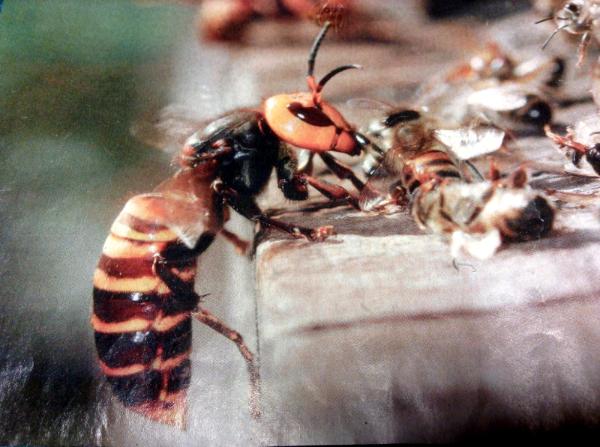
The final one also demonstrates the reflective sheen a bit better that the ink glazes give - deliberate on my part due to the inspiration for the colour scheme itself comes from the Japanese Hornet - insects themselves having a sheen on their cuticle that I wanted to emulate:
Anyway, apologies for the terrible pics. Also, just wanted to check for anyone following, do you want further details of the painting as it progresses, or just pic updates as they occur?
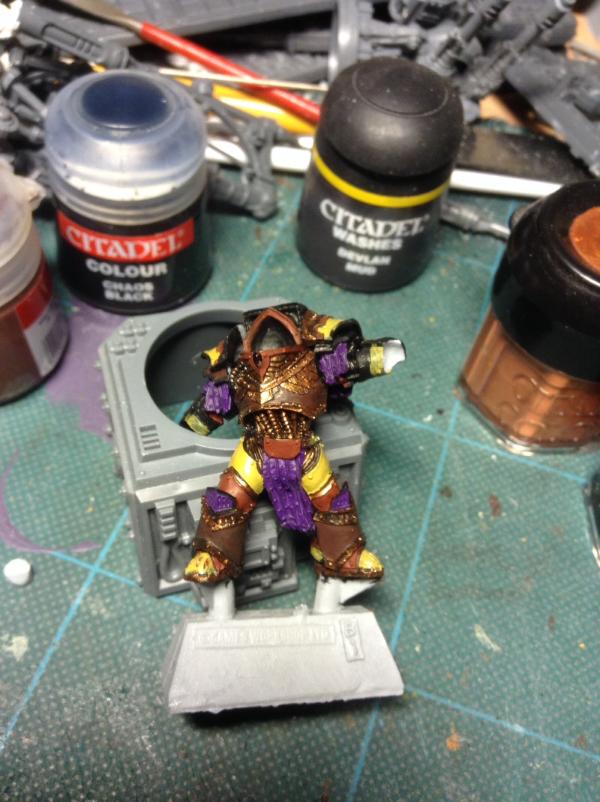
Automatically Appended Next Post: Ok, last update of 2013! Having worked on the light brown sections earlier, did some of the dark brown bits:
1) Base: Scorched Brown:
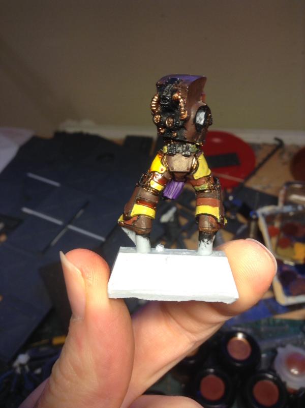
2) Shade: 50:50 mix Scorched Brown & Chaos Black, wet blended into base:
3) Highlight 1: 50:50 Scorched Brown & Dark Flesh (more wet blending):
4) Highlight 2: Dark Flesh:
5) Edge Highlight: Terracotta:
6) Glaze: Flesh Wash:
And that's it for the armour sections! Just need to paint them all now, and do one of these on the purple bits - but that's for 2014...
Thanks for those that have stopped by, hope I've not bored you to death! 
|
|
This message was edited 1 time. Last update was at 2013/12/31 22:48:01
|
|
|
|
|
2014/01/01 15:39:15
Subject: Re:Phutarf's painting blog... 31/12/13: Legion Preator WIP
|
|
Boosting Space Marine Biker
|
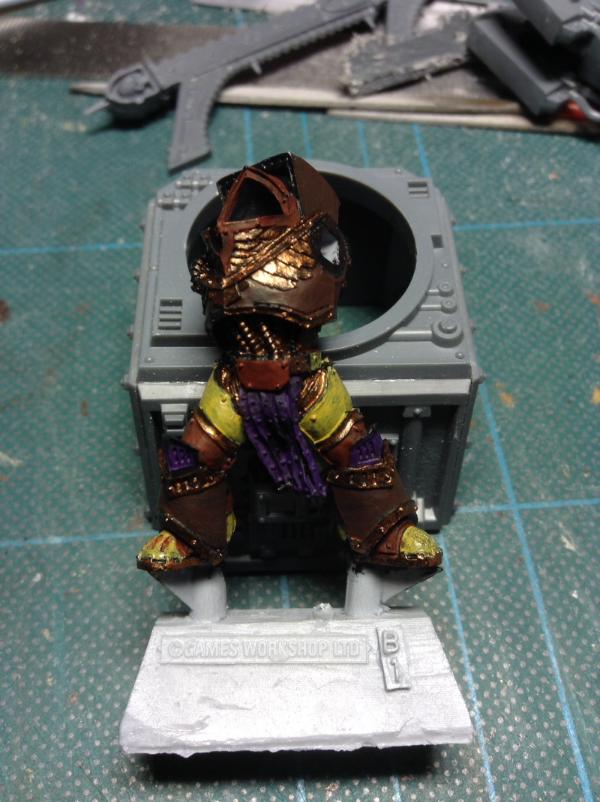
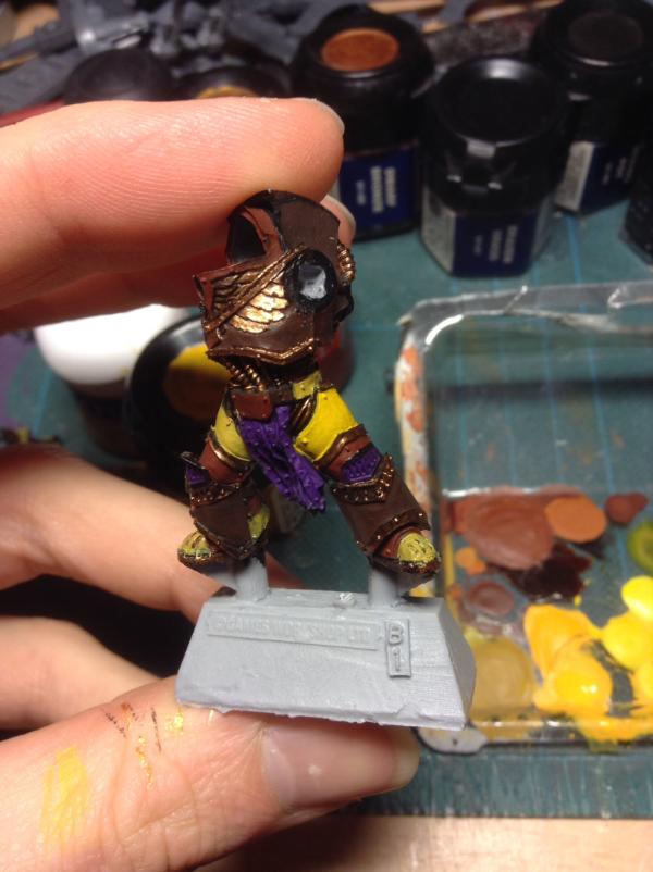
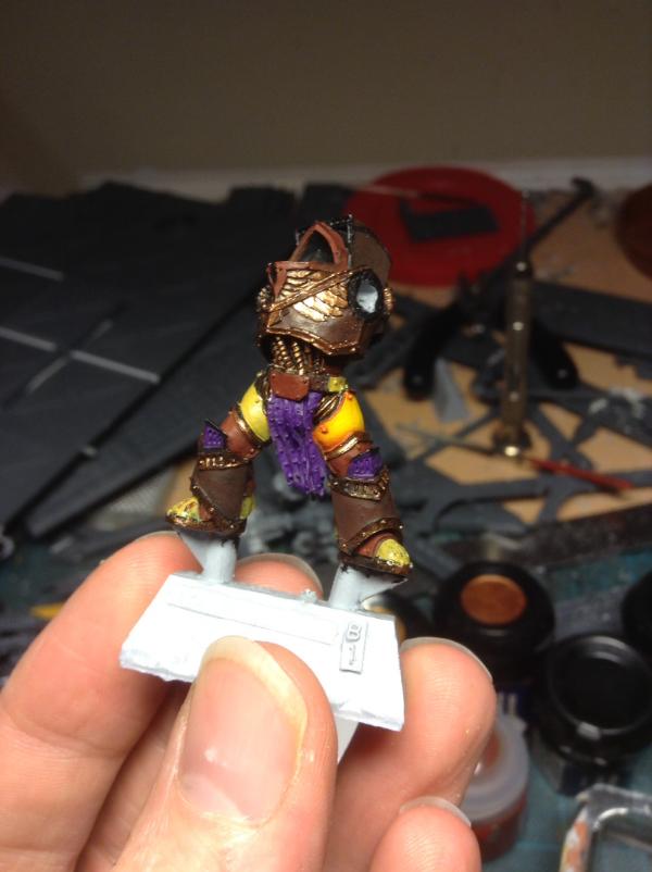
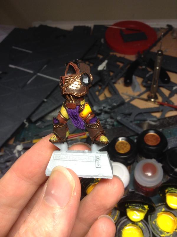
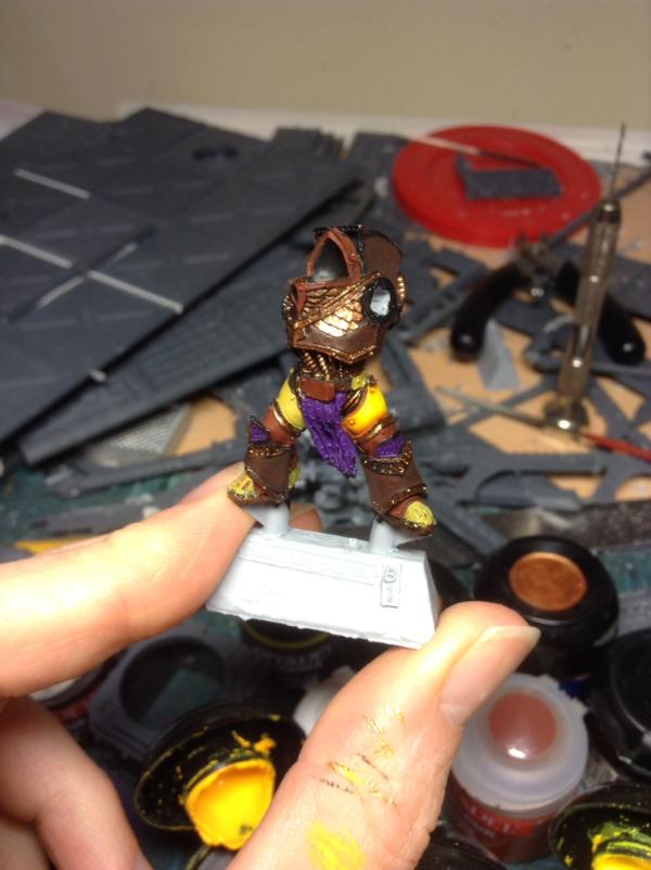
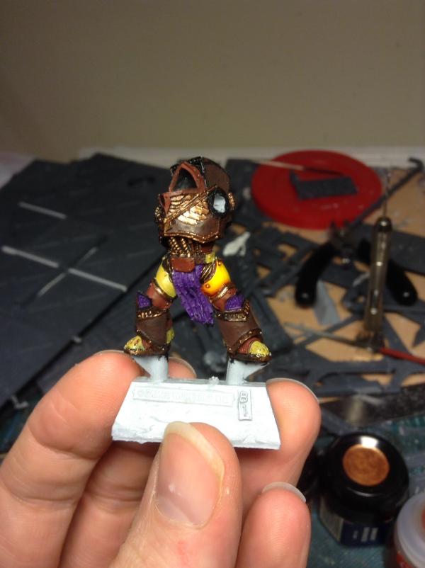
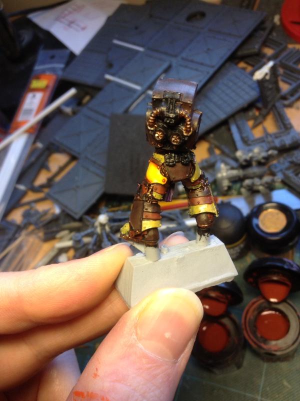
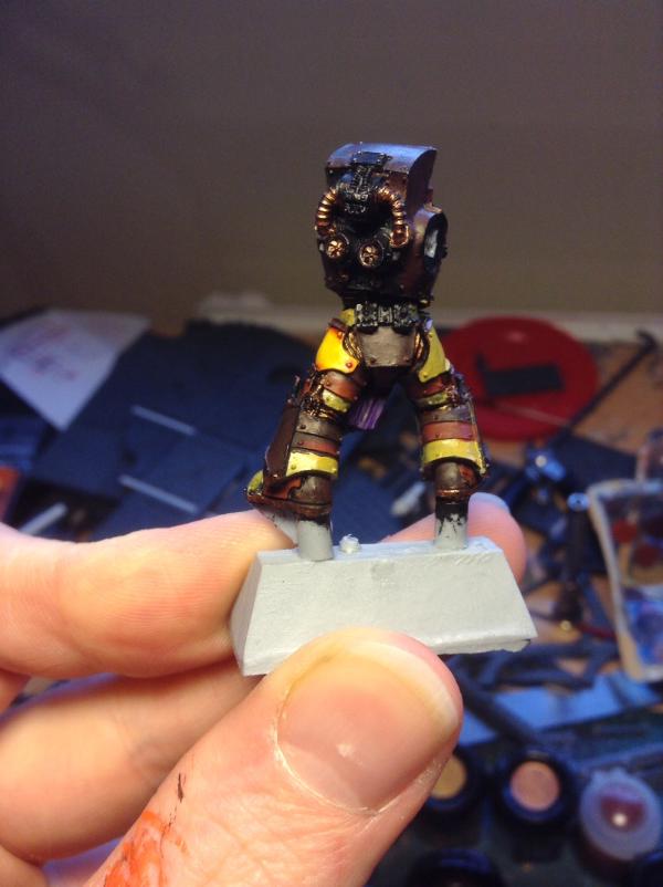
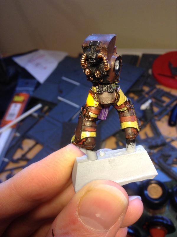
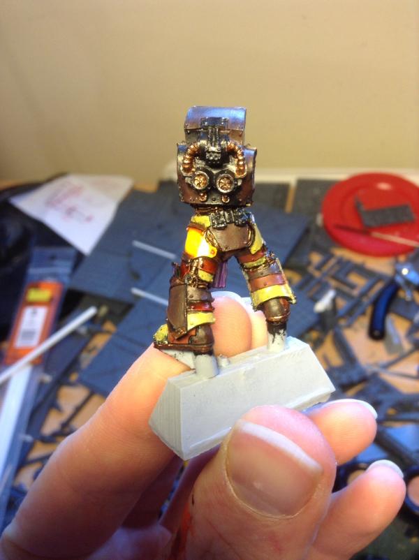
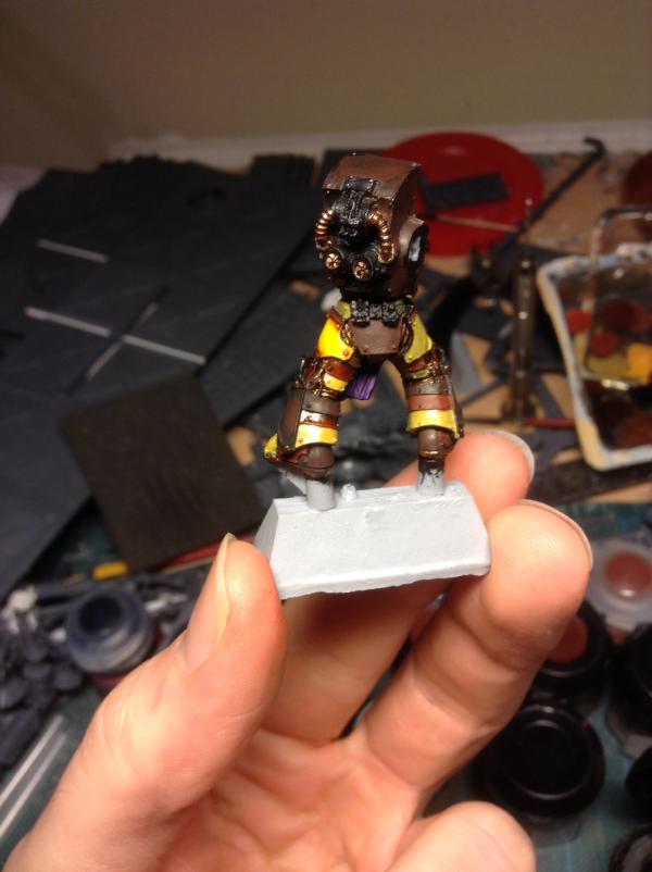
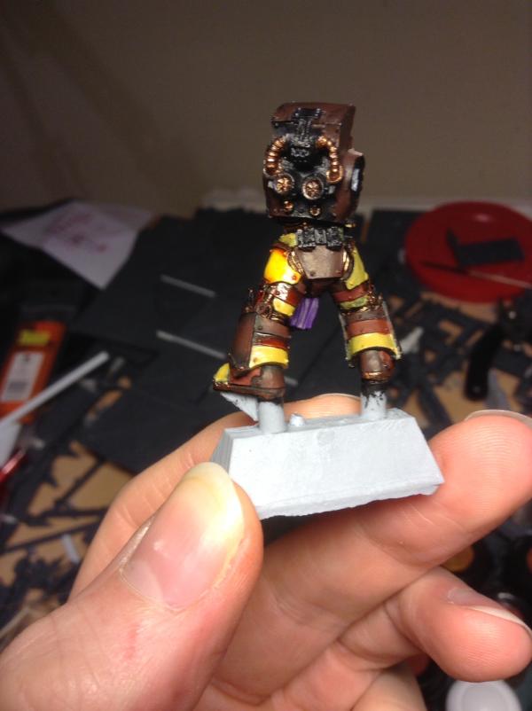
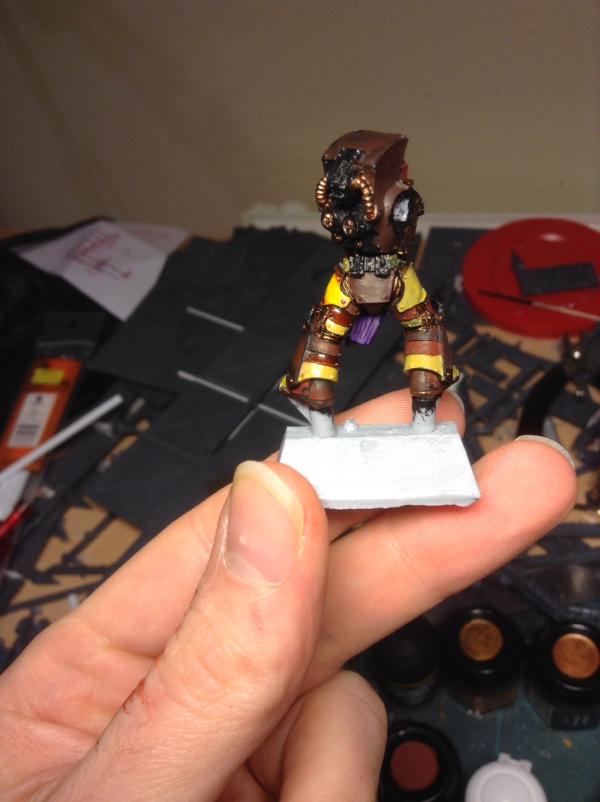
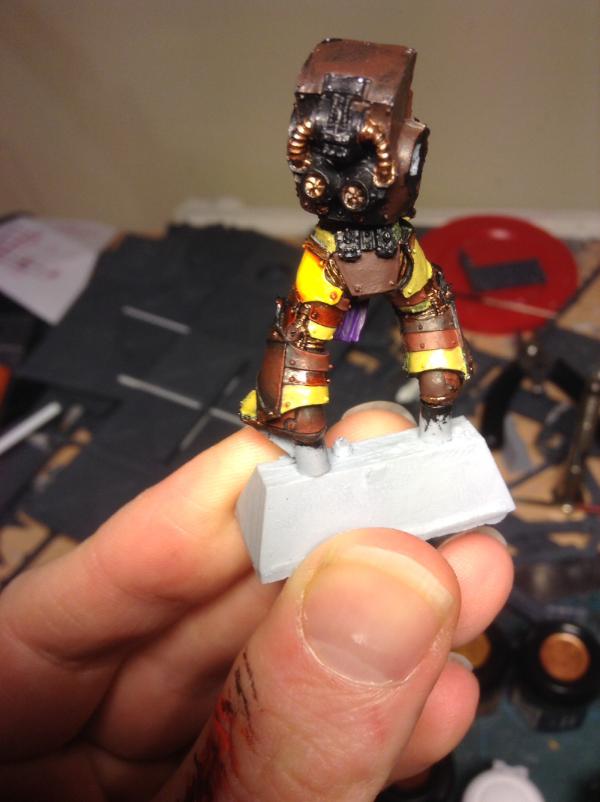
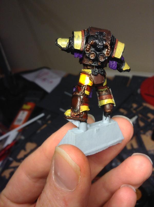
01/01/14 - ornate metalwork and purple knee on leg completed - before and after pics:


|
|
|
|
|
2014/01/01 16:29:08
Subject: Phutarf's painting blog... 31/12/13: Legion Preator WIP
|
|
Dakka Veteran
|
That brown is a really unique choice, I especially love the front panel, lower left leg. Never seen so much blending mate, well done! And thanks for the step by step pics
|
|
|
|
|
|
2014/01/01 17:11:08
Subject: Re:Phutarf's painting blog... 31/12/13: Legion Preator WIP
|
|
Boosting Space Marine Biker
|
Cheers San - hope the guides have been interesting if not of use lol... The brown I think would be incredibly dull if it was the only colour, but as part of this scheme it really works (I think!). Of course, having THREE colours, plus the amount of work it takes me to wet blend everything, is really, really, REALLY time consuming, but worth the effort in the end...
|
|
|
|
|
2014/01/20 02:00:41
Subject: Re:Phutarf's painting blog... 31/12/13: Legion Preator WIP
|
|
Flashy Flashgitz
|
Sorry late coming to the party.
I really like the scheme. The yellow and brown with purple work so well together, almost steam-punkish or roman. I'm not sure.. What I like is how weathered it looks without it being weathered. It really feels like armor out in use.
But, jeez, that yellow. I really really like that yellow. It pops. The contrast is so striking, the yellow just glows. It makes me want to start my army over. Again. No! No. I'll keep my yellow to be consistent.
Really cool colors.
How many in this project?
|
|
|
|
|
|
2014/01/20 20:16:49
Subject: Re:Phutarf's painting blog... 31/12/13: Legion Preator WIP
|
|
Boosting Space Marine Biker
|
 Gorgrimm wrote: Gorgrimm wrote:Sorry late coming to the party.
I really like the scheme. The yellow and brown with purple work so well together, almost steam-punkish or roman. I'm not sure.. What I like is how weathered it looks without it being weathered. It really feels like armor out in use.
But, jeez, that yellow. I really really like that yellow. It pops. The contrast is so striking, the yellow just glows. It makes me want to start my army over. Again. No! No. I'll keep my yellow to be consistent.
Really cool colors.
How many in this project?
Cheers Gorgrimm - admittedly I've not posted anything on this thread in ages but I'm amazed anyone was looking anyway, either that of I bored everyone to death...
Re your weathering comment - I know it's all the rage these days to weather everything in sight, but I've never been a huge fan - I like my minis to look their best! I may need to change that if I ever get anywhere close to displaying them, but for now I'm keeping them 'clean'.
As for the yellow, well thank you - it takes an inordinate amount if effort but the results I think are worth it. However, I also like your interpretation, so don't go changing it! Yours has more of an earthy, ochre-y feel to it, but there are multiple hues in the yellow spectrum, it'd be dull if we all did it the same way!
Numbers wise - honestly I don't know how many I'll eventually have. Enough to make a decent Armies on Parade display on my Cathedral project, so could be 30-50ish... Trouble is I really like Caterphractii and MKIII marines (cos of the multiple banding) but they'll take the longest to paint up! We'll have to see...
Anyway, keep up the good work on your Sons of Dorn! 
|
|
|
|
|
|
|
 Imperial Fist, IG and GK WIP:
 IMPOSSIBLE IS RELATIVE