| Author |
Message |
 |
|
|
|
|
Advert
|
Forum adverts like this one are shown to any user who is not logged in. Join us by filling out a tiny 3 field form and you will get your own, free, dakka user account which gives a good range of benefits to you:
- No adverts like this in the forums anymore.
- Times and dates in your local timezone.
- Full tracking of what you have read so you can skip to your first unread post, easily see what has changed since you last logged in, and easily see what is new at a glance.
- Email notifications for threads you want to watch closely.
- Being a part of the oldest wargaming community on the net.
If you are already a member then feel free to login now. |
|
 |
2013/12/31 11:36:04
Subject: Is the Artwork Degrading?
|
|

Daemonic Dreadnought
|
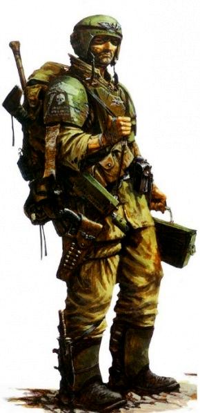
The art they put on book covers is usually very good.
The art that goes inside novels is of a lower quality. It's like a graphic novel, meant to express minimal detail in the interests of advancing a narrative. It's really not appropriate for an extended story where it's placed selectively around other text. Just write graphic novels if you want to do that style of art.
The art that goes inside Codexes is definitely degrading. It seems GW wants to establish a standard for how art is laid out in books, and it's not as interesting as what they had before.
I really liked the original Realms of Chaos books because they were drawn by a lot of different artists, the art was non-literal, and it was drawn in stark black and white. It had character that the most recent books simply can't match. There was a vision to it that really captured elements of the imagination of the authors in ways you can't do with a literal interpretation of the subject.
That said, I don't like the 'art' going into the books. I am starting to get tired of the images of models as well. It seems GW has decided that quantity of models matters more than quality of the picture. Photos of models in White Dwarf used to tell a story about what is going on in a battle, usually a very dramatic scene being laid out around some key models. These days, there's no story, it's a ton of models or a focus on one really key model. I am getting tired of seeing tons of things all the time...
|
|
|
|
 |
|
2013/12/31 11:58:27
Subject: Re:Is the Artwork Degrading?
|
|

Morphing Obliterator
Elsewhere
|
Beauty is in the eye of the beholder.
There was some really good stuff in previous editions, and I do feel that sometimes the new style lacks personality and character.
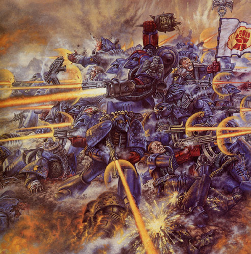
 MWHistorian wrote: MWHistorian wrote:I think the art has gotten much better.
I love me some Rogue Trader, but...
we went from this
To this.
My opinion on that two drawings is exactly the opposite. The first is not particularly good, but it is still interesting. The second is a copy-paste, computer generated random marine. It makes me admire the level of detail you can get nowadays with a good computer, but that´s all.
This is one example from Rogue Trader:
It is not the technique (which is superb). It is the character, the epic, the "something completely different" feeling I get from this that makes me admire this art work. This picture yells "THERE IS ONLY WAR" every time I look at it.
It is in this "personality" thing that Blanche shines the most. All his art is personal and with lots of character. Some of it is... meh, confusing for the sake of being original. But I really, really like some of his drawings.
Some of the new artwork is brilliant though.
|
‘Your warriors will stand down and withdraw, Curze. That is an order, not a request. (…) When this campaign is won, you and I will have words’
Rogal Dorn, just before taking the beating of his life.
from The Dark King, by Graham McNeill.
|
|
|
|
|
2013/12/31 12:06:54
Subject: Is the Artwork Degrading?
|
|

Is 'Eavy Metal Calling?
|
I'm a huge huge fan of the newer style. 40k or otherwise, I've always preferred more realist art rather than impressionist or stylised stuff, so the newer style where everything is much more detailed and vibrant is, to me, better than the old stuff, a lot of which seems out of proportion or oversimplified. Some stuff, like the RT cover, still stands out as great, but on the whole I'd much rather look at newer stuff.
My picks of the recent art would be the gatefold of the Imperial Palace in the 6th Ed BRB, the full page Raven Guard airforce pic in the SM codex, and the UM/IF vs IW double-spread from the same.
|
|
This message was edited 1 time. Last update was at 2013/12/31 16:53:08
|
|
|
|
|
2013/12/31 12:19:01
Subject: Is the Artwork Degrading?
|
|
Brigadier General
The new Sick Man of Europe
|
*Bows down*
I am not worthy!!! 
|
DC:90+S+G++MB++I--Pww211+D++A++/fWD390R++T(F)DM+
|
|
|
|
|
2013/12/31 13:57:00
Subject: Re:Is the Artwork Degrading?
|
|
Secretive Dark Angels Veteran
|
The Swanland covers so far have all been pretty amazeballs, compared to some of the old Codex covers (Blood Angels i'm looking at you) really lend a uniform approach to the series.
Artwise I'm unsure why GW likes to recycle art so much; How expensive can commissioning artists really be in this day and age of Deviantart?
Blanche art is still my favourite as it really lends a whole different dimension to the game, of horror and uncanny valley that few other game systems approach.
|
|
|
|
|
|
2013/12/31 15:55:32
Subject: Is the Artwork Degrading?
|
|
Land Raider Pilot on Cruise Control
|
 Paradigm wrote: Paradigm wrote:I'm a huge huge fan of the newer style. 40k or otherwise, I've always preferred more realist art rather than impressionist or stylised stuff, so the newer style where everything is much more detailed and vibrant is, to me, better than the old stuff, a lot of which seems out of proportion or oversimplified. Some stuff, like the RT cover, still stands out as great, but on the whole I'd much rather look at newer stuff.
My pics of the recent art would be the gatefold of the Imperial Palace in the 6th Ed BRB, the full page Raven Guard airforce pic in the SM codex, and the UM/IF vs IW double-spread from the same.
The UM/IF vs IW spread was one of the few new pieces of new artwork I liked. It had as much character as most of the RT stuff. Automatically Appended Next Post:  Asmodai Asmodean wrote: Asmodai Asmodean wrote:The Swanland covers so far have all been pretty amazeballs, compared to some of the old Codex covers (Blood Angels i'm looking at you) really lend a uniform approach to the series.
Artwise I'm unsure why GW likes to recycle art so much; How expensive can commissioning artists really be in this day and age of Deviantart?
Blanche art is still my favourite as it really lends a whole different dimension to the game, of horror and uncanny valley that few other game systems approach.
Yeah Blood Angels cover was pretty horrible. But I liked the 5th ed cover for Tyranids better than the 6th ed one. It met halfway and went for a semi realistic look but still kept it stylized and distinct.
|
|
This message was edited 1 time. Last update was at 2013/12/31 15:58:09
|
|
|
|
|
2013/12/31 16:23:42
Subject: Is the Artwork Degrading?
|
|

Courageous Space Marine Captain
|
While newer art is often technically good, I find that the old art is often more characterful. And of course Blanche is some sort of a mad genius, his stuff is just brilliant and full of lovely craziness.
|
|
This message was edited 1 time. Last update was at 2013/12/31 16:38:41
|
|
|
|
|
2013/12/31 16:27:12
Subject: Is the Artwork Degrading?
|
|
Elite Tyranid Warrior
|
I absolutely loved the artwork in the 4th edition Tyranid codex, especially Adrian Smiths work. His black and white stuff is amazing.
|
|
|
|
|
|
2013/12/31 16:27:30
Subject: Is the Artwork Degrading?
|
|
Land Raider Pilot on Cruise Control
|
 Crimson wrote: Crimson wrote:While newer art is often technically good, I find that the art art is often more characterful. And of course Blanche is some sort of a mad genius, his stuff is just brilliant and full of lovely craziness.
sometimes. His primarch artwork is the biggest example of how ridiculously complicated and/or stupid his artwork can get. Especially Fulgrim.
I can never forget how bad his "Fulgrim" was 0_0.
|
|
|
|
|
2013/12/31 19:33:14
Subject: Is the Artwork Degrading?
|
|

Pragmatic Primus Commanding Cult Forces
|
I also think the artwork has become a lot better.
When I see the old RT artwork, I just have to laugh because looks so silly.
That being said, art is so extremely subjective it is hard to say anything definite about it.
|
Error 404: Interesting signature not found
     |
|
|
|
|
2013/12/31 19:35:10
Subject: Is the Artwork Degrading?
|
|
Land Raider Pilot on Cruise Control
|
 Iron_Captain wrote: Iron_Captain wrote:I also think the artwork has become a lot better.
When I see the old RT artwork, I just have to laugh because looks so silly.
That being said, art is so extremely subjective it is hard to say anything definite about it.
Well I think part of the reason I liked it was it was silly but a really grim silly. That made it stand out.
|
|
|
|
|
2013/12/31 19:40:05
Subject: Is the Artwork Degrading?
|
|
Morphing Obliterator
Elsewhere
|
 Bronzefists42 wrote: Bronzefists42 wrote: Crimson wrote:While newer art is often technically good, I find that the art art is often more characterful. And of course Blanche is some sort of a mad genius, his stuff is just brilliant and full of lovely craziness.
sometimes. His primarch artwork is the biggest example of how ridiculously complicated and/or stupid his artwork can get. Especially Fulgrim.
I can never forget how bad his "Fulgrim" was 0_0.
Opinions, opinions...
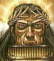
I really like his primarchs. They are completely different from one another, each one has his own personality.
Mortarion:
Khan:
Fulgrim. Do you realize he is stepping on something that looks like a mutilated young woman?
However, this is still sub-par. Artists of such an imagination work better when not restricted to "do some Primarchs sketches" orders.
Let´s see some serious masterpieces:
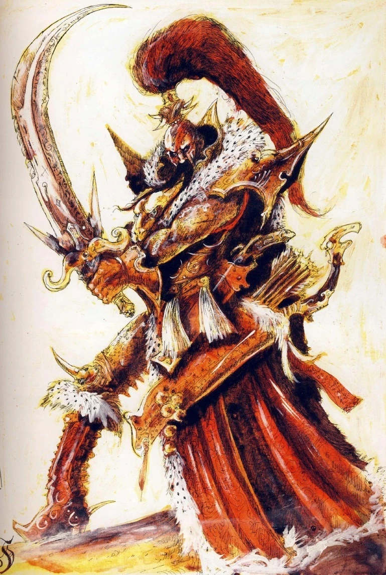
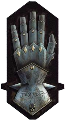
Slaaneshi Fiend concept (Daemonette Serpentine I think is called):
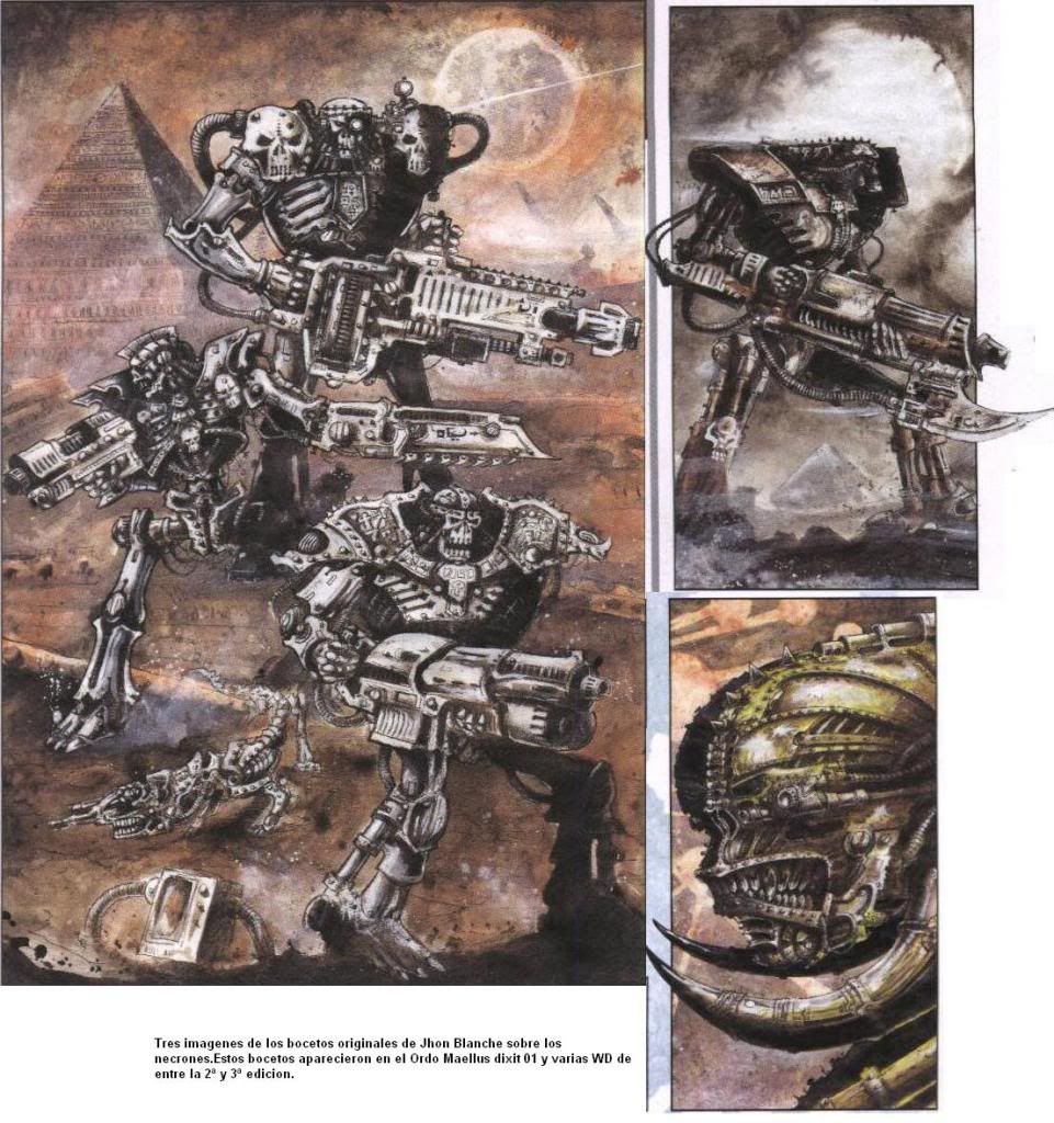
Necron concept (OMG!!):
Adeptus Mechanicus seriously wtf floating machine concept:
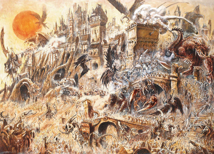
I don´t know what is going on here:
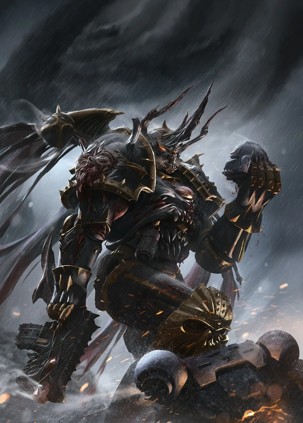
I want this dude in 40k:
A personal favorite: random chaos cultist:
If you like it, here is a blog with some of his work: http://gothicpunk.tumblr.com/
|
‘Your warriors will stand down and withdraw, Curze. That is an order, not a request. (…) When this campaign is won, you and I will have words’
Rogal Dorn, just before taking the beating of his life.
from The Dark King, by Graham McNeill.
|
|
|
|
|
2013/12/31 19:53:27
Subject: Is the Artwork Degrading?
|
|
Land Raider Pilot on Cruise Control
|
Blanche still isn't my cup of tea. But some of those are good (Mortarion actually looks like Mortarion)
|
|
|
|
|
2013/12/31 19:56:56
Subject: Is the Artwork Degrading?
|
|
Beast Lord
|
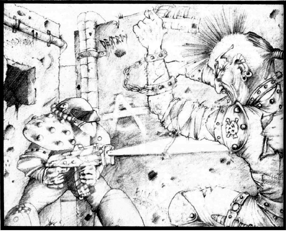
 Silverthorne wrote: Silverthorne wrote:Another fan of the old stuff. I hate all the photo-realism, I love the grittier, 2000AD feel of the old stuff.
That comparison Historian posted is a perfect example. The top is art, the bottom is an exercise in computer rendering. Not evocative at all.
The bottom is art, the top is just pencil pushing. Not evocative at all
|
|
|
|
|
2013/12/31 20:03:38
Subject: Is the Artwork Degrading?
|
|
Land Raider Pilot on Cruise Control
|
 tybg wrote: tybg wrote: Silverthorne wrote:Another fan of the old stuff. I hate all the photo-realism, I love the grittier, 2000AD feel of the old stuff.
That comparison Historian posted is a perfect example. The top is art, the bottom is an exercise in computer rendering. Not evocative at all.
The bottom is art, the top is just pencil pushing. Not evocative at all
It is subjective but honestly the bottom is just a CGI rendering of a generic marine. It doesn't give off any feelings of Grit or 40k.
|
|
|
|
|
2013/12/31 21:09:47
Subject: Is the Artwork Degrading?
|
|
Drew_Riggio
|
I suppose its only natural that GW would go from a more impressionist style to realism, as they are trying to reach a wider audience.
The newer art is technically astonishing, kind of like a movie ripe with CGI. Its flashy and expensive, but that doesn't automatically make it superior to the older stuff, but for anyone who doesn't put much more thought into it other then 'how realistic it is' (which is most people who look at art) the newer stuff will win out.
I think there is a lot of great new stuff, in particular in the 6thed rule book that depicts the adeptus mechanicus and the palace on terra. Realism can still be just transporting and inspirational as the old stuff.
|
|
This message was edited 2 times. Last update was at 2013/12/31 21:19:21
|
|
|
|
|
2014/01/01 00:09:19
Subject: Is the Artwork Degrading?
|
|
Is 'Eavy Metal Calling?
|
To add to my earlier comments, the reason I love the realism in newer 40k art is that the artwork is what defines the universe we game in. The more real it seems, the more accurate image we can form of it, the more our games becomes something meaningful rather than generic plastic toys with guns and chucking some dice. I do like the older stuff, including Blanchian stuff, but when I picture my games, it's the newer style I see in my head, and in a way what I try to replicate on my minis.
|
|
|
|
|
|
2014/01/01 02:01:47
Subject: Is the Artwork Degrading?
|
|
Impassive Inquisitorial Interrogator
|
Bronzefists42 wrote: tybg wrote: Silverthorne wrote:Another fan of the old stuff. I hate all the photo-realism, I love the grittier, 2000AD feel of the old stuff.
That comparison Historian posted is a perfect example. The top is art, the bottom is an exercise in computer rendering. Not evocative at all.
The bottom is art, the top is just pencil pushing. Not evocative at all
It is subjective but honestly the bottom is just a CGI rendering of a generic marine. It doesn't give off any feelings of Grit or 40k.
I must agree with bronzey; while the top is a pencil pushing, it involves imagination and heart. I can almost imagine the artist, some poor schmuck working for pennies trying to create a fun and engaging game, bringing it to life in his own artistic way. The lower image, while well done, shows no soul. Its a rendering of a Marine shooting his gun. The image isn't dynamic, it isnt inspiring, and its certainly not creative.
|
|
|
|
|
2014/01/01 02:18:12
Subject: Is the Artwork Degrading?
|
|
Ancient Venerable Dark Angels Dreadnought
|
 DEUS VULT wrote: DEUS VULT wrote:Bronzefists42 wrote: tybg wrote: Silverthorne wrote:Another fan of the old stuff. I hate all the photo-realism, I love the grittier, 2000AD feel of the old stuff.
That comparison Historian posted is a perfect example. The top is art, the bottom is an exercise in computer rendering. Not evocative at all.
The bottom is art, the top is just pencil pushing. Not evocative at all
It is subjective but honestly the bottom is just a CGI rendering of a generic marine. It doesn't give off any feelings of Grit or 40k.
I must agree with bronzey; while the top is a pencil pushing, it involves imagination and heart. I can almost imagine the artist, some poor schmuck working for pennies trying to create a fun and engaging game, bringing it to life in his own artistic way. The lower image, while well done, shows no soul. Its a rendering of a Marine shooting his gun. The image isn't dynamic, it isnt inspiring, and its certainly not creative.
I think it's also a matter of the appearance. The Fist just doesn't look that interesting. For example, I far prefer the cover of the Black Legion Supplement- which looks striking and grabs your attention immediately with its immense detail and daemonic appearance.
|
“There is only one good, knowledge, and one evil, ignorance.”
|
|
|
|
|
2014/01/01 04:37:58
Subject: Re:Is the Artwork Degrading?
|
|
Basecoated Black
|
GW artwork has always been hit and miss with me. Nevertheless, no matter how I personally feel about a piece, I think it is more important to understand and respect the artist's process in creating it. If we all felt the same way about every piece of art, to be quite frank, it really wouldn't be art.
Furthermore, I can only speculate, but I would assume that GW places strict guidelines on what it wants from the artists it employs. I would argue that issues with the artwork would be more the fault of the company than the artists creating it.
|
 3500 pts 3500 pts |
|
|
|
|
2014/01/01 21:41:48
Subject: Is the Artwork Degrading?
|
|

Shrieking Traitor Sentinel Pilot
|
For me, both the old and new still evokes the same sense of the universe, just from different perspectives.
The old style seems more surreal, while the new covers are much more 'realistic', if I can use that term in connection with mutated space soldiers with horns on their faces.
|
|
|
|
|
|
2014/01/04 19:51:41
Subject: Is the Artwork Degrading?
|
|

Furious Raptor
Karlovac, Croatia / Bihac, Bosnia and Herzegovina
|
This kind of topics emerge from time to time and there are always "pro-Blanche" (me included) and "anti-Blanche" sides. Although somehow usually people forget to mention probably technically most superior artist that worked for GW - Mark Gibbons (I am saying that from perspective of time he worked, so no tablets, custom brushes, generated poses or backgrounds).
Nowadays there are artist which do fantastic stuff with computers and tablets but for me they distinctly lack, how would you say, personality, driving spark or that kind of thing that leaves you imagining back story of drawn character or admiring small details.
From top of my head one of the best MG art is his Avatar and Njall, still after all these years for me they didnt age a bit. (And Avatar in that pic is not punchbag-can you believe it).
But to conclude, view on quality of art is totally subjective so someone like me doesnt like new way of GW art department (including before mentioned Blanche new stuff) and someone (probably new generations of gamers) likes it much more.
|
|
|
|
|
|
2014/01/07 16:26:12
Subject: Re:Is the Artwork Degrading?
|
|

Been Around the Block
|
I'm not a Blanche fan, neither do I like any most of the newer over the top digitally rendered work.
For me, the king is Karl Kopinski. I dont think anyone else can consistantly capture the grit and personality of the subjects he paints.
|
|
|
|
|
2014/01/07 17:18:35
Subject: Re:Is the Artwork Degrading?
|
|
Quick-fingered Warlord Moderatus
|
The art style is improving but the technique in the artwork is slipping.
For example, someone once pointed out to me the Tigurius painting. Visually, it's a huge improvement from the old style especially from RT and 2E (I am also not a fan of Blanche, so that's a large part of it), but you can see a lot of obvious brushwork from their tablet with no defined boundaries. It looks like something you'd find on deviantART or a booru compared to the meticulous lineart and inking you'd find from the 80's and 90's.
No. In fact leaving visible brush strokes actually IS a legitimate (and often challenging) technique. It is NOT generally the sign of bad technique. There's exceptions of course. For example the cover of the Blood Angels codex. The too white hot spot on the thigh of the power armor looks unfinished because it's not as blended as the rest of the piece (I'm not even going to get into the issues with perspective and anatomy on that cover lol). That whole cover looks unfinished though. If I had to guess then I'd say, from experience that the artist was probably bombarded with constant changes by the producer and ran out of time. 
Generally, the art is just changing. Better or worse is obviously a matter of opinion, but yeah, it's just changing. They are pushing more "extreme" shots and really trying to drive home the action imo. What they are doing on the covers now is a little more cinematic in approach (apologies for the c word) but the art on the inside still varies a bit.
I have a degree in Industrial Design and while I started out on the engineering/manufacturing side of things I'm now more in the art/marketing end of things and I can say that love it or hate it, the new stuff generally stacks up well against its competitors. My favorite " 40k art era" was during second edition but in all honesty that's more the nostalgia talking than anything.
While newer art is often technically good, I find that the old art is often more characterful. And of course Blanche is some sort of a mad genius, his stuff is just brilliant and full of lovely craziness.
Glad I'm not the only Blanche fan!  I like that his work actually lends itself to being looked at a few times. His lines are very energetic and each image is very much "alive" imo. It encourages the viewer to fill in details with their own imagination and really encourages interaction in that way. I think the other end of it (for me anyway) is that his work reminds me a little more of some of the older stuff I grew up looking at. Like a more adult version of it that style so he also gets a tip of the hat for a minor nostalgia factor.
|
|
This message was edited 2 times. Last update was at 2014/01/07 17:26:41
Edit: I just googled ablutions and apparently it does not including dropping a duece. I should have looked it up early sorry for any confusion. - Baldsmug
Psiensis on the "good old days":
"Kids these days...
... I invented the 6th Ed meta back in 3rd ed.
Wait, what were we talking about again? Did I ever tell you about the time I gave you five bees for a quarter? That's what you'd say in those days, "give me five bees for a quarter", is what you'd say in those days. And you'd go down to the D&D shop, with an onion in your belt, 'cause that was the style of the time. So there I was in the D&D shop..." |
|
|
|
|
2014/01/07 17:28:48
Subject: Is the Artwork Degrading?
|
|
Ultramarine Master with Gauntlets of Macragge
|
I feel the artwork is all very era-appropriate. The 80's artwork is very much like 2000 AD/Judge Dredd artwork, and is really gritty with a touch of silly, which 40k was at the time. 2nd edition artwork is really cartoony and colorful generally, which is what the game looked like at the time. It's gotten grittier and grittier, and now it's looking really polished, much like the look of the models. I can appreciate every era for what it is, and there are some I just appreciate more than others. I will, however, say that I'm not a fan of the CGI covers. They look kind of cheesy generally, and lack the personal touch that a lot of the painted/illustrated covers have.
|
Check out my Youtube channel!
 |
|
|
|
|
2014/01/07 17:56:11
Subject: Re:Is the Artwork Degrading?
|
|
Quick-fingered Warlord Moderatus
|
It makes me admire the level of detail you can get nowadays with a good computer, but that´s all.
This attitude irks me just a little. I kind of get where it comes from, but there's quite a bit that goes into making something like that. All of the textures on that marine are still hand painted, you still have to be able to frame and compose a shot, you still have to have the same handle on color theory and anatomy, etc etc. There is no "MAKE AWESOME MARINE" button. You can certainly re-use assets but even then you still have to paint your textures/backgrounds etc. It takes a lot of time and effort to create those. In fact some of the covers that people think are 2D paintings are actually 3D renderings. The previous CSM codex cover is an example of this.
That certainly doesn't mean you have to like the art of course. lol It's just that it's a lot more time and labor intensive than people realize - the quality of the 3D image has very little to do with the computer it was made on. A better machine just helps the work move faster. That's it. 
That said, I do have to say that, generally speaking, a lot of the newer 3D stuff from GW lacks a little bit of dynamism in the poses imo. That's not a limitation of the medium either. Just a choice by the artist/art director. I'd like to see them push towards more dynamic scenes and poses with a lot of that.
|
|
This message was edited 1 time. Last update was at 2014/01/07 17:57:40
Edit: I just googled ablutions and apparently it does not including dropping a duece. I should have looked it up early sorry for any confusion. - Baldsmug
Psiensis on the "good old days":
"Kids these days...
... I invented the 6th Ed meta back in 3rd ed.
Wait, what were we talking about again? Did I ever tell you about the time I gave you five bees for a quarter? That's what you'd say in those days, "give me five bees for a quarter", is what you'd say in those days. And you'd go down to the D&D shop, with an onion in your belt, 'cause that was the style of the time. So there I was in the D&D shop..." |
|
|
|
|
2014/01/07 18:02:29
Subject: Is the Artwork Degrading?
|
|
Hallowed Canoness
|
Psienesis wrote:Behold, your new master, and the epiphany of art:
Boo?! Where did you get that power armour? Does Minsc know you have that?
da001 wrote:
I don´t know what is going on here:
That would be originally a Warhammer Fantasy piece of artwork about Archaon's invasion of Middenheim.
|
   
"That time I only loaded the cannon with powder. Next time, I will fill it with jewels and diamonds and they will cut you to shrebbons!" - Nogbad the Bad. |
|
|
|
|
2014/01/07 20:48:33
Subject: Re:Is the Artwork Degrading?
|
|

Longtime Dakkanaut
|
|
|
This message was edited 1 time. Last update was at 2014/01/07 20:51:13
From the initial Age of Sigmar news thread, when its "feature" list was first confirmed:
Kid_Kyoto wrote:
It's like a train wreck. But one made from two circus trains colliding.
A collosal, terrible, flaming, hysterical train wreck with burning clowns running around spraying it with seltzer bottles while ring masters cry out how everything is fine and we should all come in while the dancing elephants lurch around leaving trails of blood behind them.
How could I look away?
|
|
|
|
|
2014/01/07 21:14:07
Subject: Re:Is the Artwork Degrading?
|
|
Land Raider Pilot on Cruise Control
|
Again there is good new art but I feel it isn't as characterful as any of this. Also I didn't even address the fact that they have toned down the "mature stuff" in their artwork but that is another, smaller issue.
|
|
|
|
|
2014/01/07 21:16:34
Subject: Re:Is the Artwork Degrading?
|
|
Ancient Venerable Dark Angels Dreadnought
|
Lolwut? The CSM book is full of bloody pelted human skin, Astartes wearing skinned humans, violence, etc, to the point that it simply becomes overbearing and boring rather than intimidating.
|
“There is only one good, knowledge, and one evil, ignorance.”
|
|
|
|
|
|
|

 Mechanicus
 Ravenwing
 Deathwing