Forum adverts like this one are shown to any user who is not logged in. Join us by filling out a tiny 3 field form and you will get your own, free, dakka user account which gives a good range of benefits to you:
No adverts like this in the forums anymore.
Times and dates in your local timezone.
Full tracking of what you have read so you can skip to your first unread post, easily see what has changed since you last logged in, and easily see what is new at a glance.
Email notifications for threads you want to watch closely.
Being a part of the oldest wargaming community on the net.
If you are already a member then feel free to login now.
2015/07/06 21:01:38
Subject: Painting styles. Realism or super fantastic schemes
So I've been having this discussion with a friend over painting styles and would love the war gaming communities ideas on this.
What's better or easier to do or achieve the super fantastic 40k marine schemes we see from the 90s till now or the gritty battle forged 30k ones?
Personally I prefer realism over the "hello boys, were over here schemes", if that's your cup of tea collect eldar or harlequins where it suits. Marines are supposed to intimidating fearsome foes not fabulous.
Also being a former art student from experiace painting both realistic schemes or imagined fantastical ones, real life is always harder to accomplish and prefect, as your trying to do it artificially, which requires references and trying to control an organic uncontrollable force which is natures effect or battles effect in this case on the subject. Where as fantastical ones have no bases for comparison and hence allow you free rain.
Why this weekend at the open day with forgeworld it was refreshing to see this acknowledged with the winners entry. It's not that I don't like the fantastical or respect it. I just think it's a cop out and easier choice than trying to understand say the shades in rust or how corrosion works, or even still how a dark colour or flat as fantastical painters will call it can contain many shades or layers, sometimes more so than the "oh hello, I'm over here marines"
No ones wrong on the style they pick, I just think achieving a level of realism is a much harder craft both to achieve and master
What do you think? I'd love to hear all your opinions
This message was edited 1 time. Last update was at 2015/07/06 21:02:42
I personally think Marines fit with the fabulous schemes. Why? They're 3 metre tall, super strong, super fasst super soldiers with full-auto RPG's, and they're proud of it, damnit! They want people to see that they do not fear death, they do not hide.
Buttery Commissar wrote: Perhaps you could share with us some examples of paint jobs so we have a clear idea of your definitions?
Well for example look at salamanders and space wolves, both in 30k have darker shades. Wolves slate grey and salamanders an olive to forest green, the look at 40k wolves are a pastel blue and salamanders are almost the same green Microsoft uses for the Xbox one boxes. Doesn't exactly inspire fear. Look at how most people paint marines like they are on parade all polished up and shines then make them look totally out of place putting them one in a war zone two puyying them on war themed bases
Automatically Appended Next Post:
Matthew wrote: I personally think Marines fit with the fabulous schemes. Why? They're 3 metre tall, super strong, super fasst super soldiers with full-auto RPG's, and they're proud of it, damnit! They want people to see that they do not fear death, they do not hide.
True they don't hide but they also aim to strike fear and menace, fabulous schemes don't do this. As I said no ones wrong it boils down to personal taste. But never in any fluff are they described as having such bright armour
This message was edited 1 time. Last update was at 2015/07/06 21:19:45
If a seven foot tall, armoured, chainsword wielding, angry man lands in your garden, you aren't really going to care what colour he is. He could be painted neon pink and green and you'd still do a little wee.
Marines are likely meant to be seen and feared. Like propaganda tools in themselves. When they land, your day is pretty much over.
And does the fluff not include codex/rule books? Rainbow Warriors existed from an extremely early publication.
Though I have pretty much no real skill in painting, my models do very much tend towards the 'gritty' side of things.
For example, with my Blood Ravens, I intentionally chose a darker red than their normal model paint schemes (though I'd argue this is closer to how you see them in DoW2)
Even when I use lighter colours, like my Deadzone Plague, there's still a darkness about them. - Probably because I prefer working with black undercoat!
It even extended to that time I flitted with painting High Elves.
2015/07/06 22:18:40
Subject: Painting styles. Realism or super fantastic schemes
DalinCriid wrote: According to Fluff, aren't most, or some, of the Space Marines required to repaint their power armors?
They only reprint it when joining and leaving the deathwatch
Automatically Appended Next Post:
Buttery Commissar wrote: If a seven foot tall, armoured, chainsword wielding, angry man lands in your garden, you aren't really going to care what colour he is. He could be painted neon pink and green and you'd still do a little wee.
Marines are likely meant to be seen and feared. Like propaganda tools in themselves. When they land, your day is pretty much over.
And does the fluff not include codex/rule books? Rainbow Warriors existed from an extremely early publication.
Yeah they did exist but where then scrapped. It's just when you read they books any of them their armour is described as dark colours exertions being blood Angels, scars, and ultras.
In this age of layering and new paints people seem to have forgot the realism this hobby aims for in what it teaches with battle damage etc.
It looks terrible when you see a brightly pained Marine with battle damage as its too contrasting. You can't paint them with prestige colours and not dirty them up and then apply battle damage it just doesn't work and then looks cartoony.
End of the day it's a war game, models are supposed to look like they actually have fought but I digress. I just think it's an easy choice to be fabulous and not as technically demanding as realistic painting from an artist point of view
Automatically Appended Next Post:
Compel wrote: Though I have pretty much no real skill in painting, my models do very much tend towards the 'gritty' side of things.
For example, with my Blood Ravens, I intentionally chose a darker red than their normal model paint schemes (though I'd argue this is closer to how you see them in DoW2)
Even when I use lighter colours, like my Deadzone Plague, there's still a darkness about them. - Probably because I prefer working with black undercoat!
It even extended to that time I flitted with painting High Elves.
I agree with your blood Ravens which look amazing btw In relation to fantasy and specifically aelfs as they are now. They are the same as eldar with high elves, wood and dark are gritty and earthy in colour.
I've no experience of dead zone but those look to be none humans which would explain the skin colours
For example my raven guard have albino skin but that's due to fluff stating they do and I paint their armour damaged and dirty as they are in a war zone fighting not on parade
This message was edited 2 times. Last update was at 2015/07/06 23:11:05
Son_of_corax wrote: As I said no ones wrong it boils down to personal taste.
I'd believe you if you weren't putting so much effort into disproving why colourful marines might exist. Maybe cool your boots...
Son_of_corax wrote:In this age of layering and new paints people seem to have forgot the realism this hobby aims for in what it teaches with battle damage etc.
No, you don't get to say what "this hobby aims for". You cannot begin to define the sole goal of an entire hobby that has a basis in imagination and fantasy.
If I want to paint my space marine like a toilet wall and put dick graffiti on him, that's what I aimed for.
If a nine year old child wants to paint her first marines with corrective fluid and highlighter pens, that's what she aimed for.
If you want to paint fluff specific markings and tones on yours, that's what you aimed for.
And none of those would be any less "valid".
I just think it's an easy choice to be fabulous and not as technically demanding as realistic painting from an artist point of view
I think it depends on the skill level of the painter in question. For example the Warhammer World displays full of brightly painted marines probably have more work invested in one shoulder pad than some folks' entire squad. It's not always easy being fabulous. Many of the pro painters here use colourful schemes, and the work they put in is extensively documented, I wouldn't call any of it "easy".
You say you are an artist in your first post... I would expect you to appreciate then, the interpretation and enjoyment of different aesthetics by different people..
Personally I think there's room for all different types. To make the hobby accessible to everyone, we need to embrace that not everyone wants the same thing.
well, judging by the responses and critique i get for my painting, people's interpretations of what "should be" is all over the map...
there are wildly varying interpretations of the same book and descriptions...
the majority of the fluff that i have ever read about Space Marines over the last 30 years has said that armour is repaired, maintained, and paint touched up whenever there is downtime between battles, out of respect to the machine spirit in the armor...
this interpretation seems to be shared by all the people who have had a negative reaction to the battle damage i have painted on Marines...
then you have the people who love it...
who is right???
my personal perspective is that the Salamanders' 40K scheme does look imposing, even if it is a brighter green than their 30K version...
same goes for Space Wolves...
i like both versions equally...
i like painting battle damage on bright schemes exactly because of the contrast that it provides...
a brighter scheme provides the look that draws the eye from 3-feet away on the tabletop...
a more muted scheme would have to be picked up and examined closely for people to appreciate the subtle work that has gone into it...
as to cartoony versus gritty, no one way is right...
that is a personal choice...
if you think that a comic book is not serious art, that's your choice, but i would disagree...
people put just as much passion and skill into a cartoon drawing as an oil painter like Turner put into a seascape, in my experience...
i come from the cartoony school of approach way more than the gritty approach, and put a whole hell of a lot of work into getting things to look good...
if you think that super fantastic doesn't look right to you, that's cool...
if you think that painting super fantastic schemes takes less talent than realism, i would say you are way off base...
mistakes show up way more on a super fantastic scheme way more than they do on a gritty scheme...
cheers
jah
Paint like ya got a pair!
Available for commissions.
2015/07/07 00:32:18
Subject: Painting styles. Realism or super fantastic schemes
This is just the dilemma I have with my Orks Lootas. My normal boyz are mega grimy, filthy.
I put such much work into the detail (for me) on the Deffgunz that I could barely bring myself to apply the final layer of grimy wash.
I stopped half way through (batch of 20) to compare and contrast. In the end I finished griming them up but promised I would touch up all the metal highlights after the final wash.
Grime wins for orks...but the ungrimed ones were beautiful!
2015/07/07 00:34:49
Subject: Re:Painting styles. Realism or super fantastic schemes
This is the whole point I said that there is no right or wrong answer its purely an exercise in seeing people opinion. On something that's peaked my interest lately
As the game states its in the grim darkness of the future so the key is in that statement.
I never said comic book styling isn't serious art but there's a time and a place for it.
The major issue I have is people thinking painting gritty realism is somehow easier than the fantastical, which as I said any artist whose done both would say its harder to perfect random applications of wear and tear making it not look artificial to painting lots of layers to add shade.
In terms of what I said with what the hobby aims for look at the transition, of some chapters colours over the past 15 years.
With some races its got more realistic i.e Orks
But gw are trying to force people to use layers more so than the last generation of paints which was washes.
Its a war-game at the end of the day, and I suppose that's where I take my key from its "war".
I always feel that marines look stupid when painted to a parade standard then put on bases that show battle conditions.
This message was edited 2 times. Last update was at 2015/07/07 12:24:53
This is actually a really cool discussion.... for me personally I am in the camp of Realism!! Filthy dirty shot & beat up realism... only because I like the aesthetic! WW1 trench pictures and battle of berlin style.... however with something like 40k emperors children.... or some of the horrors of the chaos gods I can see why the fantastical paint work would work! I guess that's the great thing about creativity... we all have our own opinions and thata what gives variety..... whether super shiney and bold or grimey and grey..... each has their own merits!
I think it comes down to color scheme and layering. People that are not painters seem to think that they need to mix their color to the image and apply directly whereas painters know that they get that effect by layering of different light coats of paint.
Your images are quite good examples actually, the blood Ravens looks quite flat from a distance comparing to the dead zone minis, I would have layered doombull brown first over the black primer before going to Khorne red. The elf archer looks like Christmas elf with no layering comparing next to the spearelf, even though the tones are darker, it looks worse than the lighter scheme elf due to lack of layering, highlight etc. freshly applied sand instead of painted over sand makes both models look out of scale too.
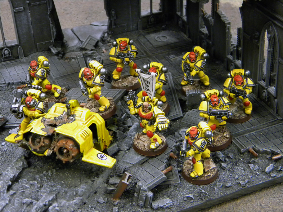
The imperial fists images found online is a good example of making any scheme work if the layering is there, though I wish there is a little more weathering on the brighter scheme.
2015/07/07 23:29:50
Subject: Painting styles. Realism or super fantastic schemes
Son_of_corax wrote: This is the whole point I said that there is no right or wrong answer its purely an exercise in seeing people opinion. On something that's peaked my interest lately
As the game states its in the grim darkness of the future so the key is in that statement.
I never said comic book styling isn't serious art but there's a time and a place for it.
The major issue I have is people thinking painting gritty realism is somehow easier than the fantastical, which as I said any artist whose done both would say its harder to perfect random applications of wear and tear making it not look artificial to painting lots of layers to add shade.
In terms of what I said with what the hobby aims for look at the transition, of some chapters colours over the past 15 years.
With some races its got more realistic i.e Orks
But gw are trying to force people to use layers more so than the last generation of paints which was washes.
Its a war-game at the end of the day, and I suppose that's where I take my key from its "war".
I always feel that marines look stupid when painted to a parade standard then put on bases that show battle conditions.
you say that there is no right answer, but make statements as if you opinion is fact...
it's a bit confusing...
yes, the setting is grim, but then the fluff goes on to specifically state that Marines maintain their armour to be as pristine as possible at every opportunity...
this setting is completely over-the-top heroes and villains...
seems the like the most appropriate time and place for comic book styling to me...
of course that is a limitless styling, since comics can be gritty too...
it is not just the clean lines and bold colors of a traditional comic style, which is why any approach is equally valid here...
i have painted both, and i could not disagree with you more...
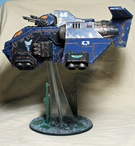
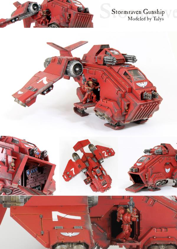
this took me one tenth of the time to paint:
versus this:
the amount of thought that went into each paintjob is equal, but the amount of time and skill that went into the Blood Angel is miles ahead of what i had to do on the Stormraven...
some washes and a sponge take care of the grit, while the fantastical style takes a lot of very precise work with the layers and lines to create the comic book style...
i don't understand how GW is trying to "force" layering any more than layering was already a thing in the 'EM style for a couple of decades before they changed the names of their latest paints...
washes are still there in the form of shades...
again, you say there in no right answer, and then go on to say how stupid you think Marines look with a parade ground paintjob...
there obviously is a right answer for you personally...
i'm not trying to attack you here, just pointing out why i am a little confused...
personally, i like a mix of both bright schemes and damage...
i had great fun painting this one:
there are almost as many approaches as there are individuals in any kind of art...
one thing i never understood, are the people who get irritated by basing altogether...
i hear a lot of "why is he dragging that terrain around with him everywhere he goes???", and they prefer the clear acrylic bases...
some people get in a tizzy over snow basing...
for me, i see a miniature as a representation of a moment caught in time, like a photograph, and like to create a visual story of that moment with the paintjob and basing...
anyway, like i said, i'm not trying to be a jerk, i just find myself totally on the other side of the fence with my thoughts and opinions on this one...
cheers
jah
Paint like ya got a pair!
Available for commissions.
2015/07/08 02:09:37
Subject: Painting styles. Realism or super fantastic schemes
I've found weathering a model takes a massive amount more artistic ability, at least for me
Good weathering isn't just about paint chips, it's about subtle browns used for shading, filters used to make it look like the armour wasn't just washed, polished and waxed 30 seconds ago, weathering powders or airbrushed dust tones to show the build up of dust on some parts and not on others, the use of a few complimentary browns, yellows and greys to show the contrasting tones in grime build up, all without going over board and making it look like the model has just rolled around in the mud!
Even if I can apply the techniques, I lack the artistic ability to actually do them in a way that looks good.
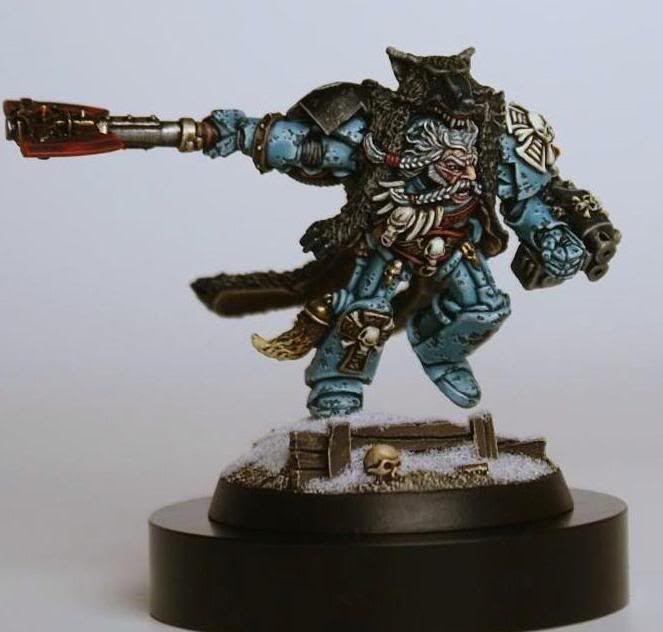
@Jah, don't take this the wrong way because I really love your work and know you're an awesome painter, but the examples you showed there, to me, aren't good examples of weathering. The paint chips just stand out too much. Logan looks like he just fell down a 1000 step flight of concrete stairs, but then cleaned and polished his armour afterwards, lots of paint chips but underneath it still looks like your typical clean Space Marine. The chips also all look quite regular, you typically would expect paint to come off with abrasion, scratching and chipping, you've only really done the "chipping" which looks odd to my eye. The flyer looks a bit like someone came along with an angle grinder with a stripping wheel and randomly took chunks of paint off, then rubbed dirt in to the panel lines.
Both models (to me) look like they need less paint chips and more dust, grime, streaking, fading, etc.
Forge World have a lot of examples of really nicely weathered Space Marines. They look like they DO maintain their armour between battles, and the dirt/dust/paint chips have just been collected during the battle they are currently fighting.
I really lack the artistic ability to paint good weathering and I'm 50/50 about whether Space Marines benefit from weathering anyway (good weathering I think can definitely add to them, but since I am incapable of that, I tend not to bother, lol).
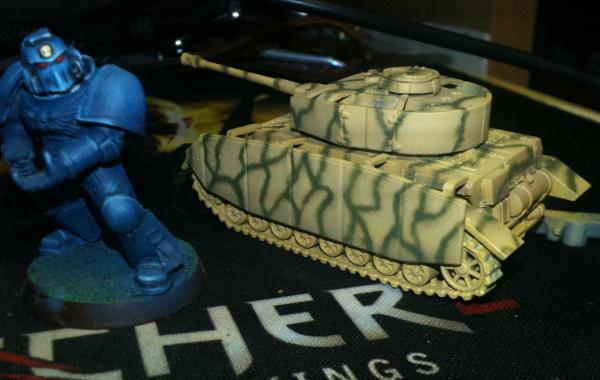
But I have been enjoying going to town on some of my 15mm tanks.
This StuG has a bit too much paint chipping, but I still like it...
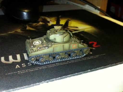
My Shermans I decided to approach them without any paint chipping, but rather just grime build up and then subtle streaking caused by rain and whatnot, though the tracks are too clean!
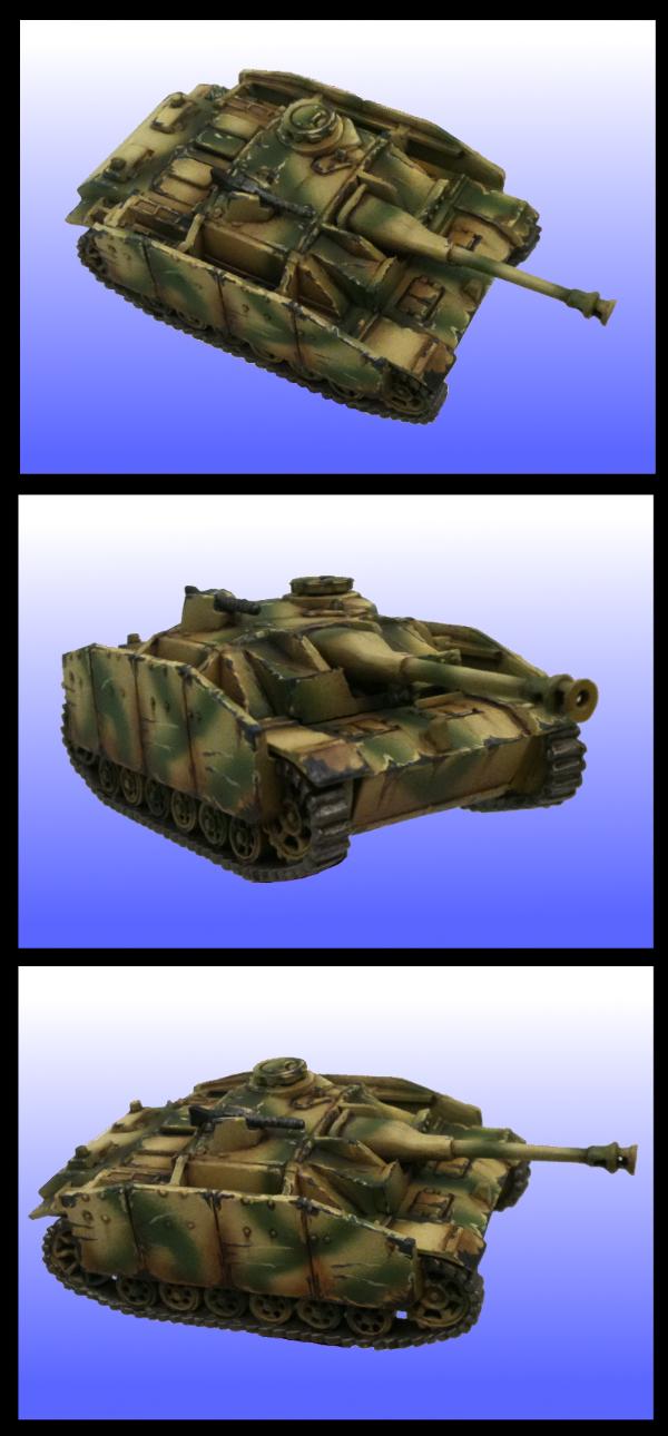
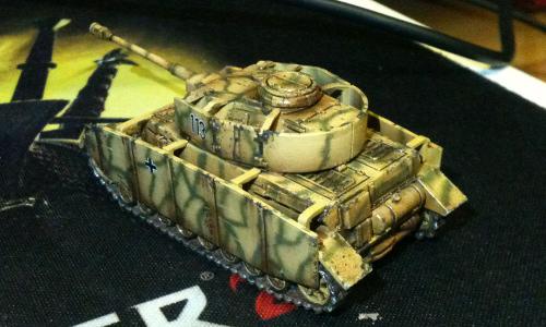
The Panzer IV combines a small amount of paint chipping with a lot of grime, I probably over did the grime/streaking on it, I was going for a Kursk theme on it. Clean: Weathered:
This message was edited 1 time. Last update was at 2015/07/08 02:13:11
2015/07/08 02:44:59
Subject: Painting styles. Realism or super fantastic schemes
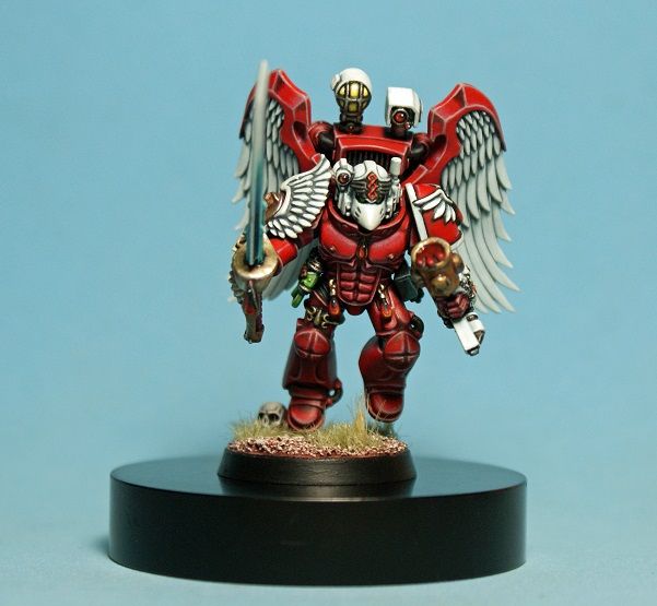
@jah - I love your blood angel. The whites are so well done, and all the subtle shading is in the right places, such as the red parts of the wings. I'm sure I've mentioned it before, but it's worth saying again
@son_of_corax - I am in the bright contrasty for fantasy and scifi. Since I'm not interested in historical, that puts me solidly in the parade ground camp. There are beautiful non-contrast paintjobs too, such as some of the ones on Darksword, but even so, they use lots of color.
On miniatures, I find that the exaggerated contrast really defines the models and make them pop.
@skink - I agree that weathering takes creativity. However, once you know what you want to do, it takes very little time. Precision is a lot less important, and drybrush is always fast. So, figuring out your scheme takes a little bit, and you might even go overboard on one, but the next 100 models that are weathered in the same way (which is a good thing) is pretty easy.
2015/07/08 03:39:03
Subject: Painting styles. Realism or super fantastic schemes
@Skink: like i said, it is a matter of personal preference with painting...
i would never expect everyone to like my style, but have been working hard for the last 6 or 7 years to develop a recognizable personal style...
i think i have a couple of years to ge before i get there, though...
having put a lot of time into making sure that there are many different sized chips in the paint, it is disheartening to hear to hear you say that they all look the same size to your eye...
it is in no way meant to be realistic though, and neither is the Stormraven...
i leave that to the rivet counters...
i was trying to illustrate how a comic book style can run the gammit of gritty, fantastical, and in the middle...
as well as showing how much more precise the parade ground look has to be, in my opinion...
i do like your work on the tanks, mate...
great camo and weathering on the Panzer, and that Sherman has some wonderful shading!!!
@Talys: thanks, bud...
very enjoyable discussion, SoC...
cheers
jah
Paint like ya got a pair!
Available for commissions.
2015/07/08 11:31:55
Subject: Painting styles. Realism or super fantastic schemes
Talys wrote:@skink - I agree that weathering takes creativity. However, once you know what you want to do, it takes very little time. Precision is a lot less important, and drybrush is always fast. So, figuring out your scheme takes a little bit, and you might even go overboard on one, but the next 100 models that are weathered in the same way (which is a good thing) is pretty easy.
I tend to not really agree with that. Maybe because drybrushing never features in any of my attempts at weathering It's not just "creativity", it's artistic capability. You want a model to be subtly dusty, but not look like a statue that someone has sprayed with dirt and left to dry.... you want mud, but you don't want it to look like it's rolled around in mud... you want paint scratches, but you don't want them to look like someone has done a bad job sandblasting them.... you want a bit of battle grime, you don't want to make it look like it's been sitting in a field for 50 years... using some subtle feathering of pale tones to give a worn appearance without making it look craggy.... having a blended grime build up without it looking like someone smeared poo over the model. Then combining multiple of those different effects seamlessly on a model, picking the right colours for your pigments, your dust, your scratches, your filters.
And fast? It really depends on the techniques you are using, most of the techniques I like the look of actually take quite a while to do. Look at a fine scale modeller doing a weathered tank, producing the clean model is like a day's work and then they spend weeks slowly building up the weathering. Layers of stains, varnishes, oils, filters, powders... it certainly takes time.
Repeatability is also strongly dependent on the techniques. One of the things I hate about weathering powders is that even if I create a look I like, my chances of reproducing it are tiny Mixing in just the right amount of varnish, the right amount of water, applying the same amount of it, the damn things always come out different, lol.
There's a subtle line between awesomely weathered and simply making a model look messy.
Check out Dr Faust's recent tutorial on painting a Kastelan... not saying it's the best example of weathering but it's in the style I really like, where the model is simply painted with mostly flat colours and then the contrast and "life" is added via the weathering.
When you're talking about infantry rather than vehicles.... I find those even harder to weather, making sure you use muted tones so it doesn't look like they just bought their clothes yesterday from Walmart, building up realistic dust and mud effects, giving things some texture and depth without going overboard.
I just totally lack the artistic ability to produce that sort of stuff
jah-joshua wrote:@Skink: like i said, it is a matter of personal preference with painting... i would never expect everyone to like my style, but have been working hard for the last 6 or 7 years to develop a recognizable personal style... i think i have a couple of years to ge before i get there, though...
Definitely, and I really love your clean models which is an incredible style of its own, but your weathered ones aren't really doing much for me at the moment.
having put a lot of time into making sure that there are many different sized chips in the paint, it is disheartening to hear to hear you say that they all look the same size to your eye...
It's not the size, it's the style. They all look like paint gouges. I made a rough picture of what I mean just using GIMP. The entire panel has lots of light scratches which don't actually penetrate the paint. The bottom has a big chip of paint (like damage caused by some sort of impact). The right side has a spot where paint has been worn away (like you might see around hatches or joints or any spot that sees frequent use), the top has some big scratches as if a Genestealer just took a swipe at him.
The paint chips on your Logan look ok, but they're just 1 style which covers the whole model. I think with paint chips you are trying to add some "visual interest", so you want some scratches here and there, some chips elsewhere, some abrasion damage somewhere else and so on. It's less about quantity and more about adding some selective contrast.
it is in no way meant to be realistic though, and neither is the Stormraven... i leave that to the rivet counters... i was trying to illustrate how a comic book style can run the gammit of gritty, fantastical, and in the middle...
Definitely. To me, personally, I think weathering is less about realism and more about "visual interest" (that's a term I've stolen from Humbrol's video tutorials because I think it describes it well ). You're trying to add some contrast, add some earthy tones, tell a story. I tend to agree with the idea that Space Marines probably maintain their armour between battles, that doesn't mean you have to paint them in showroom style though, it means the weathering (to me at least) looks best if you can make it look like it's just happened recently. It's not dusty because the Space Marine didn't clean it, it's dusty because he just ran across a field. It's not muddy because he never cleans the mud off, it's muddy because he just jumped out of a trench which has been bombarded by artillery for the past 2 days, the paint isn't scratched because the armour is left untended, it's scratched because a frag grenade just went off 3 feet away from him and then he dove in to cover on a concrete ground to avoid getting hit from a missile.
It's obviously just personal preference, but even if I wash and wax my car it only stays that way until I drive it across the city.
as well as showing how much more precise the parade ground look has to be, in my opinion...
Yeah, it all depends. There is a style of painting like you used where you do awesome shading to create lots of contrast but still have a parade ground look to it. But there's also a style (like I used on that Panzer) where you just start with a clean model painted in relatively flat colours with not much contrast, and then you start weathering, instead of shading, you add grime, instead of highlighting you add abrasions, instead of modulating the colour, you add dust.
Both take as much precision as the artist is willing to put in to doing it. I can usually tell the difference between a model that has been roughly weathered by an amateur and the artistic glory of someone who really knows what they're doing adding just the right amount of dust in the right place, using just the right tones of earth in just the right places.
i do like your work on the tanks, mate... great camo and weathering on the Panzer, and that Sherman has some wonderful shading!!!
Thanks! I am pretty happy with how they turned out, some of my favourite models out of my personal collection. Though I still have a long way to go, I totally suck with weathering powders for and my paint chipping looks a bit amateur (and I'm sure lots of other things ).
This message was edited 1 time. Last update was at 2015/07/08 11:33:08
2015/07/08 14:06:03
Subject: Painting styles. Realism or super fantastic schemes
Seeing some of the more realistically painted Marines makes me think I might just do some Marines and AdMech.
One of my goals for Sculpting (Once I get back to where I CAN SCULPT - I am currently trapped by a fething evil as hell doctor who is ruining my life), is to do a Space marine with realistic proportions and equipment with the same (the Bolter sculpted as if it was a real weapon, and not a box that is three feet long, a foot deep, and eight inches wide - real Guns, even larger Support weapons don't have those dimensions).
But... maybe a few of the new marines with components from FW???
MB
2015/07/08 20:30:53
Subject: Painting styles. Realism or super fantastic schemes
very nice breakdown of where you are coming from, Skink...
i get what you are saying, and miniature painting, at least for me, is still a learning process...
keep in mind, pretty much everything i do is done under the constraints of a client's expectations of time, price, and style...
i have to figure out how to give them what they want, while still being able to express myself as a painter...
although i don't watch painting tutorials (like i said, i'm working hard to develop a personal style) it is nice to see Dr. Faust is still doing tutorials...
i always liked his work, and seeing his Khador army in person ten years ago, and talking shop with him was awesome...
the Ultramarines commission was my first time trying to paint weathered tanks...
i had only ever painted one tank before this, and it was factory-finish clean...
suddenly, i had to figure out how to paint in a completely different style, the whole while dealing with a very tight deadline...
with time to experiment, i'm sure i would come up with a more elegant execution...
as it is, from tank #1 to tank #10 the style evolved...
if you go look at my WIP blog, you will see the progression...
all of that was done without even knowing that i wasn't even being original (though i thought i was) by using rust for shading, and metal showing through for highlights on the edges...
i don't claim to be an expert...
it is all a learning process...
a process which is very much slowed down by the constraints of commission work...
Logan was my first time trying heavily chipped paint, the Stormraven was one of my first attempts at weathering, and the Sang. Priest was my first try at such a high-contrast red...
i'm sure i have a long way to go before i will feel like i have perfected the ideas i was trying to convey...
i was just surprised by the very quick techniques that i came up with to paint the Ultramarines versus how long it took me to achieve the look on the BA...
i'm not trying to take anything away from the realistic weathering guys, just saying it was 10x faster to do the dirty paintjob...
obviously, i have a long way to go with any kind of weathering to meet the standards of the military modeling crowd, but it is fun to try something different...
cheers
jah
Paint like ya got a pair!
Available for commissions.
2015/07/08 20:43:53
Subject: Painting styles. Realism or super fantastic schemes
One thing to keep in mind: 30k marines are from legions, which were the main fighting army of the Crusades. A 30k Salamander was a front line grunt, fighting en masse.
By 40k, the Astartes are closer to special operations: they dont' have the numbers or the need to operate en masse, but instead they are used for surgical strikes and as a highly mobile, highly adaptable fighting force.
Toss in 10,000 years of superstition and ritual, and the marines of "today" attach more importance to painting their colors, they have more downtime to do so, and they have less downside.
2015/07/08 23:55:01
Subject: Painting styles. Realism or super fantastic schemes
@Skink - I can appreciate what you're saying. You certainly can get to the point of being pretty meticulous where it comes to weathering, and the historical folks put a lot more energy into it than the scifi folks, I think.
Because I like my marines (and Eldar) bright, shiny, and clean, the opportunities for weathering are really restricted to Imperium vehicles for me. I just think that a Space Marine should keep his armor spit shined
This one is probably one of my better recent weathering attempts, though I could probably find better if I dug through my Imperial Guard pile --
Although it's not spectacular like what you see in some of the historical models, all the weathering, didn't even take a day to do.
2015/07/09 00:12:10
Subject: Painting styles. Realism or super fantastic schemes
If you're a professional painter maybe the correct style is "whatever the customer asks for" but for everyone else maybe you should go with whatever floats your boat and speaks to you artistically.
I've seen photos of soldiers on parade in neatly pressed uniforms and soldiers in trenches covered from head to foot in mud so I don't think the 40k setting should necessarily restrict your decision.
Maybe the ideal choice is whatever suits your talents best. Michael Bay may be the master of explosions but I couldn't see him doing a great job directing Pride & Prejudice.
2015/07/09 08:53:01
Subject: Painting styles. Realism or super fantastic schemes
Minimachine wrote: If you're a professional painter maybe the correct style is "whatever the customer asks for" but for everyone else maybe you should go with whatever floats your boat and speaks to you artistically.
Wiser words could not have been said in this thread
2015/07/09 09:25:27
Subject: Painting styles. Realism or super fantastic schemes
Minimachine wrote: If you're a professional painter maybe the correct style is "whatever the customer asks for" but for everyone else maybe you should go with whatever floats your boat and speaks to you artistically.
Wiser words could not have been said in this thread
Agree.
Its an argument about art, and opinions about art are well.... opinions. Personally I am an abstract artist, I prefer to paint in the surreal, using techniques that often include an 'unruly' or 'experimental' element. I am not looking to hone my skills to perfection so that I can paint something as if it actually existed, im looking to paint those things that do not exist, the images that float through my dreams, the odd things you see when your eyes trick you in the dark. But that is just my style.
In the end, you could spend the same amount of time on comic book style as a realistic style, to say one is more skilful than the other is a fallacy, because there are too many variables in both for there to be any sort of comparison on any meaningful level.
For example; you could say realistic is more skilful because you need to think about light direction, colour variance, shades etc.... But on the other side you could say being able to ignore those realistic features and create a vibrant, eye-catching model that is full of inventiveness and oddities is more skilful.
Take a model; paint it entirely red.
From a realistic point of view; "I like how they have captured the correct tone that matches the red's seen in the real world."
From a surreal point of view; " I like how the red is uniform across the whole model and coats all the details in obscurity."
Its all just opinion and how you react from the stimulus of viewing said model. Nothing is right, nothing is wrong. But its also so widely variable that its incomparable. That being said I take great pleasure in seeing both and often strive for something that's in the middle ground, but that's only because I personally wouldn't be happy if it was only realistic, or only surreal. I bow to no one but myself
Favourite Game: When your Warboss on bike wrecks 3 vehicles simply by HoW - especially when his bike is a custom monowheel.
Talys wrote: @Skink - I can appreciate what you're saying. You certainly can get to the point of being pretty meticulous where it comes to weathering, and the historical folks put a lot more energy into it than the scifi folks, I think.
Because I like my marines (and Eldar) bright, shiny, and clean, the opportunities for weathering are really restricted to Imperium vehicles for me. I just think that a Space Marine should keep his armor spit shined
I think that's where the artistic bit comes in. Making something look like it WAS clean but has been in the field for a half a battle (and not just left out in a field for 50 years) is definitely a skill. When it comes to Eldar, I think subtle filters are good for weathering... kind of like a car that has just been freshly washed and waxed will still pick up a bit of dust as it's driven around (but is a massive contrast to a wreck that's been sitting in a field for years... which is more how you might approach an IG vehicle)
That's what I like about most of Forge World's weathering. I think they're a good example of "realistic" because for the most part their Space Marines DO look like they take care of their armour between battles, but it's just suffered the dust/scratches of the battle they're currently fighting.
all the weathering, didn't even take a day to do.
Certainly you can do that, but if we're comparing the likes of Jah's brilliantly painted super clean models to a weathered model, I think it's a bit more fair to compare it to something someone has put similar amounts of effort in to weathering it.
I tend to think there's two extremes (with a lot of grey in between) that you can consider.
1. You use scheme with bright colours and contrast those colours heavily using lighter and darker versions of those colours. You are creating contrast, depth, "visual interest" by how well you layer your shades and your highlights. To paint red, you start with a dark brown, work up to a red, then highlight with an orange or maybe a flesh tone. This is what I think when I see Jah's models and there's certainly nothing wrong with painting that way.
2. The weathering route. You paint on your scheme in flat colours. So if you want red, you just paint it.... red. You then create your contrast, depth, "visual interest" by how well you layer your grime, your fading, your paint chips, your dust, your mud. This method has I think largely been pioneered by the historic guys because when you paint a Panzer or a Spitfire in fantastical schemes, it just looks a bit silly because you know what a real Panzer of Spitfire looks like in real life, if you shade the greens with super dark green it just looks too unnatural.
But with those 2 methods, really I think it's hard to say one or the other is easier/faster/whatever. Certainly you can take short cuts with weathering (usually sacrificing the end result for speed), but you can also take short cuts when you don't weather.(again, sacrificing quality for speed).
This message was edited 2 times. Last update was at 2015/07/09 11:57:07


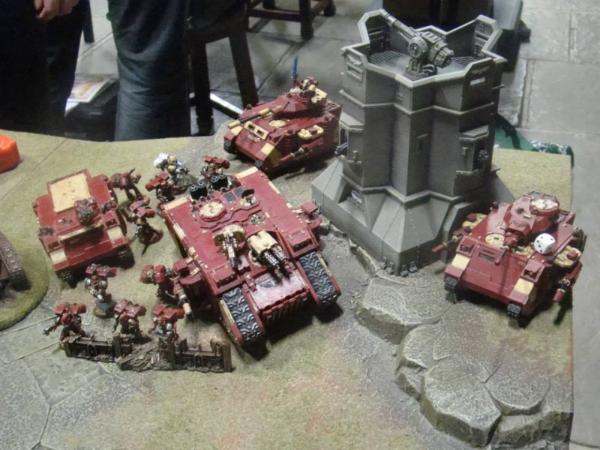
 ~2800 points