Forum adverts like this one are shown to any user who is not logged in. Join us by filling out a tiny 3 field form and you will get your own, free, dakka user account which gives a good range of benefits to you:
No adverts like this in the forums anymore.
Times and dates in your local timezone.
Full tracking of what you have read so you can skip to your first unread post, easily see what has changed since you last logged in, and easily see what is new at a glance.
Email notifications for threads you want to watch closely.
Being a part of the oldest wargaming community on the net.
If you are already a member then feel free to login now.
I think this thread is really awesome and as someone who really wants to improve my painting I would like to join. I started when I was around ten, and have some miniatures in a box that are a little thick with paint. But then I left miniatures behind for around 14 years until now when I have just gotten back into it.
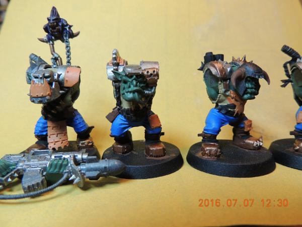
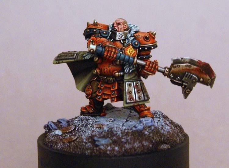
Here is what I am working on at the moment. My Stormcast Orcternals. Still heavily WIP
that's a really cool idea Hojin!! making me lol at Orcternals honestly that's a hoot your painting looks really good you've got a lot of expression on that orc face! and the eyes, just really like them. My only quibble might be the right (viewer's side) looks maybe a tad off. I have a terrible time with eyes so please don't take this as more than just a friendly note!
I appreciate all the kind words too guys!
I've been painting again now for maybe a total of two years I think? And I am looking for ways to improve. I feel like I've hit a bit of a plateau and I'm not sure how to push through it. One of my weaknesses is colours. I have a few colours I really really like and I tend to like dark colours overall, in terms of the whole painted shebang so to speak. I see a lot of very inspirational work you all and others have done and I just can't quite grasp how you got the colours to go together. Maybe it's simply experience, having used a lot of colours etc and knowing how to apply them together.
I just think I've gotten stuck in a rut a bit, and I need to break out of it. One of the reasons, since I started an ork army to play with my son's Necrons, that I decided to incorporate a colour I've really never used: orange. Not in so much a huge major way, but in a way that'd give me enough variety in the army itself and also let me work with a new colour.
Example so far:
(in hindsight a piece of sandpaper as a backing may not have been the best choice but it did keep the models in place! lol)
Re: techniques etc - I think all the techniques have a place in our arsenal, yes, drybrushing I'm looking at you While I don't care for say, most OSL, I certainly see really good examples of it! And frankly anything can be overdone of course. Everyone has their own style, or things they like as well. In regard to NMM vs. TMM I don't see the point of debating the merits of one over the other, because as I said, they all have their place. I personally may not care for NMM for my own models, for instance, I have seen absolutely awesome examples of it, in very fitting ways as well.
If you all get a chance as well you might take a gander at Wyrd forums Iron Painter entries - so much beauty in one place. Even if you don't like the models necessarily, you can enjoy and appreciate the techniques used (well just ignore mine though )
wanted to add a little note, I've been listening to a lot of malifaux podcasts whilst painting of late, and I came across one I quite liked, with a painting section. One of the things he said kind of struck a chord with me, and while I'm not sure he's 100% correct, it makes an interesting way to think of it. He was talking about priming. The bit that stuck out to me was as he explained, essentially you only get so many layers on your mini to work with (yes I'm paraphrasing in case it's not obvious.) It was a bit about not overpriming and how, at least he thought, if you over did the layers on your mini, you end up not only obscuring your previous layers but also with a matte (or 'natty?') finish. I should probably listen to it again, I do have issues with accents at times, and keep in mind, this is based on my audio memory!
I think it definitely gives me something to think about, especially since, I know a lot of people talk about, do this layer, then this on top and it changes based on what your base was, or about the translucency of paints and how they're thinning to get a certain effect etc. Basically high end stuff I don't really get (obviously). I've always been a more paint by numbers kind of girl. And even then I had trouble staying in the lines lol
This message was edited 1 time. Last update was at 2016/07/11 19:26:48
Fantastic stuff you guys!! Cam, I'll comment on your stuff in a sec I gotta be fast right now... This is a quick post, a copy n paste from my own pm blog but here's the finished morlock. The wips are in my blog and I'll comment more later, but getting in trouble with the gf right now lol....the pic is huge, click n zoom....
This message was edited 1 time. Last update was at 2016/07/12 17:22:21
@Guildy when ever I paint orange, I don't paint orange, I paint a lighter shade of red. What I mean is, I paint it red and bring it up with orange then yellow. Not really getting this across very well. Help.
Is that because of the colours GW has available? the way you paint it I mean? I found ratskin flesh, one I got originally to use for my Skaven, is honestly quite orange, maybe a bit of a dark orangey. Was kind of surprised, I'd not liked it after I found Bugman's instead.
wondering what wash to use, I'm thinking to go with agrax as I want it to be worn looking, but not as dark as nuln will do.
@ Cam: Re: the skaven...Super nice work there my friend. Your progress is inspiring and I'm sure everyone agrees!! There are three things that I think when I look at the mini, in terms of positive feedback and areas to improve. I don't necessarily feel comfortable critiquing like this, as art is art. But you did ask One, I think you could Improve a little a on clean application of a base coat. It's easy to practice, experiment with viscosities on a mini you don't care for...try getting a perfect smooth opaque coat with no brush strokes visible. This is something I cared deeply for in my own work growing up, it's not important to everyones style but it is to me, and I think is a great foundation to build upon. Secondly, I think you could sometimes strip down the amount of colors that you use on one mini, or rather find tones that compliment each other a little more. A color palette builder is a good way to see what works, and they are usually free. (I go for some obscure schemes too that don't always work lol, like the aqua gun on my MB which I aborted for black Which brings me to #3, is the photos are sometimes hard to tell or focus on the clarity of the mini. The green background in this case is pretty dominating and close to the mini in tones so it's kinda overbearing, try experimenting with upping your camera game, your minis deserve it. There's a good tut that ifalna posted many moons ago using gimp, which is free. Beyond that, keep pushing. Paint things that are hard, fail, get better, tiny victories
@Guildenstern: how appropriate that I posted a mini painted in orange. I used Reaper Phoenix Red (which is a bright orange not red) and Ochre Brown mixed to make the base coat, added Fair Skin highlight to lighten up for the highlight mix, maybe a *tiny* dab of white for final mix, and shaded with glazes of medium brown (scorched brown equivalent i forget the new name) I then went around and glazed red in various mid spots for a bright tone. I very very very rarely actually use washes, or even apply them anymore, (besides RMM, and other specific circumstances). For my own tastes, I don't use red as a base coat or shade per say, for orange because it reminds me of ketchup and mustard mixed together lol, but that's a personal thing and cam makes it work for his style really well. Personally I think you're on a good track with the agrax wash. Don't forget to show us your progress!!...anyways, cheers everyone!!!
This message was edited 1 time. Last update was at 2016/07/12 19:46:58
Painted this last year, I considered that to be my best model yet:
Spoiler:
And this is what I'm painting right now. Arms are almost finished, just need to do some blending on the pads, body and legs need some highlights. Any advice?
Spoiler:
Also, any ideas on how I take a decent photo without having to crank up the exposure?
Nerdy, for your candy effect: The "watered gold" is that a "wash" consistency, just using gold paint rather than more traditional wash colours? How does it compare to the green wash you add there?
bebopdrums2424 wrote:@Dr H: Great pics and tuts...love SENMM tower, reminds me of home! And yes please do post your wood painting tut here, it would be massively appreciated and at this point I think this thread has enough visibility that it's worth it to rehash some tuts that's are posted in the tut forums.
Thanks BB, nice to see it does conjure memories of the real thing (means I've done a passable job).
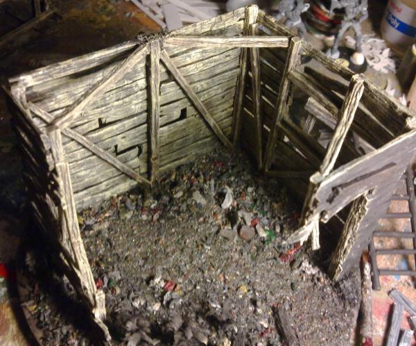
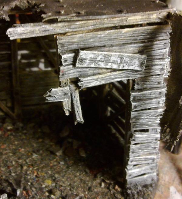
Right-y Oh! Painting wood, of various flavours, ctrl-c ctrl-p into here (If you have read through my full hut tutorial, I thank you, but you don't need to read through it again), with translations from my paints to Citadel.
Spoiler:
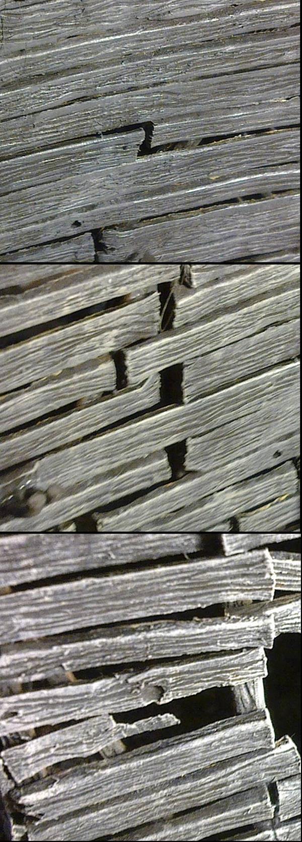
Before starting the painting I spent a lot of time looking for pictures of various types of wood and studying them very closely to pick out all the colours that make up the overall colour you see as "wood". I will encourage you to do the same, really look closely at the wood you want to replicate; you will be amazed at the number of different colours and shades present in that wood and that is what you need to replicate to make your "wood" look as real as possible. Having done this, I then spent quite a while trying different colour combinations on a scrap bit of hut that I wasn't using to perfect the technique required and the final colour result. Do this as well, it will help you.
On another note, the paints that I use are very rare in this corner of the miniature war-gaming community. I will attempt to supply you with correct or near-as-possible translations from my Humbrol Enamel paints to GW/Citadel Acrylic paints. I have a range of paint conversion charts that I usually use to convert what others do here into the paints that I use, but there is more Humbrol paints than GW paints so there is not always a direct conversion and sometimes there isn't one, even if I go via Vallejo paints. However I will do my best and I will be showing pictures of my paints so you can judge for yourself as well (or even suggest better matches). Also, apologies if these are the older, out-of-date paint names or a mixture of the old and new, I'm working with what I've got and really don't know which is which.
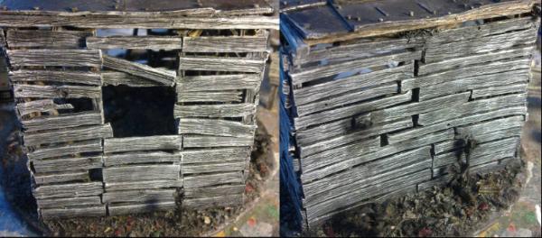
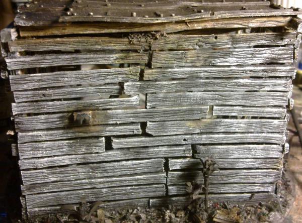
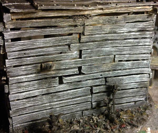
After all the testing of wood colours I decided to give the planks of the hut a sort of old, driftwood colour that would only be visible on the inside because the outside would be painted to be a grey, sun-bleached colour. The beams I wanted to look like a stronger, more substantial wood and so would be painted a brown, healthier colour than the planks. The table-top ended up being similar to the planks for the walls, but the bench I decided would be made from nice, hand-picked pieces of wood (because if you're going to sit on it, you're going to take more care about it's quality), and that is where I started painting...
But before that I gave everything a thin coat of very dark brown (Fig. 32), this was 33 (Black = Chaos Black) with a little 186 (Brown = Bestial Brown) mixed in. This was watered down to get into all the details and give the deep shadows, but was largely covered up in the end.
Fig. 32. Base coat of very dark brown.
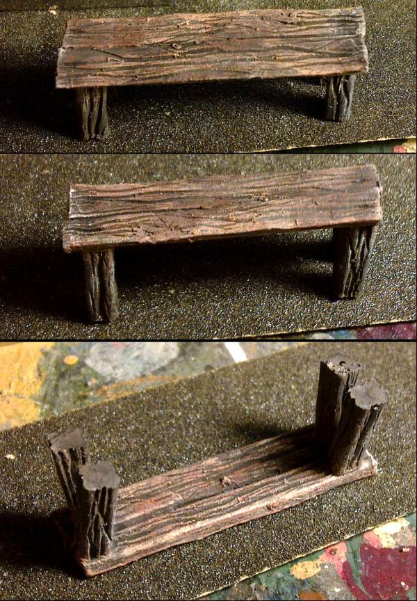
The bench (Fig. 33) was painted to be a slightly red coloured wood (using mahogany as a reference).
Over the base colour the following were dry-brushed;
186(Brown = Bestial Brown) + a small amount of 60(Scarlet ~ Blood Red),
71(Satin Oak ~ Bleached Bone) not as heavily as the previous coat,
34(White = Skull White) lightly and in patches to give variation to the colour,
and then a wash with 33(Black = Chaos Black) Also patchy for variation and in dots to represent the nails.
The legs were done the same but without the added red and the black wash was concentrated more towards the ground to show the dampness seeping into the legs.
Fig. 33. Wooden bench.
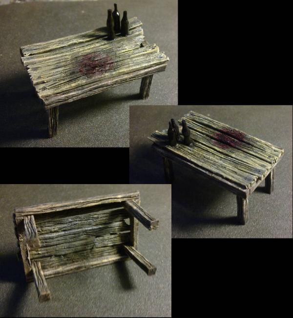
For the table (Fig. 34), I painted the legs and frame first with the same paints that were used for the legs of the bench;
Over the base colour the following were dry-brushed;
186(Brown = Bestial Brown)
71(Satin Oak ~ Bleached Bone)
34(White = Skull White) lightly and in patches to give variation to the colour,
and then a wash with 33(Black = Chaos Black) Also patchy for variation and again concentrated towards the ground.
The frame and legs were masked off and the planks were then painted as follows;
Over the base colour the following were dry-brushed;
83(Ochre = Camo Green)
71(Satin Oak ~ Bleached Bone),
34(White = Skull White) lightly and in patches to give variation to the colour,
and then a wash with 33(Black = Chaos Black) in patches and streaks, but more heavily on the underside of the table and in two concentrated patches under the bottles and in the position of the bloodstain.
Once that paint had dried I painted the bottles with 21 (Gloss Black = Chaos black + gloss) with a little 20 (Gloss Crimson = Scab Red + gloss) for the wine bottle, and a little 10 (Gloss Service Brown ~ Scorched Brown + gloss) for the "Nuka"cola bottle. The "Guinness" bottle was left with just the black, but the difference between these bottles is actually a bit too subtle and could have done with more of the red and brown added. The labels were added later.
The bloodstain was painted with 1321 (Clear Red = ? ), keeping within the black wash area (where the "blood" has soaked into the wood) from earlier and then more black wash was added to the middle of the red patch to darken that further. Dots of black wash were also used for the nails on the planks.
Fig. 34. Wooden table.
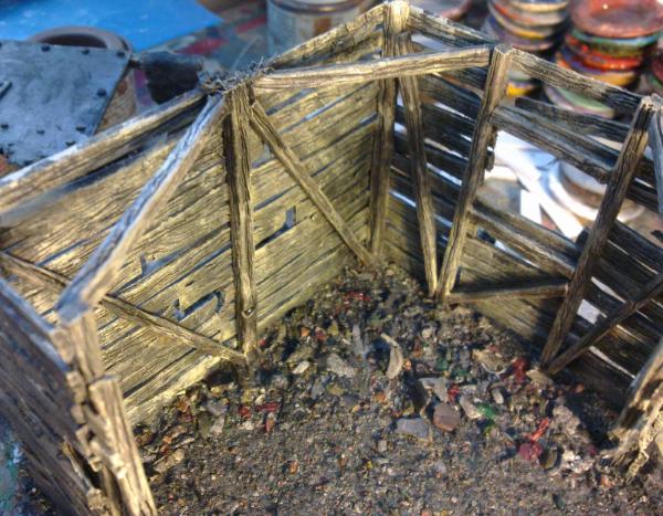
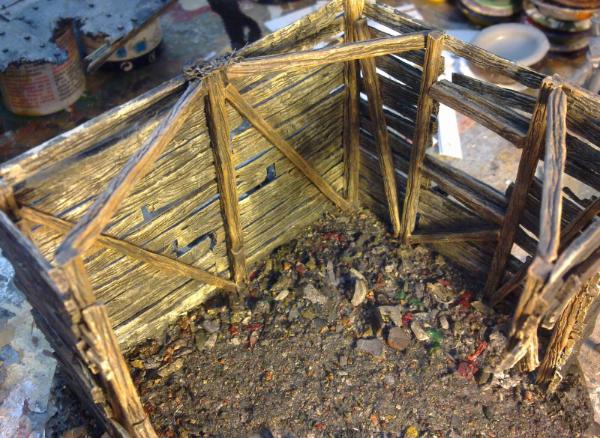
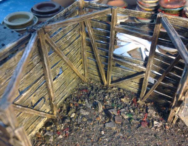
I then moved on to the hut, starting with the inside. This was because while painting the planks some paint is likely to spill through the (many) gaps to the other side and it would be better for the bleached colour to spill through to the inside rather than the inside darkening the outside.
As before, the wood was base coated with very dark brown, and then the beams were dry-brushed with 186(Brown = Bestial Brown). The planks and beams (only partially) were dry-brushed with 83(Ochre = Camo Green), and then everything was dry-brushed with 71(Oak ~ Bleached Bone) (Fig. 35).
Fig. 35. Inside after dry-brushing with 186, 83 and 71.
The beams and planks were then given a wash with 33(Black = Chaos Black) in patches and streaks to give uneven shades and definition to the texture Fig. 36).
Fig. 36. Inside after the irregular black wash.
The beams were then given a wash with 186(Brown = Bestial Brown). Once that had dried everything was given a patchy dry-brush with 63(Sand ~ Iyanden Darksun) (Fig. 37).
Fig. 37. Inside after a wash of 186 on the beams and a dry-brush of 63 on all surfaces.
Finally the wood was completed by an irregular dry-brush of 34(White = Skull White) (Fig. 38). Weathering, dust/dirt, mould and rust were left until later.
Fig. 38. Inside complete after an irregular/patchy dry-brush of 34 over everything.
The outside was started with a dry-brush of 27(Sea Grey = Codex grey) and this was followed by a dry-brush of 64(Light Grey ~ fortress Grey) and then a dry-brush of 34(White = Skull White) (Fig. 39).
Fig. 39. The outside with (top) a dry-brush of 27, (middle) a dry-brush of 64 and (bottom) a dry-brush of 34.
The outside was then given an irregular/patchy wash of 33(Black = Chaos Black) focussing on area near the ground, roof, overlapping planks the ladder hook and plants (Fig. 40).
Fig. 40. The outside after an uneven wash of 33.
Then it was time to do what shall be known as anti-weathering. This is a process of adding the wood colour back to the bleached wood where it would actually be in the shade and therefore not be bleached by sunlight.
The first thing to do is plan where you will be adding this effect by looking for area of the wood where things like the roof and other planks overhang and would therefore shade the wood, these are likely areas that you have darkened with the black wash in the previous step. Paint these parts with 186(Brown = Bestial Brown) only lightly or use a wash but be careful so it doesn't go where you don't want it to.
There wasn't much on my hut in the end, a little along the roofline and a couple of loose planks. I also used the technique in areas that will acquire moisture, such as the plant growing under the roof and the ladder hook (Fig. 41), but these will have more paint added at a later date to further represent their influence (green for the plant and "rust" for the hook).
Fig. 41. Anti-weathering 186 wash.
After the brown has dried you then want to dry-brush some 83(Ochre = Camo Green) without completely covering the previous brown in the darkest areas and starting to think about blending the brown towards the grey without extending the non-bleached area too far (Fig. 42).
Fig. 42. Anti-weathering blended in.
The final stage of the anti-weathering is a dry-brush of 71(Oak ~ Bleached Bone) to complete the blend between the brown and the grey (think of it that as the wood has been bleached it went from the brown, through ochre, through oak/bone to dark and then light grey). This is followed by a black wash over the whole area to darken the grey and complete the blend/effect (Fig. 43).
The outside wood is then finished off with a patchy dry-brush of white and nails are added for the planks with black wash. You can even add a name plate if you like (Fig. 43).
Fig. 43. Final details to the outside.
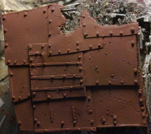
And as a bonus, the rust painting section from my tutorial:
Spoiler:
Then came time to paint the rusty roof. Again, I encourage you to search for and study many pictures of rusty things and look at the many colours that make up the whole.
This is also where the colours of paint become complicated as I wasn't using paints straight from the pot and I tend to mix colours by eye without keeping track of how much I added of a particular paint. So you will have to just match the colours as best you can, however, as with painting wood you can't really do rust wrong. There is such a wide variety of colours of rust (and wood) that almost anything will work, within reason.
With that in mind the first colour to be added was a red-ish brown (that also included some black to darken it) that was used to cover everything that was to be rusty metal (Fig. 44). Also note that the underside of the roof was painted at the same time as the top and isn't greatly different.
...and remember the fine dried paint dust that was used for the mud on the base... a small sprinkle of this in your paint can add that rough texture/flakes that you get on rust. Who needs weathering powder?!
Fig. 44. Red-brown base layer.
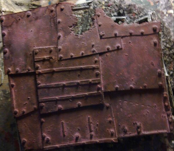
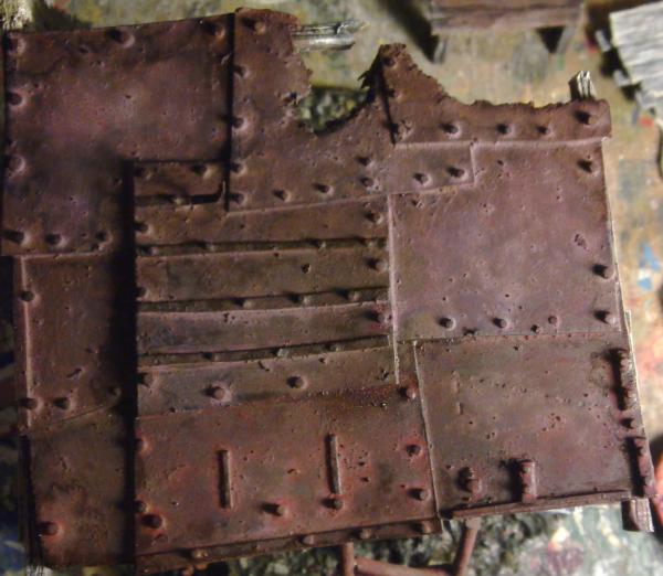
The next colour added to the rust was a colour I noticed from a few images of very old rust; purple, applied as a wash and kept as non-uniform as possible (Fig. 45).
Fig. 45. Purple wash.
After that, I wanted to make the plates look individual (as if they had been added at different times and were made from differing grades of metal), so I started to add different colours in different quantities to different plates. Such as a red-ish wash (Fig. 46) that used the same paints as the base coat, but a larger quantity of red, and an orange wash (Fig. 47) that included both orange and yellow paint.
Fig. 46. Red-ish wash for some plates.
Fig. 47. Yellow/orange wash for other plates.
However, after these I decided that I quite liked the red wash effect and the orange wash was a little too light. So I used a black wash to darken some of the lighter patches and added some more red wash to some areas.
It's also worth noting that when I was applying the washes I would slap on a little of the wash and then spread it, direct it and remove it from areas by applying (quite large) quantities of white spirit and moving it about with my brush. You will want to use water for this with your water-based Acrylic paints, although you will want to reduce the surface tension as much as possible to achieve the same effect as an oil-based paint such as I'm using. Also, due to the large pools of solvent that resulted, I often got many "high water" marks on the roof. I reduced but didn't necessarily remove most of these marks with more evenly spread layers of solvent. The final result (Fig. 48) was quite pleasing even if I'm not entirely sure how it was achieved (I just kept going until it looked right).
Fig. 48. Finished roof.
Camkierhi wrote:Going to try an experiment, since we have the creme dela creme here, please pick this to bits...
bebopdrums2424 wrote:... I don't necessarily feel comfortable critiquing like this, as art is art. But you did ask
I, on the other hand, have no qualms about critiquing things. Not that I'm a mean person, But "do unto others what you will have them do unto you". I'm very happy to get honest, comprehensive and constructive feedback on my work, so that I may improve, and so I give out as much as possible in the hope of helping someone else improve.
Right, Cam', Hat-of-judgement on, Zoom-in on 32" monitor... away...
As BB said, the green background (while matching the theme of the model nicely) is not a great choice as there is little contrast between that and the green bits, and gold bits, and some of the brown bits... of the model. Makes it difficult to really focus on colour choices on the model.
The tassels are a bit too similar in colour to the wood bits, and they look more like shaped bits of wood than hair/fur/whatever it was they made the tassels out of. They could do with some more layers of highlights of "bone"/cream up to white to make them appear shiny (See the "halo" effect that BB pulled off on his blue-haired girly recently), and/or some dark washes on the wood to help create a contrast between the tassels and the wood.
Also the string that's been used to tie them on with (which you probably haven't touched yet, like the wrappings about the wood etc.) could be done with a strongly contrasting colour to the brown on the wood and tassels; maybe not white if you are highlighting the tassels up to white, and not green as you have enough green elsewhere, but red would be nice to match the robes, or blue to contrast nicely with the red.
The skulls have a nice tone, but could do with slightly stronger highlights on the pointiest of places.
The netting on his back also could do with some stronger highlighting.
The gold looks nice (although slightly green due to the background) and shiny.
Some of the deepest recesses could be darker; pin-washes of your preferred gold wash.
And I like the furry stuff you've used for the smoky things (I'm full of technical terms).
The face is good, but if you want to push it further you'll need to use more layers and thinner paint to get smoother transitions.
The red also needs more depth. With all those deep folds of the cloth it really helps to be bold with the shading (this is something I'm guilty of too).
There isn't really a good shot of the weapon and it's blade to judge. Get a top-down photo for it on it's own.
The big rock(s) on the base look pretty good, but are slightly out of focus in most of the photos to judge fully (a couple of photos specifically of the base is good), but the rest of the base needs few more things picked out (the occasional leaf or stone etc.) to break up the mass of reddish-brown.
And I think that's all for now.
Guildenstern wrote:I've been painting again now for maybe a total of two years I think? And I am looking for ways to improve. I feel like I've hit a bit of a plateau and I'm not sure how to push through it.
I do, and I think many other's do too, get this feeling.
I find that focusing on one new technique can help.
Or have a really critical look over your latest model and pick one thing that isn't "perfect" and set an aim to improve it on the next. (which as we see below is what you are trying)
Also, make something completely different. Not just a different race for the same game; that's still a little person. Switching between figures and terrain is good, but I've gone even further (if you have a look at my commission/making money thread) and have been making items of jewellery, shelf-top display models, scale 2D paintings and models in drastically different scales.
All these force you to change how you paint and therefore break bad habits of painting something the same way you have painted it many times before.
One of my weaknesses is colours. I have a few colours I really really like and I tend to like dark colours overall, in terms of the whole painted shebang so to speak. I see a lot of very inspirational work you all and others have done and I just can't quite grasp how you got the colours to go together. Maybe it's simply experience, having used a lot of colours etc and knowing how to apply them together.
This is a tricky thing to answer for me in any specific way. I do, and have always, had a good eye for colours (not to blow one's own paintbrush). But I do generally "just know" what colours would work and what don't.
That's not to say that I always get it right. I have painted things, and was sure it'll work out in the end (as all models look "off" during painting and come together at the end), but to stand back and look at it to see it's not right. I think the latest was the Tau Ethereal I painted:
The first attempt of the red and orange (oh look, orange...) didn't look right, and unfortunately I didn't upload any photos of it to show.
The red was too far to the purple end to really match the orange that I wanted to keep.
Thankfully, all that was required was a wash of scarlet to bring it away from blue, and it kept all the shading.
... I decided to incorporate a colour I've really never used: orange.
How to paint orange (like many colours) depends on what flavour of orange you want to achieve.
Starting from a red base will give you a deep, reddish (for lack of a better word) orange, that won't jump out at you, and is pretty much a lighter red.
For an orange like the above, I started from a dark brown (for crevices) and up to a tan colour before mixing in orange and finally highlighting with a mixture of "bone" and yellow.
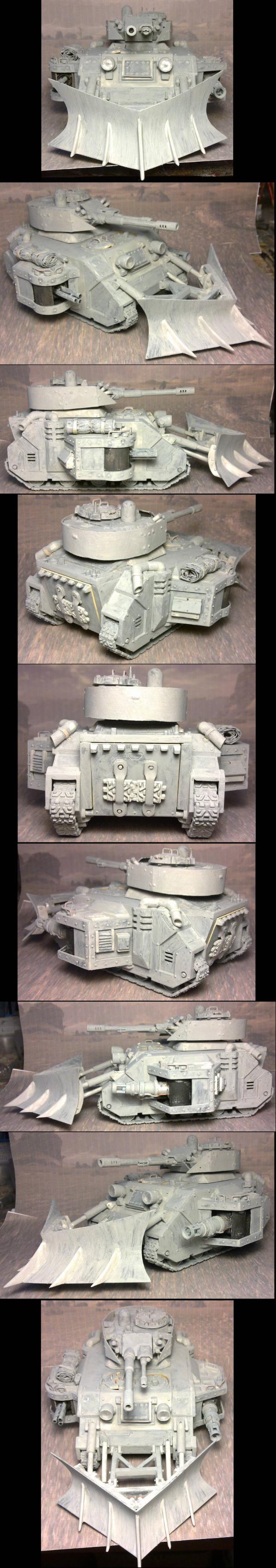
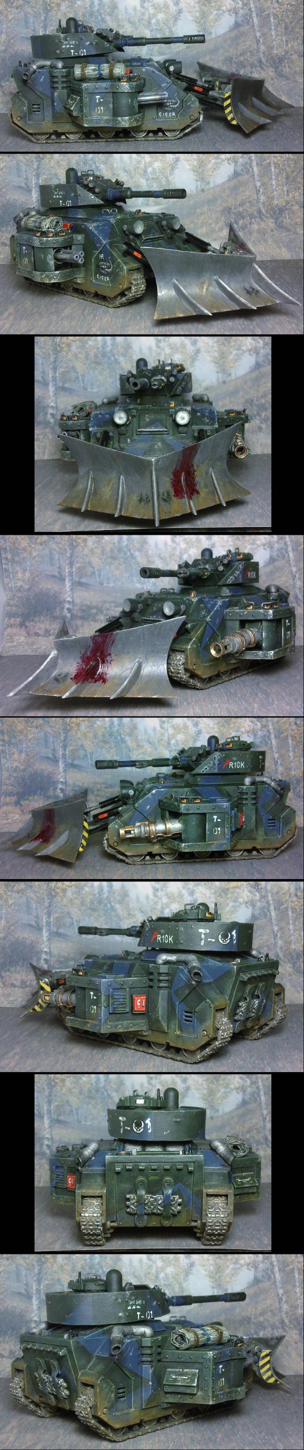
I'm very thin on priming my models. I don't go so far as to cover all the varying shades of plastic / putty / etc. but just enough to have a thin coat over everything. I see it just as a layer to allow subsequent paints to adhere properly.
e.g. My tank, primed with brush strokes an' all:
Spoiler:
and complete:
As much as the primer is not a perfect coverage layer, and my following "black" layer doesn't always cover everything either (as it's aim is to get into crevices), I do make sure that the base coat of each colour (the dark brown for the orange) is a good smooth even layer.
Matthew wrote:...Also, any ideas on how I take a decent photo without having to crank up the exposure?
As there has been a couple of posts mentioning photos:
What you want is more light and lower exposures.
Also, choose a background appropriate for each model, don't just use the same background for all models: A dark model will appear almost completely black if photographed in front of a bright background, and equally, a light model will appear almost white in front of a dark background.
This is due to your camera automatically adjusting the "average" lighting of the whole photo. If most of what the camera "sees" is "cor' blimey WHITE" it's going to turn down the brightness and your dark model will become darker, and we won't be able to see any detail.
If you have a good camera, and can adjust the exposure manually, then you won't have the darkening of the model, but the background will appear to glow and "wash out" the model (as you have there Matthew).
Really good cameras, with knowledgeable owners, can get the above to work, I believe. I don't know how, I have neither a good camera, nor the knowledge of how it is done: I have a phone and choose the background for each model (I will take many test photos in front of a range of backgrounds to find the one that works best for the model in question).
Also, don't use strongly coloured and fussy/busy backgrounds. This will confuse the eye and make it difficult to pick out the model's details. If you want to use something more than a plain background then use a faded version (see my photos above).
And don't place a background, whatever it is, close to the model. It helps to have the model in focus and the background out of focus, as this will separate them and allow us to see the model more clearly.
And you want to avoid shadows. Get lighting all around the model, as best you can. Shadows hide details.
And all that took a lot of time and Zebedee is trying to tell me something...
Mastodon: @DrH@dice.camp
The army- ~2295 points (built).
* -=]_,=-eague Spruemeister General. * A (sprue) Hut tutorial * Dsteingass - Dr. H..You are a role model for Internet Morality! // inmygravenimage - Dr H is a model to us all Theophony - Sprue for the spruemeister, plastic for his plastic throne! // Shasolenzabi - Toilets, more complex than folks take time to think about!
Thanks Dr H! appreciate the advice and link will be definitely checking it out. I've not gotten too much further atm with my Orks, we actually stopped to play a WHFB game today (which was exciting in that my youngest also wanted to play!) didn't finish but very cool.
@Mathew - not saying I'm good at photography! but just wanted to say, try a neutral background. I use a grey because it was suggested on the Reaper forums by people more knowledgeable than me. Not that there aren't others. I just happen to have a foam sheet in it lol
one of the best things I did so far for my photography, even with my phone camera, when I use it, is to get the better lighting as Dr H suggests. Even if you have to grab a couple desk lamps temporarily up on the desk, it will help enormously. Also, use the same kind of lighting (lightbulbs), as it helps the camera get a better picture (how I'm not 100% up on, I'm just taking a professionals word for it). Ideally you want at least a lamp on either side of the camera. Not into the camera obviously but at the mini(s).
if you don't have a tripod and can't get one, you can make a cheap temporary one out of say a two step stool and a few books or something. It does help a lot. Some of my pictures aren't very good because I've gotten too impatient and not set up the tripod or even a steady surface, so inevitably my hands shake and the picture's slightly blurry. When it's WIP pics tbh I'm not that careful, I try to be much more careful on final pics.
Tracing paper between the lightsource and model helps diffuse the light. Make a little tent out of the paper, wire and stickytape. Push the lights right up close to it and viola you have a light tent. Get a program like piccasar on it to adjust the light levels if it ends up too dark or too light.
It's very intuitive, I got the hang of it quickly and I'm normally crap with computers, and it will do wonders for your presentation. Whether you're just cropping in and adding a nice border, or playing around with colour balancing and more advanced stuff, it's worth doing.
Does anyone have links to the guy who made grey, blue red and green backgrounds? They looked like smoke but were white in the middle. They were great for photos.
as bad as a stray mold line looks, gaps between the parts of your models are just as unsightly...
to see someone put hours of paint work into a model, but skimp on prep is a shame...
the main thing that makes a mini cooler than an action figure, is a lack of gaps between the pieces...
if you are like me, and paint your minis in pieces, be sure to test-fit your parts before you start...
finishing a paint job, and going to assemble your mini, only to find that the parts don't fit, really sucks...
if you find gaps during the test-fit, you can put vasoline on one part, and let the Green Stuff stick to the other part...
a little work beforehand goes a long way toward a nice finish later...
@Dr.H: nice reflections on the building...
i have always wanted to try it out on a Sci-Fi visor in orange and black...
i have the perfect girl for it, when i finally get the chance to bust her out
@HereticTom: if you are looking or a use for your P3 Khardic Flesh, you can always use it as a highlight color on your red Chaos Marines...
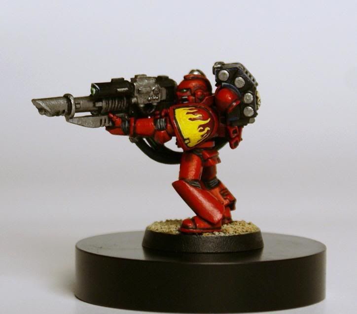
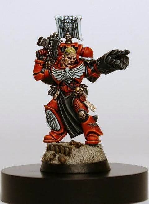
speaking of reds, and highlight colors, i have had a definite progression of my style with that color, mostly because i am a huge Blood Angels fan...
when i first started, my red was pretty basic, without much in the way of shading or highlighting...
this was what i painted in 2001:
the next time i got a chance to paint red power armor in 2007, i went for a very basic orange/yellow line highlight:
in 2009, i was still using the same highlighting technique, but tried playing around with red tones to separate the different elements of the mini:
the next year, in 2010, i put together everything that i had learned from the things i was not happy with on the previous minis, i took the crisp line highlighting as far as i could:
that same year, i got a chance to switch up my style, and start working with deeper shading on the red (using Exile Blue), and mixing a salmon color (Khador Red Base and Menoth White Highlight) for the highlights rather than using orange/yellow:
on my most recent Blood Angels mini, i pushed the shadows even further (using Coal Black), and made my highlights even brighter with a lilac color (using a touch of Khador Red Base mixed into Underbelly Blue) for more contrast:
every new mini is a chance to progress, and push your limits...
cheers
jah
This message was edited 1 time. Last update was at 2016/07/14 03:39:09
Thanks for the idea(s) jah! I'm actually working on my second red model now and I'm trying to differentiate between him (blades of rage) and my red corsair. Your post will be a great resource in this endeavor. With my red corsair, my highlights were pretty flat, kinda pink and were definitely not the best part of the paint job. With my current figure, I have been doing my best to emulate the technique Bebop demonstrated on shoulder pads (posted on page 4), along with this I'm hopeful I'll achieve a better range/depth of color.
This message was edited 1 time. Last update was at 2016/07/16 02:39:36
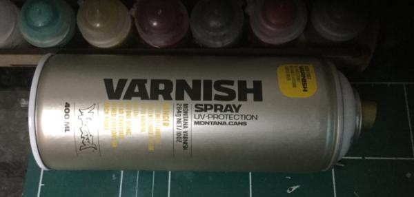
Humidity over here is awful during the summer which means the ever infamous purity seal is totally out unless you fancy the ultimate in stay frosty figs!! The only real use I have for seal anyways is for fixing weather powders as I like the way PS melts them into the areas giving a really ground in grime, dirt and worn look. Lot of folk rave about testors but can't get that over here so I've been trying just about every other Matt spray varnish I could find (white spirits can also be used but it gives a different effect and result and not what I'm looking for in this case)
Finally have found a brand/product that seems to laugh in the face of Korean humidity, fixes and seals the powers and not a glimmer of mr. Frosty to be seen. Montana is the brand!!!
Did a quick test on some of the bases I use for the SH termies yesterday evening and then on the base for Setorax after that and we seem to have a winner. Here's the stuff.
As to availability - I have not idea but if you're suffering from the humid spray blues and you see this stuff - I can heartily recommend it
Yeah I just picked up some montana spray. Its highly recommended by lots of good dakkites and comes in many many colours. Didn't know they did varnish!
Thanks Jah! I love the progression of your reds, i'd say my favorite is somewhere between your 2nd version and 3rd probably because I feel that's where my own level sort of sits (more towards your 2nd) I haven't pushed my reds much further than what you've seen me do to date but I will in the future projects :-)
Flesh Eaters 4,500 points
" I will constantly have those in my head telling me how lazy and ugly and whorish I am. You sir, are a true friend " - KingCracker
"Nah, I'm just way too lazy to stand up so I keep sitting and paint" - Sigur
"I think the NMM technique with metals is just MNMM. Same sound I make while eating a good pizza" - Whalemusic360
Not at all familiar with Montana sprays. Ive used testors dull coat exclusively for many years and have not ONCE had even the slightest issue. I dunno if im lucky but thats alot of cans of spray. Ive seen some complaints to my surprise here.
Sidenote....are citadel paints available in dropper bottles here in the US?
knowing what you want to achieve helps you determine which tools, especially primer, that you should use...
if you are going to juice (painting with glazes), you definitely want to use white primer...
even a zenithal priming technique needs a heavy spray of white over the black for glazing...
you can glaze over black, if black is the color that you are going for, to give it an interesting tone, but for other colors, you are better off using a white primer to really make your colors pop...
for layering, any primer will work, but i prefer black...
some people don't like to layer up from darkest to light, but rather start with the mid-tone, and then shade and highlight from there...
for that approach, grey, white, or colored primer is your friend, like Nerd's Imperial Fist tutorial with the yellow spray...
knowing what you want to achieve is a good way to start a mini
for a bit of context, now that i have covered most of the basics, i guess it would be helpful to explain where i will be coming from with The Tao of Sable...
i will be sharing my thoughts and experiences as a competitive painter...
ever since i picked up miniatures, and my first copy of White Dwarf magazine in the mid-80's, i knew that i wanted to paint as well as the 'Eavy Metal team...
then the first Golden Demon showcase book came out in '89-ish, and the pursuit of a Slayer Sword became my focus...
at that point, i had only been painting for a couple of years, and wasn't very good, but i was on a mission
by 2000, i thought i had become a pretty good painter, so i made the pilgrimage to Birmingham for my first Golden Demon competition, and got my butt kicked...
that was all the motivation i needed to really focus on becoming one of the top painters in the world...
16 years later, and i am still chasing that goal, and still have a fair way to go...
travel, and constant commissions, have made it a slow process, as competition painting is its own beast, and in my opinion, it is the hardest level of painting to stand-out in, because there are a lot of really good painters out there...
anyway, with Crystal Brush, Gencon PP Masters, and now the return of the Golden Demons, the old fire is hotter than ever, and i pretty much only see painting in terms of how to be as good as the top competitors...
hopefully the things i have learned will be of interest to everyone, but especially to those who really want to push their painting to the top level...
@Guildenstern: you shouldn't have any problem finding Montana sprays here in the states...
it is the spray of choice for most serious graffiti artists i know
@Heretic Tom: i don't know if you have tried it out yet, but this is what P3 Khardic Flesh looks like as a highlight color for red:
I just realised that grey is probably a paint I shouldn't be painting with. It's so dull and hard to highlight... any idea on how I can switch colour schemes?
@ Jah: great insight dude. Thanks for your always enlightening, informative and pic heavy posts! Tons of eye candy <3 and great visual representations!
Allow me to do tthe same:p My own personal experiences are somewhat similar. Started super young and basically wanted to be an 'EM painter for white dwarf. My first choice, i had to settle on professional touring jazzdrummer instead. Damn it all. But yup, as i get older, the games appeal to me less, and the craft, becomes all consuming. Ive always painted for the love of it, and actually played my first miniatures battle game with painted minis, at the age of 27 but started painting around the age of 8 with several 5-7 year hiatius' through out.
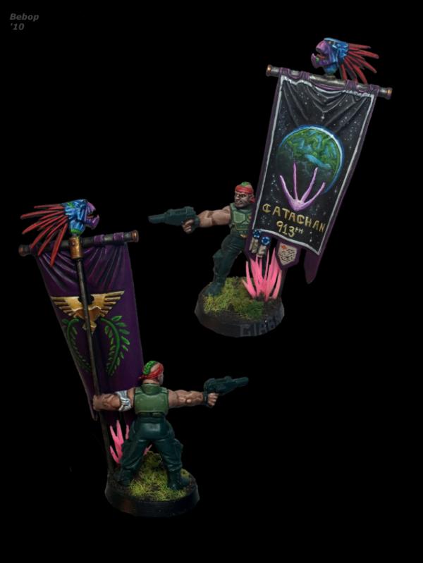
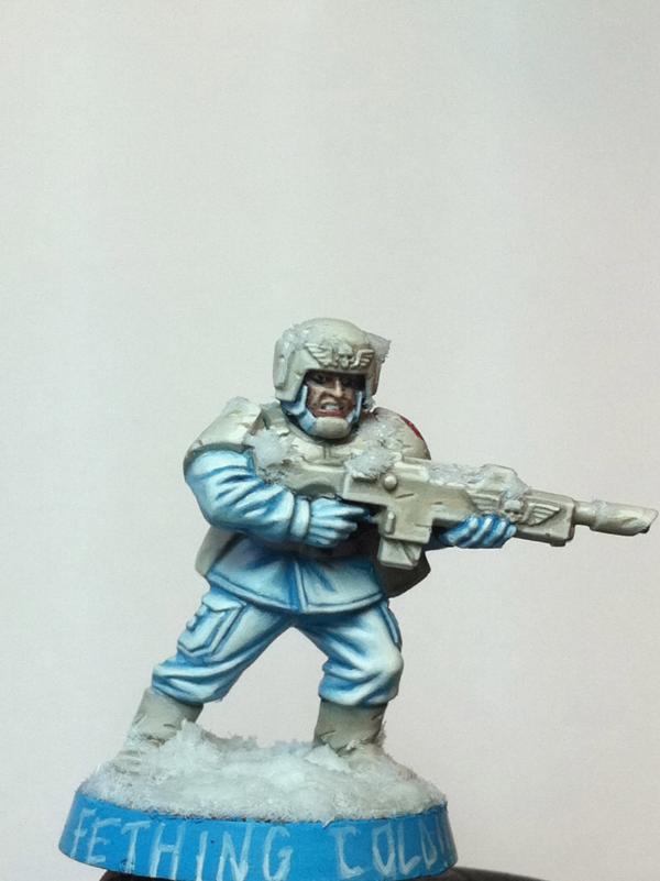
As for your remarks about priming, spot on. My first big jump in ability, i was definitely painting with Black undercoats. I liked that i didnt have to blackline anything and i was always worried about each item on the mini being a clearly defined object. With a black undercoat that became a non issue because as long as i didnt paint all the way to the edge of said section, a little darkness showed through. I was also experimenting alot with painting from darkest to lightest. The Tundra Cadian below was done that way over a black base coat and i think bordered on Madness at how long it took to do that. Hours upon hours....Both the standard bearer and the Cadian Tundra Trooper below were painted with solid black base coats. The actual soldier holding the flag was painted to match the other 140 catachan soldiers so it was painted speed/tabletop, but that flag,while not being my "best' work, for some reason is probably my favorite single thing ive ever painted.
beyond that, my first execution of zenithal also proved to be a huge learning experience for me. I was using relatively opaque paints on this mini, but used a stippling technique to give the robe a worn canvas feel 9you can really zoom in on that pic and see it close up) Where i really was blown away with how different i could paint on this mini was the parchments, which almost seemed to paint themselves after an initial coat of thinned whatever tan i used i forgot. I just stopped and said, woah! look at that. It was shaded and highlighted in one thin coat! (obviously thats a basic summary but not far off the effect):
Finally with Infinity models, i needed to find a way to paint incredibly small details, but with the roots of GW style painting. Edge highlighting etc etc without going batsh*t crazy because of its insane scale. Ultimately, and after throughly investigating Angel Giraldez' book,( http://studiogiraldez.blogspot.com/ ) i see that, while he uses an airbrush for certain things, the main difference is that he is using incredibly thin paints, and blacklining instead of edge highlighting on alot of the tricky bits, giving them clear definition. An extremely effective tactic that i find pretty fiddly at such a small scale so thats where my practice is at these days: Black lining to effect.
@ Mattew: Why do you say grey is a hard color to paint? whats giving you trouble with it? I say if its a color you orginally wanted than you should figure out how to paint it instead of giving it up for a scheme youre more familiar with. Of course if its a matter of getting it done fast, some colors are more conducive to quick painting and i understand you may want to just batch paint em up and get em on the battlefield. However that way of thought is anathema to the point of this thread Grey, black, and white (or even just black and white) is a good place to start with practicing grey. Obviously theres alot more there as you progress with any color than just a base, highlight and shade, when we get into color theory. But those three colors mixed appropriately outta give you a good place to feel to good about the results.
As per building color schemes, i pay attention to things like architecture, clothing styles through history (camo patterns and appropiate colors per theatre, *definitely* interior design; these are good templates for color palettes and to remember these you can download free color palette apps for your phone or a website, to catalog palettes you like. A good place to start as well is the tried and true 3 color approach. Two colors that compliment and tertiary color that is generally opposite the color wheel or just eyeballs well with the other two youve picked. I dont ALWAYS think the color wheel is the answer, sometimes im certainly wrong about that, but experimenting with color is a big part of finding your voice as a painter.
Hope this is helpful!.
Happy painting everyone, looking forward to seeing all your works and progress! Share as much as you like!
Bebop
This message was edited 2 times. Last update was at 2016/07/17 15:15:48
Yes, grey is the colour I want. It's just that it doesn't feel like I can achieve the same results wih grey than with say red. I'm painting grey with Eshin Grey as basecoat and Dawnstone as highlight.
Hmmm...well, i did a squad of Space Sharks a few years ago as an experiment to see how fast i could paint up a unit of marines and still be somewhat pleased with the outcome. I used those exact colors except i used Eshin Grey as a Shade (with black and brown in it) and Dawn Stone was the base. The highlight was Admin grey plus more and more white and the heavy lifting was done with weathering sponge and i airbrushed the base, shade 1, and high light one. I used a crappy airbrush at the time hence the speckle effect but ended up kinda digging it. I managed to get these done under 4 hrs per model which i think is a good middle ground for painting up a squad fast and could do one squad a week. Which i actually plan on doing. is this something that youre going for here? (in terms of dull, i used the bright light blue to give something interesting to the model color wise, also the green base rim, which got alot of flak, was done that way for the same reason. a brown or black base rim would have generally been rather boring to me.)
Anyways, hope that helps. To recap, thats Eshin grey base, dawnstone, admin grey, white. and i (washed (read glazed) a bunch of glazes of a dirty mix of brown and black into shadowy areas and heavily around the feet.
Cheers Matthew! Please show us your progress when you get some painting on!
bebop
This message was edited 1 time. Last update was at 2016/07/17 16:54:48
Matthew wrote: Yes, grey is the colour I want. It's just that it doesn't feel like I can achieve the same results wih grey than with say red. I'm painting grey with Eshin Grey as basecoat and Dawnstone as highlight.
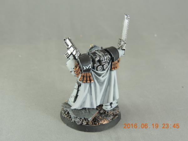
Matthew, this is grey (one of my luna wolves from my gallery of em):
My intention was to use a very light grey to go up to a fake white, instead of painting white.
I used a lot of layers of greys to get there (reaper colours) but the last step I picked ghost white which is really more of a blue grey white colour. I just really liked how it ended up looking over all the other greys.
Not saying I did an awesome job there are a lot of things I'm not totally happy with with these models but I do really like how the colour worked out, and the cloak on the above I'm quite pleased with tbh.


 Flesh Eaters 4,500 points


 your painting looks really good you've got a lot of expression on that orc face! and the eyes, just really like them. My only quibble might be the right (viewer's side) looks maybe a tad off. I have a terrible time with eyes so please don't take this as more than just a friendly note!
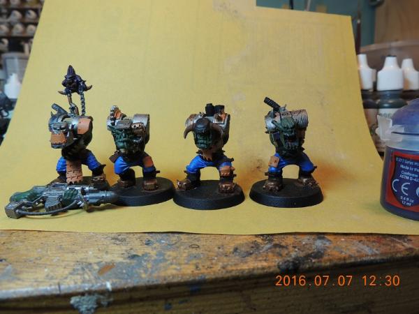
 but it did keep the models in place!
  While I don't care for say, most


 ~2800 points
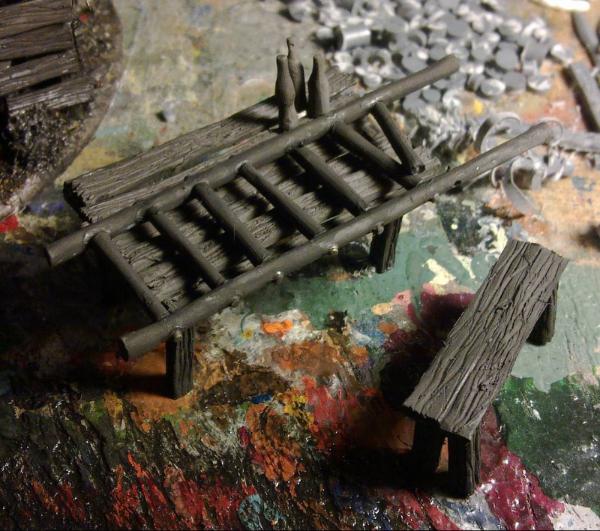


 Chaos Warband & Inquisition