| Author |
Message |
 |
|
|
|
|
Advert
|
Forum adverts like this one are shown to any user who is not logged in. Join us by filling out a tiny 3 field form and you will get your own, free, dakka user account which gives a good range of benefits to you:
- No adverts like this in the forums anymore.
- Times and dates in your local timezone.
- Full tracking of what you have read so you can skip to your first unread post, easily see what has changed since you last logged in, and easily see what is new at a glance.
- Email notifications for threads you want to watch closely.
- Being a part of the oldest wargaming community on the net.
If you are already a member then feel free to login now. |
|
 |
2016/10/10 00:14:40
Subject: Imperial Guard and Blood for the Blood God-Shaddock learns how to Paint
|
|

Been Around the Block
|
I started the hobby February of this year and have enjoyed it greatly thus far. I am awed by the workmanship and artistry of many of the posters here and aspire to produce something similar. I have watched a few video tutorials and have made some progress in mimicking their works. My biggest issue is that even when I do layers and highlighting I still don't seem to get the contrast and "POP" that others achieve. Case in point, I have attached these tyranid warriors I completed during Hurricane Mathew. They have a wash and 4 different reds and still don't seem to pop. Please share your experiences so I can continue to improve my hobby.
Update: I greatly appreciate everyone's input. I learned a lot and maybe even improved a little. Posting below is my 1650 Astra Militarum army that I painted this year (well February to last night) as a starting point of reference. Next year My goal is to paint a 1650 point army of World Eater's to a higher standard (felt like something to practice assault with as opposed to sit and shoot guard). I hope people will follow and continue to provide guidance in my attempts at doing something artistic. Thanks again.
|
|
This message was edited 3 times. Last update was at 2016/12/30 22:01:57
|
|
|
 |
|
2016/10/10 00:57:42
Subject: Need help improving
|
|
Norn Queen
|
To get pop you need to get contrast. Lets exllain something about color.
All colors are described in 4 scales.
Hue- ths rainbow scale... look up a color wheel.
Tint- add white
Tone-add grey
Shade-add black.
The farther Long any scale you move the more contrast you build. White and black are extreme contrast. But if you picture a 10 step scale with white being 1 and black being 10 a spot of 2 or even 3 on a field of 9 will still look like 1 and 10 because of contrast.
To get 2 colors to actually appear as 2 different colors you need to make at minimum a 2 step jump. A spot of 1 on a field of 2 looks like the 2 is just dusty or dirty. Its not until the spot of 1 is on a field of 3 that they start to appear as distinctly different colors.
You can build that contrast on any(including multiple) of those 4 scales above. Your reds are not popping? Your colors are too close move another step over and the highlights and accents will pop more.
|
These are my opinions. This is how I feel. Others may feel differently. This needs to be stated for some reason.
|
|
|
|
|
2016/10/10 01:10:05
Subject: Re:Need help improving
|
|
Longtime Dakkanaut
|
Hey, nice to see some warriors out there! Other people can explain it better (the post above for example) but it is about getting more "difference" between a bottom color and a top color. You say its been less than a year, well, hey doing well for your time in! Just keep working, practice means a LOT in this hobby, same with experience and learning which colors work well together, which dull each other etc.
You painted this during Hurricane Mathew? I hope you weren't in your house spinning through the air to a strange land of short people...(or have I just pointed out how old I am...)
Anyway, keep sharing and keep talking my friend!
|
Keeping the hobby side alive!
I never forget the Dakka unit scale is binary: Units are either OP or Garbage. |
|
|
|
|
2016/10/10 01:39:57
Subject: Need help improving
|
|
Dakka Veteran
|
You want pop? Don't just use reds, start going into oranges. Push the envelope, what may seem too extreme when holding the paint pots next to each other may be just right on the mini.
BTW, wait till the little camera on the screen rotates so your pictures are right side up. (I have to remind myself of this all the time)
|
|
This message was edited 1 time. Last update was at 2016/10/10 01:41:07
|
|
|
|
|
2016/10/10 03:21:03
Subject: Need help improving
|
|
Incorporating Wet-Blending
|
Try some purple for your blue and red shading colors. Purple should be useful to unify your miniature colors.
Highlight reds with orange.
|
|
|
|
|
|
2016/10/10 22:51:23
Subject: Need help improving
|
|
Been Around the Block
|
I appreciate the input. Just to make sure I comprehend. My current process is base Mephisto red, wash nuln oil, highlight mephisto red again, then the high round spots with wazdaka, then edges with evil suns and then I did a final edge with wild rider red So maybe one more edge with a bright orange or yellow? Would that cover my previous highlight?. It seems like I am running out of real estate. Again, I appreciate the help
|
|
|
|
|
2016/10/10 23:55:00
Subject: Need help improving
|
|
Norn Queen
|
Honestly you can probably replace your last color with something that has the same darkness or whatever but just a slight orange to it. Just nudge it into that family of colors. Again, the more levels of contrast you build the better it will pop.
|
These are my opinions. This is how I feel. Others may feel differently. This needs to be stated for some reason.
|
|
|
|
|
2016/10/11 00:13:30
Subject: Need help improving
|
|

Veteran Wolf Guard Squad Leader
|
CDShaddock wrote:I appreciate the input. Just to make sure I comprehend. My current process is base Mephisto red, wash nuln oil, highlight mephisto red again, then the high round spots with wazdaka, then edges with evil suns and then I did a final edge with wild rider red So maybe one more edge with a bright orange or yellow? Would that cover my previous highlight?. It seems like I am running out of real estate. Again, I appreciate the help
Isn't Wazdakka red darker than Mephiston? That's probably why you feel like the model isn't popping, your first highlight isn't the right hue.
I would be using something like this:
Basecoat Mephiston Red
Wash Nuln Oil
Relayer Mephiston Red
Highlight with Evil Sunz Scarlet
After that I would mix the Evil Sunz with something like Trollslayer Orange.
|
|
|
|
|
|
2016/10/11 02:14:41
Subject: Need help improving
|
|
Sneaky Striking Scorpion
|
Winter, yes, at least in bottle Wazdakka and Mephiston red are relatively similar. I would actually give the nod to Mephiston being lighter. It surely is a more intense red.
The way I do red (I like really intense contrast) is to start with Khorne Red base, then use either Nuln Oil or Agrax Earthshade depending on the other colors on the model, then Khorne Red again, midtone with wazdakka, and highlight with Evil Suns Scarlet. That said, I do not do edge highlighting - it's not really my thing. If I had to pick colors to edge highlight with, it would be Wild Rider Red then Troll Slayer Orange.
If you want to start with Mephiston, I would do what Winter suggested, but I think a sufficiently watered-down Troll Slayer Orange would do well as a highlight by itself. It and Wild Rider are pretty close together overall, so the change would not be too drastic.
|
~  Craftworlders ~ Craftworlders ~  Harlequins ~ Harlequins ~  Coterie of the Last Breath Corsairs ~ Coterie of the Last Breath Corsairs ~ |
|
|
|
|
2016/10/11 02:45:50
Subject: Need help improving
|
|

Boosting Ultramarine Biker
|
The base needs contrast too. I would suggest a darker shade of brown for the ring.
|
|
|
|
|
2016/10/11 12:41:57
Subject: Re:Need help improving
|
|
Dipping With Wood Stain
|
Red's a tricky colour to get good contrast in, too, imo (and an absolute pain in the rear to photograph decently!). What I find helps is starting with a base that isn't red - for example, I actually base the red on my Thousand Sons in Xereus Purple first, before layering up with a darker, medium, then brighter red. This leads to a richer-looking red in the end, and then I also use flesh colours for the extreme edge/corner highlights instead of orange.
For a warmer red, you could try using something like Rhinox Hide brown instead of purple as your very base colour, then extreme highlights with oranges.
|
|
|
|
|
|
2016/10/11 16:01:43
Subject: Need help improving
|
|

Dakka Veteran
|
To be honest, I think those Tyrandids look really good.
|
|
|
|
|
2016/10/11 18:24:28
Subject: Need help improving
|
|
Sneaky Striking Scorpion
|
Well... I appear to have missed that part.
For being in the hobby for only 8 months or so, your Nids look great! Good on you for taking on highlights so early.  Btw
Btw, welcome to 40k if I missed that. I hope your experience moving forward is as great as or better than your entry months.
|
~ Craftworlders ~ Harlequins ~ Coterie of the Last Breath Corsairs ~ |
|
|
|
|
2016/10/11 20:21:31
Subject: Need help improving
|
|
Thane of Dol Guldur
|
these look good. the advice above is good. i'll simplify a little and help you with these specific models. youve gone for a red on the exoskeleton, and a blue on the carapace, which is cool, these colours do compliment one another, but green compliments red better, as it is its opposite on the colour wheel. what i'd do here, is work on your layering. layer the red exoskeleton from a dark red to an orangey red highlight, then take the carapace from a dark green to a light blue turquoise, or a dark blue to a light green turquoise. i did this on some orruks recently and it looks amazing with the colour contrast.
|
  Heresy World Eaters/Emperors Children Heresy World Eaters/Emperors Children 
Instagram: nagrakali_love_songs |
|
|
|
|
2016/10/11 20:40:51
Subject: Need help improving
|
|
Arch Magos w/ 4 Meg of RAM
|
When I highlight red, I usually go all the way up to Kislev Flesh or even Pallid Wych Flesh (or even White Scar). I think those minis look great, but if you want them to really pop I just going much much brighter in your highlights. Just remember the brighter you go the smaller you want to paint it. When highlighting with something as bright as white on red you'll want the dots to be tiny. Really really tiny. :-)
|
Bye bye Dakkadakka, happy hobbying! I really enjoyed my time on here. Opinions were always my own :-) |
|
|
|
|
2016/10/11 21:11:47
Subject: Need help improving
|
|
Dakka Veteran
|
If you do highlight red with white, you have to be careful not to make them pink though.
For someone who's been painting for only eight months though, CDShaddock, you're doing amazingly. The best thing you can do is keep painting. You'll continue to improve without even realising, then one day you'll compare something you're painting with something you painted a while ago and be surprised by the improvement.
Other than that, read a few things about colour theory, watch a few videos. The Three Colours Up videos on Beasts of War have some good colour theory episodes. For painting red in particular, have a look at Sorastro's excellent YouTube channel, and his video on painting the Royal Guards from Imperial Assault. Then when you're feeling a bit ambitious, have a watch of the Painting Buddha videos. I reckon I improved a lot by trying and completely failing to replicate Ben Komets' work on there.
Keep going though. You've obviously got some talent for this. 
|
|
|
|
|
2016/10/15 18:57:04
Subject: Re:Need help improving
|
|
Been Around the Block
|
I appreciate everyone's guidance and kind words. I decided to do this cultist next so I could put to practice more variety in the highlight advice you gave me. Photos aren't great and it took me like 4 hours to do this thing. (I paint so slow). Please critique so that I know what I can do next.
|
|
|
|
|
2016/10/15 19:48:01
Subject: Need help improving
|
|
Grey Knight Psionic Stormraven Pilot
|
Yea, what he said. Really good.
|
 Grey Knights 7500 points Grey Knights 7500 points
 Inquisition, 2500 points Inquisition, 2500 points
 Baneblade Baneblade
Adeptus Mechanicus 3000 points |
|
|
|
|
2016/10/15 20:58:17
Subject: Need help improving
|
|

Storm Trooper with Maglight
|
Same here. Those models are above table top quality. The paintjob is really neat.
|
|
|
|
|
2016/10/16 05:50:52
Subject: Need help improving
|
|
Incorporating Wet-Blending
|
Maybe a bit more highlighting? Unless you have more figures, then stop and go the next one!
|
|
|
|
|
|
2016/10/16 06:02:49
Subject: Need help improving
|
|
Fixture of Dakka
|
Highlighting some edges will go a long way for the hard surfaces. I suspect you start with a base coat, perhaps highlight a little with some layer paints and apply a shade or two over the entire model (or perhaps the reverse order with shade/highlight).
One of the issues of doing it that way is that most color combinations will come out quite dark, yielding less contrasty results.
A couple of ways to rectify that -- you can layer some brighter colors up on surfaces that look more raised or where you think light might hit. Don't be afraid to go quite bright, as this looks good. Another possibility if you want to up your game is to use less shade, and only use shade where you really want to darken things (rather than paint it over the entire model). If you learn to feather the edges of the shade (with water or medium), you can gently make areas darker, while keeping other spots brighter. Overall, you get more control, and it generally takes less time than if you wanted to blend it up to bright raised areas again. On the downside, it takes a lot more time than just drowning the model in shade.
And, of course, edge highlights make a huge difference.
Nice models, though! Good luck!
|
|
|
|
|
2016/10/16 09:50:39
Subject: Need help improving
|
|
Dakka Veteran
|
Again, really nice job on the cultist. He's got a properly grimy, chaosy feel to him. I like him as he is, but if you want some advice I'll try to give you some. Bear in mind that I'm far from a golden demon winning expert!
To just boost the contrast a little, you could try painting on a few spots of light, brighter than anything else on the area in question, on areas where the sun might be reflecting. So the metallic bit on the shoulder, for example. Just a couple of really tiny spots of pure silver on the upper edge. It'll look like areas where his armour has been nicked or scratched in battle. You could also make a feature of the eyes. Try painting them like gems, perhaps? Green is a great choice of colour for them (contrasting with the red) but you could boost them a bit and make a focal point for the miniature. Here's a simple illustration of how to paint them.

Personally, I use pure black for the darkest areas, then a crescent of warpstone glow over the bottom half, then a smaller cresent of moot green, and a tiny spot of white in the black.
You can also boost the contrast on the miniature in general by taking the highlights slightly higher than you think is correct (experiment a bit) and adding more shade after the shading and highlighting process by somewhat neatly painting another layer of nuln oil into the areas of shade.
As I say though, he already looks great!
|
|
This message was edited 1 time. Last update was at 2016/10/16 10:07:47
|
|
|
|
|
2016/10/16 16:43:07
Subject: Need help improving
|
|
Been Around the Block
|
What are people's thoughts on inversing the red/grey in order to give some variety to the colors with the duplicate sculpts?
|
|
|
|
|
2016/10/16 18:04:58
Subject: Need help improving
|
|
Norn Queen
|
I would NOT paint metals like Gems. Gems only work that way because they are translucent. You will cause contradictory light sources on the model if you paint metal like gems.
But to expand on that image I would like to explain the 7 parts of the shadow to maybe help with where you are putting your highlights.
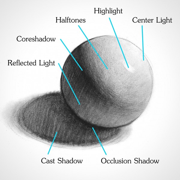
The 7 parts of the shadow are depicted in the image above.
1) The center light is where the light is hitting the object.
2) The highlight is a single spot of concentrated light. It is where the light most directly hits the object and reflects to the viewers eye. On a shiny ball when you bob your head a bit the highlight might move around a little. Not particularly important for model painting except to note that having a small spot of highlight is need on particularly shiny objects to create truely realistic effects. Hence the way Gems are painted.
3) Halftones are the truest representation of the color of the object. Not in shadow, not in light.
4) Coreshadow is the object in shadow.
5) reflected light is a small sliver of slightly lighter color in the core shadow. Usually on the edge of an object opposite the center light. It is light reflecting off other objects.
6 and 7 are parts of the cast shadow.
6) The occlusion shadow is the darkest part of the shadow. It is where the object touches another object and is near if not total shadow because there is no place for light to get in.
7) gets lighter as the shadow gets farther from the object and more light can reach the surface.
Mostly you do not need to worry about cast shadows on models. The models will cast their own. So ignore 6-7 unless you want to get real bonkers with your detail.
Otherwise you only really need to worry about 1-5 and only REALLY need to worry about 2 on particularly shiny object.
|
|
This message was edited 1 time. Last update was at 2016/10/16 18:14:28
These are my opinions. This is how I feel. Others may feel differently. This needs to be stated for some reason.
|
|
|
|
|
2016/10/16 19:25:51
Subject: Re:Need help improving
|
|
Been Around the Block
|
Thank you for the excellent info. I appreciate the diagrams. They make digesting the info much easier since I have don't have any artistic background (last time I touched any form of paint was in a mandatory high school art class). I have been working on a second cultist (attached). So far I have the base colors and washes on it and will try to do a bit more extreme highlights this time around.
|
|
|
|
|
2016/10/18 00:11:00
Subject: Re:Need help improving
|
|
Been Around the Block
|
Finished second cultist. Looks like sloppy up close but pretty good from far away. Maybe still too dark?
|
|
|
|
|
2016/10/18 23:59:00
Subject: Re:Need help improving
|
|
Been Around the Block
|
Cultist #3 in the making.
|
|
|
|
|
2016/10/22 22:07:48
Subject: Re:Need help improving
|
|
Been Around the Block
|
Cultist #3 complete
|
|
This message was edited 2 times. Last update was at 2016/10/22 22:09:35
|
|
|
|
|
2016/10/22 22:14:08
Subject: Re:Need help improving
|
|
Been Around the Block
|
All three together. The start of a 500 point chaos raiding party.
|
|
|
|
|
2016/11/06 22:14:28
Subject: Re:Need help improving
|
|
Been Around the Block
|
Been away for a bit at conferences. I am a little over halfway through my first squad of cultists. Since the next four a duplicate models I am thinking of inverting the red/grey colors. What are everyone's thoughts?
|
|
This message was edited 1 time. Last update was at 2016/11/06 22:17:09
|
|
|
|
|
|
|

